
TradingEdge Weekly for May 31 - Technical warnings, utility turnaround, summer tech trend

Key points:
- Participation among stocks in the Nasdaq 100 is waning
- On the Nasdaq exchange, technical warning signs are piling up
- Other warnings are being triggered across the broader market
- The warnings have been enough to trigger a Risk-off alert
- Utility stocks went from broad outperformance to...not
- Stocks are looking at a positive short-term window at the end of the month
- During the summer months, the cap-weight Nasdaq 100 tends to outperform the equal-weight index
- Semi stocks enjoyed a swift reversal
- How we can use stocks to predict the economy (not the other way around)
- Coffee's seasonal tendencies suggest traders should be on alert for a price reversal
Waning participation
Even though the primary big-tech index, the Nasdaq 100 (NDX), has recovered to all-time highs, fewer and fewer members of that index have enjoyed the ride along with it.
As of last week, fewer than 60% of stocks in the NDX were holding above their 50-day moving averages, a dramatic change from earlier in the year. This trend starkly differs from what we saw at this time last year.
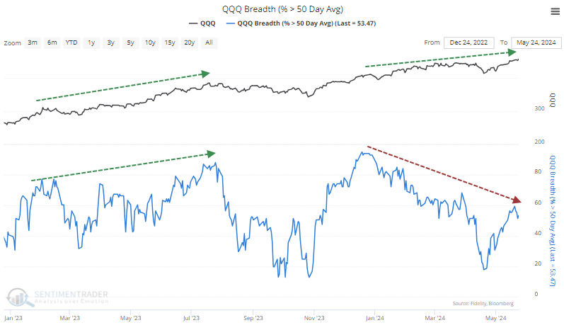
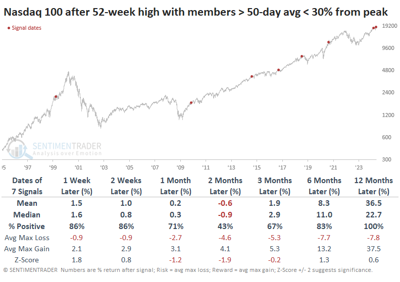
Over the past 30 years, there have been a handful of times when the NDX hit a 52-week high, and the percentage of its member stocks holding above their 50-day averages was at least 30% below the peak reading over the past six months. Over the next two to three months, the NDX lost some steam.
It's not just medium-term trends that are showing some weakness. Fewer and fewer stocks are also trading above their long-term 200-day moving averages. This is somewhat similar to the activity leading up to the 2021 peak.
It's notable that this is one of the very few times in the past 30 years when both medium- and long-term divergences were in effect simultaneously. The others were in 1999 and 2018, which are inauspicious dates for anyone investing at either time.
More technical warnings
The divergences noted above aren't just isolated to the large stocks in the NDX; they are endemic to the broader Nasdaq exchange.
Over the past 100 days, the number of Hindenburg Omens has spiked to the highest level in four years. The same goes for the Titanic Syndrome, though it's not quite as severe. These signals highlight "split" market conditions when many stocks are doing well, and many others are doing poorly.
When we combine the two signals and add up the number of times they have triggered over the past year, the total just surpassed everything since July 2008.
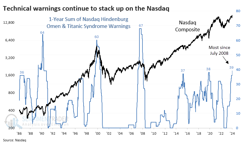
The only times the 1-year sum of these two technical warnings has reached this level were ahead of the Nasdaq peaks in 1990, 2000, and 2007. Which isn't great.
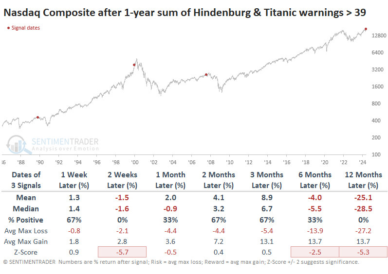
If we relax the parameters to 35 signals over a year, we double the sample. Overall, the results were still weak, with each preceding some kind of trouble. This total was exceeded in March of this year, so if the April weakness was "it" for this cycle, it would be among the most unscathed.
Relaxing the parameters to 30 or more signals over a year gives us a few more dates. Only one of those, in 1996, got by without much trouble, though the Nasdaq still sported a negative return three months later. All the others led to trouble.
More internal warnings
Two components in the Risk-Off Composite Model issued warnings, indicating deteriorating stock participation. Dean noted that similar precedents preceded negative returns for the S&P 500 over the subsequent two months.
A new signal from a voting member in the Risk-Off Composite Model issued an alert on Wednesday. This component uses the percentage of S&P 500 stocks outperforming the index over rolling 21-and 63-day periods to identify market environments when fewer and fewer stocks match the S&P 500's performance.
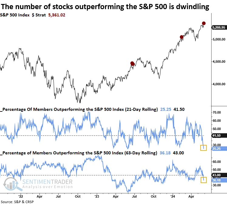
Following a significant contraction in the number of stocks outperforming the S&P 500 index, the world's most benchmarked index tended to struggle over the subsequent two months. Throughout this timeframe, the median maximum loss was consistently higher than the maximum gain.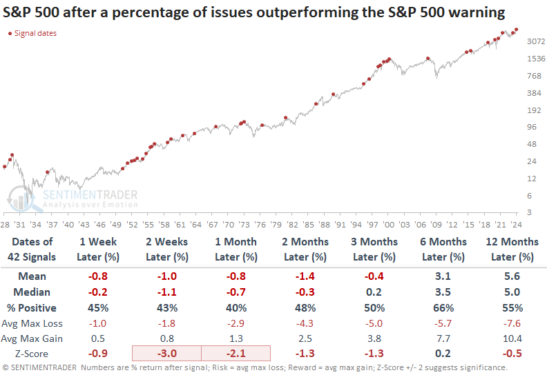
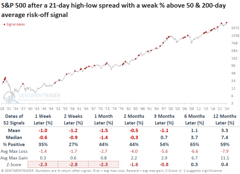
Last week, a new signal from a voting member in the Risk-Off Composite Model issued an alert. The component is called the New High Low Spread with a Weak % Above the 50 & 200-day Average model, and it uses breadth-based indicators to identify a narrowing in stock market participation.
In precedents where the breadth-based model triggered an alert when it identified a deterioration in S&P 500 participation across several indicators and durations, the world's most benchmarked index struggled over the subsequent two months, displaying a loss in all four horizons.
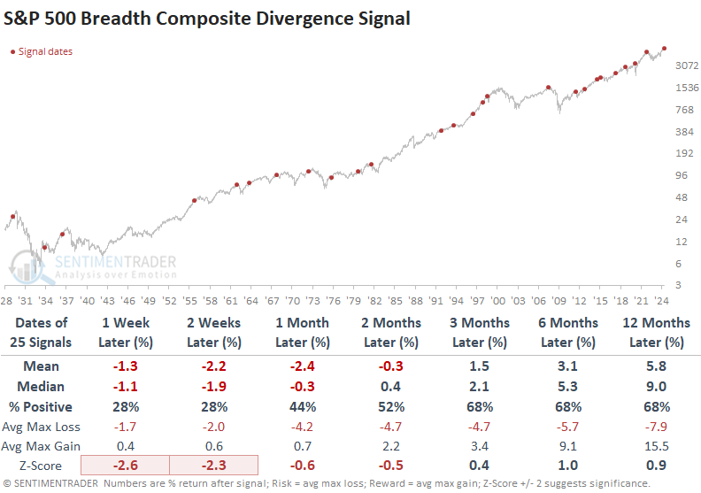
A risk-off signal
Dean followed up by noting that a component in the Risk-Off Composite Model that identifies a breadth divergence issued an alert. Similar divergences suggest the S&P 500 could struggle over the following two months.
With the above component signal, the Risk-Off Composite Model triggered its first alert since December 2021. Although the S&P 500 rose to a marginal new high following that warning, investors who dismissed the risk faced harsh consequences during the severe bear market of 2022.
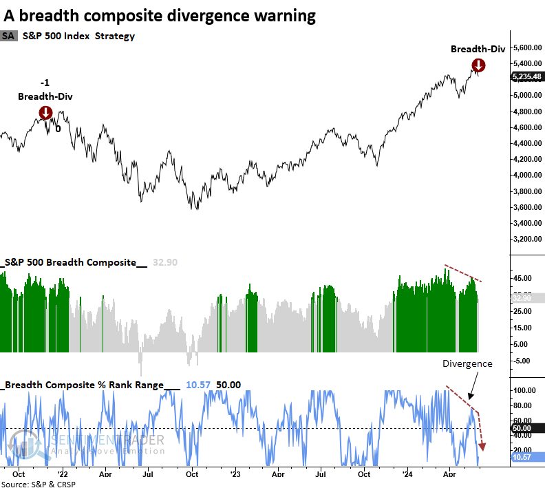
Following a breadth composite divergence warning, the world's most benchmarked index tended to struggle over the subsequent two months. That was especially the case in the first few weeks, with the S&P 500 declining 72% of the time in both the one- and two-week periods. Over the first three months, the median maximum loss exceeded the maximum gain in each time frame.
The Risk-Off Composite Model signal count increased to 60%, triggering the 20th warning since 1955.
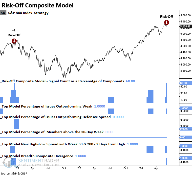
Whenever the Risk-Off Composite Model triggered a warning, the S&P 500 struggled over the subsequent two months, with the greatest risk of a selloff occurring in the first two weeks. Over that horizon, the world's most benchmarked index declined 79% of the time. Like the divergence model, the median maximum loss exceeded the maximum gain in each horizon throughout the initial three months.
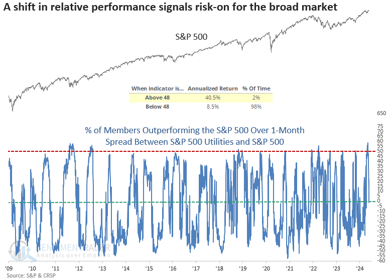
Utilities are losing some electricity
Following a notable spike in outperformance, relative trends for the utility sector suddenly collapsed. Dean showed that similar shifts in relative performance for the defensive-oriented group often foreshadow a risk-on backdrop.
During periods of market turbulence, investors frequently gravitate toward the utility sector, strategically positioning their portfolios defensively to cushion potential losses. As market fears subside, they tend to move away from utilities' perceived safety, seeking opportunities in more aggressive groups.
To capture this shift in investors' risk appetite, Dean calculated the difference between the percentage of S&P 500 Utility sector members outperforming the S&P 500 Index and the percentage of overall S&P 500 members outperforming the Index on a rolling one-month basis. This triggered a new alert when the spread cycled from above 48% to below 0%.
Whenever the spread between S&P 500 Utility sector stocks outperforming the S&P 500 and all S&P 500 stocks outperforming the benchmark cycled from greater than 48% to less than 0%, the world's most benchmarked index displayed some short-term weakness, likely due to volatility that usually accompanies a transition out of a drawdown period. Once the near-term sluggishness subsided, the outlook for the S&P 500 was excellent.
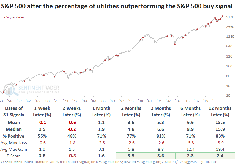
Precedents that were triggered when the S&P 500 traded above its 200-day average, context similar to now, displayed solid returns and consistency, notwithstanding the signals at the outset of the 2022 bear market.
As expected, Utilities and other defensive sectors underperform relative to the S&P 500 and more aggressive groups like Technology and Consumer Discretionary.
A short-term clear window
Over any seven-day trading period, the stock market has shown a slight favorable trend. Jay noted that this edge increases during a particular seven-day period starting near the end of May.
During any 7-day window, S&P 500 results can vary widely. The key takeaway is that there is a slight bias to the upside, with the S&P showing a 7-day gain 57% of the time and a 7-day decline 43% of the time.
The chart below displays the hypothetical growth of $1 invested in the S&P 500 Index (using price-only data) only during the last four trading days of May and the first three trading days of June, every year starting in 1920.
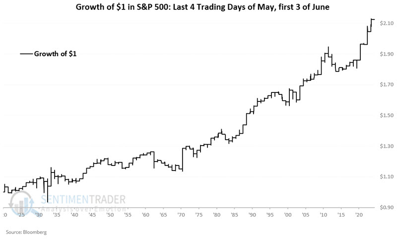
These windows increase the Win Rate to 66% versus the baseline of 57%, and gains and losses over 4% skew to the positive side 9-to-1.
For 2024, this period extends from the close on 2024-05-24 through the close on 2024-06-05.
Let's consider only the late May/early June period during the U.S. Presidential Election years.
The chart below displays the hypothetical growth of $1 during these 7-day windows only during presidential election year starting in 1920.
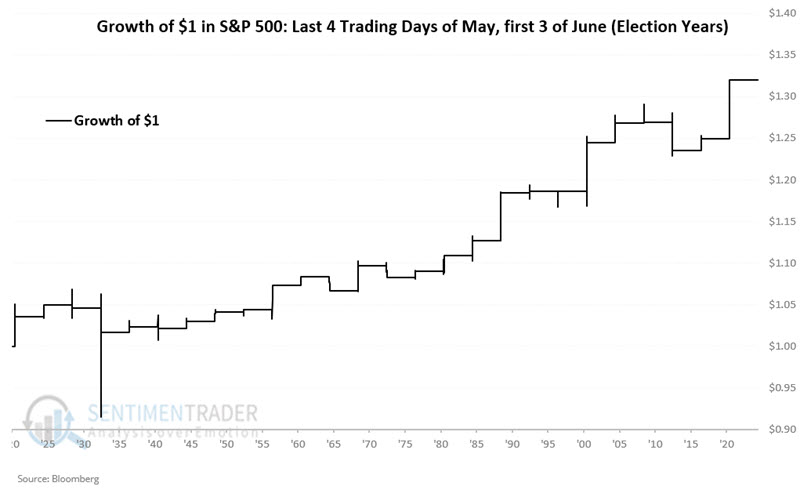
The key things to note are the Win Rate of 73% and no losses over -4%. Compared to a 57% Win Rate for All Days, it equates to a slight edge.
A summer edge for big tech over "average" tech
Jay showed that the Nasdaq 100 Index (a capitalization-weighted index) has been a stellar performer over the past several decades. Many investors are unaware that there is an equal-weighted version of the index; a simple switching strategy between the two may offer the potential for greater long-term returns.
The standard Nasdaq 100 Index is capitalization-weighted, i.e., each stock is weighted based on stock price times number of shares outstanding. A Nasdaq 100 Equal Weight Index also exists, which gives equal weight to all 100 stocks in the index.
For testing, we will use the Invesco QQQ Trust ETF (ticker QQQ) to represent the Nasdaq 100 Index and the First Trust NASDAQ-100 Equal Weighted Index Fund ETF (ticker QQEW) to represent the Nasdaq 100 Equal Weight Index.
The chart below displays the growth of $1 invested on a buy-and-hold basis in both QQQ and QQEW starting in May 2006.
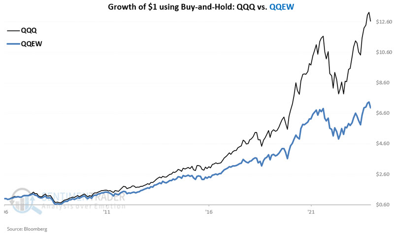
On a buy-and-hold basis, the cap-weighted index has significantly outperformed the equal-weighted index (1.96-to-1) since 2006. But let's take a closer look at performance results throughout the year.
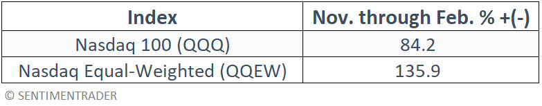
The table below displays the return in both QQQ and QQEW only during the months of November through February starting in May 2006. The equal-weight version of the index handily outperformed.
In contrast, the chart below displays the growth of $1 invested in both QQQ and QQEW only from March through October starting in 2006.
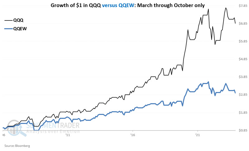
During the summer months, the cap-weighted version of the index returned +586.5% versus only +194.5% for the equal-weight version.
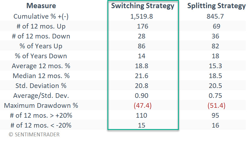
Let's create a switching strategy that will always be fully invested in either ticker QQQ (cap-weighted Nasdaq 100) or ticker QQEW (equal-weighted Nasdaq 100) using the following rules:
- During November through February, hold QQEW
- During March through October, hold QQQ
The table below summarizes this simple approach.
A swift reversal in semis
The Relative Strength Index (RSI) for a Semiconductor index cycled from below 31 to above 69 in 23 sessions. Dean showed that similar swift reversals preceded mixed results for the industry over the subsequent three months.
Following a 17% correction from March to April, the S&P 1500 Semiconductor sub-industry group swiftly reversed to the upside, sending its Relative Strength Index (RSI) from below 31 to above 69 in only 23 sessions.
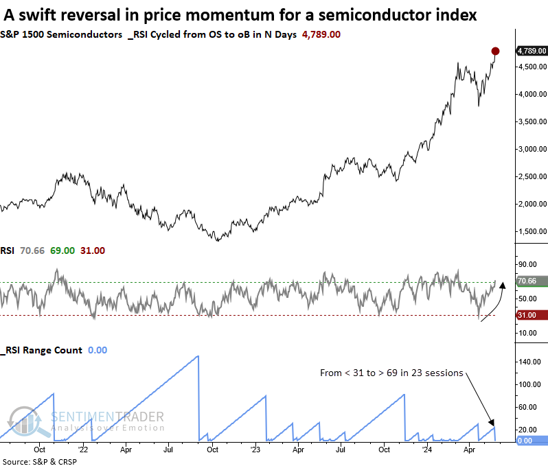
Whenever the Relative Strength Index (RSI) for the S&P 1500 Semiconductor industry cycled from below 31 to above 69 in 25 or fewer sessions, a broad basket of chipmaking stocks showed mixed results for up to three months later.
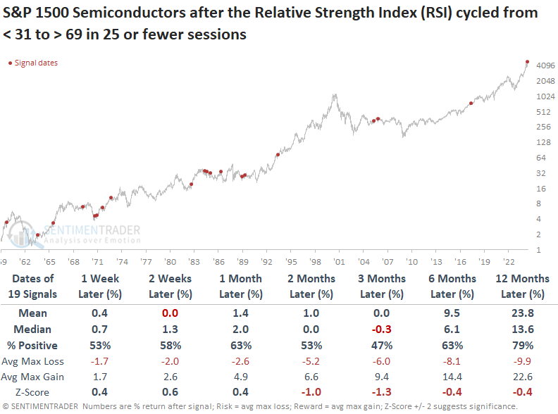
When the semiconductor industry exhibits bullish price momentum like now, the outlook for the S&P 500 is excellent. Over the subsequent twelve months, the world's most benchmark index rose 84% of the time and is presently enjoying an 11-signal win streak that began in 1982.
The swift reversal in the semiconductor industry was not driven solely by Nvidia. The Relative Strength Index (RSI) for the equal-weighted semiconductor ETF (XSD) cycled from below 33 to above 67 in 22 sessions. Even though the sample size is small due to the ETF's short history, the forward returns and win rates were impressive following similar price momentum shifts in a basket of semiconductor stocks that weigh each stock the same, removing market cap bias.
Using stocks to predict the economy (not the other way around)
The stock market is a leading indicator of the economy and not the other way around. Jay showed that we can use the performance of the S&P 500 Index over 12 months to assess the likelihood of economic decline in the subsequent month.
The hypothesis here is that the stock market performs better in the 12 months before a monthly economic gain and less well or even poorly in the 12 months before a monthly economic decline.
Since 1959, the Coincident Economic Index has shown a monthly gain 698 times and a monthly decline 85 times. The table below compares the performance of the S&P 500 Index in the 12 months before months that showed an economic gain versus its performance in the 12 months before months that showed an economic decline.
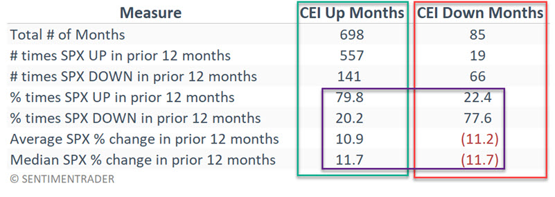
Note the stark differences. Months that showed a gain in the Coincident Economic Index saw the S&P 500 show a gain in the previous 12 months, almost 80% (79.8% to be exact) of the time, with a median 12-month gain of +11.7%. Conversely, months that show a decline in the Coincident Economic Index saw the S&P 500 show a gain in the previous 12 months only 22.4% of the time, with a median 12-month decline of -11.7%.
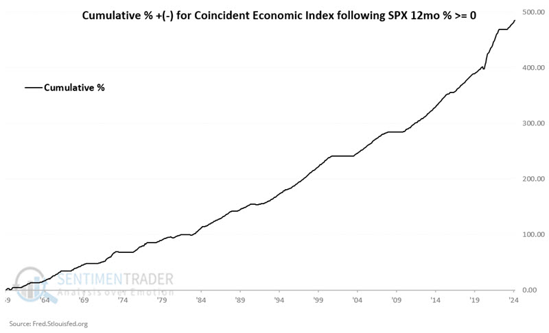
The chart below displays the cumulative % gain for the Coincident Economic Index if we only count months following a 12-month gain for the S&P 500 Index. Historically, the risk of economic decline is low if the stock market has been higher over the past 12 months.
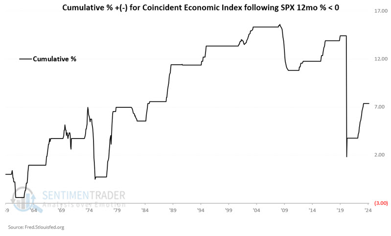
Conversely, the chart below displays the cumulative % gain for the Coincident Economic Index if we only count months following a 12-month decline for the S&P 500 Index. An economic decline is not guaranteed following a 12-month decline by the S&P 500 Index, but the odds are much greater.
If you want to impress your friends with your ability to "predict" economic weakness, history suggests waiting for the S&P 500 Index to show a 12-month loss before doing so.
Coffee jitters
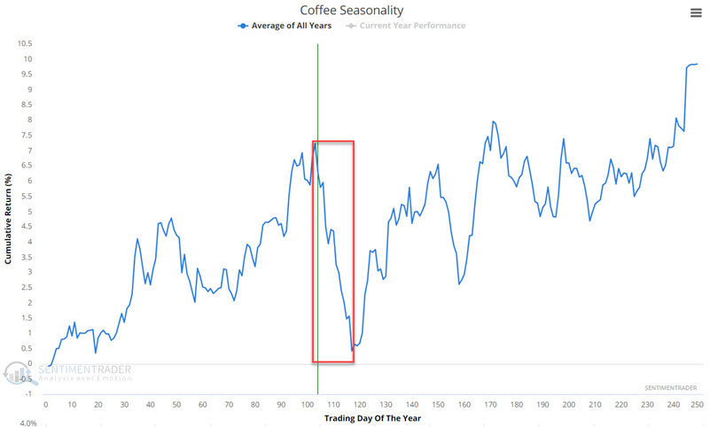
Coffee has entered the weakest seasonal period of the year. Jay noted that so far, the price of coffee futures is rallying hard, but alert traders should note any sign of a downside price reversal.
If coffee fails to regain new highs - or if it tests the previous high but then fails and reverses lower - the potential for a swift plunge exists. The chart below displays the annual seasonal trend for coffee futures. Note that this market has entered a relatively brief - but often significant - unfavorable seasonal period that extends from TDY #103 through TDY #117. For 2024, this period began at the close on 2024-05-29 through 2024-06-18.
So far, during this purportedly bearish period, coffee futures have rallied hard over a couple of days, a reminder of why trading based solely on seasonality is rarely a good idea.
The best times to act based on seasonality are if price action agrees with the direction of the seasonal trend or if the price experiences an extreme and then a significant reversal. In the case of coffee futures, recent price action clearly does not agree with an unfavorable seasonal trend. However, the jury is still out on the possibility of the second scenario.
Why bother? Well, the chart below displays the hypothetical cumulative $ +(-) achieved by holding a long position in coffee futures only during the end of TDY #103 through the end of TDY #117 every year since 1973.
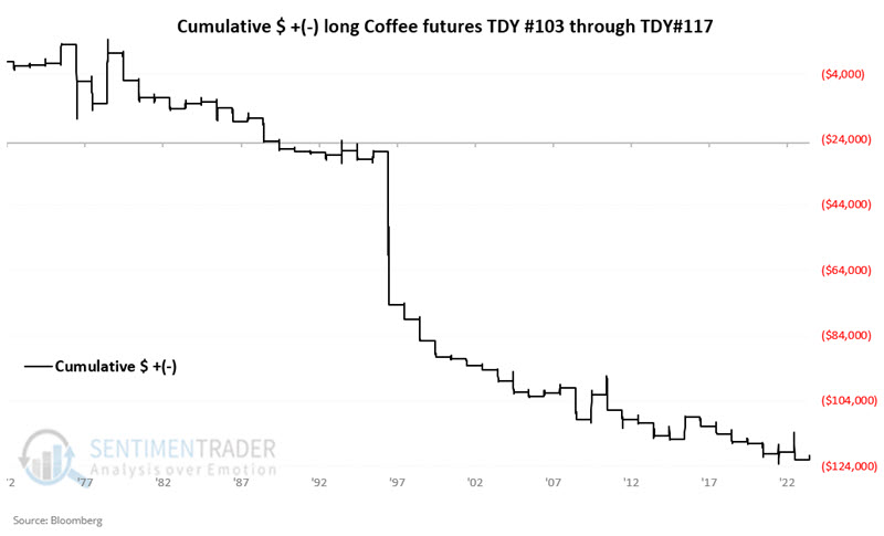
There has clearly been a historical downside bias during this period. Also note that of periods that have shown a net move during this period over $3,000 in contract value (each one point in price is worth $375 in contract value), four have been to the upside, and seventeen have been to the downside.
About TradingEdge Weekly...
The goal of TradingEdge Weekly is to summarize some of the research published to SentimenTrader over the past week. Sometimes there is a lot to digest, and this summary highlights the highest conviction or most compelling ideas we discussed. This is NOT the published research; rather, it pulls out some of the most relevant parts. It includes links to the published research for convenience, and if you don't subscribe to those products, it will present the options for access.