
Energy Bad News and Good News - Part II

In Part I here, we highlighted that the energy sector during the late-August through late-October period has historically been basically a coin-flip, with an overall negative performance over the past 68 years (i.e., the Bad News).
This piece will highlight a potentially positive development for the energy sector (i.e., the Good News).
SECTOR COMPONENT CORRELATION
A recent addition to the Sentimentrader indicator lineup in Sector Component Correlation. If it sounds complicated, it's not. In fact, the underlying theory is extremely straightforward.
When a sector as a whole is performing well:
- There tend to be "leaders", "laggards" and "tagalongs". As the names imply, the leaders outperform the other stocks in the sector, the laggards are the weak sisters in the group, and everyone else (the tagalongs) is pretty much just along for the ride
- When a sector is performing well, investors tend to do a lot of analysis and often focus on trying to find the "best" stocks in that sector to buy and hold
On the other hand, when a sector as a whole falls out of favor:
- There is often a "guilt by association" phenomenon, and the "baby gets thrown out with the bathwater," so to speak
- When investors decide it's time to dump a sector, they are much less discerning. And they dump stocks in the sector en masse
As a result, generally speaking:
- When a sector is performing well, there tends to be a lower degree of correlation among the stocks in the sector (as some lead and some lag)
- When a sector is performing poorly, there tends to be a much higher degree of correlation among the stock in the sector as "everything" get sold
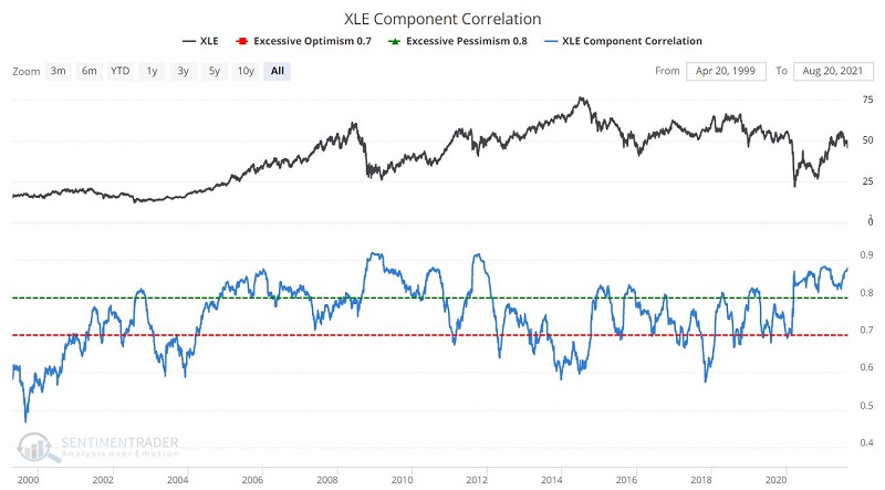
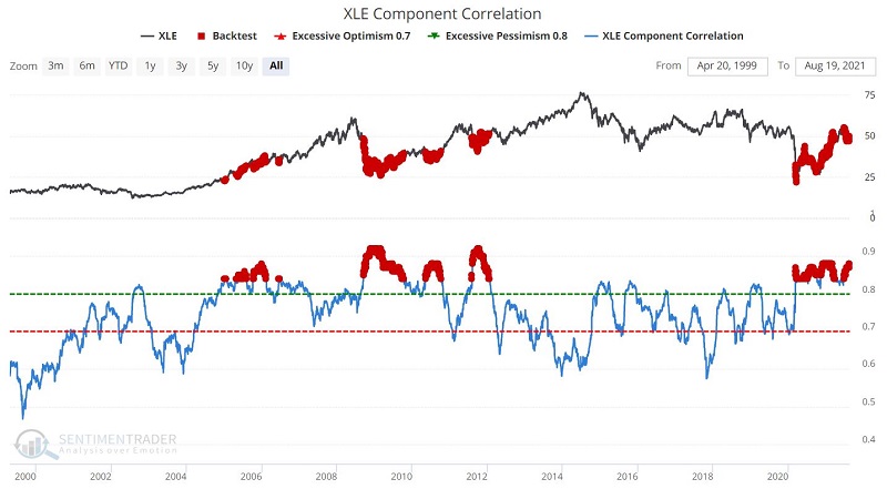
Fortunately, Jason and Eric figured out how to build this into an indicator. To get a sense of this, peruse the chart below.
Note that the tendency for the indicator value to increase (i.e., exhibit higher correlation) during price declines and drift lower (i.e., exhibit lower correlation) during price advances.
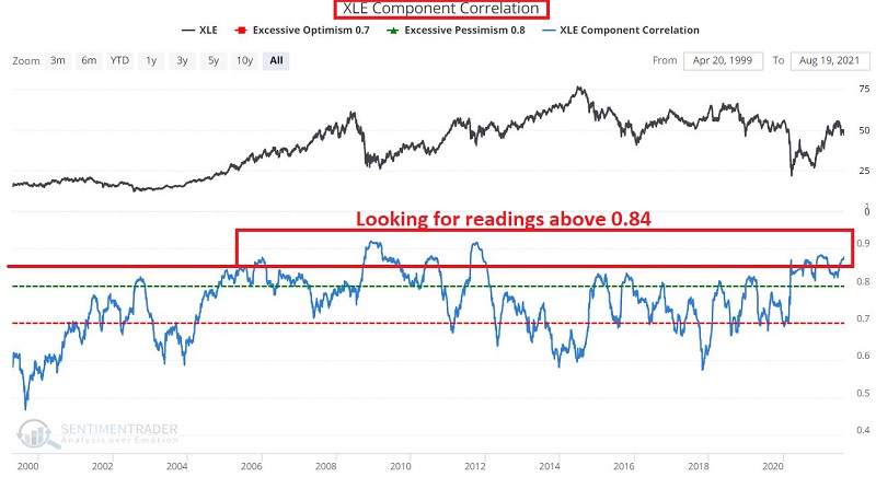
For our purpose, we will go to the extreme and look for readings above 0.84%, as highlighted in the chart below.
XLE COMPONENT CORRELATION
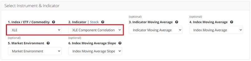
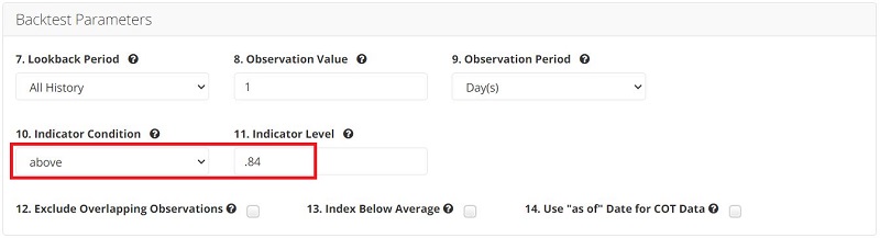
To run this test, you can click this link. The input screens appear below.
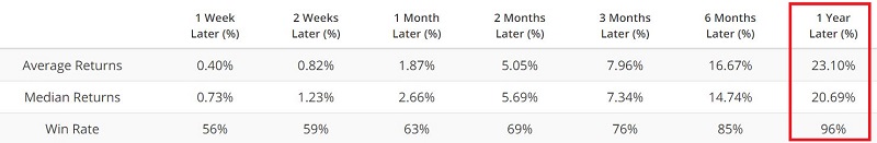
The output screen appears in the chart below.
The key thing to note is the performance of ticker XLE (Energy Select Sector SPDR) over the ensuing 12 months, as shown in the table below.
ZEROING IN
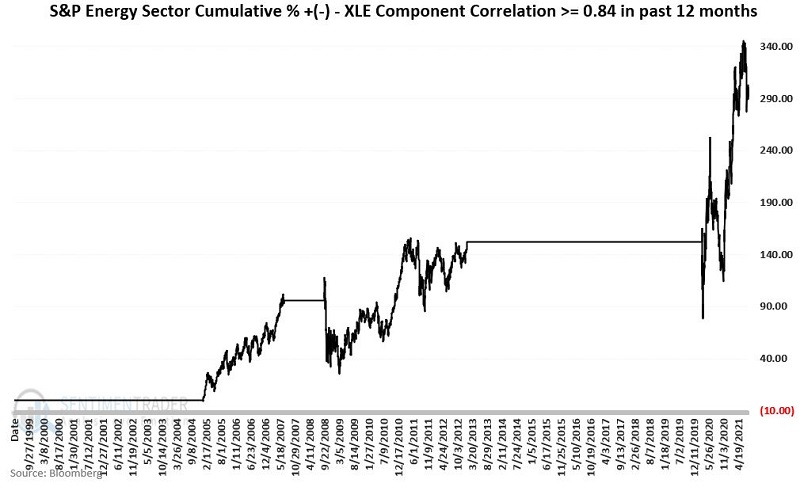
To get a better sense of what this all means, let's consider the performance of the S&P 500 Energy Sector if held ONLY when in the past 12 months the XLE Component Correlation:
- HAS been at 0.84 or higher
- HAS NOT been at 0.84 or higher
The chart below displays the hypothetical equity curve for the S&P 500 Energy Sector held ONLY IF the indicator HAS been above 0.84 in the past 12 months.
The chart below displays the hypothetical equity curve for the S&P 500 Energy Sector held ONLY IF the indicator HAS NOT been above 0.84 in the past 12 months.
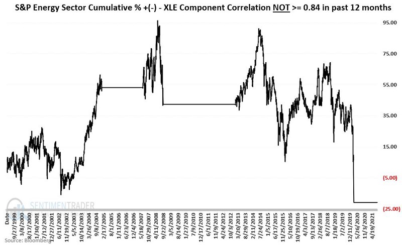
Notice any difference in the charts above?
While neither is uniformly bullish nor bearish, the difference in performance and the overall trend is fairly obvious.
SUMMARY
So, the "good news" for energy stocks is that the XLE Component Correlation is presently above 0.84, which implies that this indicator will remain "bullish" for at least another 12 months.
Does this "guarantee" higher energy stock prices? Absolutely not! But a 96% 12-month Win Rate from previous readings can certainly be viewed as a positive influence.
Is this enough to justify holding energy stocks during the months directly ahead - given the wildly inconsistent performance during late-August to late-October highlighted here in Part I?
That's a decision each investor has to make for themselves.