Headlines
|
|
Nasdaq's waning momentum clarifies its analogs:
Over the past 10 days, the Up Volume Ratio on the Nasdaq has turned negative for the first time in 5 months, ending a historically long stretch of positive underlying momentum. Analog comparisons to other times the Composite Index behaved as it has over the past 50 days showed the importance of watching near-term price action.
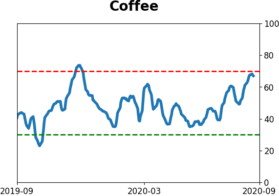
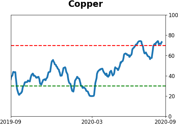
The latest Commitments of Traders report was released, covering positions through Tuesday: The 3-Year Min/Max Screen shows that "smart money" hedgers mostly moderated their extreme positions. The only contract showing a new extreme was coffee, where hedgers are holding the 2nd-most short contracts in history. The Backtest Engine shows coffee was unable to hold any rallies when hedgers held more than 50,000 contracts net short. As a percentage of open interest, it's still extreme, with still-negative forward returns but it's not as consistent. Hedgers are still holding a large net long in 30-year Treasury bonds, but are net short 10-year Treasuries. The only precedent is July 2006 - July 2007 when they had a similar position as bonds meandered then took off to the upside. Hedgers remain long the U.S. dollar, while being extremely short many commodities like copper, soybeans, and just agriculture contracts in general. They backed off their equity index exposure a bit but are still holding a curiously large net long position worth an estimated $22.9 billion.
Bottom Line:
|
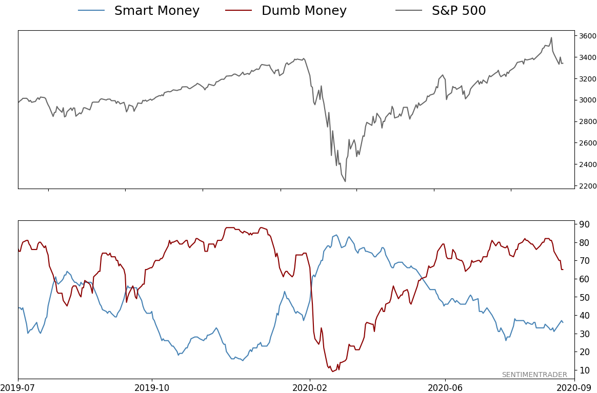
Smart / Dumb Money Confidence
|
Smart Money Confidence: 36%
Dumb Money Confidence: 65%
|
|
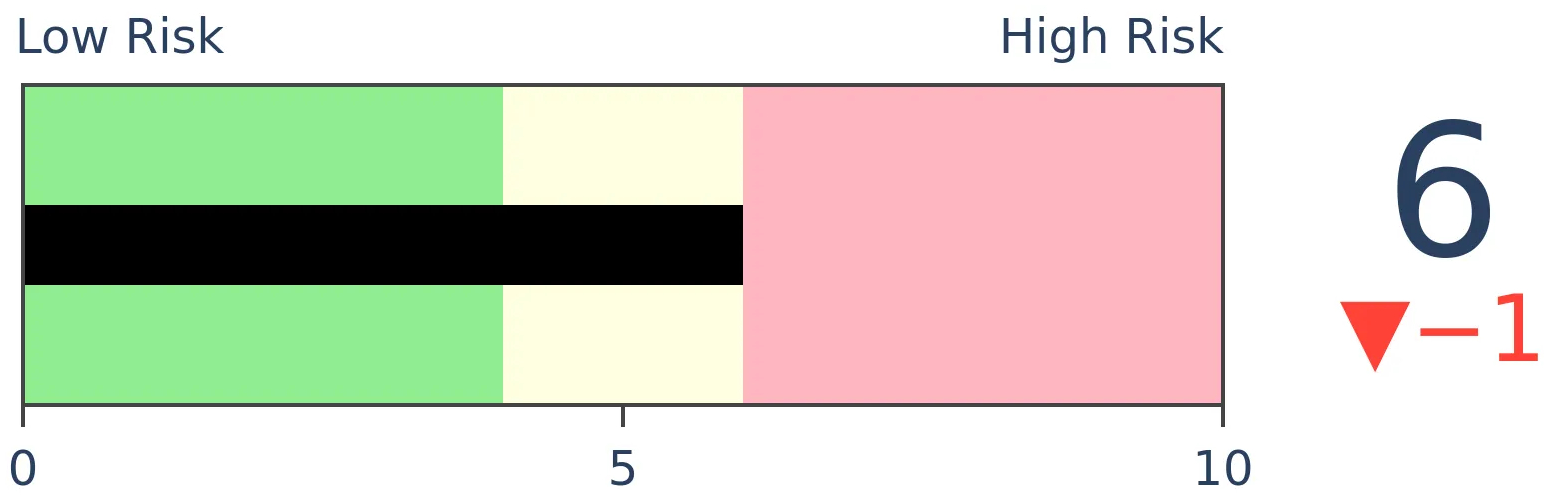
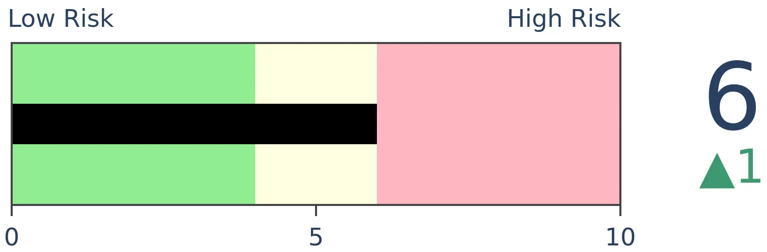
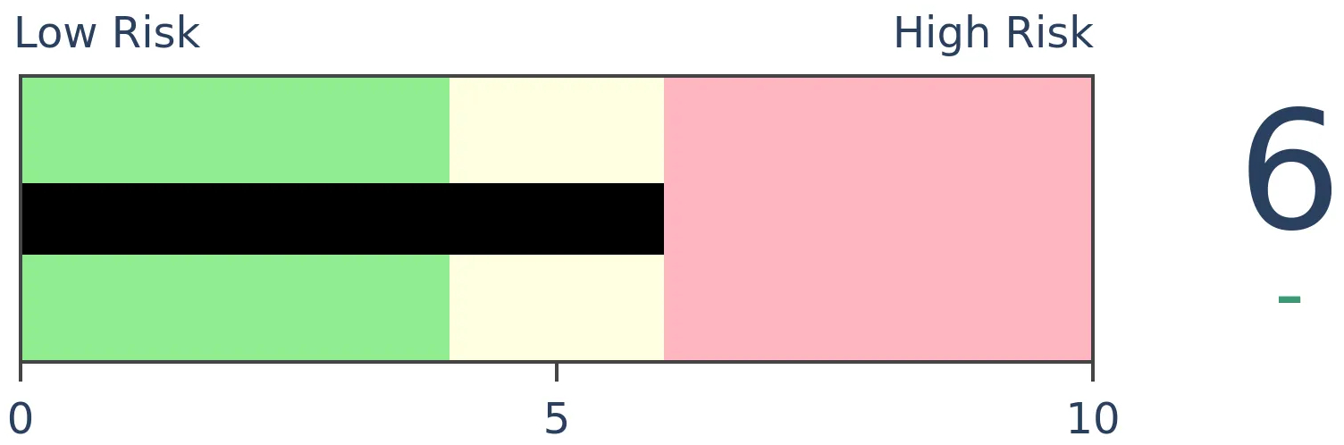
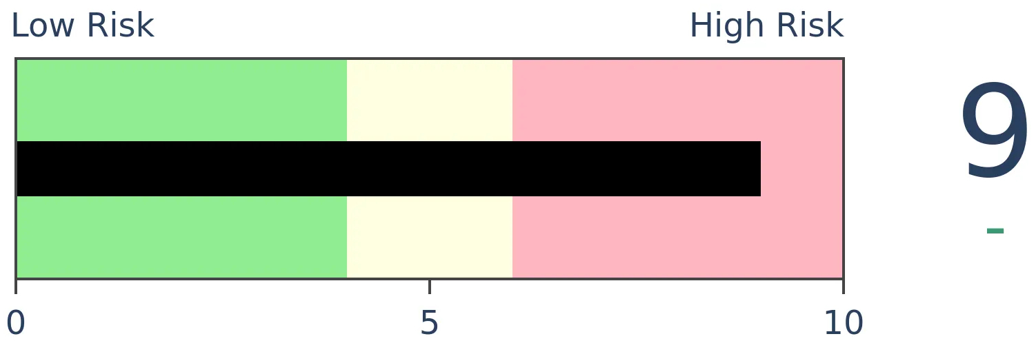
Risk Levels
Stocks Short-Term
|
Stocks Medium-Term
|
|
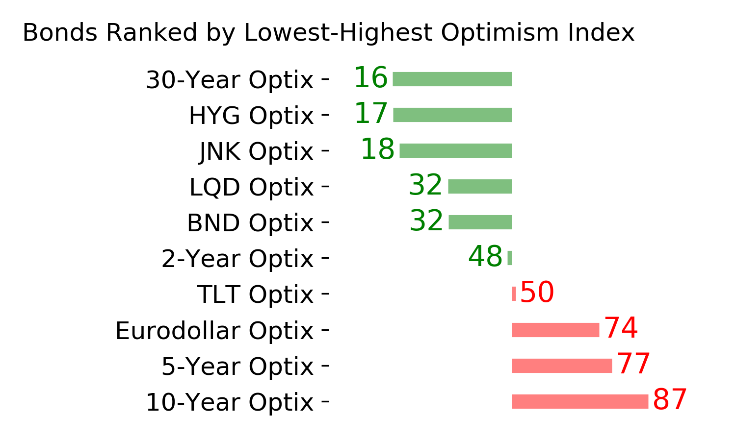
Bonds
|
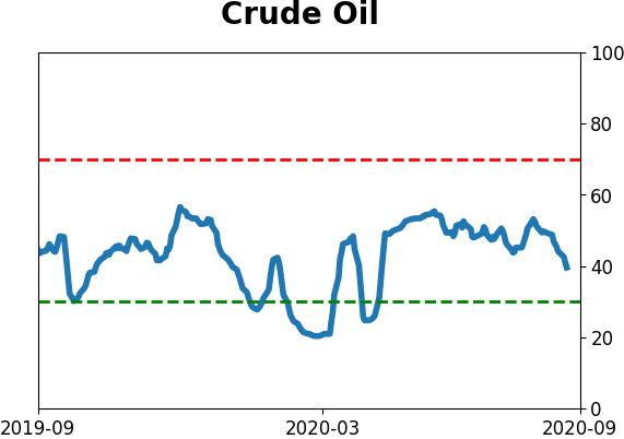
Crude Oil
|
|
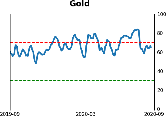
Gold

|
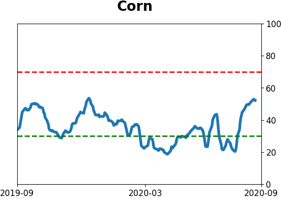
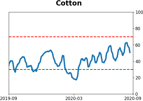
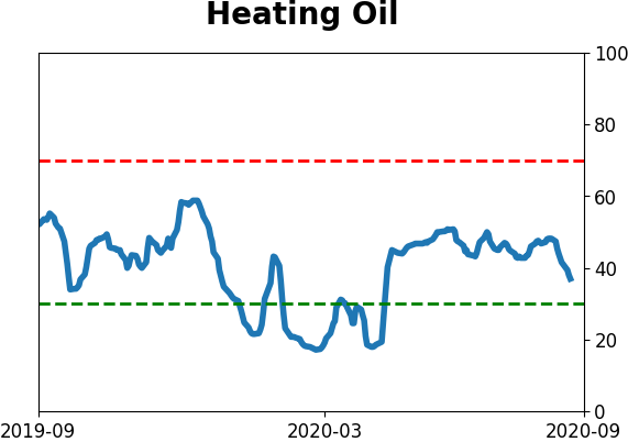
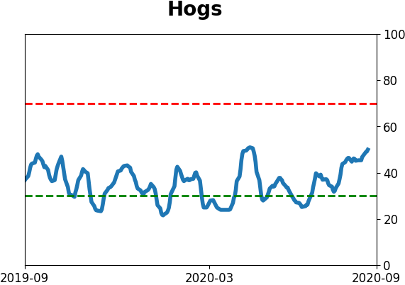
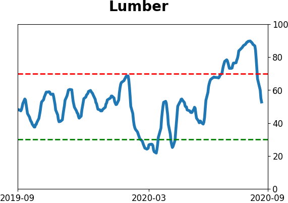
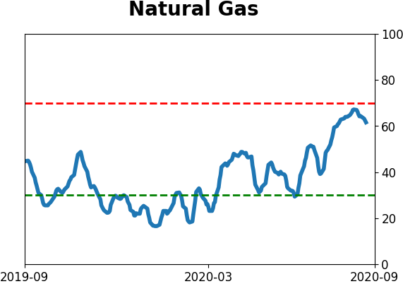
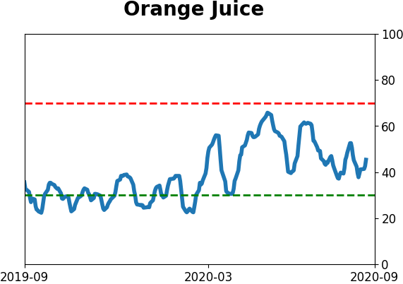
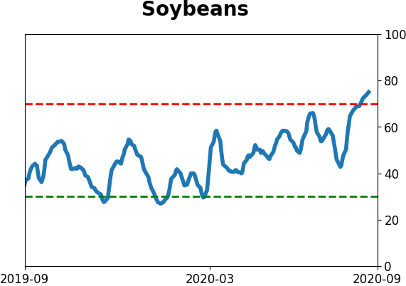
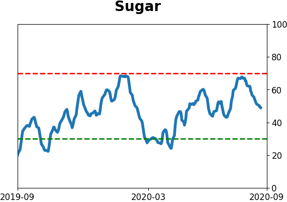
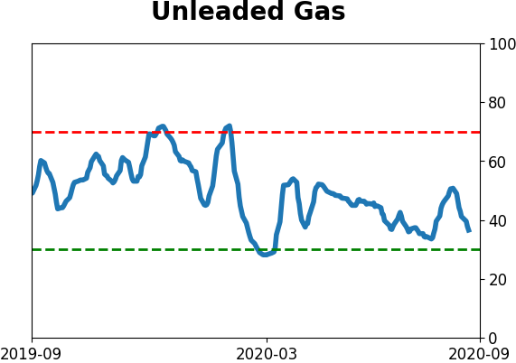
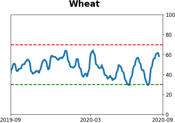
Agriculture
|
|
Research
BOTTOM LINE
Over the past 10 days, the Up Volume Ratio on the Nasdaq has turned negative for the first time in 5 months, ending a historically long stretch of positive underlying momentum. Analog comparisons to other times the Composite Index behaved as it has over the past 50 days showed the importance of watching near-term price action.
FORECAST / TIMEFRAME
None
|
Arguably the two biggest stories in sentiment this week are the continued explosion in speculative options activity and nascent signs that the momentum bubble in the Nasdaq has been pricked. The two are related and will have a big impact on overall market returns going forward. We won't get an update on how options traders behaved this week until Saturday.
As for the Nasdaq's momentum, earlier in the week, we saw that the swift price declines in the Composite Index and its underlying components were leading to a quick deterioration in its momentum. Now the 10-day average of its Up Volume Ratio has slid below 50%.
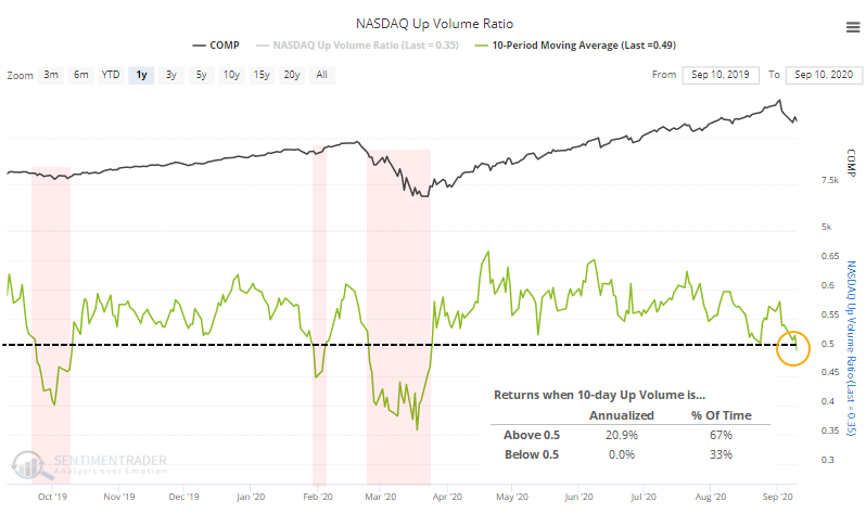
There are all kinds of ways to define market environment and momentum, and using an average of Up Issues or Up Volume is effective on a short- to medium-term time frame. We can see from the chart that the Nasdaq's annualized return when 10-day Up Volume is above 50% is a very robust +20.9% while below 50% it's a lowly zero. The Composite tends to struggle when Up Volume is negative but not negative enough to be oversold.
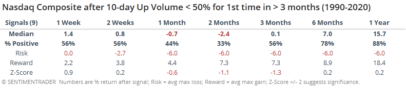
This ended the Nasdaq's 3rd-longest streak in 35 years with 10-day Up Volume above 50%.
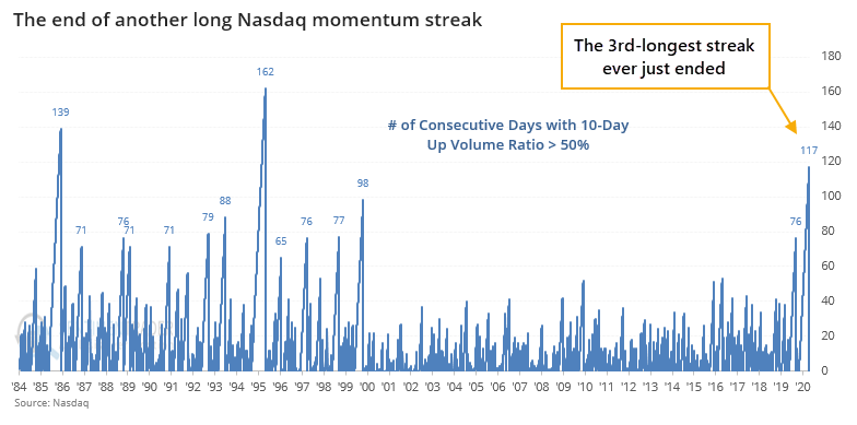
The ends of prior streaks led to mixed returns. The last two were nasty, but the others were wildly inconsistent.
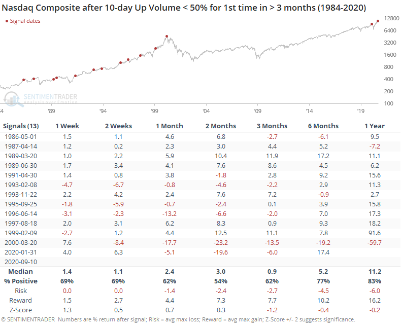
It was more consistently positive in the 1980s. Since 1990, returns were worse. Over the next 2 months, there were 3 positive signals and 6 negative ones.
There is a popular method of analysis that tends to get a lot of attention which is essentially just, "Hey, look at this chart, it looks just like..." and that "just like" is usually some extreme event in history. Analogs are dangerous but occasionally useful if done objectively, which is almost never.
To guard against that danger, we use all available history, and with clear rules. This helps to avoid cherry-picking extreme examples, and it's also why most of the time it doesn't give us much more of a basis from which to judge potential risk/reward.
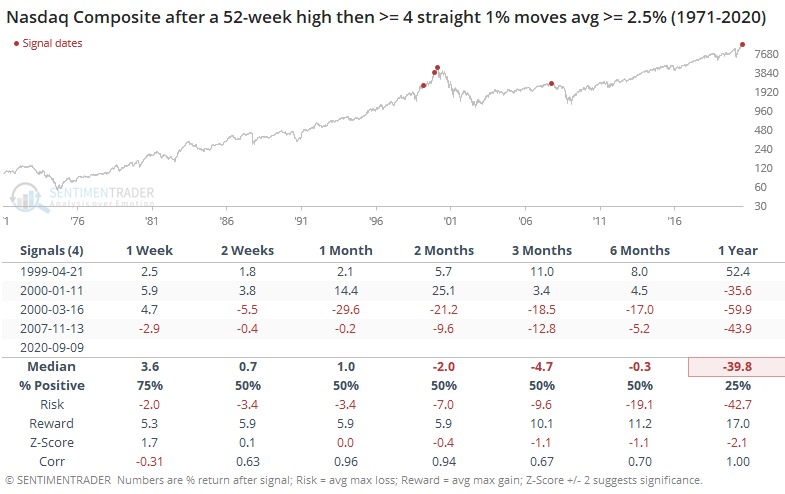
Last week, we looked at prior major peaks in the Nasdaq Composite, seeing that most of the time the index went straight up then pretty much straight down. Now that the Nasdaq has seen some volatility, let's revisit that.
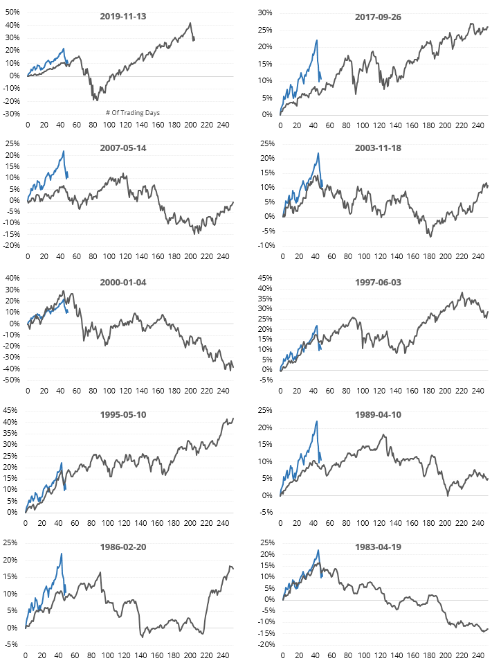
Below, we can see the price path in the Nasdaq leading up to and following the highest-correlated 50-day stretches in the past ~50 years.
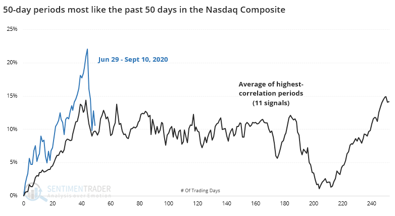
When the index showed high upside momentum then started to wobble, the median price path going forward was quite volatile. That's mostly due to wide variation among the precedents. The individual thumbnails show how drastically different they unfolded (dates are from the start of the 50-day windows).
Putting some numbers to it, the table below shows forward returns at the end of the 50-day windows.
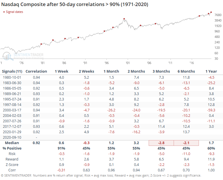
The Nasdaq's average forward returns weren't great, and the risk/reward was poor. There were a couple of exceptions (Oct 1980 and Jul 1995) that didn't really see any selling pressure for up to 6 months later. The others tended to see a negative return between 1-6 months later.
The last row in the table, labeled "Corr", shows the correlation between that time frame's return and the return 1 year later. The correlation was negative after 1 week, meaning that the Nasdaq's initial move after these windows was often a head-fake. But its direction over the next month was almost perfectly in line with its direction over the next year.
The volatility over the past week has been a wake-up call to any new investors. After a long stretch of calm, the Composite swung more than 1% for each of the past 5 days, and its average absolute daily change has spiked above 3%.
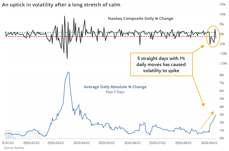
There haven't been many times when volatility has returned so suddenly, so soon after the Nasdaq had been at a 52-week high.
We haven't seen any strong evidence that the Nasdaq has peaked, just some modest suggestions that it potentially has. If so, any bounce-back in the coming days should be modest relative to its recent declines, and shouldn't last long. If it violates that, and especially if it hits a new high, most of the negatives we've seen would be reset.
Active Studies
| Time Frame | Bullish | Bearish | | Short-Term | 0 | 1 | | Medium-Term | 1 | 12 | | Long-Term | 47 | 2 |
|
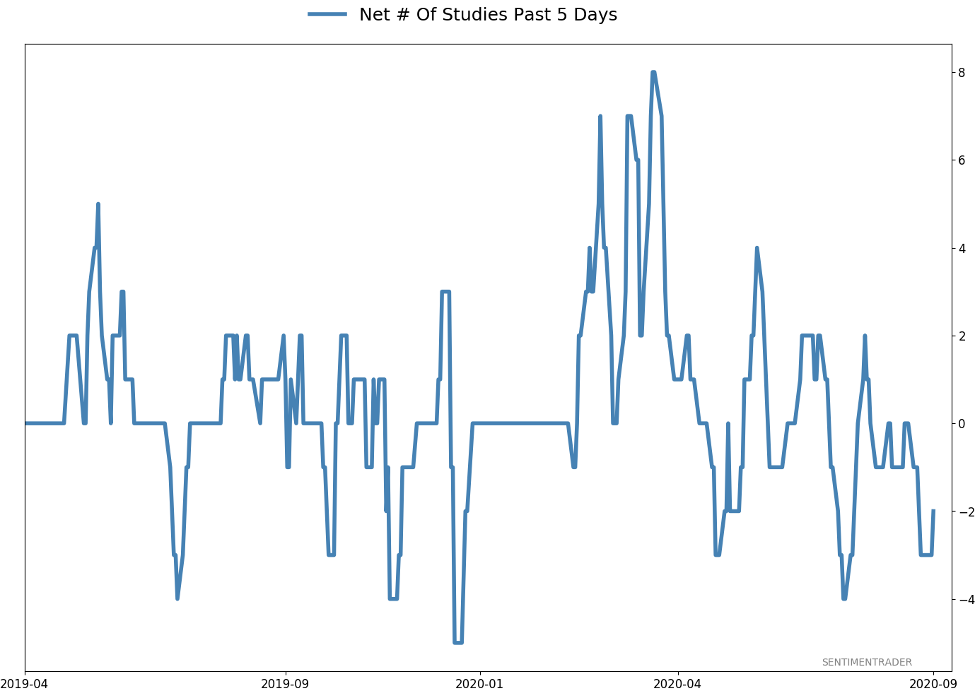
Indicators at Extremes
Portfolio
| Position | Weight % | Added / Reduced | Date | | Stocks | 15.2 | Reduced 4.2% | 2020-09-03 | | Bonds | 30.0 | Added 30% | 2020-09-09 | | Commodities | 2.4 | Reduced 2.1%
| 2020-09-04 | | Precious Metals | 5.0 | Added 5% | 2020-09-09 | | Special Situations | 4.9 | Added 5.1% | 2020-09-03 | | Cash | 42.5 | | |
|
Updates (Changes made today are underlined)
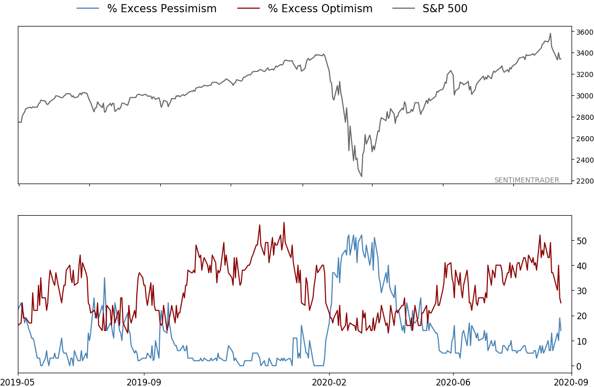
After stocks bottomed on March 23rd, they enjoyed a historic buying thrust and retraced a larger amount of the decline than "just a bear market rally" tends to. Through June, there were signs of breadth thrusts, recoveries, and trend changes that have an almost unblemished record at preceding higher prices over a 6-12 month time frame. On a shorter-term basis, our indicators have been showing high optimism, with Dumb Money Confidence recently above 80%, along with signs of reckless speculation during what appears to be an unhealthy market environment, historically a bad combination. While there are certainly some outlier indicators that are showing apathy or even outright pessimism, a weight-of-the-evidence approach suggests high risk over a multi-week to multi-month time frame. That has been the case since July, even arguably June and yet the major indexes hit continual new highs through late August. With the indicators and studies failing to precede any weakness, I've been hesitant to lower my already-low exposure. I am getting increasingly anxious about the oddities we're seeing, though, and lowered it again. This account is mostly about comfort with risk for me, and right now I'm not at all comfortable with any of it. In more than 25 years of experience, this is the oddest market I've ever seen. I lowered exposure again - likely the lowest I'm willing to go at this point given longer-term positives - and decided to switch to an equal-weight version of the S&P 500 index. I've become intensely uncomfortable with the concentration in the cap-weighted index. Our studies have been mixed with regard to the potential for the equal-weight version to outperform the cap version going forward, so historical support isn't overwhelming. I'm also increasingly interested again in energy stocks, starting with a small allocation. I got burned in March with the unprecedented geopolitical spat that hammered those stocks then but the longer-term setup is decent. In this account, I’ve roughly followed what has become known as the All Weather portfolio popularized by Ray Dalio. It allocates across four broad assets, designed to hold up no matter the market environment. The goal is modest positive returns while limiting large, sustained losses. I typically use popular ETFs, with low costs. At times, I will swap out for a fund I believe has better prospects, or simply lower fees if not. At other times, I will diverge quite a bit from baseline allocations, largely depending on the indicators and studies we discuss on the site. I've gotten away from this in the past, using "cash" as a substitute for "bonds" and with rates stuck at 0%, that has become less appetizing. I'm trying to get back more toward the baselines with less dramatic swings in either direction. The base allocation I use is the following: Stocks: 35%
Bonds: 45%
Precious Metals: 7.5%
Commodities: 7.5%
Cash / Special Opportunities: 5%
RETURN YTD: -0.9% 2019: 12.6%, 2018: 0.6%, 2017: 3.8%, 2016: 17.1%, 2015: 9.2%, 2014: 14.5%, 2013: 2.2%, 2012: 10.8%, 2011: 16.5%, 2010: 15.3%, 2009: 23.9%, 2008: 16.2%, 2007: 7.8%
|
|
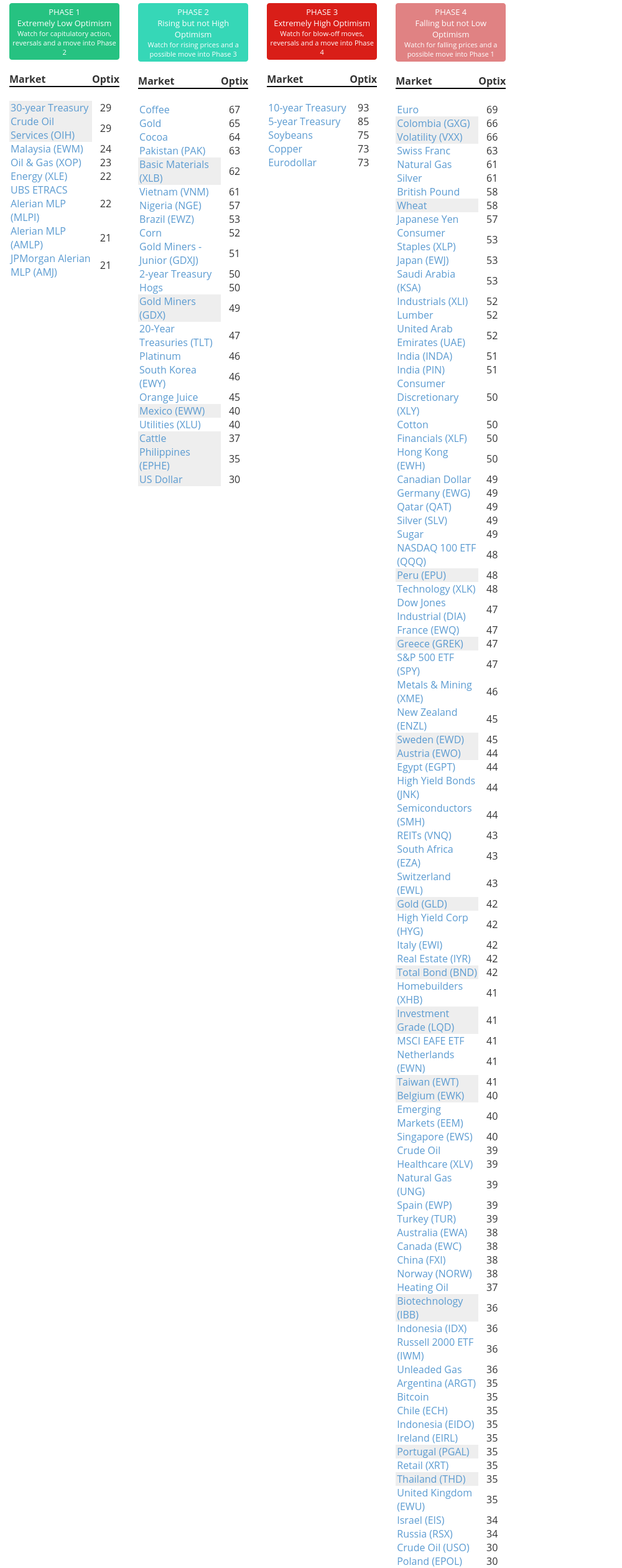
Phase Table
Ranks
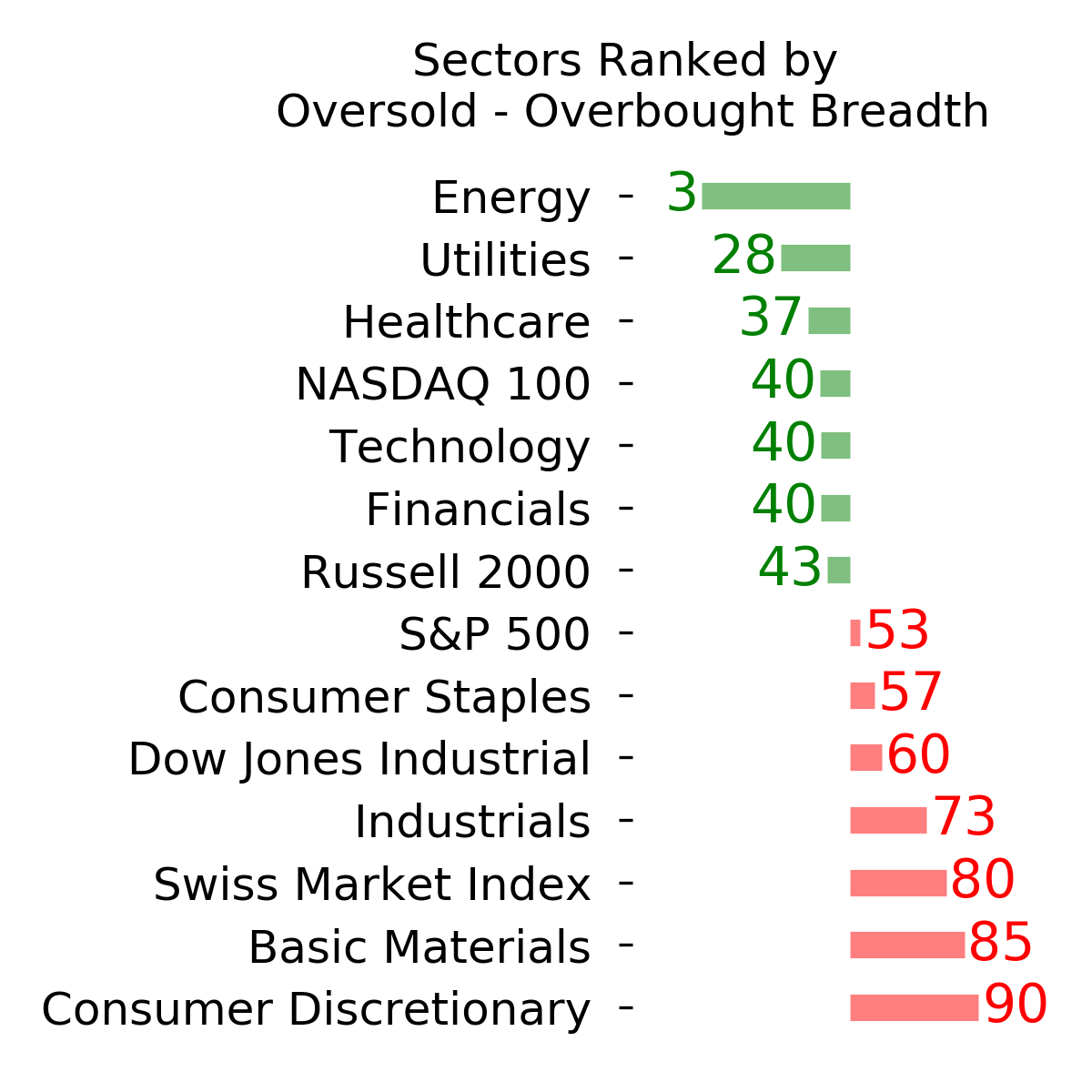
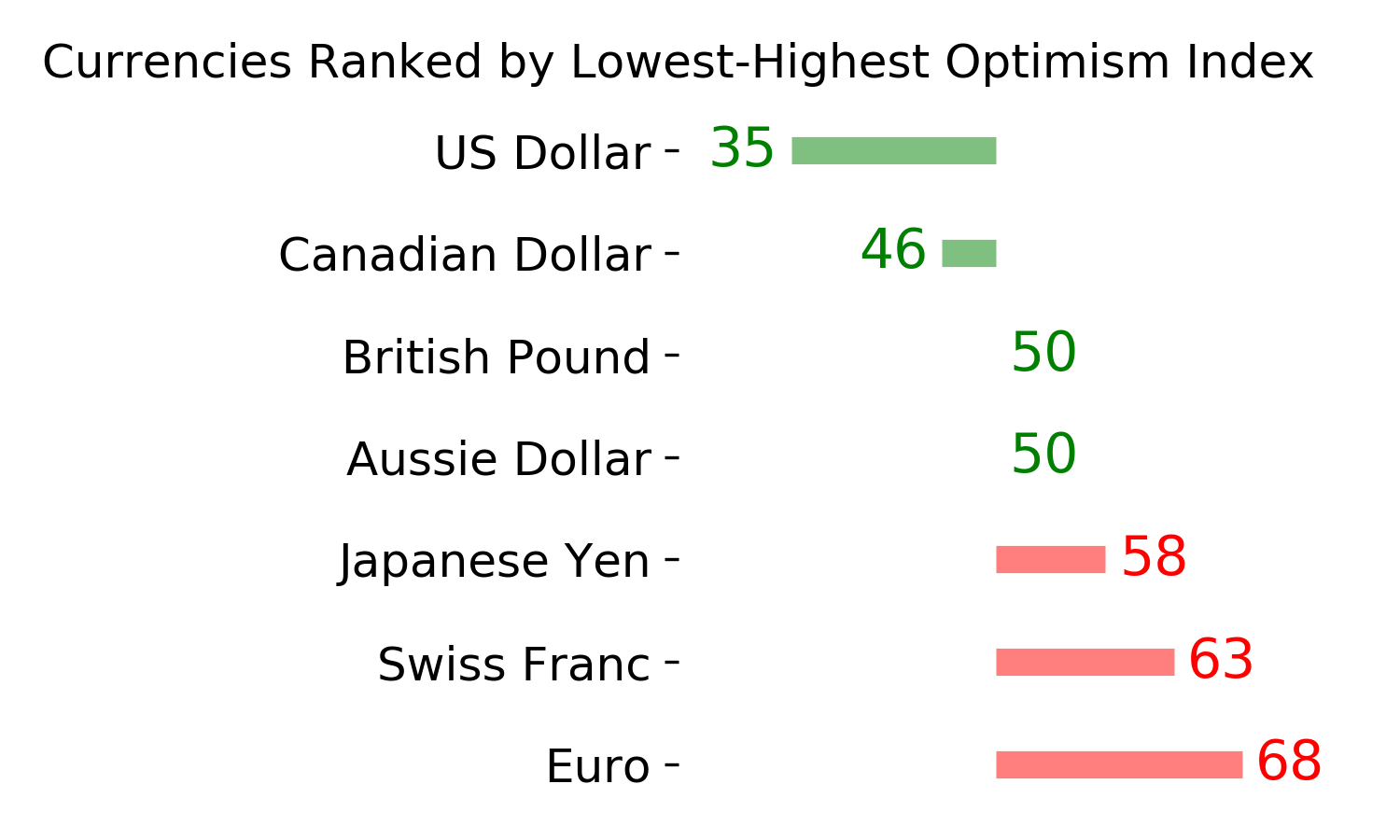
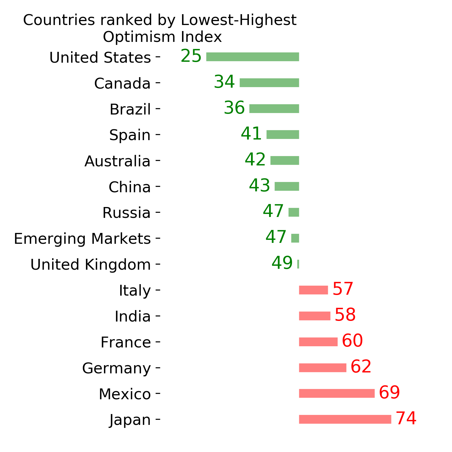
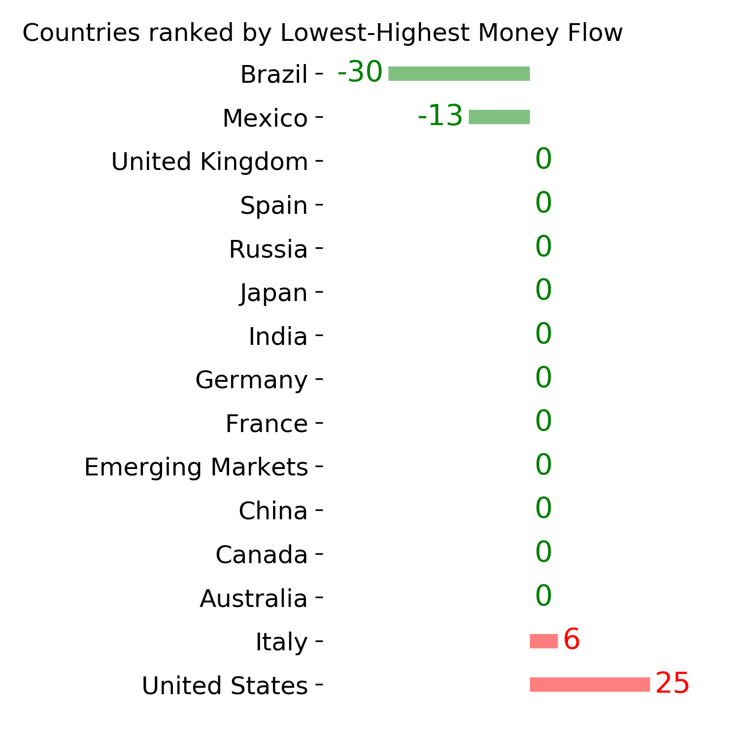
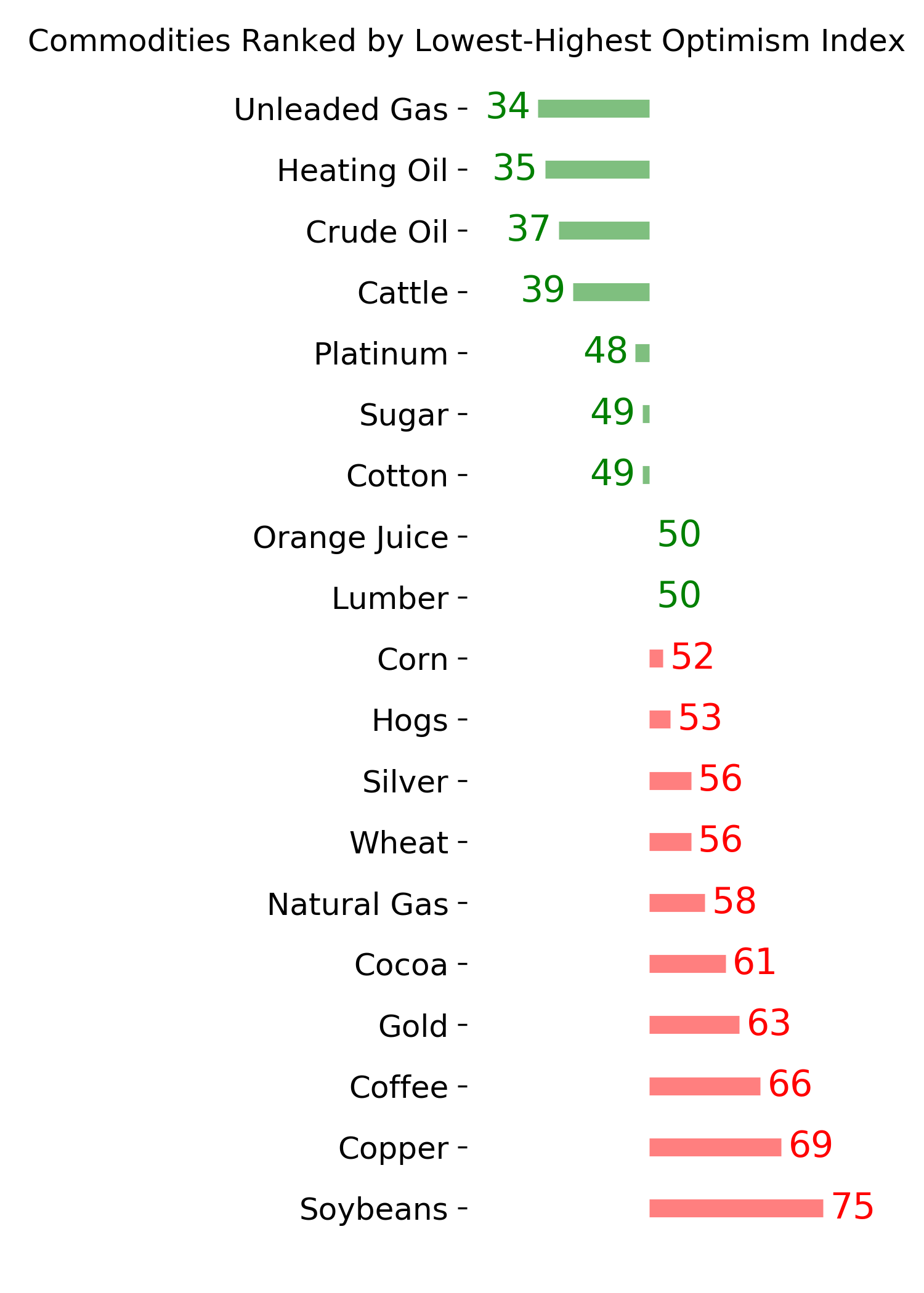
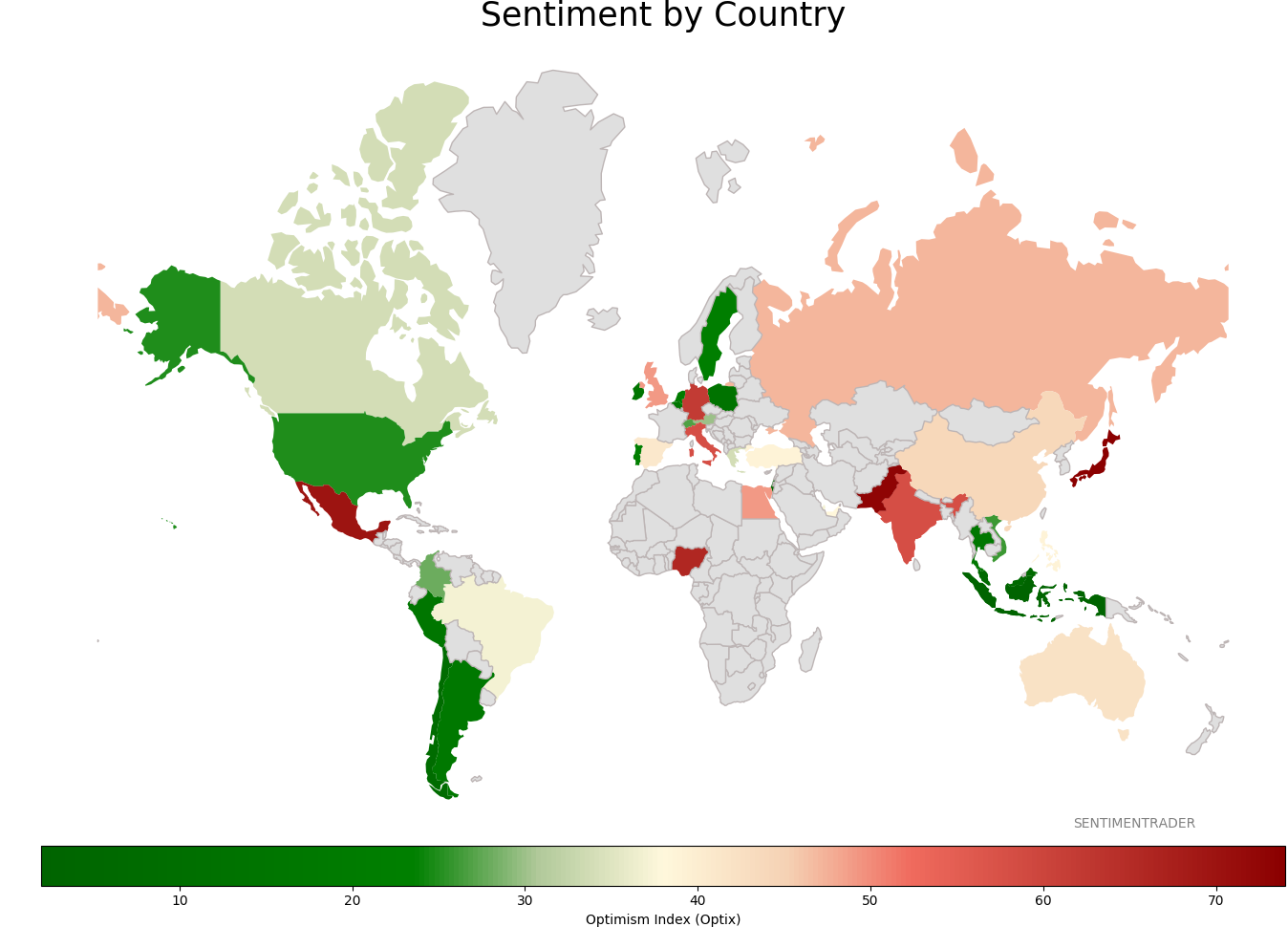
Sentiment Around The World
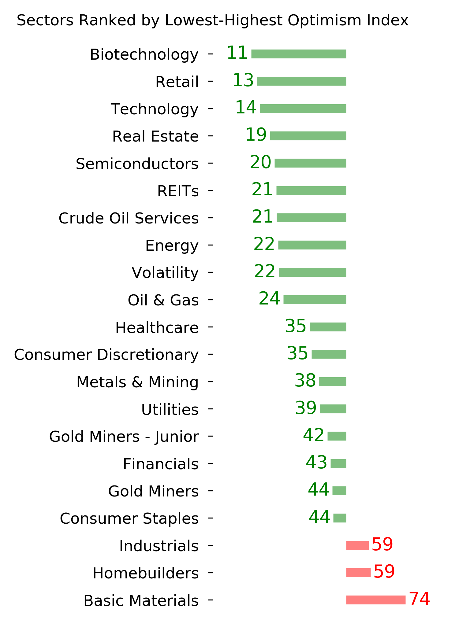
Optimism Index Thumbnails
|
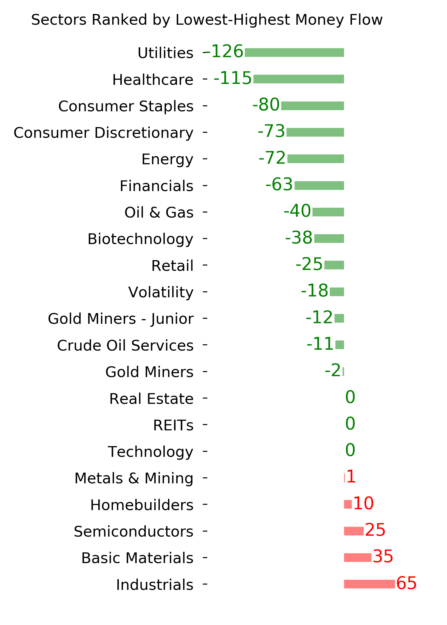
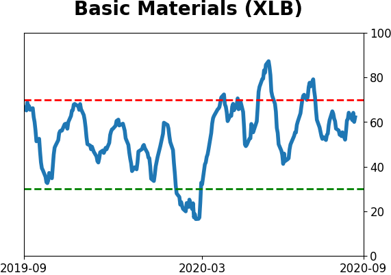
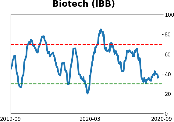
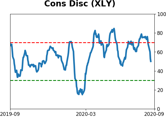
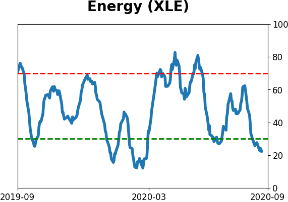
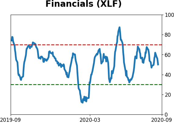
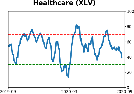
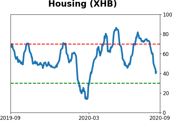
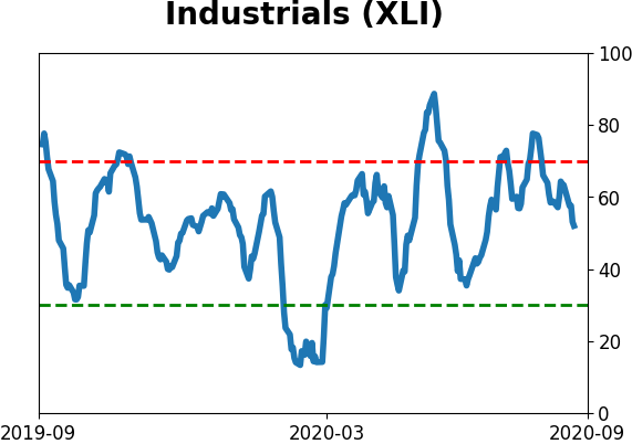
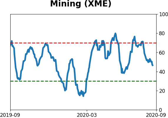
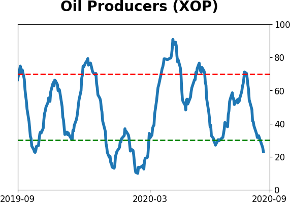
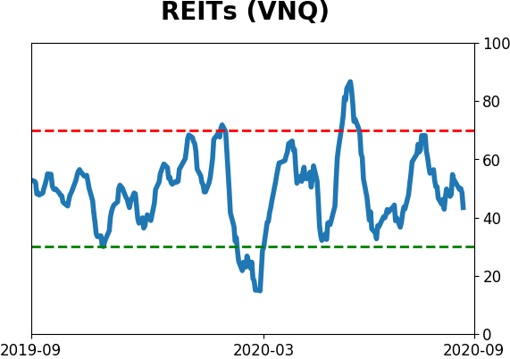
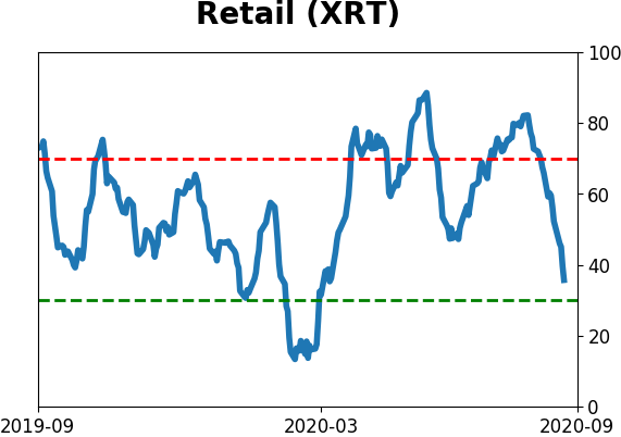
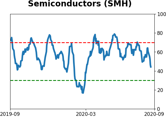
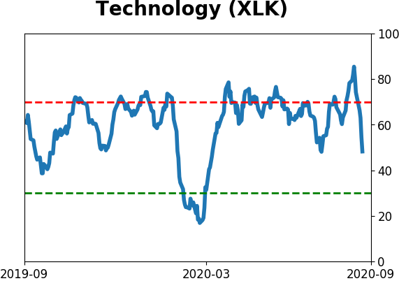
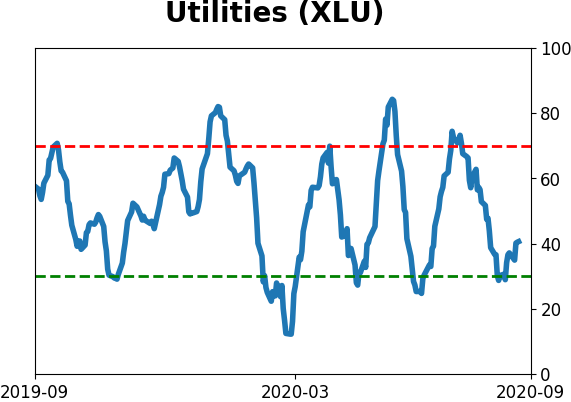
Sector ETF's - 10-Day Moving Average
|
|
|
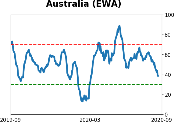
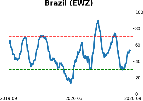
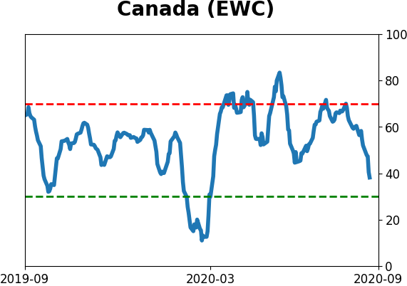
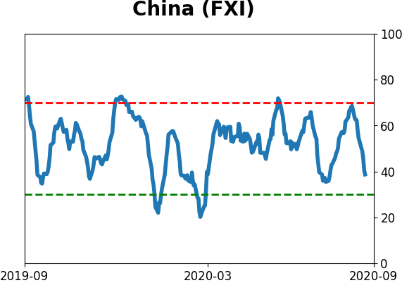
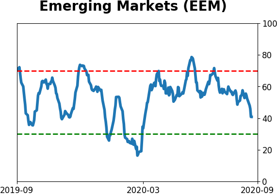
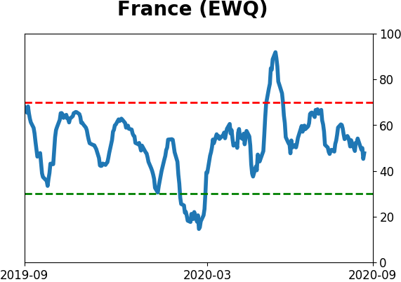
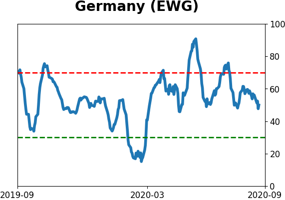
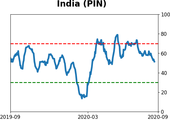
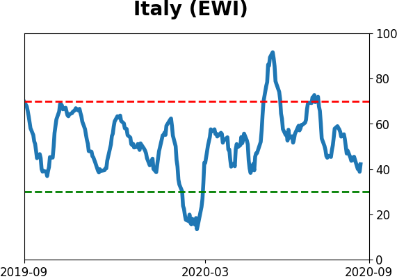
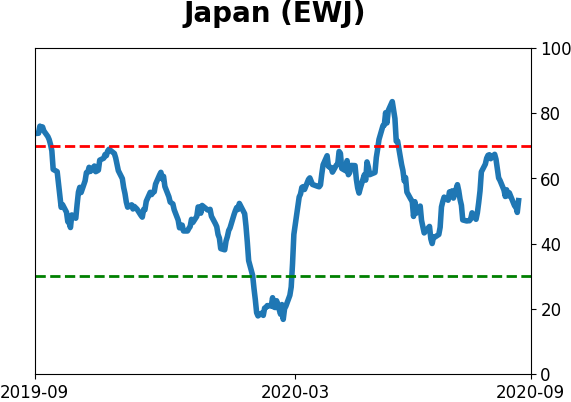
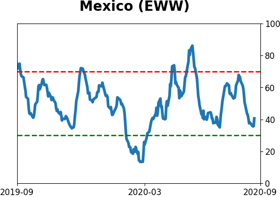
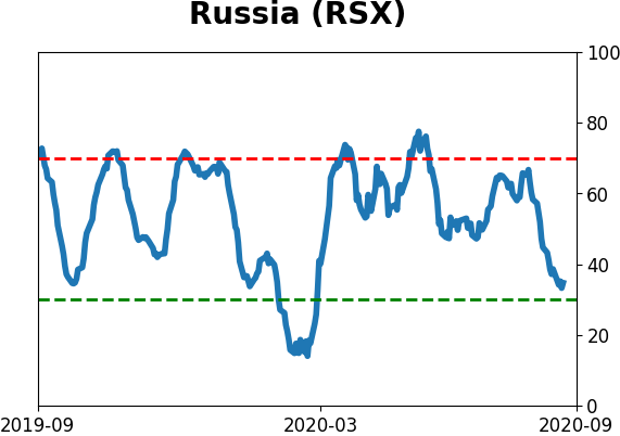
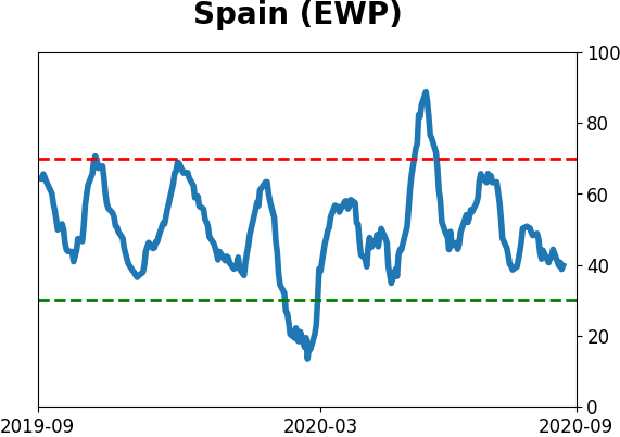
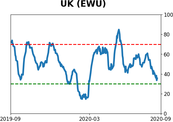
Country ETF's - 10-Day Moving Average
|
|
|
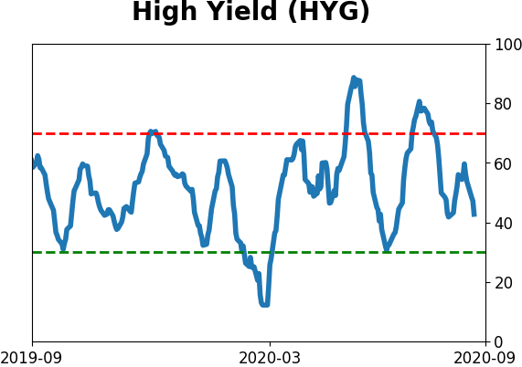
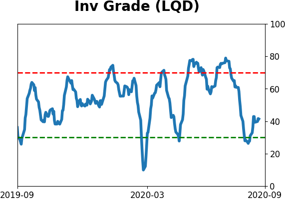
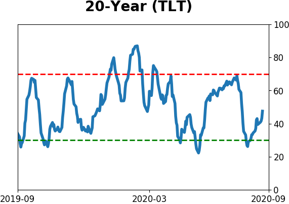
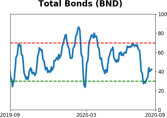
Bond ETF's - 10-Day Moving Average
|
|
|
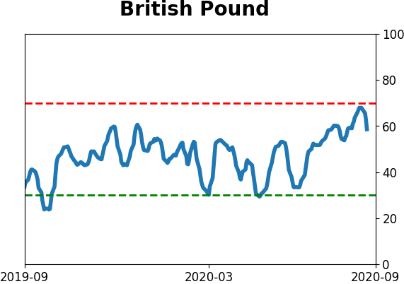
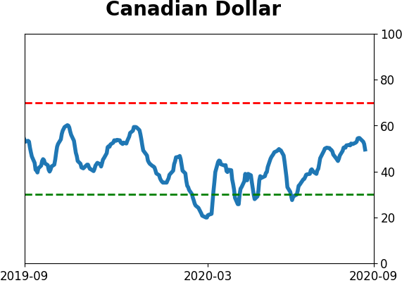
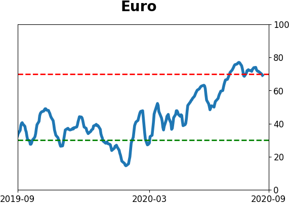
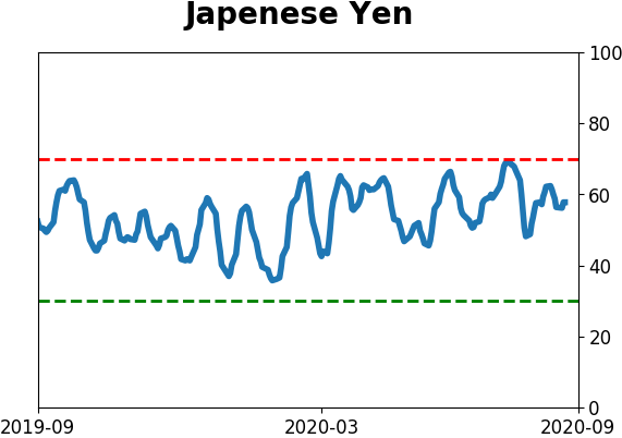
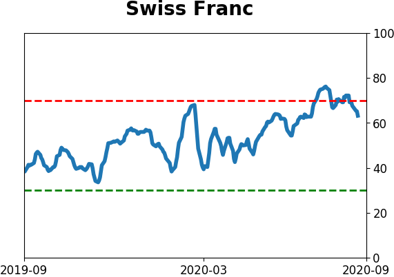
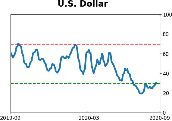
Currency ETF's - 5-Day Moving Average
|
|
|
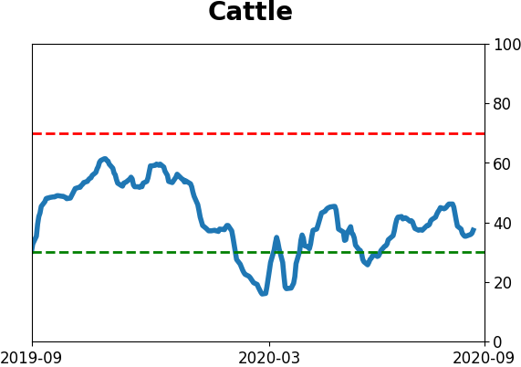
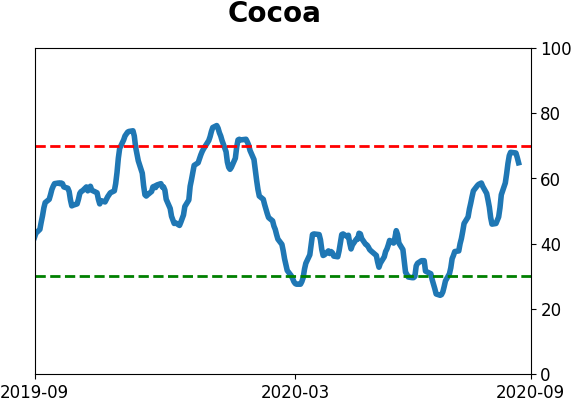
Commodity ETF's - 5-Day Moving Average
|
|