Headlines
|
|
Weekly Wrap for Apr 2 - Some internal weakness but still no major risk warnings:
The past week brought continued late-day selling pressure and some unusual internal weakness. Stil, we're heading into a positive seasonal stretch with no major risk warnings yet triggered. Bonds and gold have suffered one of their worst quarters on record.
Bottom Line:
See the Outlook & Allocations page for more details on these summaries STOCKS: Weak sell
The extreme speculation registered in January and February is starting to get wrung out. Internal dynamics have mostly held up, so a return to neutral sentiment conditions would improve the forward risk/reward profile substantially. We're still a ways off from that. BONDS: Weak buy
Various parts of the market have been hit in recent weeks, with mild oversold conditions. The Bond Optimism Index is now about as low as it gets during healthy bond market environments. Fixed income isn't responding well, so that needs to be monitored in case it's transitioning to a longer-term negative market environment. GOLD: Weak buy
A dollar trying to rebound from a severe short position has weighed on gold and miners. The types of signals they've given in recent weeks, within the context of their recent surge, have usually resulted in higher prices over a medium- to long-term time frame. Like bonds, gold and miners aren't responding very well, and this needs to be monitored.
|
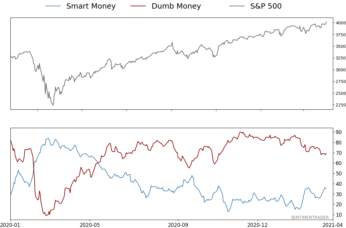
Smart / Dumb Money Confidence
|
Smart Money Confidence: 35%
Dumb Money Confidence: 69%
|
|
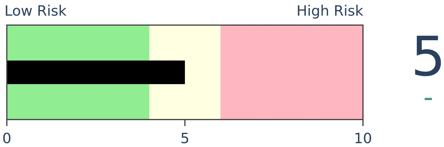
Risk Levels
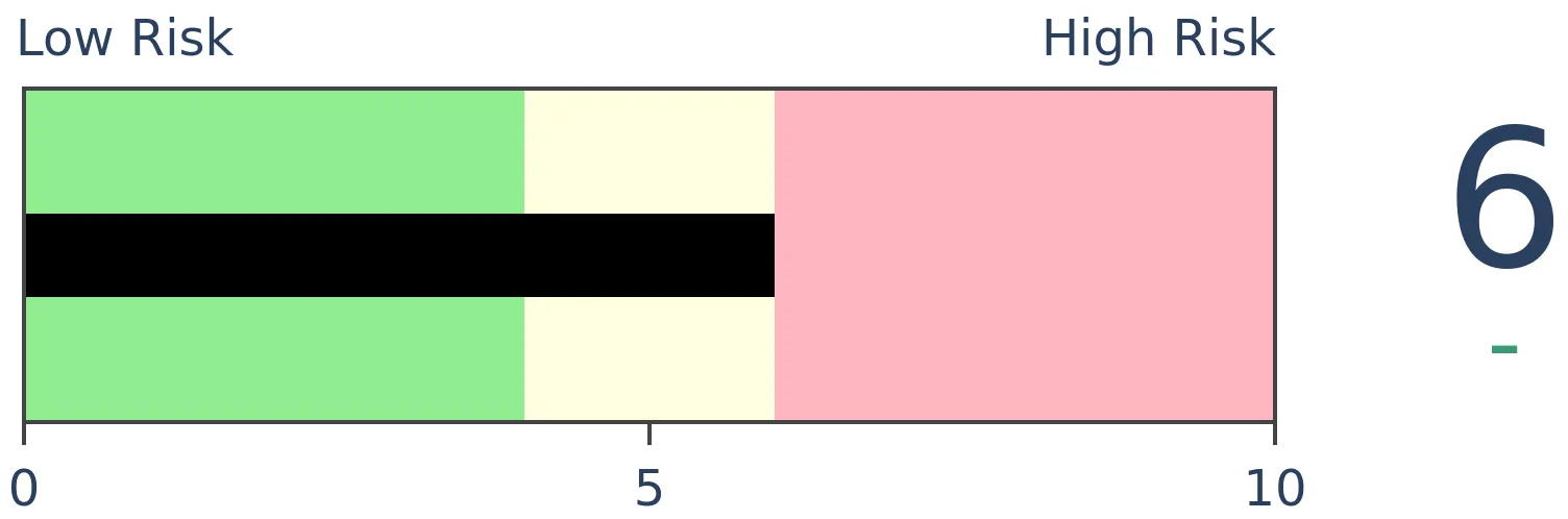
Stocks Short-Term
|
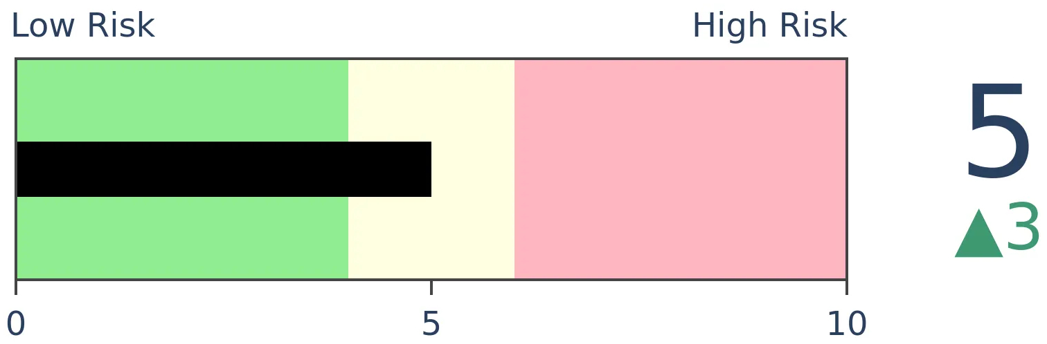
Stocks Medium-Term
|
|
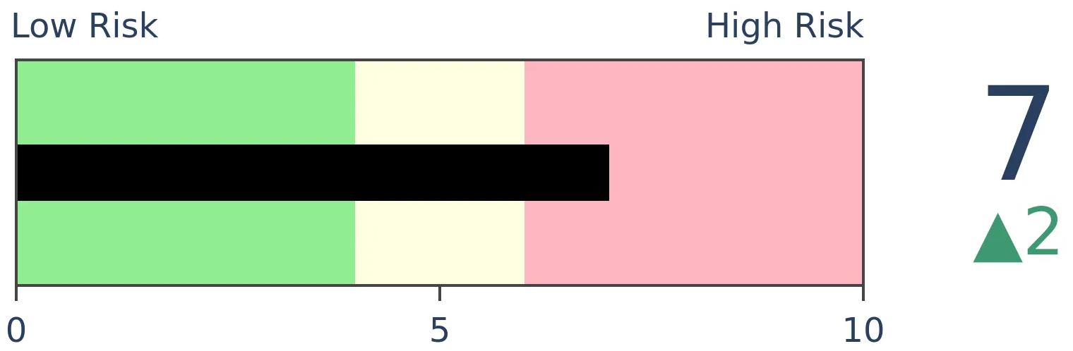
Bonds
|
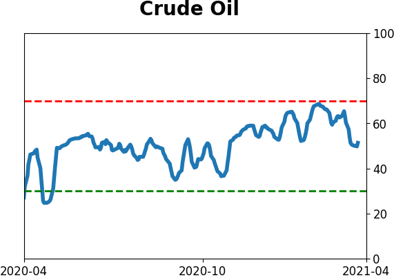
Crude Oil
|
|
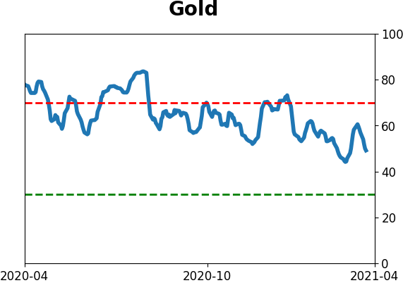
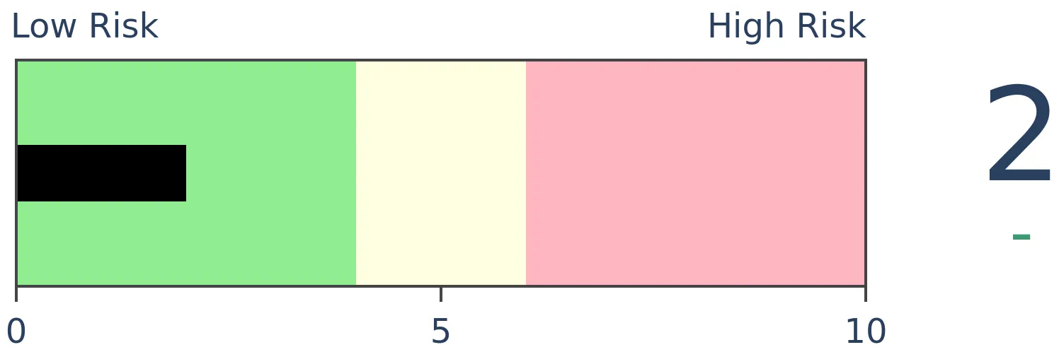
Gold
|
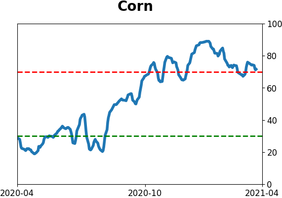
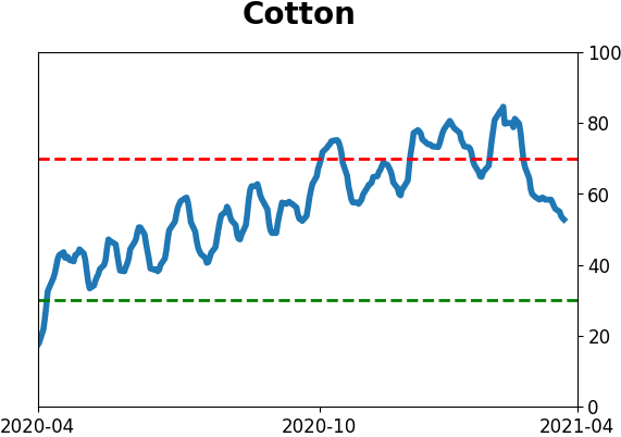
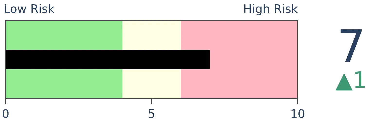
Agriculture
|
|
Research
BOTTOM LINE
The past week brought continued late-day selling pressure and some unusual internal weakness. Stil, we're heading into a positive seasonal stretch with no major risk warnings yet triggered. Bonds and gold have suffered one of their worst quarters on record.
FORECAST / TIMEFRAME
None
|
The goal of the Weekly Wrap is to summarize our recent research. Some of it includes premium content (underlined links), but we're highlighting the key focus of the research for all. Sometimes there is a lot to digest, with this summary meant to highlight the highest conviction ideas we discussed. Tags will show any symbols and time frames related to the research.
| STOCKS |
 |
|
|
Some selling amid pick-up in volatility
The past few months have been dominated by late-day selling pressure. This predates issues with the blowup of Archegos Capital.
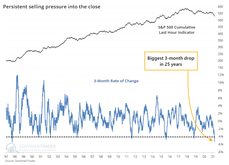
The Cumulative Last Hour indicator looks at the last hour of trading in the S&P 500 fund, SPY. Recent months have seen a continual erosion in the indicator, to the point where it's at the lowest level in 6 years. When stocks have been persistently hitting new highs while the Last Hour indicator was plumbing new lows, it has been a warning sign.
What is especially notable about the current behavior is just how persistent the selling has been during the last hour. Over the past 3 months, the indicator has dropped 25 points, or 5%, which is the biggest plunge in 25 years in both points and percent.
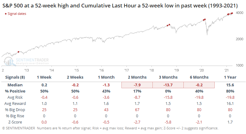
When we look specifically for divergences between the S&P and the Last Hour indicator, with them recently at opposite 52-week extremes, then there isn't much of a sample size. It never happened prior to 2012, and all of them witnessed some weakness going forward.
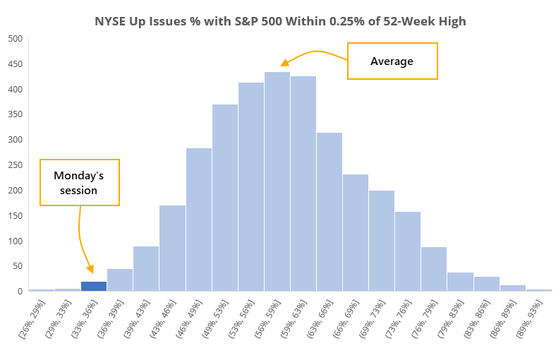
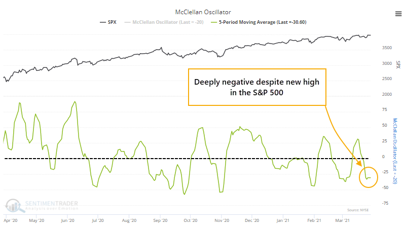
Despite indexes like the S&P 500 being at or near new highs, there has been some internal turmoil, like happened on Monday.
Since 1928, when the S&P 500 was within 0.25% of a 52-week high, an average of 58% of securities on the NYSE advanced for the day. There have been 3,331 days when the S&P was that close to a high, and the histogram below shows just how unusual Monday's session was.
It's not just Monday, though. Over the past week, even with the S&P ticking a new high on Friday, the McClellan Oscillator has been deeply negative.
Monday's activity was further evidence that volatility in those small-caps has jumped in recent weeks, even as the broader market stays relatively calm. Over the past 30 days, historical volatility in the Russell 2000 is now about 15 points higher than that for the S&P 500, one of the widest spreads in 40 years.
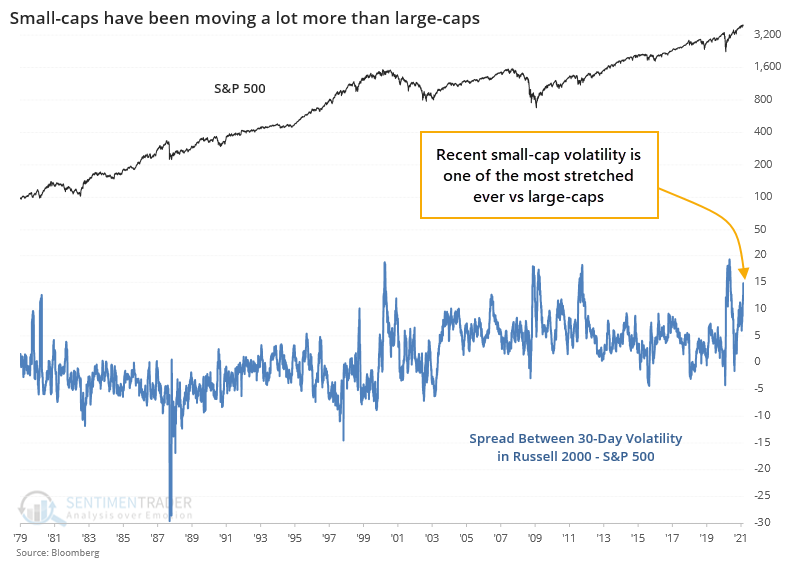
As markets hit new highs and then become volatile, there is a tendency to think that it necessarily suggests a trend change. If overall levels of current and implied volatility start to persistently march higher, then the likelihood of a sustained decline becomes more probable.
We're still not seeing broad-based internal weakness, at least enough to generate major warning signs. But the more we see activity like Monday, and continued weakness in measures like the Oscillator and Summation Index, the higher we'll end up generating more of those warnings.
Jay discussed another type of signal that is a bit concerning. This is using the return on the aggregate bond market versus short-term Treasuries as a measure for risk appetite toward stocks.
Everyone wants to know if there is a time to be fully invested and a time when it may be desirable to be less so. In the real world of trading the holy grail of "to be in or not to be in" still does not exist (and sadly, never will). But there are certain measures that can offer some useful weight-of-the-evidence to help investors determine how aggressive to be at any given point in time.
The chart below displays the cumulative total return for the S&P 500 Index during the 71 quarters designated as "Risk Off" using this model.
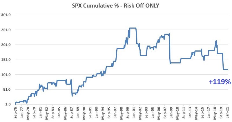
During other Risk Off periods, the S&P 500 Index advanced more often than it declined. HOWEVER, this method also warned investors ahead of:
- The Crash of '87
- The Dotcom collapse in 2000-2002
- The Financial Crisis of 2008
- The Covid selloff of 2020
...which is kind of what you want a Risk Off indicator to do - i.e., warn you of potential trouble.
But now we're in a seasonal strong spot without major risk warning signs
Jay pointed out that April brings some definite seasonal tailwinds to some sectors over others - specifically Energy, Materials, and Discretionary.
Let's assume that one portfolio splits evenly between the Top 3 sectors every April and that another portfolio splits evenly among all 11 sectors. The chart below displays the cumulative total return from 12/31/1926 through 12/31/2020 for:
- 3 Sectors = Average return during April for Energy, Materials and Discretionary combined
- All Sectors = Average return during April for all 11 sectors combined
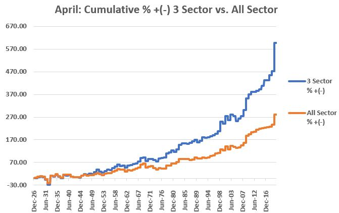
At first blush, we can look at the chart above and see that over time the performance of the Top 3 keeps growing relative to the performance of All Sectors. This is reassuring - to a point. But more importantly, there are times when this line moves sideways to lower over the course of a number of years.
In light of the recent deleveraging by Archegos Capital and the potential spillover effect on the banking sector, Dean reviewed one of the components in the Risk Warning Model (we're still working on getting these automated and updated regularly on the site).
Financials are undoubtedly the most vitally important sector when it comes to identifying market risk. Anyone that says otherwise has not studied history.
The TCTM Risk Warning Model contains two components that utilize time series from the financial sector. The financials relative strength low count model seeks to identify instances in history when financials severely underperform the broad market.
The table below shows components of the Composite Risk Warning Model, with red highlights showing those times when the component triggered ahead of a major decline in stocks. The component focused on Financials triggered ahead of 60% of bear markets.
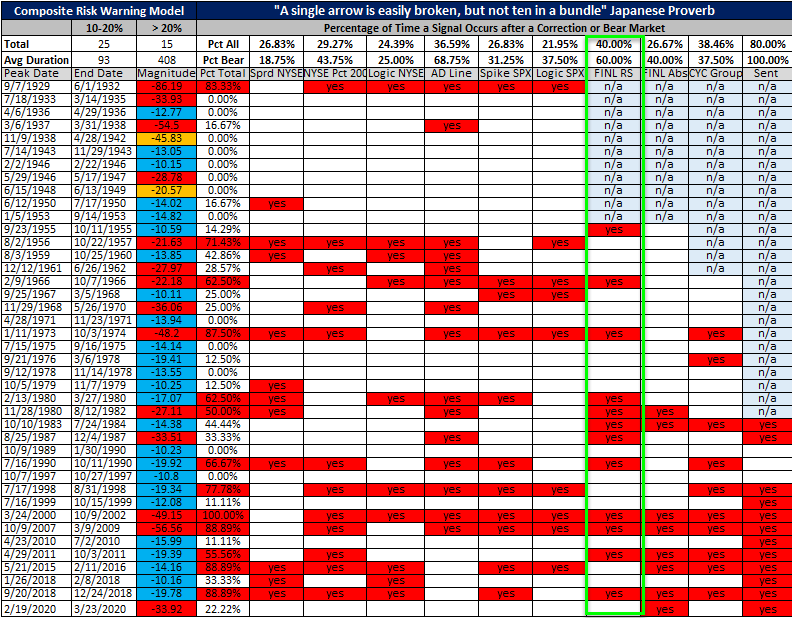
While credit default swaps for several banks are on the rise due to potential knockoff effects from Archegos Capital, we have not seen a broader spillover effect in the financial group as measured by this model, and the potential for a warning from the financials model remains low.
Dean updated another component of the Risk Warning Model that looks at relative performance in 7 important cyclical groups.
The premise behind the indicator is that a healthy economy and bullish stock market should see favorable trends within the important cyclical group composite. It doesn't mean that the components have to lead the market, but one does not want to see them diverge from the broad market uptrend in a meaningful way.
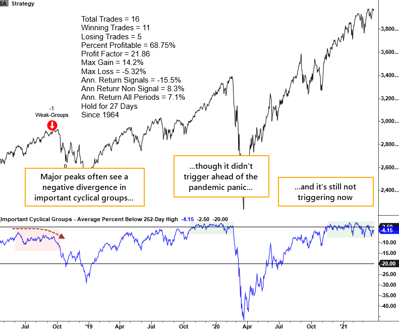
While growth-oriented technology groups get all the glory, one should always respect the economically sensitive groups' market message. For now, the market message remains constructive.
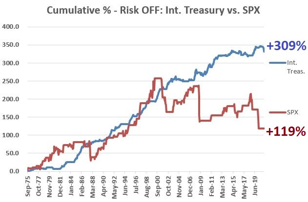
Jay pointed out that if an investor switched into Treasuries during the Risk Off signals noted above, one would have done well.
The chart below displays the total return achieved by holding intermediate-term Treasuries (blue line) versus the total return achieved by holding the S&P 500 Index (orange line) ONLY DURING RISK OFF quarters since 1975.
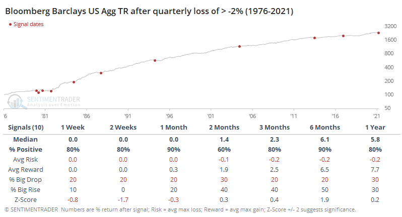
The bond market has had a horrible quarter. While focused mainly on long-dated Treasuries, the total return of an aggregate bond index suffered one of the worst losses in its history.
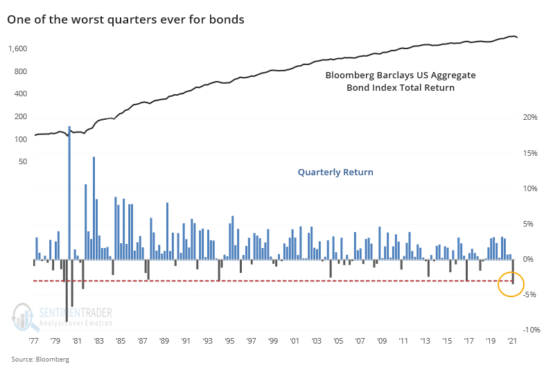
A quarterly loss of 3% or more is so extreme that it doesn't give us much of a sample to work with, so if we lessen the loss to -2% or greater, we pick up a few more precedents. The chart doesn't show us much because it's pretty much just a straight shot up and to the right, but the table shows impressive results.
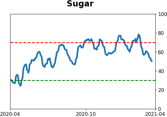
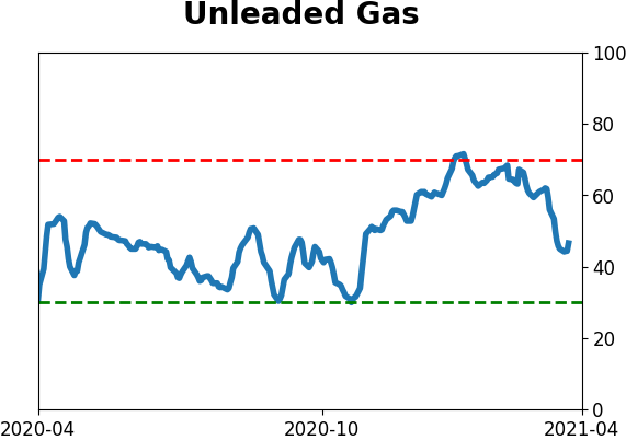
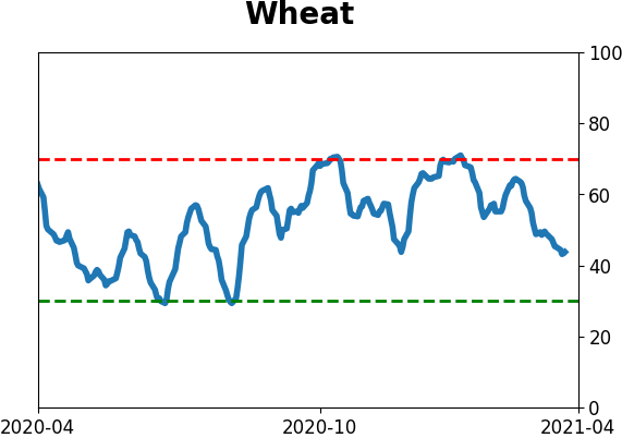
| COMMODITIES |
|  |
|
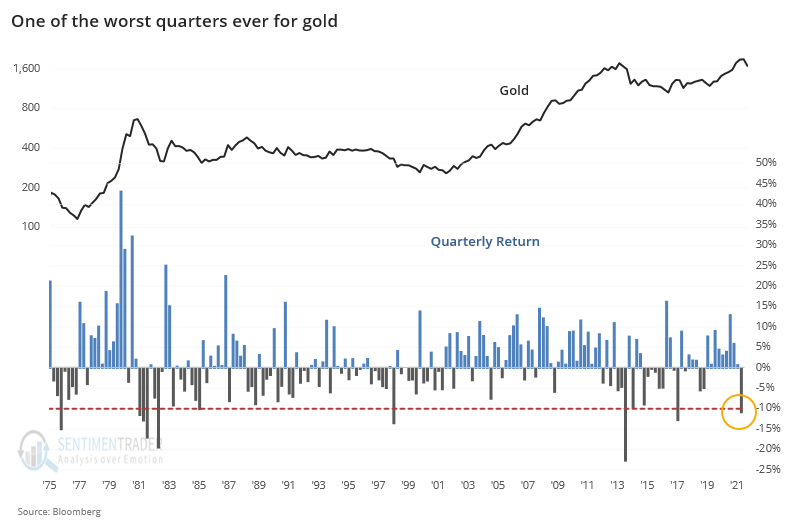
During a mostly positive quarter for stocks - depending on where in the stock universe you were concentrated - other major markets got hit hard. For both gold and bonds, it was among the worst ever.
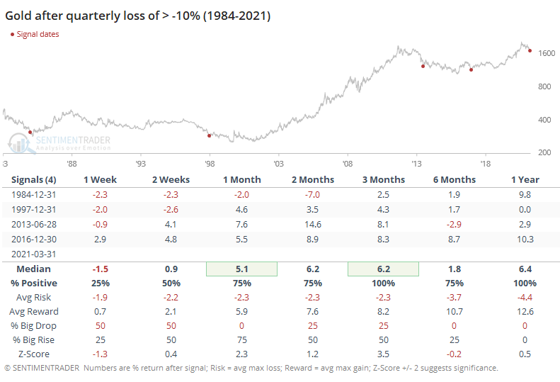
For gold, a 10% quarterly loss is unusual. In nearly 50 years, there had only been 9 other quarters with a loss this large.
If we want to commit the cardinal sign of ignoring anything prior to the last 40 years simply because they were ugly, then we can get a better handle on the risk vs reward of the good signals in more recent decades.
Jay looked at crude oil's positive tendency heading into April.
For example, one can state that "April is the best month for crude oil." At this point in time that is a factually correct statement. But does this mean that one can simply buy crude oil on April 1st and wait for the profits to roll in? Let's take a closer look.
The chart below displays the hypothetical cumulative $ gain/loss achieved by holding a long 1-lot position in crude oil futures ONLY during the month of April every year since the contract started trading in the early 1980s.
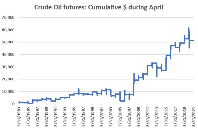
Despite the fact that April is the best month for crude oil, the winning percentage is only 61%. The edge comes from the fact that the average and median winning trade is twice as big as the average and median losing trade.
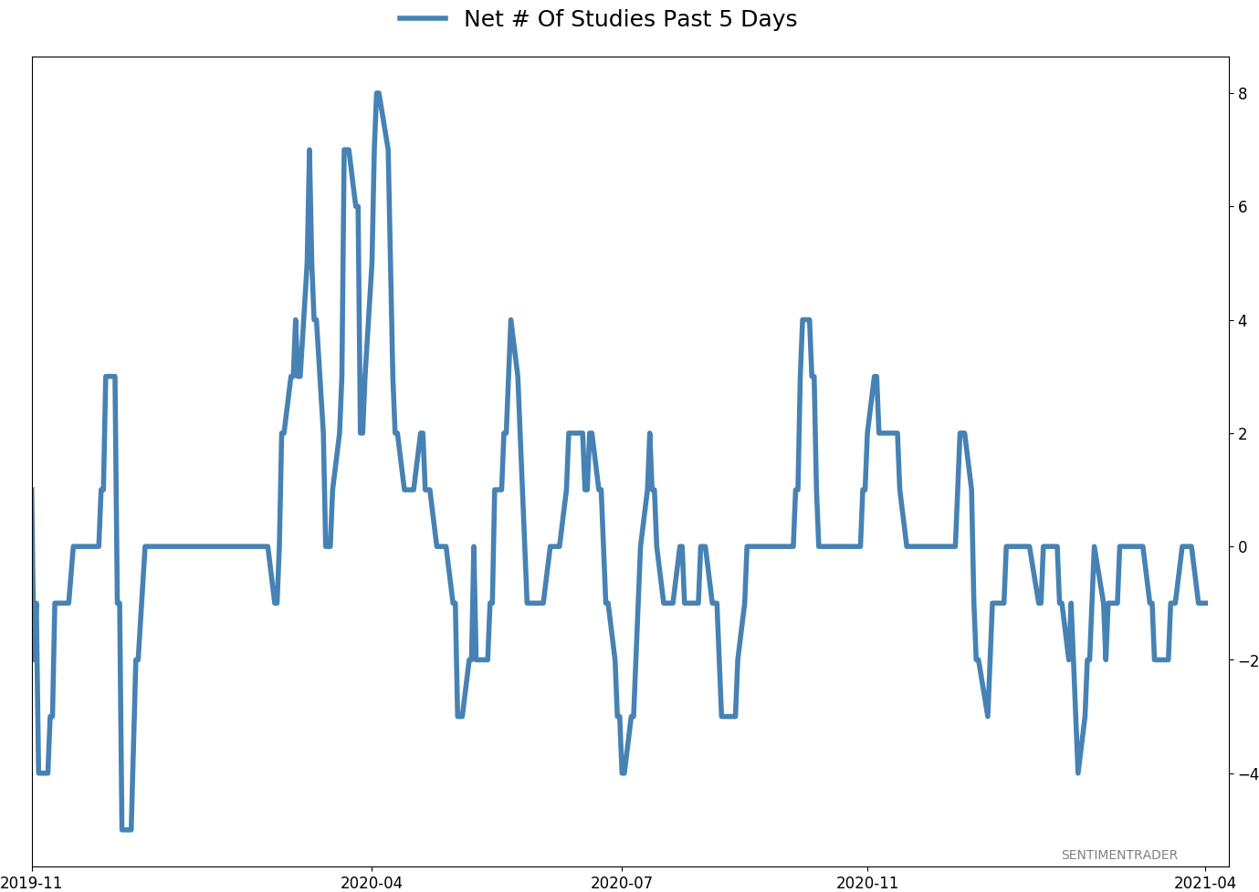
Active Studies
| Time Frame | Bullish | Bearish | | Short-Term | 0 | 0 | | Medium-Term | 0 | 10 | | Long-Term | 11 | 4 |
|
Indicators at Extremes
Portfolio
| Position | Description | Weight % | Added / Reduced | Date | | Stocks | RSP | 4.9 | Reduced 4% | 2021-02-09 | | Bonds | 30.0% BND, 8.8% SCHP | 38.8 | Added 15.1% | 2021-02-18 | | Commodities | GCC | 2.3 | Reduced 2.1%
| 2020-09-04 | | Precious Metals | GDX | 9.0 | Added 0.1% | 2021-02-18 | | Special Situations | 7.3% XLE, 4.8% PSCE | 12.1 | Reduced 5.6% | 2021-02-18 | | Cash | | 32.8 | | |
|
Updates (Changes made today are underlined)
With a market that has seen the kinds of broad participation and big breath thrusts like we did in the fall, it's hard to become too negative. Those kinds of conditions have consistently preceded higher returns over the next 6-12 months. It's the interim that's more of an issue. Even conditions like that haven't prevented some shorter-term pullbacks. And when we combine an environment where speculation is rampant and recent days have seen an increase in cracks under the surface of the indexes, it's enough to become more defensive over a short- to medium-term time frame. We still don't have much confirmation from the price action in the indexes, so those who are more conservative would likely wait before increasing cash levels. I've decreased risk exposure a bit more, mainly in terms of energy stocks and the ANGL fund, while adding more to the broader bond market. RETURN YTD: 7.0% 2020: 8.1%, 2019: 12.6%, 2018: 0.6%, 2017: 3.8%, 2016: 17.1%, 2015: 9.2%, 2014: 14.5%, 2013: 2.2%, 2012: 10.8%, 2011: 16.5%, 2010: 15.3%, 2009: 23.9%, 2008: 16.2%, 2007: 7.8%
|
|
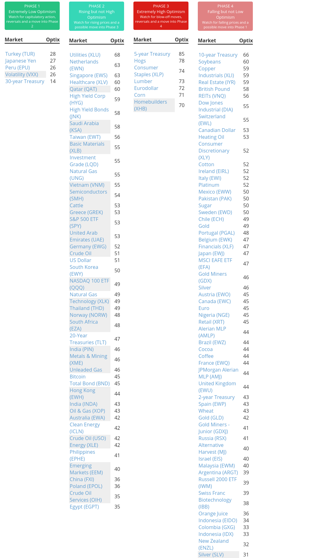
Phase Table
Ranks
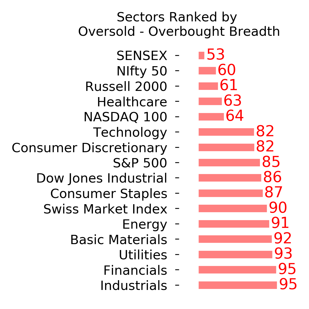
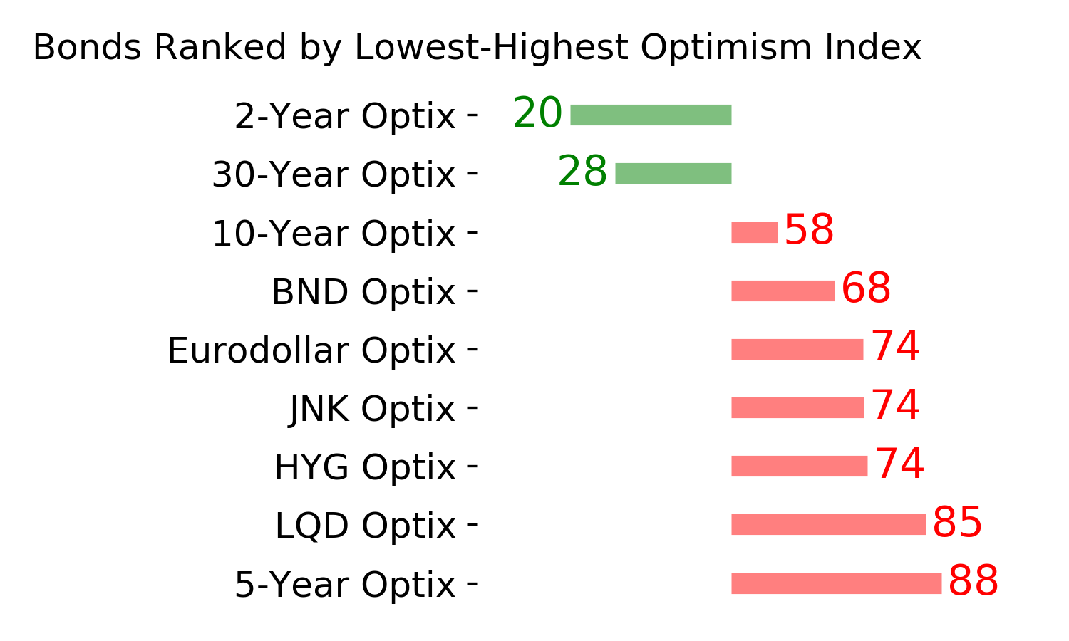
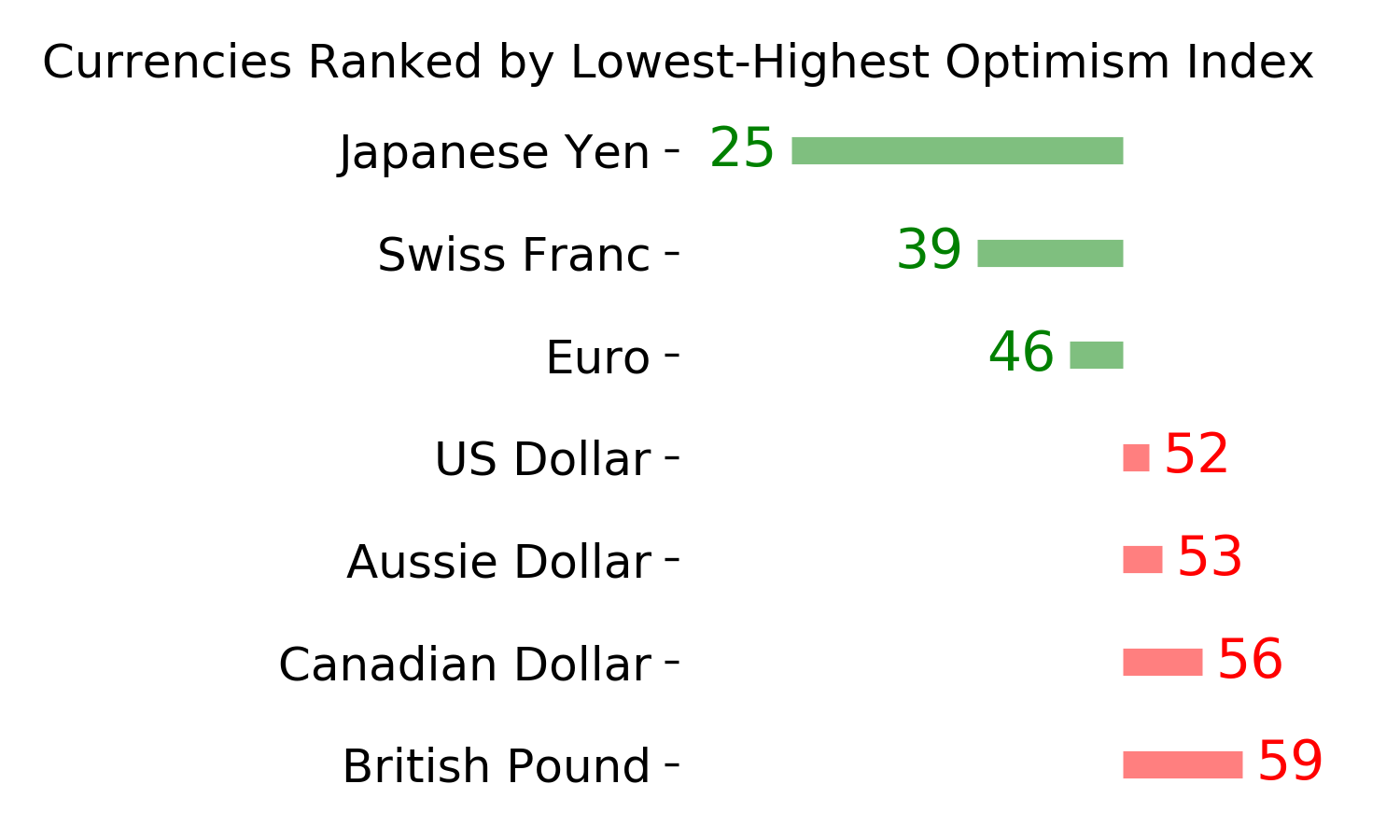
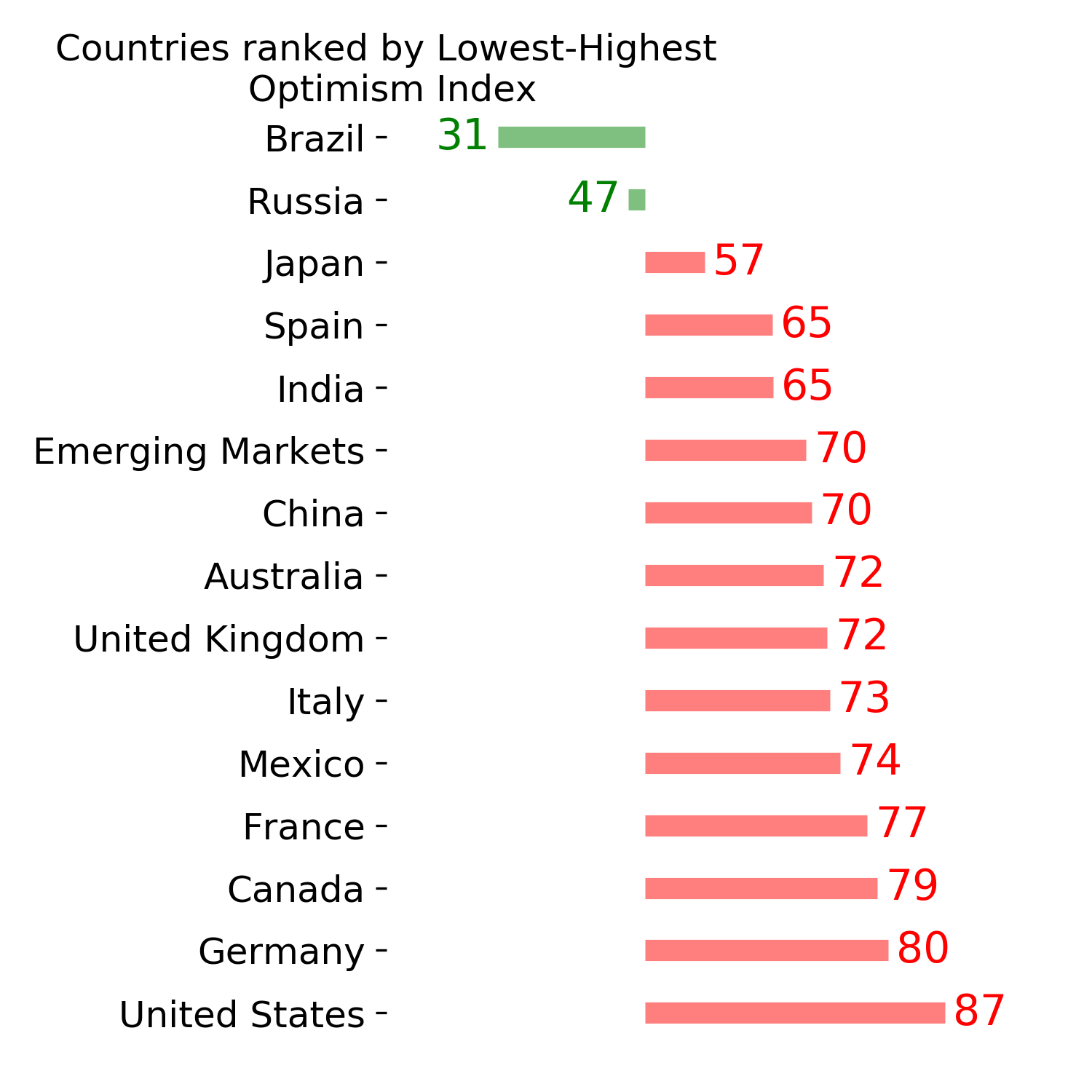
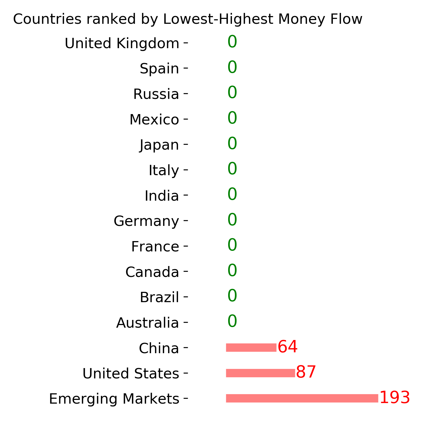
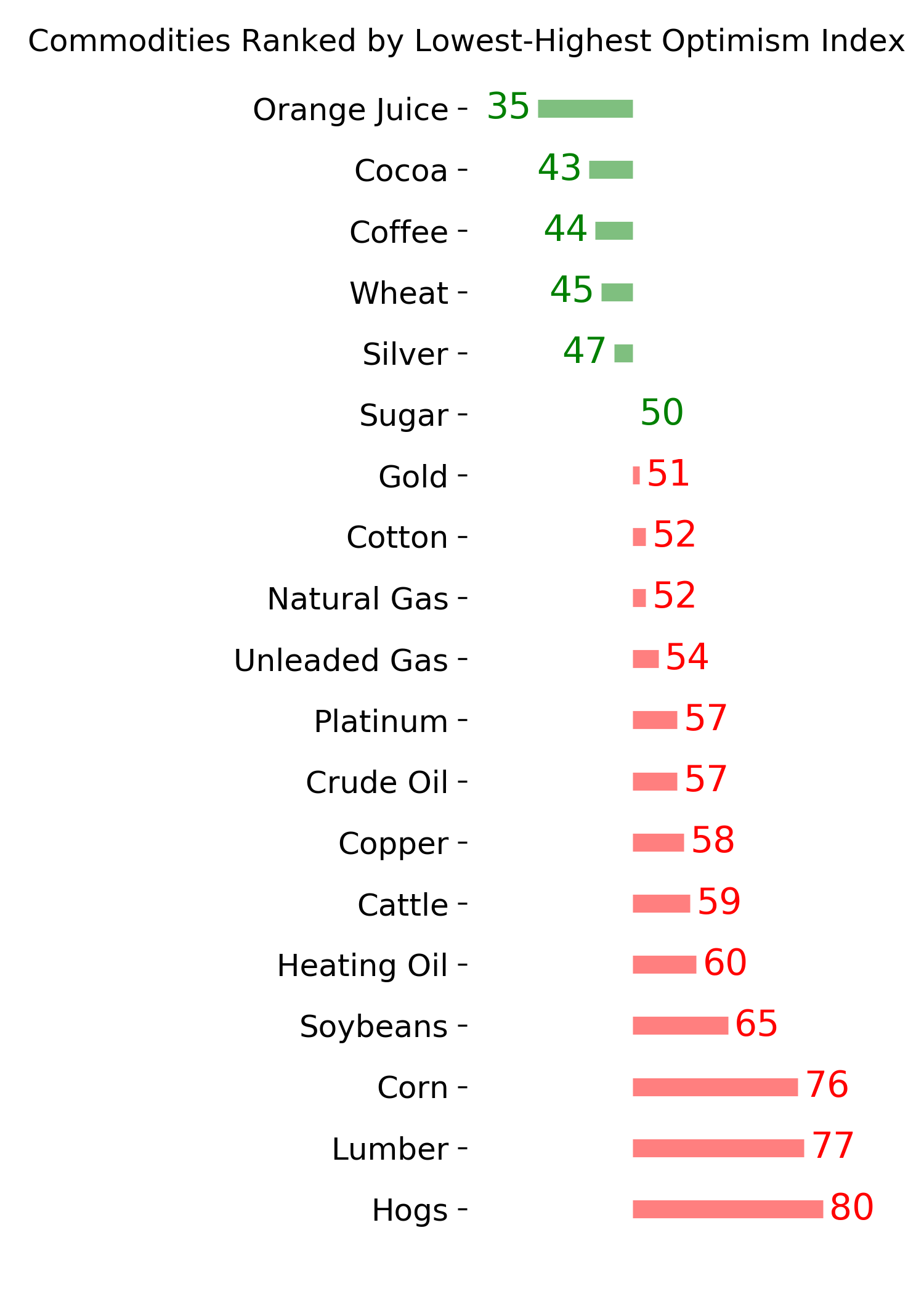
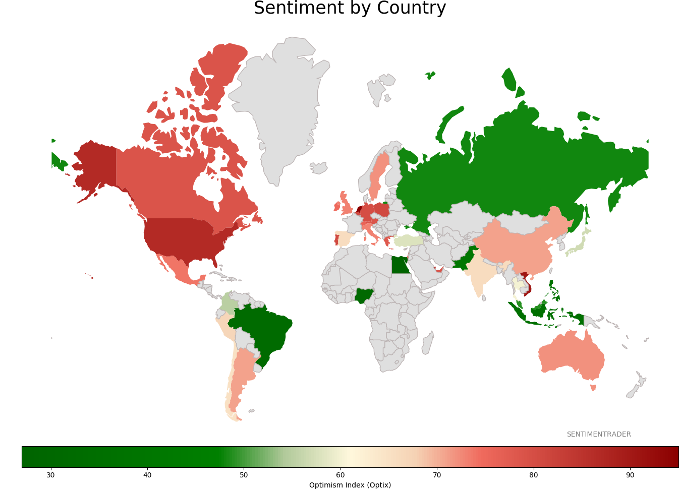
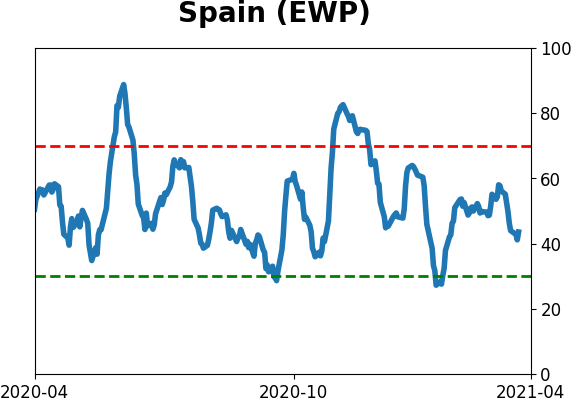
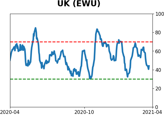
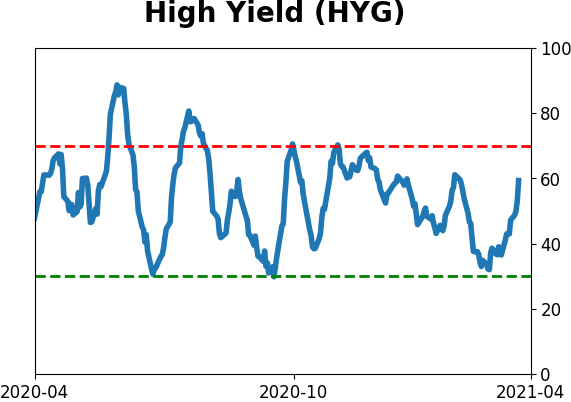
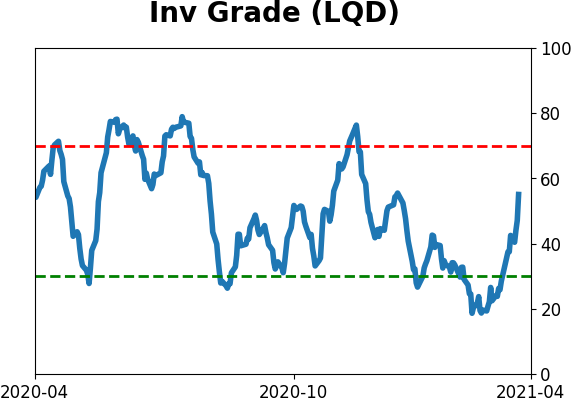
Sentiment Around The World
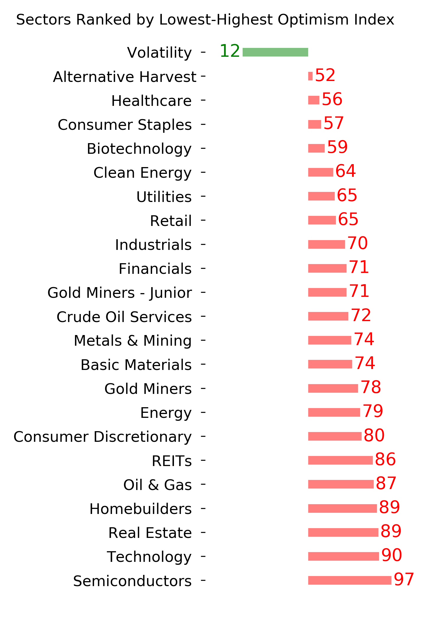
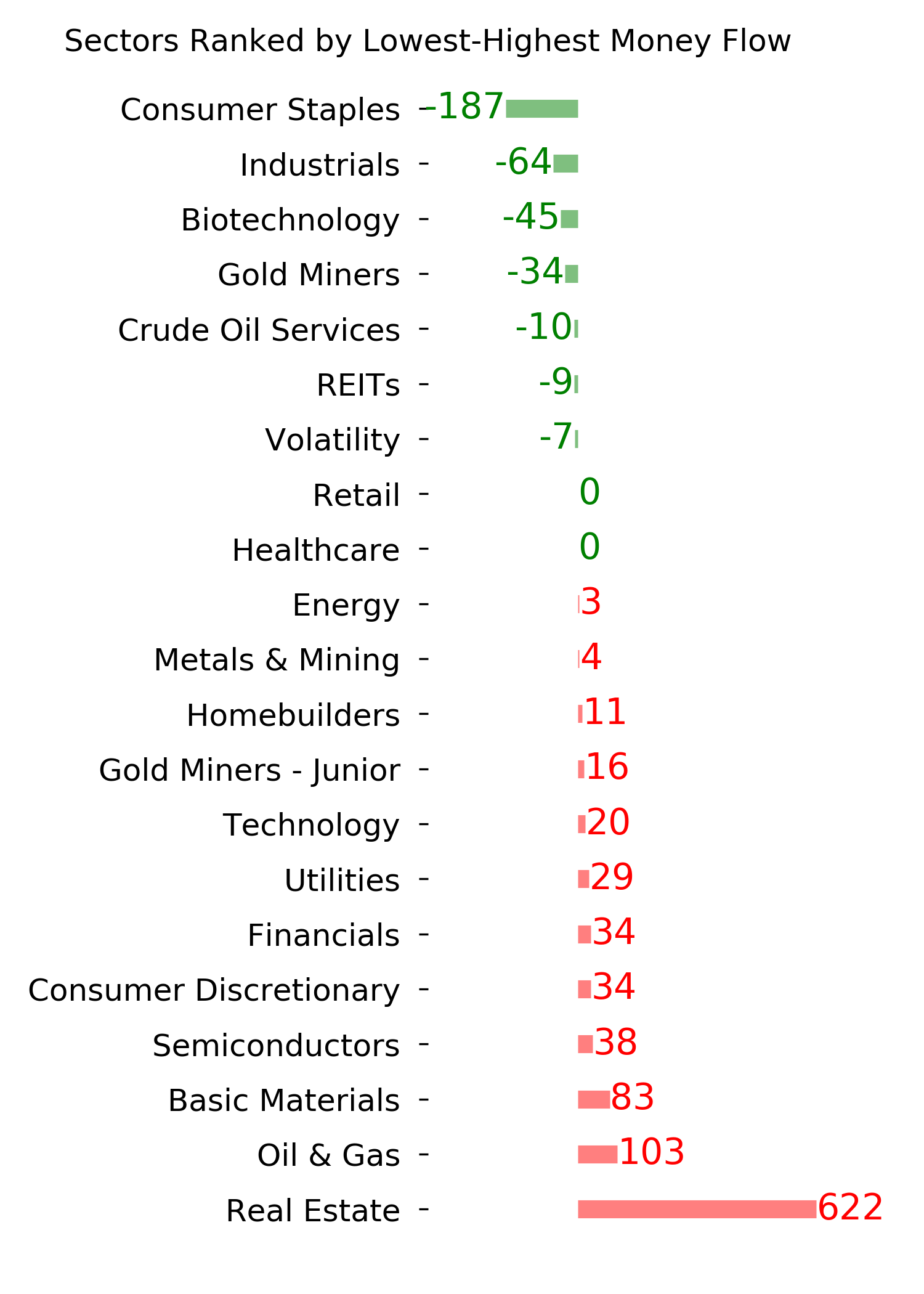
Optimism Index Thumbnails
|
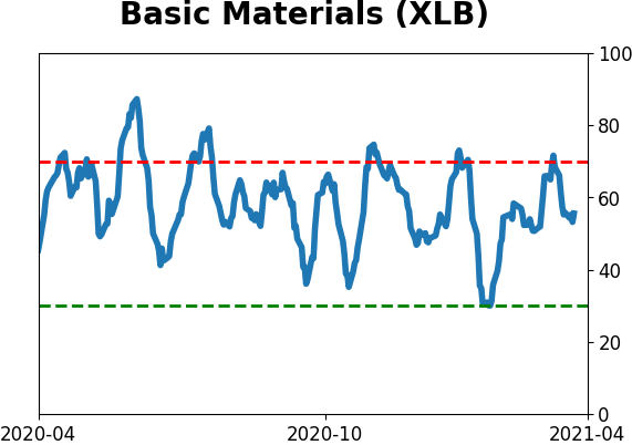
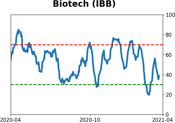
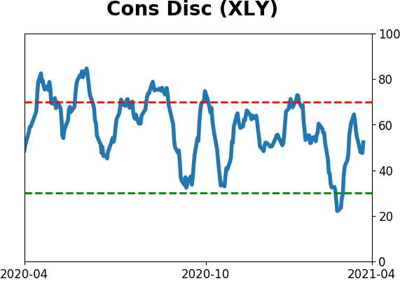
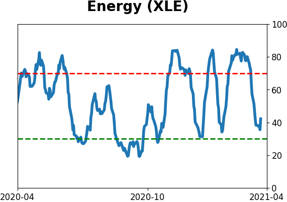
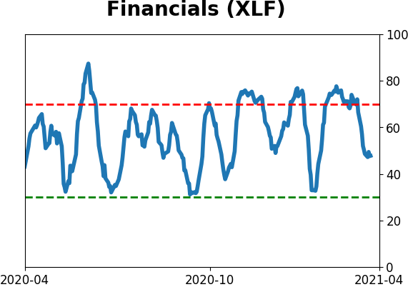
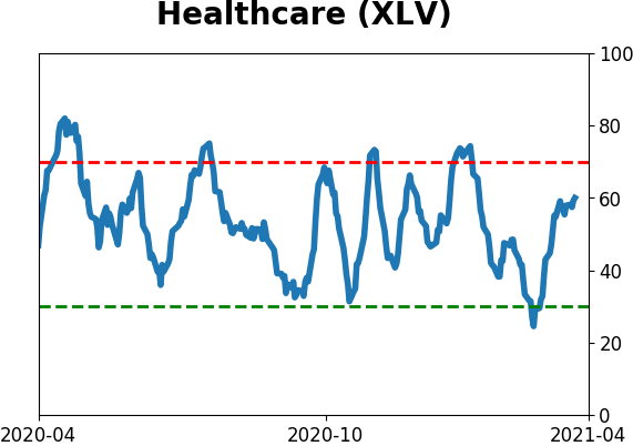
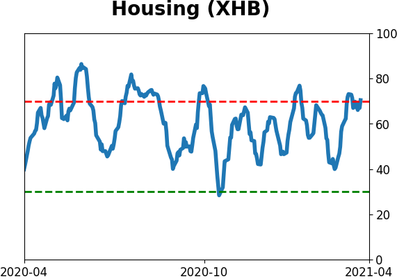
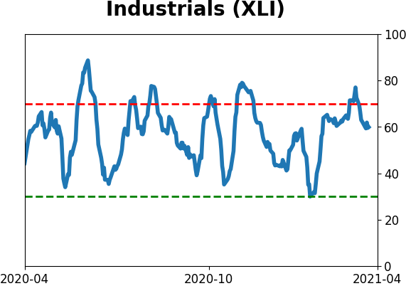
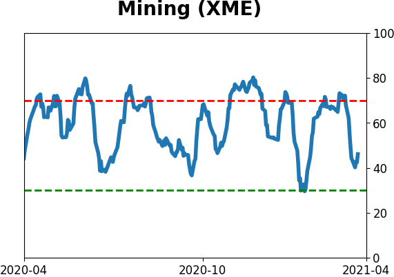
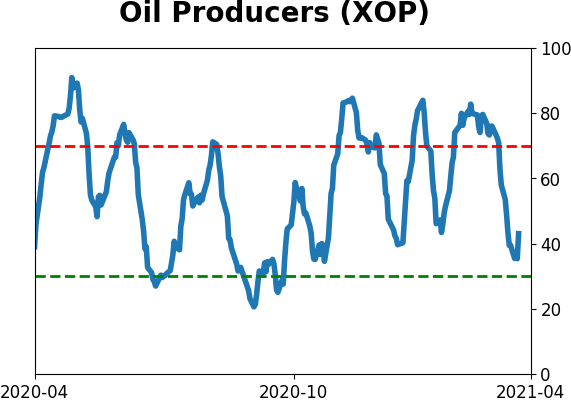
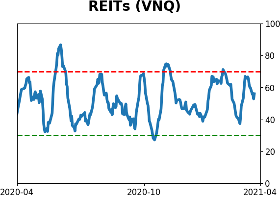
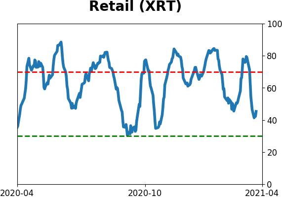
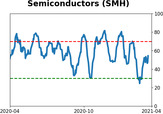
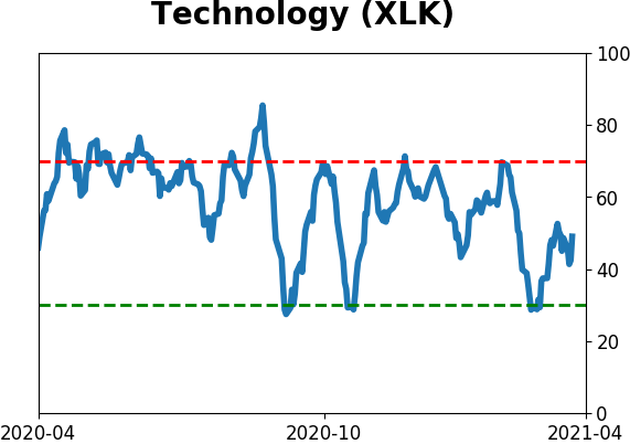
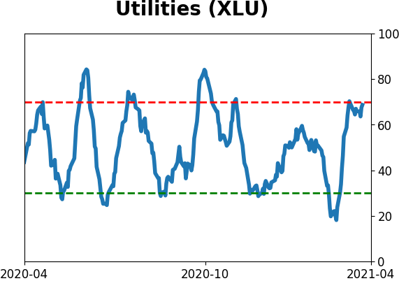
Sector ETF's - 10-Day Moving Average
|
|
|
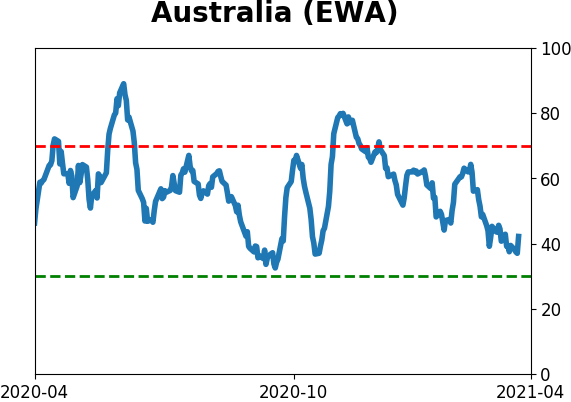
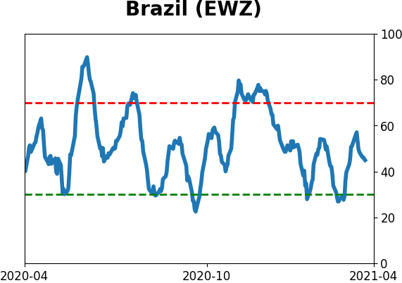
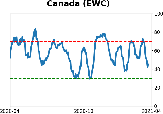
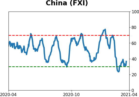
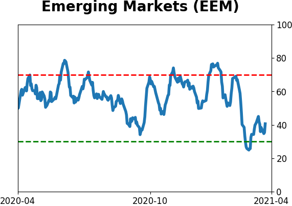
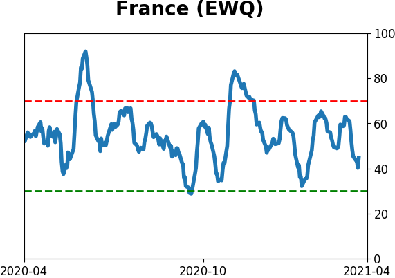
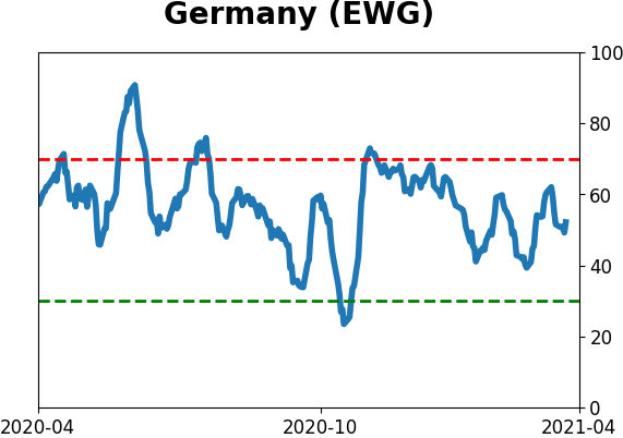
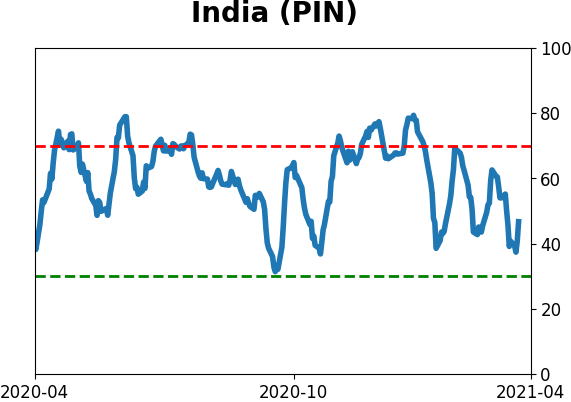
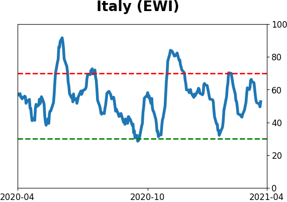
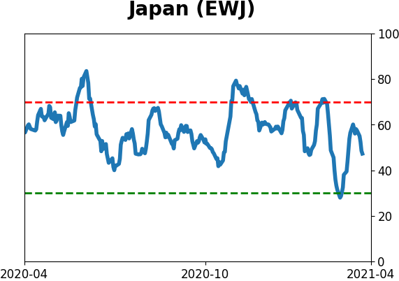
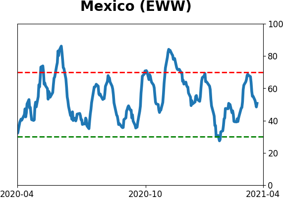
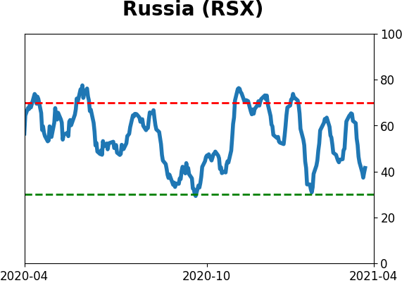
Country ETF's - 10-Day Moving Average
|
|
|
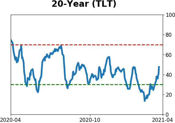
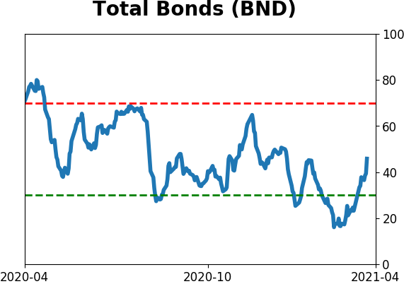
Bond ETF's - 10-Day Moving Average
|
|
|
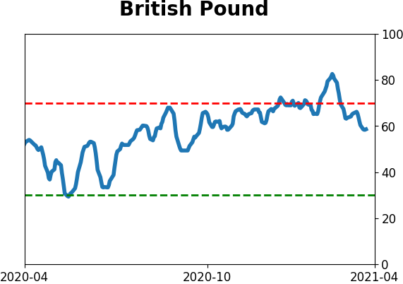
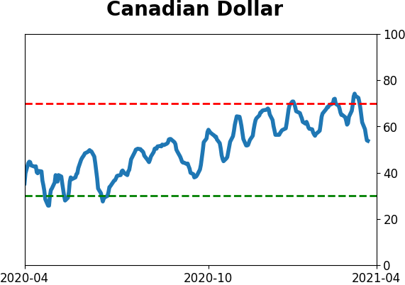
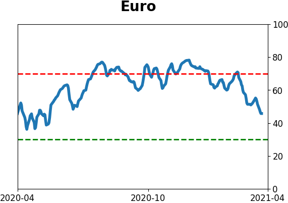
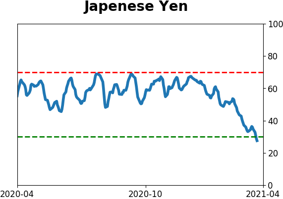
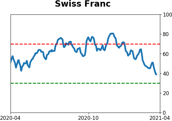
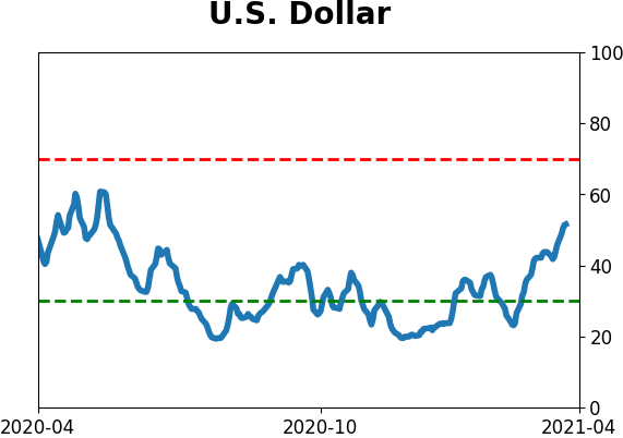
Currency ETF's - 5-Day Moving Average
|
|
|
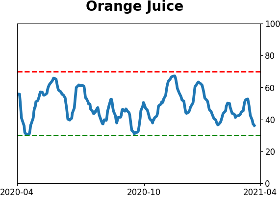
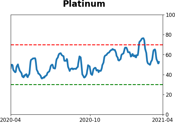
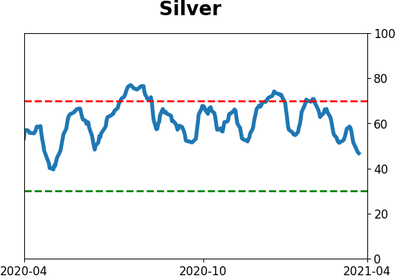
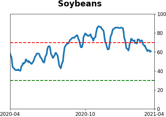
Commodity ETF's - 5-Day Moving Average
|
|