
Yield curve un-inversion versus stocks and the economy

Key points
- The 10-year minus 3-month treasury yield curve recently returned to positive territory after spending over two years in inverted territory
- Yield curve inversion indicates some imbalance or abnormality in the credit market. However, the typical attendant fear and loathing surrounding this circumstance is sometimes right and sometimes wrong
- Overall, the economy and the stock market have historically tended to exhibit subpar - though not necessarily negative - results following "un-inversion"
The yield curve ends a long period of inversion
For testing purposes, we will define the "yield curve" using month-end data for the 10-year treasury note yield and the 3-month T-bill yield as follows:
- Yield curve = 10-year treasury note yield - 3-month treasury bill yield
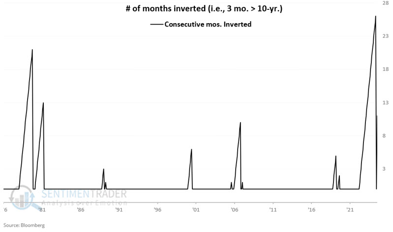
The chart below displays month-end 10-year-3-month yield curve readings since 1976.
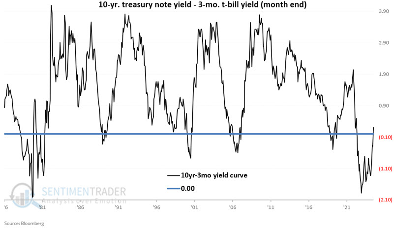
If the yield curve is negative (i.e., if the 3-month bill pays a higher rate of interest than the 10-year note), it is considered "inverted." We seek to answer the following question: "What are the implications for the economy and the stock market when the yield curve un-inverts after becoming inverted?"
Interestingly, the yield curve became inverted at the end of October 2022. At the time, much hand-wringing and gnashing of teeth took place as many pundits invoked doom and gloom regarding an inverted yield curve. However, the reality is that if there is going to be trouble, it typically starts after the inversion ends, as it did at the end of December 2024.
A closer look at economic activity after un-inversion
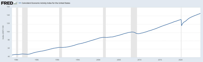
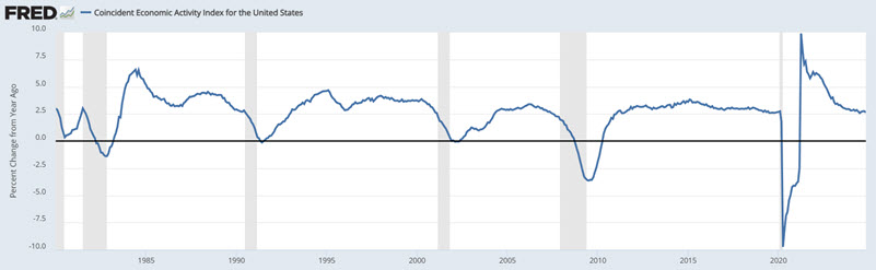
For testing purposes, we will use the latest reading for the Coincident Economic Activity Index (CEAI) at the end of each month, starting July 1976. The charts below display the raw index and the 12-month rate-of-change, respectively. The grey vertical areas in the charts represent periods of economic recession.
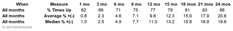
First, let's set the baseline for performance by looking at the typical CEAI performance across 1, 3, 6, 9, 12, 18, and 24 months. The results for ALL 558 months appear in the table below.
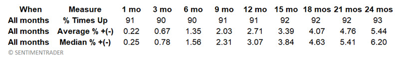
So, for example, if we look at the 18-month column in the table above, we find that the CEAI rose over 18 months 92% of the time (and declined only 8% of the time). The average 18-month gain in the index was +4.07%, and the median gain was +4.63%.
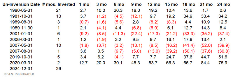
Now, let's look at what has happened following previous un-inversions. The chart below shows periods when the yield curve was inverted. The short period was one month, which occurred on three occasions. The longest is the one just completed, which lasted 26 months.
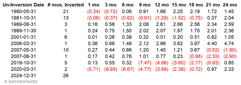
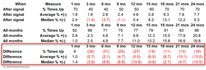
The table below displays the month when the yield curve returned to normal (i.e., it went from inverted to un-inverted) and the subsequent performance for the CEAI.
In the table below:
- The first part ("After Signal") displays CEAI performance only following the dates listed in the table above
- The second part repeats the earlier information for ALL months (i.e., baseline performance)
- The third part compares the difference between post-signal performance versus baseline performance
- Negative numbers mean the index performed worse overall following un-inversion
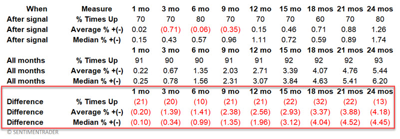
The two key things to note are:
- The economy does NOT always contract or perform poorly following an un-inversion
- However, the % of times up and average and median results are worse across all time frames following un-inversion versus the baseline
The latest un-inversion does not preclude economic expansion in the years ahead. However, it does imply the potential for continued below-average economic growth over the next several years.
Let's zero in on 18 months in the table above.
- Looking at All Months, the CEAI moved higher 92% of the time. Following un-inversion the CEAI moved higher only 60% of the time
- Looking at All Months, the average 18-month gain for CEAI was +4.07%. Following un-inversion the average 18-month gain was +0.71%
- Looking at All Months, the median 18-month gain for CEAI was +4.63%. Following un-inversion the median 18-month gain was +0.59%
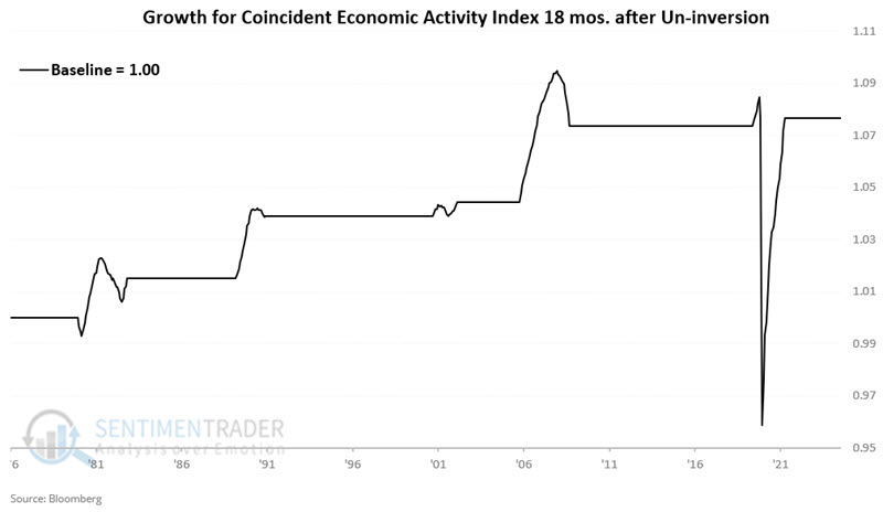
The chart below displays the cumulative growth in the Coincident Economic Activity Index during the 18 months following each month-end un-inversion date listed above (the chart arbitrarily starts at a baseline of 1.00).
The chart below displays the cumulative growth in the Coincident Economic Activity Index during all months NOT included in the chart above (the chart arbitrarily starts at a baseline of 1.00).
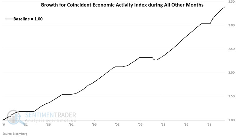
Clearly, the performance shown in the second chart is more consistent than that shown in the first chart. Still, to those who want to shout doom-and-gloom about the recent un-inversion, it must be noted that the first chart did show a net gain across the 48-year test, albeit with a lot more volatility and some period significant air pockets.
The bottom line: A yield curve un-inversion does not guarantee an economic slowdown. However, the slowdown/contraction probability is much more significant following an un-inversion than during all other times.
Now, let's turn our attention to stock market performance.
A closer look at stock market performance after un-inversion
For testing purposes, we will use the monthly closing price for the S&P 500 Index starting July 1976.
First, let's set the baseline for performance by looking at the typical S&P 500 performance across 1, 3, 6, 9, 12, 18, and 24 months. The results appear in the table below across ALL 558 months.
So, for example, if we look at the 12-month column in the table above, we find that since 1976, the S&P rose over 12 months 77% of the time (and declined 23% of the time). The average 12-month gain in the index was +9.63%, and the median gain was +10.07%.
Now let's look at what has happened following previous un-inversions. The table below displays the month when the yield curve returned to normal (i.e., it went from inverted to un-inverted) and the subsequent performance for the S&P 500.
In the table below:
- The first part ("After Signal") displays SPX performance only following the dates listed in the table above
- The second part repeats the earlier information for ALL months (i.e., baseline performance)
- The third part compares the difference between post-signal performance versus baseline performance.
- Negative numbers mean the index performed worse overall following un-inversion
The two key things to note are:
- The stock market does NOT always decline following an un-inversion (see 1980 and 2020)
- However, the % of times up and average and median results are worse across all time frames following un-inversion versus the baseline except for the first month.
Let's zero in on 12 months in the table above:
- Looking at All Months, SPX moved higher 77% of the time. Following un-inversion SPX moved higher 50% of the time
- If we look at All Months, the average 12-month gain for SPX was +9.6%. Following un-inversion the average 12-month gain was +4.6%
- If we look at All Months, the median 12-month gain for SPX was +11.00%. Following un-inversion the median 18-month gain was +0.4%
The chart below displays the hypothetical growth of $1 invested in the S&P 500 only during the 12 months following each month-end un-inversion date listed above. $1 grew to $1.19.

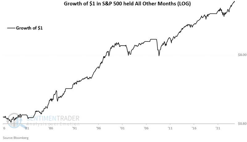
The chart below displays the hypothetical growth of $1 invested in the S&P 500 only during all months NOT included in the chart above. $1 grew to $47.27.
What the research tells us…
The good news is that the recent un-inversion of the yield curve does not guarantee an impending economic recession or a bear market for stocks. The bad news is that it might. Historically, economic growth and stock market performance have been subpar for up to two years following previous reversals from a yield curve inversion. While this recent development does not in and of itself constitute a "Sell" signal, it strongly suggests that the road ahead may get significantly rougher and more volatile than what investors have experienced during the last two calendar years. Investors may do well to adjust their expectations accordingly.