What's the message from the surge in Doctor Copper
When I turned my quote machine on yesterday morning, it was awash in a sea of flickering red flashes. As I frantically scrolled through page after page searching for something with a green tick, I was relieved to find Dr. Copper up more than 2% and registering a new 52-week high. I immediately went to work to see if I could find an information edge in what many call the commodity with a "Ph.D. in economics."
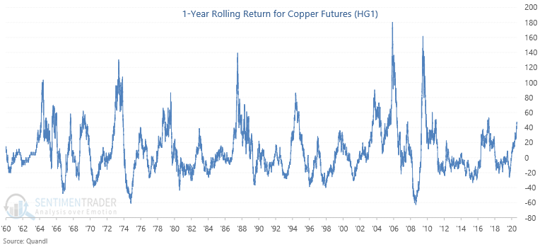
The rolling return chart is one of my absolute favorite tools for analyzing the big picture of any security. I like to start with the 1-year and zoom out in one-year increments until I reach the five-year.
With the 2%+ gain in copper futures on Thursday, the 1-year rolling return crossed above 49%. There is nothing special about this value. It's just what I noticed on Thursday.
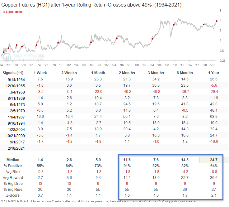
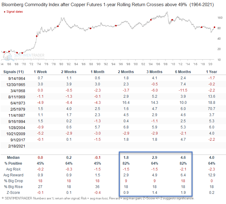
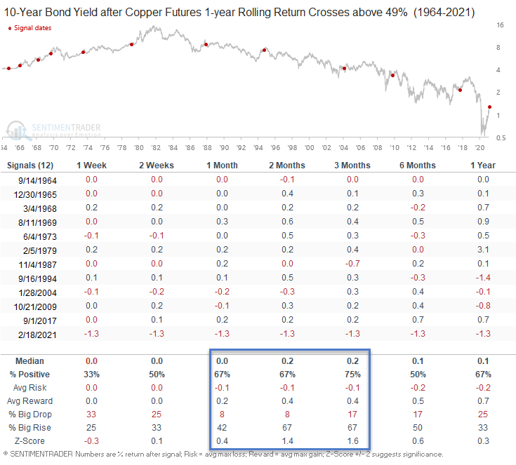
Let's see what a 49% surge in Dr. Copper says about the potential future returns for copper, commodities, bonds, and stocks.
Please note, the sample size is small as I utilized a reset cross condition below zero to identify the first cross above 49%.
Rolling Return Chart
Copper Signal Performance
Commodity Signal Performance
10-Year Bond Yield Signal Performance
Please note, the numbers in the table below reflect the net change in the 10-year yield.
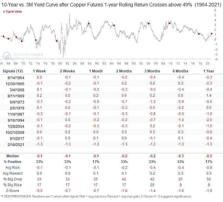
10-Year vs. 3-Month Yield Curve Signal Performance
Please note, the numbers in the table below reflect the net change in the yield curve.
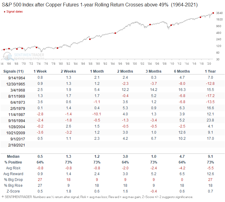
S&P 500 Signal Performance
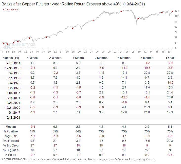
Bank Signal Performance
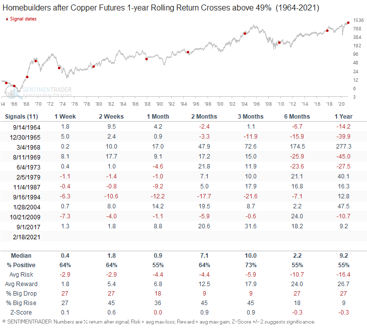
Homebuilder Signal Performance
Gold Miners Signal Performance
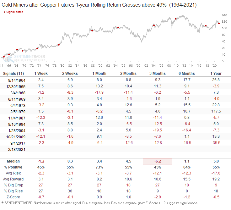
Basic Materials Signal Performance
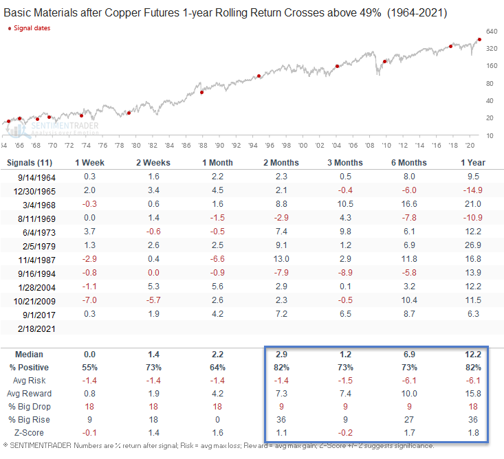
Technology Signal Performance
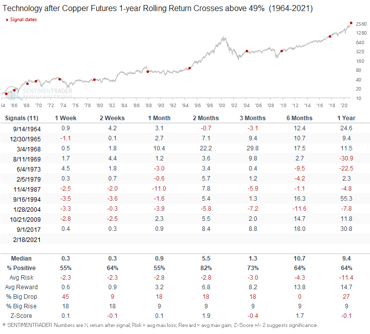
Semiconductor Signal Performance
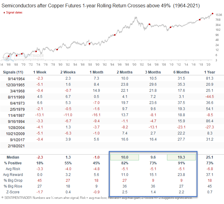
Conclusion: The economic message from the surge in copper appears to be following the typical post-recovery script. Stocks, commodities, and bond yields should continue to advance higher. I think copper will be the most interesting one to watch as there has been significant talk around the utilization of the metal in electric vehicles and charging stations.

