What I'm looking at: stocks vs. gold, fractals,McCulley, copper, yield curve
Stocks continue to fluctuate along the lines of trade war news. Here's what I'm looking at.
Gold vs. stocks
With precious metals rallying during recent "trade war fears" and "recession fears", we've seen a renewed interest in gold and silver that we haven't seen in years. As usual there are the "macro trade of a century" calls which tell investors and traders to buy gold and sell stocks. (And it certainly does lend credence to this story when big fund managers like Ray Dalio suggest investors add gold to their portfolios).
Personally, I'm not a big fan of these macro bets. I've seen too many macro bets on gold and silver go wrong over the years (remember how QE was supposed to lead to surging inflation?)
So instead of guessing what the future will look like, here's a simpler and more objective way to look at gold vs. stocks. The S&P:gold ratio is important because it compares a risk-on asset (stocks) vs. a safe haven asset (gold).
I originally got this idea from Mark Ungewitter, who suggested that traders look at the S&P:gold ratio vs. its 5 year moving average.
- When the S&P:gold ratio is above its 5 year average, then stocks are in a secular bull market (e.g. 1980s-1990s, 2010s).
- When the S&P:gold ratio is below its 5 year average, then stocks are in a secular bear market (e.g. 1970s, 2000s).
The following chart illustrates what happens if you:
- Buy the S&P 500 if the S&P:gold ratio is > its 5 year moving average AND the S&P 500 is above its 200 day moving average.
- Buy gold if the S&P:gold ratio is <= its 5 year moving average AND gold is above its 200 day moving average.
- Otherwise, SELL
You can do 1 of 2 things when you SELL.
- Shift to 100% cash
- Short the S&P 500
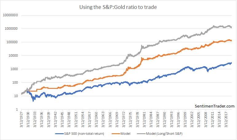
With stocks recent surge, this strategy has bought gold for the first time in years. Keep in mind that this is essentially a trend following strategy, so if gold pulls back, this strategy will sell gold and switch back to stocks.
The S&P 500 today is just like...
Fractals are popular perhaps because they give traders a sense that they know *exactly* what's going on in the markets right now. E.g. "the S&P 500 today is just like (insert historical year)". But while some historical price patterns do repeat, the future is rarely just like the past. E.g. if today we say "the S&P today is just like in 1998", did people in 1998 say "the S&P today is just like 1990"? And did people in 1990 say "the S&P today is just like 1987?" Each rally, correction, bull market, and bear market is somewhat different from the past.
With that in mind, a popular chart that compares the S&P in 2019 with 1998 and 2013 has been going around financial circles recently. The question is:
"Is the S&P today just like 1998?" (prepare for a crash)
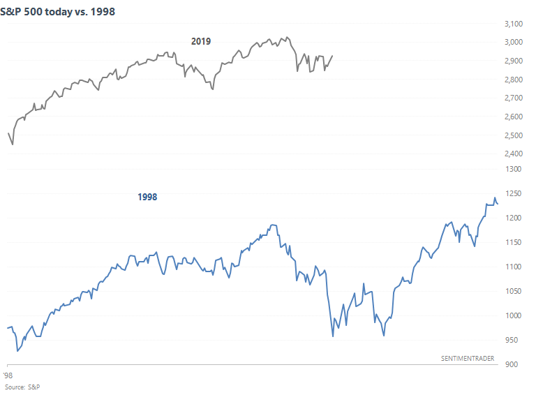
Or is the S&P today "just like 2013"? (prepare for another big rally)
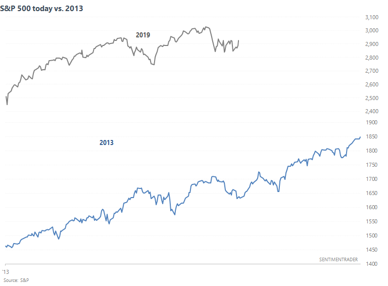
As I've said in the past, the problem with many of these charts is that they're optical illusions. When the scales are changed, compressed, or stretched, the S&P today can "look just like" whatever historical date suits your bullish/bearish belief (how many of these "the S&P today looks just like 1987" charts have we seen over the past 10 years?). So to accurately compare the S&P in 2019 with other historical years, we have to quantify the correlation.
There's been 167 trading days in 2019 so far, so we'll compare this against other 167 day periods in history. Then we can look for cases in which other 167 historical periods had a correlation of > 0.9 compared to the 167 days so far in 2019.
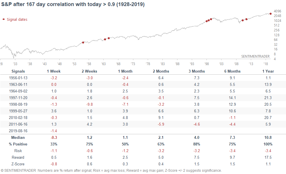
As you can see, 1998 does feature among these 8 historical cases. These 8 historical cases rarely turned into a big bear market over the next year, which is why the S&P's 3-12 month forward returns were generally positive. But at the same time, risk:reward was not terrific because some of these cases had a sizable correction over the next few months (2011, 2010, 1998).
Overall, this suggests that when the stock market surges over an 8 month period, it usually continues to trend upwards, but in a much more choppy manner. Melt-ups are not the norm.
McCulley Indicator
As Bloomberg reports, the "McCulley Indicator" is rolling over into potential recession territory. If we look at Manufacturers New Orders: Capital Goods (excluding aircraft and defense), we can see that the year-over-year change has turned negative. This also happened before the 2001 and 2008 recessions.
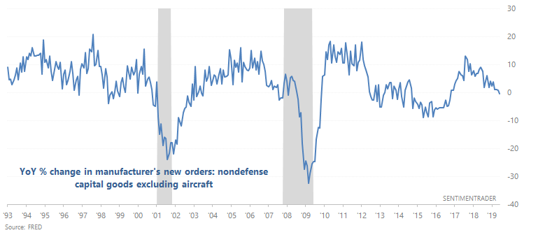
While weakness in new orders did precede the 2000-2002 and 2007-2009 bear markets, there were also other false bearish signals.
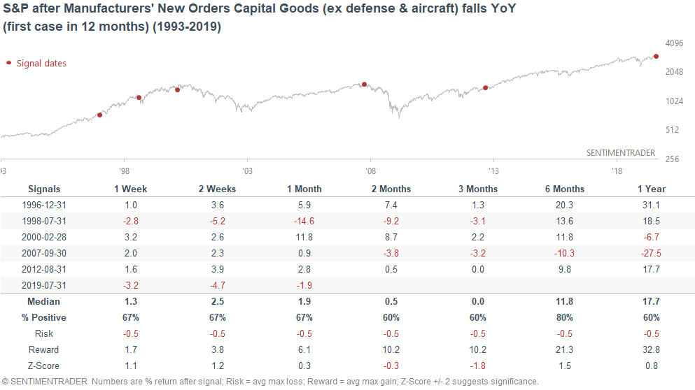
Overall, manufacturing remains a weak point in the U.S. economy.
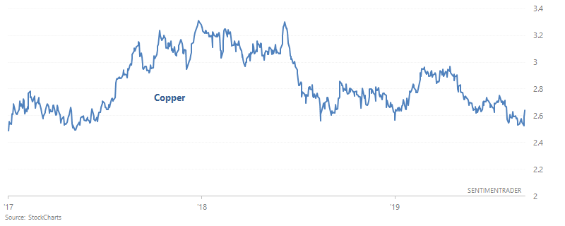
Copper
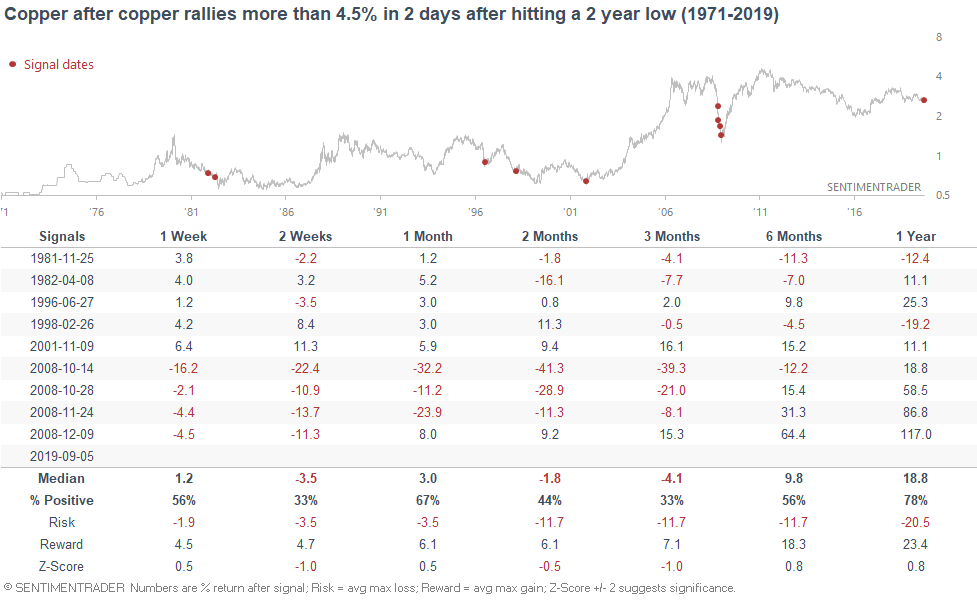
Copper has been weak this year, weighed down along with emerging markets. (Dr. Copper is a more accurate indicator for emerging markets than the S&P 500). But after falling to a > 1 year low, copper has rallied 4 days in a row. Is this the start of a reversal?
When this happened historically, copper often rallied over the next 3 months. However, the risk:reward isn't great because sometimes copper could go lower before making a rally.
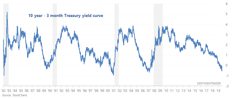
Yield curve
And lastly, it seems like people have been talking about "yield curve inversion" for a long time. The 10 year - 3 month yield curve has been inverted for 4 months (if we use monthly CLOSE data).
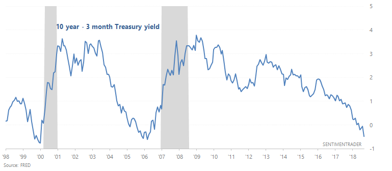
When this happened in the past, the S&P's returns over the next year were more bearish than random. The yield curve remains a long term bearish factor for the stock market.