What I'm looking at - relentless rally, bullish percent index, recession probabilities, abandoning utilities
Here's what I'm looking at:
Relentless rally
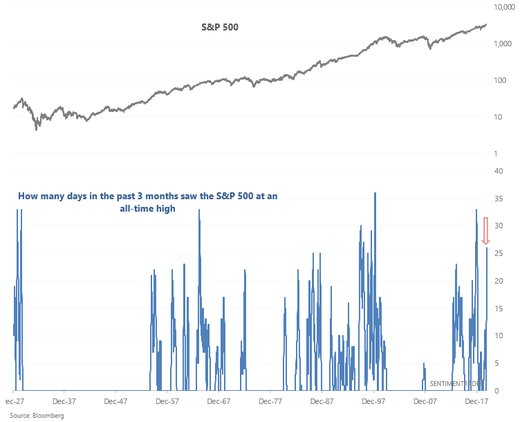
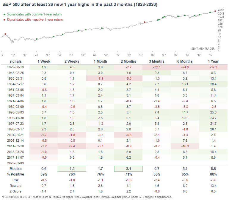
If it seems like the S&P 500 is making a new high every day, that's because it has been doing just that. The past 3 months have seen 26 new all-time highs (using daily HIGH $).
The last time this happened was in late-2017, just as the U.S. stock market began a blow-off top that ended with a crash in January-February 2018. After that, we'd have to go back more than 20 years to the 1990s to find similar cases. And of course the worst such cases were in 1928-1929, which culminated in an epic stock market crash.
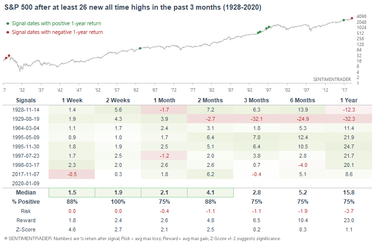
With momentum on the stock market's side, the S&P usually rallied more over the next 2 weeks. But what if instead of looking at the number of all-time highs, we look at the number of 1 year highs?
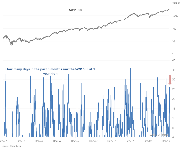
Once again, this impressive display of momentum usually led to more gains over the next 2 weeks, although cases over the past 15 years have been quite bearish over the next week.
Breadth
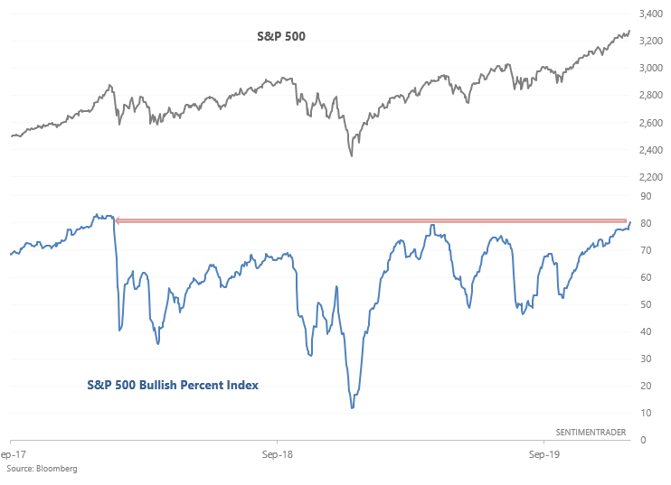
As the stock market rallies relentlessly, various breadth figures (e.g. % of members above their 200 dma) continue to push higher and higher. One of these is the S&P 500 Bullish Percent Index, which looks for point and figure buy signals. This indicator has now risen to the highest level since early-2018:
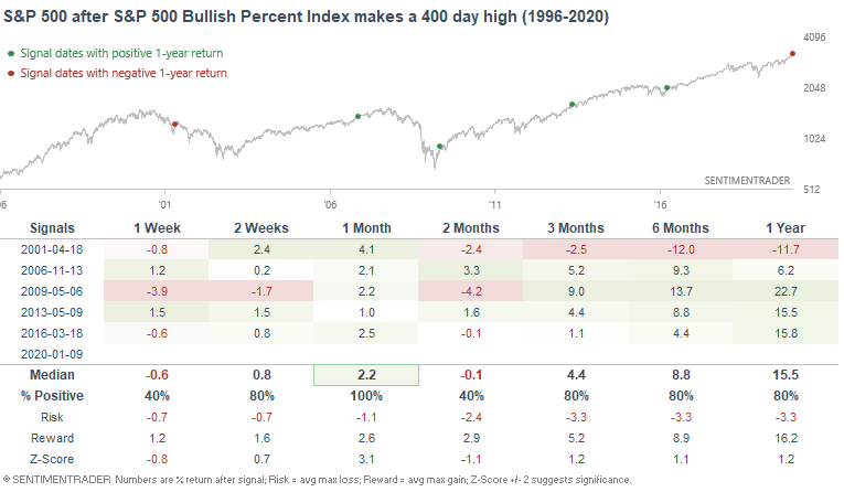
When the Bullish Percent Index made a 400 day high in the past, the S&P typically rallied further over the next month. Once again, momentum is bullish for stock market right now while sentiment is bearish. Pure trend followers have no reason to be bearish on stocks right now, while contrarian traders have plenty of reasons to be short-medium term bearish.
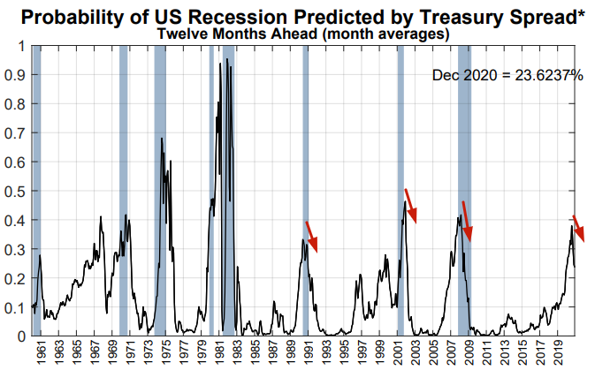
Recession probabilities and yield curve
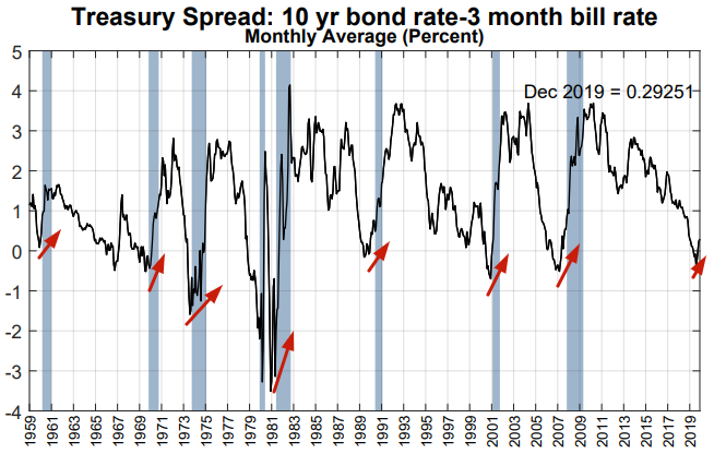
As I mentioned 2 weeks ago, steepening yield curves aren't a terrific sign for stocks since it often happens during recessions. The steepening yield curve has caused several yield curve-based recession probability models like this one from the New York Fed to fall:
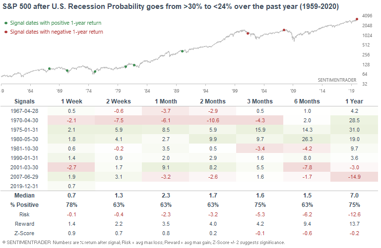
When the New York Fed's Recession Probability Model fell from 30% to 24% sometime over the past year, the S&P's returns over the next 6 months were mixed:
- The bearish cases occurred towards the start of a recession (e.g. 2001 and 2007).
- The bullish cases occurred towards the end of a recession (e.g. 1970, 1975, 1970).
Once again, the yield curve is something that bulls should be mindful of, but is not the end-all-and-be-all of trading.
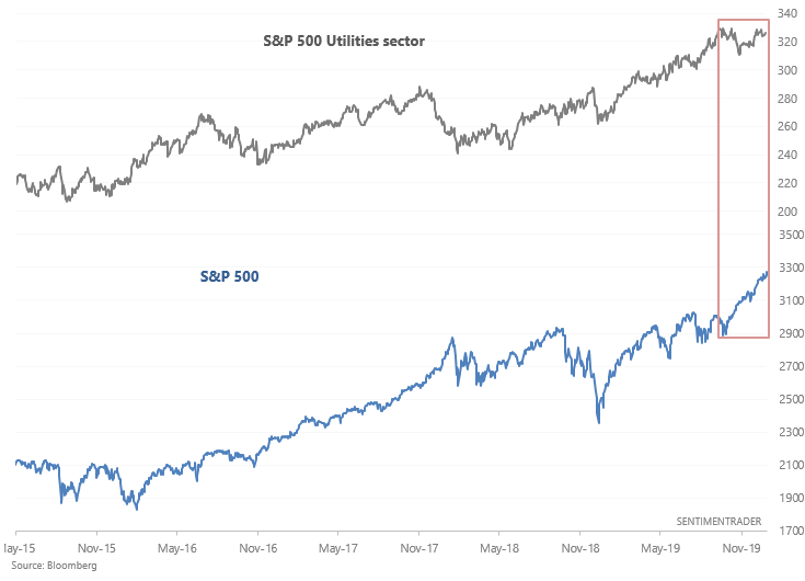
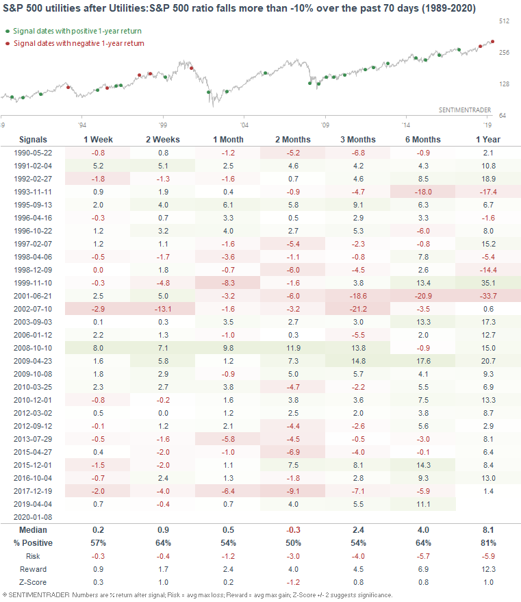
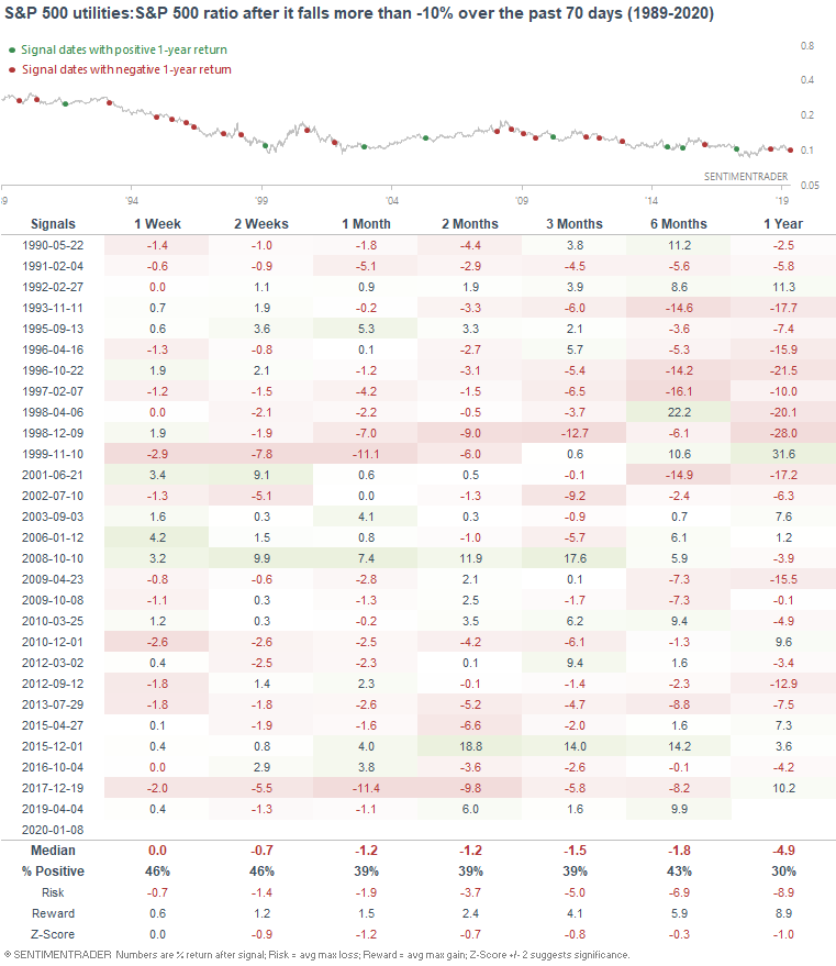
Abandoning utilities
As U.S. stocks surged over the past 3 months, there continues to be a notable shift away from defensive assets and sectors. The following chart compares the S&P 500 utilities sectors vs. the S&P 500. The broad U.S. stock market (particularly tech stocks) has surged while utilities have languished over the past 3 months.
As a result, the 70 day rate-of-change in the S&P 500 utilities vs. S&P 500 ratio has fallen to -10%.
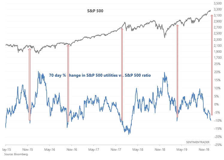
In the past, this often happened around:
- Market meltups (see late-2017), or...
- Periods when the market was climbing out a recent stock market crash or major uncertainty (see December 2015, October 2016, April 2019)
Here's what happened next to the Utilities sector:
Here's what happened next to the broad S&P 500:
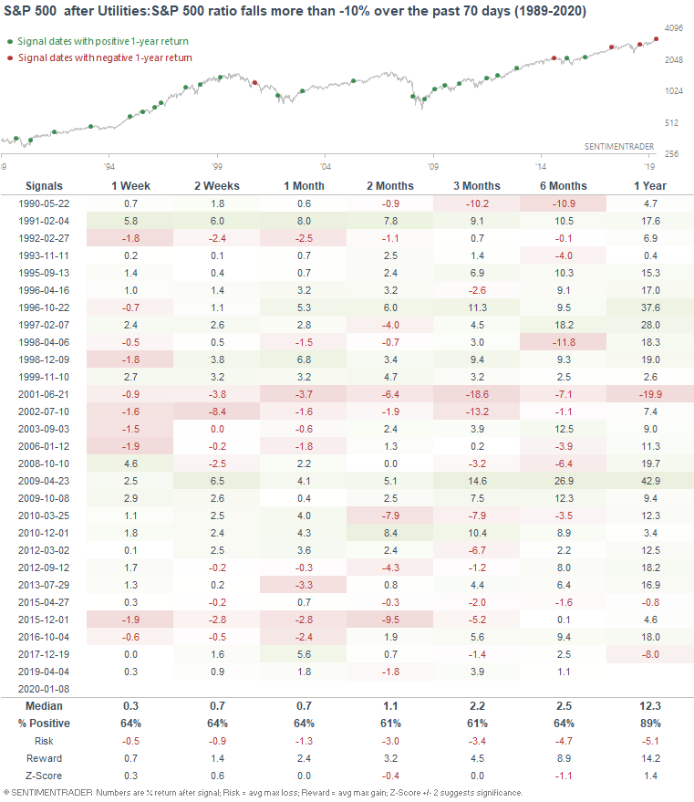
As you can see, this wasn't consistently bullish or bearish over the short term, but typically led to gains over the next year. And finally, it usually led to more underperformance for utilities over the next month:
My trading portfolio
My trading portfolio is allocated 50% in the Macro Index Model and 50% in the Simple Trading Model With Fundamentals. At the moment I have instituted a discretionary override and gone 100% long bonds (instead of long stocks) due to the extreme nature of many of our core indicators, even though some of these core indicators aren't in the models.
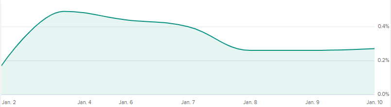
Performance in 2020 through to January 10, 2020:
- My trading account is up 0.27%
- Currently 100% in bonds