
What I'm looking at - Put/Call spike, Rydex flows, Rydex breadth, Economic Surprise & bonds
The stock market continues to bounce within a range. Here's what I'm looking at.
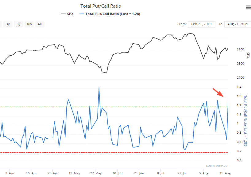
Put/Call spike
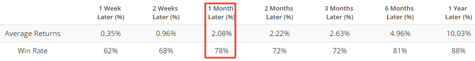
While the stock market rallied more than 0.8% yesterday, the Total Put/Call ratio spiked to the highest level since this pullback/correction began. This is extremely rare because the stock market and the Put/Call ratio often move in opposite directions each day. There is no other historical case in which the Put/Call ratio jumped more than 0.4 while the S&P also rallied more than 0.8%.
So let's relax the parameters to increase the sample size. Here's what happened next to the S&P when the Put/Call ratio spiked more than 0.3 while the S&P went up that day.
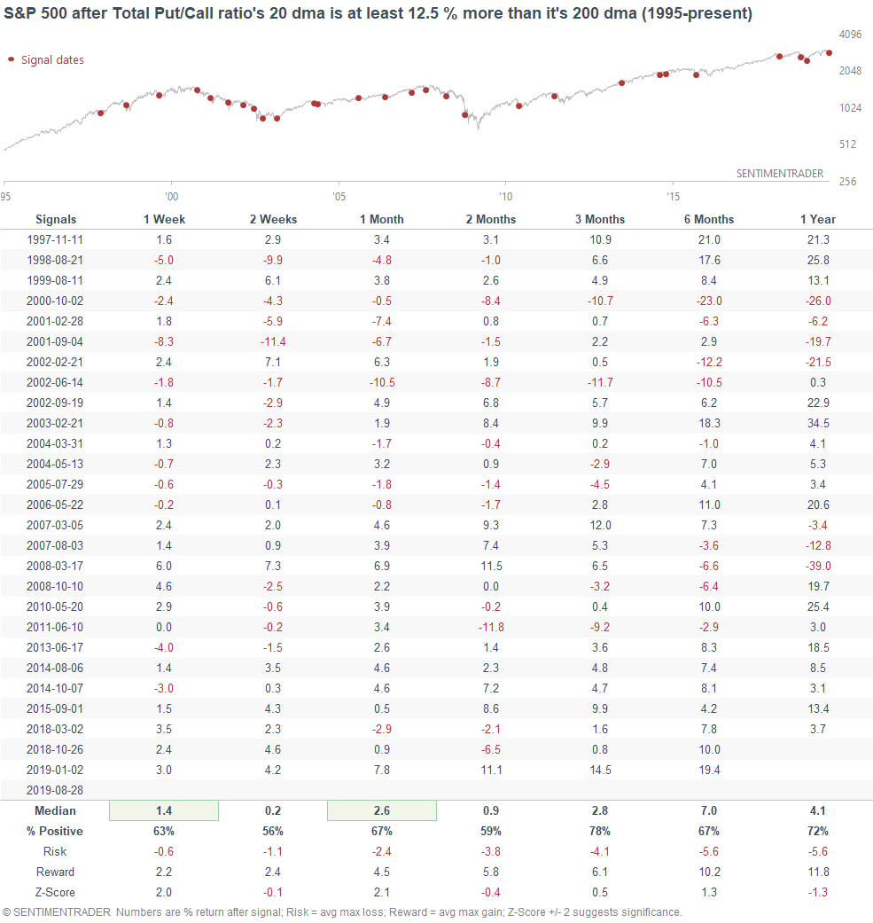
The S&P's returns over the next 1-3 months were more bullish than random. This seems to occur during pullbacks and corrections, when something is "spooking" (for lack of a better word) investors and traders. Sometimes these fears pan out, e.g. July & December 2015, December 2007, December 2000. But more often than not, these fears are unfounded.
Rydex Bearish Flow
The Rydex Bearish Flow indicator looks at how much money is flowing into bearish Rydex Funds. When this indicator exceeds 0.15, there is excessive pessimism (i.e. a lot of money flowing into bearish funds).
The Rydex Bearish Flow indicator exceeded 0.15 as of Tuesday. If we look at all the historical cases in which this indicator exceeds 0.15, the S&P's forward returns over the next 2 months are more bullish than random.
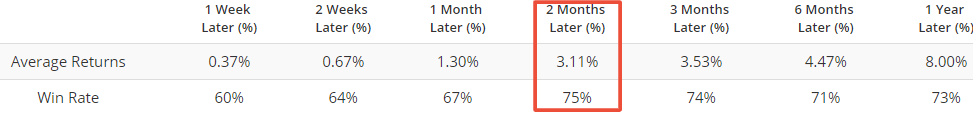
Most of the consistently bearish cases occurred from 2001-2002, when the stock market was stuck in a clear long term downtrend. So if we only look at the cases in which the S&P was above its 200 dma (e.g. right now), forward returns are more bullish.
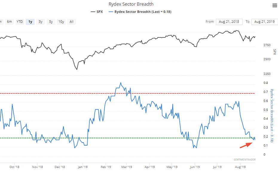
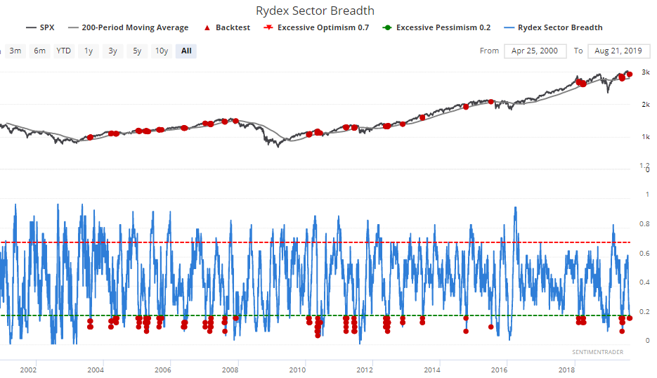
Rydex Sector Breadth
Rydex Sector Breadth is a breadth indicator that's based on the Rydex family of mutual funds. This indicator looks at the % of funds that have assets greater than their average over the past 50 days. When this figure is high, it means that there's a lot of money flowing into a wide array of funds. When this figure is low, it means that market timers are pulling their money out of a wide array of funds. Figures above 70% indicate excessive optimism, while figures below 20% indicate excessive pessimism.
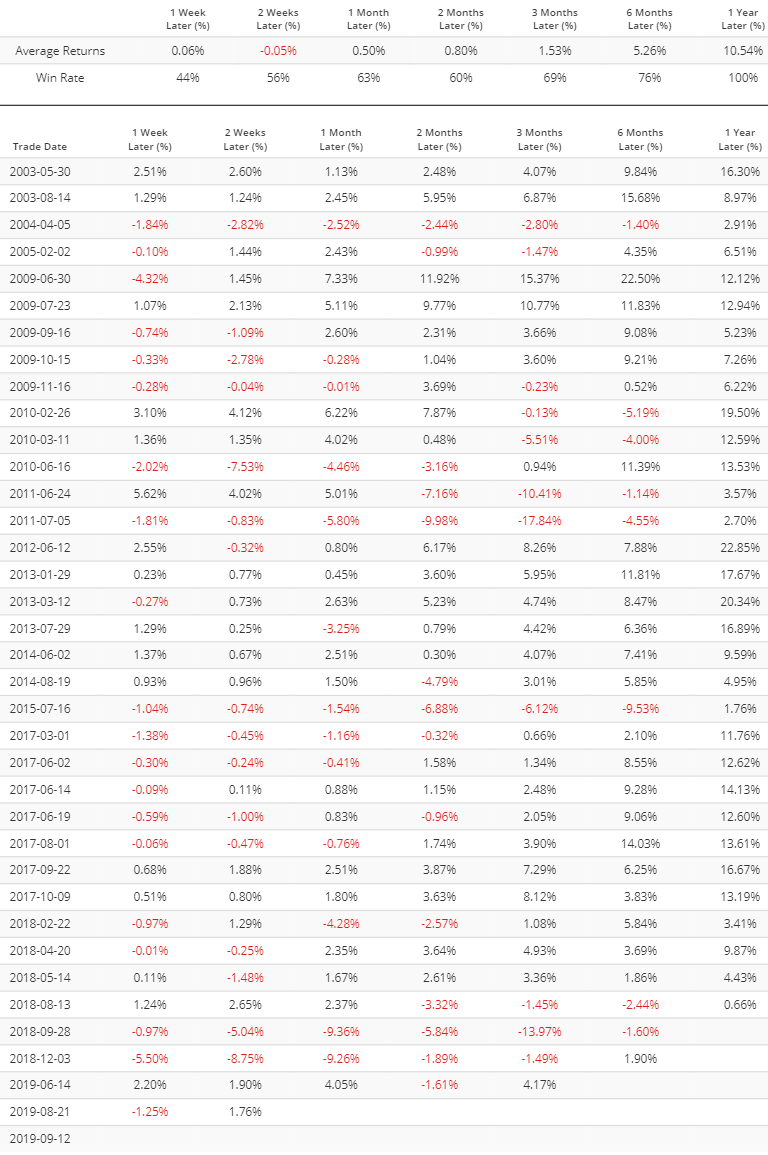
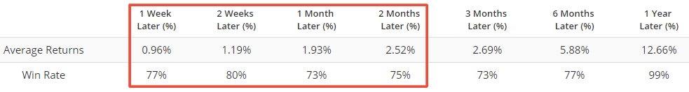
The Rydex Sector Breadth indicator fell below 20% this week, and remains here.
Similar breadth readings were often bullish for the S&P over the next month, but only when the S&P was above its 200 dma.
Economic data & bond yields
If you haven't read Dr. Ed Yardeni's book "Predicting the Markets", I highly recommend you do so. It's a great primer on applying fundamentals to various markets, and there are tons of insightful charts & indicators.
Yardeni spends a part of the book discussing the popular Citigroup Economic Surprise Index, a popular but often misunderstood indicator. This indicator is more useful in currencies, commodities, and bonds, even though most market watchers apply it to the stock market. Yardeni regularly overlaps the Economic Surprise Index with various markets. The following chart looks at the Economic Surprise Index vs. the 10 year Treasury yield's 13 week change.
*Why 13 weeks? Because the Economic Surprise Index is calculated using a rolling 3 month window of data. 3 months = 13 weeks (approximately).
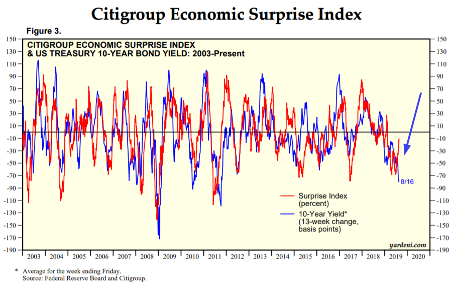
As you can see, the Economic Surprise Index and the 10 year yield's 13 week change are tightly correlated, but have diverged recently.
The Economic Surprise Index is finally going up right now after remaining depressed for many months. But bond yields remain depressed. This divergence may be seen as a positive for bond yields (and bearish for bonds).
But that hasn't always been the case. The following table looks at what happened next to the 10 year yield when these 2 indicators diverged. The 10 year yield didn't always go up, although the argument can be made that today is "most similar" to 2008 in terms of the Treasury yield's collapse.
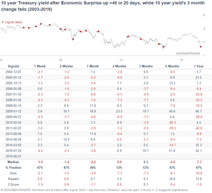
The reason why this "divergence" doesn't always work out is because Yardeni's chart compares the Economic Surprise Index vs. the 10 year yield's 13 week change. Just because the 13 week change goes up, doesn't mean that the 10 year yield is going up. It might just mean that the 10 year yield is still falling, but at a slower pace.
This is the problem with many charts that overlap an indicator with a market's rate-of-change, and uses the "leading indicator" to predict the rate-of-change. Predicting the rate-of-change isn't the same thing as predicting the market itself, because the rate-of-change is partially dependent on its starting point in time.