
What I'm looking at - Liquidity Premium, Bullish Percent Index, Down Volume, Equity Put/Call, Value Line Geometric Index
Hi everyone, it’s Troy. The market has been in a downtrend recently. This is my first post, so let’s dive straight into it.
SPY Liquidity Premium
As the stock market remains in a downtrend, market participants are favoring securities with more liquidity. Index ETFs such as SPY are generally deemed to have superior liquidity over the stocks that their underlying indices track. With lots of uncertainty right now in the markets, market participants are gravitating towards these vehicles.
As a result, our SPY Liquidity Premium indicator has surged to the highest level since the October 2018 stock market crash.
* The SPY Liquidity Premium compares the volume in SPY to the volume in the S&P 500’s underlying stocks. When this indicator is high, it means that ETF volume is high relative to the volume in underlying stocks. This suggests high uncertainty.
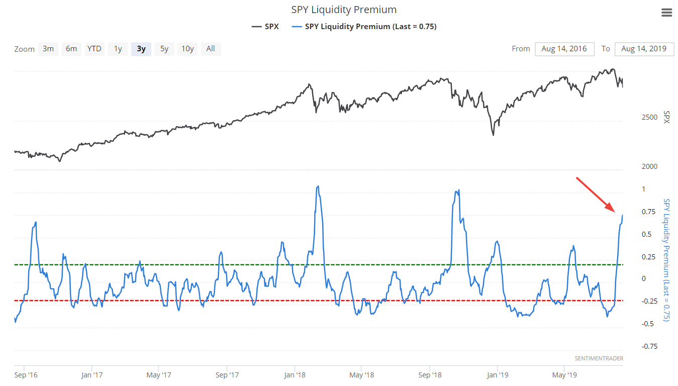
The following chart illustrates what happened next to the S&P when SPY Liquidity Premium reached 0.75 (e.g. now)
We can also only examine the cases that occurred while the S&P was in an uptrend (i.e. above its 200 dma).
Overall, the conclusion is similar. The S&P tends to bounce over the next week, but can have another DOWN leg after that. Corrections aren’t usually V-shaped. Corrections (which I define as declines that exceed 6%) usually see at least 2 DOWN waves, with the 2nd DOWN wave making a lower low vs. the 1st DOWN wave.
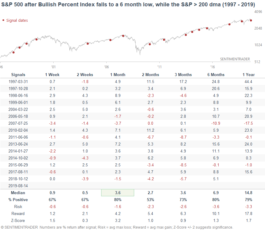
S&P 500 Bullish Percent Index
The S&P 500 Bullish Percent Index is a breadth indicator that looks at the number of stocks on a Point & Figure buy signal, relative to the total number of stocks. This figure is currently at 47.8%, which is the lowest reading in more than 6 months.
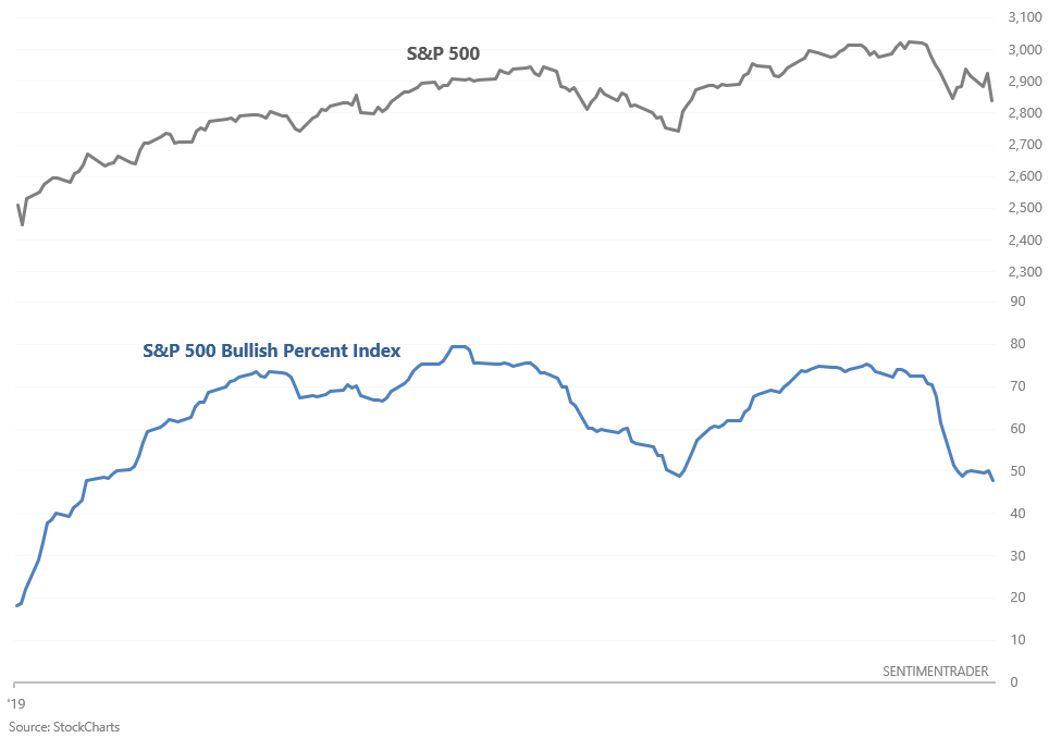
When this happened in the past while the S&P was above its 200 day moving average (e.g. today), the S&P’s 1 month forward returns were mostly bullish.
Down Volume
As many market watchers have noted, the stock market witnessed heavy selling yesterday. More than 90% of NYSE volume flowed into declining stocks. This is similar to what we saw during last Monday’s selloff.
*The following is the NYSE Up Volume Ratio, which is the inverse of the Down Volume Ratio.
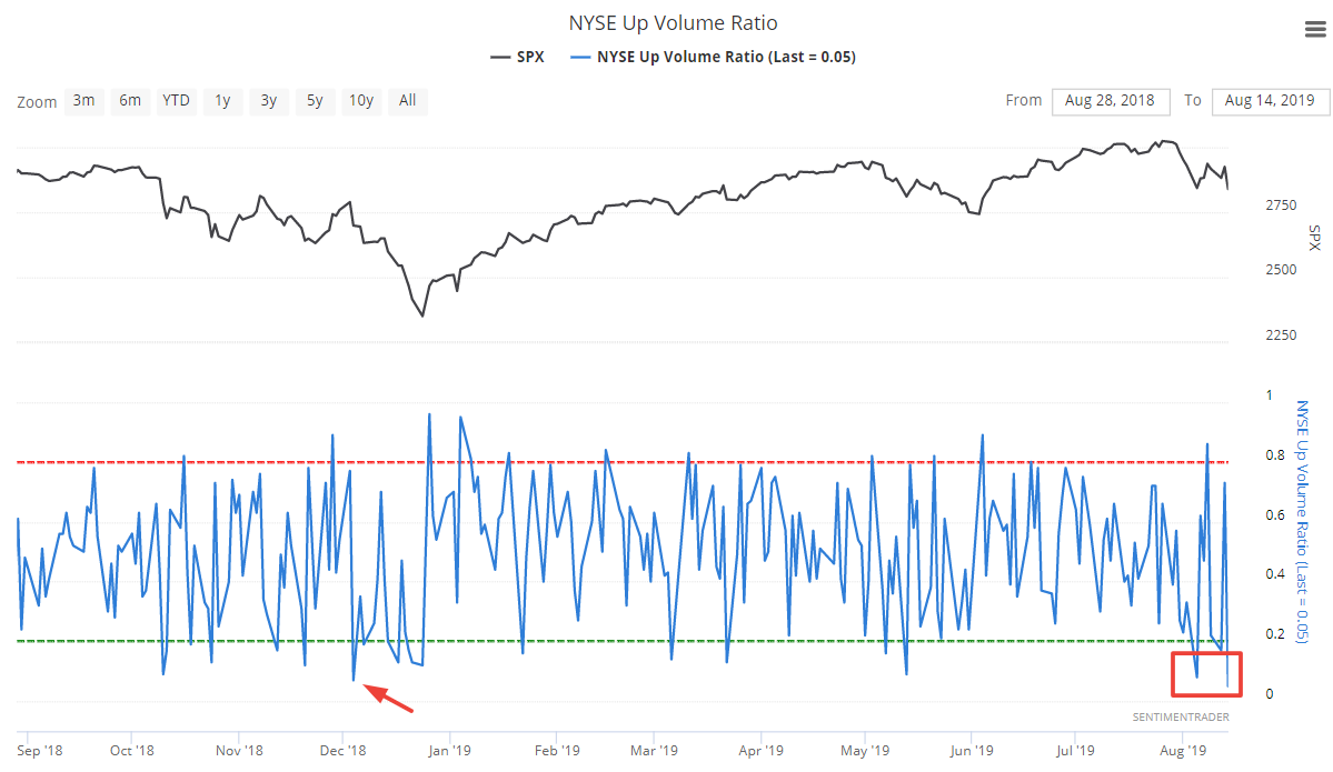
It’s rare to have 2 days of heavy selling so close to each other, particularly when the stock market is rather close to an all-time high. It’s more common for this to happen after the stock market has already tanked more than -15%.
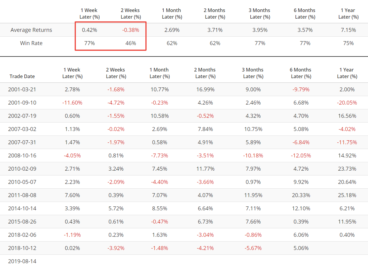
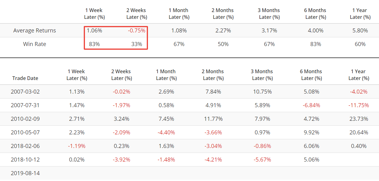
The following table illustrates what happened next to the S&P when 2 of the past 10 days have seen an Up Volume Ratio below 0.1
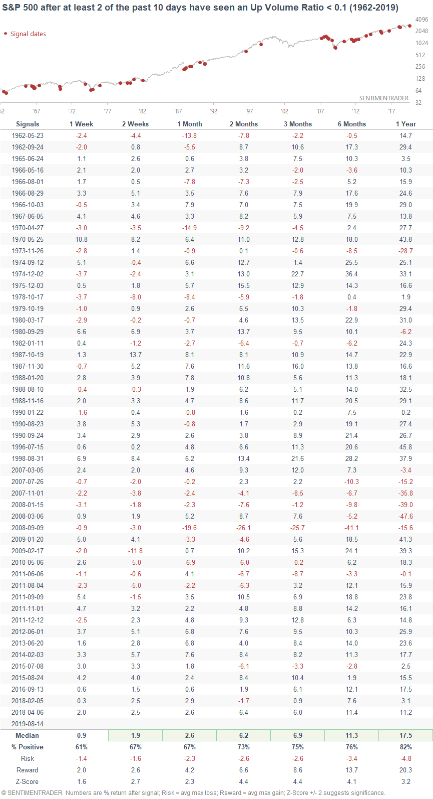
On its own, you can see that this is slightly more bullish than random for the S&P over the next few weeks. But if we only look at the cases in which the S&P is within -10% of a 1 year high…
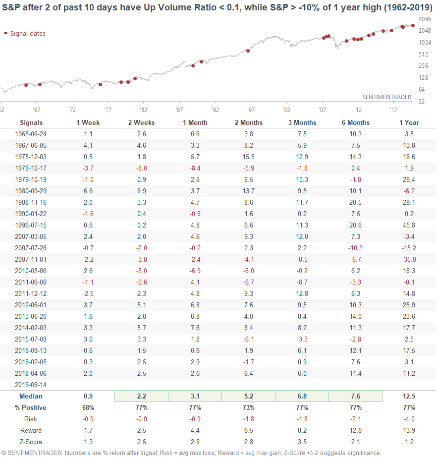
…. The S&P’s returns over the next 2-4 weeks become a little more bullish.
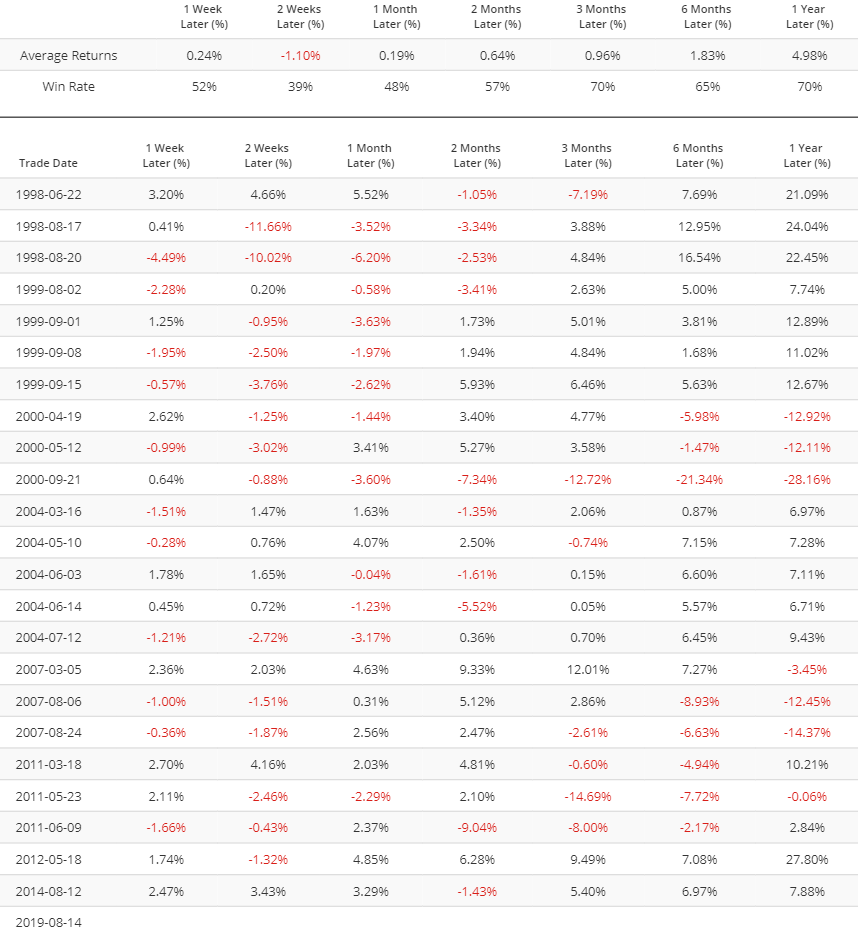
Equity Put/Call
But I want to caution investors and traders in thinking that the outlook over the next few weeks is decisively bullish. It isn’t. A rational investor/trader should remember that rarely will there be a time in which all the factors are bullish, or all the factors are bearish. As is the case with most corrections, it’s hard to know where the market’s exact short term bottom is.
The de-trended Equity Put/Call ratio has exceeded 0.18, which means that the Equity Put/Call ratio’s 10 day moving average is 19% above its 26 week moving average. This indicator is better than the Equity Put/Call ratio, whose average moves overtime (rendering an absolute value comparison less meaningful).
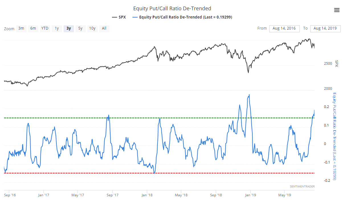
It’s easy to assume that this is a short term bullish sign for stocks, especially with the S&P still in an uptrend (above 200 dma). But that’s not what history suggests. Our Backtest Engine demonstrates that when this happened in the past, the S&P’s returns over the next 2 weeks were more bearish than random. Extreme can become more extreme. When this happened in the past, the S&P was lower 61% of the time 2 weeks later.
Valueline Geometric Index
And finally, the Value Line Geometric Index has made a new low vs. its May 2019 low, while the S&P is still above its May 2019 low.
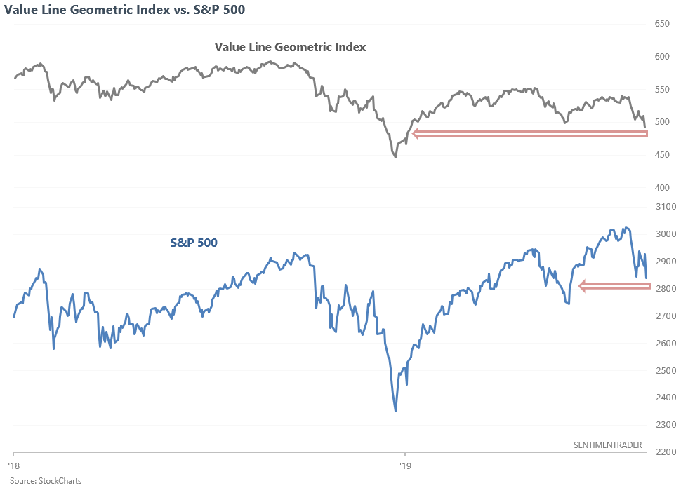
The Value Line Geometric Index is an equal-weighted index of 1600+ stocks in the Value Line Investment Survey. These stocks come from the NYSE, NASDAQ, AMEX, and TSX (Canadian stocks). Traders often use the Value Line Geometric Index as a breadth indicator that looks “under the hood”. The general thinking is that if the S&P is not breaking down but the Value Line Geometric Index is breaking down, then there is the potential for the S&P to follow suit.
There is some truth to this. The following chart illustrates what happened next to the Value Line Geometric Index when the index fell to a 6 month low, while the S&P was still more than +3% above its 6 month low.
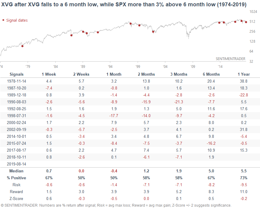
As you can see, the Value Line Geometric Index’s forward returns over the next few weeks and months were mixed. The risk:reward over the next few months wasn’t great for bulls, with some large stock market declines over the next few months (e.g. 2018, 2015, 2000, 1998, 1990).
Same thing applies to the S&P over the next few weeks. Not consistently bullish or bearish.
Conclusion
Overall, I don't see a strong edge in the short term right now. There are some bullish factors and there are some bearish factors, but nothing is decisive. The news-driven short term environment certainly doesn't help either. In coming posts we'll take a look at a 6-12 month forward time frame.