What I'm looking at - breadth for the S&P, NASDAQ, and Dow, stocks vs ETFs, stocks vs bonds, VIX spike and S&P's weekly drawdown
Here’s what I’m looking at:
Breadth for the S&P 500 (even more extreme)
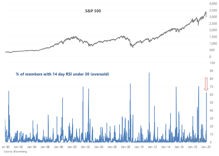
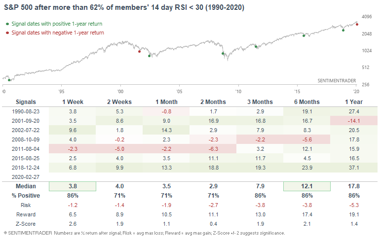
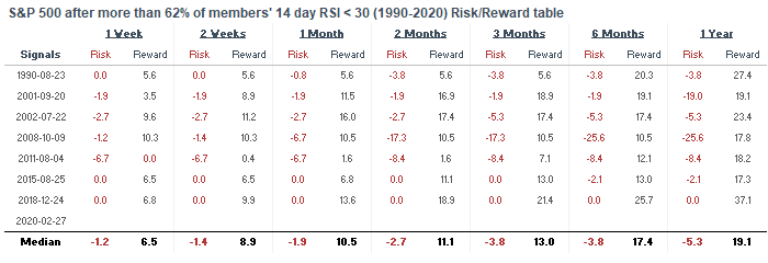
The stock market's continued decline has pushed indicators that were in somewhat-extreme-territory into very-extreme-territory. For example, more than 62% of the S&P 500's members are oversold (RSI < 30). This is a level that has only been matched a few other times in history:
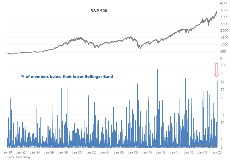
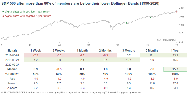
Similarly, the market's sudden crash has pushed more than 80% of its members below their lower Bollinger Band. Again, historic selling:
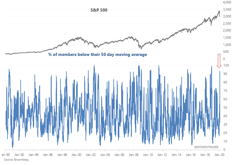
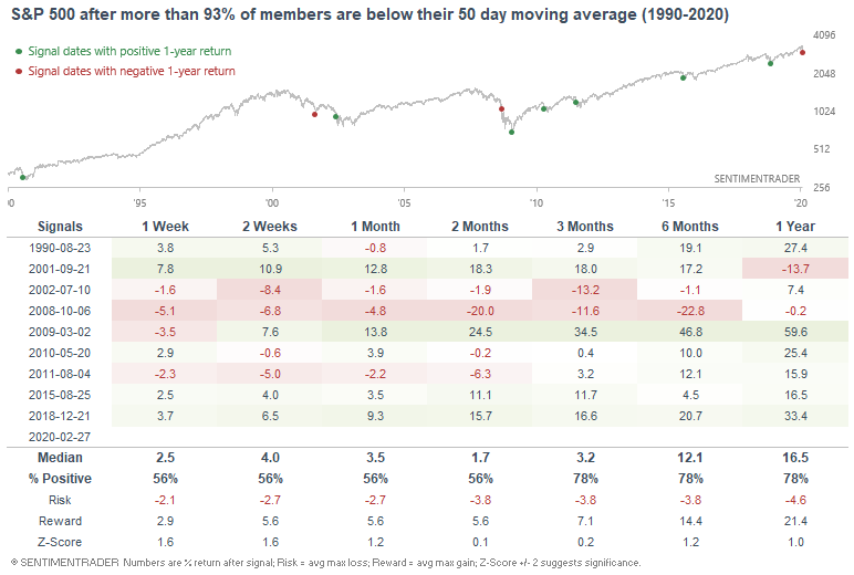
And finally, 93% of the S&P 500's members are below their 50 day moving averages. While not as extreme as the previous 2 breadth figures, this is still quite an extreme reading:
So what does this all mean? As one would assume, this is short term bullish for U.S. equities. While it doesn't mean that the exact bottom has arrived (no one can consistently and accurately predict exact tops and bottoms), it does mean that risk:reward is starting to favor bulls. Here's what the S&P did next when many of its constituents were oversold:
Here's what the S&P did next when most of its constituents crashed below their lower Bollinger Bands:

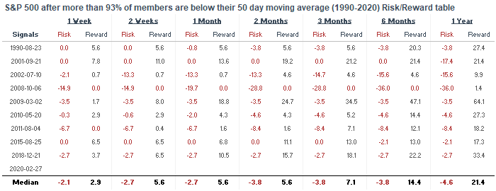
And here's what the S&P did when almost all of its constituents were in a medium term downtrend:
Breadth for Dow and NASDAQ 100
Without flooding you with a firehose of data, here's a quick glance at the same indicators, but for the Dow Jones Industrial Average and the NASDAQ 100.
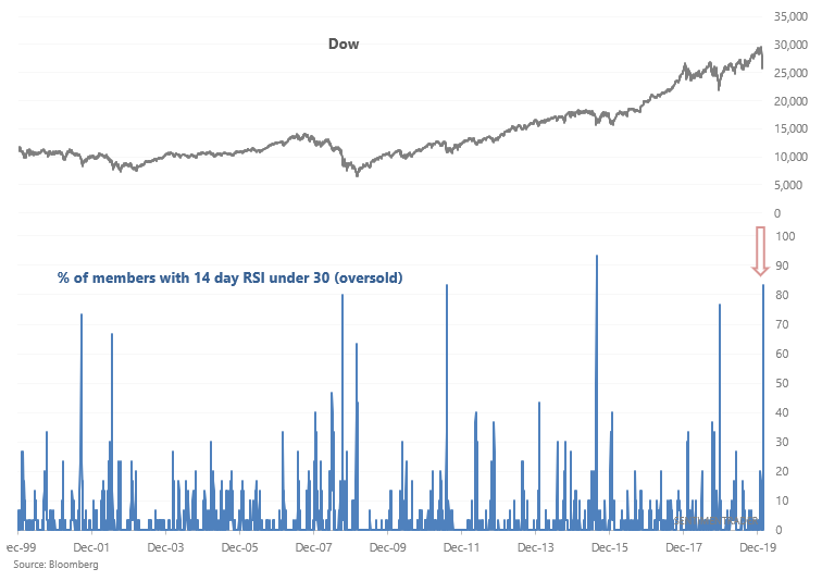
Here's the "% of members with 14 day RSI under 30" for the Dow:
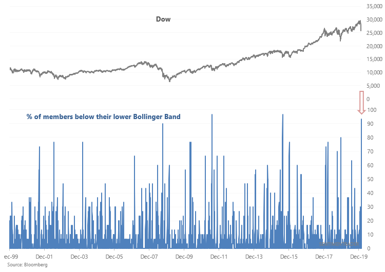
Here's the "% of members below their lower Bollinger Bands" for the Dow:
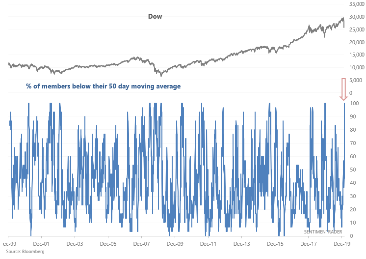
And here's the "% of members below their 50 day moving averages" for the Dow:
Here's the "% of members with 14 day RSI under 30" for the NASDAQ:
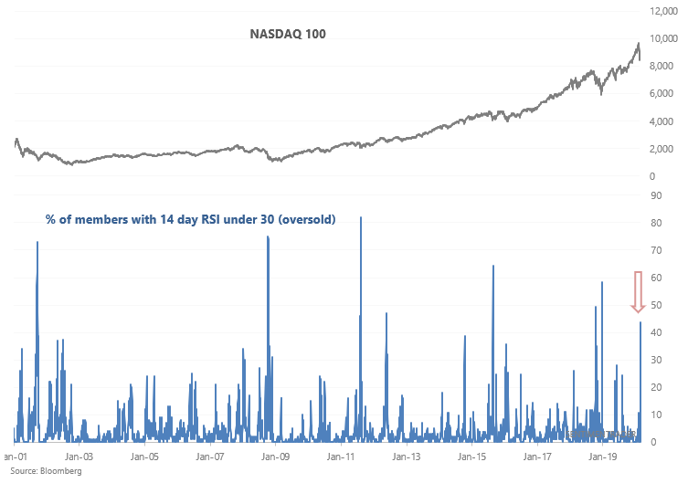
Here's the "% of members below their lower Bollinger Bands" for the NASDAQ:
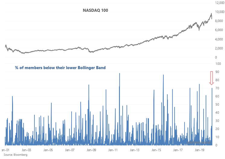
And here's the "% of members below their 50 day moving averages" for the NASDAQ:
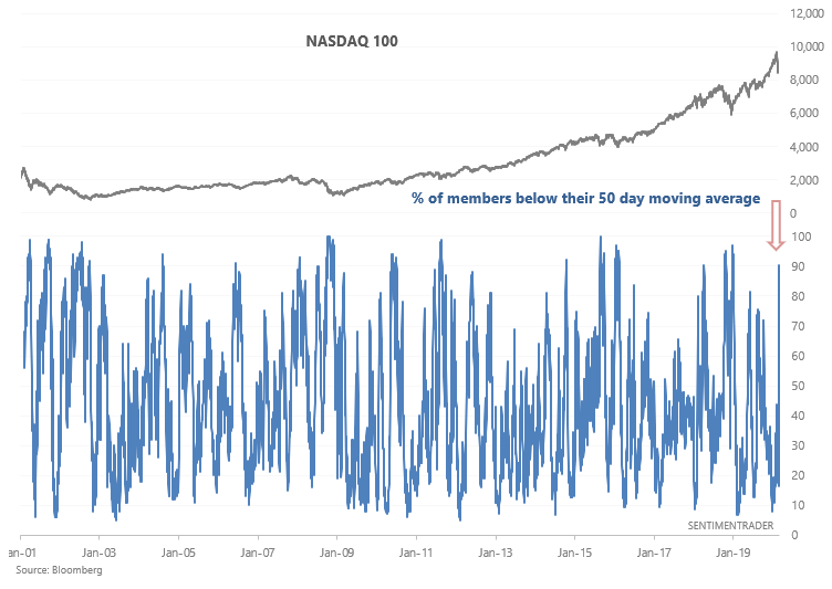
Stocks vs. ETFs and Stocks vs. Bonds
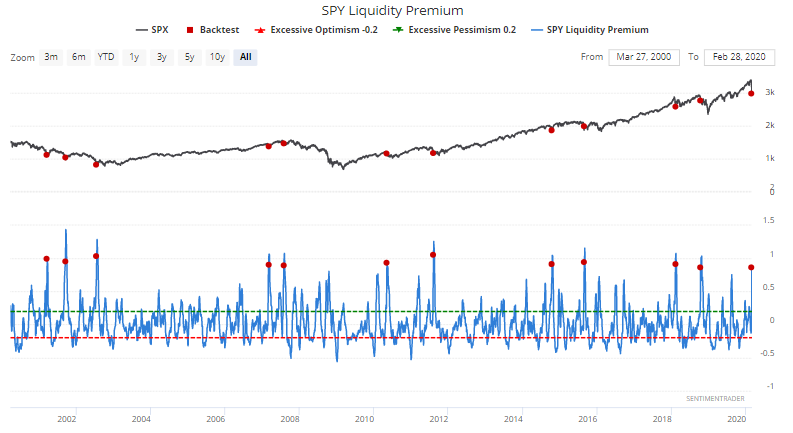
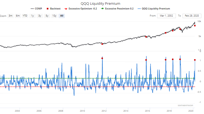
Our liquidity premium indicators compare the volume in ETFs vs. the volume in the ETFs' index's underlying stocks. For example, SPY Liquidity Premium compares SPY's volume vs. S&P 500 stocks' volume. When Liquidity Premium spikes, it typically means that volume is flowing into ETFs as panic sets into the market.
SPY Liquidity Premium has spiked over the past few days. As a short term signal, this isn't necessarily an all-clear sign. Stocks can fall more in the short term. But 3 months later, the S&P usually went higher.

Similarly, QQQ Liquidity Premium spiked over the past few days. Once again, this isn't a clear short term bullish sign, but was usually bullish over the medium term:

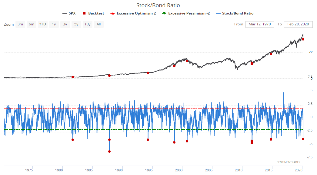
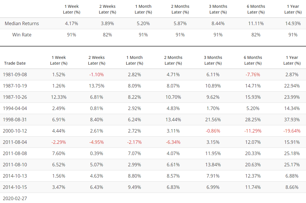
Bonds have surged as stocks tanked. Our Stock/Bond ratio is now extremely low, which historically was quite bullish for the S&P 500 on all time frames:
VIX
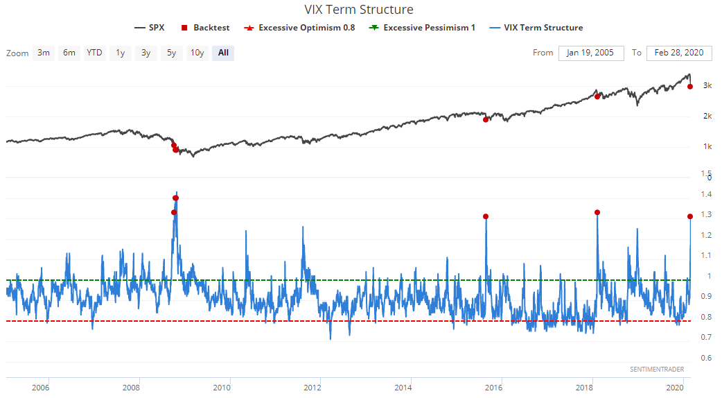
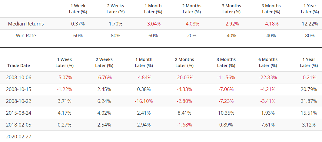
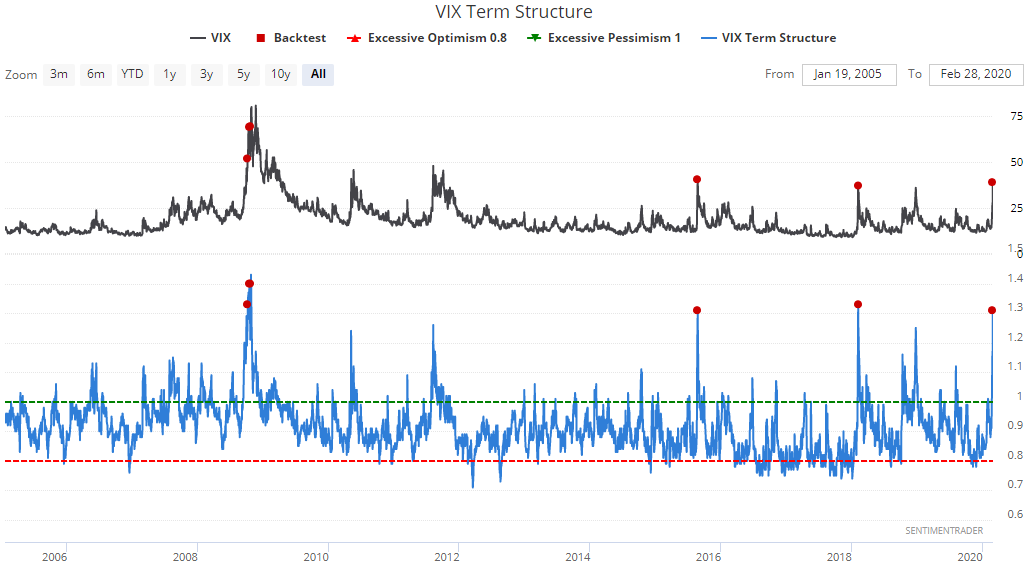
Without sounding too much like a broken record, the spread between 1 month and 3 month VIX futures has become even more extreme. This has only been matched 4 other times over the indicator's history. 2 of the cases occurred during one of the worst meltdowns in market history (2008). The other 2 came close to marking bottoms in a correction.
Here's what the S&P 500 did next:
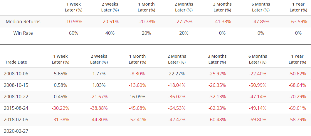
As is usually the case with VIX stats, this is more bearish for VIX than it is bullish for the S&P:
And lastly, I've seen headlines with the phrase "WORST WEEKLY MELTDOWN SINCE 2008". From a copywriting perspective, these headlines are effective since anything that compares today vs. 2008 is clickworthy. So let's have some fun.
Here's the S&P 500's maximum weekly drawdown (this week's lowest LOW $ / last week's CLOSE $).
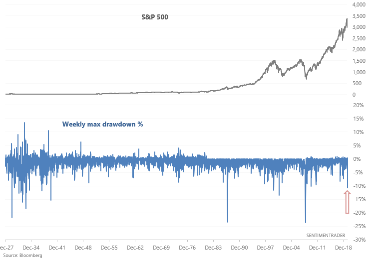
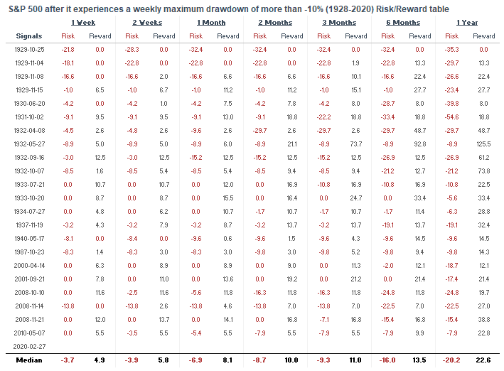
Here's every week with a max weekly drawdown greater than -10%. Notice how most of the cases occurred in recessions, bear markets, mega-crashes, or (better yet) THE GREAT DEPRESSION.
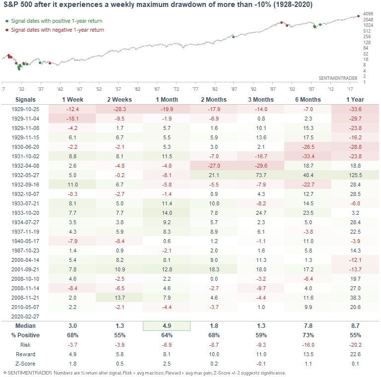
Perhaps I should publish a tweet with "WORST WEEKLY DRAWDOWN - ONLY MATCHED by the 2007-2009 bear market, 2000-2002 bear market, 1987 crash, and GREAT DEPRESSION. WE'RE ALL GONNA DIE". Unfortunately, this is the sort of hype-y stuff that's popular on Twitter.
How I allocate my assets
Instead of just sharing how I manage my own trading portfolio, here's how I allocate all my assets for the sake of full transparency. Some of these percentages are approximate, particularly for private assets (since private assets don't have a value on a day to day basis).
- 40% emerging market real estate.
- 20% trading portfolio. My trading portfolio is allocated 50% in the Macro Index Model and 50% in the Simple Trading Model With Fundamentals. Right now I am 25% long stocks and 75% long bonds (went long yesterday)
- 20% is a buy and hold position for the S&P 500 which I won't sell unless I see better opportunities in private markets. This IS NOT a trading position - here I care about the earnings yield. I expect this portion of the portfolio to see weak returns over the next 5-10 years given that valuations are high (and hence earnings yields are low).
- 20% in short term Treasury bond ETFs. This is a temporary placeholder. When opportunities arise I will sell these cash-like instruments to fund private market investments.
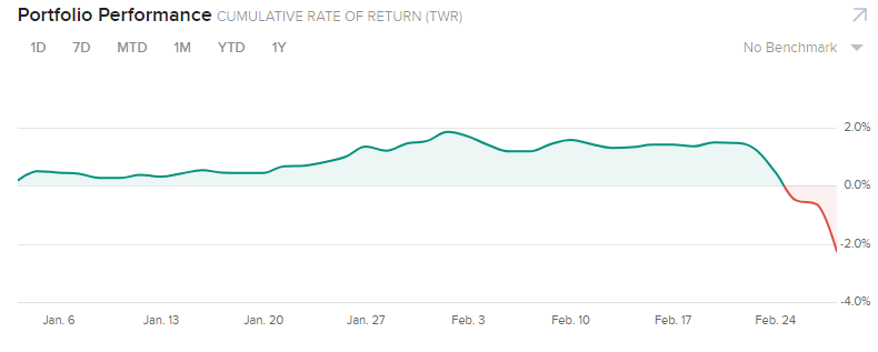
YTD 2020 performance for my public markets portfolio (trading portfolio, buy and hold position, temporary placeholder):
-2.27%
