
What I'm looking at - 2019 vs 2018, equity Put/Call, Value Line, breadth surge, AUD
With markets moving slowly around the holidays, here's what I'm looking at:
2019 vs 2018
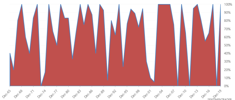
2018 was a year in which almost every market fell. By contrast, 2019 will most likely close out to be a year in which every market went up. Using 20 countries from the MSCI World Index, I created a chart that illustrates the % of countries' whose stock markets went up in a given year.
*Assuming that global stock prices won't fall significantly between now and the end of 2019.
*Countries = Canada, USA, Australia, Germany, HK, Japan, UK, Netherlands, Austria, Sweden, France, Spain, Finland, Switzerland, Belgium, Israel, Portugal, Norway, Italy, Singapore
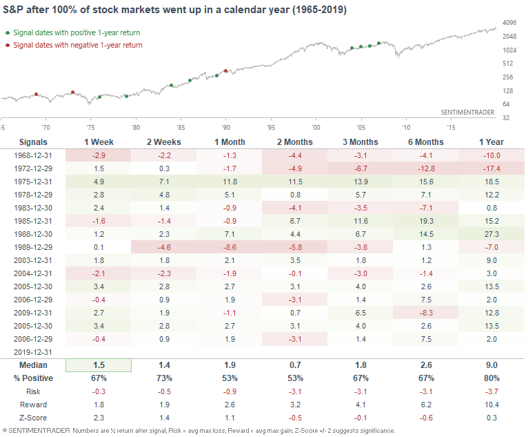
When practically every market around the world rallied in a year, the S&P 500 sometimes struggled over the next 1-2 months:
If we look at years in which every stock market rose after a year in which more than 80% of stock markets fell...
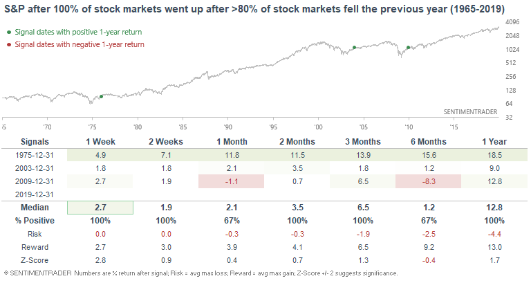
...the 3 historical cases occurred after major bear markets.
Equity Put/Call
The Equity Put/Call Ratio (de-trended), which looks at the ratio's 10 day average relative to its 26 week average, is now at its lowest level since January 2018. Stocks tanked and VIX spiked the last time this ratio was this low:
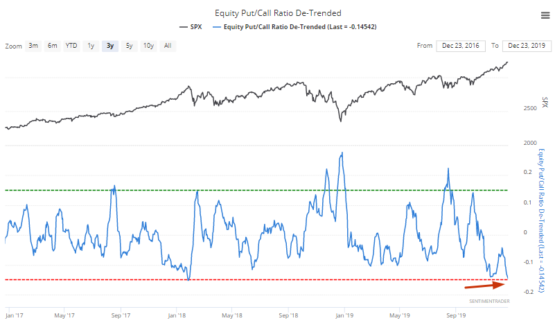
But to avoid recency bias, we can look at every case in which the Equity Put/Call ratio (de-trended) fell to -0.145:
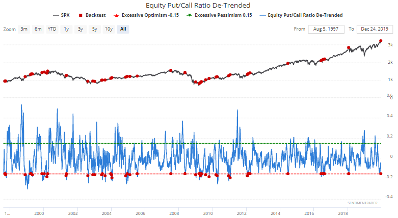
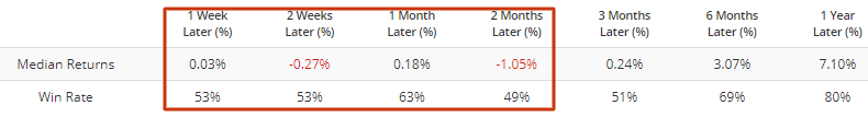
As you can see, the S&P's returns over the next few months were consistently worse than average. If we exclude overlapping signals over a 1 month period, we get the same result:
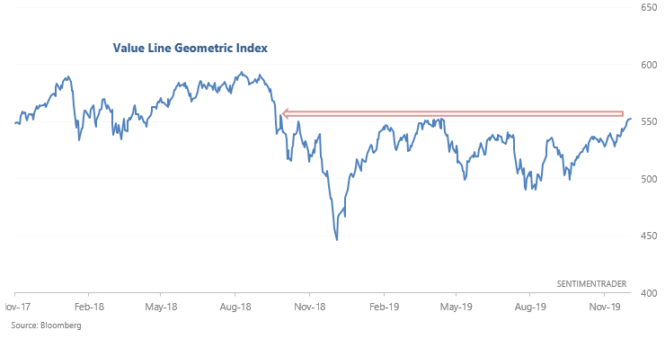
Value Line breakouts
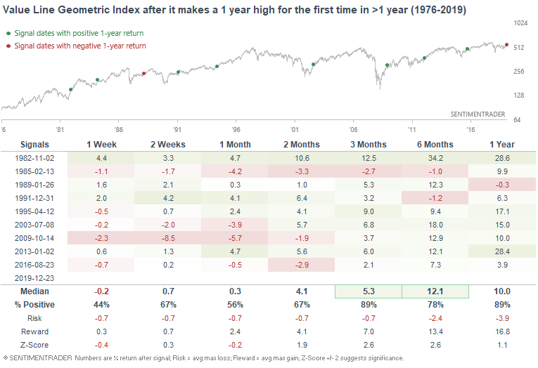
As I mentioned over the weekend, the Value Line Arithmetic Index has broken out to a new all-time high. Its cousin, the Value Line Geometric Index, broke out to a 1 year high yesterday.
*The difference between these 2 indices comes down to how they're calculated. One uses an arithmetic mean and the other uses a geometric mean.
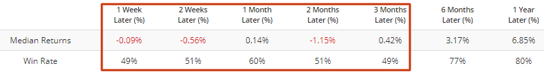
The following table illustrates what happened next to the Value Line Geometric Index when it broke out to a 1 year high:
The next table illustrates what the S&P 500 did next:
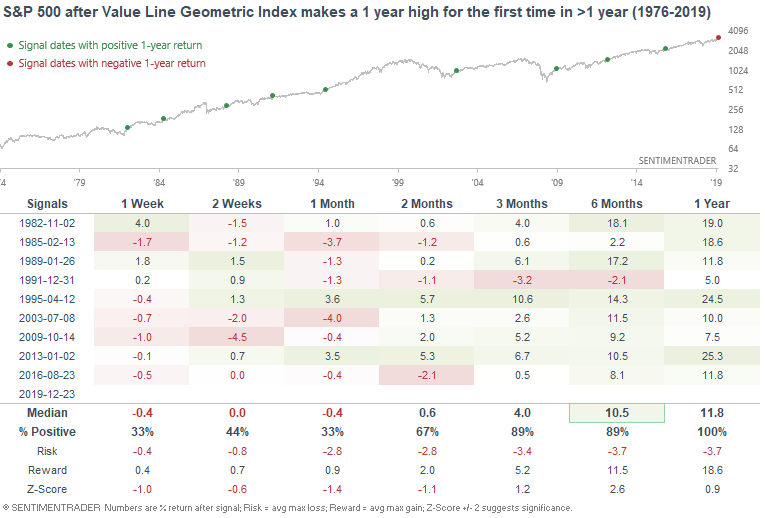
Returns over the short term were mixed/bearish, with many breakouts failing over the short term. But on a longer term basis (6-12 months later), this usually led to more gains.
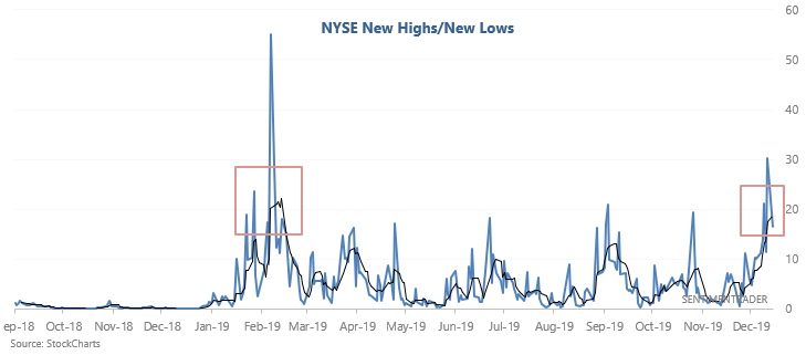
Breadth surge
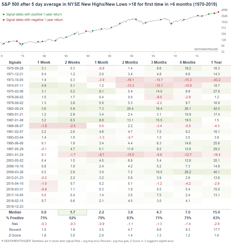
As the stock market continues to push higher relentlessly, more and more issues on the NYSE have been making new 52 week highs. I looked at this over the weekend, with the conclusion that this usually led to more gains for the S&P in the weeks and months ahead. Looking at this from another angle, the 5 day average in New Highs/New Lows has also climbed to the highest level since February:
Such breadth thrusts in the past usually led to more gains for stocks in the weeks and months ahead, particularly over the next 2 weeks. This goes against the many short term negatives we've looked at in recent posts.
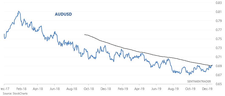
Australian Dollar
While the U.S. Dollar has been slowly trending higher over the past 2 years (since the trade war began), the Australian Dollar has tanked. But perhaps this trend is in the midst of a long term reversal. The USD's uptrend is losing steam, and the Australian Dollar has broken out above its 200 dma for the first time since early last year:
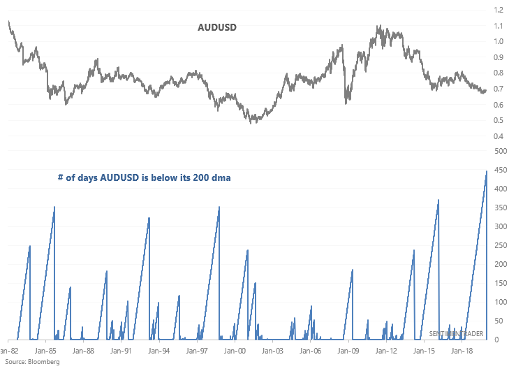
 This marks the end of the AUDUSD's longest downtrend streak since 1982:
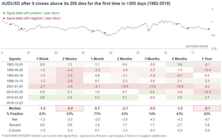
When the Australian dollar tried to reverse upwards for the first time in more than 200 days, risk:reward favored the downside over the next few months:
The sample size is small, so let's relax the parameters. The following table illustrates what happens next to the AUDUSD after it closes above its 200 dma for the first time in >6 months:
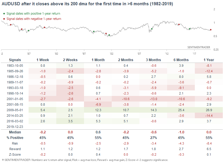
The Australian Dollar's returns over the next 3 months were still poor. Perhaps the U.S. Dollar will swing sideways for a while before it decisively breaks down. But then again, I don't trade currencies, so please take my thoughts on currencies with a grain of salt.