
TradingEdge for Dec 3 - Spit markets, new Small Cap correction, oil bear

Key points:
- There has been ample evidence of split market conditions in stocks
- A cluster of technical warning signs triggered recently
- A sudden spike in new 52-week lows tends to precede even more weakness
- Small-cap stocks fell into a correction, typically preceding further selling pressure
- Same for crude oil, which moved into a bear market for the first time in over 200 days
A questionable indicator with a good record signals caution
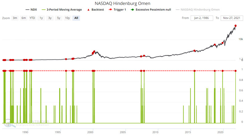
Jay showed that the Hindenburg Omen on the Nasdaq triggered on back-to-back-to-back days.
The Omen is a technical warning sign created by James Miekka in the 1990s, based on work from Norman Fosback in the 1970s. It monitors conditions that analysts have looked at throughout history as signifying potential weakness underlying the market. On the site, we calculate it for both the NYSE and Nasdaq exchanges.
We use three criteria, which may differ from other sources:
- The Nasdaq 100 is above its 50-day moving average
- Both new 52-week lows and 52-week highs on the Nasdaq are greater than 2.8% of all advancing and declining issues
- The Nasdaq McClellan Oscillator is negative
When the signal triggers, it highlights a "split" market, which is unhealthy. Multiple signals in a cluster are a worrying sign. Traditionally, the signal is canceled after 30 days or if the Oscillator turns positive again, though we've seen that it can lead to market trouble several months in advance.
The criteria we will use is a 3-day average equal to 1, meaning three consecutive days all meeting the Hindenburg criteria. For this test, we will include overlapping signals. The input screens appear below. You can run this test by clicking here.
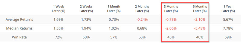
It is essential to understand what this signal does and does not imply. What it does not imply is that a massive bear market is necessarily in the offing. What it does imply is that the next 3 to 6 months are far less likely to be the type of smooth sailing that stock market investors have gotten very comfortable with over the last 12+ months. Stock and strategy selection are likely to be much more critical in the months ahead
It's not just the Nasdaq and not just the Hindenburg
Everyone's favorite technical punching bag is back. Non-technical market people love to make fun of warnings like the Hindenburg Omen. The hyperbolic name, combined with the occasional failure, makes it a go-to source of comedy for those opposed to technical analysis, market history, and data mining.
Single warning signs, like we saw in March, are less of a worry. It's a more significant issue when we see multiple days of warnings and on more than a single exchange.
This is a problem now because they've been firing consistently lately, ahead of Friday's carnage. In just 5 days, a combined 12 warning signs have triggered between the NYSE Hindenburg Omen, Nasdaq Hindenburg Omen, NYSE Titanic Syndrome, and Nasdaq Titanic Syndrome.
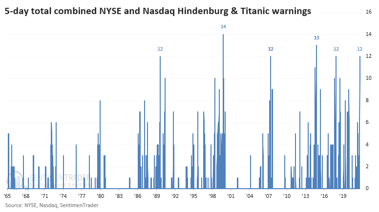
It's been rare to see such a big cluster of warnings across both exchanges over the past 25 years. The handful of times these clusters popped up, the S&P 500 had a tough time holding any upside momentum.
When we look at the price path of the S&P after each of the signals, we can see that there was quite a bit of variability, especially over the next 6 months or so. The average was negative, and all of the signals eventually sagged as time elapsed.
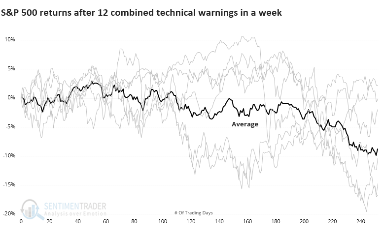
Among sectors and factors, there weren't many places to hide after these warning clusters. Defensive stocks held up the best over the next year, with decent returns in Staples, Utilities, and Health Care.
The split is due to many stocks sinking to new lows
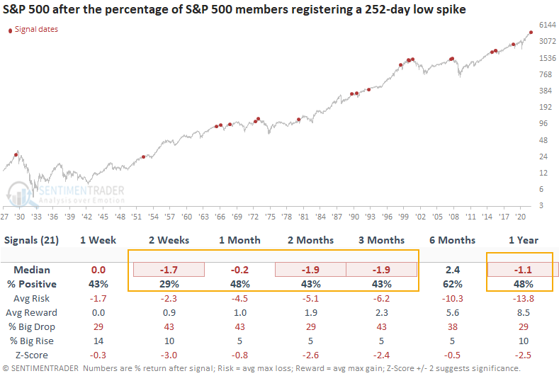
Dean looked at a new signal from a voting member in the TCTM Risk Warning Model, which registered an alert on Tuesday. The component is called the New Lows Spike Model.
The model identifies when the percentage of S&P 500 members registering a 252-day low exceeds 7.7%. At the same time, the S&P 500 must be down 5% or less from its most recent high. According to our data, new lows increased to 8.38%, with the S&P 500 down 2.92% from its high.
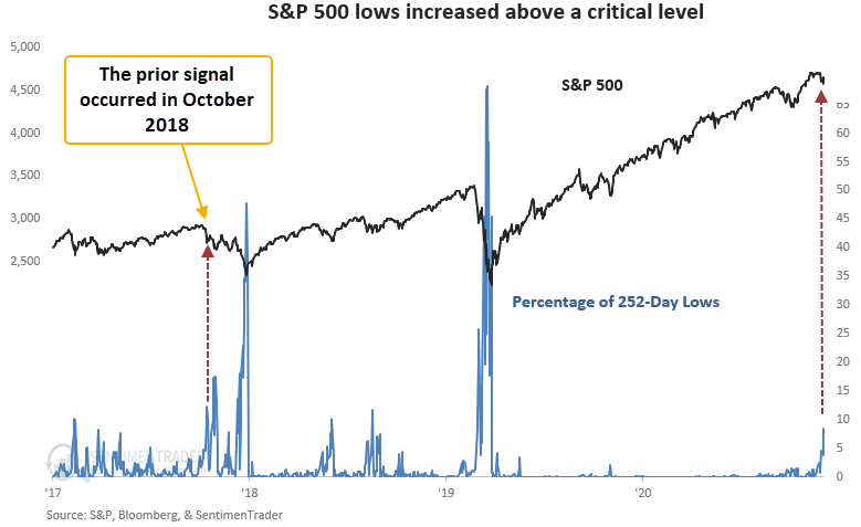
This signal triggered 21 other times over the past 93 years. After the others, future returns and win rates were weak on a short and medium time frame with several unfavorable risk/reward profiles, especially the 2-week window. The long-term results, while soft, are influenced by whether a signal marked a correction or a bear market peak. i.e., corrections show favorable 1-year returns.
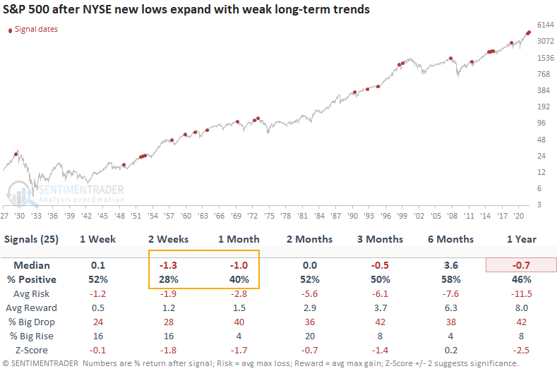
Applying the same concept to New York stock exchange members, the model also triggered a signal on Tuesday.
As a percentage of highs and lows, new lows have risen to the highest level since the pandemic crash. At the same time, the percentage of NYSE common stock members above their 200-day moving average has deteriorated to the lowest level in more than a year. When Dean compared the long-term stock trends to the price of the S&P 500, the divergence is noteworthy.
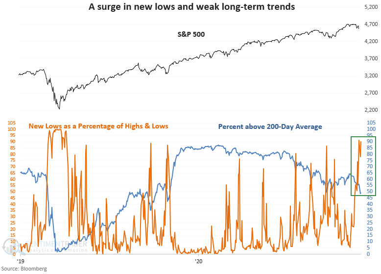
This signal triggered 25 other times over the past 93 years. After the others, future returns and win rates were weak in the 2-4 week time frame. The 1-year results look unfavorable. However, I would note that most of the negative signals occurred before 1973.
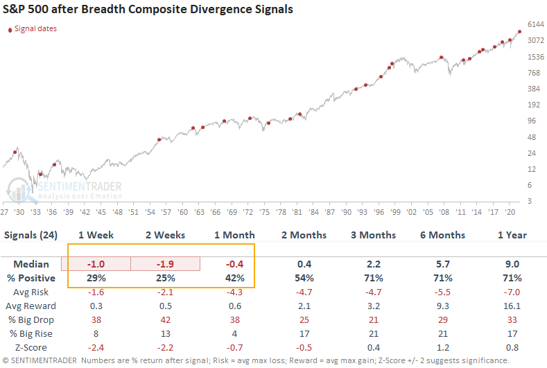
Other breadth measures are showing a negative divergence
Dean noted that a new signal from a voting member in the composite risk-off model registered an alert last Friday. The component is called the Breadth Composite Divergence model.
The composite includes the following long-duration indicators:
- S&P 500 percentage of issues above the 200-day moving average
- S&P 500 percentage spread between 252-day highs and lows
The composite peaked in May and has made a series of lower highs and lower lows. Conversely, the S&P 500 has made a series of higher highs and higher lows. This pattern is known as a bearish divergence setup.
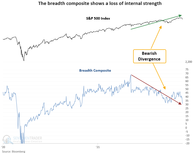
This signal has triggered 24 other times over the past 93 years. After the others, future returns and win rates were weak in the short term with several unfavorable risk/reward profiles. The long-term results look slightly better than historical averages, even with a few notable signals around significant market peaks.
Small-Caps fall back into a correction
Earlier this month, the small-cap Russell 2000 broke out of a long consolidation. When it's done that before, it had a strong tendency to keep going. While short-term returns were modestly positive, the index showed a positive return 2 months later 16 out of 18 times.
After its latest attempt, it promptly failed. And failed hard.
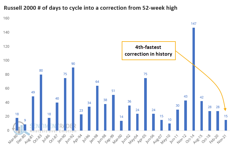
Within only a few weeks of trading at an all-time high, the Russell is already back into correction territory. This is its first drawdown of more than 10% (rounded) in more than a year.
At only 15 days removed from a 52-week high, this is the Russell 2000's 4th-fastest correction.
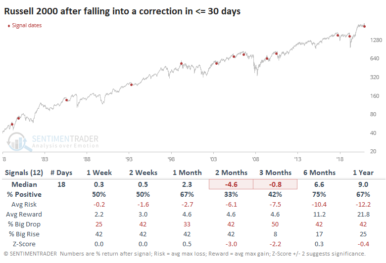
Since the Russell's breakout failed (so far) to follow through on its historical tendencies, maybe we can't rely on its failure either. But for the most part, fast corrections equaled negative future returns for the small-cap index. Quick failures were not a good sign for these stocks, with 9 out of the 12 signals leading to a negative return either 2 or 3 months later. A few of them bounced in the short-term then crapped out.
This quick correction is also the Russell's first substantial pullback in a long time. It ends a streak of nearly 300 trading days since it last traded more than 10% below a 52-week high.
The first correction in more than 200 days tended to precede weak short-term returns and below-average medium-term ones. Out of the 14 other signals, only 2 managed to see large and sustained gains in the months ahead (June 1992 and July 1996). Most of the others either saw weak medium-term returns, or strong ones that ended up being given back over the next 6-12 months.
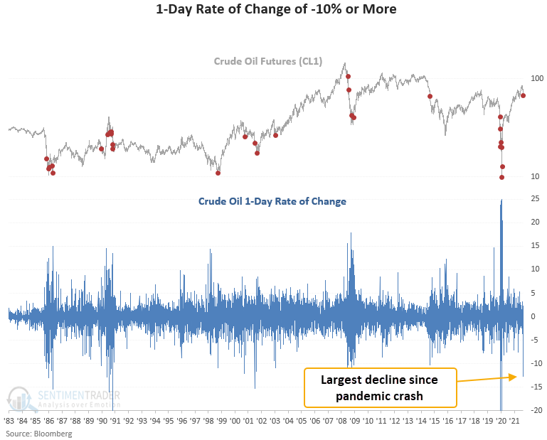
Crude oil's dead-cat bounce
Crude oil just enjoyed a big bounce from an even bigger decline. Traders are wondering if that bounce is more likely to be of the "dead cat" variety.
According to Dean's data, a 1-day decline of 12% or more has only occurred 16 times since 1983. When he included a condition that crude oil also closes at a 42-day low, the number of instances drops to seven.
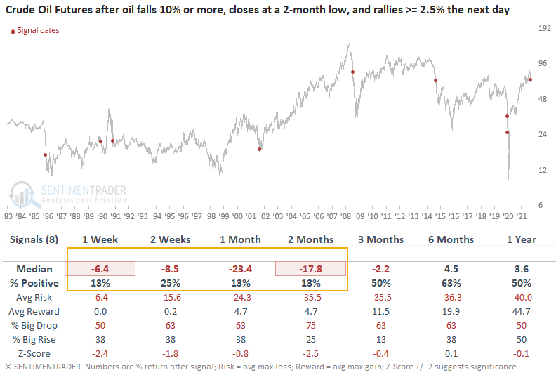
Let's assess the outlook for crude oil when the commodity falls 10% or more, closes at a 42-day low, and subsequently rallies 2.5% or more on the next trading day. I lowered the 1-day rate of change threshold to -10% to increase the sample size.
This signal triggered 8 times over the past 36 years. After the others, future returns and win rates were weak in the short term with several unfavorable risk/reward profiles. And, several of the time frames showed a loss in 7 out of 8 instances. Every signal showed a loss either 1 or 2 months later.
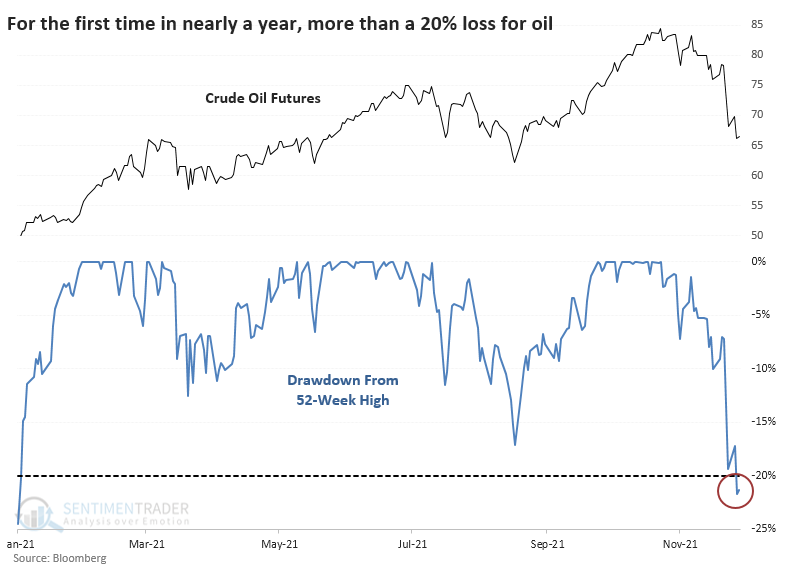
As it falls into a correction
After a plunge to start the week, crude oil bounced back quickly. The selling pressure was enough to push it more than 20% below its prior 52-week high, the first bear market in nearly a year.
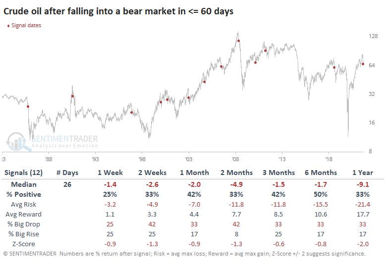
It took crude oil only 24 days to cycle from a new high to a bear market. This is relatively quick but not totally out of bounds for such a hit-or-miss market. Since 1985, there have been 12 other times when oil cycled into a bear market in under 60 days, and it was not a good sign for future returns. Over the next 2 months, oil rebounded only a third of the time.
There is not a perfect correlation between crude oil and the price of Energy stocks. Even so, these new bear markets in oil were not all that great of a sign for the sector, even when using total return, which includes sometimes-hefty dividend payouts.
According to Bloomberg, the currency with the most significant 60-day correlation to crude oil is the Canadian dollar. So, it's not too surprising that currency had trouble holding any gains.
This week's drop also ended nearly a year-long bull run in oil. It had been 228 days since oil was more than 20% below a 52-week high, ending one of the longer positive streaks in the history of the futures contract.
The ends of long periods without a bear market were even worse for oil prices going forward. Over the next 2 months, oil lost ground after 11 out of 14 signals.
Another bad sign for commodities - a falling Aussie dollar
The Australian Dollar has a long history of tracking closely to the price of a basket of commodities. Jay showed that after 16 months in a bullish trend, the Aussie dollar closed November below a critical moving average - in turn flashing a warning sign for commodities.
The chart below shows the growth of $1 invested in the GSCI only when the Aussie dollar closed the previous month above its 24-month moving average. That $1 grew to $60.87, a return of +5,987%.
The chart below shows the growth of $1 invested in the GSCI only when the Aussie dollar closed the previous month below its 24-month moving average. Here, that $1 declined in value to just $0.22, a return of -78%.
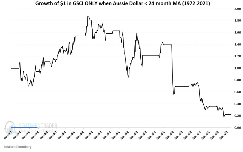
Commodities as an asset class have performed vastly better over the past five decades when the Aussie Dollar was above its 24-month moving average. The Aussie Dollar just closed back below its 24-month moving average and while this by no means guarantees that commodities are doomed to decline, it removes a very favorable factor from the bullish side of the ledger.
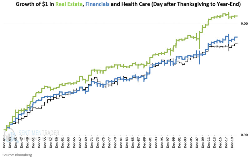
At least these 3 sectors tend to do well
Certain sectors tend to perform well late in the calendar year. Jay noted that 3, in particular, tend to do well, those being Real Estate, Financials, and Health Care.
For our test, we will focus on the period beginning at the close on Friday the day after Thanksgiving through the end of the calendar year. We will compare the performance of the Real Estate, Financial, and Health Care sectors to that of the S&P 500 index from 1942 through 2020.
The chart below shows the hypothetical growth of $1 invested in those 3 sectors during this stretch of time.
The chart below displays the growth of $1 split evenly each year among the three sectors, versus the growth of $1 invested in the S&P 500 Index each year only during the Post-Thanksgiving through Year-end period. In the 3 sectors, $1 grew to $7.66 versus only $3.68 in the S&P.
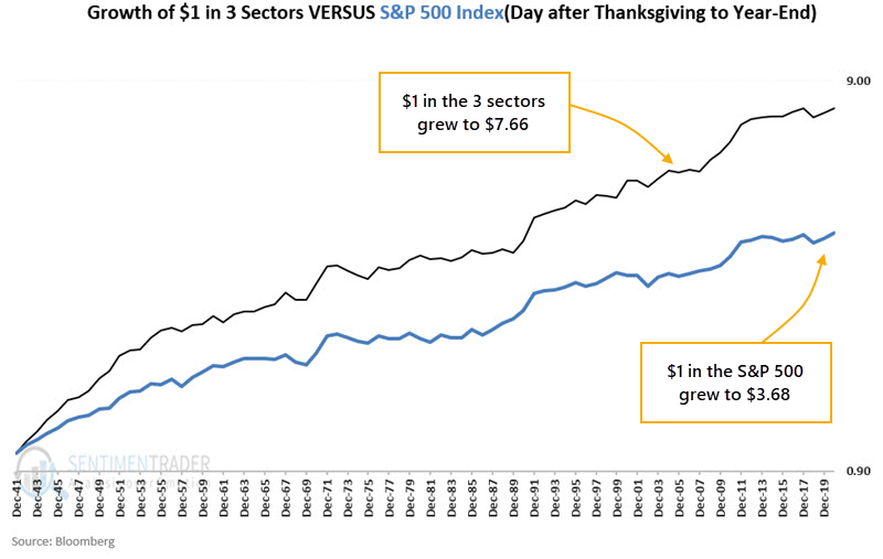
The three-sector portfolio has shown a gain during 70 out of 70 rolling 10-year periods (100%), while the S&P 500 Index has shown a gain during 67 out of 70 rolling 10-year periods (95.7%). The three-sector portfolio has outperformed the S&P 500 Index 64 out of 70 rolling 10-year periods (91.4%).
About the Weekly Wrap...
The goal of the Weekly Wrap is to summarize our recent research. Some of it includes premium content (underlined links), but we're highlighting the key focus of the research for all. Sometimes there is a lot to digest, with this summary meant to highlight the highest conviction ideas we discussed. Tags will show any symbols and time frames related to the research.