
TradingEdge for Aug 27 - Breadth Lags, Then Thrusts, Gold's Tough Time


The goal of the Weekly Wrap is to summarize our recent research. Some of it includes premium content (underlined links), but we're highlighting the key focus of the research for all. Sometimes there is a lot to digest, with this summary meant to highlight the highest conviction ideas we discussed. Tags will show any symbols and time frames related to the research.
| STOCKS | ||
|  | |
For the first time in years, two of our core measures for a long-term, broad look at how healthy stocks are is the NYSE McClellan Summation Index and the Net % of New Highs - New Lows. And right now, they're signaling caution.
Despite the S&P rallying on Friday to close within 1% of its prior high, and another push on Monday, the Summation Index is negative. The worst possible combination for this indicator is when it is below zero and declining.
On the NYSE, there are also now more securities falling to 52-week lows than rising to 52-week highs. When this is below zero, the S&P's annualized return is only about a third of what it is when it's above zero.
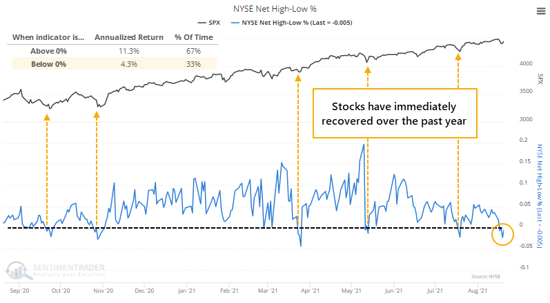
Bulls could justifiably argue that every time this has happened in the past year, the S&P 500 almost immediately turned around and resumed its advance. Fair point. So, we should watch to see if this time will be any different, which would suggest that the environment has changed.
The table below shows every time since the late 1920s when the S&P was within spitting distance of a 52-week high and both the Summation Index and Net NH - NL were negative.
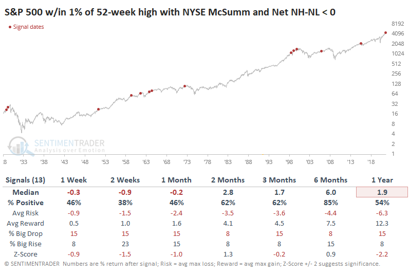
The only instance when stocks escaped unscathed was 2005. There is a bit of boy-who-cried-wolf with this type of analysis because it hasn't worked at all in 2021. This time, the potential difference is that it's really the first time such broad and long-term metrics were so poor despite the major indexes holding near their highs. This has been a dangerous combo in the past.
DEBT (AND CASH) SEE BIG DROP
Curiously, even as the S&P has moved to new high after new high, investors have pulled back on the amount they're borrowing against their stock holdings. The latest figures, aggregating customer data through July, shows that Margin Debt dropped from record levels.
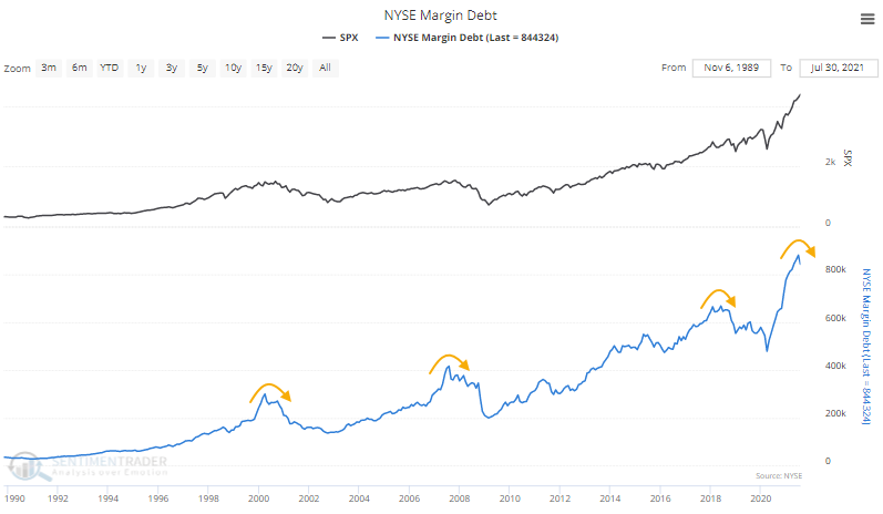
Margin debt more or less ebbs and flows with stock prices. So it's fairly unusual to see margin debt drop as stocks march to continual record highs. This is one of the largest-ever drops in debt during a month when the S&P hit a new high.
Investors pulled back on debt, but their cash cushion dropped even more. The total dollar value of Free Credits - cash available to brokerage account holders to withdraw - plunged by one of the largest degrees in 70 years in July.
If cash drops more than debt, then the Available Cash figure, a kind of "net worth" for investors, will decline. And so, in July, it fell yet again to another record low. Even if we express Available Cash as a percentage of the total market capitalization of the U.S. stock market, this is among the lowest readings in history.
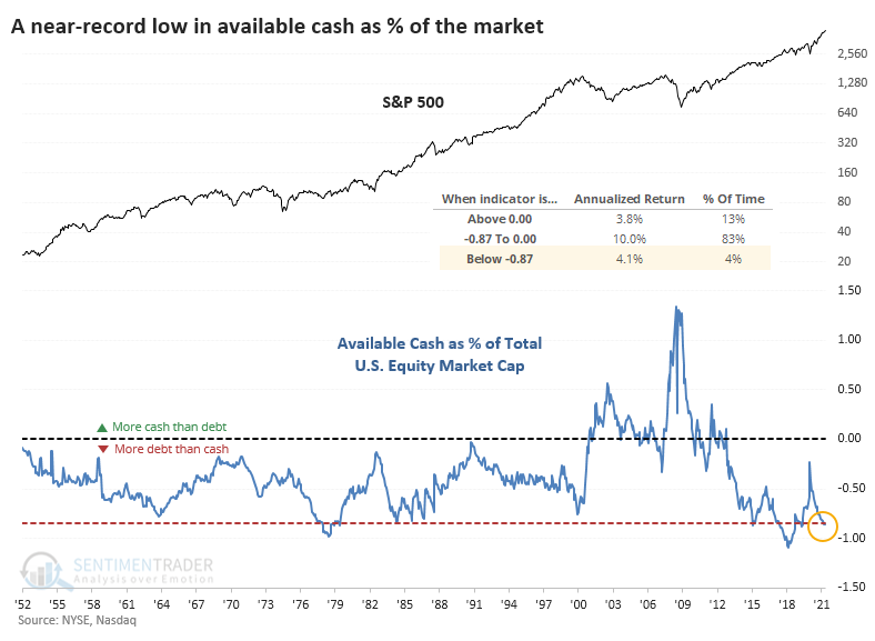
We can see from the chart that the S&P 500's annualized return when Available Cash was -.87% or less of market cap was +4.1%. That's positive, but below the returns when the net worth figure was less extreme.
OUT OF THE BLUE, A MAJOR BREADTH THRUST
Seemingly whenever something negative triggers, buyers show up immediately. We saw on Monday that the S&P 500's approach to its former high was accompanied by a negative McClellan Summation Index and more 52-week lows than highs on the NYSE.
No matter, stocks continued to rise, and breadth turned around. The switch was dramatic enough that more than 75% of volume on the NYSE flowed into advancing securities. It happened on Monday, too. And Friday.
Over the past three years, this is only the 3rd distinct time that the 3-day average of NYSE Up Volume has neared 80% (lumping together the handful of post-pandemic thrusts as one).
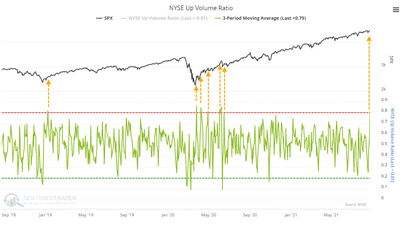
Often, we see thrusts like this when coming out of oversold conditions. The last time there were 3 consecutive days with at least 75% Up Volume with the S&P closing at a 52-week high was more than 30 years ago. While it can signal some short-term buying exhaustion (8 of the last 14 signals showed a negative 1-month return), the risk/reward ratio was impressive over the longer-term.
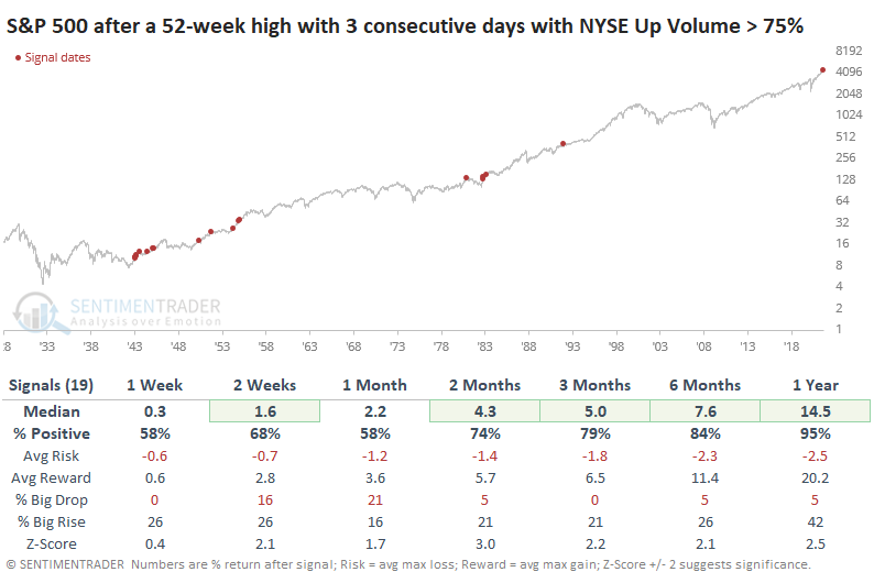
Once again, buyers have stepped in almost to the day following a dip in some breadth measures like the net percentage of NYSE issues at 52-week highs minus lows. That shows that there is still no change in the character of this market and its participants, and we might as well throw our hands up when trying to determine when any of the negatives might finally matter.
STOCKS AND SECTORS - OVERSEAS INDEXES
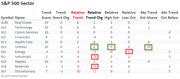
Dean updated his absolute and relative trend following indicators for domestic and international ETFs.
Last week, the relative trend backdrop turned defensive with relative highs from utilities, staples, health care, and real estate. The utilities led the way with a six-point increase in its relative trend score and a new relative high on all five trading days. I would also note that relative trend scores for the more offensive or cyclical-oriented sectors turned down.
The percentage of countries with a positive relative trend score versus the S&P 500 decreased on a w/w basis. The current level suggests an unfavorable environment for the MSCI ACWI World Index ex USA.
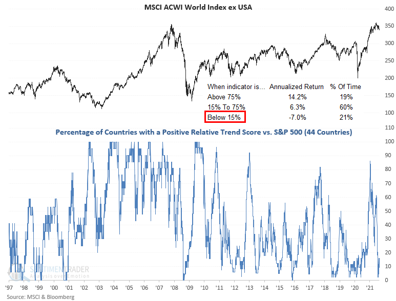
The percentage of countries with a relative trend score of -10 versus the S&P 500 remains at a level that suggests negative returns for the MSCI ACWI World Index ex USA.
STOCKS AND SECTORS - ENERGY STOCKS
Last week, Jay noted that energy stocks have to deal with some unpleasant seasonality. But on a longer-term basis, one positive is that many of these stocks are showing very high correlation.
A recent addition to the Sentimentrader indicator lineup in Sector Component Correlation. If it sounds complicated, it's not. In fact, the underlying theory is extremely straightforward.
- When a sector is performing well, there tends to be a lower degree of correlation among the stocks in the sector (as some lead and some lag)
- When a sector is performing poorly, there tends to be a much higher degree of correlation among the stock in the sector as "everything" get sold
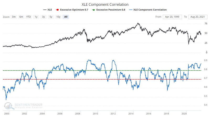
Note that the tendency for the indicator value to increase (i.e., exhibit higher correlation) during price declines and drift lower (i.e., exhibit lower correlation) during price advances.
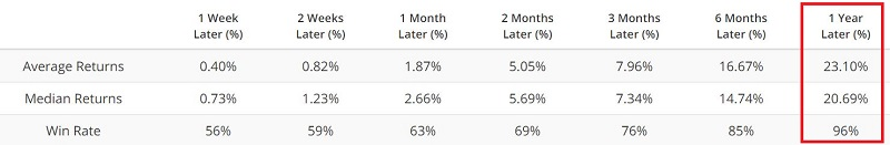
For our purpose, we will go to the extreme and look for readings above 0.84%. The key thing to note is the performance of ticker XLE (Energy Select Sector SPDR) over the ensuing 12 months, as shown in the table below.
So, the good news for energy stocks is that the XLE Component Correlation is presently above 0.84, which implies that this indicator will remain "bullish" for at least another 12 months.
| COMMODITIES | ||
 |  |  |
Jay showed that the propensity for large price movements in commodities creates the opportunity for large gains. It also creates the risk of large losses. For this reason, it is essential to know where to look when trying to ride the trend.
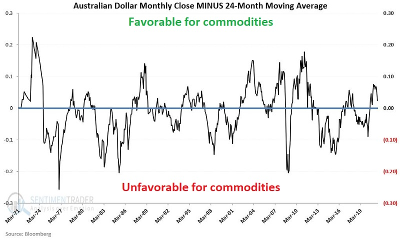
As it turns out, one of the best places to look is "Down Under." When the Australian dollar is in a positive trend, it tends to be good for commodity prices.
The chart below displays the monthly closing price of the Australian Dollar ("The Aussie") versus its own 24-month moving average.
So why these labels? To answer that question, we will use monthly total return data for the Goldman Sachs Commodity Index ("GSCI") as a proxy for commodities as an asset class.
The chart below displays the cumulative growth for the GSCI ONLY during the months when the AUSSIE closed the previous month ABOVE its 24-month moving average.
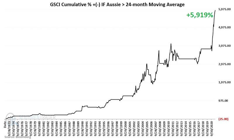
There are times when commodities lose ground despite the Aussie being above its 24-month moving average and when commodities gain ground when the Aussie is below its 24-month moving average.
So, remember, we are talking "long term perspective" here and NOT "precision market timing." The real question is, "when does it make sense to commit capital to commodities."
GOLD'S LONG YEAR
Gold has failed to register a new closing high in 270 trading days as of the close on Tuesday. There's nothing special about that value; it just happens to be what Dean noticed when reviewing a scan of 100s of securities.
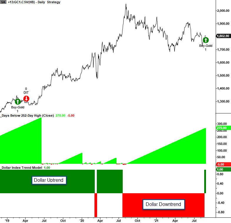
Last week, Dean shared a trend-following model to determine whether the Dollar Index is in an uptrend or a downtrend. So, let's keep the 270 trading day study, but break them out and view them according to the underlying trend in the Dollar Index.
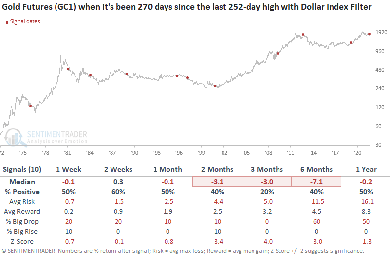
Gold returns look weak, especially in the 3-month window. The commodity will struggle when the Dollar Index is in an uptrend.
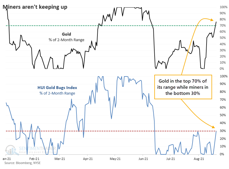
After a June plunge, gold has been treading water until recently. After a good week, gold is now trading in the upper end of its 2-month range. Gold mining stocks, however, are struggling. Looking at each of them relative to their ranges of the past 2 months, we can see how stark this divergence is.
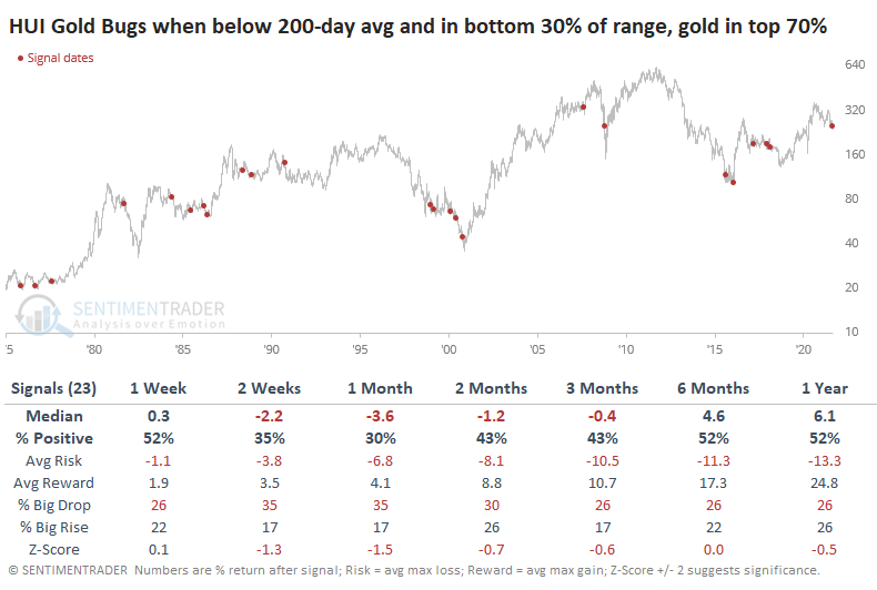
When mining stocks were in a downtrend at the time, this was not a good sign. The table below shows returns in the HUI Gold Bugs index when there were similar divergences between the price of gold and miners. This only includes signals when the Gold Bugs index was trading below its 200-day moving average.
On August 19, more than a third of mining stocks fell to a 52-week low, the most in 3 years. It triggered right at the bottom in 2018. It's a high number for a medium-term washout but is well under the 50% or higher figure we see during long-term panics.
Jay noted that miners face a seasonal headwind heading into the fall months. There is no guarantee that any given seasonal tendency will play out as it did in the past, but GDX (VanEck Vectors Gold Miners ETF) seasonality appears below.
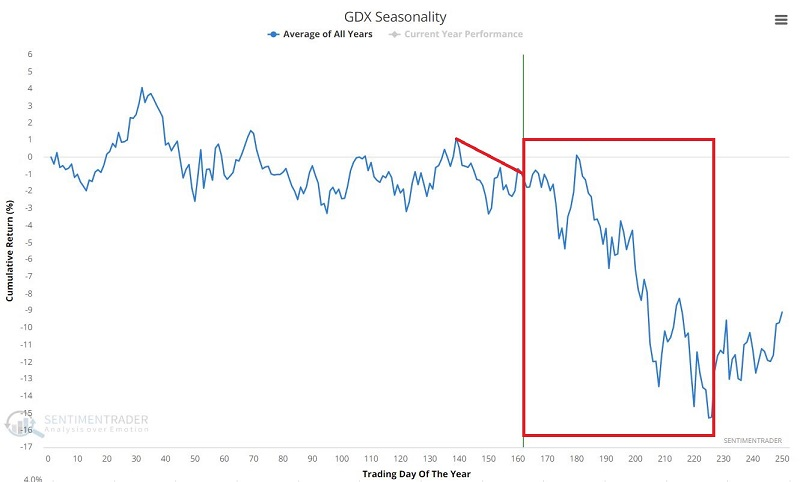
Since May, we've struggled to find much that has consistently preceded strong positive returns in gold or miners. That's still the case. There are some modest extremes among miner breadth metrics, maybe even enough to expect a multi-week or longer bounce. There just isn't enough consistency among what we've been watching to suggest that it's a high probability setup.
For those looking for a long-term way to allocate to precious metals, Jay suggested watching the ratio between DBP and SPY along with its 156-week (3-year) exponential moving average.
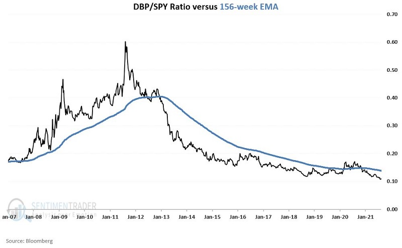
The black line ("Switch") in the chart below represents the hypothetical return achieved by holding DBP if the ratio is above its average and SPY if it's below its average. The blue line ("Buy/Hold/Rebalance") in the chart below represents the hypothetical return achieved by holding 50% in DBP, 50% in SPY, and rebalancing to a 50/50 split at the beginning of each new year.
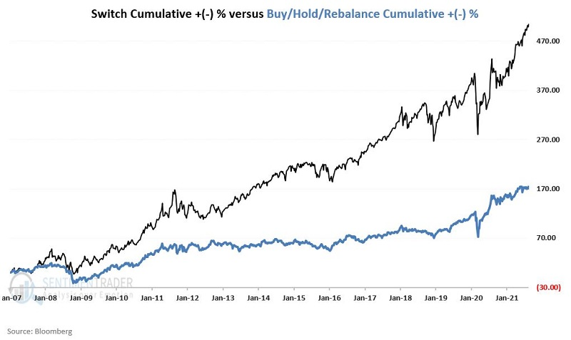
The good news is that the simple switching method detailed above handily outperformed buy-and-hold over the past 14+ years. The bad news is that past performance does NOT guarantee future results.