
TradingEdge for Aug 13 - A Record Streak of Trends, Financials Breadth Thrust


The goal of the Weekly Wrap is to summarize our recent research. Some of it includes premium content (underlined links), but we're highlighting the key focus of the research for all. Sometimes there is a lot to digest, with this summary meant to highlight the highest conviction ideas we discussed. Tags will show any symbols and time frames related to the research.
| STOCKS | ||
|  | |
This year has behaved like few in market history.
Last month, we showed that through the first half of the year, 2021 has been one of the most consistent and persistent rallies ever. It's done nothing but continue.
Through late last week, the S&P 500 had gone 189 days - nine consecutive months - without being more than 5% from a 52-week high. And it recorded its 43rd day with a 52-week closing high.
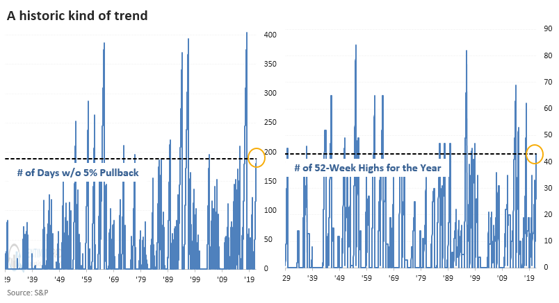
When we combine the two studies, this year has only a handful of precedents. Shorter-term returns were tepid, but the next few months were good, except for 1989 as we headed into the 1990 recession.
Once the S&P recorded this kind of momentum, it took an average of 75 trading days and more than an additional 10% gain before it fell into a 5% pullback. It took as short as 33 days and a 2.2% gain, and as long as 206 days (!) and 15.6% gain, so there was wide variability among them.
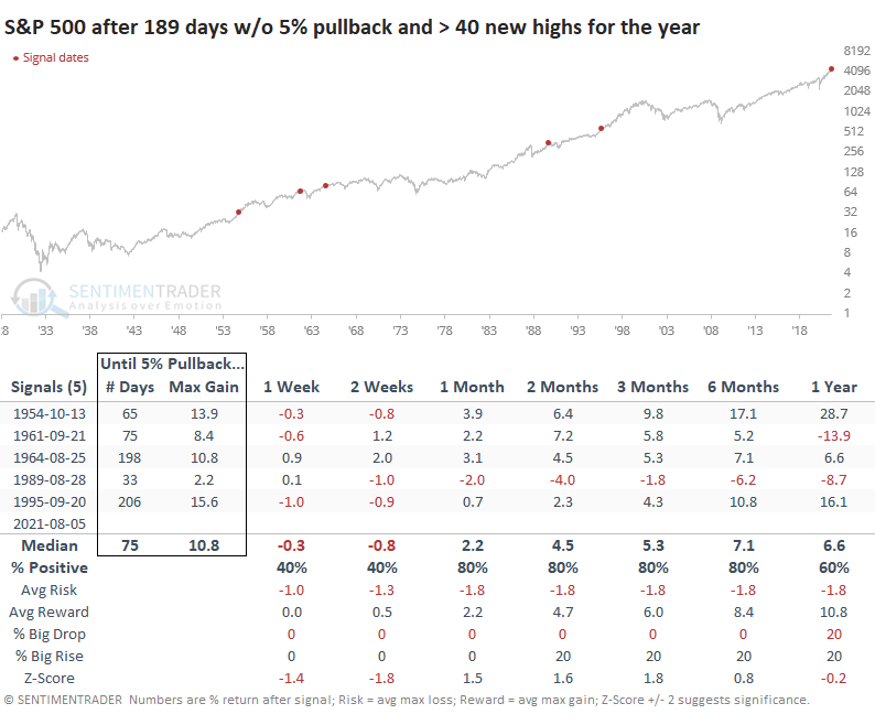
PRISTINE GLOBAL TRENDS
It's been a heckuva year for the most benchmarked index in the world. And while some securities have been struggling (mostly of the smaller cap variety), the recovery in indexes has been a global phenomenon.
For more than 7 months now, every major world equity index that we follow has been in a solid long-term uptrend, with a rising 200-day moving average. Over the past 50 years of data we have, this is now the 5th-longest streak of uninterrupted global uptrends and is creeping up on the longest in 35 years.
The general pattern after the few times this occurred is shorter-term weakness but medium- to long-term strength. The MSCI World Index saw one double-digit pause following the 2009-10 recovery. The other three all saw consistent and impressive gains.
Even when we looked at lesser extremes, the long-term positive ramifications remain, after mediocre returns on shorter time frames.
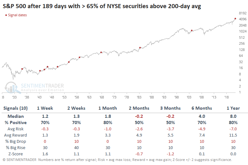
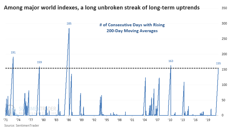
9 MONTHS WITHOUT A BIG DROP IN LONG TERM TRENDS
Trends in 2021 have overpowered every other factor we typically consider when it comes to stocks. Sentiment hasn't mattered. Seasonality hasn't mattered. Divergences haven't mattered.
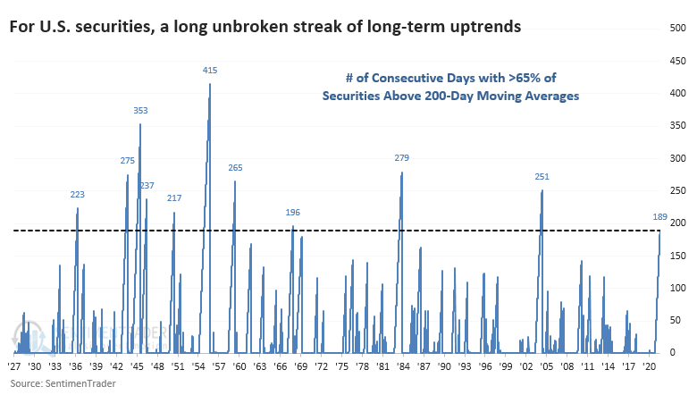
For nine months - 189 consecutive trading days - more than 65% of securities trading on that exchange have held above their 200-day moving averages. Even the remarkable momentum markets in 2013 and 2017 couldn't match this streak.
Dating back to 1927, this long of a streak has been rarely exceeded. The current one is now the 3rd-longest in five decades.
The medium-term of 2-3 months showed some sketchy returns after the other signals. The S&P showed a negative median return and uninspiring risk/reward ratio. Only 3 out of the 10 signals showed a positive return across both of those time frames, and one of those gave up most of its gains soon after.
But over the next 6-12 months, it was harder to find a negative return.
Over the next few months, Technology and Growth stocks tended to suffer the most, while Value and Defensive stocks showed among the best returns. That makes some sense if we think about investors not willing to sell out of the market entirely but shift their portfolios to "safer" parts of the market.
A SPLIT AMONG NASDAQ STOCKS, THOUGH
A winner-vs-everyone-else divergence that has developed since the speculative peak in February is especially evident on the Nasdaq.
In recent days, more than 70% of stocks included in the Nasdaq 100 index have closed above their 50-day moving averages. But within the broader Nasdaq Composite index, fewer than 40% of stocks are above those trendlines. The 5-day average of the spread in breadth between those indexes is now among the widest in 20 years.
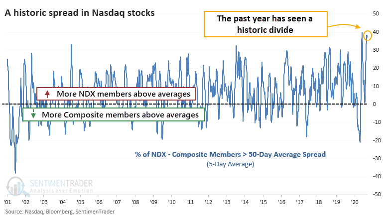
These extremes in the medium-term trends tended to coincide with shorter-term blowoff peaks in the Nasdaq 100 to Nasdaq Composite ratio.
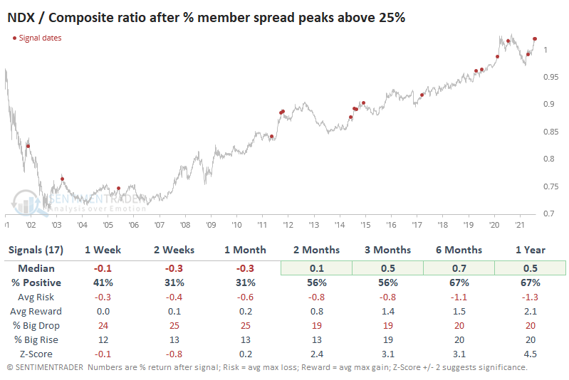
When they've triggered while the S&P 500 was at or near a 52-week high at the time (as it did this week), it preceded some shorter-term trouble. Over the next month, the S&P managed to show a positive return after only 3 of the 12 signals, and 2 of those were just barely. The other one quickly turned into a loss. The S&P's returns across all time frames were below average, with a poor risk/reward ratio.
INFLATION BOGEYMAN...AGAIN
Jay noted that the latest Producer Price Index number just came out. And of course, it is getting spun in all different directions - based primarily on whether the person doing the spinning wants to spin it in a mostly negative light ("inflation is soaring!") or a mostly positive light ("the individual components are a mixed bag, therefore...").
Using a basic calculation for the rate of change, the historical chart using since 1914 appears below.
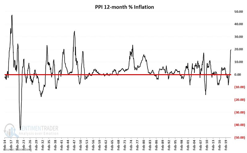
The bottom line is that - however you calculate it - PPI inflation rises and falls over time, sometimes reaching extreme highs and lows.
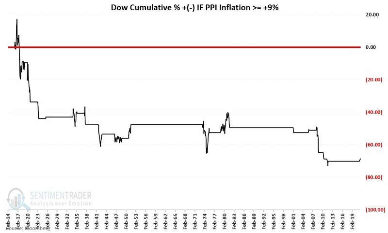
The chart below displays the cumulative % +(-) for the Dow since 1914 if held ONLY when PPI inflation at the end of the previous month is greater than +9% (where it is now). As you can see, the cumulative result is extremely negative. Holding the Dow over the last 107 years ONLY when PPI 12-month inflation is greater than +9% produced a staggering loss of -68.7%.
That said:
- We can note in the chart above that NOT ALL periods of >+9% PPI inflation resulted in severe stock market declines
- The PPI inflation rate first pierced +9% in the latest go-round at the end of April 2021
- Since that time, the Dow has barely shrugged, walking steadily higher by roughly +4.8%
So does this mean that we don't need to be concerned about high inflation this time around? The jury is still out on that one. The bottom line is that - based on historical results - the current state of inflation should be listed on the negative side of the "Weight of the Evidence" ledger.
A LOW-RISK WAY TO CAPITALIZE ON WEAKNESS
Jay looked at some options trades that would profit if stocks did miraculously happen to stall over the next few months.
For the sake of illustration, we will assume that Trader A and Trader B have analyzed ticker SPY and have made the following assumptions/determinations. Trader A is assuming a crash could be possible, while Trade B just thinks some weakness is probable.
- The stock market is due for a pullback
- NOT playing for a Crash (although Trader A thinks it is possible)
- Looking for SPY to work lower, possibly as low as 422 (previous support/resistance)
- Expect decline anytime between now and mid-October
- Not willing to risk a lot of $
- Don't want to sell short futures contracts
A trader could just buy a put option. But a potentially better solution is a Diagonal Put Calendar Spread.
It sounds complicated. But really, all that is involved is Trader B buying a SPY Nov15 442 put and selling a SPY Oct15 422 put. The risk curves are shown in the chart below.
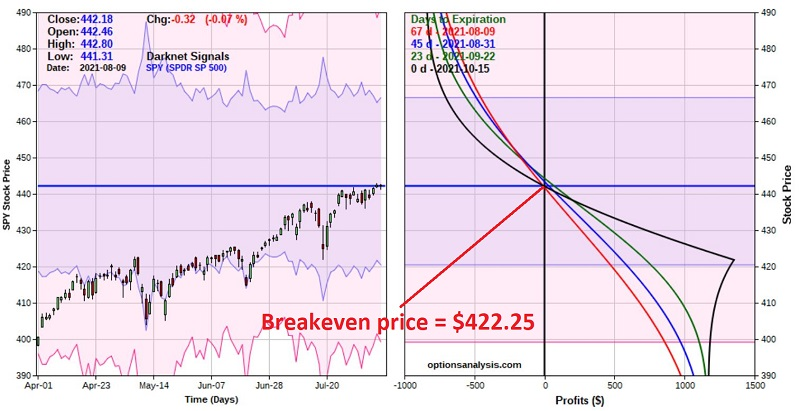
The black line in the chart above represents the expected P/L as of October option expiration. If this position were held until that time, the October option would expire (or be exercised), and Trader B would still be holding the November 442 put.
The cost to enter the trade - and the maximum risk - is $851. This trade has limited profit potential, so if the market were to crash, there is a limit to what Trader B might make.
If SPY DOES hit $422 a share during the life of this trade, the expected profit will be roughly $433 to $1,385, depending on whether $422 is hit sooner or later. But if SPY were to rally 15 points to $457.18 during the life of this trade, the expected loss would be roughly -$300 to -$550, depending on whether $457 is hit sooner or later
In a nutshell, this trade is a bet that SPY will decline below its current price SOMETIME between now and October option expiration.
EQUAL-WEIGHT IS LOSING ITS FOOTING
Dean notes that the ratio between the S&P 500 equal and cap-weighted index is a closely followed indicator. It provides a perspective on whether the troops or the generals are leading. When the ratio is rising, the average stock is participating.
The relative ratio for the equal vs. cap-weighted S&P 500 index has now traded above the 10-day moving average for ten consecutive days. However, suppose we assess the conditions before the current winning streak. In that case, we see that the 10-day count reached 29 consecutive days below the average. That's the longest streak below the average since October 2008.
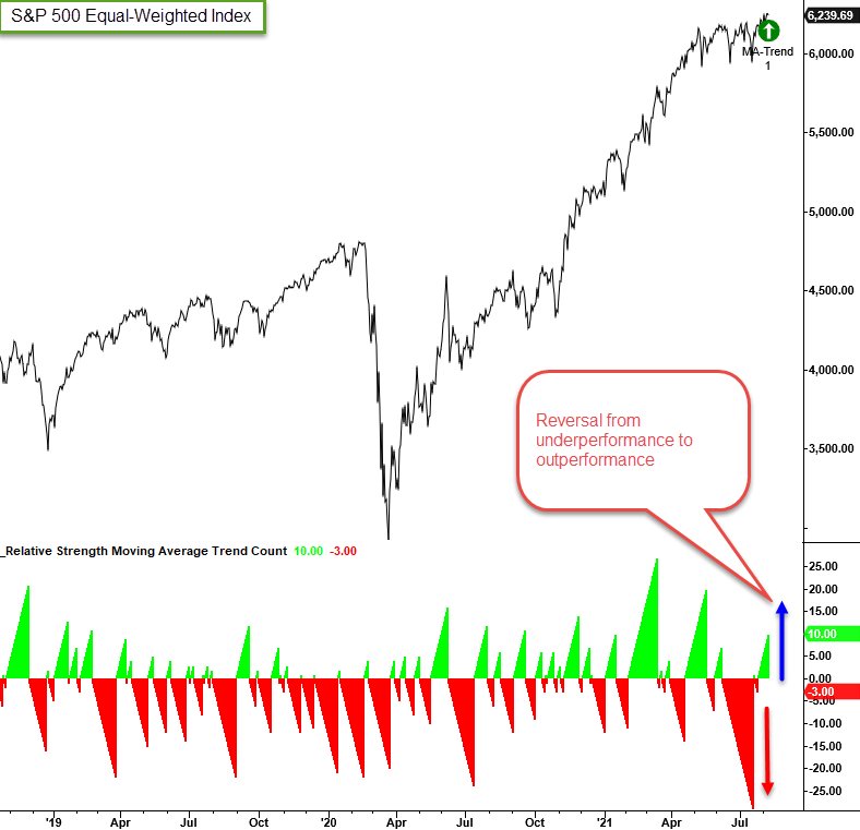
As the chart shows, it's highly unusual to see the days below count reach a level of 29 outside of a bear market environment.
Let's assess what happens when the days above count hits ten after the days below count resets at 29 days, meaning a reversal in the relative ratio count trend like we've just seen.
Besides the 1-month timeframe, results are about in line with random.
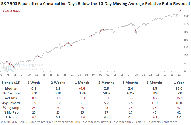
Nothing to get excited about there. But when Dean assessed lesser extremes to get a larger sample size, there was a modest bias toward the cap-weighted version of the index performing better than the equal-weighted version on a longer-term basis.
Jay also looked at this weight issue.
The chart below divides the cumulative value of $1,000 invested in the S&P 500 Index by the cumulative value of $1,000 invested in the Equal-Weight S&P 500 Index to get a ratio and adds a 13-month exponential moving average (orange line) of the ratio itself.
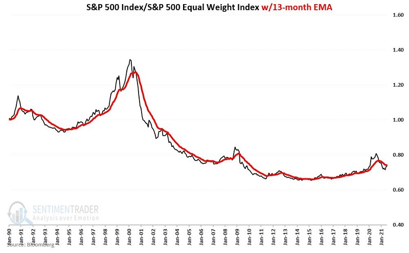
When the ratio is above its EMA, it favors the S&P 500 Index. When below, it favors the Equal-Weight S&P 500.
So, let's consider an actual trading method. The chart below displays the cumulative % return for both indexes ONLY when the ratio is below its EMA.
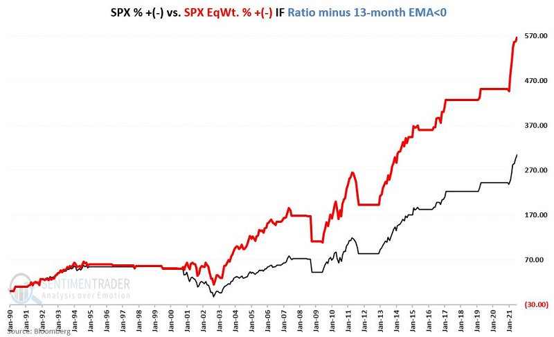
We can see that the orange line is much higher, meaning that it greatly favored the equal-weight version of the index. This is worth following now because the ratio is close to crossing back above its 13-month EMA, which would then switch to favoring the cap-weighted version of the index.
STOCKS AND SECTORS - OVERSEAS STOCKS
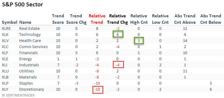
Dean updated his absolute and relative trend following indicators for domestic and international ETFs.
The relative trend score for the health care sector continues to gain strength. And, it registered a new 1-month relative high on 3/5 days last week. On a w/w basis, Technology had the best trend change score whereas Industrials showed the most significant decline.
Real Estate lost a little ground on a relative basis. However, it still maintains the best combination of absolute and relative trends. Keep an eye on the discretionary sector.
The percentage of countries with a positive relative trend score versus the S&P 500 deteriorated on a w/w basis. The current level suggests an unfavorable environment for the MSCI ACWI World Index ex USA. Even though global trends are solidly positive, as noted above, they're lagging the S&P as the U.S. is currently displaying some of the best trends.
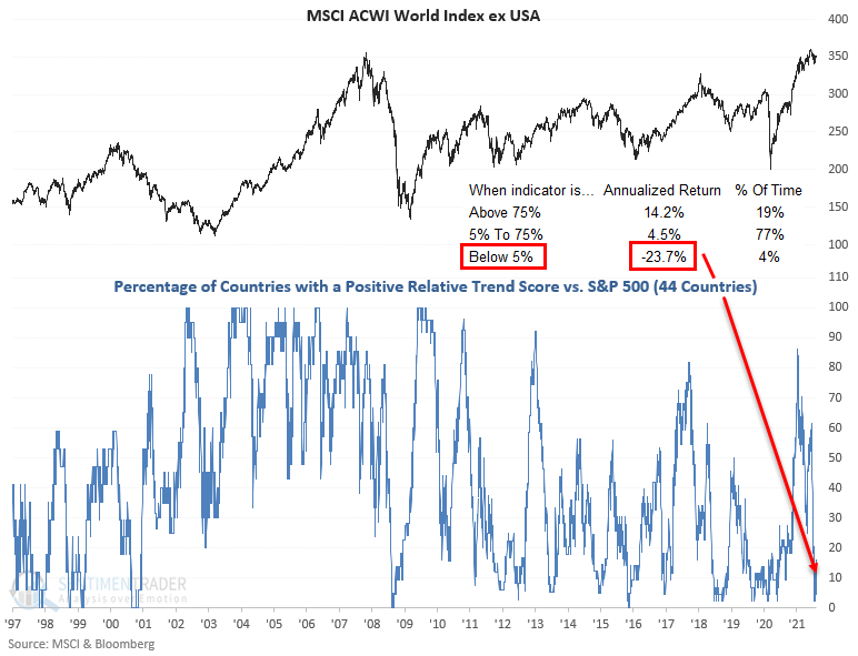
The percentage of countries in the Asia Pacific region with a relative trend score of -10 remains at a level that is concerning.
STOCKS AND SECTORS - FINANCIALS
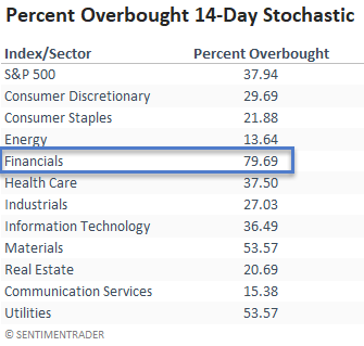
Dean noted that in his opinion, the term "overbought" might be the most misrepresented term in technical analysis. A good overbought condition represents market momentum with bullish implications for intermediate and long-term trends; a bad overbought condition typically occurs at the end of a multi-year uptrend when sentiment is complacent, and investors are all-in.
The percentage of S&P 500 financial members with a 14-day stochastic level of 80% or more has surged to 79.69%. The stochastic indicator measures momentum by comparing the current closing price to the high and low range of prices over a lookback period. The standard setting is 14 days, and the indicator ranges from 0% lowest to 100% highest.
Financials have the best short-term momentum as of 8/10/21.
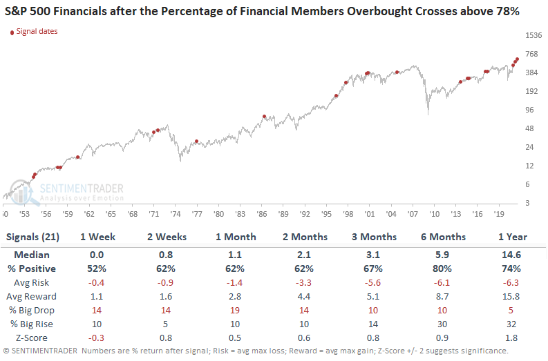
Let's look for instances when the percentage crosses above 78% and the sector is down less than 5%, but not at a new high. We will also include that the financials have not made a new high in the last 42 days.
Results look pretty consistent across all timeframes. The risk/reward profile is not strong, but it's not surprising given the requirements as the signal carries less momentum. A signal coming out of a bear market typically has more upward force than an instance from a shallow correction.
Dean then looked at another momentum signal for Financials.
On Wednesday, the percentage of S&P 500 financial sector members trading above their respective 50-day moving average crossed above 89%. And, the cross occurred within five days of the indicator registering a reading below a level of 38%.

While the sample size is small, the results look good across almost all timeframes, especially in the 6-12 month window.
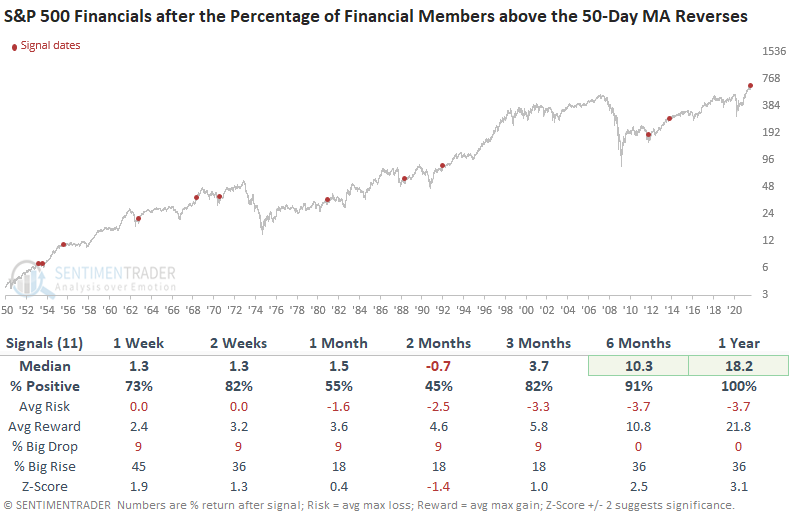
As was the case with some other signals Dean showed, momentum-based signals often see follow-through in the short term, followed by a digestion period. After the digestion period, the uptrend resumes. Over the next year, Financials rose every time following behavior like we've seen in recent weeks.
Looking at how Financials tended to see a short-term bounce following conditions like this, Jay highlighted a simple strategy that can reduce risk (or at least capital at risk) while still allowing participation in a rally. This is the stock replacement strategy.
The advantage of buying shares of XLF is that a trader can hold them beyond the two-week "favorable" period if desired. But for our purposes, we are assuming that we are focusing strictly upon generating a profit if XLF advances by some amount over the next two weeks.
This is a situation where it can make great sense to buy a deep-in-the-money call option instead of the shares of the underlying security (XLF in this case) itself.
The chart below overlays the two positions (long 100 shares vs. long 1 Aug27 36 call).
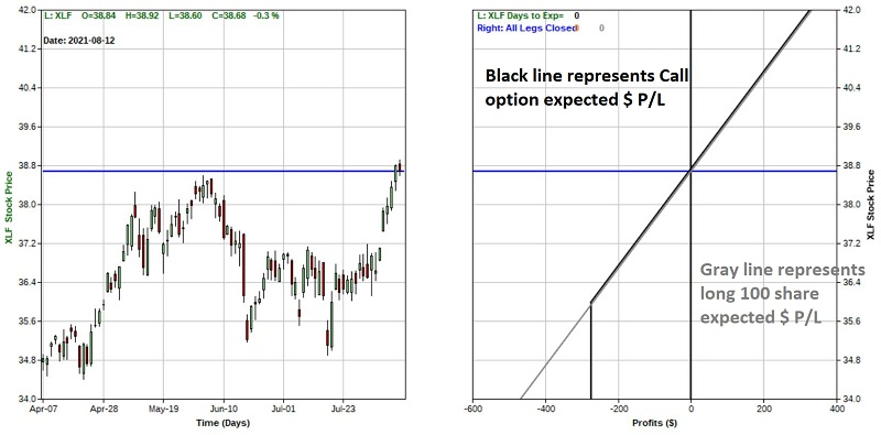 Above $36 a share for XLF, the option trade will behave just like the long stock position (minus the $6 in time premium paid when buying the option). Below $36 a share for XLF, the stock position will continue to lose money, while the option can lose no more than $274.
The purpose of the trade is a potentially cheaper alternative to buying shares in some circumstances that can offer:
- A lower cost of entry
- Similar profit potential
- Less downside risk
| COMMODITIES | ||
 |  | |
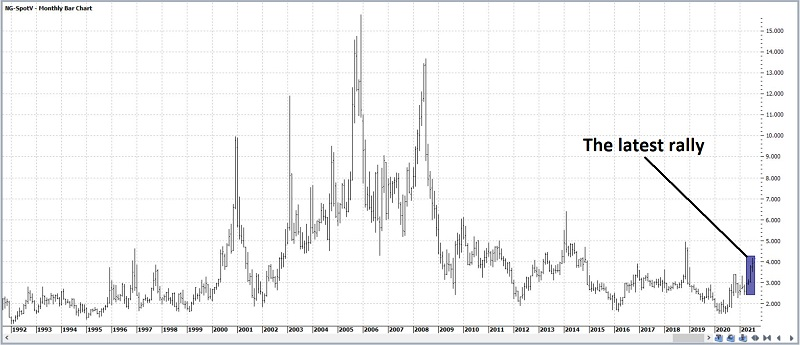
Jay took a look at the setup in natural gas. The daily chart displays the recent powerful advance enjoyed by natural gas. Looking at this chart along one might wonder why anyone would even consider fading this particular trend.
The monthly chart below (courtesy of ProfitSource) puts the recent advance into a slightly different context. Based on historical results, one person might conclude that maybe natural gas will explode higher - but another person might see a strong possibility that the recent advance will run out of steam.
The contract often sees a seasonal weak spot around now. And the chart below displays all trading days in the last 20 years when the 5-day average for natural gas Optimism Index was above 65.
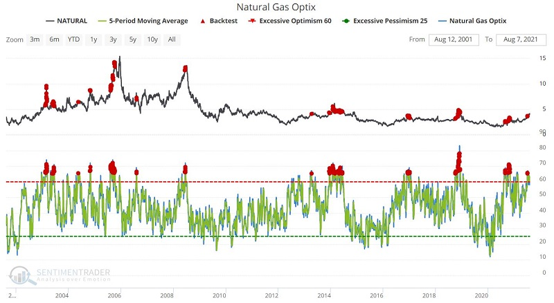
After other signals, forward results during the first two weeks after such a day were basically a coin-flip. After that, the results got decidedly more unfavorable, particularly 6 and 12 months out, with almost no positive returns.
Jay then looked at an options trade using the UNG fund that would provide a low-risk way to profit if natural gas followed through on the setup.
THE YEN AGAIN
Jay discussed a potential setup in the Japanese yen and a detailed breakdown of trades using either the futures or options market and the pros and cons of each.
Let's start with the weekly chart for ticker FXY. The chart below (courtesy of Profitsource) shows two potential support levels for ticker FXY.
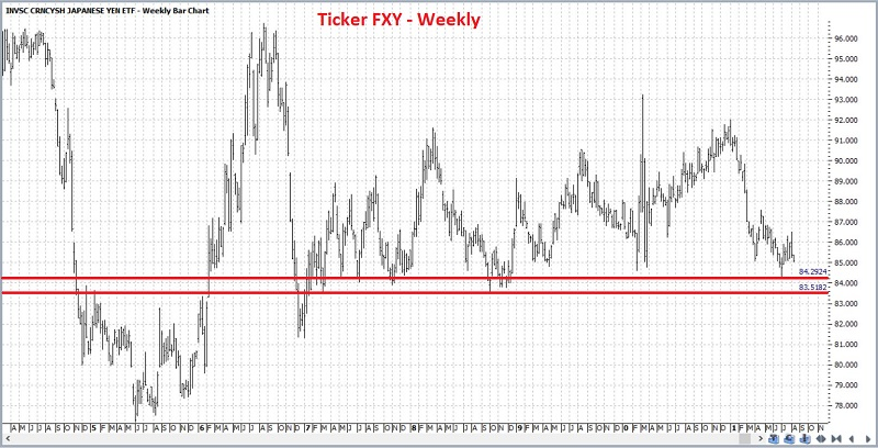
The daily chart shows the same two support levels plus a 5-wave down completed Elliott Wave count (calculated - for better or worse - by the algorithm built into Profitsource). This suggests that the recent downtrend may have run its course.
According to our seasonality charts, the yen is still very much in the midst of a favorable period. As usual, this is typically not enough to go on all by itself - and in any given year, the market may behave completely differently than suggested by its seasonal pattern. But it may give a trader another reason to contemplate speculating on the long side of the yen.
In terms of sentiment, the chart below displays all trading days when the Japanese Yen Optimism Index 50-day moving average was below 39% during the past 5 years.
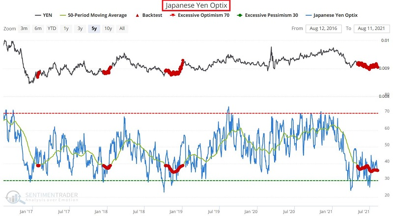
The results appear in the table below. Most notable is the favorable Win Rate 3 and 6 months after recent signals.
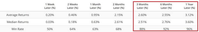
It should be noted that results before the past 5 years were not as consistent as the yen experienced a series of multi-year bear markets. But given more recent results, a trader might interpret the current reading as a potentially favorable contrarian sign for the yen in the months ahead.
Jay then discussed the leverage inherent in trading yen futures, with the positives (and negative!) involved. A more accessible way to trade the setup is by using a bull call spread in the FXY exchange-traded fund.