
Weekly recap - Volatility compression, new high cluster, commodity trifecta

House view:
- Stocks:
- Short-term: Modestly bearish. A compressed VIX during this time of year consistently preceded weak returns, as did Julys with numerous new highs in the S&P 500 and Nasdaq Composite. Robust earnings have been met with a churning market, with multiple fades from emotional gaps up. Volatility is now rising, with the VIX above 20. This time frame covers 1 - 4 weeks.
- Intermediate-term: No view. Momentum is strong, and breadth is good, including among cyclical sectors. However, positive earnings have been met with selling, and gap up opens have been met with selling pressure. Speculative trading activity bumping against historical extremes and valuations by nearly any metric at or near multi-decade ceilings. This is a tug-of-war that shows no clear edge. This time frame covers 1-5 months.
- Long-term: Bullish. The recovery from the April panic has been historic, and signs since then have supported a long-term bullish move, with primarily economically sensitive sectors leading. Long-term breadth measures have improved across sectors and world markets, which have consistently preceded positive 6-12 month returns in most equity indices. This time frame covers 6-12 months.
- Cyclical momentum tends to favor those sectors for average returns
- Defensive sectors also doing well, with momentum favoring high win rate but lower average return
- Very long-term (one year+) favors mean reversion to equal-weight, small-caps, and health care
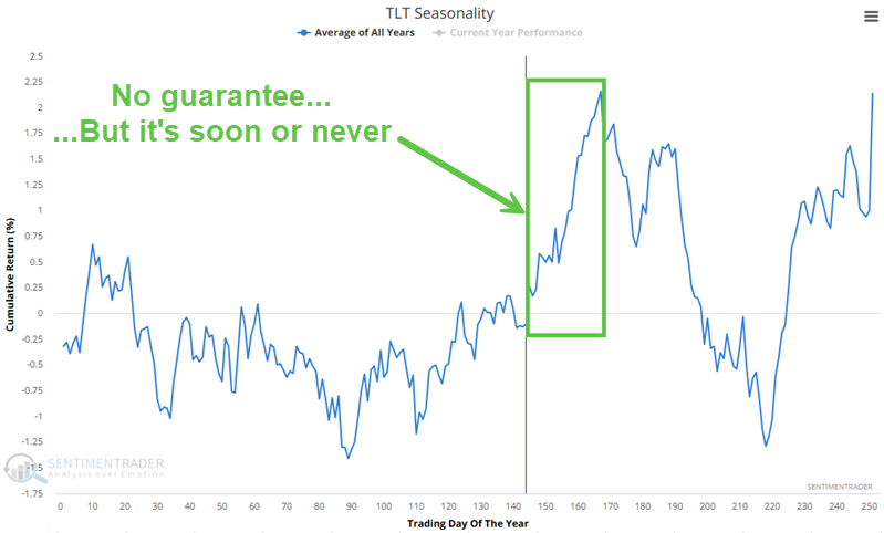
- Bonds: Long-term cycles remain bearish. Historically, August has been one of the strongest seasonal months for TLT, but since the 2020 peak, it's been one of the weakest. That leads into September and October, which are traditionally weak. We haven't seen much among analysts' studies to suggest a change in trend.
- Commodities: Signs point to a probable secular bull market following multiple new highs. An effective commodity trend model is currently bullish. Gold (especially gold miners) and silver are extended and have a bad history of sustaining gains. Oil seasonality is especially weak for the next three months.
- Crypto: Similar to the stock market, we mostly follow a benchmark index, in this case, bitcoin. We consider two primary inputs for bitcoin - how many currencies are in bullish long-term trends, and whether traders are mostly optimistic. Sentiment tends to play a major role in this market. Both of those factors are mostly positive. Also, as we will show next week, two fundamental forces are at work that have been a tailwind for bitcoin.
Where we're at
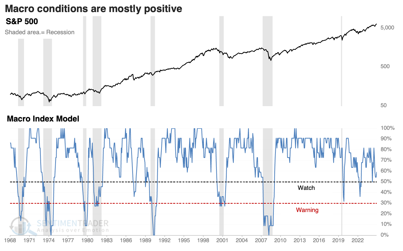
Currently, only scattered evidence suggests that the U.S. economy is in or in imminent danger of recession, lessening the threat of a deep and protracted bear market.
Our core model for determining that is the Macro Index Model. IMPORTANT NOTE: We've found an error in the chart's calculation on the website. The correct version is shown below. It is still holding above the 50% threshold.
The Market Environment has been a little skittish since the April low, and has flipped back to unhealthy late this week. The composite is too noisy to be taken dogmatically, but over the past year, the rockiest patches have occurred when the environment was unhealthy (the unshaded sections on the chart).
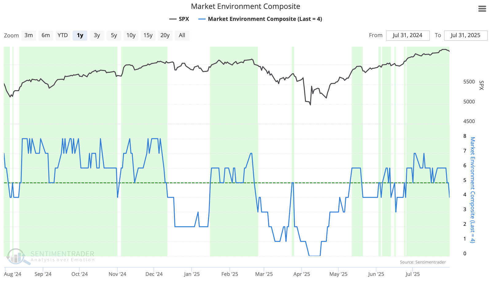
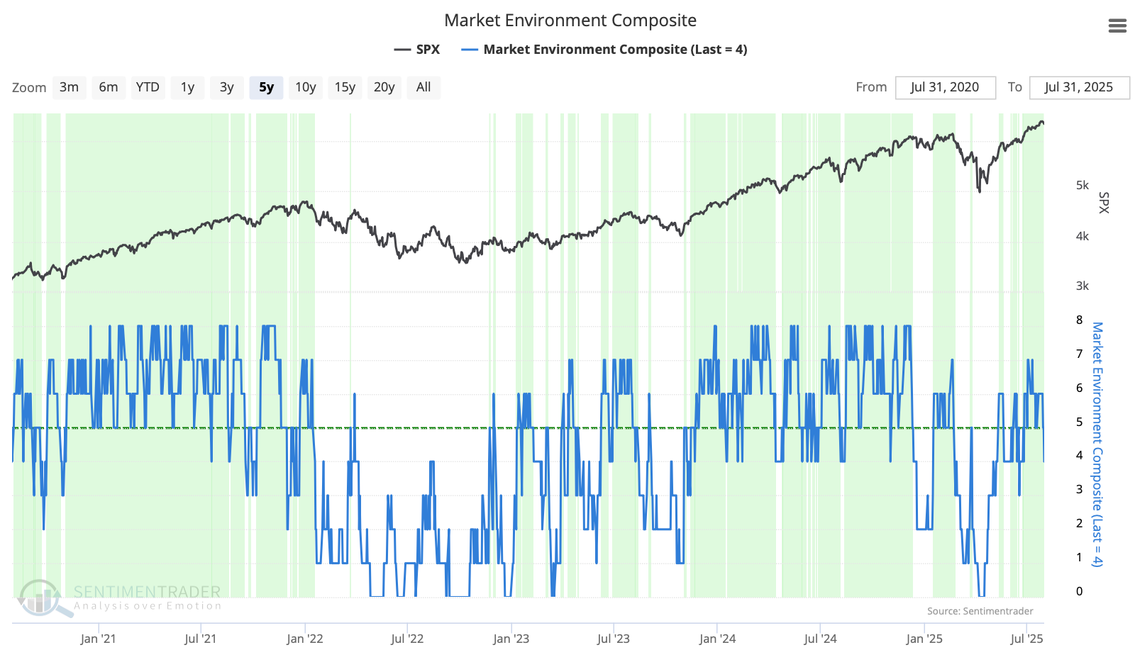
Over the past five years, it would have kept one out of the worst losses. Again, using a hard cutoff on a daily time series often means many whipsaws, and that's the case with this composite. For investors, it would be too easy to get shaken out of long-term positions. For traders, it has been a good guide to help focus on long versus short positions, and/or leverage versus no leverage.
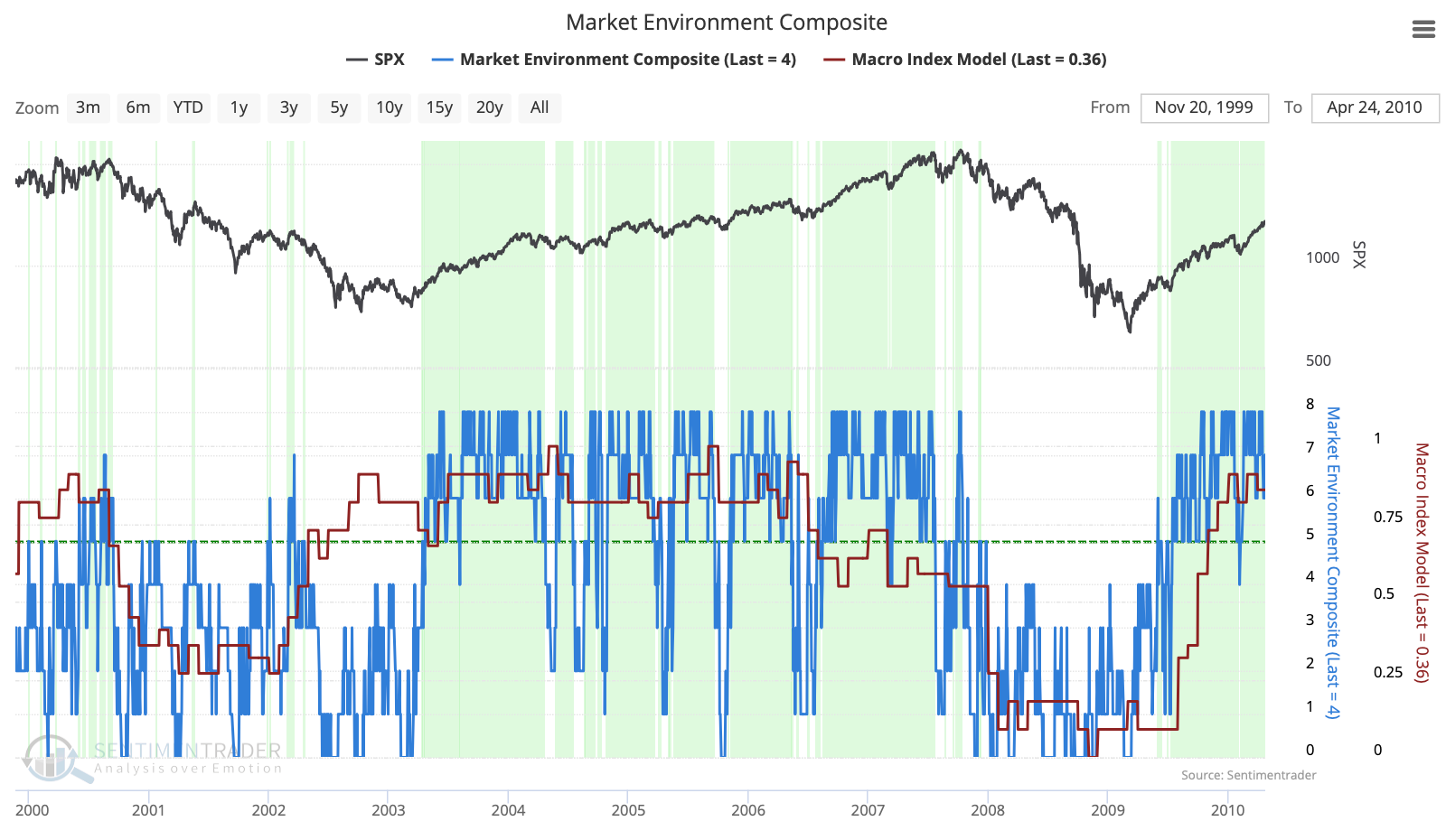
When we combine the Market Environment with the Macro Index Model, we can see how the S&P 500's worst declines of the past 25 years occurred when both models were below their healthy thresholds. We don't have that condition today, suggesting the current dip isn't yet a reason to be overly concerned about longer time frames.
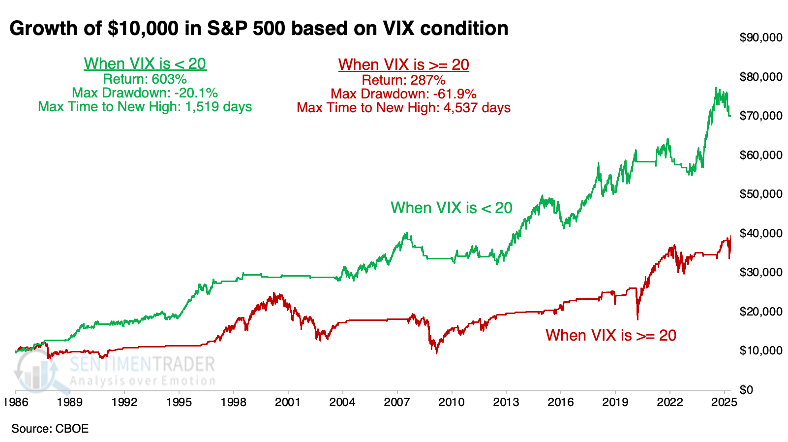
While not part of the Market Environment Composite, it is important to note that volatility is not spiking. As shown below, the S&P 500 shows markedly better characteristics when the VIX is below 20. It climbed above that on Friday, which is another short- to intermediate-term concern.
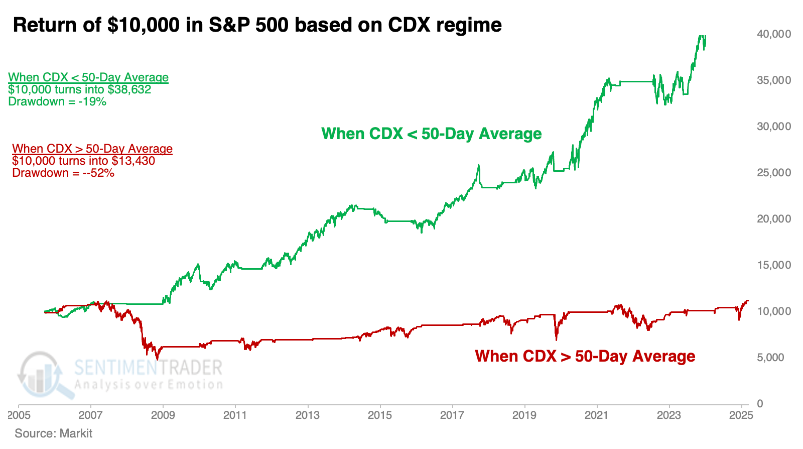
While they've ticked higher in recent days, credit spreads are below trend. As shown below, when the CDX Index is below its 50-day average, the S&P 500 has performed well. The index has now climbed above its 20-day average, a modest worry.
Since April, the most compelling studies have had a strongly bullish bias on longer time frames. You can follow these through the Active Studies page. From time to time, when the analysts' studies provide an overwhelming message, it will override whatever the Market Environment suggests. The bullish studies have been sporadic on short- and intermediate-term time frames, so they don't give an overly compelling reason to override an unhealthy market environment.
What we covered this week
A week+ of records
On Monday, the S&P 500 notched its sixth consecutive record high, completing the second-fastest rebound from a six-month low to this many all-time highs.
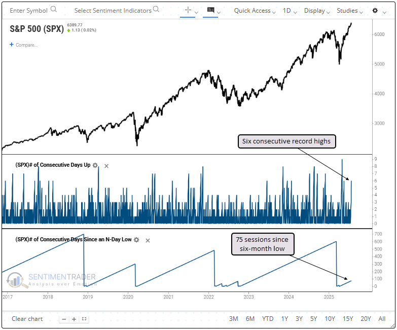
Whenever the S&P 500 logged six consecutive record highs for the first time following a six-month low, the world's most benchmarked index showed strong persistence, with solid returns over the next three to twelve months.
The S&P 500 was more likely to rally 10% over the subsequent year rather than decline by that amount. However, the last two signals occurred in July and August, during a seasonal window prone to market hesitation, and preceded declines of just over 7%.
Best-ever July for new highs
Due in part to that streak of new highs, the S&P 500 has already carved out a place in history as one of the best Julys ever. Only two other years have witnessed so many highs during a traditionally slow month.
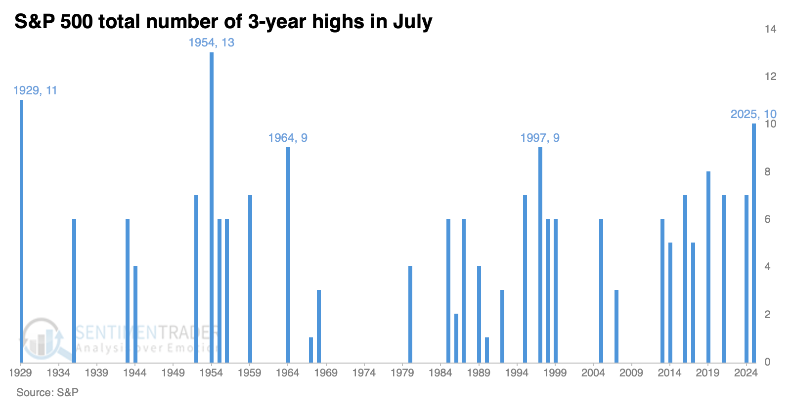
It has been unusual for the S&P to record one of these "super months" during the summer period of June through August. When the S&P 500 enjoyed at least seven multi-year highs in July, August was weak, rising only 36% of the time.
It's been even better to be an investor in a Nasdaq stock. The Composite recorded its 14th high in July, marking this month as the all-time best, bar none.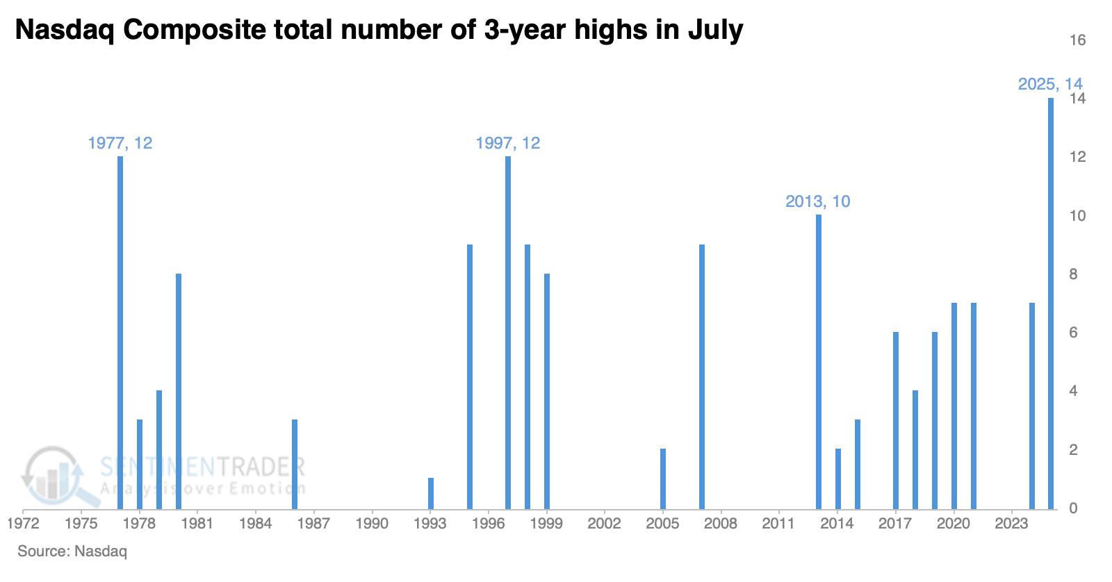
The Nasdaq Composite declined over the following month in the three years when it enjoyed ten or more new highs in July. The losses weren't significant, and two snapped back the month following that. Only 2013 saw the Nasdaq take off to the upside and not look back in the months following.
A "perfect" trend indicator
Every S&P 500 sector except health care has closed above its 200-day moving average. This kind of alignment is particularly encouraging after a period when none of the sectors were trading above their 200-day averages.
As shown in the chart below, the S&P 500 delivered an annualized return of 18.2% when at least 10 sectors traded above their 200-day average.
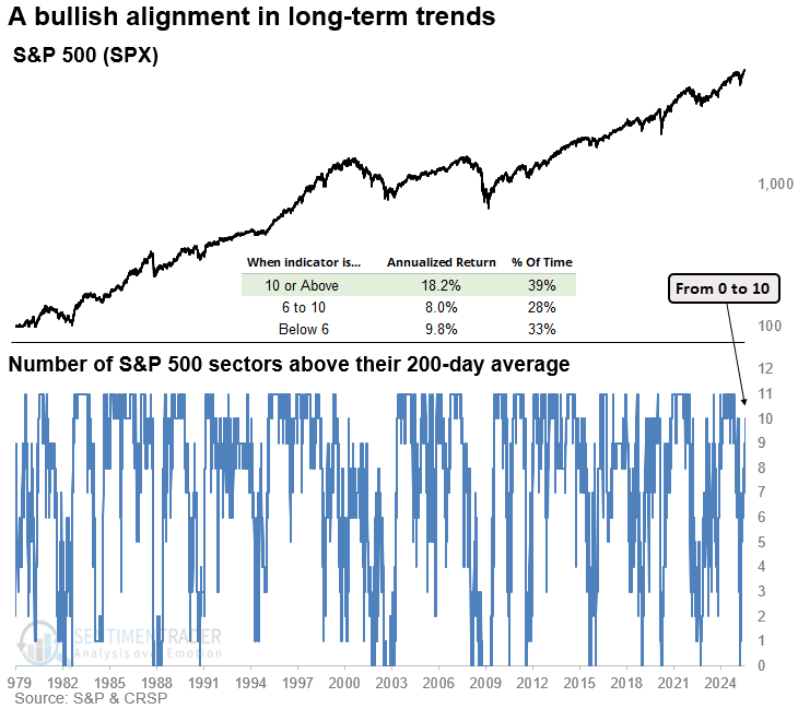
Whenever the number of S&P 500 sectors above their 200-day average rose from 0 to 10, the S&P 500 delivered exceptional returns and consistency over the following year, with a flawless track record at the six-month mark, with muted drawdowns.
Among the equal-weighted sectors, 9 out of 10 closed above their 200-day moving average. That's an indication of broad strength, and when we've seen the sector count climb from 0 to 9 in the past, the S&P 500 rallied without exception over the next six months.
Calendar compression in fear
Volatility is ebbing fast.
A good way to visualize how comfortable traders are with their beliefs is by measuring the distance between the Bollinger Bands on the VIX. Since the end of the global financial crisis in 2008, the VIX's Bbands compressed this tightly only five other times. Within the following four months, the VIX jumped by more than 50% every time.
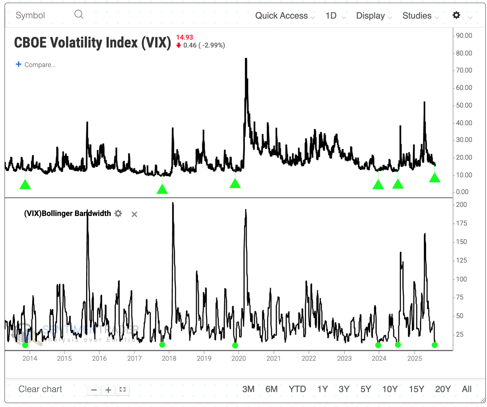
What's especially notable about the current compression is when it is happening. The VIX has had a strong seasonal tendency to rise this time of year.
When we combine these two factors, compression and seasonality, we see that the VIX has had a strong tendency to spike quickly. The S&P tended to decline over the next couple of weeks. The only signals that saw more than a 1% rally both two and three weeks later were August 1987 and July 2000.
The S&P 500 showed a relatively strong negative bias over the next one to three months. It declined most of the time, showed a poor average return, and an even poorer risk-to-reward ratio. Within the following three months, the index lost more than 5% seven times while gaining more than 5% only three times.
Scary sector seasonality
When evaluating a sector, looking for opportunities where price action and seasonality align can be helpful.
The Annual Seasonal Trend chart for the VanEck Gold Miners ETF (GDX) has entered an unfavorable period that extends from Trading Day of the Year (TDY) #139 through TDY #191. For 2025, this period extends from July 24th through October 7th.
A hypothetical $1 invested in GDX during this period, every year since 2006, has declined 67% to $0.33.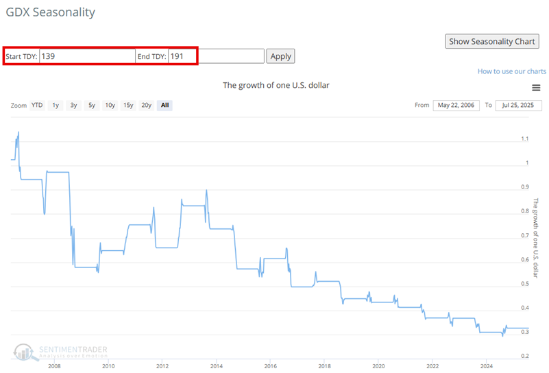
GDX has rallied over 60% since late December 2024. However, a recent 14-day RSI reading above 70 has been followed by a choppy - but so far, failed - attempt to breakout to the upside.
Similar setups exist in Chinese stocks, German stocks, copper miners, metals and miners, and materials.
3 keys unlock potential upside for commodities
Investors have been hearing about the potential for a commodities supercycle for years. Finally, there is some evidence that they're right.
The Bloomberg Commodity Spot Price Index (BCOMSP) is above its 40-week moving average, suggesting positive price momentum. In March, Jay highlighted the JK Commodity Trend-Following Model Signal, which objectively designates the trend for commodities as favorable or unfavorable. This model has jumped around a bit recently, but is presently favorable.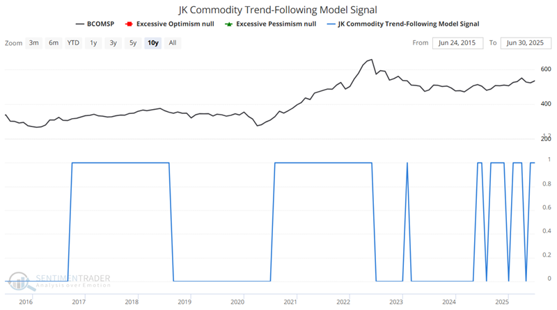
In prior years, he highlighted the 30-year cycle in commodities. This cycle tends to see commodities advance significantly and outperform stocks for 15 years, followed by 15 years of underperformance. It still has 13 years to go in a favorable cycle.
The Annual Seasonal Trend chart for BCOMSP shows the average performance on the index across the calendar year. The index has entered one of its most favorable seasonal periods, extending from July 23rd through October 15th.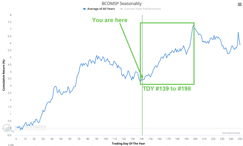
A 68% Win Rate suggests that commodities rise during this period roughly two out of every three years, so it's not a sure thing. However, average and median gains are significantly better than average and median losses.
None of this guarantees a rip-roaring rally - or any rally at all - in the months ahead, but history suggests that is the highest probability.
Intraday minutes
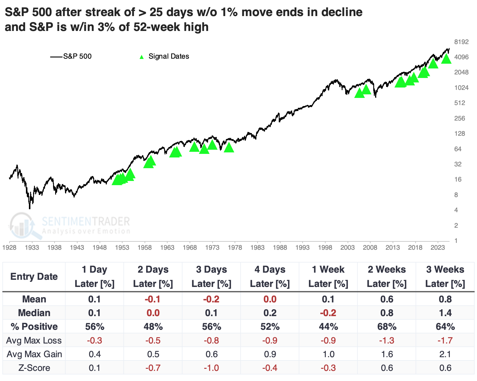
Among the intraday notes published this week, we learned that the end of a long streak without a 1% down day in the S&P 500 tended to lead to more short-term weakness.
That might help a flight-to-safety bid in Treasuries, which would coincide with an auspicious time in the calendar.
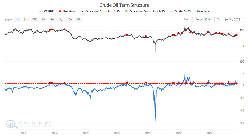
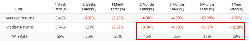
Crude oil is facing the opposite seasonal bias, with a headwind in the coming month(s) just as the term structure of its futures contracts is showing extreme backwardation.
We also looked how the IWM small-cap fund has been fading intraday, the S&P 500 equal-weight index finally broke its streak without a new high, and tech stocks have insider buying and high correlation.
About TradingEdge Weekly...
The goal of TradingEdge Weekly is to summarize some of the research published to SentimenTrader over the past week. Sometimes there is a lot to digest, and this summary highlights the highest conviction or most compelling ideas we discussed. This is NOT the published research; rather, it pulls out some of the most relevant parts. It includes links to the published research for convenience, and if you don't subscribe to those products, it will present the options for access.