
Unemployment as a stock market indicator

Key Points
- Employment is a key component of a strong economic environment
- The economic environment is obviously an important factor for stocks (BUT only one of many)
- Continued claims is a useful data series for objectively assessing the state of unemployment
The economy remains less than it could be despite the low unemployment rate
The chart below displays our Macro Index Model. Note that it has been mired in essentially unfavorable territory (below 70%) since 2022.
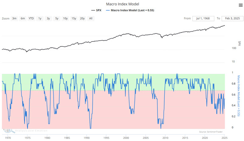
So, how is it that the stock market has been on a tear for almost two-and-a-half years now despite a lackluster economy? My theory is that other factors also influence the market and have powered the rally (go to this link and scroll down to the 12.11.2024 Exclusive Client Webinar for more information on the nine factors I follow).
The chart below shows the official Unemployment Rate, which is 4.0%, which is relatively low on a historical basis.
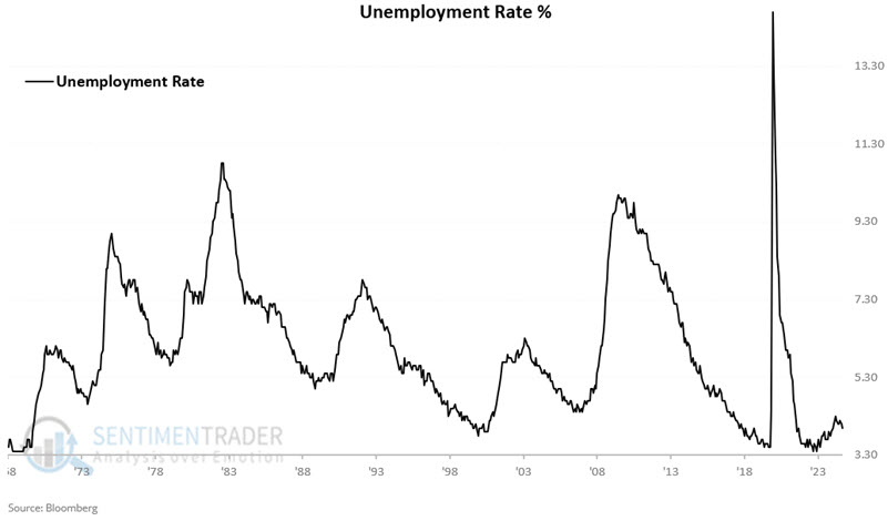
Two things to note: Many consider this number to be somewhat manipulated, and technically, it has been on the rise since the middle of 2023. Regardless, we will focus here on a different measure of unemployment.
A closer look at Continued Claims
Per FRED:
Continued claims, also referred to as insured unemployment, are the number of people who have already filed an initial claim and who have experienced a week of unemployment and then filed a continued claim to claim benefits for that week of unemployment. Continued claims data are based on the week of unemployment, not the week when the initial claim was filed.
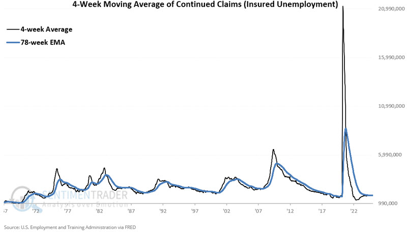
The chart below shows the 4-week Moving Average of Continued Claims (Unemployment Insurance). Typically, when we experience the kind of economic weakness that actually negatively affects stock price, we see this number "spike" higher.
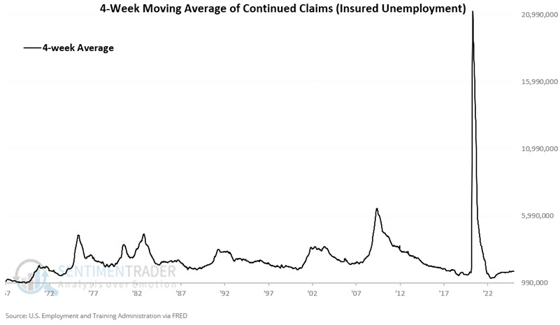
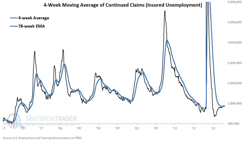
The forced unemployment during the pandemic shutdowns skews the chart above. So, the chart below mostly cuts off that spike and "zooms in" on the data.
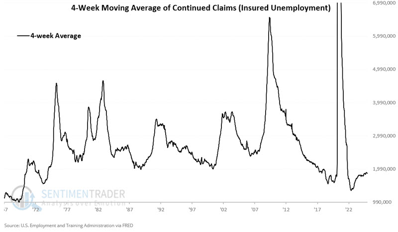
Every sharp rise in the chart above (the mid-1970s, early 1980s, 1990, 2000-2002, 2008, and 2020) was accompanied by meaningful downside volatility in the stock market.
A trend following approach to Continued Claims
The chart below adds a 78-week exponential moving average to the chart above. When the black line is above the blue line, we can objectively designate the trend of Continued Claims as "rising," and when black is below blue, we designate it as "falling."
The chart below cuts off some of the 2020 spike and zooms in closer on the historical results.
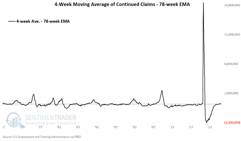
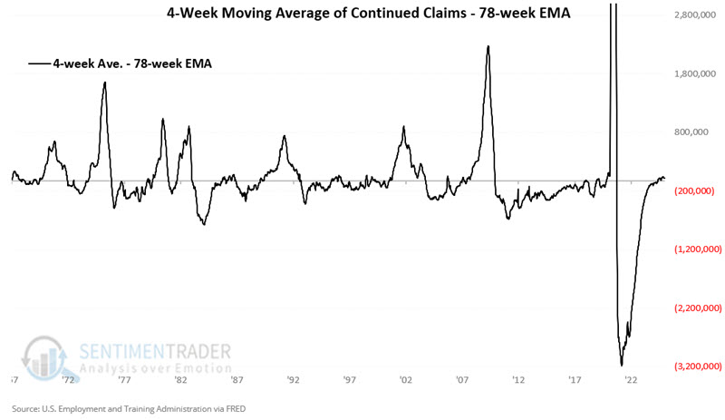
The chart below subtracts the 78-week EMA from the raw 4-week average. If the line is above 0, we can objectively designate the trend of Continued Claims as "rising," and when it is below 0, we designate it as "falling."
Once more, the chart below zooms in on the historical results.
Continued Claims versus the stock market
Please note that we do not advocate using Continued Claims as a standalone trading model, but rather as weight of the evidence. That said, it is helpful to get a sense of how stock prices have tended to react to changes in the indicator. The chart below displays the hypothetical growth of $1 invested in the S&P 500 only when the 4-week average of Continued Claims is below its 78-week EMA (i.e., unemployment is deemed as "falling"). An initial $1 grew to $39.81 since February 1967.
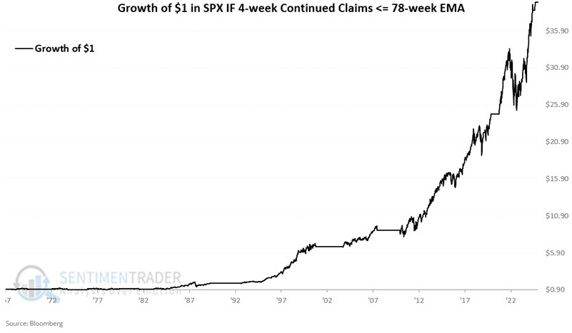
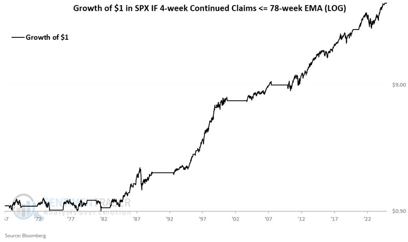
The chart below displays the same results on a logarithmic scale.
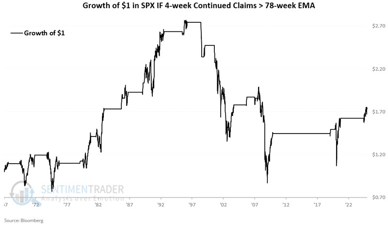
Conversely, the chart below displays the hypothetical growth of $1 invested in the S&P 500 only when the 4-week average of Continued Claims is above its 78-week EMA (i.e., unemployment is deemed as "rising." An initial $1 grew to $1.73 since February 1967.
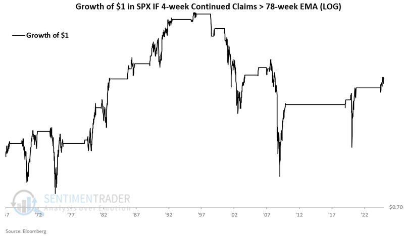
The chart below displays the same results on a logarithmic scale.
But wait, an increase from $1.00 to $1.73 is hardly "bearish," someone could rightly proffer. Hence, the reason we use this is weight of the evidence and not as a trading system. That said, a closer look at the charts above reveals two things:
The probability of higher stock prices has historically been much greater when Continued Claims are falling
This method was unfavorable for stocks during the major bear markets of 1973-74, 2000-2002, and 2008. It also missed a number of sharp (albeit, in some cases, temporary) downward spikes in stock prices.
The bottom line: The stock market typically (but importantly, not always) performs well when Continued Claims are trending lower. Conversely, while a rising trend in Continued Claims in no way guarantees lower stock price, that is when the majority of serious bear market activity has occurred.
Adding price trend to make the indicator more useful
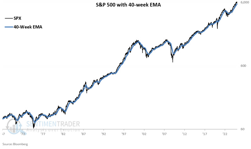
The problem with using any non-market data series to "forecast" stock prices is that, at times, the market will ignore it completely (as other factors exert more influence on stock prices). So, let's add a price trend filter to try to make things more useful. The chart below shows a weekly chart for the S&P 500 with a 40-week exponential moving average.
So, let's create a rudimentary model.
A = If SPX > 40-week EMA then A = 2 else A = 0
B = If the 4-week average of Continued Claims is below its 78-week EMA, then B = 1 else B = 0
C = A + B
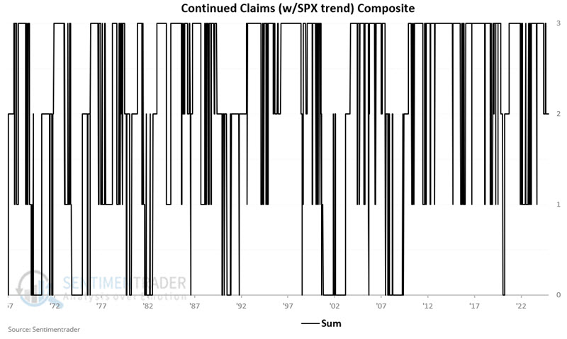
Continued Claims Composite = C
So, our "Continued Claims Model" (such as it is) considers BOTH price action and indicator action. For any given week, the value can read 0 to 3. Readings of 0 are considered unfavorable for stocks (i.e., unemployment is in an objective uptrend, AND stock prices are in an objective downtrend).
The chart below shows the weekly readings since 1967.
Model hypothetical results
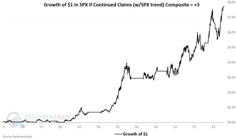
The chart below shows the hypothetical growth of $1 in the S&P 500 only when the model = +3. A hypothetical $1 grew to $8.66.
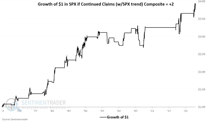
The chart below shows the hypothetical growth of $1 in the S&P 500 only when the model = +2. A hypothetical $1 grew to $3.89.
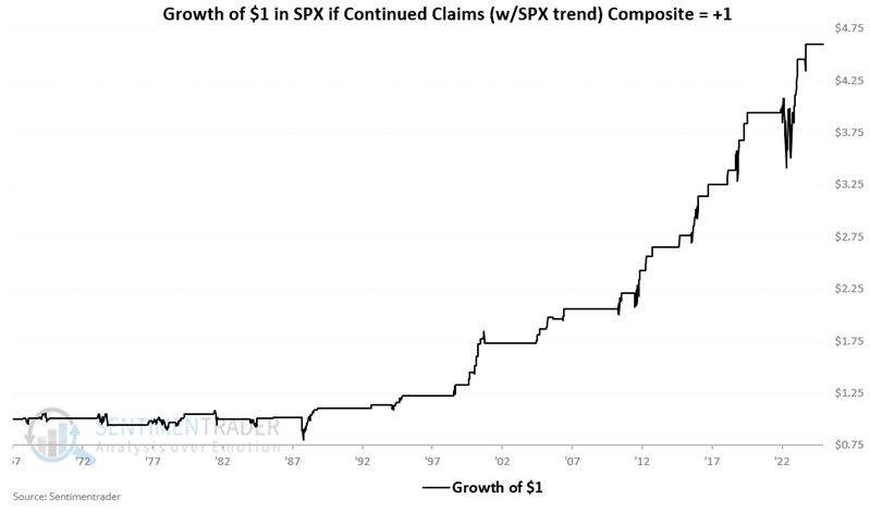
The chart below shows the hypothetical growth of $1 in the S&P 500 only when the model = +1. A hypothetical $1 grew to $4.60.
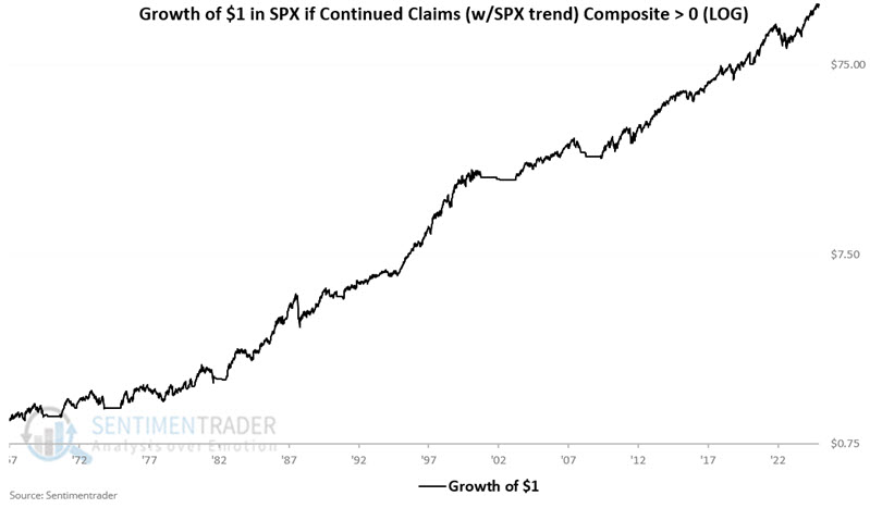
The chart below shows the hypothetical growth of $1 in the S&P 500 only when the model is greater than 0 on a logarithmic basis. A hypothetical $1 grew to $155.03.
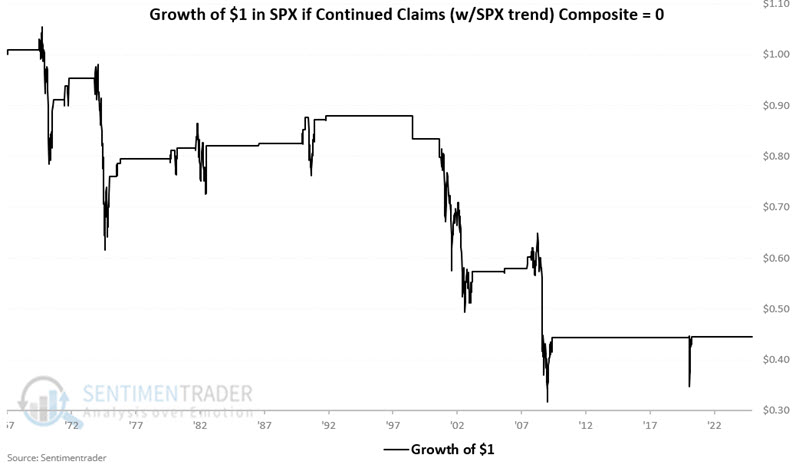
Finally, let's consider model readings of 0. Remember, this only occurs when unemployment is rising, AND stock prices are already in a downtrend. So, this model will never "pick a top." However, the real point is to avoid (or at least lighten up on) stocks when both factors (employment and price action) are unfavorable. Avoiding or lightening up on stocks when unemployment is rising and stock prices are (already) falling appears to be useful, as shown in the chart below.
The chart below shows the hypothetical growth of $1 in the S&P 500 only when the model is = 0. A hypothetical $1 shrank to $0.44.
What the research tells us...
So, how do we use this data? If unemployment starts to rise but stock prices are still in an uptrend (Model = 2), ignore any negative headlines about "rising unemployment." If stock prices slump but unemployment remains in a downtrend (Model = 1), consider it a "buying opportunity." If the stock price falls into a downtrend and unemployment is rising (Model = 0), "play defense" (i.e., raise some cash). And if employment is falling and stock prices are in an uptrend (Model =3), sit tight and enjoy the ride.
At the moment, the 4-week average of Continued Claims is above its 78-week EMA. However, the S&P 500 remains well above its 40-week average. So the model reads a favorable +2.