
TradingEdge Weekly for Sep 23 - All or nothing days, spiking yields, inverted curves, seasonal swings

Key points:
- Stocks have suffered a near-record number of all-or-nothing days
- Those days have kept adding up during an unusual 65-day rally from a low
- A primary cause of the volatility is likely rising rates, with real yields breaking out again
- Yields all across the Treasury curve have hit 252-day highs
- In the process, more than half of the curves inverted, a sure recession signal in recent decades
- More economic deterioration has also triggered a recession alert in the TCTM model
- Leading indicators are rolling over
- We still have another week of poor seasonality, then a strong tailwind due to the election cycle
- More and more commodities are losing their long-term uptrends
- Silver and gold miners are both facing a tough seasonal window
A bevy of all-or-nothing days
Days when seemingly everything swings in lockstep have been common in recent months.
Through Trading Day of the Year (TDY) #178, our data shows that investors have gone mostly one way or the other on 70 sessions. These are moderate extremes, with fewer than 20% or more than 80% of S&P 500 stocks advancing in the session. It ranks among the most extreme years this far into the calendar since 1928.
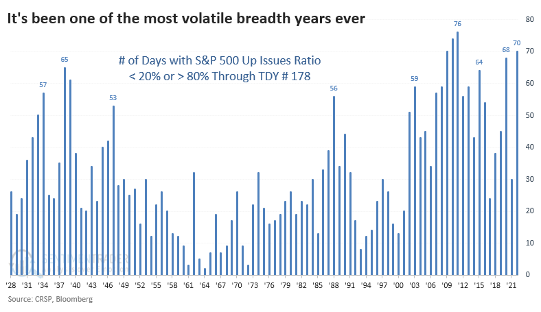
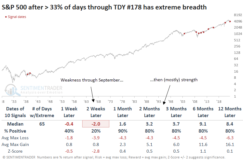
When we've gotten this far into the year and more than a third of days witnessed at least a moderate extreme in breadth, the S&P struggled over the next couple of weeks. The last half of September tends to be a bear. The month(s) ahead witnessed a rebound each time outside of 2008, though 1939 also ended up being a failure.
If we look at even more extreme days, when fewer than 10% or more than 90% of stocks advanced, it's no surprise that 2022 also ranks high. So far this year, there have been 27 such days.
There have only been a handful of years when at least 15% of days witnessed true all-or-nothing days this far into a year. All but one have triggered since the global financial crisis, and all but one preceded losses over the next couple of weeks before (mostly) rebounding.
The volatile swings have occurred during an unusual rally
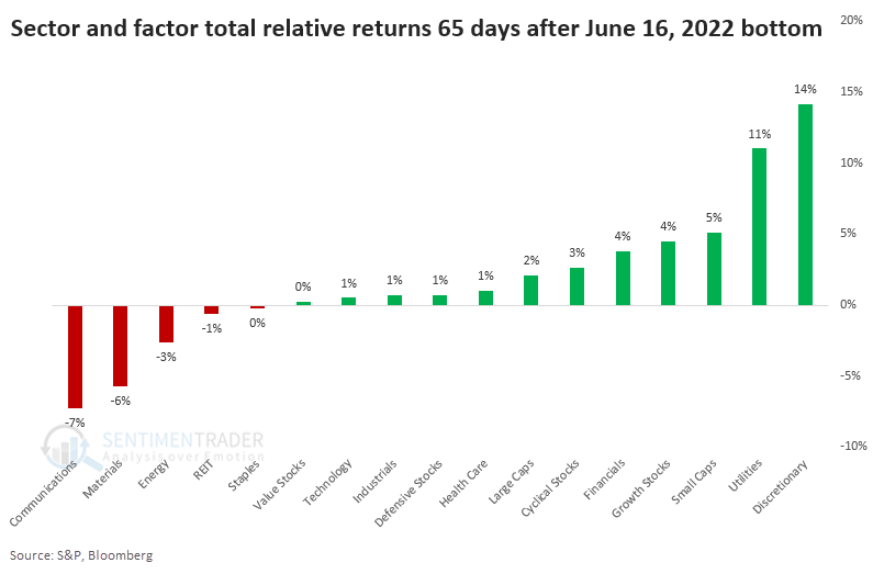
This past week, we had gone 65 days since the June 16 bottom. And the focus of investors has been...interesting.
Consumer Discretionary stocks have sported the best return, along with Utilities, of all things. Bringing up the bottom of the sectors and factors we watch are Communications and Materials. Relative to the S&P 500's return, Discretionary and Utility stocks have far outpaced the index and other sectors and factors.
Macro folks like to point out Utilities and insist, "This is not what new bull markets are made of!" To see if that has merit, we went back to 1928 and looked at how major sectors and factors performed relative to the S&P 500 during the first 65 days of a rally from a 252-day low.
The ten bottoms with the highest correlation are shown in the table below. The highest-correlated sector and factor performance occurred in the first three months of the lows in 1984, 1947, and 1938. Those didn't lead to great gains, but also not big losses.
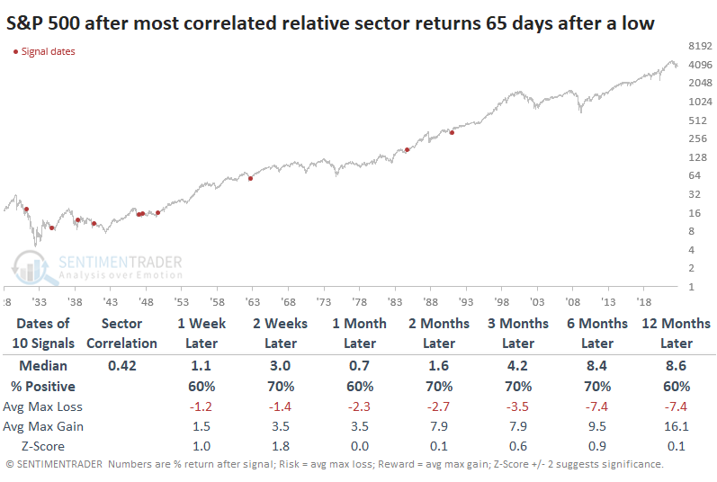
We like to look at the inverse conditions as that can help bolster confidence in a conclusion. When we look at the most inversely correlated sector and factor returns after a low, the S&P 500's returns going forward were worse. That suggests that the stocks leading now aren't necessarily the "bad" ones that increase the chances that we're just seeing a bear market rally.
Rising rates are the likeliest reason for high volatility
The Wall Street Journal notes that rising rates are increasingly becoming an issue for investors.
Most consumers and investors are more concerned with real rates, whether they realize it or not. This is the rate of the 10-year Treasury yield minus the 10-year breakeven rate, roughly a gauge of investors' long-term inflation expectations. This real yield has been spiking and is nearing an 11-year high.
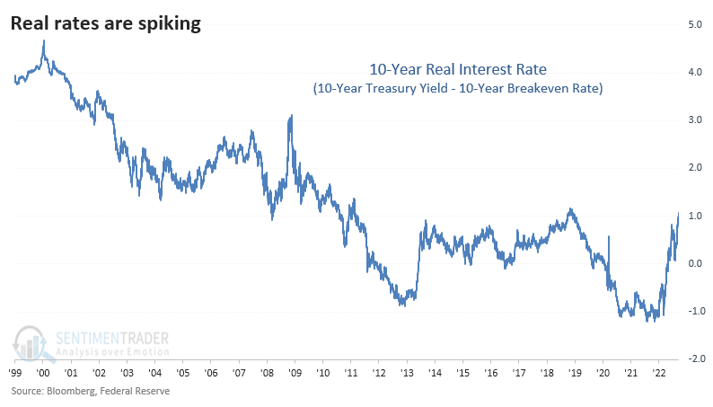
The rate spiked to a fresh three-year high a couple of weeks ago and has kept climbing. Before 1999, we need to use an alternative data source, which uses core CPI to reflect inflation. It's imperfect, to be sure, and is more volatile.
Whenever the real rate broke out to a new multi-year high for the first time in months, the S&P 500 struggled a bit over the next 2-3 months. Returns over the past 30 years were fragile in that time frame.
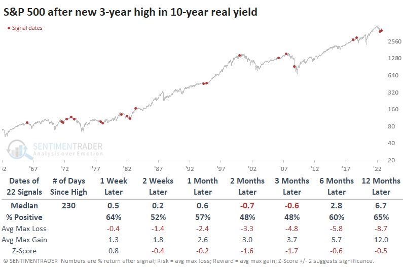
One of the charts that often zooms around is the 10-year real rate superimposed against gold, with one of them inverted. Rising real rates have been a killer for gold prices over the past 15 years. Before that, the relationship wasn't as strong, particularly during the mid-2000s.
If we use the signal dates above, when real rates broke out to a new 3-year high, we can look at returns in other asset classes. Gold was the only one that showed losses more often than gains over the next couple of months, but even that wasn't egregious.
Yields are breaking out across the curve
Yields are rising again, and other asset classes don't like the competition from bonds.
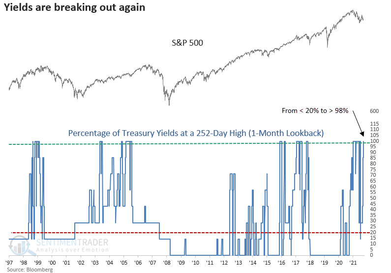
Dean noted that on Monday, Treasury yields ranging from 6 months to 10 years closed at a new 252-day high. The breakout in yields occurred after an easing in rates, which helped to fuel the significant rally in stocks from the June low.
A model that measures the percentage of Treasury yields closing at a 252-day high within the past month cycled from < 20% to > 98%, triggering a new signal.
The yield breakout looks unkind to stocks, with negative returns across all time frames up to three months later. Since 1974, stocks closed lower in 16 out of 18 cases in the first two weeks.
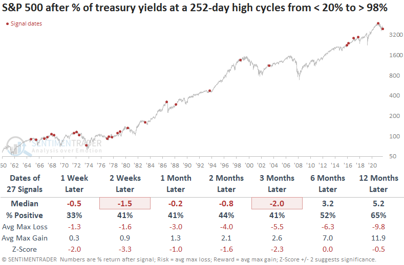
Similar to stocks, commodities struggled with mostly flat returns across the short- to medium-term. Interestingly, the prior signal from January 2022 shows some of the best historical returns in the first few months.
Gold struggled more than a broad basket of commodities, with negative returns in the first few months. More recent signals show a better return outlook starting in the 3-month window, with seven consecutive winners.
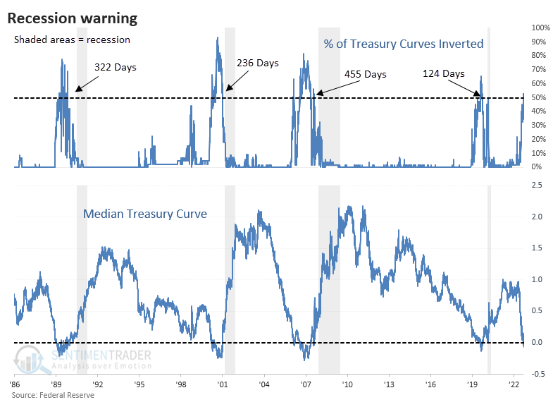
Short-term yields are rising faster, triggering a spike in inversions
When we looked at yield curve data in March, only a few curves were inverted. A recession only becomes (much) more probable when more than 50% of major yield curve combinations show a negative value. And that's what has happened. At the same time, the median yield curve is now negative, a drastic decline over the past few months.
When we zoom in on the past 30 years, we can see that this combination preceded every recession, with no false positives. It's safe to say there's a high probability that one's coming down the pike, but it may take awhile. Over the past four recessions, it took an average of more than a year between when the signal triggered and the official declaration of recession. For these purposes, "signal" means that more than half of curves were inverted, and the median was negative.
Due to the nature of the data, we're limited to a tiny sample size, so any conclusions are suspect. Still, if we buy the S&P 500 just as we're about to enter a recession, the returns weren't horrid. Of the five times this triggered, stocks did show mostly poor returns in the short term. But from 3-12 months later, the S&P sported a positive return all but once. Granted, that "once" was a doozy, as it triggered near the peak of the 2000 bubble.
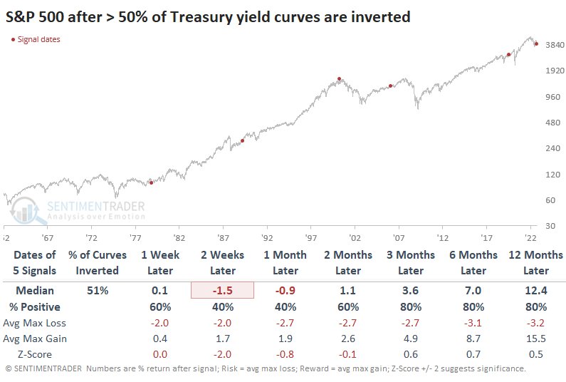
Other indexes and assets also showed mostly poor returns. The dollar tended to rally in the short- to medium-term, while gold did the opposite. It's somewhat surprising that the Nasdaq Composite performed the best out of the "big four" equity indexes.
More recession indications
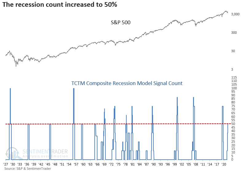
Building permits have fallen more than 14% on an annual basis. At the same time, the S&P 500 is trading below its 12-month average. After similar conditions, the S&P 500 was flat to slightly negative up to 6 months later. Dean showed that his TCTM Composite Recession Model count increased, triggering a recession warning.
When building permits fall by over 6% annually, and the S&P 500 is trading below its 12-month average, all is not well with two leading indicators. With the new alert from the building permits model, the TCTM Composite Recession Model count increased to 50%, triggering the 16th warning since 1928. So, we now have heavyweight truck sales, corporate bond yields, economic sentiment, and housing, all pointing toward a potential economic contraction.
Recessions signals were unkind to stocks, especially 3 to 12 months later. The signal shows a loss at some point in that time frame in all but one instance, which occurred within the context of the Covid-induced government shutdown of the economy.
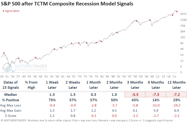
The new recession signal does not alter the overall TCTM outlook, which remains with a cautious bull status. That will be the case until the Composite Thrust Model signal window expires. If that window expires and the TCTM Long-Term Trend Model is negative, the overall TCTM model will return to a bearish status.
Still more recession indications
Dean also showed that the Conference Board released the August Leading Economic Index (LEI) on Thursday. The composite, which contains ten economic components, registered the first annual decline since the Covid recession.
When the LEI contracts annually and the S&P 500 is trading below its 12-month average, the environment for stocks is unfavorable.
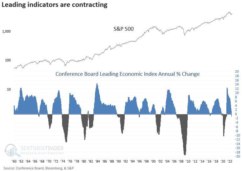
While the sample size is small, which is the case with most economic data, stocks struggled on a medium to long-term basis, especially 12 months later. The original data for July did not show a contraction. In the August update, revisions caused the July annual number to turn negative, which is why the signal date occurred in July.
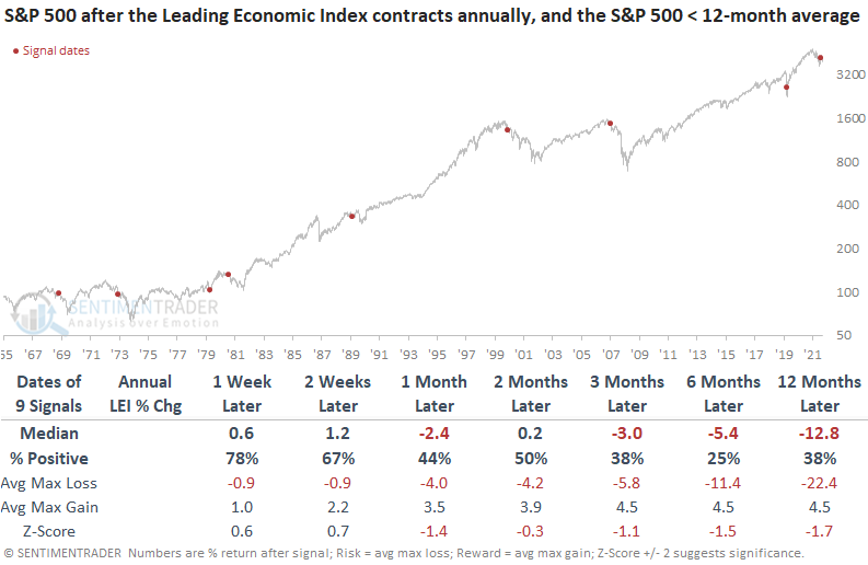
Since 1969, the LEI model has generated an alert during a recession in five cases. If a signal occurred before a contraction in the economy, it took, on average, 55 days until the NBER declared a recession.
Another week of a stiff seasonal headwind
September is widely recognized as the poorest performing month for the stock market. It is a mistake to assume that the market will decline simply because the month happens to be September. Jay noted that a lesser-known fact is that weakness is much more common during the last ten trading days of September.
We will define "the latter part" of September as the last ten trading days of the month. The chart below displays the cumulative return for SPX held long only during the last ten trading days of September, and the table summarizes the results.
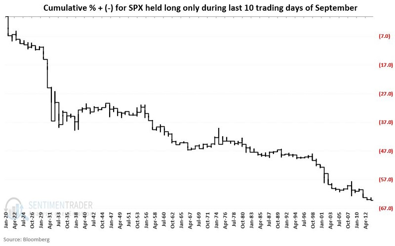
During these stretches, the S&P 500 showed a gain in only 35% of years. Its average and max losses were significantly larger than its average and max gains. We still have another week to go.
After that, though, the seasonal bias turns solidly higher
Jay showed that the upcoming ten-month period starting October 1st is the most favorable portion of the 48-month election cycle. Results are not always hugely profitable. The last 20 election cycles have seen the S&P 500 Index rise during this period.
The most favorable portion of the 48-month election cycle extends from the end of September of the mid-term election year and the end of July of the mid-term election year. The next favorable period extends from the close on September 30 through July of next year.
The chart below displays the cumulative price return for the S&P 500 if held only during October of each mid-term election year through July of the following year.
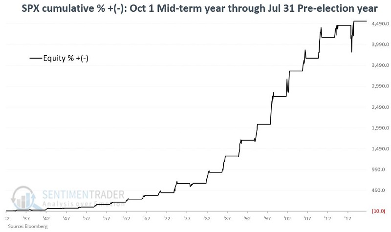
Over roughly 90 years, the cumulative return for the best ten months was +4,553% versus +1,134% for all 38 other months.
The chart below shows the performance for the best ten months over a full cycle.
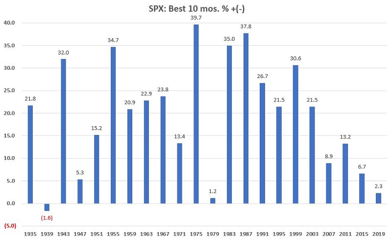
The average return was +19.7%, and the median return was +21.5%. Of the 22 completed election cycles, the best ten months have shown a gain 21 times (95% of the time) and a loss only once.
Commodities are losing their uptrends
Dean noted that after a multi-year bull market with solid participation, most commodities have given up their long-term uptrends.
Last week, a significant reversal in uptrends occurred when fewer than 20% of commodities closed above their 200-day average. The shift happened after more than 80% of commodities traded above their 200-day average as recently as May.
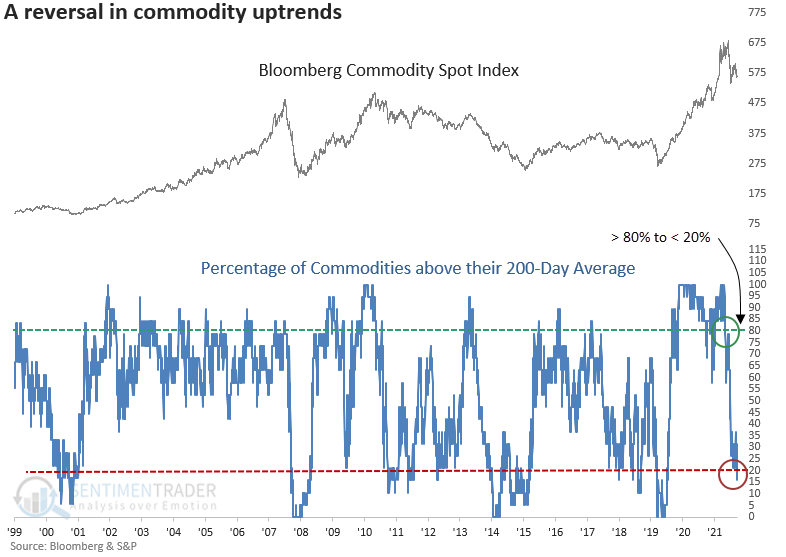
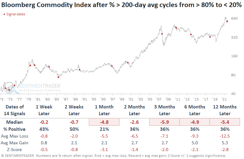
The u-turn in long-term uptrends for commodities does not bode well for the Bloomberg Commodity Spot Index. After similar signals, returns, win rates, and z-scores were unfavorable across all time frames. The index was lower a month after 9 out of the last 10 signals.
If we look at sectors that may be heavily influenced by commodity prices, two stand out. Energy stocks look weak in the near term, with a more favorable outlook 3-months later. The materials sector looks better than the energy group, with positive returns across almost all time frames.
Silver's tough spot
Silver has a history of moving in a highly cyclical fashion. Being aware of the current seasonal status can help keep traders on the right side of this volatile market. Jay showed that one of the weakest seasonal periods of the year begins in late September and lasts until late October.
The chart below displays the annual seasonal trend for silver futures. The red box highlights an impending period of seasonal weakness.
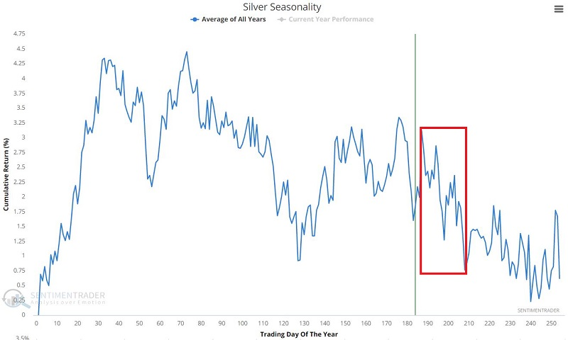
The unfavorable period for silver in question runs from the close on Trading Day of the Year (TDY) #187 and extends through the close on TDY #208. For 2022 this starts at the close on September 20 and ends on October 19.
From the end of 1974 through the present, the cumulative loss during the red box unfavorable periods was -$77,588. Silver declined 62% of the time during these windows, with a significantly larger average and maximum decline.
Gold miners are facing a tough spot, too
Jay also noted that gold miners have collapsed by over -40% in the last five months. While many traders are looking for an oversold bounce, history suggests that caution remains in order. The weakest period of the year for this sector begins in late September and will last until late November.
The chart below displays the annual seasonal trend for The NYSE Arca Gold Bugs Index (HUI). The red box highlights a period of typical seasonal weakness. The current unfavorable period begins at the close on September 21 and ends on November 22.
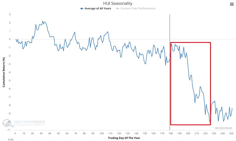
The chart below displays the hypothetical return achieved by holding HUI only during the unfavorable period marked by the red box in the chart above.
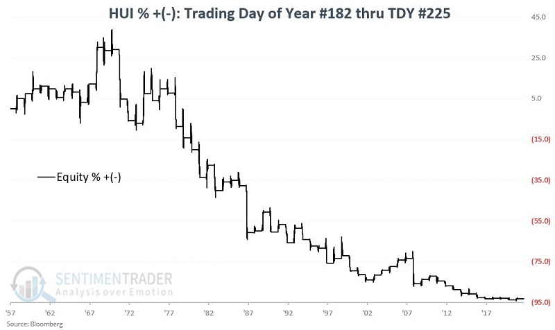
From 1962 through the present, the cumulative return during the TDY #181 through TDY #225 period was -93%. It is important to note that results can vary significantly from year-to-year. The table below summarizes HUI's performance during this unfavorable fall period.
About TradingEdge Weekly...
The goal of TradingEdge Weekly is to summarize the research published to SentimenTrader over the past week. Sometimes there is a lot to digest and this summary is meant to highlight the highest conviction or most compelling ideas we discussed. This is NOT the full research that's published, rather it pulls out some of the most relevant parts. It includes links to the published research for convenience; if you don't subscribe to those products it will present the options for access.