
TradingEdge Weekly for Nov 18 - Seasonal sweet spots, depressed consumers and funds

Key points:
- NOTE: Our research publishing will be light the week of November 21-25
- NOTE: TradingEdge Weekly will not be published during the week ending November 25
- Consumers are more depressed than they've ever been
- Hedge funds, too, have been slow to embrace the rally
- At least we're in the midst of the most favorable time of the year
- And about to enjoy several Holiday Day stretches
- It gets even better if we use an equal-weighted version of the S&P 500
- Basic Materials stocks have come storming back
- Industrial stocks are also resurgent
- The Optimism Index on bonds finally reversed higher after deep pessimism
- Investment-grade bonds, in particular, have surged
- The dollar has suffered a very sharp, sudden reversal
- A plunge in the dollar has helped metals like copper
Consumers get even more depressed
The latest round of surveys on the American consumer by the University of Michigan showed more deterioration. These are not the official month-end readings, but there usually isn't too much of a change.
One of the notable aspects of the poll is that on pretty much all the questions, consumers are discouraged, including about their current condition and outlook for the future.
There are four main parts of the survey that we've focused on, shown in the chart below. Two (Sentiment and Current Conditions) are focused on the here and now, while two (Expectations and Business Conditions) are more forward-looking. Across the board, they're near the lowest levels in more than 40 years. A six-month average of the four surveys has now dropped to the lowest on record.
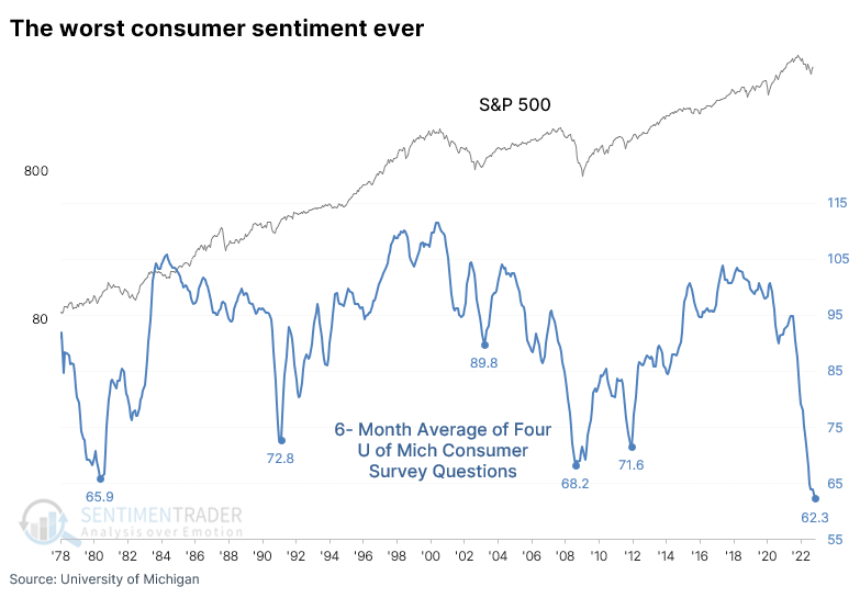
When the 6-month average of these surveys got this low, it was early during the financial crisis, and investors in the S&P 500 were still nursing losses three years later not including dividends. The others, however, coincided with the ends of bear markets or just after.
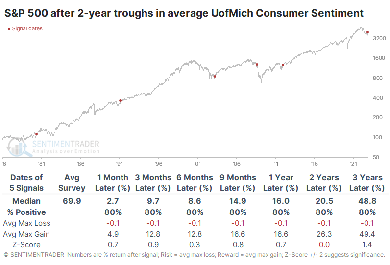
Among other indexes after these signals, the Nasdaq Composite enjoyed the highest average returns, followed by the small-cap Russell 2000. Other assets were mixed, but commodities generally fared poorly.
The best sector performers were Discretionary, Financials, Real Estate, and Technology. Small-caps showed the best average return a year later, at more than 45%. Value stocks enjoyed the best two-year return, nearly 55%.
Hedge funds aren't embracing optimism, either
Consumers aren't the only pessimistic ones - hedge funds have been slow to embrace the rally and appear to carry low exposure to stocks across strategies.
On the website, we track the rolling beta of returns of trend-following Commodity Trading Advisors (CTAs) to the S&P 500 and other assets. Currently, that is showing about 10% net short exposure. It's not just trend followers. Global macro, equity long-only, and market-neutral funds also have low exposure using this method.
The average rolling 50-day beta across these four strategies is now negative, suggesting a net short position. While funds were short during the worst of the financial crisis, their pessimism didn't pay off most of the time. The S&P 500's annualized return when their exposure was 5% or lower was 16.2%, compared to 4.5% when exposure was 25% or higher.
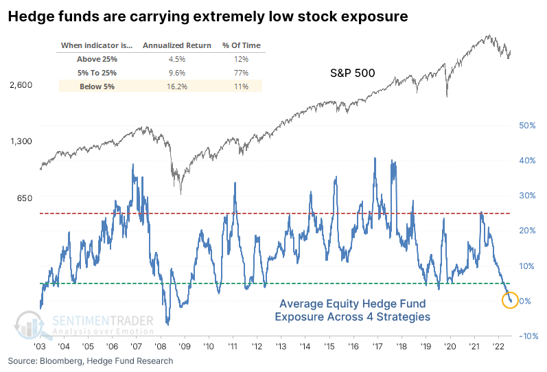
There was an even greater dispersion between returns when exposure was about in the bottom and top 5% of readings. During the bottom 5% of readings, the S&P's annualized return climbed to 17.8% versus -8.0% when it was 30% or higher.
Maybe the calendar will help their mood
Jay showed that there are many different takes on year-end seasonality, and none of them are necessarily the "right" one.
From his perspective, the year-end rally period starts at the close on Friday the week before Thanksgiving and ends at the close on the last trading day of the year.
For testing purposes, we will use daily closing prices for the S&P 500 Index. The chart below displays the cumulative percentage return for the S&P 500 Index held long only during this period starting in 1942.
The S&P 500 sported a positive return 73% of the time, but more impressively, average gains about doubled average losses, and the S&P was much more likely to enjoy a large gain than a large loss.
The S&P 500 will likely be at a loss for the year when this year's year-end rally period begins. To assess if this might matter, we looked separately at year-end rally period performance based on whether the S&P 500 was showing a gain or a loss as of the close on the Friday before Thanksgiving. The chart below displays the cumulative S&P 500 return for year-end periods when the S&P is down for the year as of the Friday before Thanksgiving.
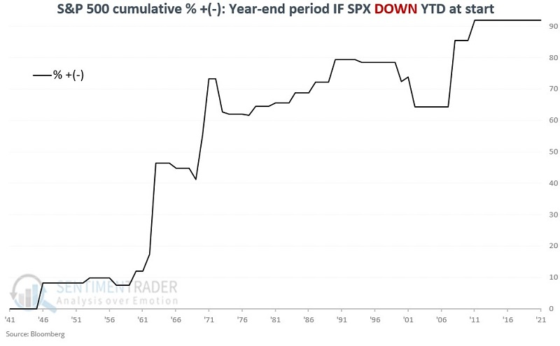
The year-end period Win Rate drops from 77% to 63% during these years. The good news is that results still skew significantly positive. Also, the median loss is just -2.2%. The worst losses were -6.1% in 1973 and -5.5% in 2002.
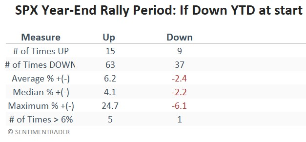
History suggests that investors should have a high degree of confidence in being in stocks during the week of Thanksgiving through the end of the year. While there is never any guarantee, and year-to-year results can vary greatly, the period has shown a bullish consistency that is very rare. Another striking thing to note is the relatively benign nature of declines during those years when the year-end rally period does show a loss.
Using the holiday seasonal effect on shorter time frames
On a short-term basis, we have several 6-day stretches that have been especially favorable for bulls.
Jay outlined a strategy of holding the Dow only during the three trading days before and the three trading days after every market holiday starting in December 1933. The chart below shows this strategy's hypothetical cumulative percentage return.
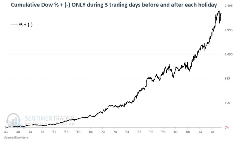
The chart below is quite enlightening. It displays the cumulative growth for the Dow held only during Holiday Days (black line) compared to the cumulative growth for the Dow held during all other trading days (blue line).
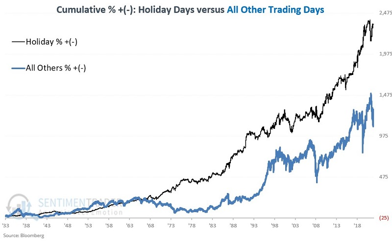
Despite representing only 19% of all trading days, Holiday Days gained +2,337% versus All Other Days (representing 81% of all trading days), which earned only +1,294%. The bottom line: Holiday Days have delivered almost twice the return in a fifth of the time.
Roughly three out of every five Holiday Day periods showed a gain, and the average and median gains are greater than the average and median loss. The next period begins at the close on November 18 and extends through the close on November 29.
Using an unweighted index during the seasonally positive stretch
One weakness of using the S&P 500 as an investor's default index is that the largest companies assert an undue influence. Jay noted that switching between the traditional capitalization-weighted index and its equal-weighted version, depending on the calendar, can add to returns.
The strategy below aims to offer a potential edge to investors who decided to devote some of their capital to an S&P 500 Index buy-and-hold approach. For testing purposes, we will use the SPDR S&P 500 ETF Trust (SPY) to track the S&P 500 Index and the Invesco S&P 500 Equal Weight ETF (RSP) to track the S&P 500 Equal Weighted Index.
There is not much to the strategy; there are only two steps:
- From June 1st through October 31st hold SPY (SPX cap-weighted index fund)
- From November 1st through May 31st hold RSP (SPX equal-weighted index fund)
The chart below displays the cumulative percentage return for RSP and SPY if both are held only from November through May since RSP's inception in 2003.
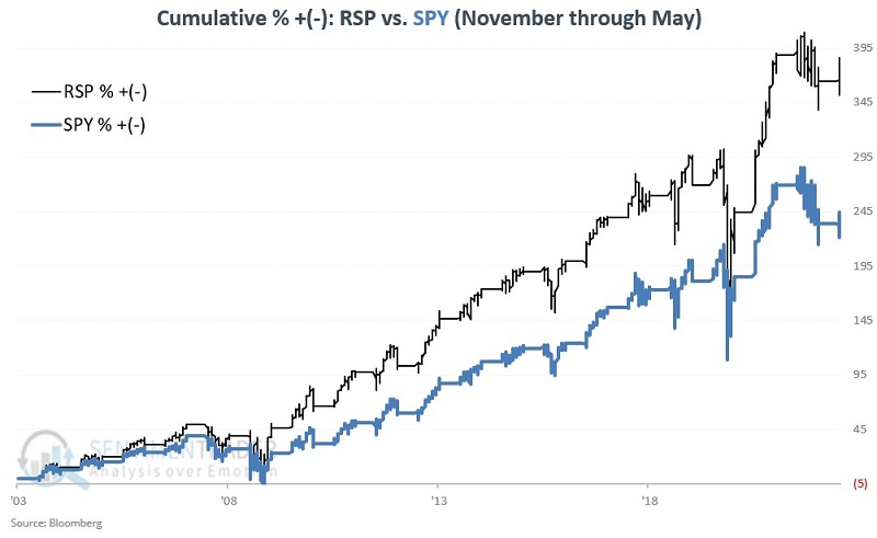
Both RSP and SPY showed a gain 85% of the time but RSP had a significantly higher average and median return. RSP outperformed SPY 75% of the time. The switching strategy involves two trades per year, switching to SPY on May 31st and switching to RSP on October 31st.
Let's take a look at the full strategy results. As a benchmark, we will also track a strategy that holds 50% each in RSP and SPY. This strategy will rebalance to 50/50 at the end of each year.
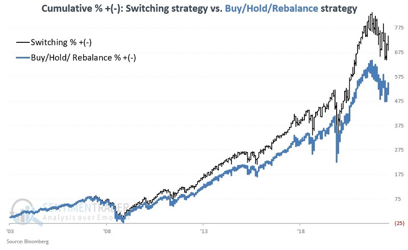
One strategy can outperform another strategy over the long term based solely on one or two periods of outperformance. So, let's take a closer look at switch versus buy/hold/rebalance to assess the consistency of outperformance.
We will look at rolling 5-year returns for each strategy for this test. At the end of May each year beginning in 2008, we will measure the return for each strategy over the previous five years. We will then subtract the 5-year performance for buy/hold/rebalance from the 5-year performance for the switching strategy to see how often the switching strategy outperforms and to what degree.
The switching strategy has outperformed buy/hold/rebalance over all 15 rolling 5-year periods. The average outperformance is +10.1%, and the median outperformance is +7.1%.
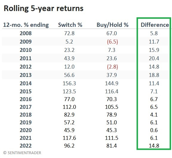
Remember that this strategy is not presented as some world-beater investment approach. Its sole objective is to offer a slight edge beyond simply buying and holding an index fund, and an investor should also consider tax implications of such a strategy.
Basic Materials stocks have come storming back
It's been a heck of a couple of weeks, including a sector most investors ignore. Out of all the sectors and indexes we track, none have more members in medium-term uptrends than Basic Materials.
It would be impossible for more of these stocks to be trading above their 50-day moving averages because every one of them is. It's a dramatic turnaround from less than two months ago when every one of the stocks was below its 50-day average.
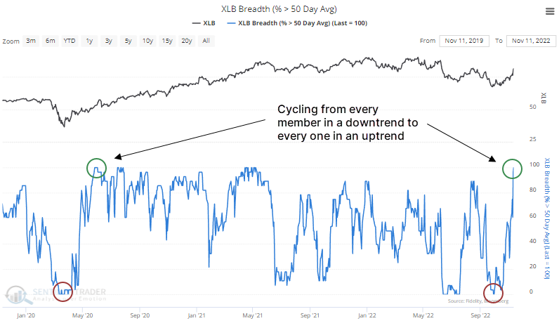
Over the past 70 years, only a handful of times has the sector undergone such a dramatic shift in fortunes within six months. The table below shows every time since 1952 when, within six months, every stock was below its average, then every one was above.
The current shift is the 2nd-fastest in history, next to May 1980. It even beat out the pandemic recovery. It was a good sign for future returns, as all of the dates showed a positive total return over the next 2-12 months.
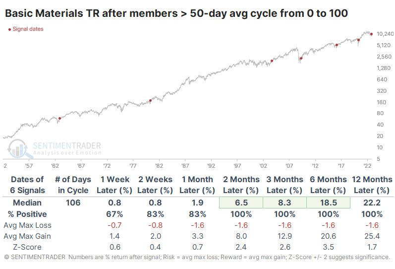
The returns in the table are impressive, though with a tiny sample size. What makes the signals more compelling is consistency. At no point within the following year did any of them suffer more than a -5% drawdown, while all enjoyed gains of at least +15%.
Industrial stocks are resurgent, too
Jay showed that Industrial stocks have suddenly become a market darling, and several factors have lined up to suggest it may continue.
The broader stock market tends to show strength from the close on Trading Day of Year #226 through the end of the year. As you can see in the annual seasonal trend chart below, the Industrials sector tends to follow suit.
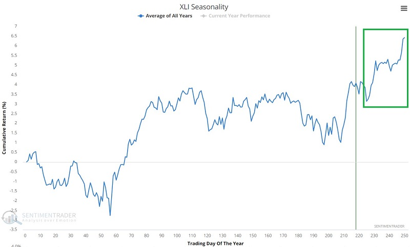
The sector showed a gain 80% of the time, with average gains about double average losses. More notably, there was a remarkable tendency to see many more large gains than large losses.
Jay previously discussed the most favorable ten months of the 48-month election cycle, extending from November 1st of the mid-term year through July of the pre-election year. The Industrials sector has shown remarkable consistency during this period, having rallied during 19 out of 20 cycles, scoring impressive gains most of the time.
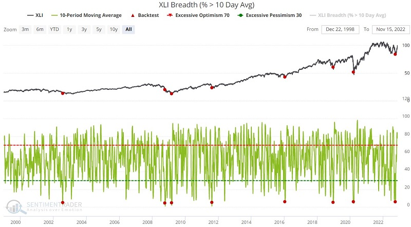
Relying solely on seasonal trends to trade requires a leap of faith. Typically, it is best to combine seasonality with information from other indicators to make the odds as favorable as possible. Fortunately, several breadth indicators confirm favorable signals.
The chart below displays when the 10-day moving average of the XLI Breath (% > 10-day avg) indicator crossed below 6%. Over the medium- to long-term, XLI averaged excellent gains.
The chart below highlights when the 10-day moving average of the XLI % New Low indicator crossed above 20%. Once again, there were few losses after the very short-term. Virtually all of the signals triggered at or near the ends of bear markets.
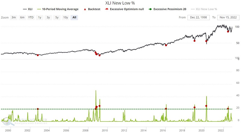
The McClellan Oscillator and Component Correlation are two other indicators that also triggered medium- to long-term bullish signals in recent weeks or months, helping give more weight to the potential positive seasonality.
Bond optimism has finally rebounded
With inflation surging to the highest level in 40 years, bond investors have endured the worst start to a year in history.
However, the recent CPI report showed inflation has potentially peaked, and bond traders responded by bidding up Treasury prices across the curve. Dean noted that the reversal triggered a new Optimism Index buy signal for the 20+ Year Treasury Bond ETF.
The model applies an 84-day range rank to the 6-day moving average of the Optimism Index for the TLT ETF. A new buy signal triggers when the range rank exceeds the 80th percentile, and ETF momentum turns positive.
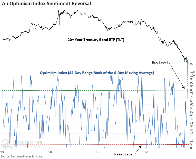
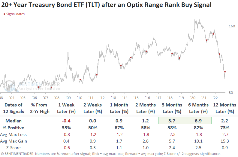
While a couple of time frames show a significant z-score, the win rates and returns are okay. Usually, the ETF undergoes a little digestion in the first week. Context is always important. So, let's isolate all signals that occurred when the TLT ETF was down 10% or more from a 2-year high, which is the case now. While the first couple weeks are challenging, the outlook improves dramatically, especially six months later.
With the release of the latest CPI report last week, the 3-month moving average of the y/y change in CPI declined for the third straight month. The successive month's lower for the average occurred with y/y CPI above 5% and within six months of an annual high.
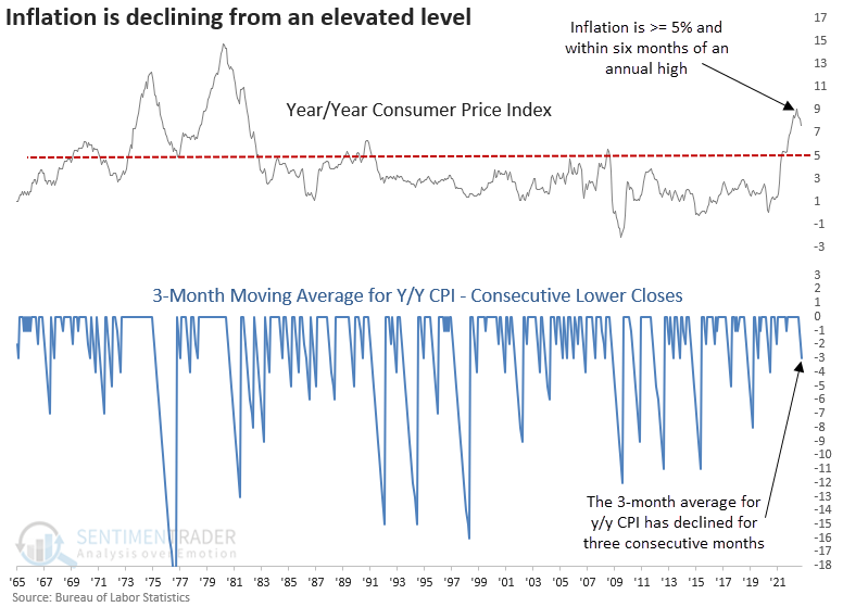
While the sample size is small, as with most studies when inflation is this high, the outlook suggests the 10-year bond yield could trend lower over the following year.
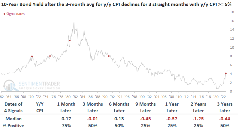
Long-term bond yields could move lower due to a recession. The CPI signals triggered near an economic contraction in 3 of 4 cases. With the 10-year to 3-month Treasury yield curve spread at -54 basis points, a level not seen since March 2007, a recession looks more likely.
Investment-grade bonds have surged
Dean also noted that with the relentless rise in the dollar and interest rates subsiding over the last few weeks, a trading model generated a new breadth thrust signal for investment-grade bonds this week.
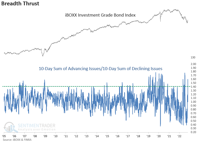
The breadth thrust alert triggers when the 10-day sum of investment-grade advancing issues exceeds the 10-day sum of declining issues by a ratio of 1.41, using a reset condition to screen out repeats.
Despite hitting a recent rough patch, the breadth thrust signal for investment-grade bonds has a solid historical record. Inflation and Federal Reserve policy are unlike anything we've seen in the data's history. Also, the 2008 signal never showed a loss, even though stock indexes declined for an additional four months. So, there's a precedent for investment-grade bonds bottoming before stocks.
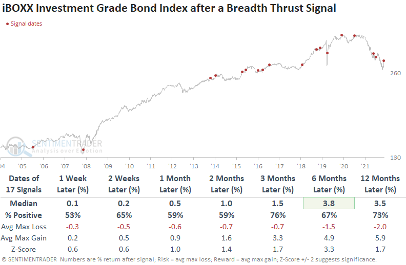
When investment-grade bonds trigger a breadth thrust, stocks take note, with excellent results across all time frames. And the more recent alerts have faired better than the investment grade results, with a gain at some point over the next few months in 3 of 4 cases.
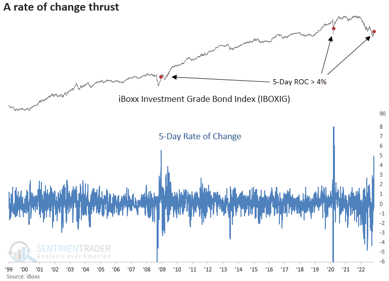
One significant difference between the current breadth thrust signal and the previous ones since investment-grade bonds peaked in 2021 is momentum at the index level. Over five days, the iBoxx investment-grade bond index surged to the third-highest level in history. The burst in price momentum looks similar to other major inflection points in 2008 and 2020.
The dollar has had a tough time of it
The weaker-than-expected CPI report last week sparked an impressive two-day rally in stocks. Dean noted that the rebound was aided by one of the most significant week-over-week declines in the Dollar Index (DXY) in more than 50 years.
For only the 7th time since 1971, the Dollar Index declined by more than 4% over one week. While one week rarely makes a trend, a decline of this magnitude suggests otherwise. Usually, a potential trend change in the Dollar Index would be a welcome development for risk assets.
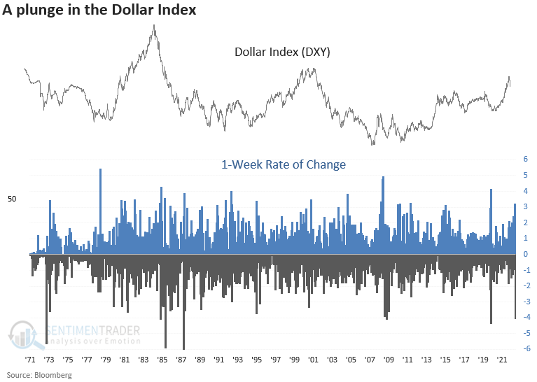
While the sample size is small, a 4% plunge over one week suggests the Dollar Index will trend lower over the next few months and potentially even the following year.
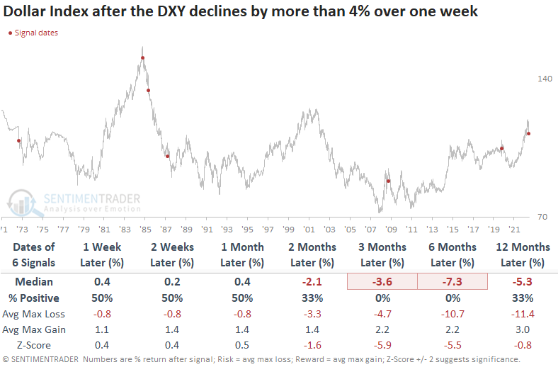
The S&P 500 struggled somewhat over the first few weeks but had an upward bias across long-duration time frames. The one significant failure besides the 1987 crash had one key difference from most other instances-Fed policy.
Interestingly, sector performance in the first month shows a similar trend to what we've seen over the last few weeks, with strength in value-oriented groups like energy and financials.
Unlike stocks, commodities show no signs of struggling in the first few weeks after a plunge in the Dollar Index. And long-term results are equally impressive. Gold looks favorable across most time frames, especially a year later. The signal shows a gain at some point over the next six months in every case.
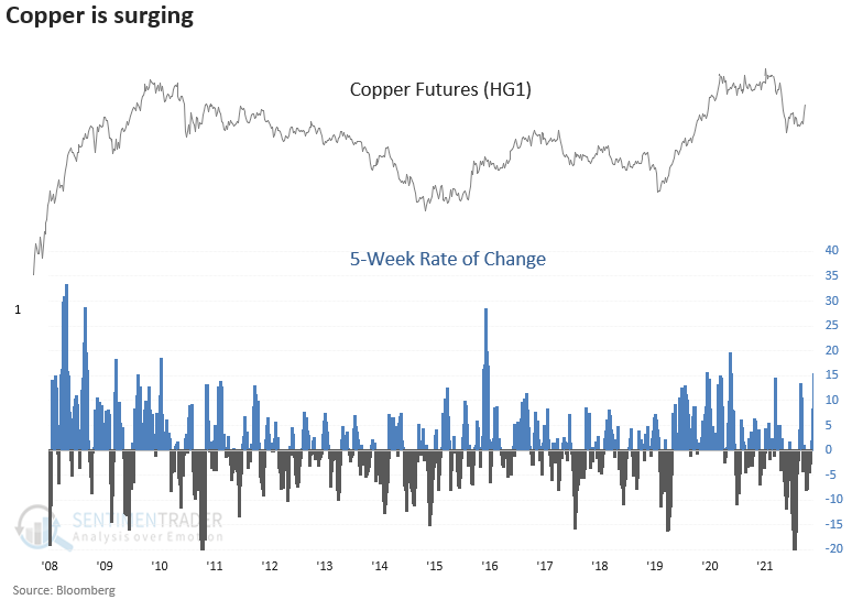
The plunging dollar is helping copper
Dean further noted that copper has been one of the beneficiaries of the recent plunge in the Dollar Index. The metal surged more than 14% over five weeks after it fell more than 20% over the prior 52 weeks.
The surge in Copper bodes well for the commodity across all time frames, especially 6 and 12 months later. The signal shows a positive return in every case at some point in the first six months.
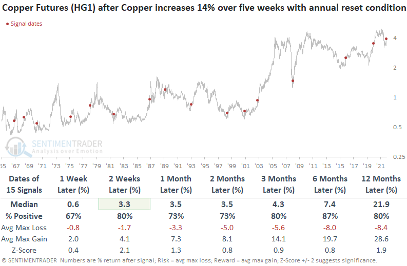
While results are constructive a year later, the S&P 500 tended to struggle over the next few months after a sharp rise in Copper. Sector and industry performance confirms the lackluster outlook over the next few months, with a few exceptions. Similar to what we've seen in other recent studies, Energy and Materials look constructive.
What's good for Copper is good for a broad basket of commodities. The Bloomberg Spot Commodity Index shows solid results across all time frames, especially a year later.
About TradingEdge Weekly...
The goal of TradingEdge Weekly is to summarize some of the research published to SentimenTrader over the past week. Sometimes there is a lot to digest and this summary is meant to highlight the highest conviction or most compelling ideas we discussed. This is NOT the full research that's published, rather it pulls out some of the most relevant parts. It includes links to the published research for convenience; if you don't subscribe to those products it will present the options for access.