
TradingEdge Weekly for May 26 - Subtle shifts in sentiment, oversold defensive stocks, Japan breakout

Key points:
- Money managers are turning more bullish
- A couple of other indicators are showing important shifts in sentiment
- Semi stocks had a great day on Thursday
- Tech stocks have enjoyed a cluster of relative breakouts
- Corporate insiders have been buying Financials and Utilities
- Many Consumer Staples and Utilities stocks are oversold
- Japanese stocks broke out of a major base
- Real estate stocks are entering a positive seasonal window
- Commodity indexes have shown weakness right about now
Money managers are turning more bullish
The NAAIM Exposure Index suggests that professional investors are becoming more bullish. Jay showed that the history of the index suggests that this is a good thing.
NAAIM stands for the National Association of Active Investment Managers. As the name implies, this is a group of professional investors. Investment surveys typically serve as contrary indicators as investors tend to become more bullish as the market rises and more bearish as the market declines. The NAAIM Exposure Index typically bucks this trend. While even professional money managers are susceptible to the pull of fear and greed, this group is more adept at fighting those emotions.
Sophisticated investors typically avoid an all-or-nothing approach. Instead, many will scale the percentage allocation to stocks up or down based on perceived risk. Members typically adjust quickly to increase exposure once the market appears to bottom and starts to rise.
We follow a 50-week moving average of weekly readings to track this trend. The chart and table below highlight those rare occasions when the NAAIM Exposure Index 50-week average crossed above 51%.
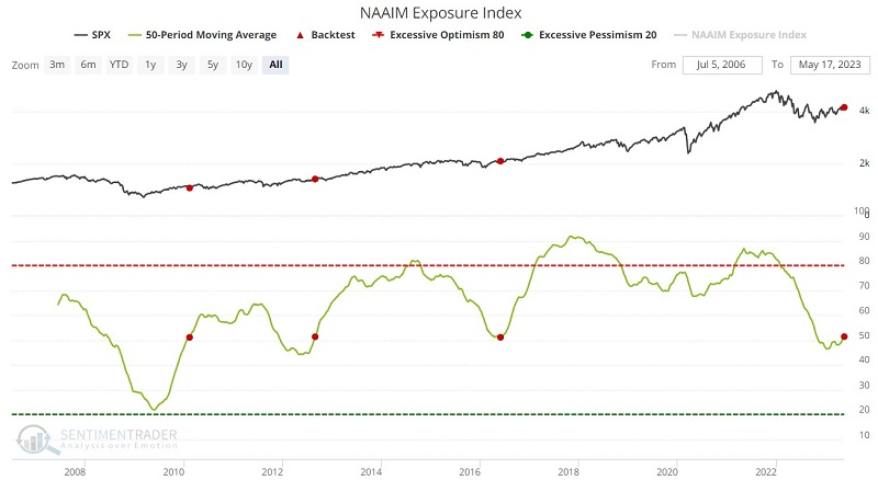
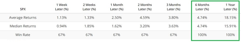
This is an exceedingly small sample size. But we are looking at this indicator as "weight of the evidence" and not as an automatic buy or sell signal. The average 12-month gain following a cross above 51% is 15.91%, with a 100% Win Rate. This is relevant as a new favorable signal occurred on 2023-05-17.
A couple of other indicators show important shifts in sentiment
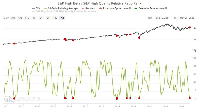
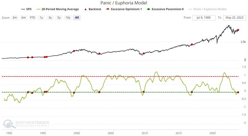
Jay further noted a couple of other indicators showing subtle but important shifts in sentiment. The relationship between speculative stocks and more stable names recently reached a significant level, and the Panic/Euphoria Model recently hinted at a return to risk-seeking behavior.
Our S&P High Beta / S&P High-Quality Relative Ratio Rank compares the relative performance of volatile stocks to that of more stable, less volatile stocks. It shows where the ratio is relative to its range over the past four months. When the ratio drops to a low level, they exhibit risk-off behavior.
Generally speaking, a rising trend is bullish, suggesting investors are more willing to take risks and vice versa. However, like most indicators that measure investor sentiment, it is essential to note when they reach an extreme. One way to measure this is to apply a moving average to the daily readings.
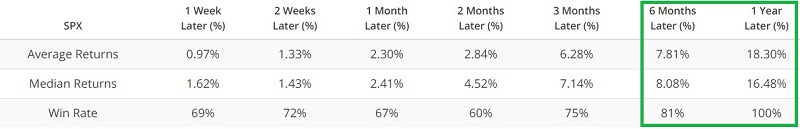
The red dots in the chart below highlight those times when the 20-day average for this indicator was below 4.0. A reading this low suggests that investors have essentially thrown in the towel on speculative stocks and are focusing more heavily on defensive stocks. This bearish action is typically a bullish contrarian sign.
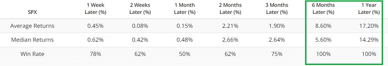
For a longer-term look at sentiment, the red dots in the chart below display those occasions when the 20-week average of the Panic/Euphoria Model crossed above 0. For this to happen, the indicator must first fall to - and remain at - a negative value for an extended period. This tends to happen as bearish sentiment reaches an extreme, and this extreme typically occurs at or around significant market bottoms.
By the time the 20-week average crosses back above 0, the worst generally is over, and the market is ready to embark on an upward trend. But again, there are no guarantees.
A great day for semis
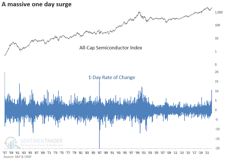
Dean noted that on Thursday, a semiconductor index surged by more than 11% and closed at a 12-month high on the back of Nvidia's earnings report.
A surge of that magnitude to a new high has never happened before. If we lower the percentage gain to 5% or more, there were 23 other historical precedents since 1960.
When the semiconductor index surges by more than 5% in a single day and closes at a 12-month high, the bullish momentum will likely continue over the near term. A month later, the index was higher 74% of the time, with a nine-signal winning streak. The last loss in that time frame occurred in 1987.
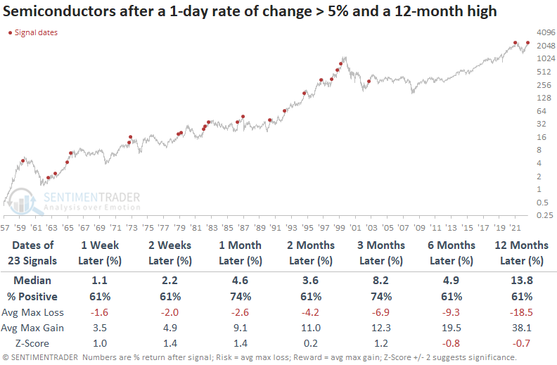
Since 1973, the max gain exceeded the max loss in 16 out of 18 precedents over the two-month horizon. And the signal showed a max loss of greater than -10% only five times over the same time frame.
While the semiconductor index surged more than 5% to a 12-month high, the index did not close at a 24-month high. While rare, a 5% surge to a 12-month high but not a 24-month high saw semis gain all four times, averaging +27.4%.
Tech's relative breakout cluster
Tech stocks have had an outstanding year, especially the big ones. According to Bloomberg calculations, a handful have accounted for all the gains this year in an index mimicking the S&P 500.
As a result, a proxy index of the Technology sector has not only broken out to a new high relative to the S&P 500, it has continued to shoot higher. It was only earlier this year when the ratio dragged along at a multi-year low.
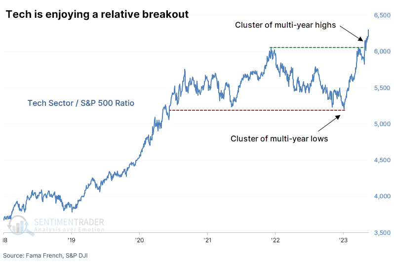
Out of the past 15 sessions, over half of the days have witnessed a new high in the Tech to S&P 500 ratio. Similar clusters proved to be a mediocre sign for the S&P 500, with returns about in line with random and unimpressive consistency. It was a modestly better sign for the Tech sector, but still not a solid edge.
When looking at the relative performance of Tech versus the broader S&P index, the six-month window showed the most consistent outperformance, especially over the past three decades. There were only three times when Tech did not outperform, and the differences were relatively minor.
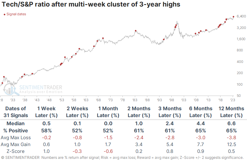
This is the 13th time when there was a cluster of days when the ratio made at least 1-year lows, which then cycled to a cluster of 1-year highs. These cycles preceded further outperformance most of the time, especially over the next two months. Over the next year, Tech outperformed after 8 of the 12 times, and one of the losers was small.
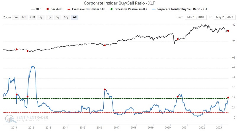
Insider buying in Financials and Utilities
Jay noted that we continue to see meaningful action among corporate insiders in specific sectors. Insider action in the Financials and stodgy, boring Utilities continue to favor their own shares.
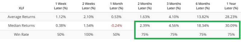
The red dots in the chart below highlight those rare occasions when our Corporate Insider Buy/Sell Ratio - XLF has crossed above 0.20. The most recent new signal occurred on 2023-05-22. The sample size of previous occurrences is small, so there is a danger in blindly assuming that the current signal will play out as before. Still, the summary of results shown below - and the fact that financial insiders have steadily become more bullish as the "bank crisis" has unfolded, would appear to be a favorable sign for investors willing to weather the elevated volatility and risks associated with the financial sector.
Many investors view utility stocks as stodgy and boring relics, suitable only for income investors. But not to the people who run those companies. Utility corporate insiders look for unique buying (and selling) opportunities just like everyone else. The ratio of buying to selling among corporate insiders of companies comprising the S&P 500 Utilities Sector was elevated for several months.
Again, we are dealing with a small sample size, making it somewhat dangerous to declare a particular level definitively bullish. Still, the previous bursts in 2015-16 and 2020 saw the SPDR Utilities Sector ETF (ticker XLU) average a 12-month gain of over 15% - a pretty heady rate of return for a stodgy sector.
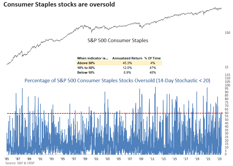
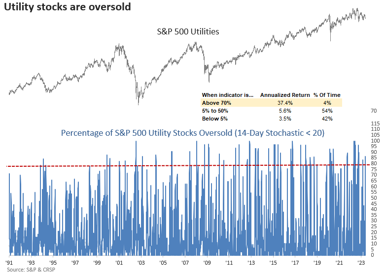
Many Staples and Utilities stocks are oversold
Treasury yields all closed at a two-month high in the last ten days, which Dean suggested helped send Consumer Staples and Utility stocks plunging to oversold levels.
The percentage of oversold issues for Consumer Staples and Utility stocks increased above 60% and 80%, respectively. Interestingly, the same indicator for the S&P 500 showed only 23% of issues oversold. The significant difference between defensive stocks and the broad market is rare.
The percentage of oversold Consumer Staples stocks surged to a level associated with extremely bullish annualized returns for the sector.
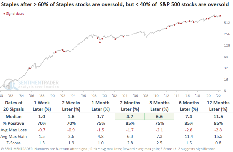
When greater than 60% of Consumer Staples stocks are oversold, but fewer than 40% of S&P 500 stocks are oversold, the divergence between a defensive sector and the broad market tends to mark a bullish inflection point for Staples. Three months later, the group was higher 85% of the time. The difference in oversold conditions between the two groups was also bullish for the broad market. Six months later, the S&P 500 was higher 90% of the time.
Like Consumer Staples, the percentage of S&P 500 Utility sector stocks registering an oversold condition surged to a level associated with significant annualized returns.
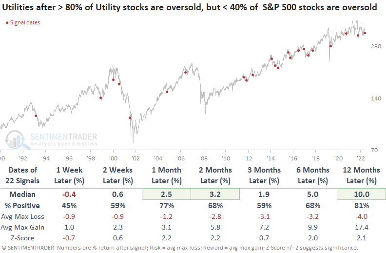
When greater than 80% of Utility stocks are oversold, but fewer than 40% of S&P 500 stocks are oversold, the variation between the two groups tends to lead to some downside follow-through over the next week. A month later, the utility sector bounced back with a 77% win rate. The results were significantly worse for the S&P 500 than the Utility sector outlook, with flat returns over the next three months.
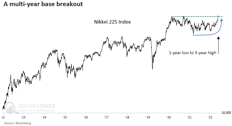
An important breakout for Japanese stocks
Dean showed that the Nikkei 225, a widely followed Japanese Index, closed at a multi-year high, the first instance after falling to a 1-year low. Similar breakouts preceded excellent results over medium and long-term horizons.
Long-duration breakouts like this one are rare. The previous breakout occurred in 2020, leading to substantial gains over the next three months.
When the Nikkei 225 Index registers its first 5-year high after a 1-year low, forward returns and win rates are outstanding, with several time frames showing significance.
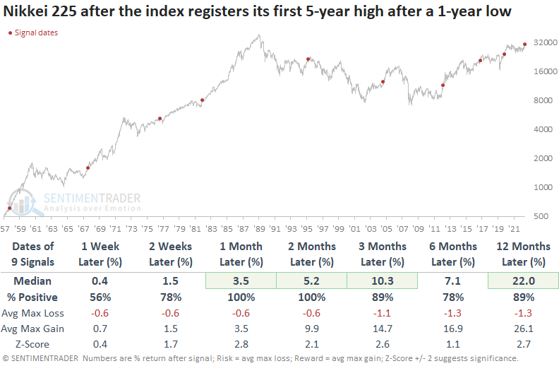
The median max gain was significantly better than the median max loss across most horizons, especially a year later.
When allocating globally, investors must always be mindful of the impact of currency. While the Nikkei 225 closed at a new high in local currency terms, the Index remains more than -20% below its high when priced in the U.S. dollar. The impact of currency is notable on a YTD basis, with Japan ETFs that hedge their currency easily outperforming the ones that do not.
Real estate's positive seasonal window
The real estate sector was hit hard in 2022 and has struggled to get off the deck so far in 2023. Jay suggested that if the sector is going to stage a rebound, the current seasonal window could be the time.
The current favorable period extends from the close of Trading Day of Year (TDY) #96 through TDY #172. For 2023, this period extends from the close on 2023-05-19 through 2023-09-11.
Traders should not assume that starting a favorable seasonal window automatically equals a "buy signal." The proper mindset is not "it's time to buy" but "it's time to keep an open mind and be prepared to buy." The chart below displays the hypothetical cumulative $ +(-) from holding a long position in the real estate sector only during this seasonal window since 1953.
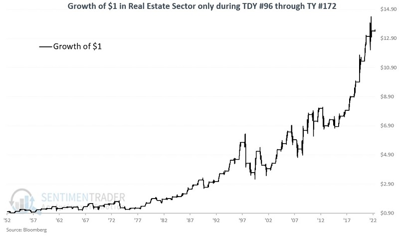
The sector showed a gain during 71% of the years. While the average gain during positive years was about the same as the average loss during losing years, the sector enjoyed a larger max gain than max loss and was twice as likely to show a 15% gain than a -15% loss.
A weak spot for commodities
Jay noted that commodities as an asset class tend to show weakness during late spring into early summer and that seasonally unfavorable period is starting now.
According to Investopedia:
The Commodity Research Bureau Index (CRBI) acts as a representative indicator of today's global commodity markets. It measures the aggregated price direction of various commodity sectors. This commodity index comprises a basket of 19 commodities, with 39% allocated to energy contracts, 41% to agriculture, 7% to precious metals, and 13% to industrial metals. The CRB is designed to isolate and reveal the directional movement of prices in overall commodity trades.
A period of weakness for the index occurs from Trading Day of Year #98 through TDY #123 is highlighted. For 2023, this period extends from the close on 2023-05-23 through the close on 2023-06-28. The chart below displays the growth of $1 in the CRB Index only during this window starting in 1994.
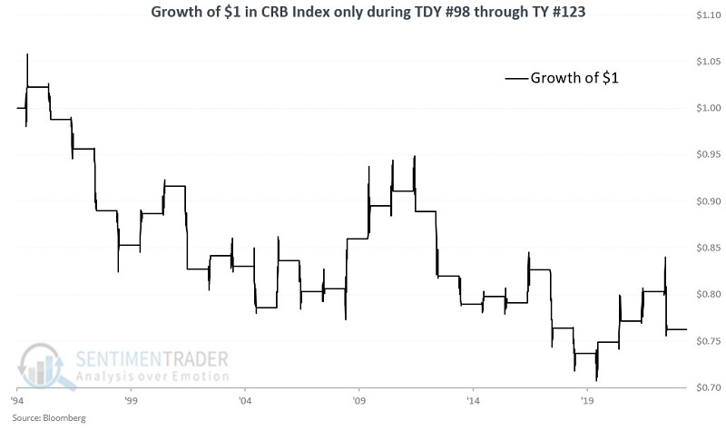
The index showed a gain 48% of the time, but with a much higher probability of showing a large loss than large gain.
Now, from 1933 to 1960, we used the Dow Jones AIG Commodity Index, and from 1960 to the present, we used the Bloomberg Spot Commodity Index (which measures prices in the cash market). The chart below displays the results using these indexes.
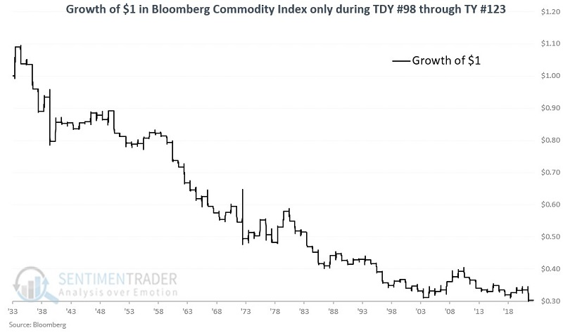
Over this much longer history, commodities gained only 38% of the time, with a median gain of 3.2% versus median loss of -4.0%. There were 10 gains larger than +5% versus 19 losses larger than -5%.
About TradingEdge Weekly...
The goal of TradingEdge Weekly is to summarize some of the research published to SentimenTrader over the past week. Sometimes there is a lot to digest, and this summary highlights the highest conviction or most compelling ideas we discussed. This is NOT the published research; rather, it pulls out some of the most relevant parts. It includes links to the published research for convenience, and if you don't subscribe to those products, it will present the options for access.