
TradingEdge Weekly for Mar 8 - Enthusiastic investors, options for options, gold breakout

Key points:
- Investors appear to be in the Enthusiasm phase of a Typical Sentiment Cycle
- Retailing stocks are in a positive part of the calendar
- A way to trade Apple with less capital outlay
- Gold has broken out, but not relative to stocks
- Despite the gold breakout, miners are still mired in a bear market
- Using options to trade a coil in silver
- Sentiment on corn (and beans) is among the worst in 30 years
In the Enthusiasm phase of a Typical Sentiment Cycle
A year ago, investors were finally getting to the point of Returning Confidence, which was a good long-term sign for stocks.
This is based on a Typical Sentiment Cycle and has served as a good guide over the years. Over the past 18 weeks, the straight-up rally has moved us to an interesting juncture in the Sentiment Cycle. For the past few weeks, the S&P 500 has demonstrated a high positive correlation to the Enthusiasm part of the Cycle and a highly negative correlation to the Panic phase.
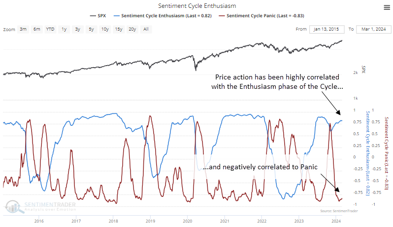
This behavior has been persistent, with the Enthusiasm correlation holding above +0.8 for fifteen consecutive days and the Panic correlation below -0.8 over the same stretch.
One wrinkle with our current situation is that the S&P has repeatedly hit new highs during the past few weeks. The table below shows S&P 500 returns after similar behavior when the index reached at least five 52-week highs within the past three weeks of extreme correlations.
After these signals, we can see a rockier path over the next 2-3 months. In 1954, 1995, and 2013, stocks continued to rocket higher without much of a pause. The other five instances suffered a medium-term pullback or showed only modest gains.
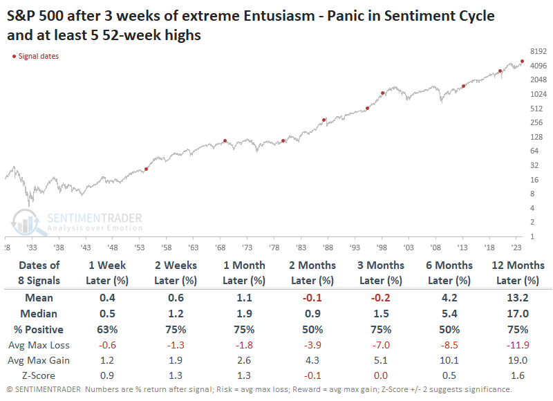
Perhaps surprisingly, the best-performing sectors and factors after several weeks of extreme Enthusiasm (and not Panic) were Technology and Growth stocks. They showed the most robust one-year returns, followed closely by Discretionary stocks.
A good time for retailers
The retailing sector has recently gained momentum and is threatening to break out of its extended range to the upside. Jay noted that this occurs just as XRT enters one of the most seasonally favorable periods of the year.
The Stan Weinstein classic Secrets for Profiting in Bull and Bear Markets leaned heavily on "stage analysis." A classic case of the four stages (1=Basing, 2=Advancing, 3=Distribution, 4=Declining) may be playing out in retail. The chart below shows a price chart for the SPDR S&P Retail ETF (XRT).
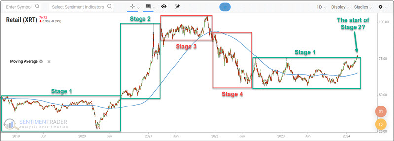
On the far right-hand side of the charts above, we see XRT attempting to break out to the upside. The implication is that it may be in the early stages of a Stage 2 advance, having just recently broken above the high of the Stage 1 base that's been forming over the last year and a half.
In addition, the annual seasonal trend for XRT is turning positive. For 2024, this period for XRT extends from the close on 2024-03-05 to the close on 2024-04-26.
The Fidelity Select Retailing Portfolio mutual fund (FSRPX) is an actively traded fund that does not track a passive index. With that caveat in mind, as it started trading on 1985-12-31, it offers a more extended history of results to evaluate. The chart below displays the growth of $1 invested in ticker FSRPX only from TDY #44 through TDY #81 every year since 1986.
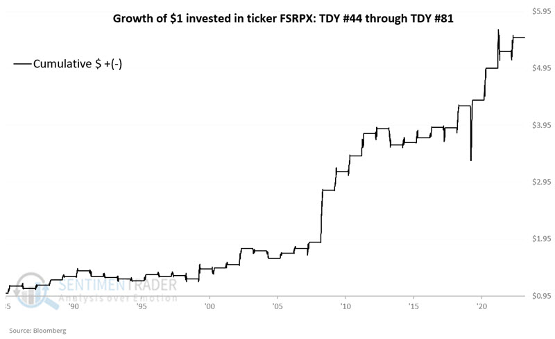
The fund rallied during 71% of these seasonal windows, with a median gain twice as large as the median loss. It rallied more than +10% seven times while never suffering a loss larger than -10%.
A play on Apple
The stock market has been roaring higher. However, Jay noted that Apple stock has been noticeably lagging.
To trade shares of AAPL requires a significant capital commitment, whether buying shares or attempting to sell them short. As of the close on 2024-03-01, AAPL shares traded at $179.66. Thus, the purchase of 100 shares requires a commitment of $17,966. Selling short would require a significant margin requirement and entail a high degree (theoretically unlimited). So, let's consider some less costly - and limited risk - alternatives.
The price of an in-the-money option is comprised of intrinsic value and time premium. The price of an out-of-the-money option is comprised solely of time premium.
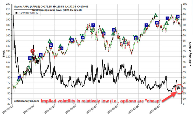
An options pricing model calculates implied volatility and indicates how much time premium is built into the price of a given option or options for a given security. If IV is relatively low historically, it suggests that the time premium is relatively low and that options are "cheap." This is generally a good time to consider buying options.
As we see in the chart below, implied volatility for options on AAPL is at the low end of its historical range. As a result, we will focus below on buying premium.
Let's consider a straightforward approach to playing this specific outlook. The example below essentially amounts to a stock replacement position. Our bullish example involves:
- Buying 1 AAPL April19 2024 170 call @ $12.50
The particulars for this position appear in the screenshot below.
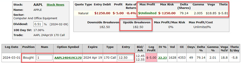
Things to note:
- The cost to enter this position - and the maximum risk - is $1,250 (or roughly 7% of the cost of buying 100 shares of AAPL)
- The breakeven price (if we hold this position until option expiration) is $182.50 (strike price + option cost, i.e., 170 + $12.50 = $182.50) - above $182.50; the option position will gain a point for point with the stock position
- The position has a "Delta" of 79.14. This implies that the position is roughly equivalent to buying 79 shares of AAPL stock
- The position has a "Gamma" of 2.005. This implies that the position will gain roughly 2 Deltas for each $1 that AAPL share gains in price (or lose 2 Deltas if AAPL declines $1 in price)
Possibly the best way to visualize this position is to compare its risk curves to those for a long 100 shares of AAPL position. This comparison appears in the chart below.
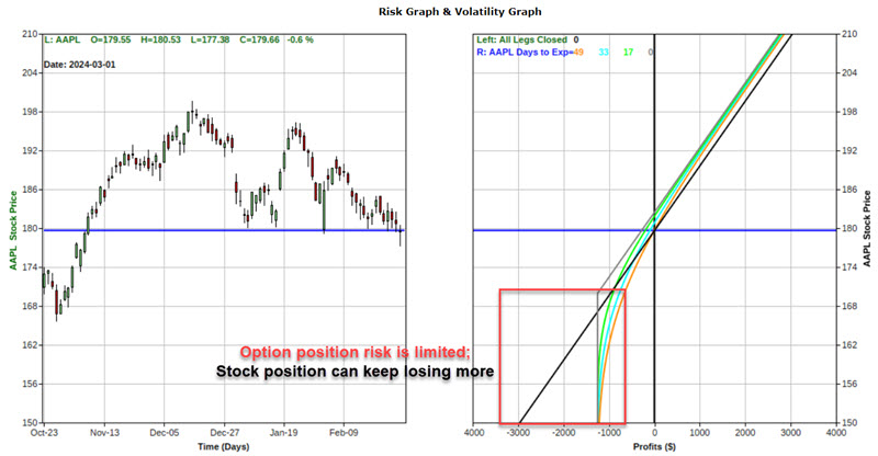
Above the breakeven price of $182.50, the option position will gain point-for-point with a position holding 100 shares of AAPL stock (despite costing only roughly 7% of the stock position). Below the option strike price of $170, the option position can lose no more than the $1,250 paid to enter the position, while the stock position will continue to lose another $100 for each $1 decline in the price of AAPL stock.
Jay also looked at a put option trade as an example for those who would be more apt to bet on a further breakdown in AAPL.
Gold has broken out, but not relative to stocks
Jay showed that gold has broken out to a new all-time high, but the Gold/SPX Ratio remains mired in a downtrend. Likewise, gold is still technically in the unfavorable portion of the 8-year cycle.
So, are we off to the races?
One typically reliable confirmation indicator is the Gold/S&P 500 ratio versus its 200-week moving average. When the ratio is above its 200-week average, it is considered favorable for gold and vice versa. The chart below displays the Gold/SPX Ratio from 1975, with the 200-week moving average overlaid.
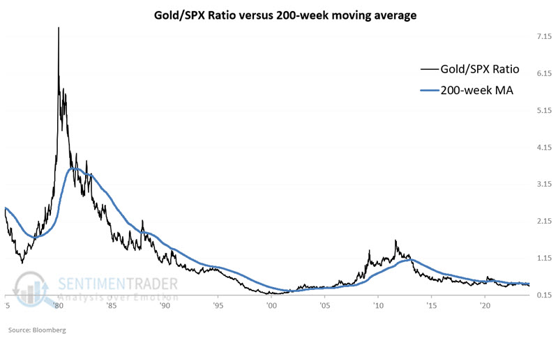
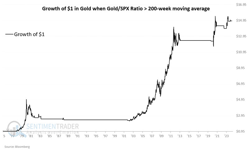
Historically, gold has performed much better when the indicator is positive. The chart below displays the hypothetical growth of $1 invested in gold only when the Gold/SPX Ratio is above its 200-week average. The hypothetical net gain since 1975 using this approach is +1,391%.
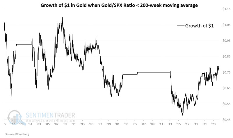
On the flip side, the chart below displays the hypothetical growth of $1 invested in gold only when the Gold/SPX Ratio is below its 200-week average (as it is now). The hypothetical net gain since 1975 using this approach is -21%.
Jay further looked at gold's historical performance based on 8-year cycles and how that impacts the ratio above. The cycle is unfavorable through 2024, so both factors are currently headwinds for the yellow metal.
Even with the gold breakout, gold mining stocks are mired in a bear market
Gold mining stocks have a demonstrated history of failing just at the point when most other markets would be overtaken by upside momentum. They've jumped over the past couple of sessions, and breadth is rapidly improving.
The percentage of miners with a rising 200-day moving average - a long-term look at solid uptrends - has quickly cycled from fewer than 5% of mining stocks to more than 20%. The other times the stocks cycled like this, miners showed gains over the next 2-3 months every time but once, in 1997, which was a complete and utter failure.
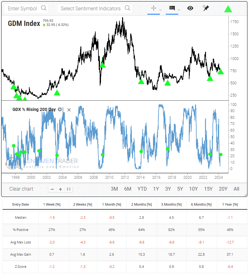
There were three distinct periods when gold stocks cycled like they have recently. The first was in the late 1990s. Only one of those signals preceded uninterrupted losses - the others either failed or led to hard-to-stomach volatile rallies over several months.
During the 2000s, these cycles were excellent signs that the worst of the selling pressure was over. All three signals ended bear markets and preceded stunning gains in the year(s) ahead.
The most recent decade has been a mixed bag. While all three signals preceded gains over the next several months, only one was convincing, and each of them ended up failing long-term.
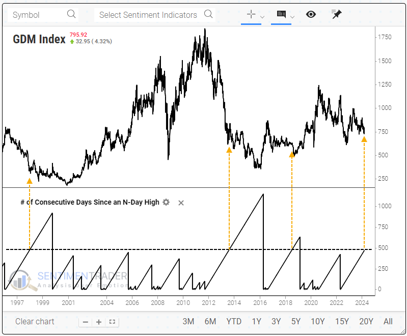
Gold stocks are also nearing 500 days since they last set a 52-week high. One of the new technical indicators added to Backtest Engine 2.0 allows a user to show how many days it's been since a stock, index, or ETF reached a user-defined high or low.
The three other times miners went this long since a new high, they started to form long-term bottoms, but it was a drawn-out, messy process.
The problem has been an absolute lack of buying interest, excluding the past few days. Recently, the sector suffered a streak of 10 consecutive down days for only the third time in 30 years. The others preceded short- to medium-term rebounds, while slightly lesser streaks tended to occur near longer-term turning points.
A silver spring
Silver is coiling on a price chart into an ever-narrower range. Jay noted that classic technical analysis suggests that whichever way it ultimately breaks out, it may move hard. An options straddle is one way to position for a move in either direction.
The chart below displays a weekly iShares Silver Trust ETF (SLV) bar chart. As you can see, it has been trading in an ever-narrowing range, particularly over the last four years.
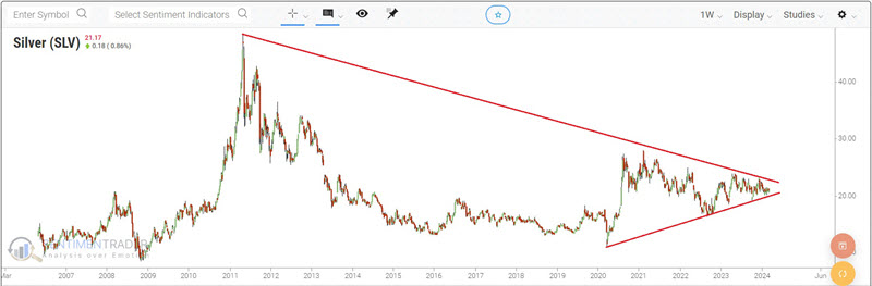
Classic technical analysis suggests that the ultimate price move will be substantial once an asset breaks out of a coiling price range. That's the good news. The bad news is that classical technical analysis does not indicate in advance when that breakout will occur or in which direction that ultimate move will be.
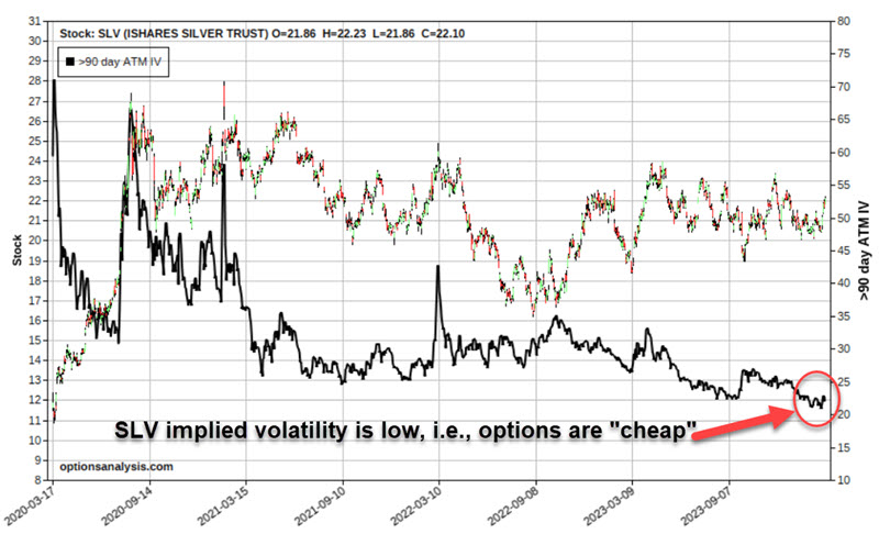
An options straddle is one way around this problem. Like any strategy, there are pros and cons.
A straddle involves buying a call option and a put option at the same strike price and expiration month. Because you are paying two option premiums instead of one, a straddle is typically best used when options are "cheap," i.e., when they have a relatively low amount of time premium built into their price.
The chart below displays a price chart for SLV with the average implied volatility for 90+-day options on SLV. As you can see, IV is very close to the low end of the historical range. This suggests that SLV options are "cheap" and that a straddle is an appropriate strategy to consider.
For silver, an example straddle might be:
- Buying 1 SLV Jun21 2024 22 strike price call @ $1.31
- Buying 1 SLV Jun21 2024 22 strike price put @ $0.89
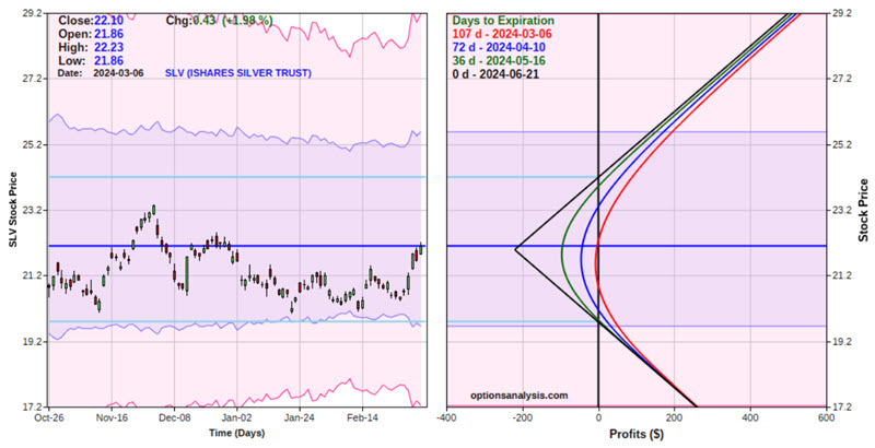
The figure below displays the particulars, and the chart below displays the risk curves (i.e., the expected $ return as of a given price for SLV shares and a given date).
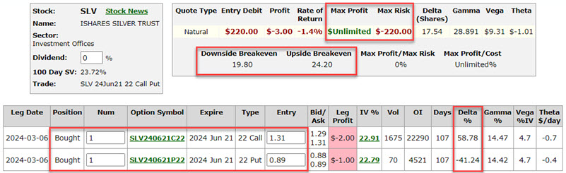
The implication is pretty straightforward:
- If SLV breaks out and runs in either direction (before the June 21st option expiration), unlimited profits can accrue
- If SLV remains between the breakeven prices of $19.80 and $24.20, the trade will lose money
Jay also outlined ways to make the position more delta-neutral, as well as a different strategy, a strangle, that bets on a more outsized move in SLV for less outlay.
Last year was a bad time for grow-and-hold
It hasn't been a pleasant year for farmers holding grains in storage. Many expected prices to hold up last year, so instead of selling to elevators or hedging with futures contracts, they put corn and soybeans in storage. And prices have wilted almost without interruption.
As a result, speculators are pressing their short bets to record levels, and overall sentiment in corn is as bad as it has been in nearly 35 years.
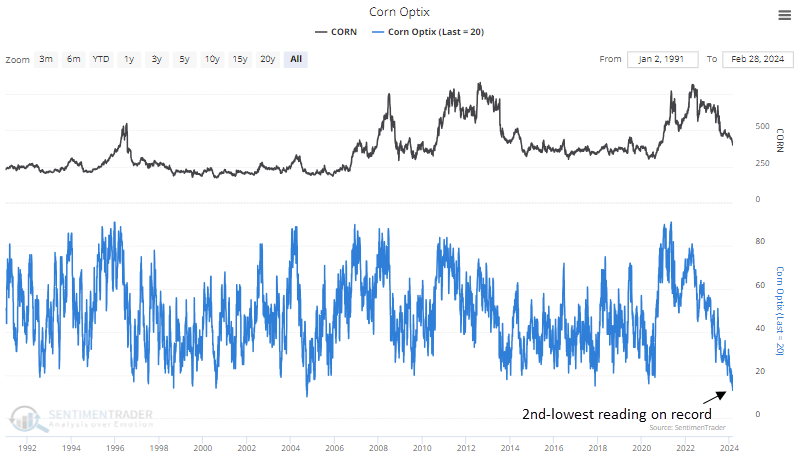
It's not much better in beans.
This is the first time in six years that the Optimism Index for both corn and soybeans was 24% or below. For corn, this tended to occur at or near troughs. It preceded months of losses in 2004 and 2014, with the contract losing more than -10% within the next six months, but the losses were then erased as the market righted itself. It performed quite well over the next 6-12 months, with limited losses relative to reward.
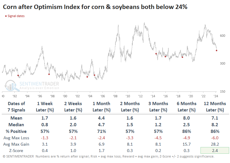
It was a very similar story in soybeans. The only signal that preceded persistent losses was in 2014.
Oddly, we're seeing this level of pessimism at this point in the year. Due to planting cycles, they tend to peak in the spring and decline during the summer months. That's why every signal but one in the tables above was during the summer months.
Instead of trading futures contracts or ETFs like CORN and SOYB to bet directly on those two markets, a popular alternative has been the DBA fund, which holds several different agricultural commodities based on their trends and other metrics. Its current allocation to corn and soybeans is only about 20%, so it's far from a direct bet on them.
The index that DBA tracks, the DBIQ Diversified Agriculture Index, has not performed all that well after the signals in the table above. A couple of established agribusiness companies, ADM and Deere, have performed significantly better.
About TradingEdge Weekly...
The goal of TradingEdge Weekly is to summarize some of the research published to SentimenTrader over the past week. Sometimes there is a lot to digest, and this summary highlights the highest conviction or most compelling ideas we discussed. This is NOT the published research; rather, it pulls out some of the most relevant parts. It includes links to the published research for convenience, and if you don't subscribe to those products, it will present the options for access.