
TradingEdge Weekly for Mar 7 - Technical warnings, sector divergences, commodity trend-following

Key points:
- Heading into this week, there was a full week of technical warning signs
- A handful of important indices were showing extended divergences against the S&P 500
- High-yield bonds triggered a trend-following warning for stocks
- Using 3 simple indexes for a trend-following approach to commodities
- A contrarian play in the Canadian dollar
A week of warnings
Some internal warning signals have fired recently - the Titanic Syndrome warning was triggered on the NYSE for five consecutive days.
Forget the stupid name of the indicator; it simply highlights a technical market condition when stocks have recently been at a high, and then there is a sudden jump in new 52-week lows versus highs on the NYSE. We wrote about a cluster of these signals in January 2022, which provided a valuable heads-up.
These signals have triggered not only on the NYSE but also on the Nasdaq exchange. For only the 3rd time in 40 years, the combined Titanic warnings across both exchanges have totaled ten in the past week. That means the warning was triggered on both exchanges every day for a week. The other two clusters saw the S&P struggle to hold any upside momentum in the weeks ahead, providing investors a poor risk/reward profile.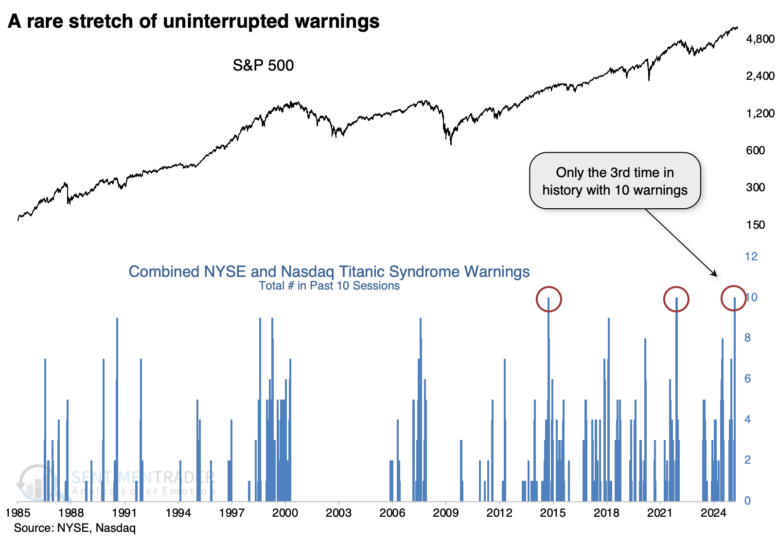
It's tough to rely on such a minuscule sample size, so the table below expands the sample to look for clusters of eight or more signals on the two exchanges. These clusters continued to precede poor returns for the S&P in the weeks ahead, and even over the following year, average risk was higher than average reward.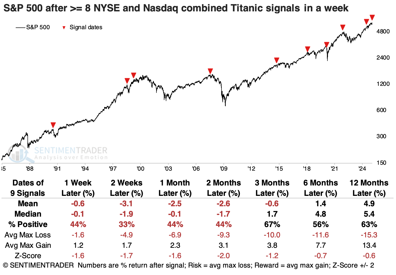
The other major indices also tended to suffer, with the Nasdaq Composite and Russell 2000 bearing the brunt over shorter time frames. Up to six months later, average returns were poor across all the indices.
Defensive-oriented sectors like consumer staples and utilities were the only consistent ports in the storm across time frames. They stood out among all sectors as having positive returns over time.
Yet more divergences
We've noted multiple times that under the surface of the market there have been some issues with participation among stocks or entire sectors.
The fine folks at Leuthold Group noted something related when the S&P 500 made its last push to new highs in February. The indices we will use below clearly show their deterioration even as the S&P pushed higher into late February.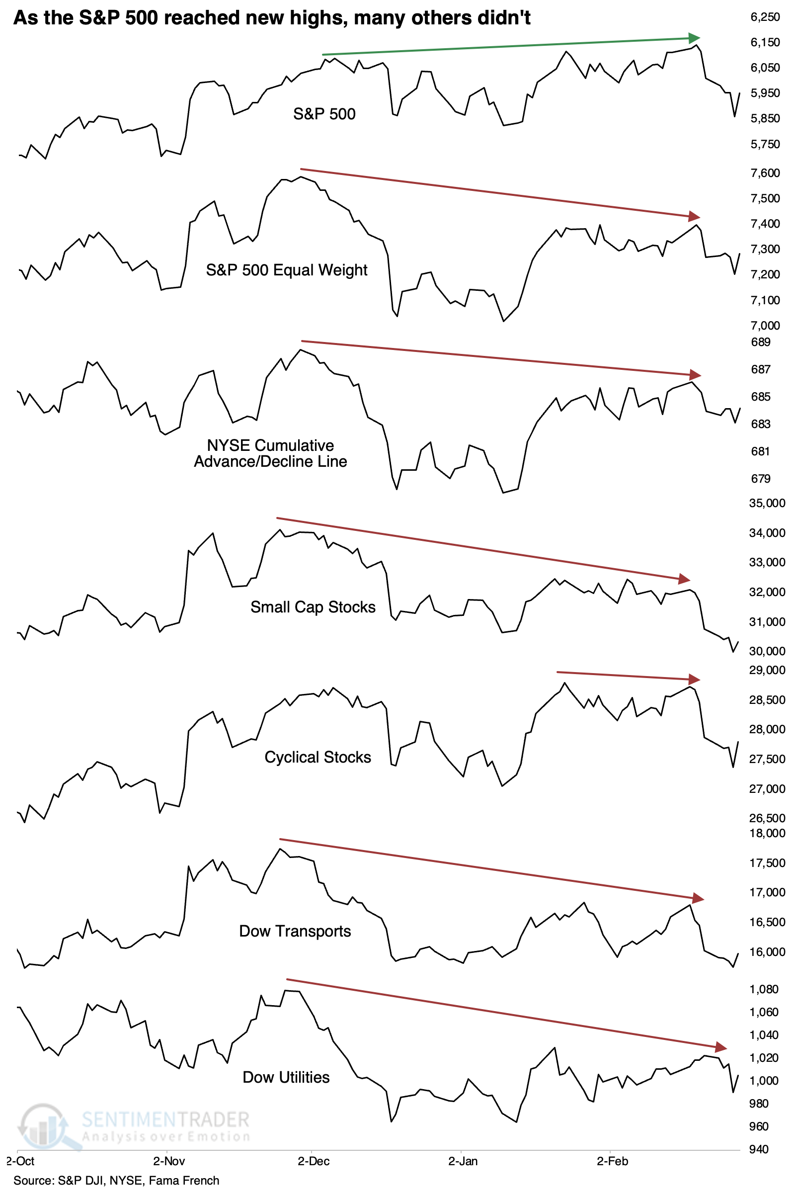
This was a rare and bad omen before the 1990s, with each signal preceding little upside in the S&P 500 in the months ahead. It was triggered multiple times in the early 1990s, again mostly preceding weak returns for months afterward. The late 1990s signals preceded the last gasp of the internet bubble. Since then, returns have been weak again, with the only real exception being one from about a year ago. It should be noted that that exception from 2024 met the criteria of this test, but the current divergence is significantly more extended than that one was.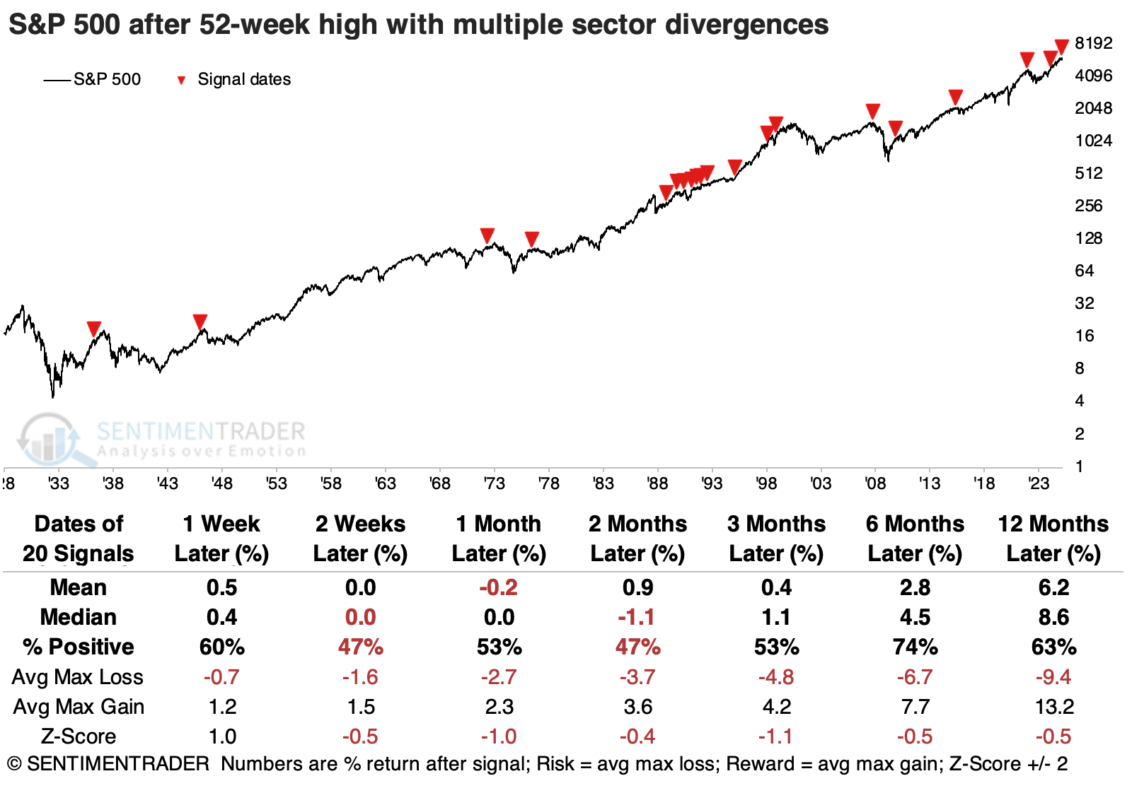
Among the other indices, the Dow Transports suffered the worst returns in the months ahead, with cyclical stocks also struggling. None of them sported very good returns, really.
Looking at win rates across factors, defensive stocks were the most consistent winners, rising more than 90% of the time over the following year. Growth stocks were the least consistent, with barely a 55% win rate a year later.
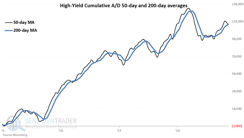
A warning from high-yield bonds, too
High-yield bonds are much more highly correlated to stocks than they are to treasury bonds. Jay showed that a recent signal qualifies as "unfavorable" for stocks.
Our High-Yield Gold Cross strategy is available on our Tools | Strategies page. The gist of the model is very straightforward:
- The model is considered favorable for stocks when the 50-day average of the High-Yield Bond Cumulative A/D Line is above the 200-day average
- Conversely, the model is deemed unfavorable to stocks when the 50-day average drops below the 200-day average
Let's take a closer look. The chart below displays the 50-day and 200-day moving average for the High-Yield Bond Cumulative A/D Line.
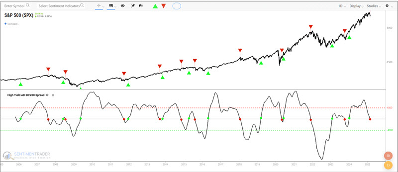
The High Yield Golden Cross strategy treats these crossovers as buy and sell signals. The blue line below displays the hypothetical equity curve achieved by holding the S&P 500 Index only during the buy signals. The grey line shows the buy-and-hold equity curve.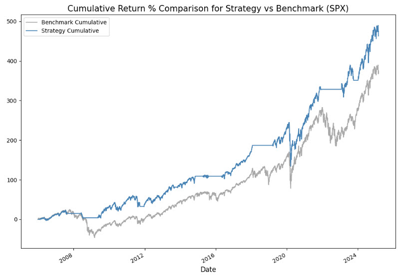
A sell signal occurred during the week ending 2025-02-28.
If we look at the buy and sell signals in the chart below, we can see lengthy and significant market declines followed by some down red arrows. In contrast, others were followed rather quickly by a new up-green arrow (signifying a new buy signal). The reality is that there is no way to predict how long the new sell signal will remain in force, nor what exactly the stock market will do between now and the next buy signal.
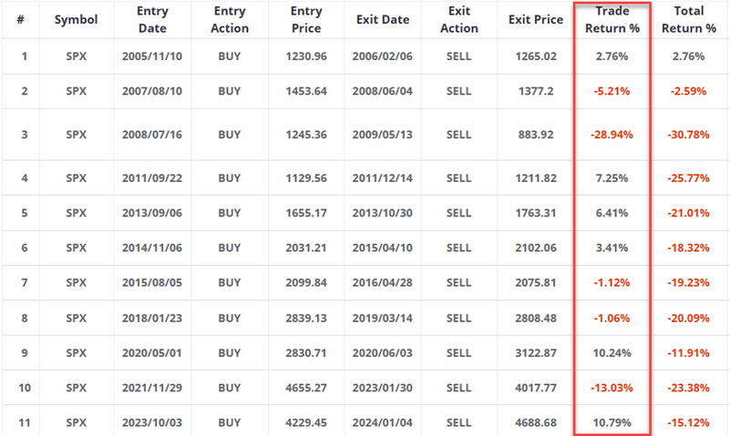
The table above displays the performance of the S&P 500 during each of the previous sell signals. Again, we can note some signals that avoided significant declines, while others involved buying back at a higher price. Whipsaws are a common fact of life when employing any trend-following indicator. Still, the net result was that the S&P 500 has declined -15.12% during High-Yield Golden Cross Strategy sell signals over the past 20 years.
A simple commodity trend-following approach
Commodities have been overshadowed by stocks and Bitcoin. But Jay noted that a simple trend-following approach may allow investors the opportunity to profit from higher commodity prices.
It is somewhat of a misnomer to refer to "commodities as an asset class" because there are many different commodities, and the price of each fluctuates based on its own unique supply and demand factors. Still, this model is deemed favorable or unfavorable for commodities as an asset class based on the trend of three commodity-related indexes, shown below.
At the end of each month, we compare them to their 24-month moving average of monthly closes. Closes above the 24-month average are considered favorable for commodities and vice versa.
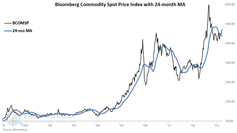
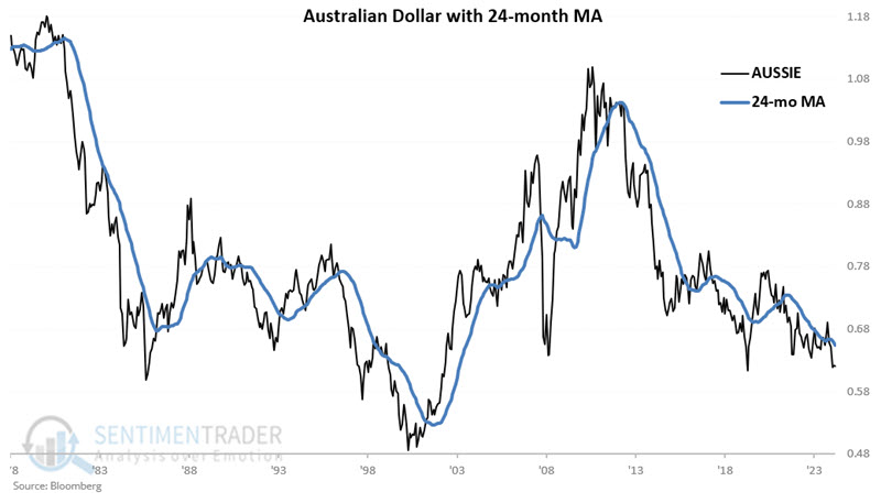
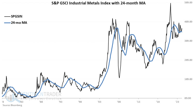
In plain English, if one of the indexes is above its 24-month moving average, then one point is added to the STCTM model. If all three are above their respective moving averages, STCTM = 3. If none are above their respective moving averages, then STCTM = 0.
The chart below displays each month's STCTM reading and the Bloomberg Commodity Spot Price Index. The STCTM rose to a favorable +2 at the end of January 2025 and remained at a +2 reading at the end of February 2025.

For testing, we will use the Bloomberg Commodity Spot Price Index (BCOMSP) as our benchmark for commodity prices.
During months when the previous month ended with all three indexes above their respective moving averages, i.e., STCTM = +3. $1 grew +579% to $6.79.
Since the model is currently at +2, the chart below displays the hypothetical growth of $1 only during months when the previous month ended with two of the three indexes above their respective moving averages, i.e., STCTM = +2. $1 grew +216% to $3.16.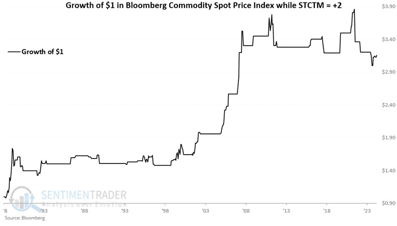
When only one of the three indexes was above their respective moving averages, $1 declined -65% to $0.35. When all three indexes were below their moving averages $1 grew +5% to $1.05 (albeit it in a highly volatile and inconsistent fashion).
A contrarian opportunity in the loonie
The Canadian Dollar has declined significantly in recent years. Jay noted that price action is presently testing a historically key level, and seasonality will soon be entering its most favorable time of year.
The scope of the devastation the Canadian Dollar has absorbed in recent years is easily discerned in the chart below. However, note in the chart below that the Canadian dollar has historically spent very little time - and has not fallen very far below - 0.6850.
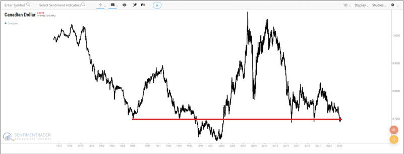
The bottom line regarding price action: There is no guarantee that 0.6850 will hold, but as long as it does, potentially good things could happen.
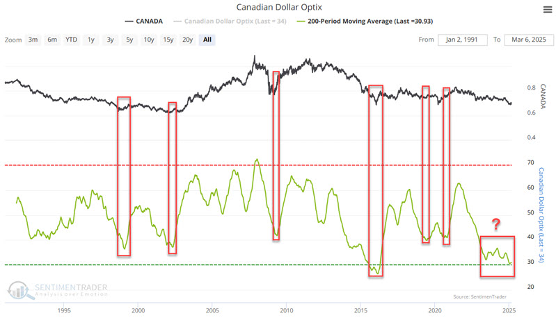
In addition to price action, let's consider trader sentiment. The green line in the chart below represents the 200-day moving average of our Canadian Dollar Optix indicator. At the far right, we see that this value is hovering near its all-time low.
The chart below displays the annual seasonal trend for the CD.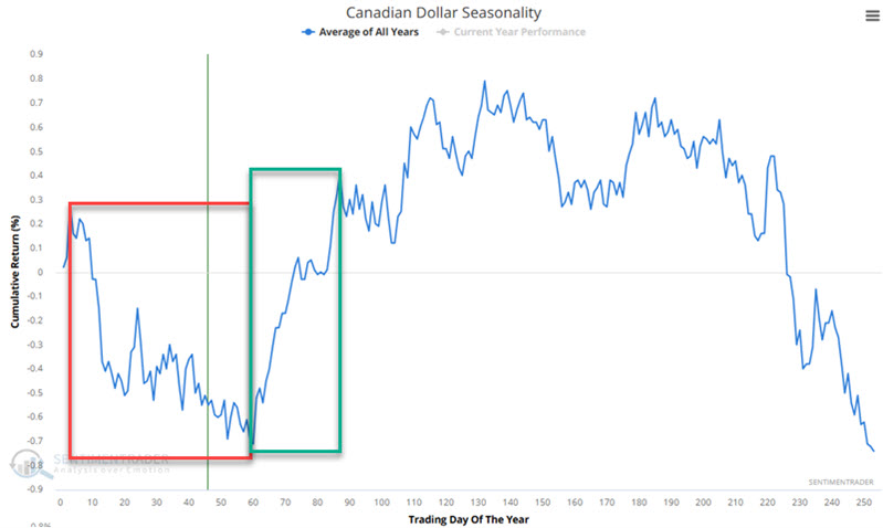
Let's consider the favorable period highlighted in the green box in the chart above. This period extends from TDY #60 through TDY #87. For 2025, this period begins at the close on 2025-03-25 and runs through 2025-05-01. The chart below displays the hypothetical gain from holding a long position in Canadian Dollar futures only during this period every year since 1971.
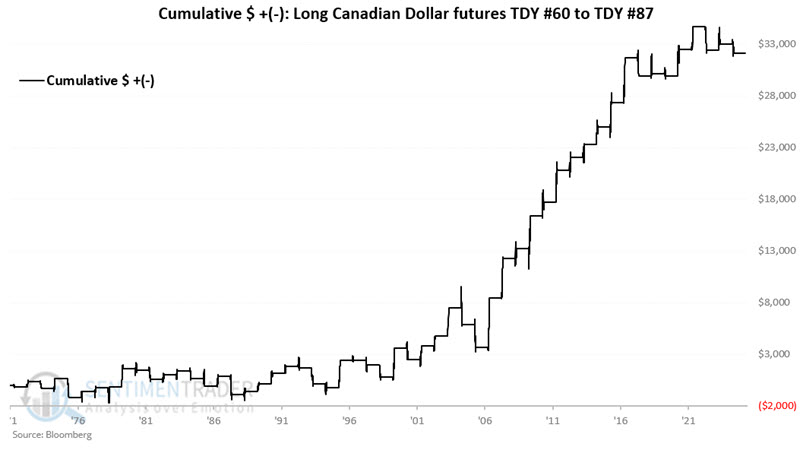
A 63% Win Rate is far from a "sure thing." So, anyone considering a long position in the Canadian Dollar must have a stop-loss point in mind when doing so. Still, note that moves of $2,000 or more have historically skewed to the plus side 11-to-2.
About TradingEdge Weekly...
The goal of TradingEdge Weekly is to summarize some of the research published to SentimenTrader over the past week. Sometimes there is a lot to digest, and this summary highlights the highest conviction or most compelling ideas we discussed. This is NOT the published research; rather, it pulls out some of the most relevant parts. It includes links to the published research for convenience, and if you don't subscribe to those products, it will present the options for access.