
TradingEdge Weekly for Jun 13 - Big move in small stocks, real yield tailwind, dollar doldrums

Key points:
- Small stocks are making big moves
- Three of the "Big Four" indices have recovered most of their drawdowns
- Industrial stocks led all sectors to a record high
- There has been a surge in Korean stocks
- A few sectors are showing short-term seasonal depressions
- A contrary take on bonds
- Why a positive real yield on bonds is good for the stock market
- The dollar has been in the doldrums
- Using the silver/gold ratio to trade silver
Big moves in small stocks
The percentage of Russell 200 stocks above their 50-day average cycled from below 5% to above 75%. Dean showed that similar recoveries in participation saw the small-cap index rise 100% of the time over several horizons.
This surge indicates expanding market breadth, hinting at rising investor appetite for riskier segments of the equity market. Such widespread participation across a diverse range of smaller, more economically sensitive companies typically occurs during the initial stages of a cyclical advance.
As shown in the chart, the Russell 2000 has delivered a 29% annualized return when more than 75% of its stocks are above their 50-day moving average.
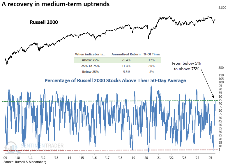
Although the sample size is small, whenever the percentage of Russell 2000 stocks above their 50-day average cycled from below 5% to above 75%, the widely followed small-cap index rose 100% of the time over the next two, three, and twelve months.
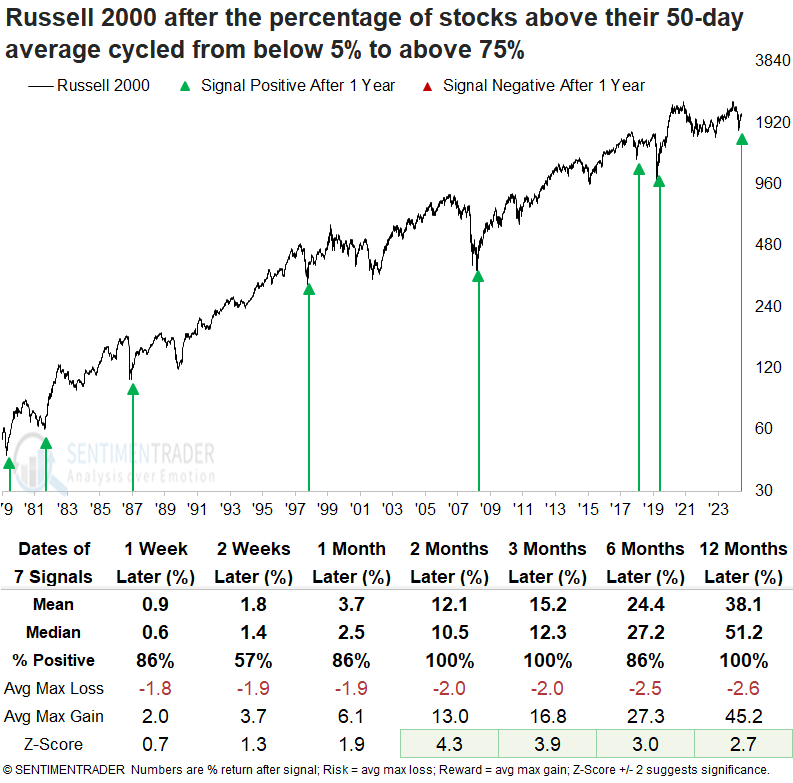
Over the next year, the Russell 2000 never experienced a drawdown greater than 10%, while it rallied more than 10% each time.
The S&P 500 displayed excellent results after participation trends for small-cap stocks recovered, rallying 100% of the time over the subsequent two, six, and twelve months. The Russell 2000 consistently outperformed the S&P 500 over the next year. However, as previously mentioned, the more meaningful gains largely followed recoveries from recessionary bear markets.
3 for 4 ain't bad
Three of the "Big Four" have come storming back.
The most-followed three U.S. equity indices have recovered to within 5% of their multi-year highs. This is a notable recovery from at least a -15% drawdown for the S&P 500, Dow Industrials, and Nasdaq Composite. Only the small-cap Russell 2000, with less historical data to test, is lagging.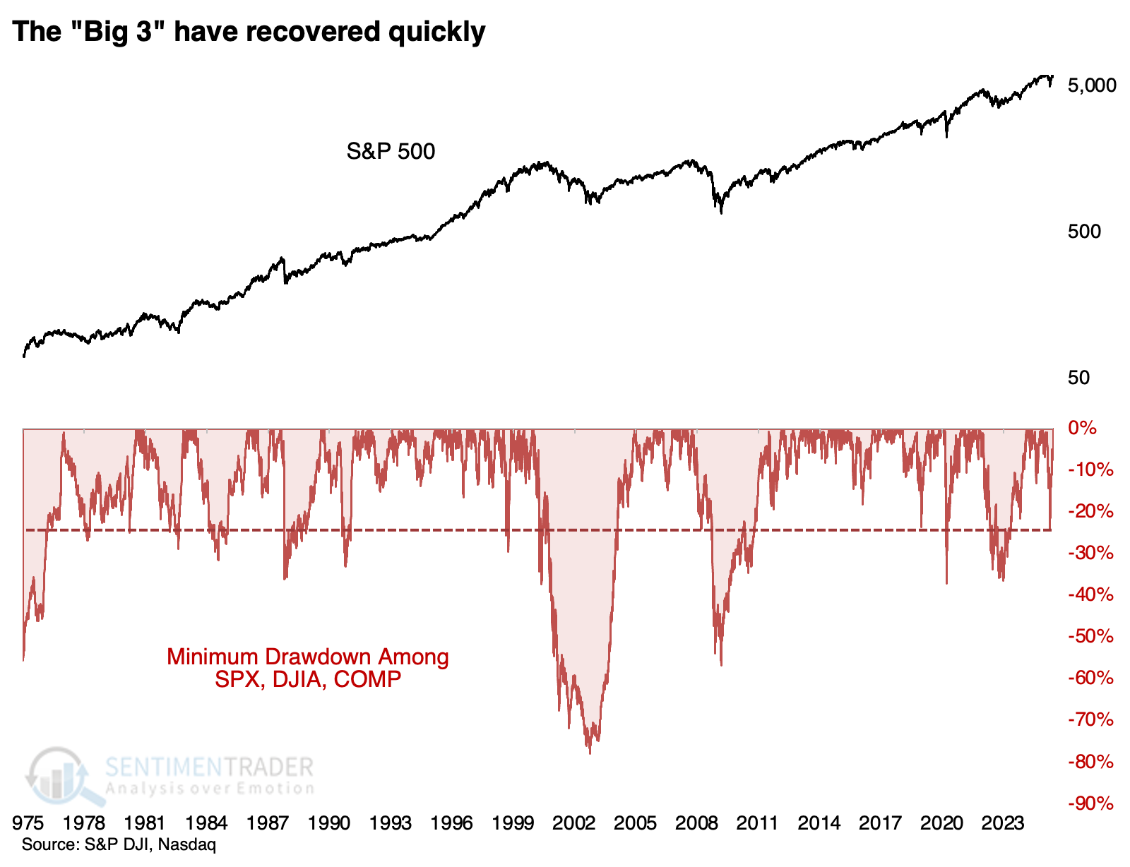
Not many times have we witnessed such a quick recovery across all three indices. However, they were good for the S&P 500 from the available history. It continued to power higher each time over the following three to six months, though it eventually succumbed to the pandemic panic in 2020.
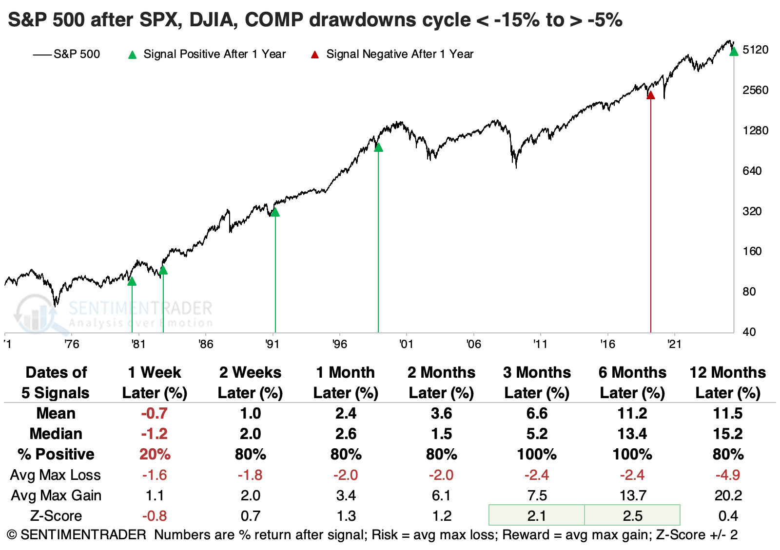
Even more notable than its consistency was how little risk there was within the next six months. The S&P didn't fall more than -4.4% at any point within that time frame across any of the signals.
These signals were okay for the Dow Industrials, but the index that shone the most was the Nasdaq Composite. It soared in the months following these signals, enjoying double-digit gains four out of five times over the following six months.
It's difficult to have high conviction with such a small sample, so we doubled the sample size by reducing the drawdown to -10%. The S&P still did very well over the following six months, with a single loss. Once again, the Nasdaq proved to be a generally better place to be among the three indices, with a higher win rate, greater average return, and better ratio of reward to risk up to three months later.
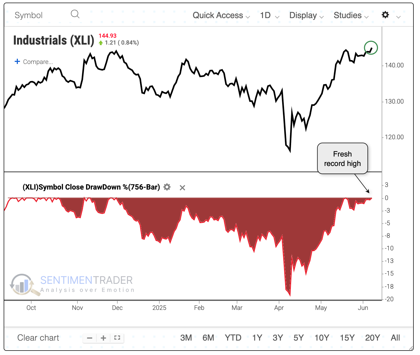
An industrial strength rally
One sector has reached a record high, and it should be a good one.
Among major S&P 500 sectors, industrials are the first to power to a new high. All the others, including the S&P 500 itself, are at least 1% off their own highs.
When the industrial sector led all others to record territory, the U.S. fell into a recession only once within the following nine months. However, two more instances were added within a few months after that, including the vicious internet bubble peak of 2000.
This dynamic is played out in the table below, showing S&P 500 returns after industrials led. The single loss - and it was a doozy - was the blow-off peak in March 2000. All the others preceded gains, though they weren't necessarily strong and without some interim pain.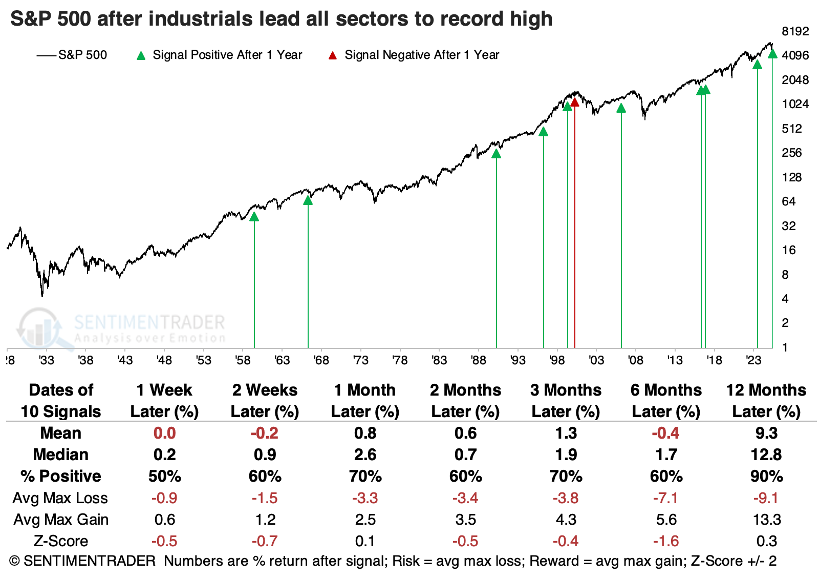
The total return for industrials was consistently positive after it led other sectors to a new high, but not without risk. After 1966 and 1990, the sector witnessed double-digit losses over the following six months.
Stocks in the sector have been holding up well, and there aren't too many warning signs. It would be nice if the Cumulative Advance/Decline Line would make a new high along with the index. On the plus side, the long-term McClellan Summation Index is well above zero, and even holding above +500, which is typical for strong, sustained advances.
A high level of correlation among stocks in the sector shows investors are anxious about the sector. But as those investors exited the stocks and funds, corporate insiders among industrial companies have been scooping up shares.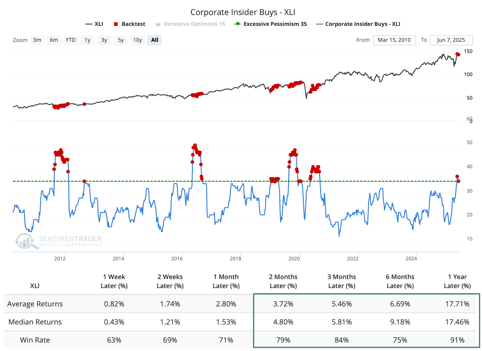
Korean comeback
The percentage of KOSPI stocks reaching a 4-week high surged above 50%. Dean noted that similar expansions in 4-week highs saw the KOSPI rise in all but one case over the subsequent year.
Why does a surge in new highs for an index based in South Korea matter? Because the KOSPI features leading multinational giants such as Samsung Electronics, SK Hynix, LG Electronics, and Samsung SDI, companies that dominate the semiconductor, consumer electronics, display, and battery sectors, all of which are essential components of the global technology supply chain.
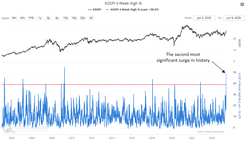
Although the sample size is limited, whenever the proportion of KOSPI stocks reaching a 4-week high increased above 40%, the benchmark Korean index displayed solid returns and consistency from four to twelve months later.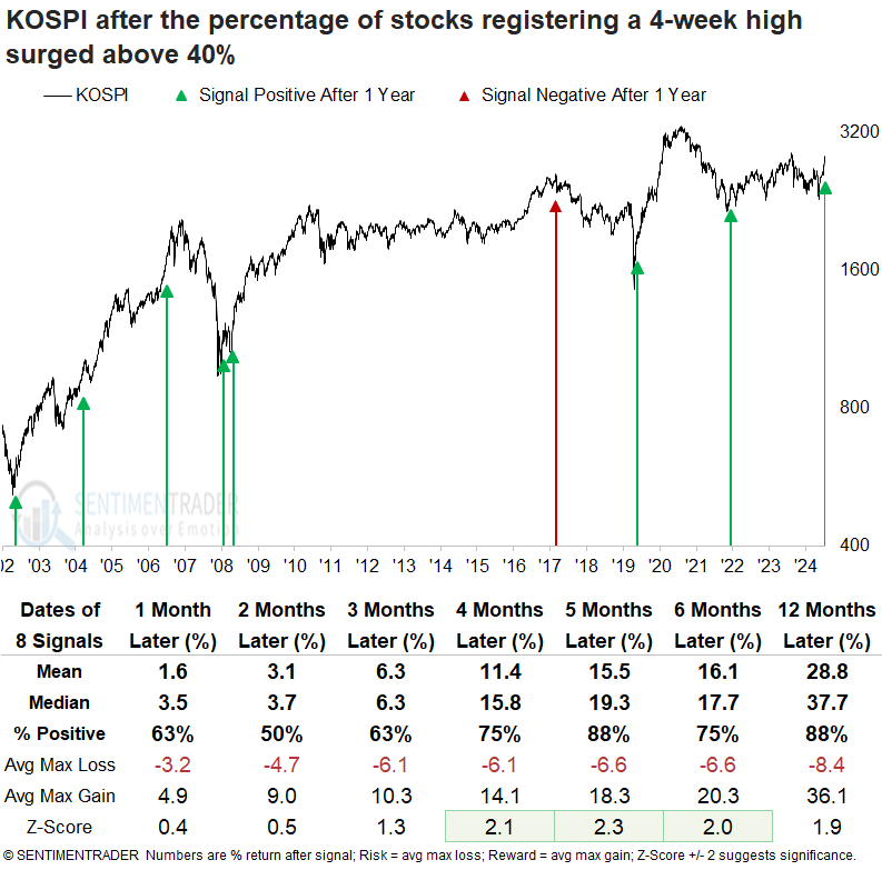
The broad U.S. semiconductor index delivered strong and consistent returns over the following year, recording gains at the four-month mark in every instance. The broader S&P 500 Technology sector demonstrated outstanding returns and consistency, outperforming the S&P 500 across all evaluated time horizons.
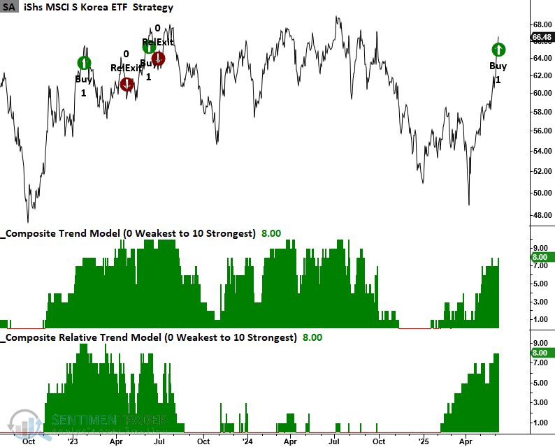
The South Korean ETF universe is relatively small, with the iShares MSCI South Korea ETF (EWY) leading in assets and liquidity. However, investors should note that EWY is heavily concentrated, with Samsung Electronics and SK Hynix accounting for 31% of its market capitalization. On Monday, EWY triggered a trend score buy signal when it recorded a 42-day absolute and relative high as both the trend and relative trend indicators maintained a score of eight or higher.
The KOSPI appears to be on the cusp of a multi-year breakout, with prices approaching long-term resistance. A sustained move above this key level would confirm a significant technical breakout, potentially unlocking considerable upside as investor confidence builds and capital flows return.
Seasonal depression
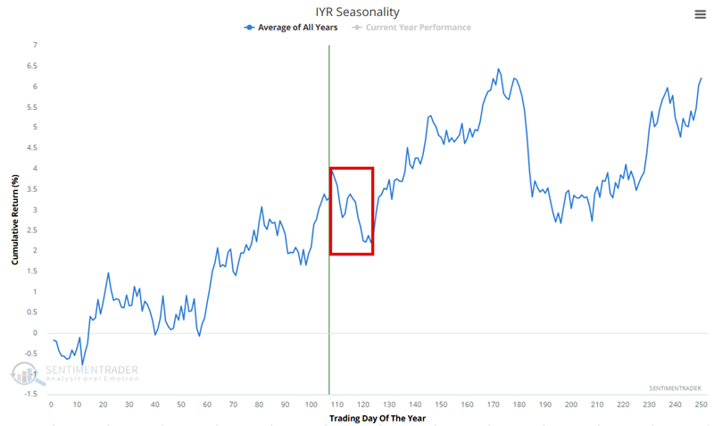
Jay showed that Real Estate, Materials, Banks, and Energy are all on the cusp of unfavorable seasonal periods.
The Annual Seasonal Trend chart below for ticker IYR shows an unfavorable period that extends from the close of Trading Day of the Year (TDY) #108 through TDY #123. For 2025, this period extends from the close on 2025-06-09 through 2025-07-01.
The chart below displays the hypothetical growth of $1 invested in IYR only during this period, every year since 2001.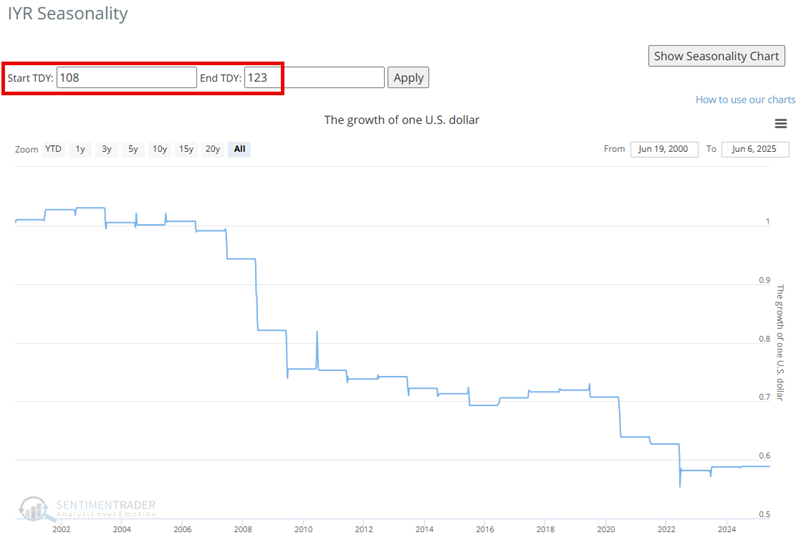
Jay performed similar analysis for XLB and KBE.
The Annual Seasonal Trend chart for XLE shows an unfavorable period from the close of Trading Day of the Year (TDY) #110 through TDY #123 and a longer period from TDY #110 through TDY #149. For 2025, the shorter period extends from the close on 2025-06-11 through 2025-07-01. The longer period extends through 2025-08-07.
The chart below displays the hypothetical growth of $1 invested in XLE only during the TDY #110 through TDY #149 period, every year since 2000.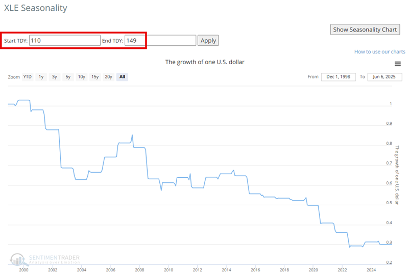
A short-term trader who expects the market to cool off might consider trying to play the short side of these sectors. There are three basic choices, each with some serious risks to carefully consider before committing. Jay discussed the merits of shorting ETF shares, buying put options, or buying Inverse ETFs.
A contrary take on bonds
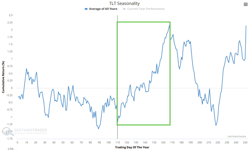
Jay showed that T-bonds have been a dreadful performer, but TLT has been forming a base for 20 months and is entering the most favorable seasonal period of the year.
While TLT has essentially gone nowhere for 20 months, from a classical technical analysis perspective, some would argue that TLT is building a strong base. The Annual Seasonal Trend chart below for ticker TLT shows a favorable period that extends from the close of Trading Day of the Year (TDY) #110 through TDY #167. For 2025, this period extends from the close on 2025-06-11 through 2025-09-03.
The chart below displays the hypothetical growth of $1 invested in TLT only during this period, every year since 2003. This data reflects "price only" data and not "total return," which would include any dividends, which would serve to slightly increase results.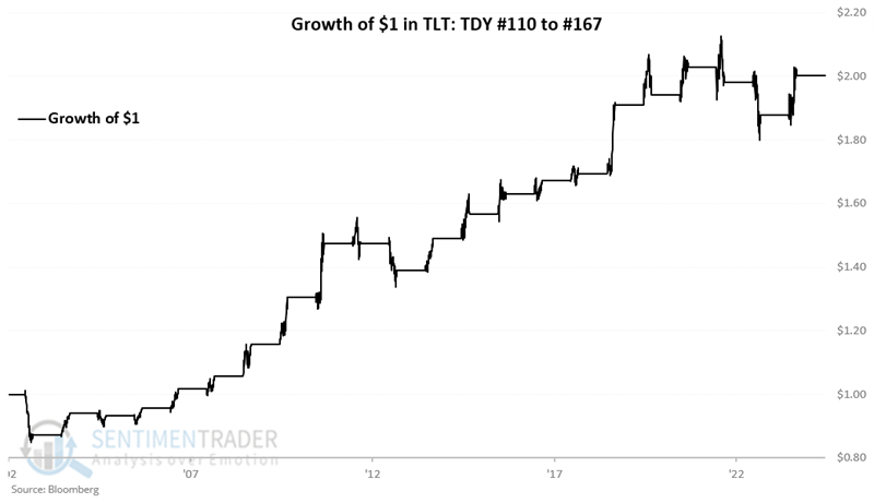
For a trader willing to speculate in a long position in TLT, the most straightforward approach would be to buy shares of TLT. However, at roughly $86 a share, this would involve a commitment of $8,600 to a speculative, contrarian position. An alternative would be to consider options on TLT.
Since the favorable period extends through September 3rd, we will look at options expiring September 19th. The example trade below is a "bull call spread," which involves buying one call option at a lower strike price and selling another call with a higher strike price. Selling the higher strike price call reduces the cost of the position and creates the potential for option time decay to work in our favor if the price of TLT rises above a certain level.
- Buying 1 Sep19 TLT 87 strike price call @ $2.43
- Selling 1 Sep19 TLT 97 strike price call @ $0.32
The table below displays the "30,000-foot" view of the risk curves (the expected $ P/L based on the price of TLT shares as of four different dates). The red line represents the current date, and the black line represents the expected P/L of the trade if held until the option expires on September 19th.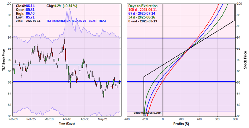
The cost to enter a 1-lot (and the maximum risk) is $211. The breakeven price (if the trade is held until expiration, which is not our intention) is $89.11. The maximum profit potential is $789.
From a trader's perspective, a stop-loss would make sense below the October 2023 low of $83.30, and an upside target of $90.21 to $94.09 (recent highs in TLT) also makes sense. Likewise, we would likely not expect to hold this position after the end of the favorable seasonal period on 2025-09-03.
If we exit the trade if TLT drops below $83.30, the expected loss would be between -$105 and -$205, depending on whether this occurs sooner or later. If we plan to take a profit or adjust the trade if TLT hits $90.21, our expected P/L would be between $190 and $130. If we plan to take a profit or adjust the trade if TLT hits $94.09, our expected P/L would be between $389 and $408.
Keeping it real (yield)
Real yield is the return on an investment after accounting for inflation. Jay noted that the lack of positive real yield can be a significant warning sign for investors.
Real yield is the difference between the yield on a 10-year treasury note and the 12-month change in the Consumer Price Index. For our test, we will use the 12-month percentage change in the Consumer Price Index (CPI) as our measure of inflation. We will also examine the difference between the 10-year treasury yield and inflation as a measure of real yield.
The chart below displays the month-end value for real yield starting at the end of 1919. The horizontal blue line is a -0.60 cutoff. Readings above the blue horizontal line at -0.60 are considered "Favorable" for stocks. Readings below the blue horizontal line at -0.60 are considered "Unfavorable" for stocks.
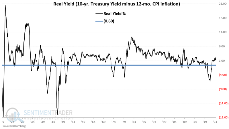
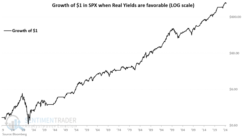
If at the end of the current month, real yield is greater than -0.60, then buy stocks. If less than or equal to -0.60, then sell stocks. The chart below displays the hypothetical growth of $1 (on a logarithmic scale) invested in the S&P 500 only if the real yield is above -0.60. The hypothetical cumulative gain is +148,068%.
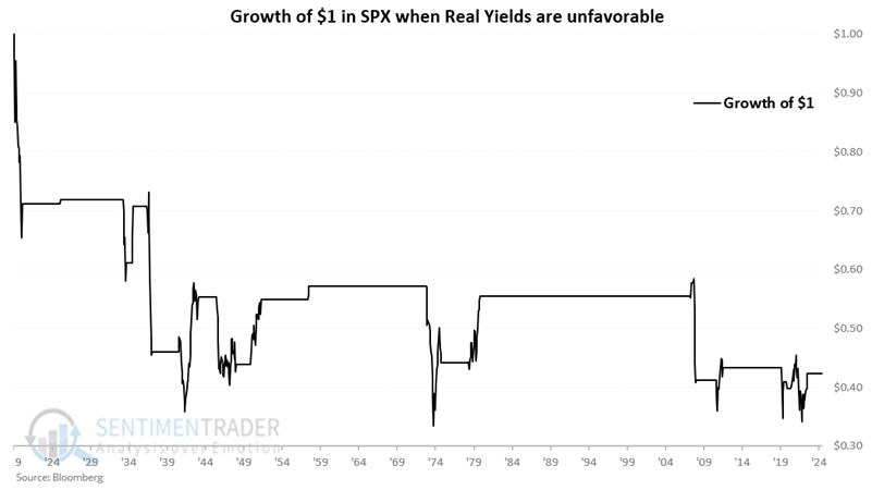
Conversely, the chart below displays the hypothetical growth of $1 invested in the S&P 500 only if the Real Yield is -0.60 or lower. The hypothetical cumulative loss is -57.6%.
The model has been favorable since 2023-06-30. At the end of May 2025, the real yield was +2.14%, so this model remains favorable for stocks.
Dollar doldrums
The Dollar Index (DXY) has experienced a sharp decline, falling 10% over five months. Dean showed that similar downturns led to further near-term losses in the DXY before it staged a rebound.
Since its inception in 1971, the dollar has suffered a drop of this magnitude only 15 other times, most recently 15 years ago in the aftermath of the global financial crisis. Why does this matter? Because a depreciating U.S. dollar can contribute to higher inflation and altered capital flow dynamics.
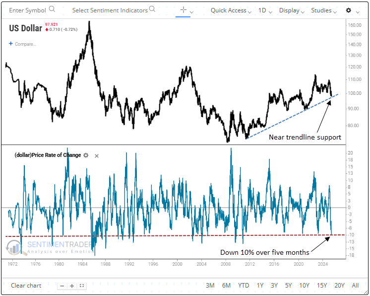
A 10% decline in the Dollar Index (DXY) over five months has often led to further weakness in the following month. Yet, this downside momentum usually subsided, as the DXY rebounded in 80% of cases by the two- and three-month mark, with the majority of the gains occurring around the two-month mark.
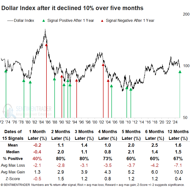
A drop in the dollar, similar to the current one, has typically been a positive for the S&P 500, which has rallied 80% of the time over the next six months. When the S&P 500 was above its 200-day average, such as now, the index showed a 75% win rate five, six, and twelve months later.
Among all sectors, Consumer Staples, Industrials, and Technology, each heavily comprised of multinational corporations, demonstrated the most persistent outperformance relative to the S&P 500 in the ensuing six months.
Commodities, denominated in dollars, showed a strong tendency to rally, with gains occurring 80% of the time over the next six months. Gold, on the other hand, often moved lower, likely weighed down by the dollar's rebound over the ensuing two to three months.
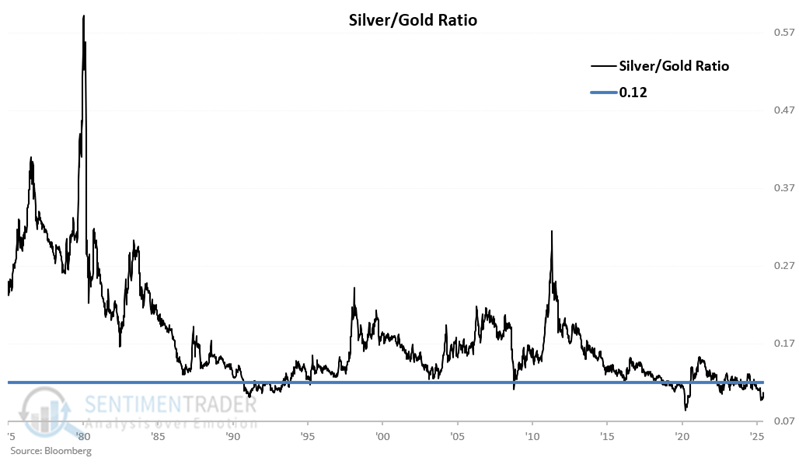
Silver vs. gold
Silver has been on a tear recently, but Jay showed that the Silver/Gold Ratio (SGR) remains within a historically low range.
For our purpose, we will use weekly closing prices for silver and gold rather than daily data. This ratio has swooped and soared dramatically over the years. In the tests below, we will focus on whether the ratio was above or below the 0.12 level, which is highlighted as a horizontal blue line.
Applying trading rules:
- Buy silver if the SGR drops to 0.12 or below
- Hold for 52 weeks
- If the SGR is below 0.12 during the original 52-week holding period, then extend the holding period for an additional 52 weeks.
The cumulative gain for silver during the holding periods using the rules above was +31.20 points. That compares to a cumulative loss of -1.96 points when the ratio had NOT been below 0.12.
To better illustrate, the chart below overlays the two hypothetical equity curves from above.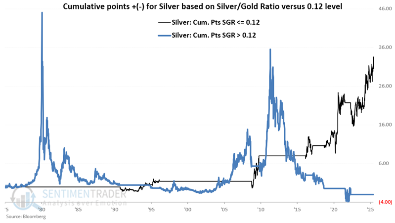
Let's consider an ETF as an alternative to trading silver futures. The chart below displays the hypothetical growth of $1 invested in iShares Silver Trust (SLV) only during the favorable periods highlighted in the table above SLV started trading in 2006. A hypothetical $1 invested in this manner since 2006 has grown to $4.82 through 2025-06-09.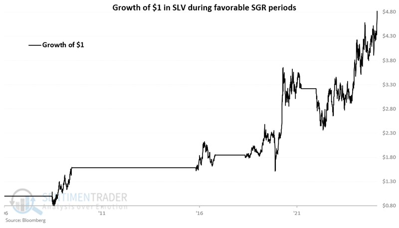
About TradingEdge Weekly...
The goal of TradingEdge Weekly is to summarize some of the research published to SentimenTrader over the past week. Sometimes there is a lot to digest, and this summary highlights the highest conviction or most compelling ideas we discussed. This is NOT the published research; rather, it pulls out some of the most relevant parts. It includes links to the published research for convenience, and if you don't subscribe to those products, it will present the options for access.