
TradingEdge Weekly for Jan 6 - Heavy selling, fearful options traders, international comeback, seasonal windows

Key points:
- Last year was the worst ever for chasing rallies or buying dips
- Heavy selling pressure triggered a washout extreme
- The Panic/Euphoria Model plunged deep into Panic territory
- Small options traders are showing a historic amount of fear
- The trend in U.S. versus international stocks has tipped toward the latter
- More country ETFs are showing positive trends relative to the S&P 500
- Despite a huge rally in energy stocks, options traders in the sector have been trading a lot of puts
- The dollar's trend is negative but is carrying a seasonal tailwind
- Watch natural gas as its severe decline faces more headwinds
Worst year ever for chasing rallies and buying dips
The worst year ever for investors ended like it spent most of the year - swinging wildly from one extreme to the other. Last week added to the large tally of days when the most benchmarked index in the world moved at least 1% in a single session.
But traders who chased rallies were terribly disappointed. The S&P 500 returned an average -0.24% on the day following a big up day, ranking among the worst rally-chasing returns in its history. There were even more big down days, with the S&P recording 63 sessions with at least a 1% loss. That was the most since 2008 and was the 4th-largest number of days in the past 80 years.
Dip-buyers fared even worst than rally-chasers. The day after a big down day, the S&P lost an average of 0.29%, the worst performance since 1987.
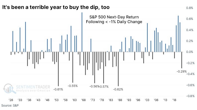
Adding to investors' woes, 2022 was the worst year ever for returns following a big day. It was the only year in history when the S&P lost at least 0.2% the day following either a 1% up day or a 1% down day.
The closest year to 2022 was 1953, when the S&P returned -0.42% following a big rally and -0.18% following a significant drop. At least investors got a reprieve the following year when the index jumped 45%.
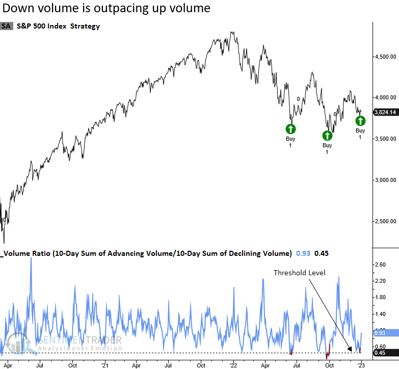
Selling pressure reaches an extreme
Thanks to some of those big down days and subsequent losses, Dean showed that a ratio between S&P 500 advancing and declining volume declined to a historically low level. The lopsided volume skew triggered a new alert for a Composite Washout Model member.
The volume washout signal identifies when the 10-day sum of advancing volume relative to the 10-day sum of declining volume for the S&P 500 falls below 0.45 and increases by 0.01. The two previous signals in 2022 led to substantial multi-month rallies.
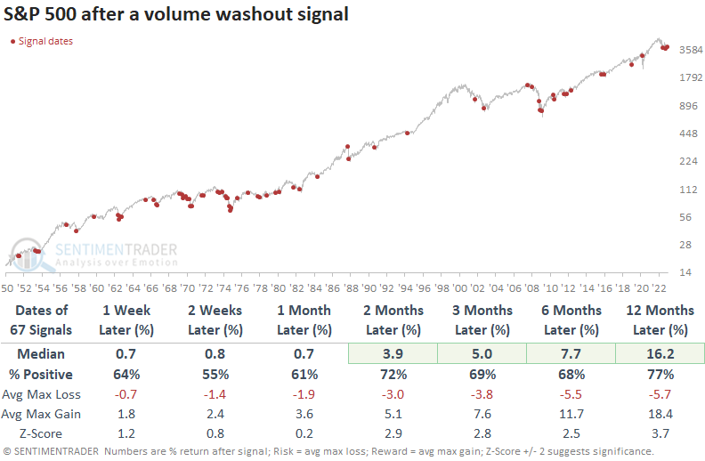
This model generated a signal 67 other times over the past 72 years. After the others, future returns, win rates, and z-scores were excellent from two to twelve months later. As with most standalone capitulation indicators, drawdowns in long, drawn-out bear markets can be gut-wrenching.
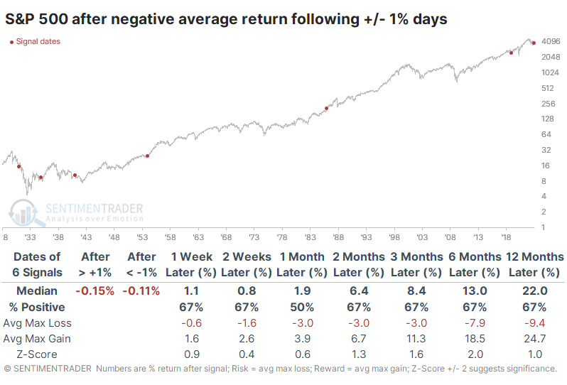
Heavy volatility caused one model to plunge into Panic mode
Given the huge number of 1% swings and subsequent negative returns, it's no wonder some investors are despondent. While models vary, the Panic/Euphoria Model shows some of the worst sentiment in 30 years.
This model is based on the Citi Panic / Euphoria model published in Barron's magazine. It does not reflect those published values; rather, our interpretation of the model inputs and construction differs modestly from the published figures. Low values, particularly below zero, suggest that investors have panicked and higher forward returns are expected. Since the model became less volatile in 1993, the S&P's annualized return when the model was below zero is +16.9%.
It has sunk far below that over the last couple of weeks. Thanks to plunging values in some of the inputs, the model exceeded -0.5 for one of the few times in its history.
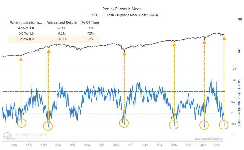
Foreward returns were exceptional whenever Panic exceeded -0.45 for the first time in at least six months. This doesn't include October 2002, when it barely missed the cutoff. That signal returned +25.1% over the next year.
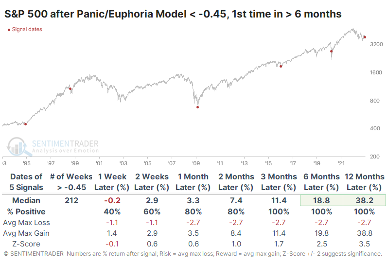
A table of maximum gains and losses over each time frame shows that the 1998 and 2020 signals were quite early, and the S&P suffered double-digit losses almost immediately. These were the final meltdown phases of the declines, and losses were quickly reversed.
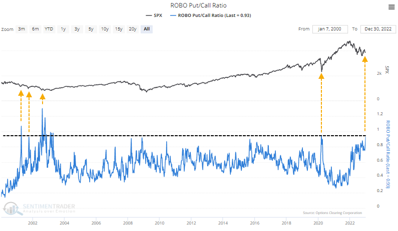
Small traders are showing historic fear in options
A lot of consternation has occurred in recent weeks about spikes in the put/call ratio. Are traders really more bearish than at any time in history? Are interest rate arbitrage transactions causing all the data to be worthless? Does any of it matter anyway?
The Chicago Board Options Exchange (CBOE) outlined some likely explanations for this activity that don't have much to do with sentiment. It argues against reading too much into the daily jumps in the ratio and focusing instead on small traders.
Last week, small options traders spent 32% of their total volume buying put contracts to open. That's tied for the 3rd-most of any week since the year 2000. They pulled back on call buying to the greatest extent since May 2019, so the ROBO Put/Call Ratio spiked to 93%. Over the past 20 years, only the week ending March 13, 2020, exceeded this.
Over the past 23 years, it's been rare to see the smallest of traders spend less on speculative call options than protective put options. But last week, they spent $1.56 billion on calls versus $1.66 billion on puts. That difference of more than $100 million favoring puts is very rare. Prior to the depths of despair this year, it only happened during the meltdowns in the fall of 2008 and spring of 2020.
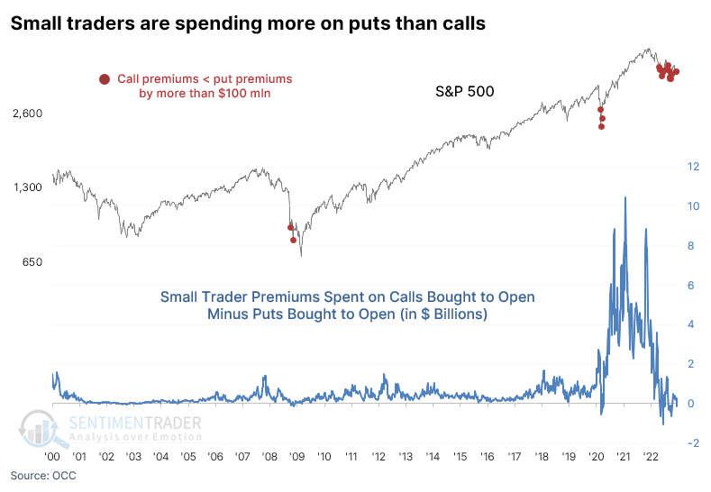
Over the past ten weeks, the average premiums spent on puts versus calls have decreased slightly, but it's coming from a level matched only by the (lengthy) bottoming processes in 2002 and 2008.
Maybe it's better to focus outside the U.S.
The U.S. stock market has significantly and consistently outperformed international stocks for many years. Jay showed that the first sign of a potential reversal has taken place.
The chart below displays the S&P 500 (SPX) / MSCI ACWI ex U.S. Index (MXWDU) ratio and a 9-month exponential moving average (blue line). When the black line is above the blue line, it suggests that SPX is leading and vice versa.
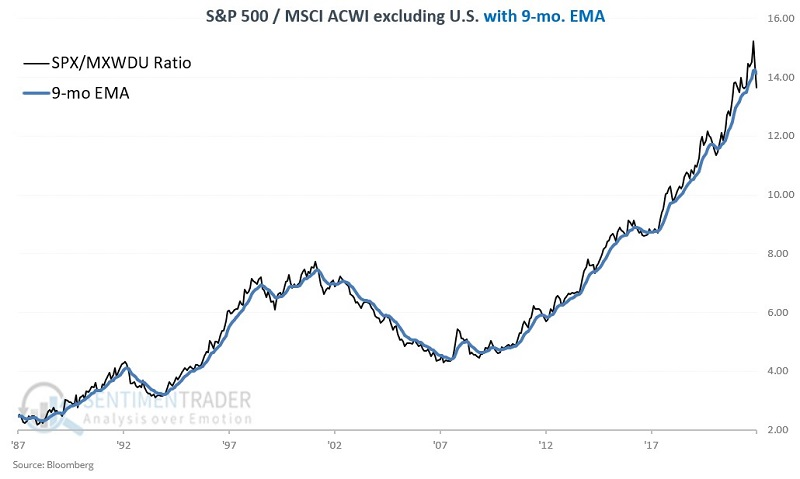
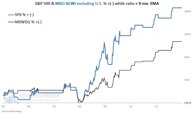
Let's look at the performance of the two indexes based on whether the SPX/MXWDU ratio is above or below its 9-month EMA at the end of the previous month. The chart below shows the performance of both indexes when the SPX/MXWDU ratio is below the 9-month EMA. Since 1987, while the ratio was below the 9-month EMA, SPX gained +118.2 while MXWDU gained +192.0%.
A simple model can be created by holding SPX when the ratio is above the 9-month EMA and holding MXWDU when the ratio is below the 9-month EMA. As a baseline, we will compare switching results to a strategy that splits 50/50 between SPX and MXWDU and rebalances to a 50/50 split at the end of each year.
The results appear in the chart below. The black line represents the switching strategy, while the blue line represents the buy/hold/rebalance approach.
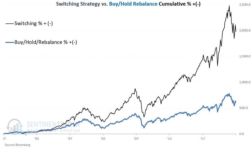
The switching strategy registered a hypothetical gain of +1,979.3% versus +611.4% for buy/hold/rebalance. For the first time since March 2021, this simple switching strategy once again favors international stocks as the SPX/MXWDU ratio dropped below the 9-month moving average at the end of December 2022.
More countries are outperforming relative to the S&P 500
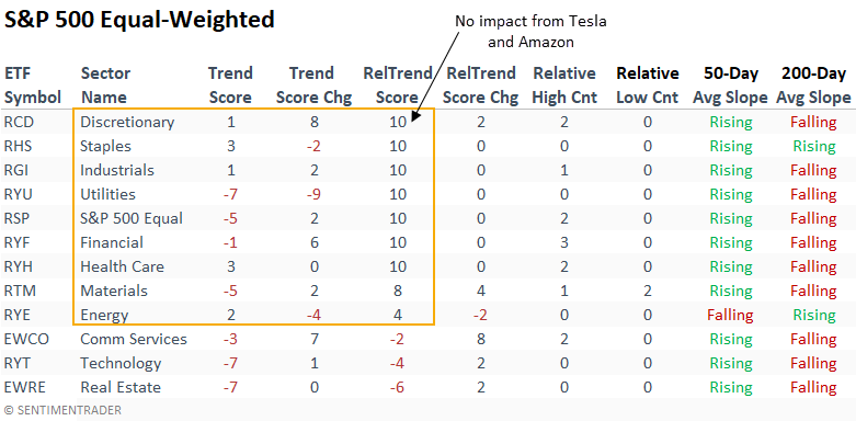
Dean showed that domestic sector and industry relative trend scores continue to favor value and defensive growth. On a global basis, relative performance for country ETFs surged to the highest level in two years.
Industrials and Financials continue to lead the value charge. At the same time, mega-cap constituents weigh on the relative trend score for the Technology and Consumer Discretionary sectors. The absolute and relative trend scores for Energy, the big winner in 2022, have deteriorated by a slight amount.
Mega-cap components within Technology, Communication Services, and Consumer Discretionary sectors continue to weigh on the cap-weighted S&P 500 performance, especially in the Discretionary sector. However, that's not the case for the equal-weighted S&P 500 sectors.
Global index relative trend score rankings versus the S&P 500 show noticeable improvement in the last few months. Country ETFs with higher weightings in natural-resource stocks, especially Energy, deteriorated in a meaningful way in Q4 2022.
The percentage of country ETFs with a positive relative trend score versus the S&P 500 surged to the highest level in two years. While annualized returns are robust when more than 75% of ETFs have a positive relative score, most gains occur in absolute uptrends, which is not the case now. i.e., global indexes are the best house in a bad neighborhood.
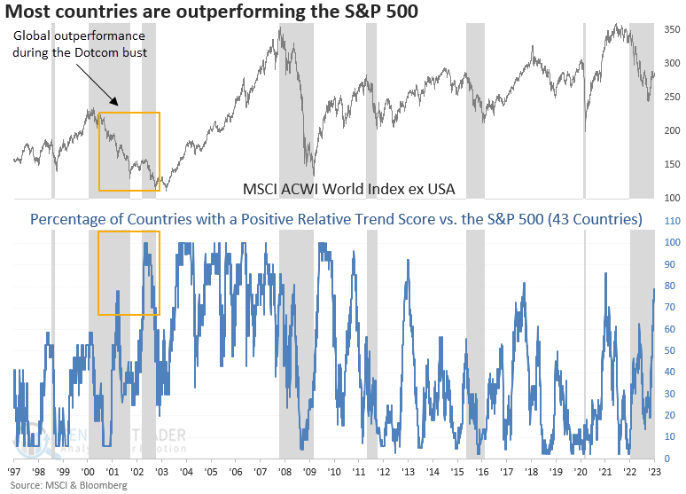
The percentage of country ETFs with a positive absolute trend score stands at 45%. While improving from low levels, the indicator remains in a position that is associated with negative annualized returns.
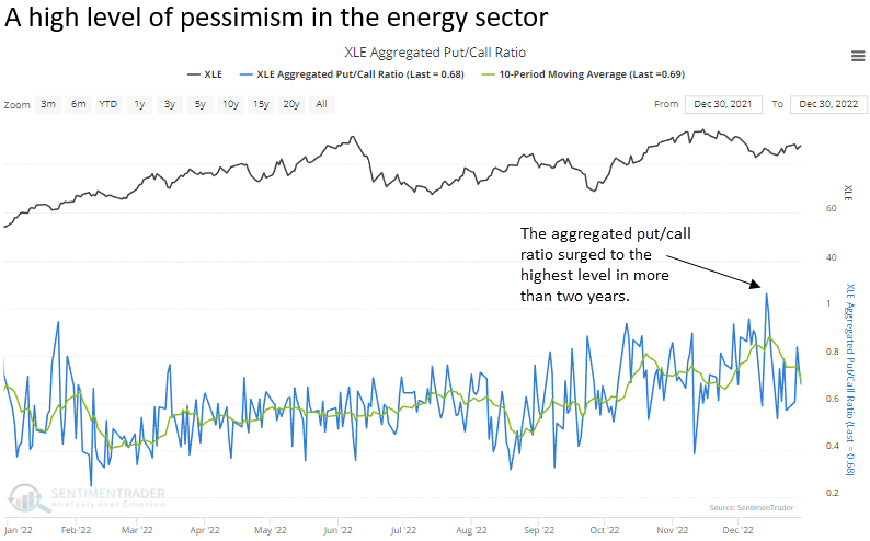
Energy options traders are skewing toward puts
Dean noted that despite big gains in the energy sector, options traders recently turned over more put contracts than calls.
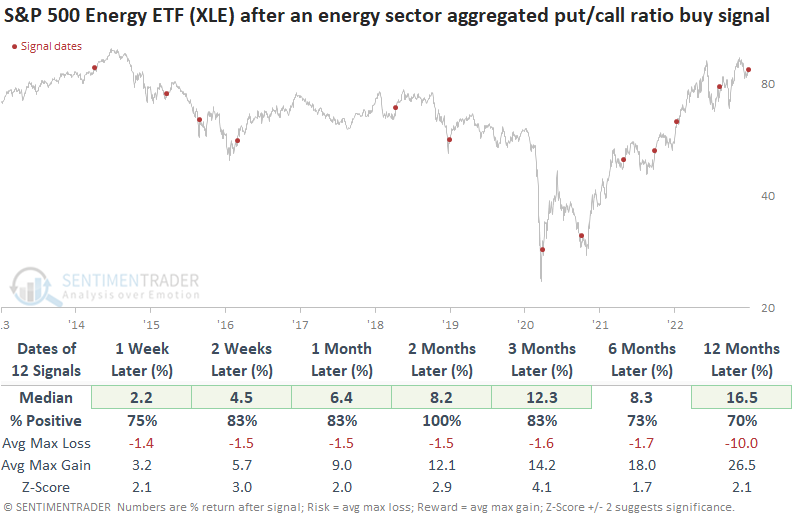
While it's fun to speculate why traders bought more puts relative to calls, a model-driven approach removes the narrative and follows the signal. The aggregated put/call ratio for the S&P 500 energy sector surged and subsequently reversed lower, triggering a buy signal for energy stocks at the close of trading on 2022-12-30.
Dean's model applies an 84-day range rank to the 10-day moving average of the S&P 500 energy sector aggregated put/call ratio. The model generated a signal 12 other times over the past nine years. After the others, XLE future returns, win rates, and z-scores were excellent across all time frames, especially two months later, even including the challenging 2014-16 period.
The dollar's trend is negative, but watch the calendar
The consensus opinion seems to be that the U.S. dollar topped out in late 2022. But Jay showed that seasonality suggests that the dollar is not necessarily dead yet.
The chart below displays the annual seasonal trend for the U.S. dollar. The tendency for strength in the early part of the year is unmistakable. The seasonal trend is favorable through Trading Day of the Year (TDY) #58.
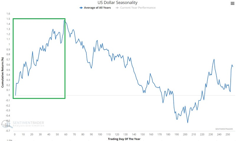
The chart below displays the growth of $1 invested in the dollar only from the close on December 31st through the close of Trading Day of Year (TDY) #58 the following year.
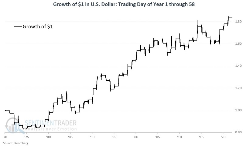
These windows showed a gain 62% of the time, with a larger average gain than average loss. The dollar rallied more than 6% nine times, while losing more than -6% only twice.
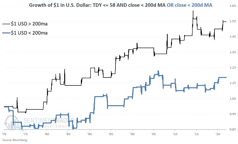
The chart below displays the growth of $1 in the U.S. dollar through TDY #58 depending on whether the dollar is above or below its 200-day moving average. Note that while results were more robust when the dollar was above its 200-day average, results were still positive even if the dollar was below its 200-day average.
If the dollar is trading below its 200-day moving average after TDY #58, the outlook darkens. The chart below displays the growth of $1 in the U.S. dollar if it is after TDY #58 and the dollar is trading below its 200-day moving average.
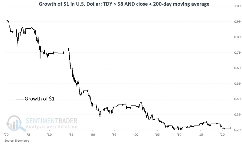
The cumulative decline in value under this scenario since 1971 is -70.1%.
Natural gas is still facing a seasonal headwind
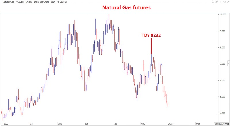
If the dollar does rebound, it would be a headwind for most commodities. Jay noted that one of them, natural gas, has plummeted since late November.
In October, Jay pointed out that natural gas was due for a seasonal peak during the 4th quarter of 2022. The peak did NOT come near TDY #210. Instead, the actual peak in NG prices occurred on TDY #232. Since that time, the decline in natural gas has been relentless - as you can see in the chart below. Natural gas has now reached an oversold level that intermediate-term reversals have often followed.
Nevertheless, the annual seasonal trend strongly warns about the dangers of playing the long side of natural gas in the near term. The tendency for weakness in natural gas during the first 41 trading days of the year is consistent. The chart below displays the cumulative hypothetical dollar return from holding a long position in natural gas futures during TDY #1 through 41 each year since natural gas futures started trading.
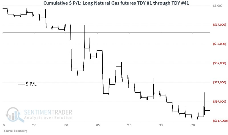
The contract showed a gain 34% of the time, with a much higher average and maximum loss in the losing years than gains in the winning years. It was also four times more likely to suffer a large loss than a large gain.
NOTE: Jay recently sat for an interview with PicturePerfectPortfolios, discussing seasonality and other topics, which you can read here.
About TradingEdge Weekly...
The goal of TradingEdge Weekly is to summarize some of the research published to SentimenTrader over the past week. Sometimes there is a lot to digest and this summary is meant to highlight the highest conviction or most compelling ideas we discussed. This is NOT the full research that's published, rather it pulls out some of the most relevant parts. It includes links to the published research for convenience; if you don't subscribe to those products it will present the options for access.