
TradingEdge Weekly for Feb 9 - Rising warnings, improving economics, commodity tailwinds

Key points:
- Oddities are increasing under the surface of the stock market
- Technical warnings are spiking
- A risk-off model has triggered
- Even with the warnings, implied volatility isn't moving much at all
- An economic report gives the first bit of good news in a long time
- Consumer confidence is rebounding - the impact on sectors
- Using heavy truck sales as an indicator for gold and the euro
- Some economic tailwinds for commodities
- A short-term positive window for crude oil
Oddities under the surface
Last week, we started to see some odd behavior under the surface of the stock indexes. There are more that are triggering.
Due to many smaller and lower-quality stocks struggling, the list of securities falling to 52-week lows has been rising while 52-week highs are stagnant on the Nasdaq exchange.
Since 1990, when the Nasdaq Composite was trading at a 52-week high, there has been an average of three stocks on the Nasdaq exchange hitting a 52-week high for every stock falling to a 52-week low. That dynamic has flipped in recent weeks, with many days recording more stocks at lows than highs. This pushes the current environment way out on a histogram.
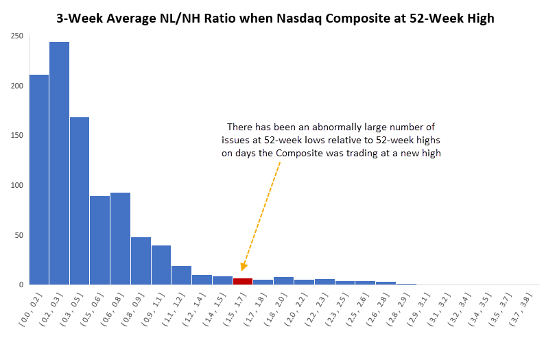
The table below shows returns in the Nasdaq composite after it closed at a 52-week high at least five times over the past three weeks, while the average ratio of stocks at new lows versus new highs averaged more than 1.5.
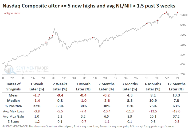
The S&P 500 didn't enjoy quite the upside in 1999, so its returns after these signals on the Nasdaq were even worse. Over the next two months, it managed to show a positive return only twice.
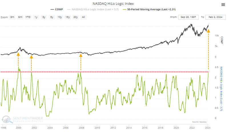
Since a relatively large number of stocks have hit new lows or new highs on any given day, the 50-day average of the HiLo Logic Index has spiked. It's now the highest in over 20 years, indicating a split market that indicates unhealthy market conditions.
Technical warnings are spiking
Among other technical warning signs that have been triggered are the Hindenburg Omen and Titanic Syndrome.
If you can get past the hyperbolic names, they provide helpful insight into what's happening below the surface of the major stock market indexes. When these signals trigger, they highlight conditions when not everything is in gear.
During the past three weeks, the two indicators have triggered a combined eight signals. That's the most since December 2021. We can see from the chart below that when eight or more signals were triggered, the Nasdaq Composite's annualized return was a horrid -29.3%.
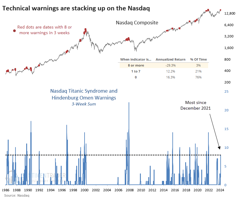
The table below takes a signal-based approach. It shows returns for the Composite after any date when the three-week sum of combined warnings cycled from zero to eight or more. Overall, risk in the index was higher than reward, which is not a condition we see often.
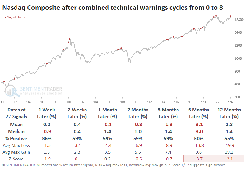
These warnings were a worse sign for the S&P 500 over the next six months. It showed a gain only 41% of the time, with a negative average return and more risk than reward.
Within the S&P 500, fewer and fewer stocks have been participating in its most recent gains. The percentage of stocks within the index holding above their 10-day, 50-day, and 200-day moving averages has been decreasing for weeks.
The table below shows dates when the S&P index was within 0.5% of a 3-year high, yet fewer than 50% of its member stocks were above their 10-day average, fewer than 60% were above their 50-day average, and fewer than 70% above their 200-day average.
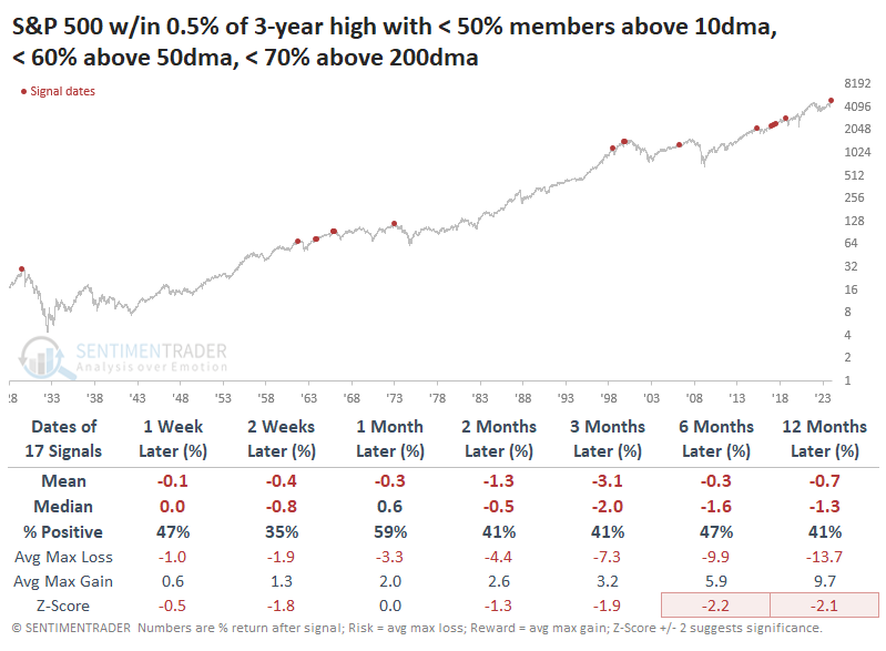
The results were not encouraging for bulls. Across almost all time frames, the S&P's returns were woeful, consistently negative, and with a terrible ratio of risk to reward. Buyers shrugged off the warnings in 1963 and 2017, but other than that, it was trouble.
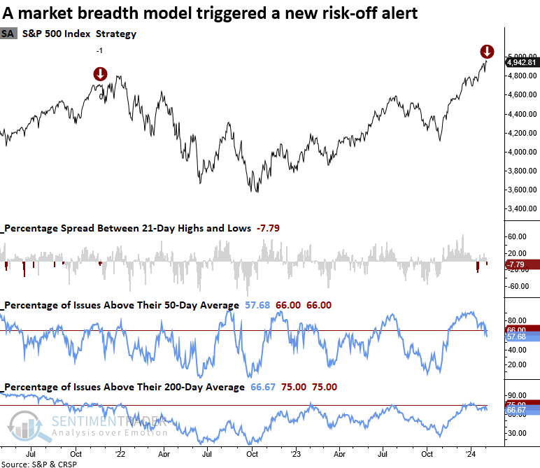
A warning from the Risk Off model
Dean noted that a component in the Risk-Off Composite Model issued a warning. The system employs breadth-based indicators to detect a deterioration in stock market participation.
The model requires the following criteria to issue an alert:
- S&P 500 <= 2 days from a 252-day high
- The spread between S&P 500 21-day highs and lows are < -0.5%
- The percentage of S&P 500 members above their 50-day average < 66%
- The percentage of S&P 500 members above their 200-day average < 75%
The previous alert from November 2021 was the first component in the Risk-Off Composite Model to trigger a warning. A month later, the overall composite triggered a warning.
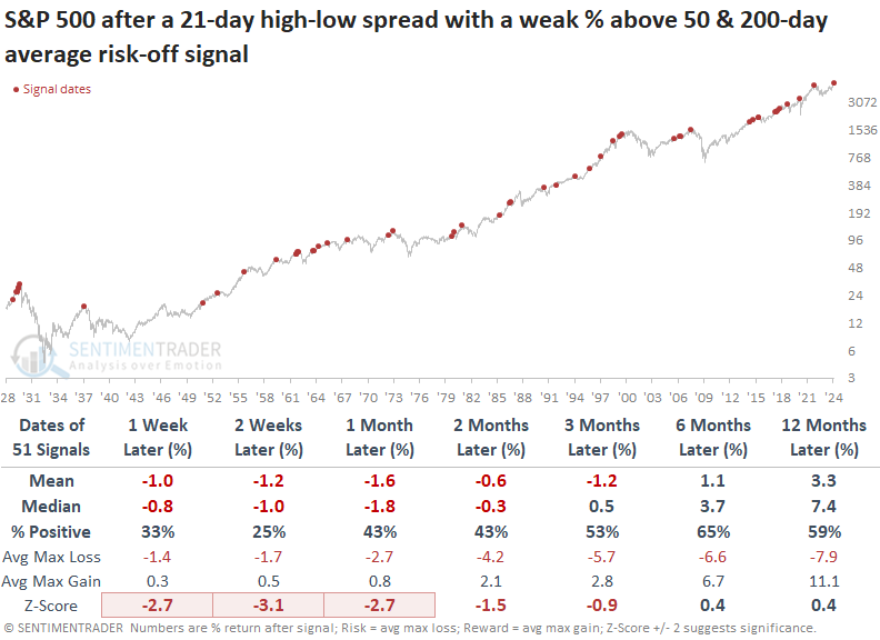
In instances where the breadth-based model triggered an alert when it identified a deterioration in S&P 500 participation, the world's most benchmarked index struggled over the subsequent three months, displaying a loss in 4 out of 5 horizons using the median return.
The outlook was extremely unfavorable over the ensuing two weeks, with the S&P 500 falling 75% of the time.
The TCTM Composite Risk Warning Model, designed to identify a potential bullish to bearish trend change for the S&P 500 before traditional trend-following indicators, currently reports a risk level of 10%, comfortably below the trigger point of 50%.
Despite the warnings, implied volatility remains exceptionally quiet
The VIX "fear gauge" of S&P 500 implied volatility has settled at a low level for months, and it hasn't moved all that much from day to day.
As a result, the standard deviation of daily price changes (not the deviation of the price itself or percentage changes) for the VIX over the past 50 sessions has plunged to one of the lowest readings on record.
When it has been exceptionally low, the VIX has tended to show abnormally large positive changes in the days afterward. Since it is a mean-reverting data series, it also shows significant daily declines when the standard deviation is abnormally high.
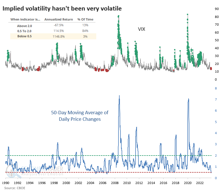
The table below shows every time since 1990 when the 50-day standard deviation of the VIX fell below 0.5. Note that it dropped below this level a few weeks ago and has remained suppressed since then. Overall, the VIX tended to show its most consistent rebounds over the next 2-3 months. It was higher either 2 or 3 months later after nine out of ten signals.
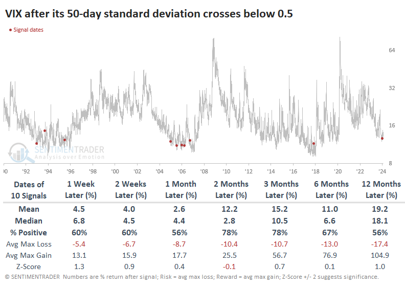
For those who don't trade options, it's difficult to capitalize on this phenomenon directly, as volatility ETFs are terrible investments. They might make decent trading vehicles, but they're disastrous for holding any longer than a few days.
Annualized returns in the S&P have been meager when complacency was so high but just because annualized returns were low doesn't mean the S&P often declined. While returns weren't highly positive, they still tended to be positive. And over the next year, the index showed a gain after all ten signals.
The other major stock indexes also showed mostly positive behavior. The Nasdaq Composite was the worst of the lot over the next two months, with a negative median return. Small caps were the most positive over the next year.
Some positive economic developments
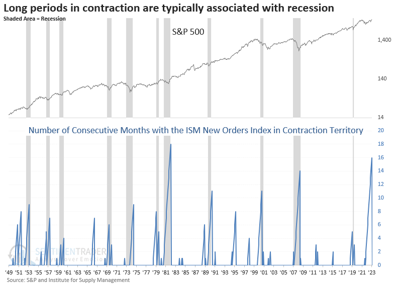
The ISM New Orders Index rose into expansion territory after contracting for 16 months. Dean showed that similar shifts from contraction to expansion preceded a bullish long-term outlook for the S&P 500.
Last week, the Institute for Supply Management released its manufacturing survey, with most components showing month-over-month improvement. That was especially the case for the new orders index, which jumped 5.5 points, shifting from contraction territory, a reading below 50, to expansion, a reading above 50.
Curiously, the second-longest streak in contraction territory was associated with a growth scare, not a recession.
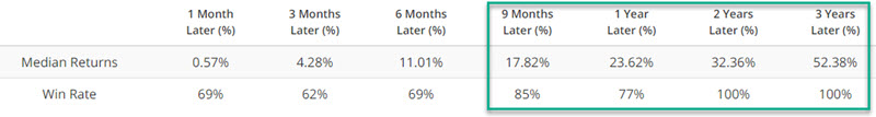
While the sample size is tiny, a shift from contraction to expansion after an extended period with a sub-50 index resulted in higher equity prices every time over the following three- and six-month horizons.
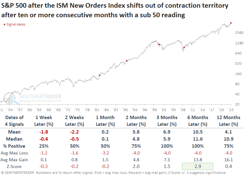
Trimming the contraction period from ten to seven months introduces a mixed outlook in the subsequent month, with variability based on whether the mean or median is utilized. However, six months later, the S&P 500 was higher 91% of the time, with a return that showed significance relative to the study period.
Cyclical sectors benefitted the most over the subsequent year when the new orders index shifted from contraction to expansion territory, while defensive groups lagged.
Except for 1980, similar shifts in the new orders index have generally had a positive impact on the overall manufacturing index. While the Conference Board's Leading Economic Indicators measured in year-over-year terms contain fewer signals due to data limitations, this widely followed economic series could turn up if history rhymes.
Consumers are responding by becoming more optimistic
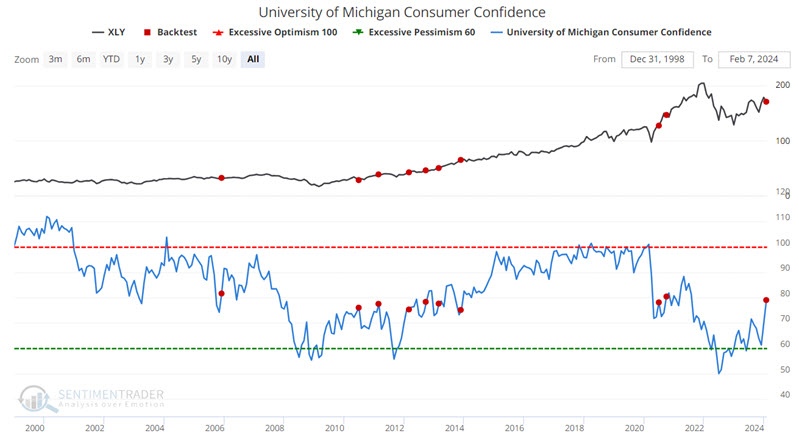
The University of Michigan Consumer Confidence index moved sharply higher in the latest monthly survey. Jay noted that sector performance has been relatively strong following such action - particularly in the last 20 years.
The University of Michigan Consumer Sentiment Index is a consumer confidence index published monthly by the University of Michigan. The Index is normalized to have a value of 100 in December 1964.
Like most other sentiment surveys, this is a coincident indicator. When times are good, consumers are happy; when times are bad, they are less optimistic. At the extremes, the survey is a decent contrary indicator. When the survey recorded readings over 100, it coincided with times of economic expansion and good stock market performance. Generally, stocks underperform after such occurrences.
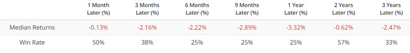
When the survey recorded readings under 70, it coincided with challenging market conditions. However, when consumers recognize and extrapolate it, we're usually nearing the trough, and the stock market tends to bottom not long after. The chart below highlights each time the UMCC crossed above 75 versus the S&P 500 Index.
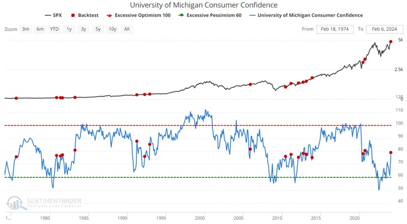
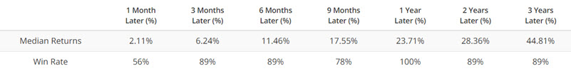
These results are something of a mixed bag. The Win Rates for six months to 3 years are higher than the average of all months (for 2 and 3 years out, the Win Rate is 95%, versus an average two and 3-year Win Rate of 85%). This suggests a higher-than-average probability of higher stock prices in the years ahead.
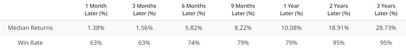
In the test below, we only consider the first UMCC cross above 75 within the last 12 months.
Note that Median Returns and Win Rates improved for 1-month, 6-month, 9-month and 1-Year periods. The 9-month period enjoyed a 92% Win Rate and a Median Return of +10.22%. Not spectacular, but solid.
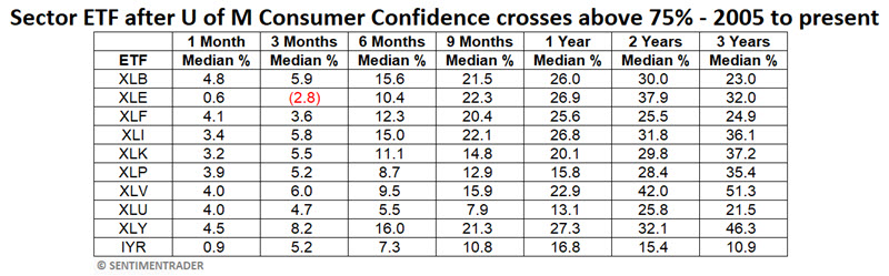
Next, let's focus on the 11 major S&P 500 sectors.
Looking at ETF performance since most S&P 500 sector ETFs started trading, we see some impressive results. The table below summarizes the median returns for each sector fund since 2005. Seven of the 11 sectors have shown a median 1-year gain excess of +20%.
One ETF performing well following crossed above 75 by the UMCC is ticker XLY, representing the consumer discretionary sector. It should not be inferred that XLY will necessarily outperform other sectors in the year ahead, but we highlight its performance below for illustrative purposes.
The chart below highlights all instances when the UMCC crossed above 75 versus ticker XLY.
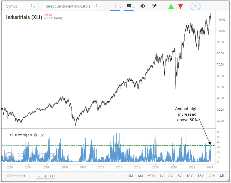
More industrial stocks are hitting new highs
Dean showed that over 30% of Industrial sector stocks registered an annual high, with the index closing at an all-time high. Similar expansions in new highs suggest the uptrend in the group continues over the following year.
This past Friday witnessed a noteworthy achievement for the S&P 500 Industrial sector, with over 30% of its stocks registering an annual high, outpacing all other groups.
The S&P 500 Industrials sector shows an upward trajectory over the subsequent year when annual highs expand by 30% or more, with the index closing at a 5-year high. Over the following six months, the sector encountered only four instances of a maximum loss exceeding -10%, with two of these occurrences representing rare crash events in 1987 and 2020.
It's worth noting that a significant number of precedents occurred since 2009, a period dominated by growth stocks.
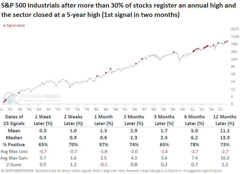
Interestingly, the expansion in new highs within Industrials did not lead to outperformance relative to the S&P 500 and growth-oriented groups like Technology, Healthcare, and Consumer Discretionary over the subsequent year. However, it did outperform other value-oriented groups and defensives like Staples and Utilities.
Heavy truck sales as a commodity indicator
The Heavy Truck Index has been a valuable tool for helping identify strength or weakness in the economy. Jay noted that the index just ticked above a level that has been meaningful for metals, commodities, and currencies.
The USA Heavy Truck Index tracks the number of newly registered heavy trucks with government agencies in the United States. As it turns out, this index is a pretty good indicator of overall economic health and the stock market. Buying a truck weighing 6.35 metric tons or more requires a lot of money.
Just because the Heavy Truck Index is below a longer-term moving average does not guarantee a recession. However, in the last 50 years, every economic recession has occurred while this index was in a downtrend. In other words, the recession probability is considered higher if this index is in a downtrend, BUT that probability is not necessarily 100%.
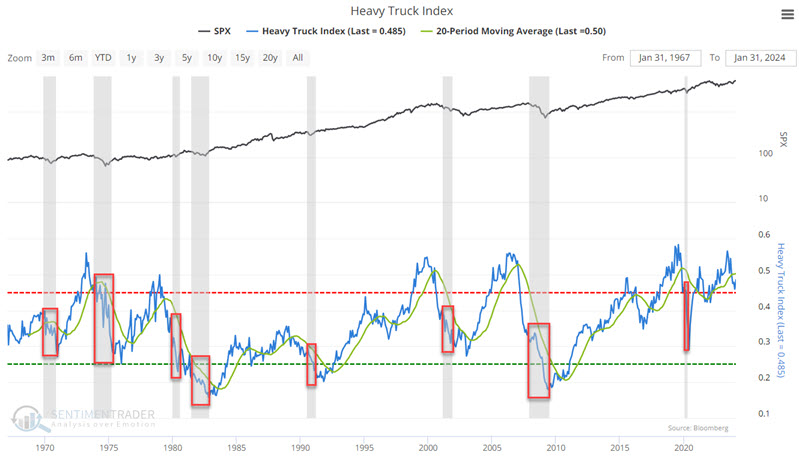
This indicator is best used not as a standalone trading model for stocks or commodities but as a weight of the evidence tool. That said, to highlight the potential usefulness of this indicator, the tests below do exactly that - i.e., measure the performance of a commodity or currency following a specific event using the Heavy Truck Index.
The chart below highlights those dates when the Heavy Trucks Index indicator crossed above 0.48 for the first time in 12 months versus gold.
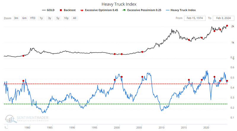
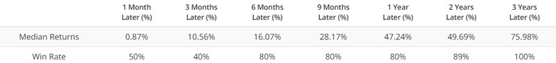
The Median Returns are pretty spectacular at face value (1-Year Median gain of +47.24%). However, a closer look reveals that these values are skewed by the absurdly high values achieved in the 1970's. If we focus on the most recent four signals, returns were much more moderate, albeit still positive. The worst 1-year loss was a seemingly manageable -5.23%.
The same signal from the Heavy Truck Index tends to have the opposite effect on several currencies than on the commodity markets above. The chart below highlights those dates when the Heavy Trucks Index indicator crossed above 0.48 for the first time in 12 months versus the euro.
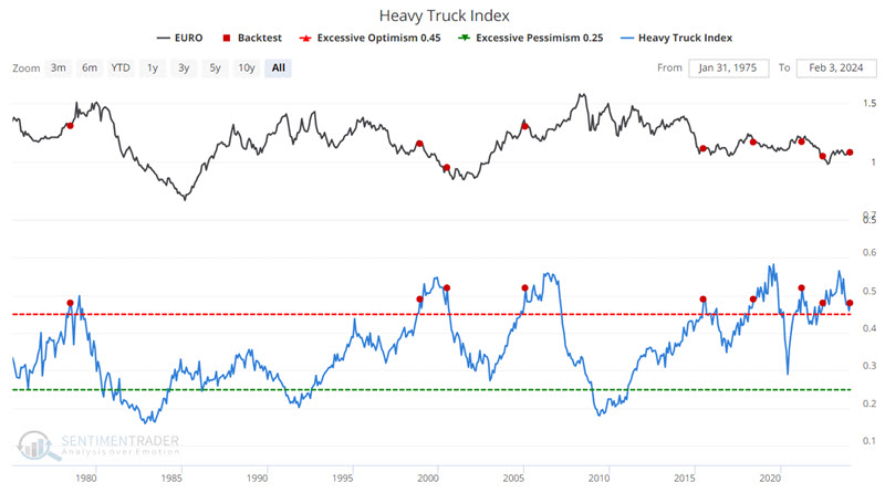
In the table above, the first signal in 1978 saw the euro rise sharply in the year ahead. The most recent previous signal in 2022 saw the euro rise a modest +0.87% over the next year. Every other signal saw the euro decline. Four of the six signals witnessed a 12-month euro decline of -4.6% or more.
Jay further outlined returns in some other commodity contracts after these signals.
Economic tailwinds for commodities
Commodities as an asset class have been in a steady downtrend since June 2022. Still, Jay showed that several economic surveys suggest that investors remain alert for an opportunity in commodities.
The Bloomberg Commodity Spot Price Index (BCOMSP) tracks the aggregate movement of a basket of commodities. This index has been in a steady decline since topping in June 2022. To get another perspective, the chart below divides the price of the Bloomberg Commodity Spot Price Index by the price of the S&P 500 Index.
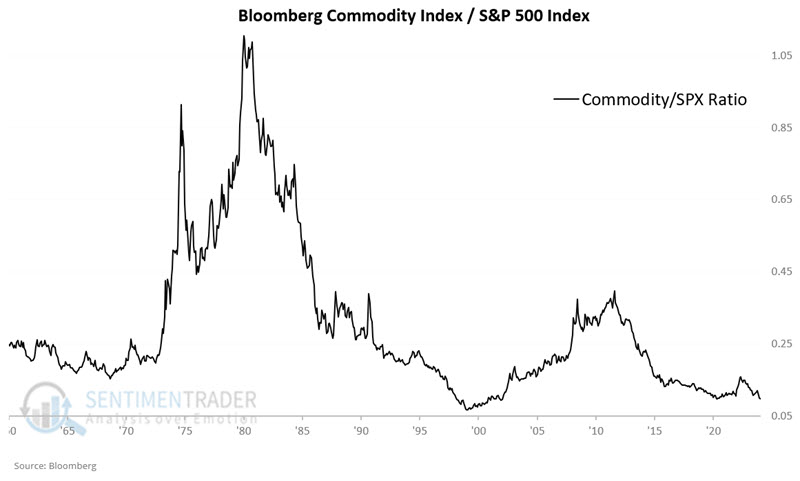
As you can see in the chart above, this ratio is towards the low end of the historical range. This is NOT a timing tool. It does not tell us when to buy stocks and sell commodities or vice versa. It is a perspective tool.
There are some economic reports that may help. The chart below highlights each time the PMI Manufacturing Index crossed above 49 while the Bloomberg Commodity Spot Price Index was below its 10-month moving average. The latest signal occurred on 2024-01-31.
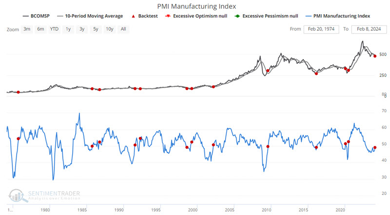
It is helpful to reiterate from time to time that not every signal from every indicator constitutes an automatic buy or sell signal. In most cases, indicator signals are best viewed as weight of the evidence.
Jay also showed that recent readings from the Consumer Confidence survey and our Macro Index Model have preceded mostly positive one-year returns in the commodity index.
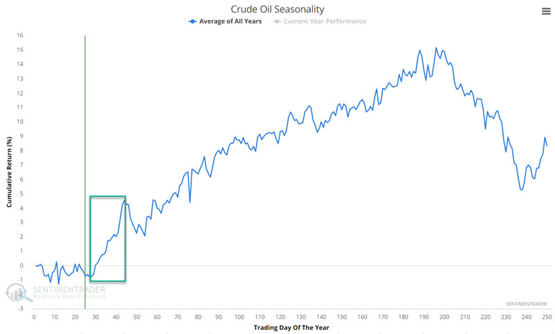
A positive seasonal window for oil
Jay showed that crude oil has been trending lower since mid-2023 but is soon entering a favorable seasonal period.
Crude Oil peaked in September 2023, then fell over $20 a barrel in three months. Since then, it has been trading sideways in a range with support in the $68-$69 range.
The chart below displays the annual seasonal trend for crude oil futures. Crude will soon enter a favorable seasonal period extending from the close of Trading Day of Year (TDY) #28 through TDY #44.
The chart below displays the cumulative hypothetical $ +(-) achieved by holding a long position in crude oil futures during this period every year since 1983.
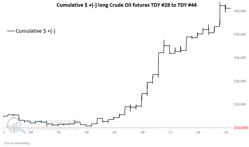
An overall 60% Win Rate is not spectacular, but it is worth noting that in the last 25 years, there have been 19 up periods and six down - a much more solid 76% Win Rate. Also, winning years have skewed more positively to the plus side than down years have to the losing side (Median gain of +$2,995 versus median loss of -$1,365 and $5K moves skewing 9 to 1 to the plus side).
Results were more consistently positive when crude oil was above its 200-day moving average. The chart below displays the cumulative $ + (-) achieved by holding crude oil futures during these seasonal windows only when oil was above its 200-day moving average.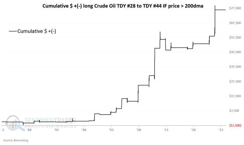
The cumulative gain was $76,500, and results trended consistently from lower left to upper right. When oil was below its 200-day average during these windows, the cumulative gain was only $16,150, and drawdowns and losing periods were much more prevalent.
About TradingEdge Weekly...
The goal of TradingEdge Weekly is to summarize some of the research published to SentimenTrader over the past week. Sometimes there is a lot to digest, and this summary highlights the highest conviction or most compelling ideas we discussed. This is NOT the published research; rather, it pulls out some of the most relevant parts. It includes links to the published research for convenience, and if you don't subscribe to those products, it will present the options for access.