
TradingEdge Weekly for Apr 25 - Volatility spike, historic thrusts, health care extremes

Key points:
- Stocks have crashed (when priced in gold)
- The S&P 500 has suffered persistently poor momentum
- A proxy index tracking the VIX back to 1962 shows a historic spike
- Some indicators are showing breadth thrusts
- A couple of compelling other thrusts also triggered
- A detailed look at sector returns following corrective periods
- Unfortunately, stocks are showing a loss through April
- Health care stocks have taken a beating, and insiders are buying
- What the copper/gold ratio suggests for various markets
- Metals are heading into a seasonal soft spot
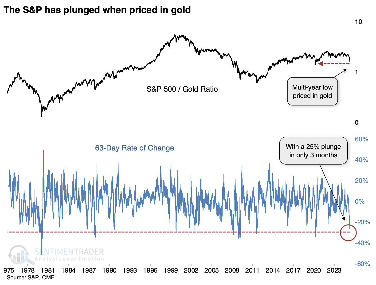
A stock market crash (priced in gold)
The S&P 500 has been vulnerable due to its top-heavy nature, and it got penalized as a result. And when we price the S&P in "hard money," meaning gold, the decline looks downright atrocious.
For one of the few times in the fifty years since gold has traded freely, the ratio between the S&P and the metal lost a quarter of its value in only three months.
The table below shows the dates and returns for those who prefer numbers. We can see that over the next two months, the S&P's risk/return profile was uninspiring, but over the following year, it showed double-digit gains except for the disastrous signal ahead of the 2008 financial crisis.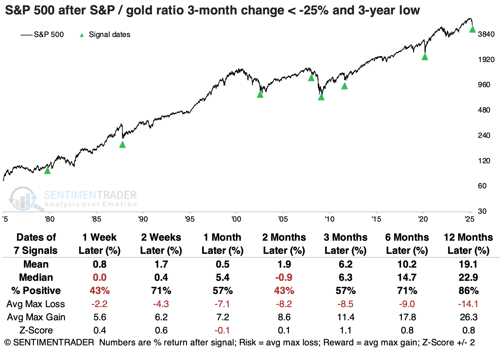
Gold didn't fare as well. The table of returns shows volatile performance over the following several months, often oscillating between gains and losses. Even so, it was positive after six of the seven signals over the following six months.
The ratio between the two assets was mixed, gyrating between positive and negative for months. Over the following year, the S&P 500 outperformed gold five of seven times, but the two times it didn't, it really didn't.
Persistently poor momentum
The Relative Strength Index (RSI) for the S&P 500 has remained below 50 for two months straight. Dean showed that similar streaks saw the large-cap index struggle over the next month, followed by a rebound.
Over the past two months, the S&P 500 has exhibited weak price momentum, with its RSI stuck below 50, marking the most extended streak since the 2000-02 bear market and the 21st longest in nearly a century of data.
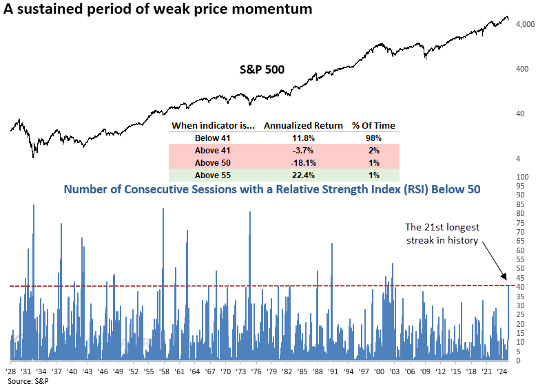
Each time the S&P 500's RSI stayed below 50 for 41 consecutive sessions, the index struggled over the next month. Once that stretch ended, performance gradually improved, with returns and win rates climbing steadily through the five-month mark. One year later, the index was higher 78% of the time, and since 1942, there's been only one loss.
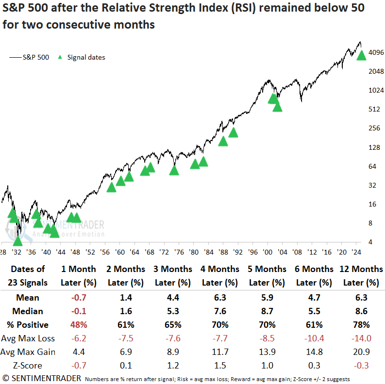
Although conditions began to improve around the two-month mark, the mean and median maximum losses still exceeded the corresponding maximum gains, indicating that risk continued to outweigh reward slightly beyond the one-month timeframe. Over short-term horizons of one to fifteen sessions, the S&P 500's three-week outlook delivered the weakest performance of any interval.
Of the 23 prior occasions when the RSI held below the 50 level for 41 consecutive sessions, 19 (or 82%) coincided with bear market conditions.
A volatility milestone
The VIX "fear gauge" that has become so popular has dropped by about half from its peak levels. But we don't need anything besides open-high-low-close data to create an accurate proxy of the VIX.
We've discussed this proxy VIX many times over the decades, which uses five academic models of volatility to estimate the VIX, without using options. It tracks the VIX remarkably closely and allows us to go back further in history.
When we do that, we can see that the current spike, which continues to escalate, now ranks 4th-highest in 63 years.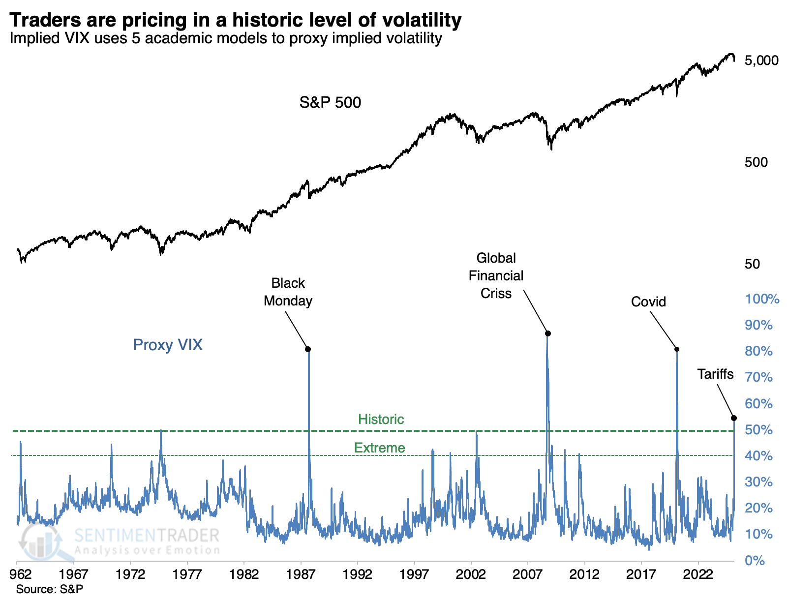
The chart above clearly reflects the historic nature of the tariff tantrum. The only equivalents were three of the most upsetting conditions in modern history.
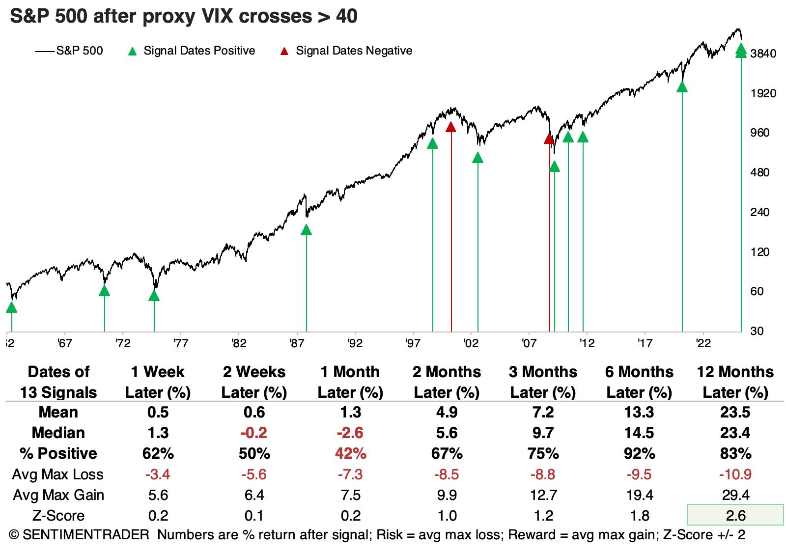
Relying on a sample size of three of sketchy, so the table below relaxes the extreme threshold to 40%. That increases the sample size considerably, and the signals were still impressive over longer time frames. There was only one negative return six months later.
These drastic swings in the level of the S&P 500 are, of course, driven by what has become increasingly all-or-nothing buying and selling pressure in individual stocks.
On Monday, fewer than 8% of S&P 500 stocks advanced on the day. On Tuesday, that swung to more than 98% of them. Since the end of the financial crisis, when these swings became more common (it never happened before 2007), one-day swings of more than 90% in advancing issues have reliably occurred near the end of corrective periods.
Impressive buying interest
In a few weeks, we have gone from seeing many overlapping "oversold" signals (and volatility ones as noted above) to many "breadth" signals. Jay showed a few of them.
Our NYSE Up Volume Ratio measures volume traded in issues that closed up on the day on the New York Stock Exchange as a percentage of total up and down volume. The chart below highlights those dates when the 3-day moving average of this indicator was above 80 since 1962. This tends to highlight significant breadth thrusts that are generally considered favorable for the stock market.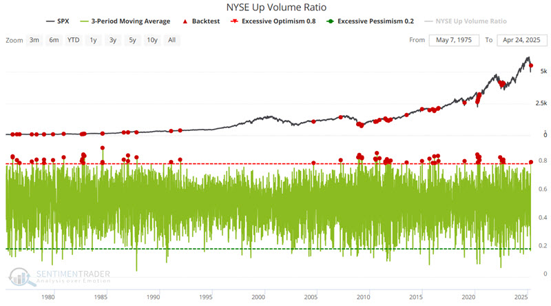
The Breadth Thrust Indicator is a technical indicator used to identify market momentum. It is computed by calculating the number of advancing issues on an exchange, divided by the total number of issues, and generating a 10-day exponential moving average of this percentage.
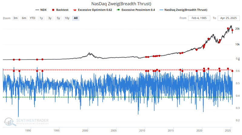
The indicator signals the start of a potential new bull market when it moves from below 40% (indicating an oversold market) to above 61.5% (indicating an overbought market) within a 10-day period. This just triggered.
And even more thrusts
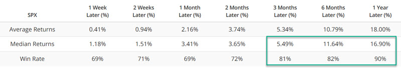
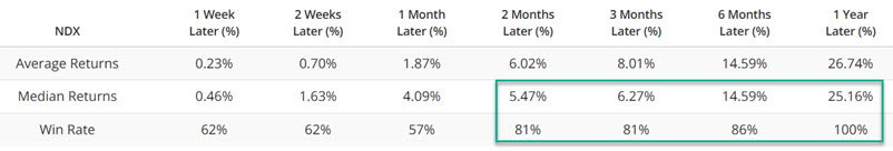
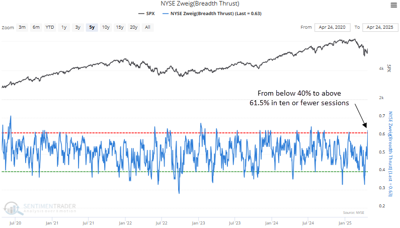
A Zweig breadth thrust for NYSE data triggered an alert at the close of trading on Thursday. Dean noted that similar thrusts produced excellent returns and consistency for the S&P 500 over the next year. Also, the advance-decline ratio for the Nasdaq exceeded 3-to-1 in three out of the last ten sessions.
One of the most widely followed breadth thrust indicators, the Zweig thrust, created by legendary investor Marty Zweig, triggered on Thursday. The indicator measures NYSE advancing issues as a percentage of advancing and declining issues, smoothed by a 10-day exponential moving average. An alert is triggered when the indicator cycles from below 40% to above 61.5% in ten trading sessions or fewer.
Whenever a Zweig thrust occurred, the S&P 500 displayed outstanding returns and consistency over the subsequent year. That was especially the case post the 1929-42 secular bear market. Moreover, multiple time horizons have recorded impressive win streaks, with the six-month window leading the way, boasting 20 uninterrupted gains since 1938.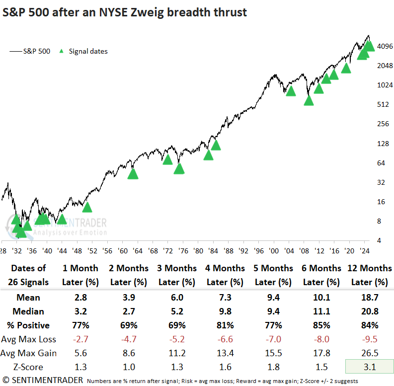
Over the last ten trading sessions, the advance-decline ratio for the Nasdaq exchange has surpassed a 3-to-1 reading on three occasions, indicating that a significant number of stocks are rallying.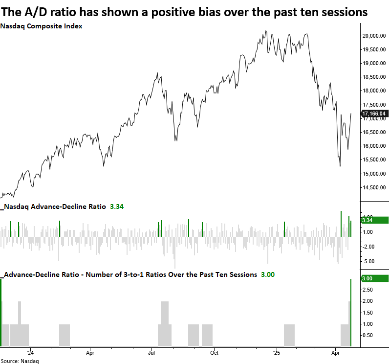
Every time a 10-day A/D ratio thrust occurred, the Nasdaq Composite experienced remarkable performance, with the tech-heavy index advancing 100% of the time in the three months that followed. Additionally, both the four- and twelve-month periods only showed a single loss, and each timeframe demonstrated statistical significance compared to random returns over the study period.
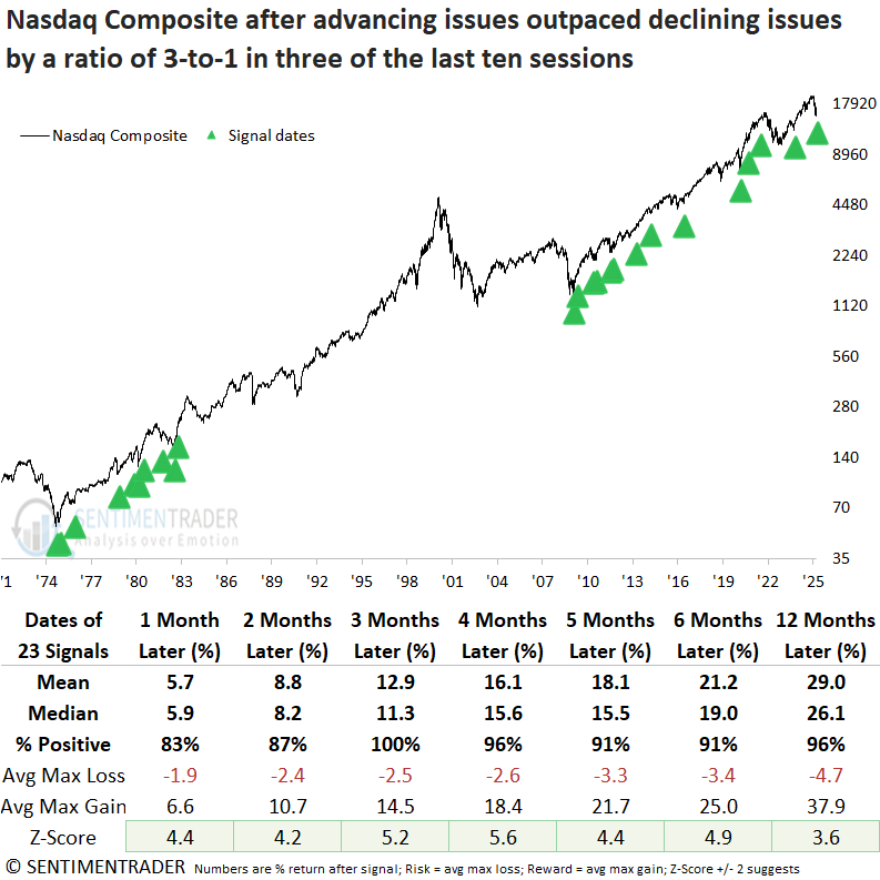
After Nasdaq thrust signals, the S&P 500 technology sector outperformed the S&P 500 across every time frame and was the best-performing sector relative to others in five of seven intervals.
If this is a bottom...
After corrections or bear markets, cyclical sectors have shown the strongest tendency to outperform. Dean noted that six months after a correction, technology displayed the most favorable returns and consistency.
Market dynamics, such as Trump's tariff policy, can shift rapidly, and anchoring too rigidly to one outcome can cloud judgment. Regardless of the depth or classification of the drawdown, historical evidence is unambiguous: opportunities consistently emerge in specific sectors after significant corrections or bear market bottoms.
The table below shows sector performance compared to the S&P 500 in the six months following significant market lows. Historically, technology, consumer discretionary, financials, and industrials have been the most consistent outperformers, with Technology exceeding S&P 500 returns in 90% of all post-correction scenarios.
In contrast, traditionally defensive areas such as consumer staples, healthcare, and utilities have tended to underperform.
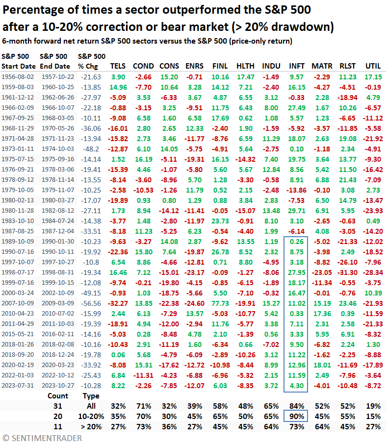
Note: Communications Services (TELS in the table) was restructured in 2018, now including growth-oriented names such as Google, Netflix, and Meta. Today, it should be viewed as an offensive sector, a shift from its pre-2018 defensive profile.
Whether looking one month ahead or a full year out, technology provided the most consistent relative leadership, followed by the consumer discretionary, industrial, and financial sectors.
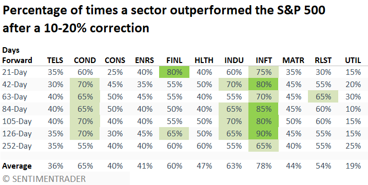
Across all measured periods, the consumer discretionary, financials, industrials, and technology sectors posted median returns above those of the S&P 500, with technology consistently delivering the highest excess return.
Post-bear market recoveries saw technology follow a similar outlook after corrections, although consistency was not as robust. On the other hand, Financials gained significant traction, with several horizons achieving a win rate of 80% or higher.
A beginning-of-year headwind
Jay showed that the first four months of the year have historically been something of a test for the market in the remaining eight months.
Each year, we look to see if the S&P is higher or lower at the end of April than at the end of December the previous year. Then we look at the performance from April through December of that year.
First, let's look at the years that saw a market gain during the first four months. The chart below displays the hypothetical growth of $1 invested in the S&P 500 only during the last eight months of the year, after the first four months showed a gain.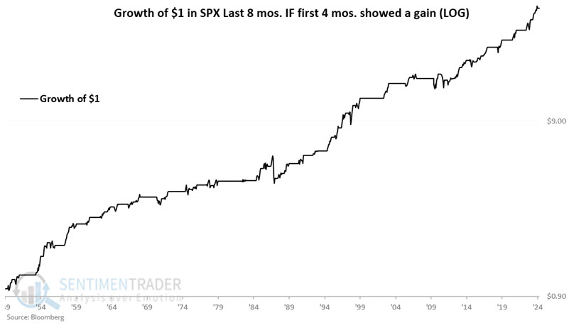
During these years, the April-December period gained 85% of the time. It rose more than +9% during 22 years, while falling more than -9% only once.
Now let's look at years that saw a market decline during the year's first four months (i.e., the S&P 500 Index closed April below where it was on the previous December 31st). The chart below displays the hypothetical growth of $1 invested in the S&P 500 only during the last eight months of the year, after the first four months showed a loss.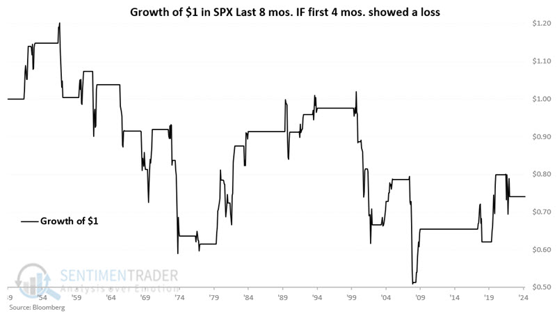
These years saw April-December rally only 46% of the time, gaining more than +9% during 7 years, while falling more than -9% also during 7 years.
A potentially healthy opportunity
Jay suggested that many indicators are giving favorable signals for the healthcare sector.
Over the long term, the healthcare sector has been a top - and relatively consistent - performer. However, the Health Care Sector SPDR Fund (ticker XLV) is essentially unchanged since August of 2021. Unsurprisingly, investor sentiment has become severely depressed in the healthcare sector.
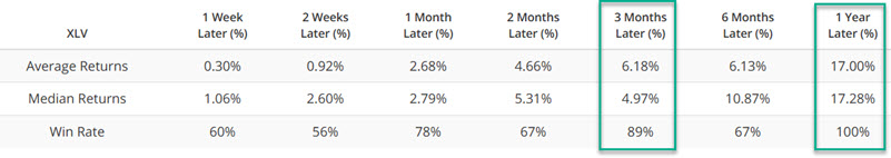
The XLV Panic Breadth Composite indicator combines market sentiment and breadth analysis to identify investors' "hair on fire" behavior. The chart below highlights dates when the XLV Panic Breadth Composite crossed above 65 for the first time in three months, and the table summarizes subsequent XLV performance.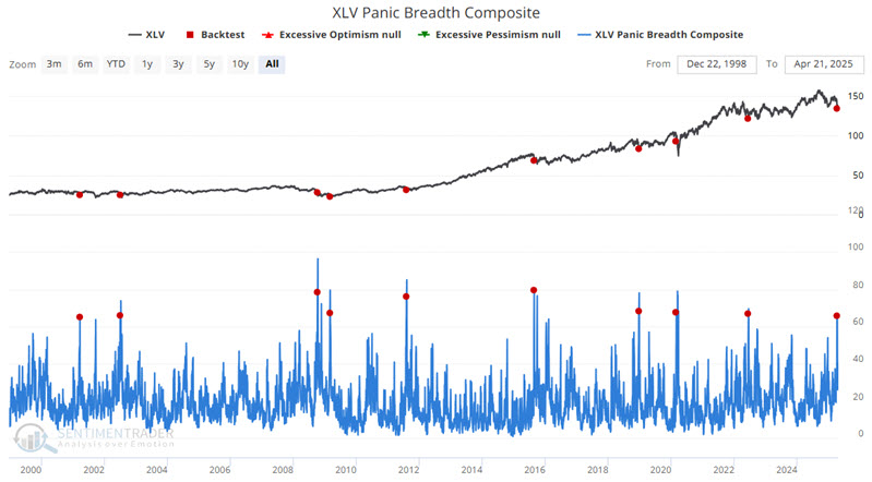
Jay also looked at the percentage of healthcare stocks exceeding their lower Bollinger Band, and the percentage that hit oversold levels. Both of those suggested positive returns going forward.
The chart below highlights all dates when the XLV Net New High-Low % indicator crossed below -35% (indicating a vast preponderance of sector stocks making new 52-week lows relative to those making new highs).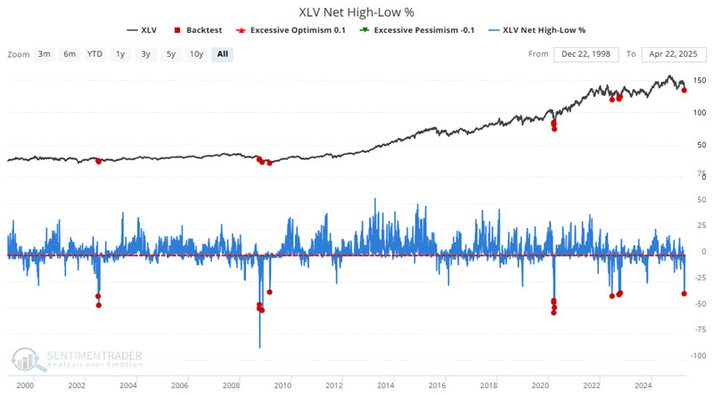
Healthcare is not the only sector that is showing a lot of "favorable indicator signals" lately. However, insider buying is the one thing that it has witnessed that other sectors have not. Breadth and sentiment indicators can alert us that the selling in a given sector may be overdone. However, a significantly favorable relationship between insider buying and selling indicates that the people who know their companies' - and the industry as a whole - best are seeing value while others are panicking.
While insiders are generally not "precision market timers," they are rarely wrong 1-3 years later. And they've been showing heavy buying interest in this sector.
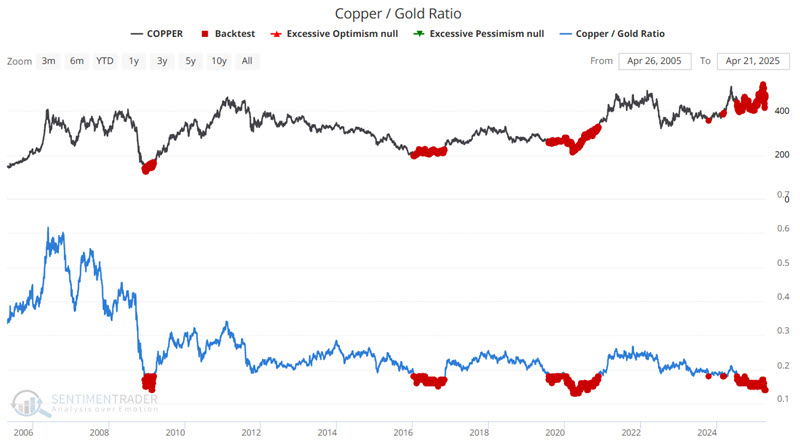
Copper versus gold
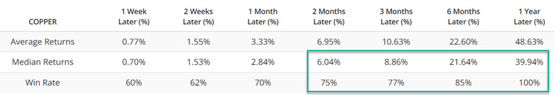
The Copper / Gold Ratio tracks the difference in performance between copper and gold futures. Jay showed the ratio has plunged to a near all-time low.
The chart below features copper and highlights all dates when the CGR was below 0.18. The table summarizes copper's performance in the following year.
Now let's consider the other markets in our test. The table below summarizes 12-month results for:
- Win Rates
- Median 12-month % return
- The difference between performance when CGR is above or below 0.18
The table below summarizes performance over the last twenty years in various markets, dividing results by whether the Copper/Gold Ratio was above or below 0.18.
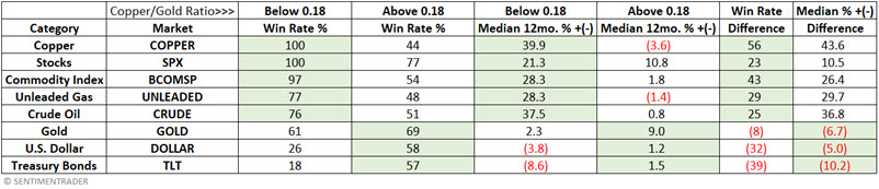
We see that copper, stocks, commodities, unleaded gas, and crude oil performed significantly better on average in the year after any CGR reading below 0.18. Conversely, performance for the US Dollar and long-term US treasuries has been notably worse following CGR readings below 0.18.
Interestingly, overall gold performance has been slightly worse when CGR is below 0.18, though that has obviously not been the case since CGR last fell below 0.18 in July 2024. Since then, gold has advanced 39%. During the same time, copper has advanced roughly 7.5%. This massive gold outperformance differs from what we have seen during previous "CGR below 0.18" periods.
Jay further looked at other extremes in the ratio, and various market performance following those readings.
Getting more granular on metals
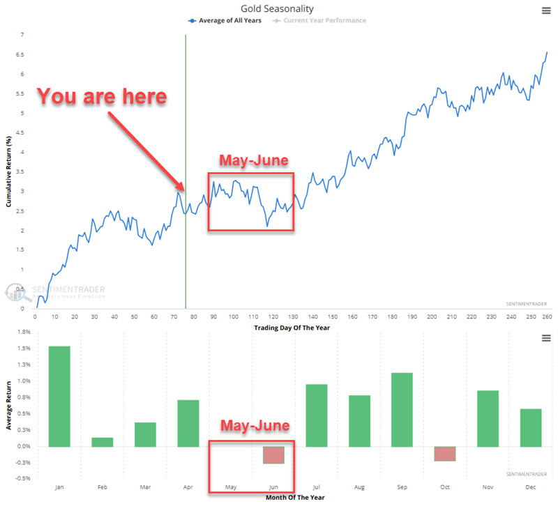
When price trend and seasonality diverge, it can serve as an alert that the current price trend may be due for a pause or reversal. Jay looked at the current seasonal outlook for metals.
The chart below displays the annual seasonal trend for gold futures. Note that the May/June period has a history of experiencing below-average performance.
The chart below displays the hypothetical growth of $1 invested in gold only between Trading Day of the Year #84 and TDY #126 (i.e., the bulk of May and June).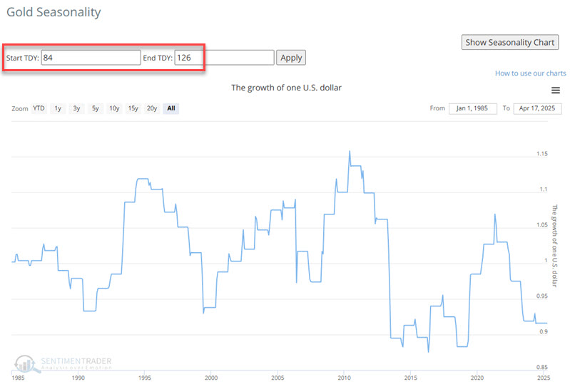
The results in the chart above have no real rhyme or reason, which is the point. The assertion is NOT that gold is about to plunge, but instead that if gold is going to cool off, the next two months seem like a likely time for that to happen.
Also note that the 14-month RSI for gold has recently been above 80%. Historically, this has presaged "cooling off" periods of varying lengths for gold.
Jay went through similar analyses for silver, copper, palladium, and platinum, all showing seasonal weakness during the upcoming months.
About TradingEdge Weekly...
The goal of TradingEdge Weekly is to summarize some of the research published to SentimenTrader over the past week. Sometimes there is a lot to digest, and this summary highlights the highest conviction or most compelling ideas we discussed. This is NOT the published research; rather, it pulls out some of the most relevant parts. It includes links to the published research for convenience, and if you don't subscribe to those products, it will present the options for access.