
Traders are panicking the most since the pandemic

An iffy market environment with hints of pessimism
Over the 20 years we've been publishing here, we've had the good fortune to test thousands of strategies. There is a reason we keep coming back to sentiment-related measures - because they worked more consistently over a multi-month time frame than any other.
One of the keys, however, is context. Investors behave differently during bull markets than they do during bear markets, and both of those are different than trading ranges.
Because of that, we've also tested an untold number of indicators to determine a market's trend. Some add significant value, but usually, they're highly complex and optimized based on historical conditions that may change.
In the help section, we outlined some basics on looking at the market environment. They're simple rules, it's easy to find the indicators just about anywhere, they've worked for decades across every imaginable setting, and they work about as well as more sophisticated systems.
Nowadays, there are many advanced charting and testing platforms available to investors and at reasonable prices. The downside is that it's too easy to get lost by continually searching for a Holy Grail and lose sight of the big picture in the process. For discretionary investors, keeping it simple is usually a better option.
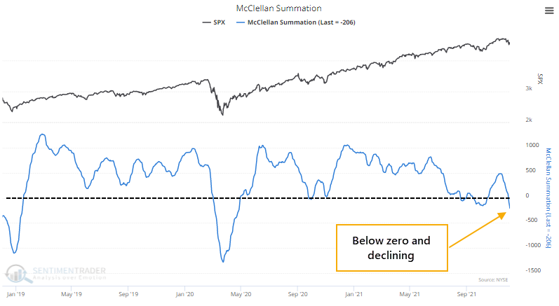
There are a few simple primary guides we watch, all of which are positive. And a few secondary ones, all of which are negative, like the McClellan Summation Index.
So, this is a problem.
We've spent much of the last couple of weeks looking at how split the stock market has been, with too many securities diverging from what the major indexes were doing. These conditions have a strong habit of leading to poor short- to medium-term returns. We can see that above, with positive trend indications in the S&P 500, but negative elsewhere.
In a stark change from recent behavior, traders scrambled to trade put options instead of call options. For the first time since the pandemic rally began, there were more puts than calls traded across all U.S. exchanges.
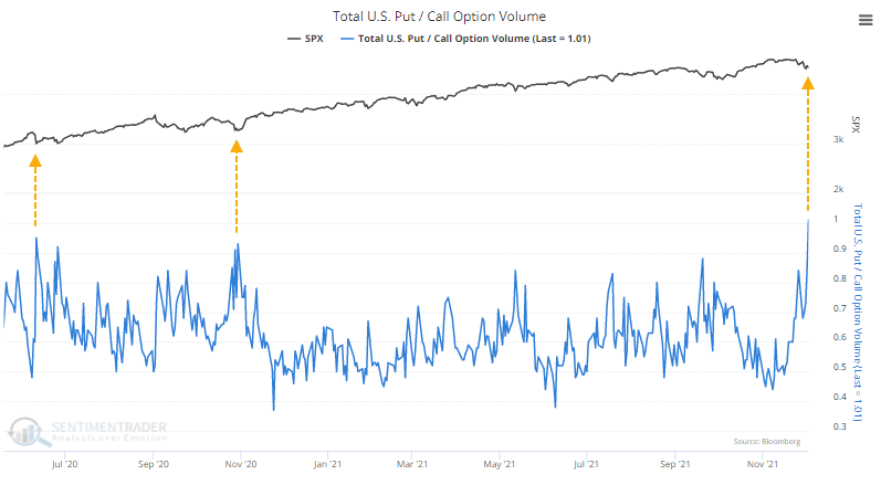
For the first time since the March 2020 surge in buying interest, there is reason to question the trends underlying most securities and investors' willingness to buy the dip. Within indexes like the S&P 500, trends are mostly healthy and not unlike other pullbacks over the past 18 months. But it's a different story across the broader universe of stocks.

| Stat box Traders have moved more than $2.5 billion into or out of the SPY ETF for 6 straight sessions. That's tied with December 26, 2007, for the longest stretch of wild inflows/outflows in the fund's history. |
The yield curve as a stock market indicator
Dean showed that when the 10's vs. 2's treasury yield spread declines, the yield curve is said to be "flattening." Typically, a flattening of the yield curve suggests softer economic conditions.
Conversely, when the 10's vs. 2's treasury yield spread increases, the yield curve is said to be "steepening." A steepening of the yield curve is typically, but not always, associated with more robust economic conditions.
Significant declines in the treasury yield spread in a brief period are typically associated with growth scare corrections and bear markets.
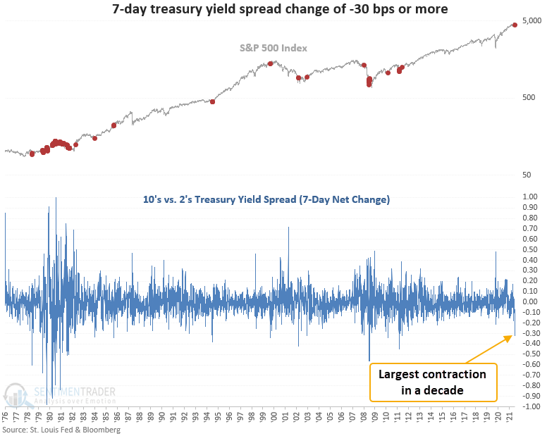
This signal triggered 30 other times over the past 44 years. Dean then looked further at these signals, adding layers of context that helped to flesh out whether this is something investors should be worried about.

What a split market looks like
Jay noted that our Short-Term Risk Level indicator can fluctuate from 0 to 10. In essence, the lower the reading, the less perceived risk in the stock market and vice versa.
One way to look at it is in terms of cash. If one were to rely solely on this indicator to allocate capital (not recommended), then a Risk Level of 0 would suggest keeping 0% of one's portfolio in cash (i.e., fully invested). A Risk Level of 10 suggests keeping 100% of one's portfolio in cash (i.e., no exposure to stocks).
Even though the Short-Term Risk Level is meant for, well, shorter-term movements, a very low level doesn't happen very often, so let's take a look at longer-term returns.
In the chart below, the red dots highlight previous Short-Term Risk Levels readings of 1.
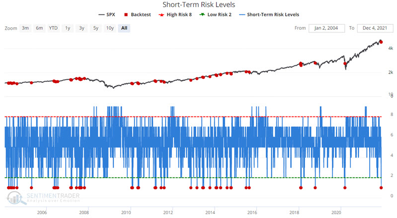
Using the Short-Term Risk Level for a longer-term signal led to 11 non-overlapping signals, which is a very small sample size, but returns following them were quite consistent.