
The Panic Button is being pressed

Key points:
- An indicator of stress in credit markets has spiked to a high - but not yet extreme - level
- If it goes much higher, it will have negative implications until it spikes to truly extreme levels
- As it stands, it's a modest positive for stock returns and higher-beta factors
On the edge of panic
This week, investors truly started to panic.
In March, despite losses in stocks, credit conditions were relatively calm. The biggest panics - not grinding bear markets, but actual panics - always see wholesale selling pressure in credit markets.
That is starting to change, and the Panic Button has been pressed. It has risen above 1.0 for the first time in almost two years.
The indicator incorporates the TED Spread, Junk Bond Yield Spreads, a ratio of Volatility to 3-Month Treasury Bill Yields, and High-Yield CDS Spreads. These spike higher when uncertainty about the economy, corporate outlooks, and stock prices are high. They reach extreme levels only during times of outright panic across markets.
Bulls want to see either a low level in this indicator, which means a lack of stress in the system, or an extremely high one, which suggests the kind of panic that usually coincides with a bottom in stocks. Bulls don't want to see a mushy middle ground, where there is enough "something" out there to trigger uncertainty but not so much that it suggests a bottom.
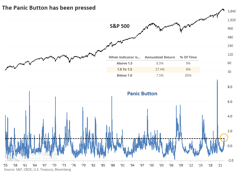
As long as the Panic Button remains below 1.5, the outlook is decent. Returns have been very good when it is between 1.0 and 1.5. When it gets between 1.5 and 3, returns tend to suffer.
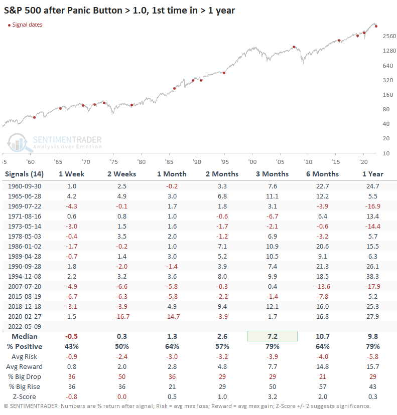
The table below shows the S&P 500's returns when the indicator rises above 1.0. There was often some volatility in the short term, and five of the last six signals saw negative returns in the first couple of weeks. But over the next few months, conditions stabilized, and eight of the last nine signals saw a positive return. The sole loser was small.
A return to risk-seeking behavior?
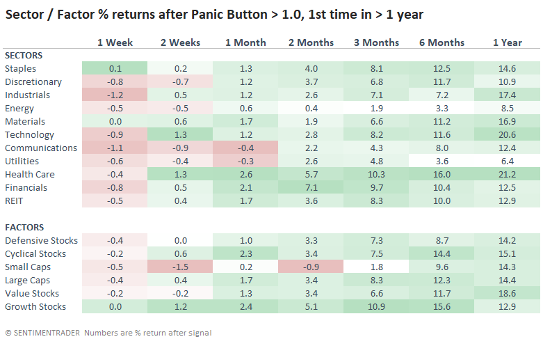
Most sectors saw some shorter-term weakness following these rises in the Panic Button, but most didn't last long. There was a curious mix with the best longer-term returns, including Industrials, Technology, and Health Care. Energy and Utilities brought up the rear.
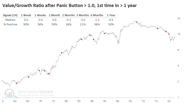
After some short-term digestion, there was mostly a return to higher-risk factors. The ratio of Value stocks to Growth stocks saw consistent losses over the next three months, rising only 21% of the time.
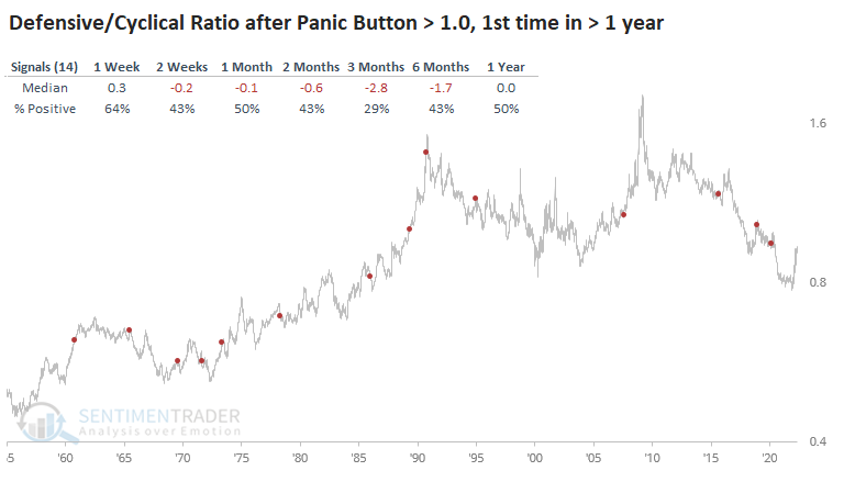
It was a similar story with the ratio of Defensive to Cyclical sectors, which rose only 29% of the time over the next few months.
One caveat with this data is that it uses a multi-year lookback period to determine what "extreme" means. Because we witnessed such profound dislocations from February through April 2020, it's going to take an all-out crash now to trigger a high reading in the Panic Button.
If it used a shorter lookback period, the Panic Button would be just under 3.0. And if we just froze the data for a couple of months during the pandemic, the Button would be just above 2.0. Right in that mushy middle ground that we don't want to see.
What the research tells us...
In equity markets, sentiment is washed out. The 3-day average of Dumb Money Confidence fell to 13% on Wednesday, matched only by 2001-09-21, 2018-12-24, and 2020-03-11, after each of which the S&P 500 enjoyed double-digit gains over the next couple of months. In credit markets, pessimism is also extremely deep but we haven't quite seen all-out panic. It seems like we're on something of a precipice here - either the world is not crumbling, in which case the current conditions should lead to a multi-week or multi-month relief rally; or it is, in which case we'll likely get the next leg down that triggers true panic in the credit markets.