
The Most Frightening Chart

The biggest challenge in analyzing markets today is separating wheat from chaff, signal from noise. The vast majority of the time, what we see, hear and read is noise. And most of that is geared toward fear.
A prime example is the recessionary doomsaying that peaked in February. It was easy to find an indicator that had signaled recession every other time it triggered, meaning we were heading into recession this time as well.
That's why we prefer taking a model-based approach. It limits the danger of finding only those indicators that happen to agree with our preconceived notions.
We shy away from economic data because it has proven to be less useful than others in terms of practical application to the markets. But a chart making the rounds today deserves special attention because it perfectly highlights the challenges we all face when consuming any kind of media.
https://twitter.com/StockTwits/status/724599621314551809
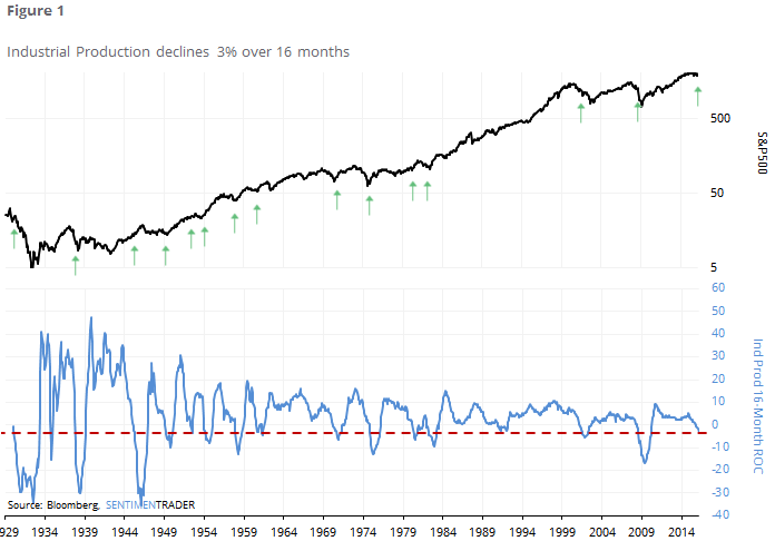
Industrial Production has dropped 3% over the past 16 months. That happened as stocks were peaking prior to the last two bear markets. That's where most of us stop reading and add it to the pile of reasons to be fearful.
But let's go a step further and look for every other time since 1930 that the indicator suffered a 3% loss over the preceding 16 months.
Here are the returns in the S&P 500 going forward.
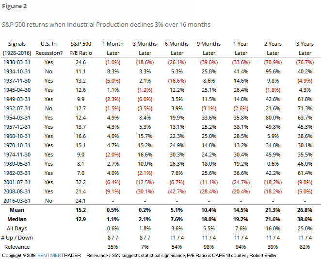
It's important to look at everything in context. Surely, this could be a repeat of the last two bear markets. Is that the most likely case, based on this particular indicator? While we do place more weight on recent history as opposed to something from 60 years ago, the suggestion from prior returns would be...no.