
Seven charts I'm watching right now for clues

Key Points
- There are no permanent relationships in the financial markets
- No security, sector, index, or commodity ever has a permanent edge on another
- Alert investors often gain an advantage by monitoring key relationships
- Here, we look at the status of crucial market relationships to help highlight areas of strength and weakness
Relative Strength Charts
All charts below are weekly relative strength charts courtesy of Optuma. In other words, these charts do not show the actual price action of a single security. Instead, they compare the relative price performance of two different securities.
The black line displays the weekly trend of relative performance, so a rising line means that the first security listed in the comparison is outperforming and vice versa. Each chart also shows a 52-week simple moving average in green.
If the relative strength line is above the green moving average line, and/or the moving average line is rising, it's more confirmation that the first security is outperforming.
Please note that I do not use these charts' actions to generate automatic buy or sell signals. I use them strictly as a starting point in finding securities exhibiting significant strength (or weakness). The primary goal is to find opportunities to trade with the trend in a more robust security.
- A relative strength line making a new high above a rising 52-week moving average suggests further investigation for a buying opportunity in the first security listed.
- A relative strength line making a new low below a falling 52-week moving average suggests further investigation for a buying opportunity in the second security listed.
Stocks vs. Bonds
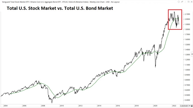
Comparing: VTI vs. AGG (Total U.S. Stock Market vs. Total U.S. Bond Market)
Recent Action: Although bonds are having almost their worst year ever, stocks have been worse...
Current trend: ...thus pushing the RS line below the 52-week MA (stocks underperforming bonds). The critical question: Will this turn into a waterfall decline ala 2008 or a shorter-term affair that ultimately results in a buying opportunity for stocks?
U.S. Stocks vs. International
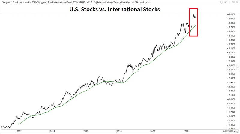
Comparing: VTI vs. VXUS (Total U.S. Stock Market vs. Total International Stock Market)
Recent Action: Although US stocks are having a dreadful year, they are still consistently and vastly outperforming international stocks.
Current Trend: The RS line continues to work its way to higher new highs. Until there is some change to the status quo, there is not much point in diversifying overseas.
Value vs. Growth
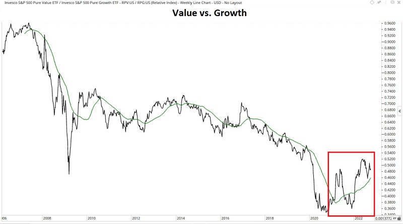
Comparing: RPV vs. RPG (Pure Value versus Pure Growth)
Recent Action: Growth outperformed value from late 2007 into 2020. While the relationship is still volatile, value stocks have outperformed growth since the second quarter of 2020.
Current Trend: For now, the tide appears to have turned back in favor of value over growth.
Technology vs. All U.S. Stocks
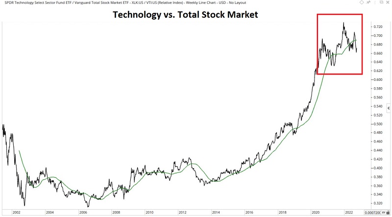
Comparing: XLK vs. VTI (Technology sector vs. Total U.S. Stock Market)
Recent Action: When tech is good, the market is good, and vice versa. After an extended run of significant outperformance from 2013 into 2021, tech is on the verge of faltering.
Current Trend: This relationship may tell us a lot about stock prospects in general. If the RS line remains below its 52-week average and starts to break down, things will likely get very ugly.
Long-term treasuries vs. short-term treasuries
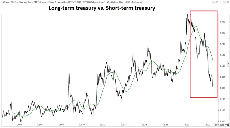
Comparing: TLT vs. SHY (20+ year treasuries vs. 1-3-year treasuries)
Recent Action: Long-term bonds are far more sensitive to changes in interest rates in the short run. For many years the RS line rose as falling interest rates favored long-term bonds. That changed dramatically after rates bottomed out in 2020.
Current Trend: Short-term bonds have declined in value over the last year. Still, they have significantly outperformed long-term bonds as rates have marched higher. The only real question is whether the sharp drop at the far right of the chart above is overdone.
Real Estate versus US Total stock market
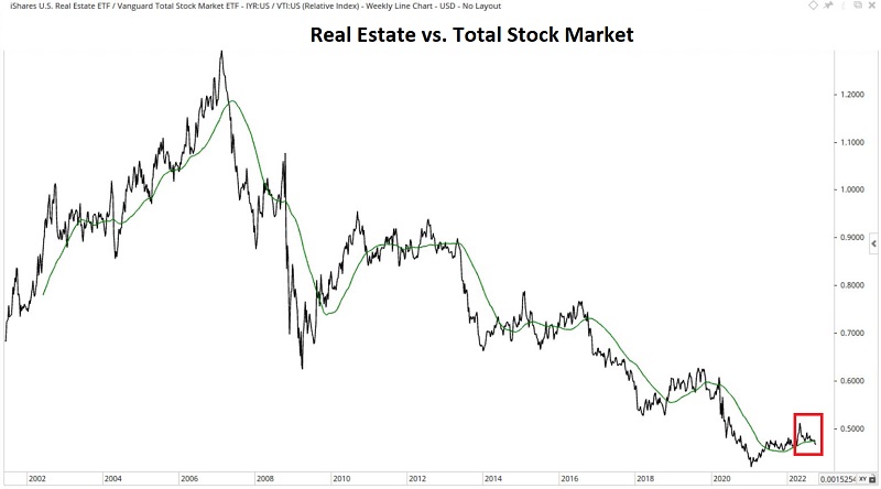
Comparing: IYR vs. VTI (Real estate sector vs. Total U.S. Stock Market)
Recent Action: From 2007 into 2021, the real estate sector significantly underperformed the overall stock market. Following a low in mid-2020 and an attempted bounce, the rally fizzled.
Current Trend: The RS line has dropped back below the 52-week MA. Does this mean that the real estate sector is doomed? Not necessarily. But anything underperforming the overall market is a dicey place to be.
Base metals vs. precious metals
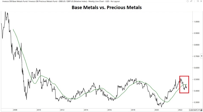
Comparing: DBB vs. DBP (Industrial metals vs. precious metals)
Recent Action: This relationship has a long history of roller-coaster-type action. After a substantial period of performance favoring industrial metals from the first quarter of 2020 into early 2022, the trend has once again reversed.
Current Trend: Gold, silver, and platinum have been disappointing this year in the face of soaring inflation. That said, gold is down less than stocks and bonds in 2022. With the RS line back below the 52-week average, the edge has flipped back to the precious metals side.