
Sentiment is cycling from panic to euphoria, kind of

Every once in a while, an indicator or model catches the investing public's attention. Reasons vary, but the gist of it is that we all want to find the holy grail, a simple and perfect guide that tells us what to do.
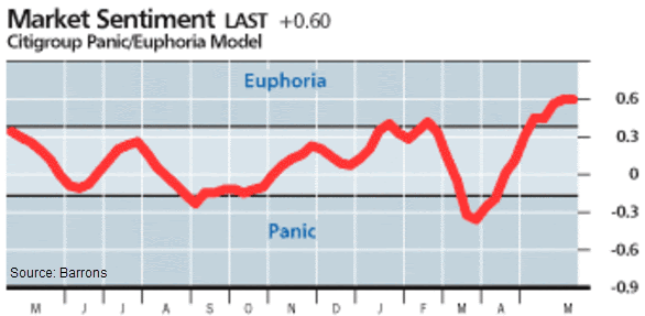
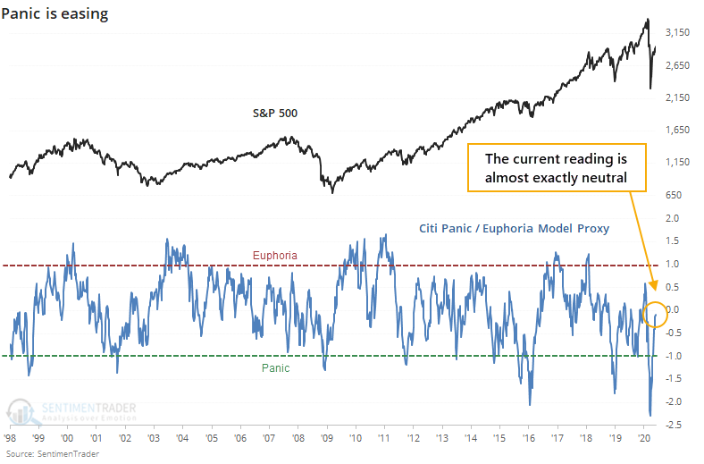
The indicator du jour is the Citigroup Panic / Euphoria Model published weekly in Barron's. It did a very good job of indicating euphoria in January and February, suggesting sentiment was overdone and stocks were due for below-average returns going forward. It flipped to panic in late March, another good call. Now it's back to euphoria, even more than at the beginning of the year.
When an indicator puts a couple of good signals together, it often gets praise as the "new thing." Once it inevitably fails, people move on to the next one. This particular model has been around for a long time, as have its detractors.
Based on publicly released data, the model's inputs are somewhat unusual. It includes:
- NYSE short interest
- Margin debt
- Nasdaq vs NYSE volume
- Investor's Intelligence survey
- AAII survey
- Retail money market funds
- Put/call ratios
- Commodities prices
- Gasoline prices
We've looked at all of these at some point, and few of them have any consistent record at being a contrary (or other) indicator of future stock returns.
Maybe they work better together than separately. To see, let's take each of these inputs and compute a 1-year z-score, then average them together. This may not be even remotely like the methodology they use to calculate their model, but the result over the past year comes pretty close to the published version.
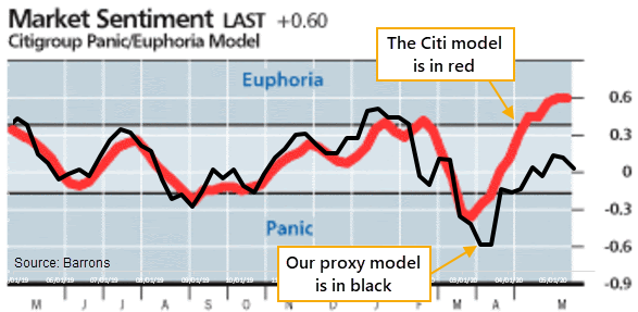
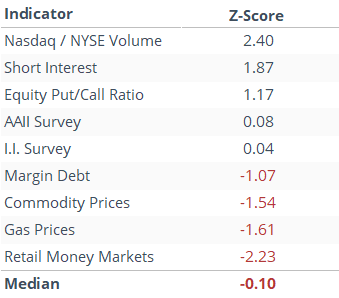
The biggest reason why it's not higher right now is that margin debt is low, commodity and gas prices are low, and money market assets are high, all of which suggest apprehension, not euphoria. The table below shows each indicator's current reading relative to its average and standard deviation over the past year.
Below, we can see each of the components over the past three years and where they are in relation to their ranges along with a tag showing whether it's currently neutral or showing a panic/euphoria extreme.
We're making the assumption that the following extremes would show euphoria (reverse for panic):
- High optimism in the AAII and II surveys (investors think stocks will rise)
- Low put/call ratio (options traders betting on rising prices)
- Low short interest ratio (short-sellers covering bets against the market)
- High margin debt (investors pledging shares against loans)
- High Nasdaq volume relative to the NYSE (speculative fervor)
- Low retail money market fund assets (investors see no need for cash cushion)
- High commodities prices (bets on economic growth)
- High gasoline prices (lots of mobility as the economy hums)
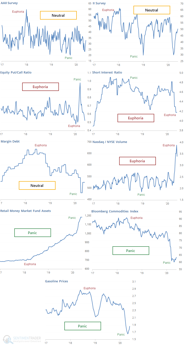
It's a pretty mixed bag, which means that the overall average is almost exactly zero, not showing any particular sense of panic or euphoria. It's unclear why the "official" model from Citigroup is showing euphoria - we can clearly see the components above.
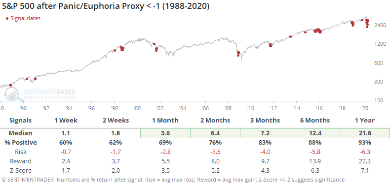
If we look at historical returns after the model fell into panic territory, then the S&P did well, especially over the next 6-12 months, with an average return of 21.6% over the next year.
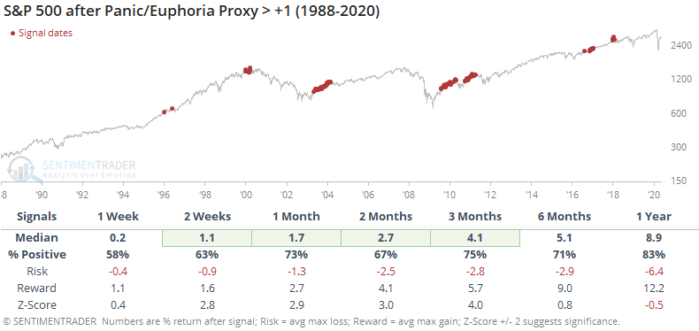
At the opposite extreme, it wasn't as good of a contrary indicator. The S&P still managed an average return of nearly 9% over the next year, and medium-term returns were still solidly positive. Much of that was due to initial readings of euphoria during the beginning of the 2003 rally, and again in 2017.
Based on the published model, we should be concerned because it's showing that investors are euphoric about the potential for a further rally. It did a very good job of warning us early this year, which is a mark in its favor.
When drilling down into the components, it's not clear why the model is currently showing euphoria, as most of the components seem to be neutral or even showing panic. Clearly, their methodology for constructing the model is different, and perhaps weights some indicators more than others. Historically, the model has done better as a contrary guide when showing panic versus euphoria, which is the case with most oscillating indicators.
While its recent record is very good, historically the model has been inconsistent after registering euphoric readings, and many components of the model don't agree. Because of that, we wouldn't consider it anything but a very minor (and iffy) negative here.