Data &
Technology
Research
Reports
Report Solutions
Reports Library
Actionable
Strategies
Free
Resources
Simple Backtest Calculator
Simple Seasonality Calculator
The Kelly Criterion Calculator
Sentiment Geo Map
Public Research Reports
Free Webinar
Pricing
Company
About
Meet Our Team
In the News
Testimonials
Client Success Stories
Contact
Log inLoginSign up
< BACK TO ALL REPORTS

Recovery in 200-day average breadth shows long-term promise

Jason Goepfert
2020-05-20
Over the past two months, a recovery in the percentage of S&P 500 stocks trading above their 200-day average looks like it did in 2009. It looks even more similar to other periods, though, with a mostly positive indication for long-term returns.

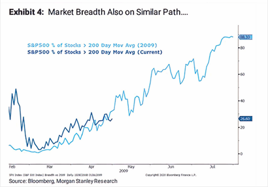
According to a major investment bank, stocks are trading just like they did during the recovery in 2009.

As noted on MarketWatch, Morgan Stanley shows that the percentage of stocks within the S&P 500 that are trading above their 200-day averages looks just like it did when they emerged out of the financial crisis.

In the decades that we've been looking at price analogs (how highly correlated a current period is to the path during other periods), they've proven to be modestly useful. When there is a very high correlation, with a decent sample size, it has helped more than hurt as a guide.

The main problem is that it's way too easy to cherry-pick examples based on whatever outlook the analyst wants to convey. That's why we use a transparent methodology, going back as far as history allows, and show every occurrence. Sometimes it suggests an edge; often it does not. It's good to know what doesn't work just as much as it's good to know what does.

If we use the same methodology we always do, then we can see if Morgan Stanley has a useful point. We'll go back to 1990 and look for every 40-day period that had the highest correlation to how the past 40 days have unfolded in terms of the percentage of stocks in the S&P trading above their 200-day moving averages.

Interestingly, the initial recovery in 2009 doesn't even make the list - that's why we use a consistent methodology instead of trying to eyeball things. This is what we get:

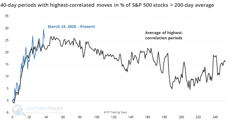
The top 15 highest-correlated periods all had a correlation higher than 0.90, which is extremely high. 

From their average path seen in the chart above, clearly it's very close to what we've seen since the March 23 low. The biggest worry is that many of those also peaked right about now - that doesn't mean that the S&P 500 itself peaked, only that the percentage of stocks above their long-term averages did. 

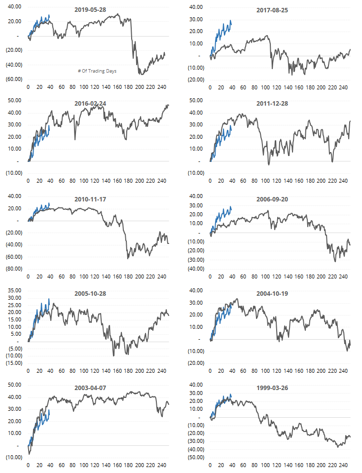
Here are the 10 most recent instances. Again, that's not the S&P 500 we're looking at, it's the percentage of stocks above their 200-day averages.

Okay, so what? Let's see what kind of impact that had on returns for the S&P going forward. These returns are from day 40 on onward, for the highest-correlated periods.

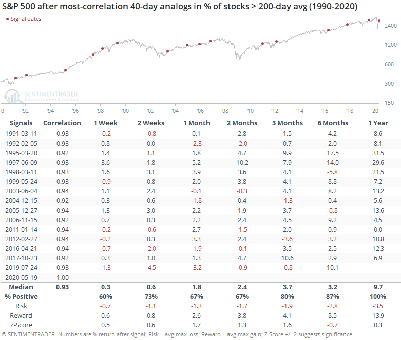
It was a decent sign, especially longer-term. The next 1-2 months were mostly positive, but not exceptionally so. There was a higher probability of seeing a positive return from 3-12 months later, with a perfect record a year later. The average return wasn't that great, about in line with random, but the risk/reward skew was healthy.

While it might not be the slam-dunk positive it was if we rely on the 2009 template, it does suggest a modest upside bias long-term.

Sorry, you don't have access to this report

Upgrade your subscription plan to get access
Go to Dasboard
DATA &
TECHnologies
IndicatorEdge
‍
BackTestEdge
‍
Other Tools
‍
DataEdge API
RESEARCH
reports
Research Solution
‍
Reports Library
‍
actionable
Strategies
Trading Strategies
‍
Smart Stock Scanner
‍
FREE
RESOUrCES
Simple Backtest
Calculator
Simple Seasonality
Calculator
The Kelly Criterion
Calculator
Sentiment Geo Map
‍
Public Research Reports
‍
Free Webinar
COMPANY
‍
About
‍
Meet our Team
‍
In the News
‍
Testimonials
‍
Client Success Stories
Pricing
Bundle pricing
‍
Announcements
‍
FAQ
© 2024 Sundial Capital Research Inc. All rights reserved.
Setsail Marketing
TermsPrivacyAffiliate Program
Risk Disclosure: Futures and forex trading contains substantial risk and is not for every investor. An investor could potentially lose all or more than the initial investment. Risk capital is money that can be lost without jeopardizing ones’ financial security or life style. Only risk capital should be used for trading and only those with sufficient risk capital should consider trading. Past performance is not necessarily indicative of future results.

Hypothetical Performance Disclosure: Hypothetical performance results have many inherent limitations, some of which are described below. No representation is being made that any account will or is likely to achieve profits or losses similar to those shown; in fact, there are frequently sharp differences between hypothetical performance results and the actual results subsequently achieved by any particular trading program. One of the limitations of hypothetical performance results is that they are generally prepared with the benefit of hindsight. In addition, hypothetical trading does not involve financial risk, and no hypothetical trading record can completely account for the impact of financial risk of actual trading. for example, the ability to withstand losses or to adhere to a particular trading program in spite of trading losses are material points which can also adversely affect actual trading results. There are numerous other factors related to the markets in general or to the implementation of any specific trading program which cannot be fully accounted for in the preparation of hypothetical performance results and all which can adversely affect trading results.

Testimonial Disclosure: Testimonials appearing on this website may not be representative of other clients or customers and is not a guarantee of future performance or success.