
One Approach to the Precious Metals vs. Stocks Relationship

As I wrote about in this piece, there is a constant ebb and flow to many relationships in the financial markets. This piece will look at the relationship between precious metals and stocks and highlight one potential way to make sense of it.
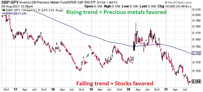
The chart below (courtesy www.Stockcharts.com) displays:
- the last 5 years of the relative performance for
- ticker DBP (Invesco DB Precious Metals Fund ) versus ticker SPY (SPDR S&P 500 ETF Trust )
- along with a 156-week exponential moving average
In the simplest terms possible:
- When the bars trend higher, it means that precious metals are outperforming stocks
- When the bars trend lower, it means the precious metals are underperforming stocks
- When the bars are above the moving average, it suggests that the trend currently favors precious metals
- When the bars are below the moving average, it suggests that the trend currently favors stocks
As you can see in the chart above, except for several months in 2020, stocks have been outperforming previous metals for most of the last 5 years.
LOOKING BACK FURTHER
To get a better sense of the precious metals/stocks' relationship, the chart below displays the cumulative % + (-) for both DBP (black line) and SPY (blue line) since DBP started trading in 2007.
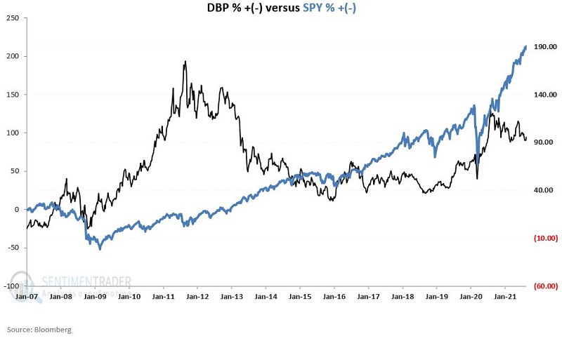
We see in the chart above a great deal of "back and forth" and a low degree of correlation between the two.
The chart below displays the full history of the relationship shown in the first chart we looked at. It measures:
- the ratio of DBP versus SPY
- from early 2007
- and draws the 156-week exponential moving average
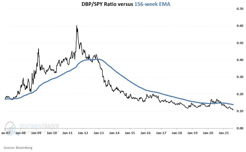
The gist of the chart above is pretty simple to ascertain:
- Through 2012, the relationship mostly favored precious metals (i.e., the rising black line above the blue line)
- Since then, the relationship has mostly favored stocks (i.e., the falling black line below the blue line)
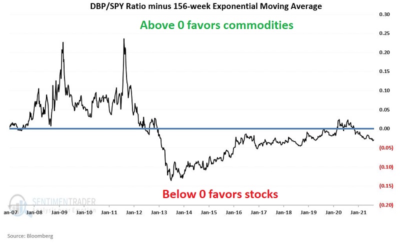
A SYSTEMATIC APPROACH TO TRACKING THIS RELATIONSHIP
What follows is NOT a "recommended" trading strategy and is presented for educational purposes only.
I will track two hypothetical equity curves as follows:
- A = Price of DBP
- B = Price of SPY
- C = A/B
- D = Exponential 156-week moving average of C
- E = C - D
The chart below displays the value for Variable E (i.e., the DBP/SPY ratio minus the 156-week exponential moving average).
HYPOTHETICAL SWITCHING RESULTS
The black line ("Switch") in the chart below represents the hypothetical return achieved by:
- Holding DBP if Variable E above > 0
- Holding SPY if Variable E above <= 0
The blue line ("Buy/Hold/Rebalance" in the chart below represents the hypothetical return achieved by:
- Holding 50% in DBP
- Holding 50% in SPY
- Rebalancing to a 50/50 split at the beginning of each new year
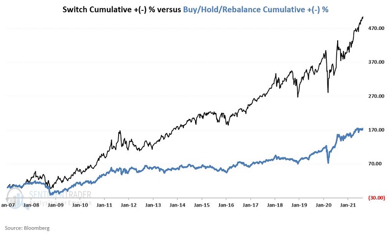
From 1/12/2007 through 8/24/2021, the hypothetical returns were:
- Switch Strategy = +505%
- Buy/Hold/Rebalance = +174%
As a reference, buying and holding each ETF separately:
- Ticker DBP = +96%
- Ticker SPY = +213%
SUMMARY
The good news is that the simple switching method detailed above handily outperformed buy-and-hold over the past 14+ years. The bad news is that past performance does NOT guarantee future results.
Whether or not the strategy detailed above represents a viable trading strategy is for each investor to decide for themself.
But if nothing else, this simple approach may well serve an investor contemplating whether to allocate money to precious metals or the stock market by considering the current status and trend of the DBP/SPY ratio.