
Gold's price path has looked like this about a dozen times before

Despite what seems like an unprecedented move in markets like gold, it has seen other stretches that look similar.
Let's go back to 1975 and look for the 100-day periods in gold that have the highest correlation to the past 100 sessions. When we do that, we get about a dozen stretches that have an extremely tight positive correlation to gold's path since March.
Below are the most recent occurrences (the dates are from the start of the 100-day analogs).
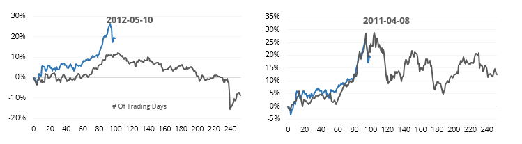
Not sure what it is about gold, but these 100-day stretches were about the longest it could go before correcting. Once the 100 days passed, gold did not perform well.
Along with gold, tech stocks have gone pretty much straight up since March. The 100-day correlation between their daily percentage changes has skyrocketed to among the highest levels in history.
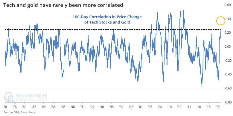
This was not a great sign for gold but was not a big edge. It was even less so for tech stocks, or the broader market.
This is an abridged version of our recent reports and notes. For immediate access with no obligation, sign up for a 30-day free trial now.
We also looked at:
- A detailed look at the 100-day analogs in gold most highly correlated to the past 100 days
- What happens to gold, tech stocks, and the S&P 500 after those markets are so highly correlated
- Fund managers think gold is overvalued
- What happens when oil recovers from a plunge below its 200-day average
- Commodities, too