Headlines
|
|
A Monthly Stock Market Anomaly That Hides in Sight:
One of the keys to long-term success is to find an "edge" in the markets and exploit it repeatedly. What we find when we look carefully is that often some of the most consistent market edges "hide in plain sight." This piece highlights a monthly phenomenon in the stock market that fits the bill.
The Closest 200-Day Comparisons:
The past 200 days in the S&P 500 have been among the index's most consistent ever. But there have been 18 other stretches that show a very high positive correlation, so we look at these analogs and see some short-term weakness among many of them.
Bottom Line:
STOCKS: Hold
Sentiment continues to decline from the speculative February peak. With deteriorating breadth, this raises the risk of poor short- to medium-term returns until optimism and better breadth returns. See the Outlook & Allocations page for more. BONDS: Hold
Various parts of the market got hit in March, with the lowest Bond Optimism Index we usually see during healthy environments. Bond prices have modest recovered and there is no edge among the data we follow. GOLD: Hold
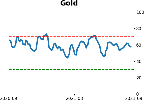
Gold and miners were rejected after trying to recover above their 200-day averages in May. Lately, some medium-term (not long-term) oversold extremes in breadth measures among miners have triggered.
|
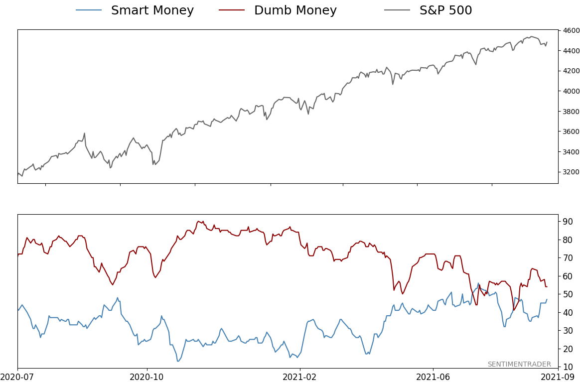
Smart / Dumb Money Confidence
|
Smart Money Confidence: 47%
Dumb Money Confidence: 54%
|
|
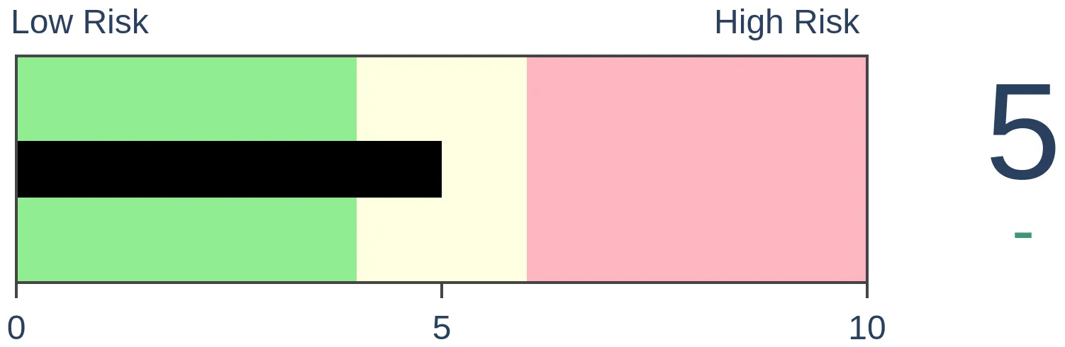
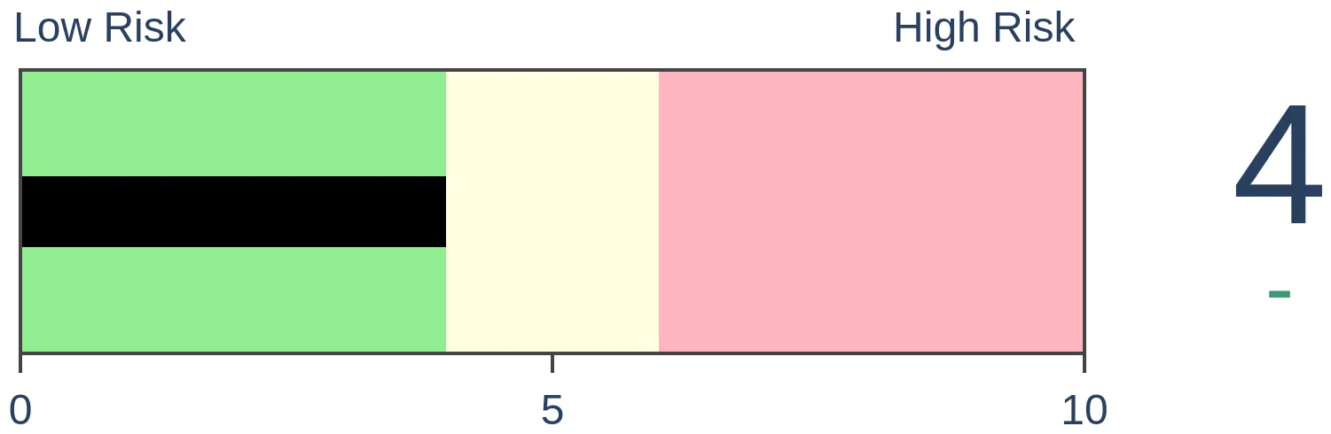
Risk Levels
Stocks Short-Term
|
Stocks Medium-Term

|
|
Bonds
|
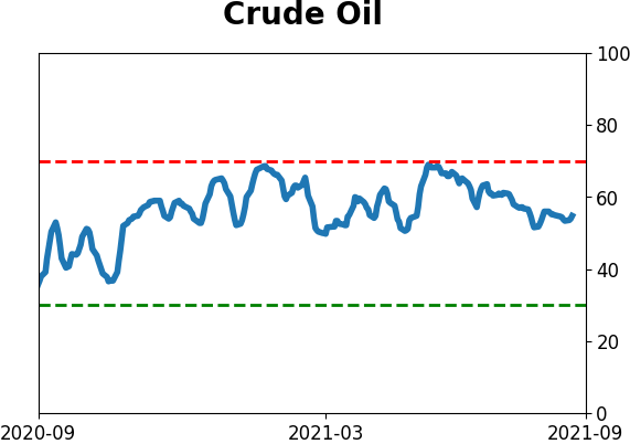
Crude Oil

|
|
Gold

|
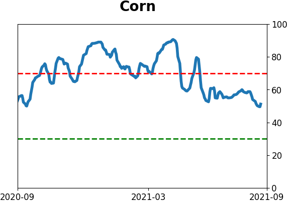
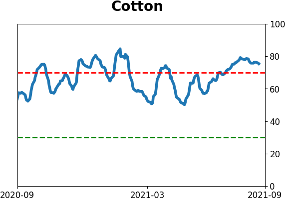
Agriculture
|
|
Research
By Jay Kaeppel
BOTTOM LINE
One of the keys to long-term success is to find an "edge" in the markets and exploit it repeatedly. What we find when we look carefully is that often some of the most consistent market edges "hide in plain sight." This piece highlights a monthly phenomenon in the stock market that fits the bill.
FORECAST / TIMEFRAME
None
|
Let's look at a time of the month that has demonstrated a strong tendency to witness weakness in the stock market.
IDENTIFYING "TRADING DAY OF MONTH"
For this piece, we start by counting back trading days from the end of the calendar month. As such:
- The last trading day of the month is designated as "TDM -1"
- The 2nd to last trading day of the month is designated as "TDM -2"
- And so on back to TDM -10
So for example, for September 2021:
- TDM -11 = 9/16
- TDM -10 = 9/17
- TDM -9 = 9/20
- TDM -8 = 9/21
- TDM -7 = 9/22
- TDM -6 = 9/23
- TDM -5 = 9/24
THE PERIOD UNDER CONSIDERATION
The period will look at is:
- The 6-day period each month that includes TDM -10 through TDM -5
- So for September 2021, we would measure from the close on 9/16 through the close on 9/24
- We will look at 90 years of history from 12/31/1930 through 12/31/2020
1931-2020: 90 YEARS OF RESULTS
The figure below shows the cumulative % price gain for the S&P 500 Index held only during this 6-trading day period each month over the full 90-year test period (i.e., the cumulative price return if one had bought the S&P 500 Index at the close of TDM -11 and sold it six trading days later at the close on the 5th to last trading day of the month, and repeated this process every single month).
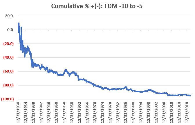
Clearly, it is NOT a pretty picture.
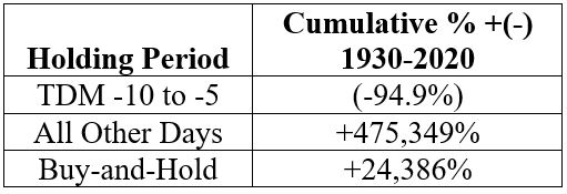
For the record, had an investor been stubborn (foolish?) enough to buy-and-hold the S&P 500 Index ONLY during this 6-day period every month starting in January 1931, the cumulative loss through 12/31/2020 would be -94.9%. This was during a 90-year period, which saw the S&P 500 Index grow +24,386% (using price data only) on a buy-and-hold basis.
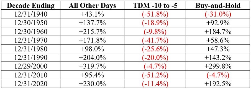
The table below displays the cumulative hypothetical price-performance achieved by holding the S&P 500 Index:
- ONLY during trading days TDM -10 through TDM -5 each month
- During all trading days, NOT including TDM -10 through TDM -5
- On a Buy-and-Hold Basis
The table below displays the decade-by-decade price performance for holding the S&P 500 Index:
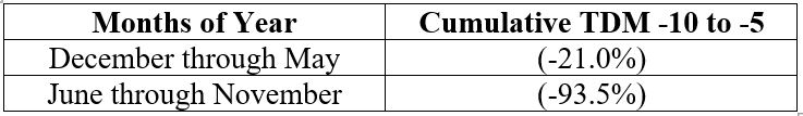
Considering Time of Year
As long as we are venturing out "into the weeds," let's go one step further and point out that there appears to be a, um, seasonal element to this seasonal element. In a nutshell, TDM -10 to -5 performance has been significantly weaker during June through November than during December through May.
The chart below displays the cumulative % return achieved by holding the S&P 500 Index ONLY during TDM -10 through TDM -5 every month, depending on the particular months involved.
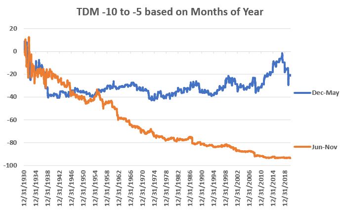
Results during December through May are poor but are essentially "hit or miss." Results during June through November have been mostly "miss."
By Jason Goepfert
BOTTOM LINE
The past 200 days in the S&P 500 have been among the index's most consistent ever. But there have been 18 other stretches that show a very high positive correlation, so we look at these analogs and see some short-term weakness among many of them.
FORECAST / TIMEFRAME
None
|
It's easy to look at a chart and cherry-pick dates to say, "Hey this looks just like that!" and make a conclusion. One of the common ones lately has been comparing the last 200 days to the initial thrust off past bear market bottoms.
Fair enough, but the past 200 sessions have been remarkable for their calm. Most other kick-offs have suffered at least some volatility along the way.
If we use the objective calculations we always do for analogs, then we can look at other 200-day periods in the S&P 500's history to see which ones have the highest correlation to the recent past. It turns out there were 18 other stretches with a very high correlation, when the S&P was also trading at a multi-year high at the time.
The chart below shows the last 200 days in the index (blue) along with an average of the 18 stretches with the highest correlation (black).
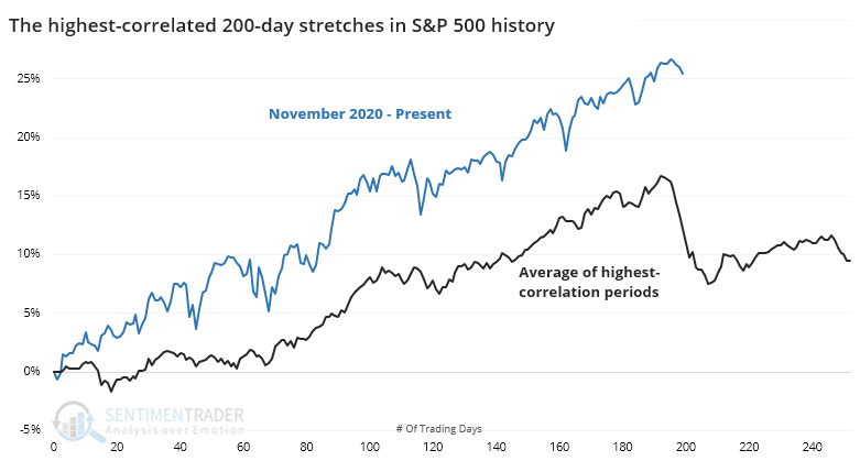
The chart shows that the average analog suffered a pullback right about now. When we look at thumbnails of the 10 most recent occurrences, we see how consistent that was.
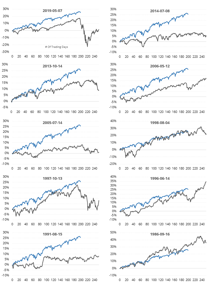
A TENDENCY FOR SHORT-TERM DIPS
What we should be most interested in is future returns. If we look at the ends of the 200-day periods shown above, then we can see how the S&P fared going forward.
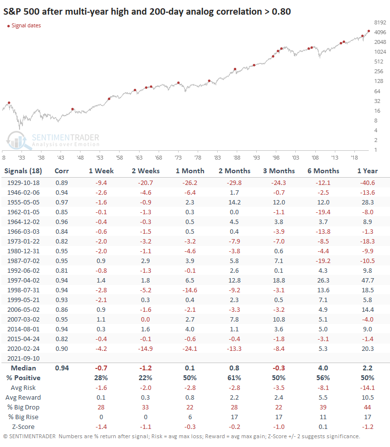
Shorter-term returns were not great, reflecting those pullbacks that we saw in the thumbnails. Across most time frames, the S&P's returns were below random, and the overall risk/reward was very poor.
One difference with our current market is just how strong the momentum and (mostly) breadth have been. The S&P just ended a historic streak with more than 75% of its members above their long-term trends, which showed that any shorter-term dips had a strong tendency to rebound in the months ahead. The current trend has been so calm, for so long, that an interruption would be par for the course but it would be rare for it to turn into a rout just yet.
Active Studies
| Time Frame | Bullish | Bearish | | Short-Term | 0 | 6 | | Medium-Term | 5 | 3 | | Long-Term | 11 | 5 |
|
Indicators at Extremes
Portfolio
| Position | Description | Weight % | Added / Reduced | Date | | Stocks | RSP | 4.1 | Added 4.1% | 2021-05-19 | | Bonds | 23.9% BND, 6.9% SCHP | 30.7 | Reduced 7.1% | 2021-05-19 | | Commodities | GCC | 2.6 | Reduced 2.1%
| 2020-09-04 | | Precious Metals | GDX | 5.6 | Reduced 4.2% | 2021-05-19 | | Special Situations | 4.3% XLE, 2.2% PSCE | 7.6 | Reduced 5.6% | 2021-04-22 | | Cash | | 49.4 | | |
|
Updates (Changes made today are underlined)
Much of our momentum and trend work has remained positive for several months, with some scattered exceptions. Almost all sentiment-related work has shown a poor risk/reward ratio for stocks, especially as speculation drove to record highs in exuberance in February. Much of that has worn off, and most of our models are back toward neutral levels. There isn't much to be excited about here. The same goes for bonds and even gold. Gold has been performing well lately and is back above long-term trend lines. The issue is that it has a poor record of holding onto gains when attempting a long-term trend change like this, so we'll take a wait-and-see approach. RETURN YTD: 8.7% 2020: 8.1%, 2019: 12.6%, 2018: 0.6%, 2017: 3.8%, 2016: 17.1%, 2015: 9.2%, 2014: 14.5%, 2013: 2.2%, 2012: 10.8%, 2011: 16.5%, 2010: 15.3%, 2009: 23.9%, 2008: 16.2%, 2007: 7.8%
|
|
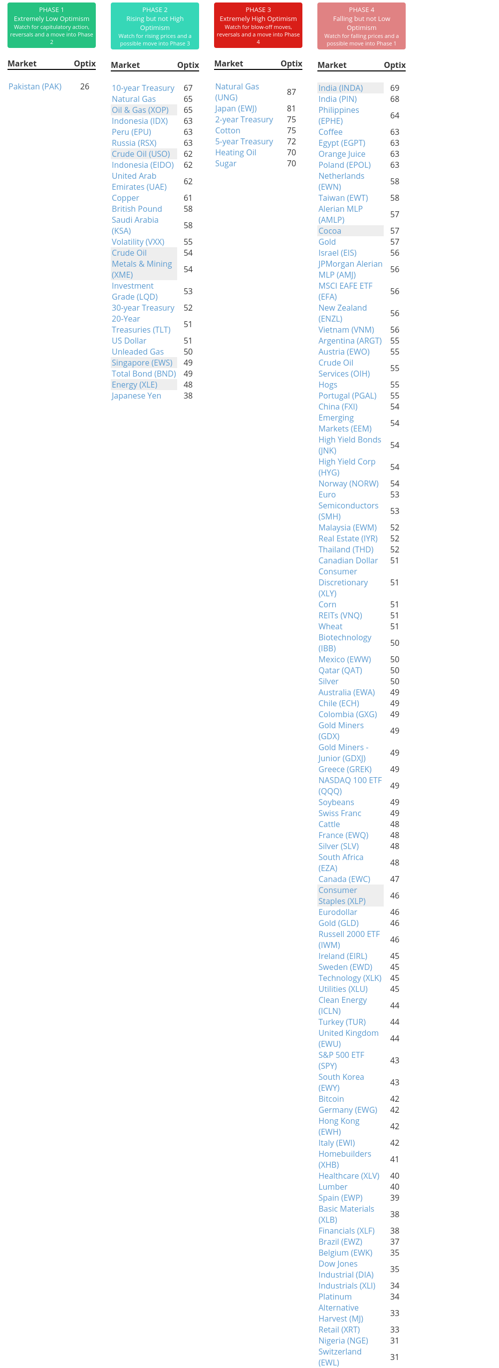
Phase Table
Ranks
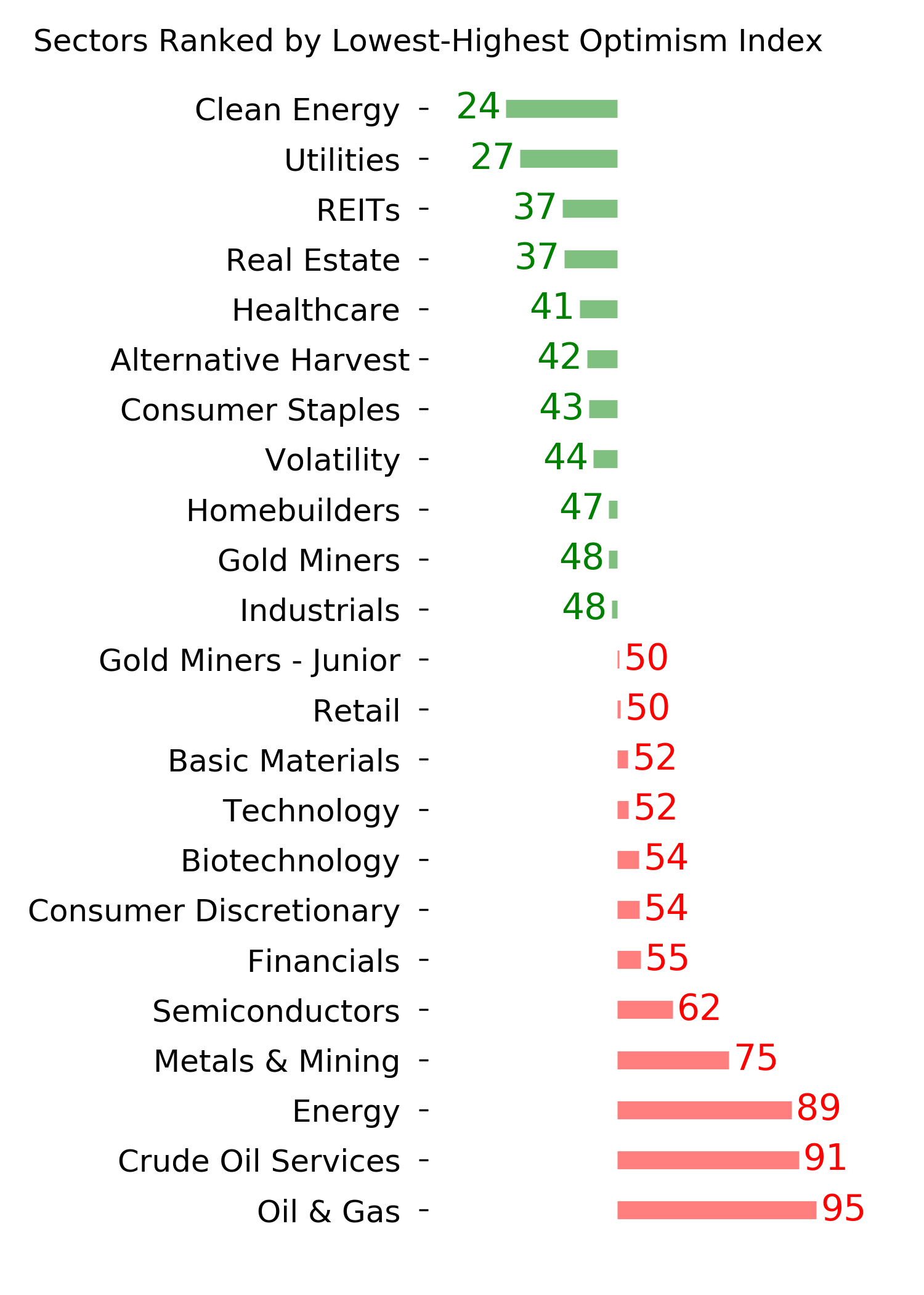
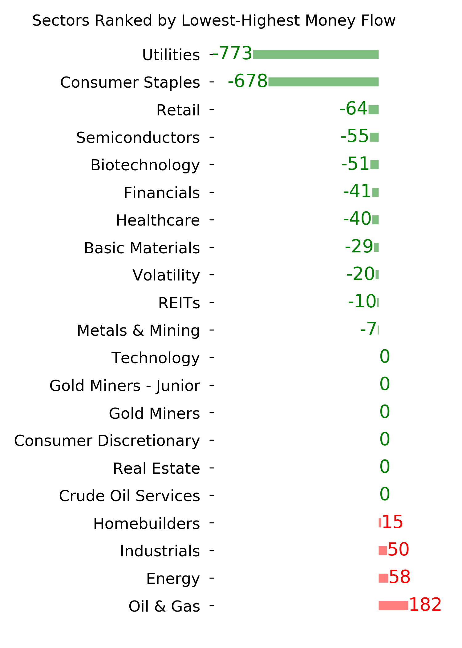
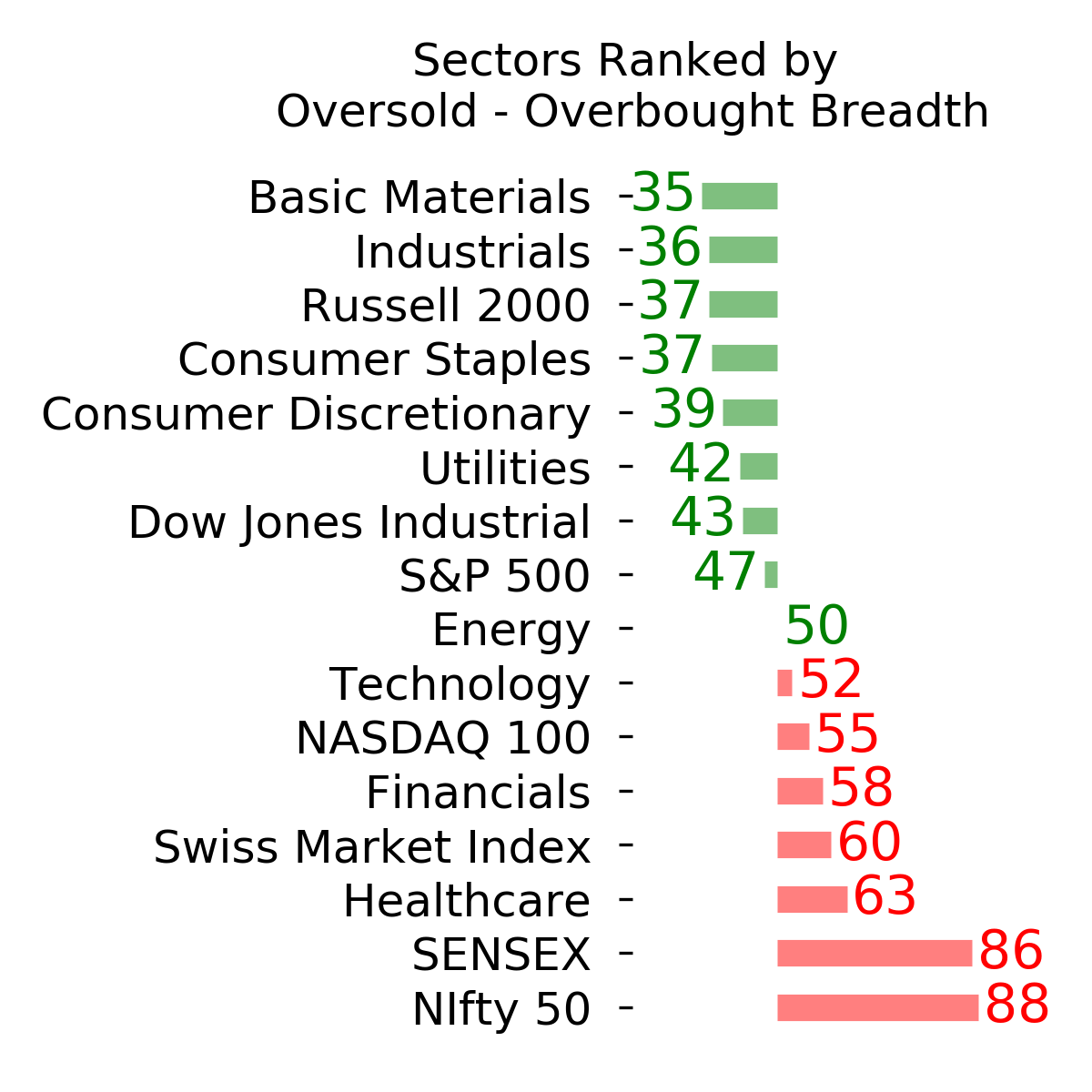
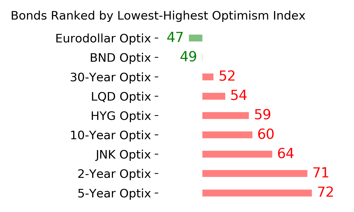
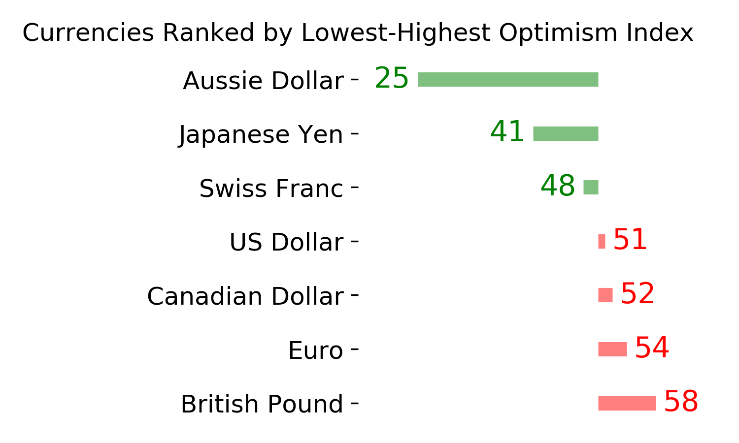
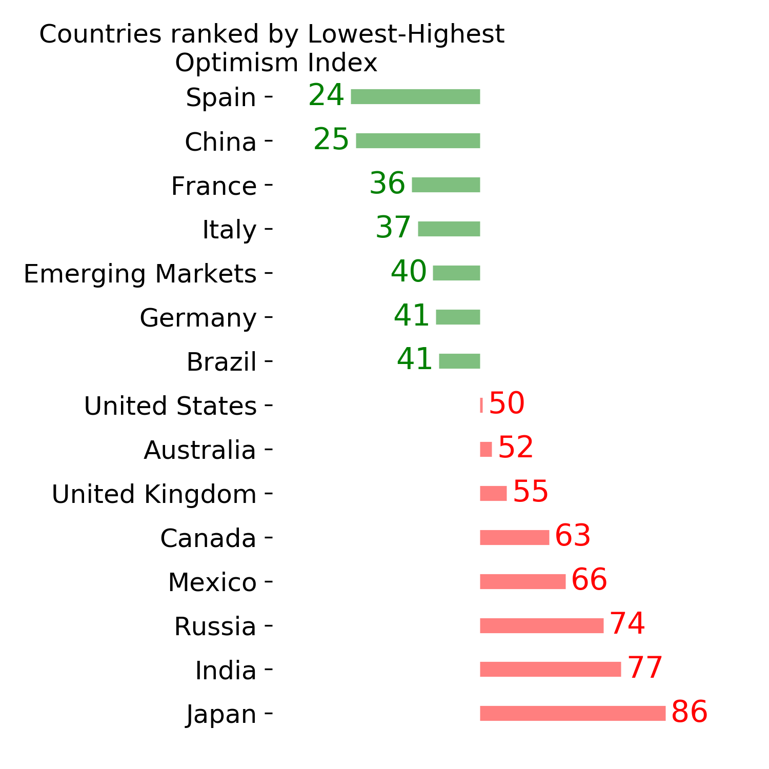
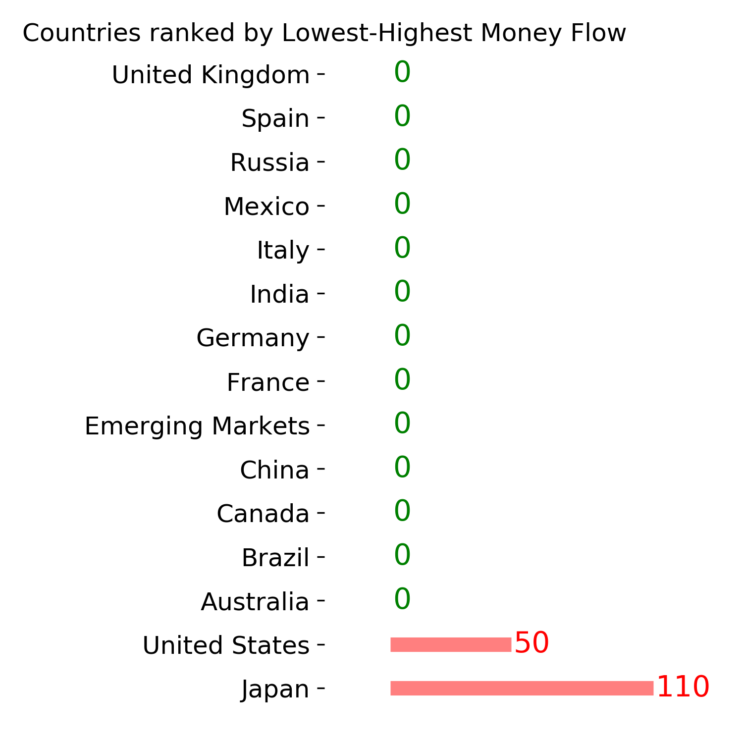
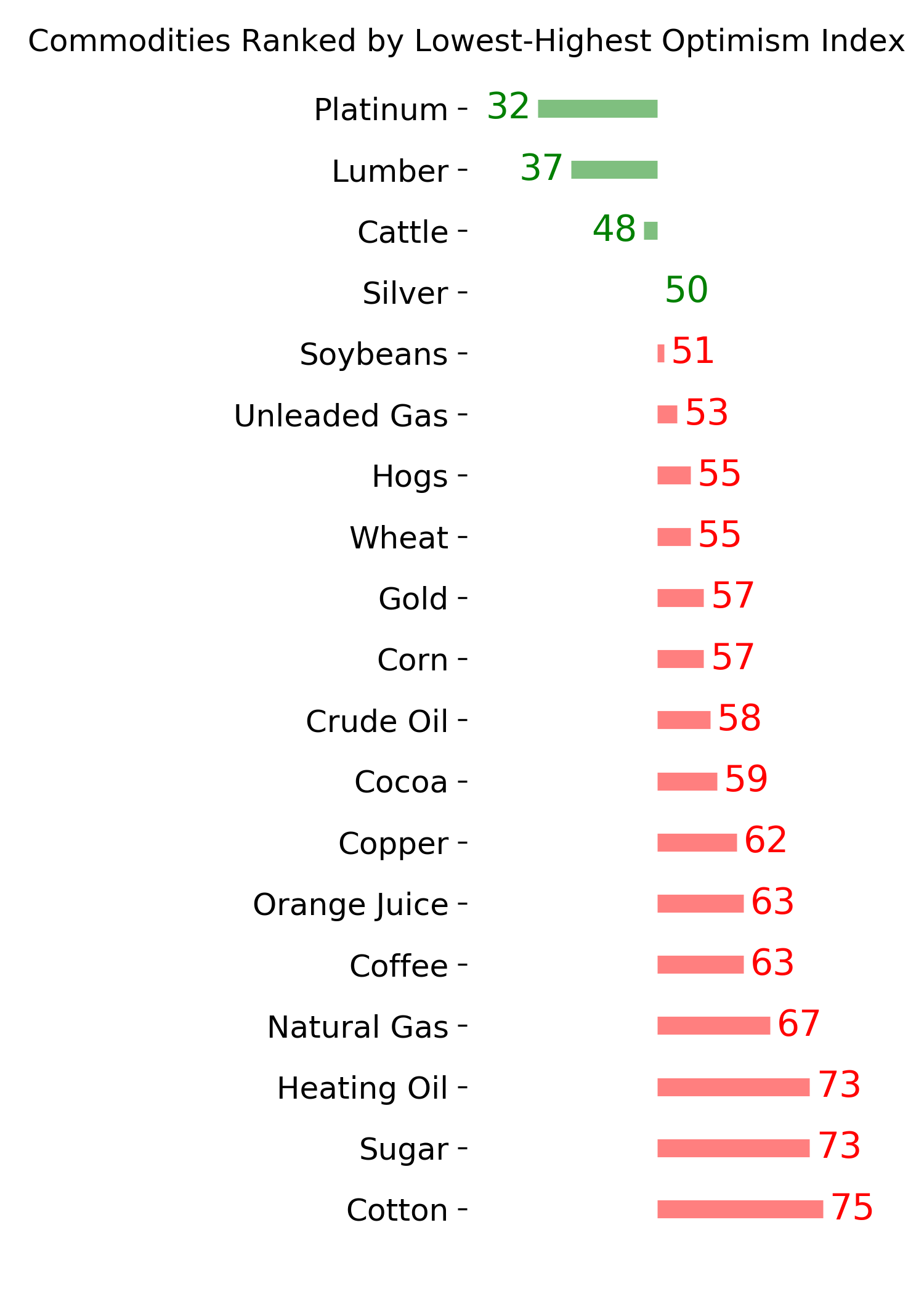
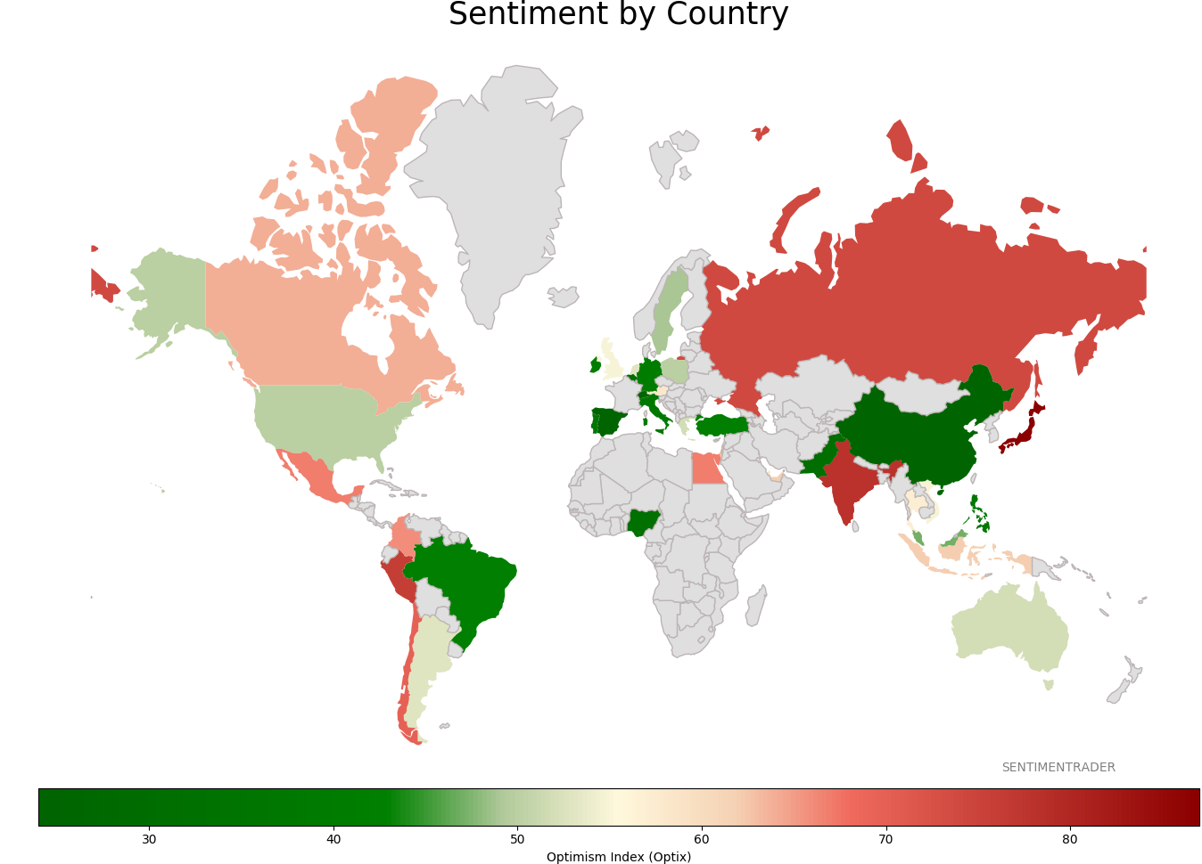
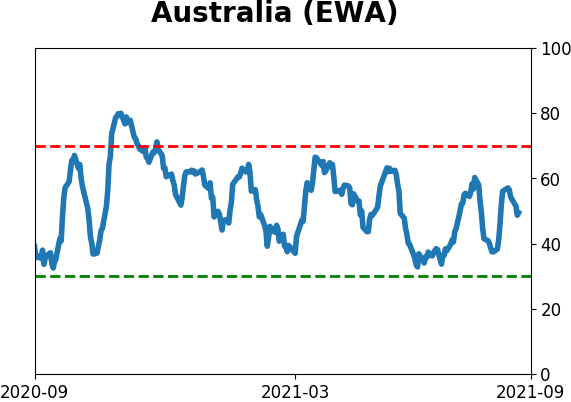
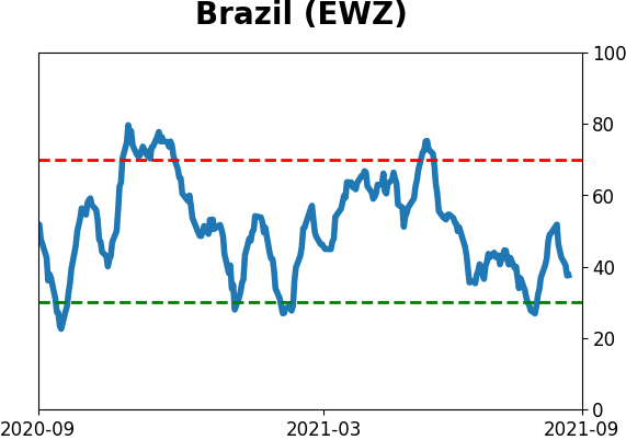
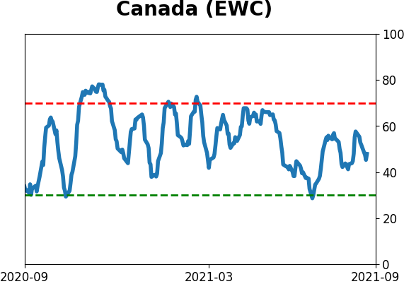
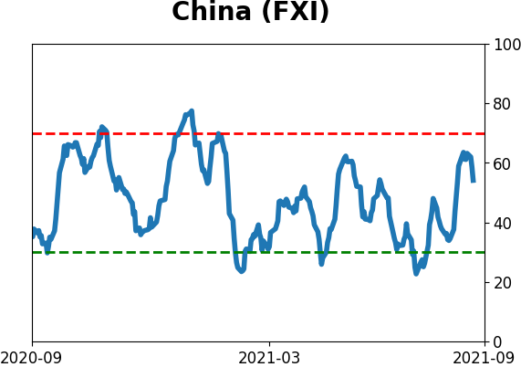
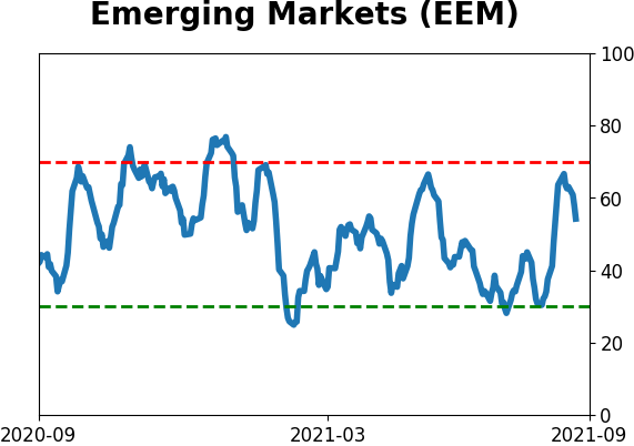
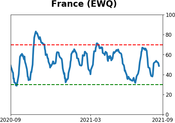
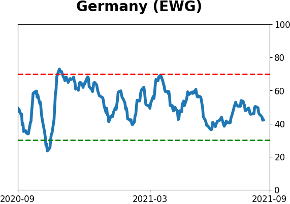
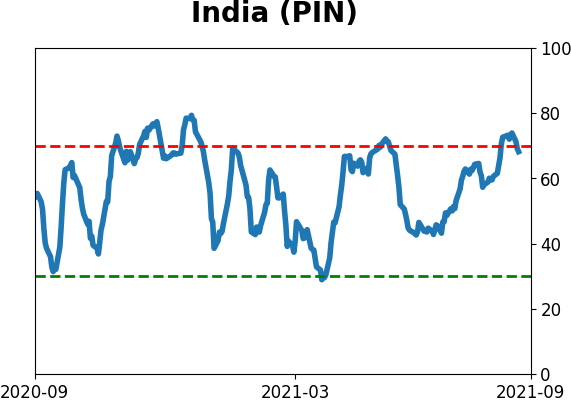
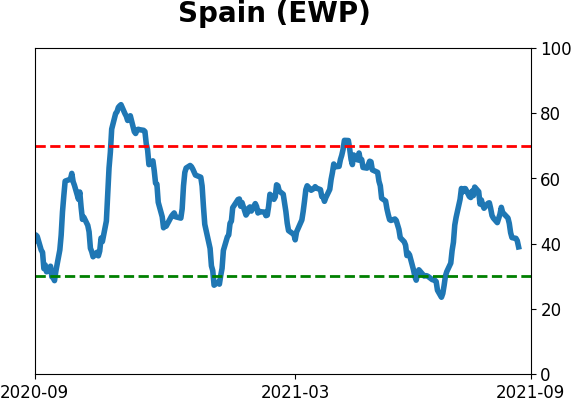
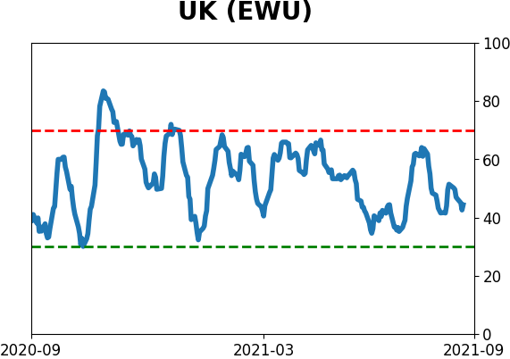
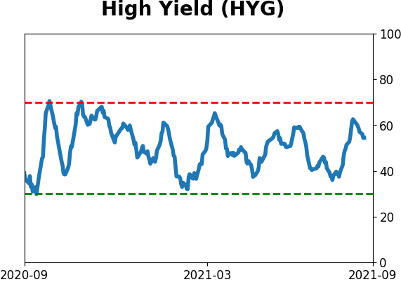
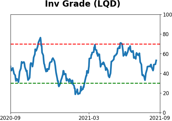
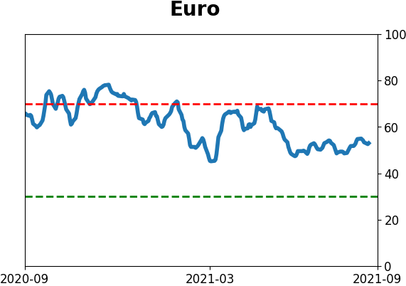
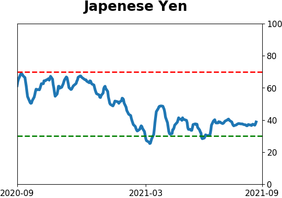
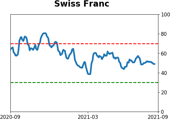
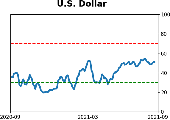
Sentiment Around The World
Optimism Index Thumbnails
|
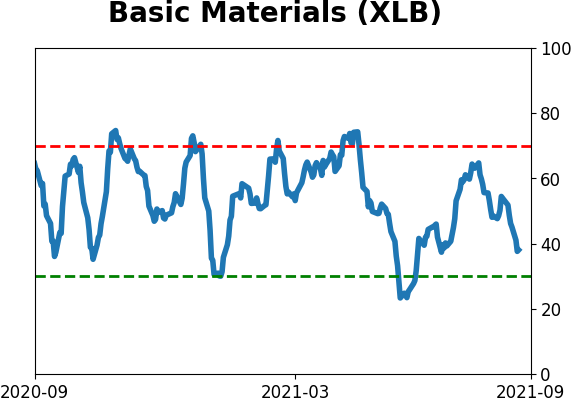
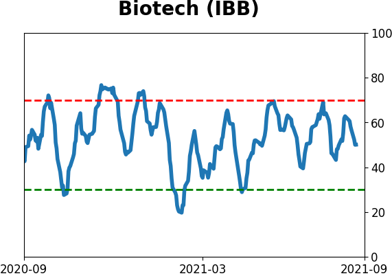
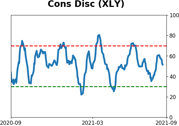
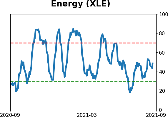
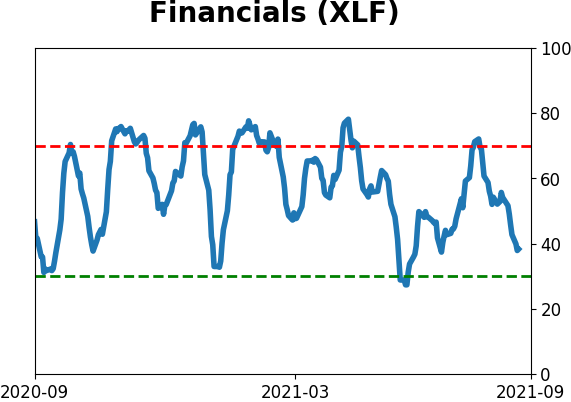
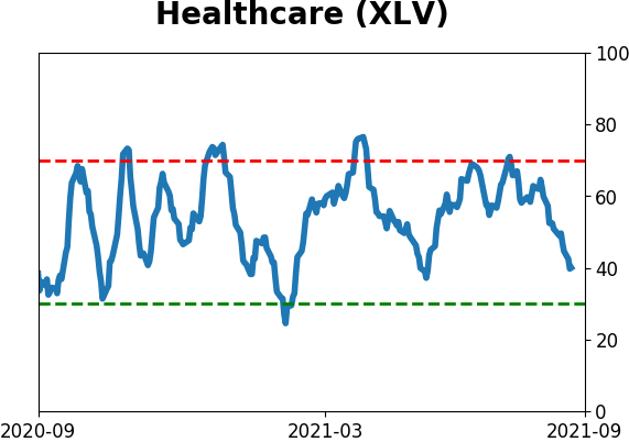
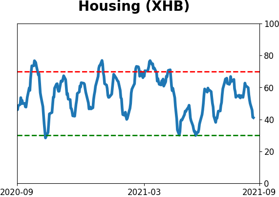
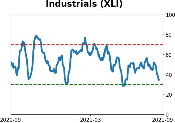
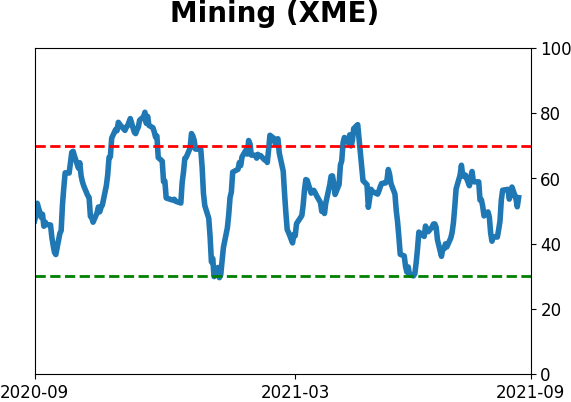
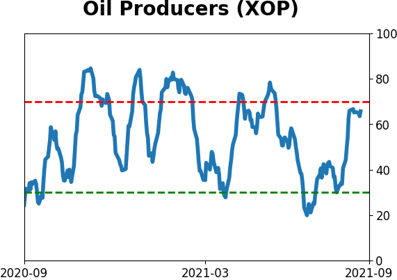
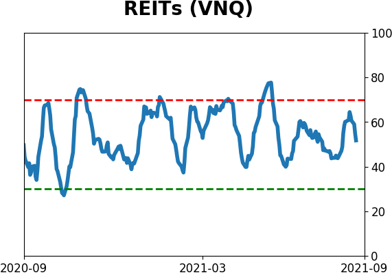
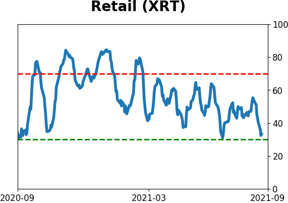
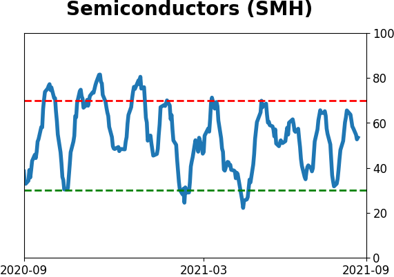
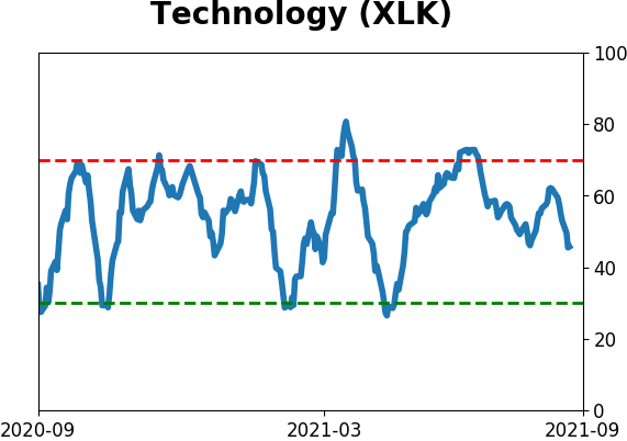
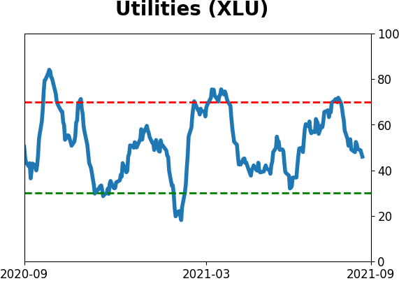
Sector ETF's - 10-Day Moving Average
|
|
|
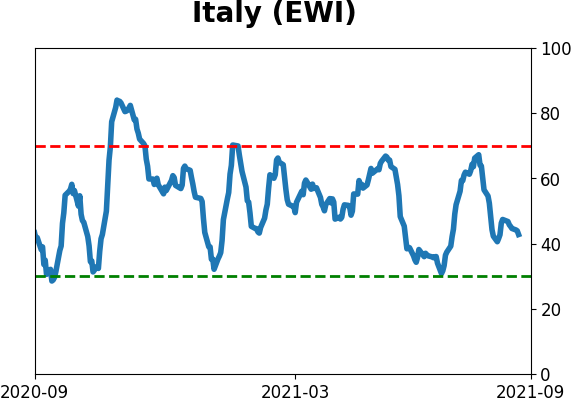
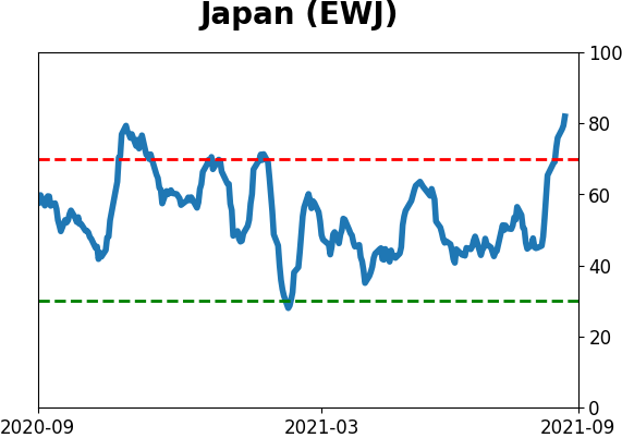
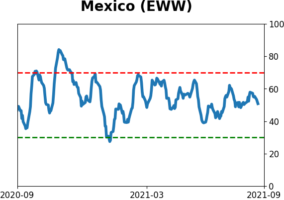
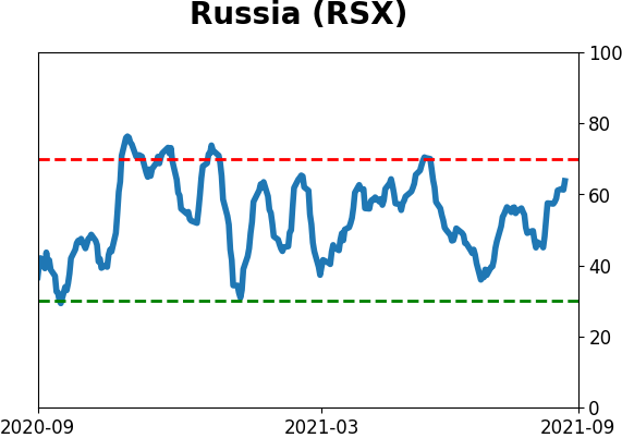
Country ETF's - 10-Day Moving Average
|
|
|
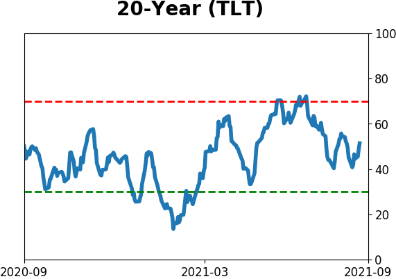
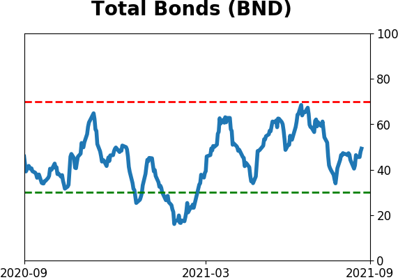
Bond ETF's - 10-Day Moving Average
|
|
|
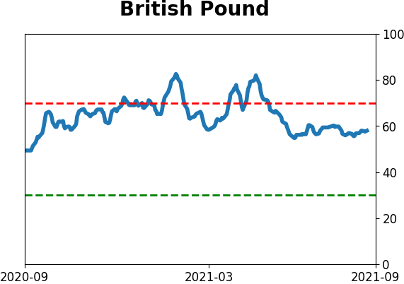
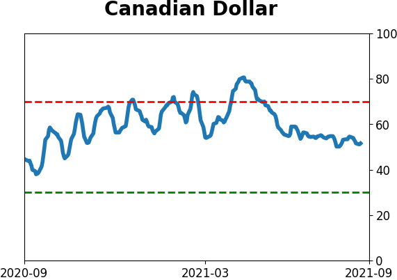
Currency ETF's - 5-Day Moving Average
|
|
|
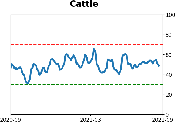
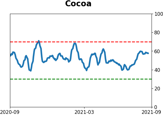
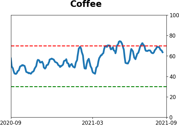
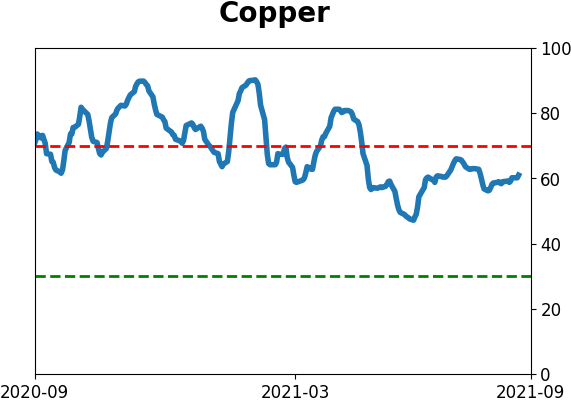
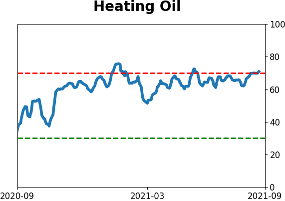
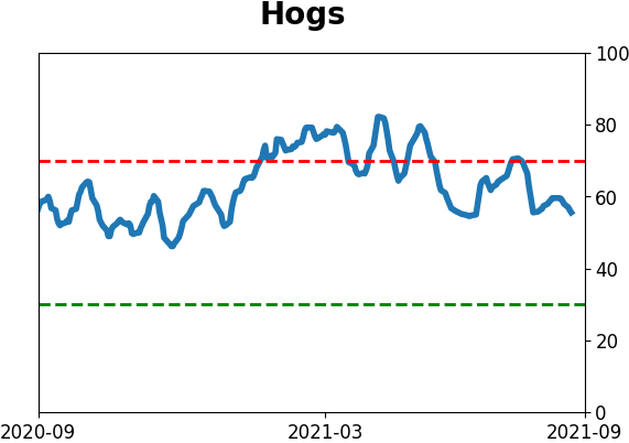
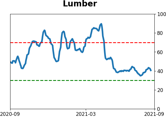
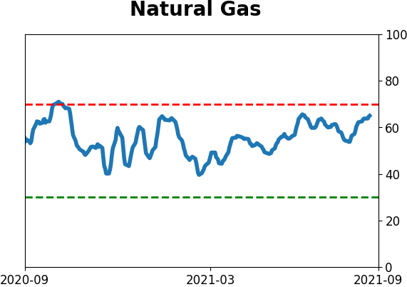
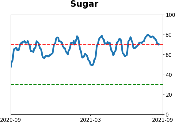
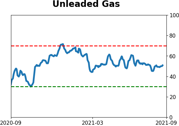
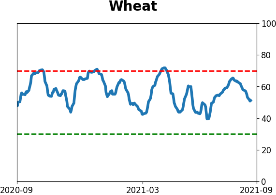
Commodity ETF's - 5-Day Moving Average
|
|