Headlines
|
|
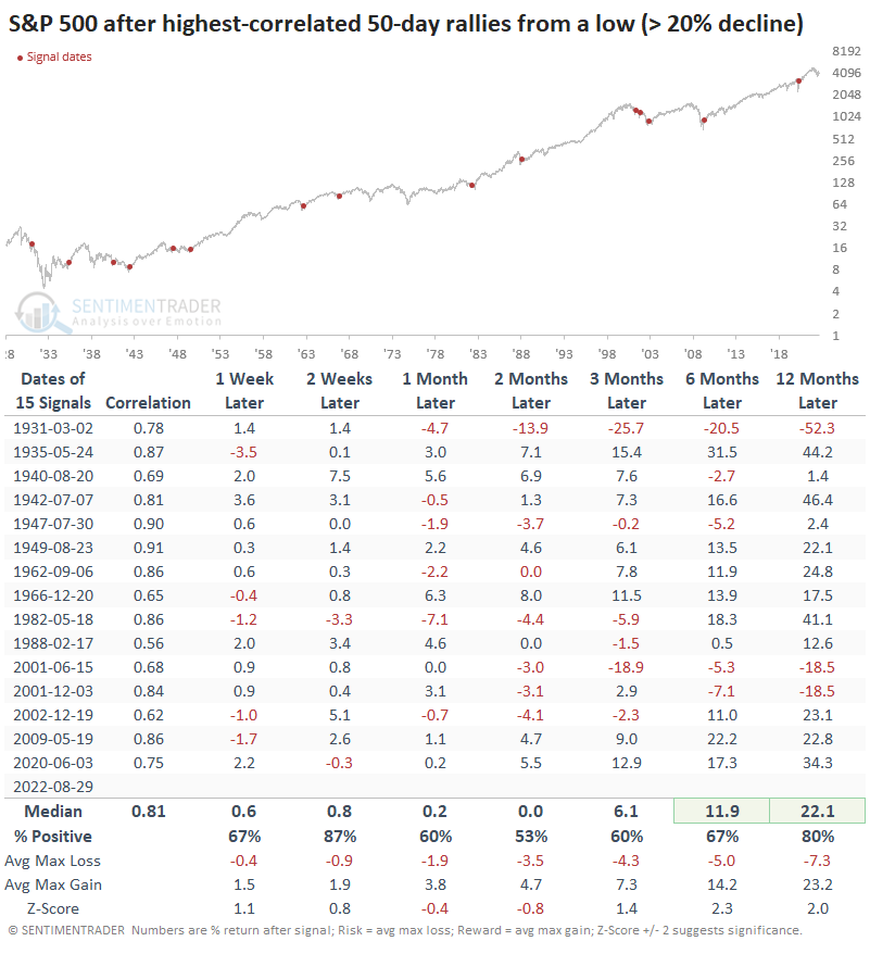
The tightest 50-day analogs from a low:
Now that we've reached the 50-day point of the rally, it can be instructive to look at how other rallies unfolded over their first 50 days. When we look at price analogs of the highest-correlated rallies, they show some weakness over the next couple of months but a strong probability of long-term gains.
|
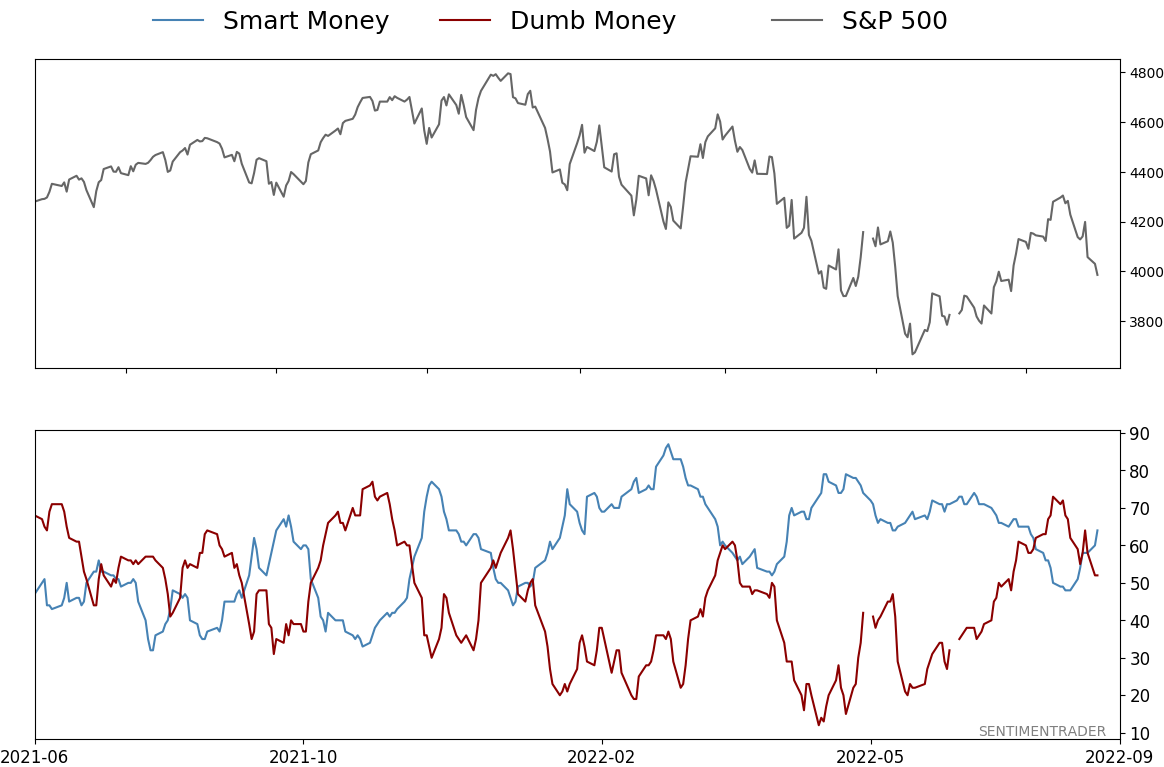
Smart / Dumb Money Confidence
|
Smart Money Confidence: 64%
Dumb Money Confidence: 52%
|
|
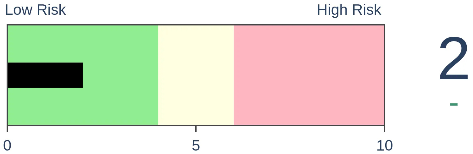
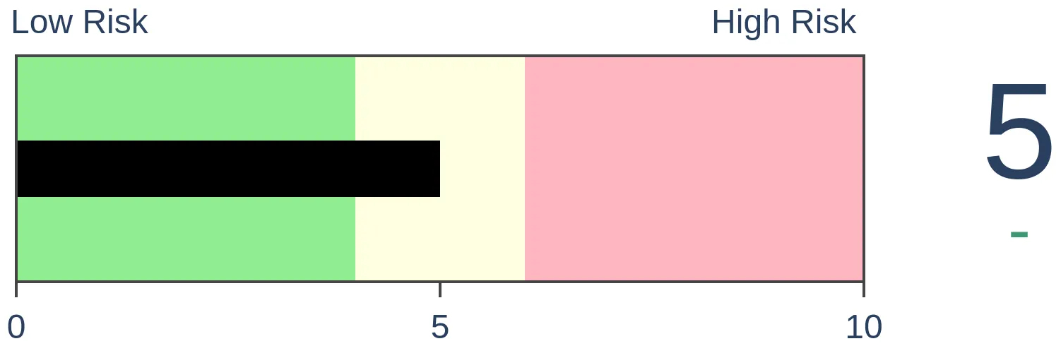
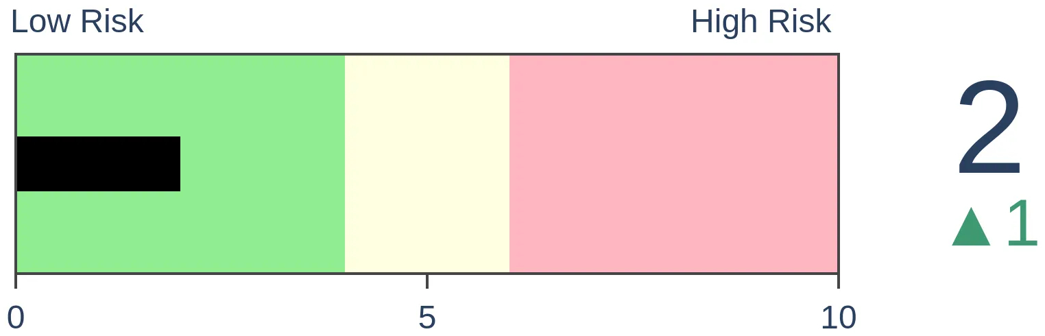
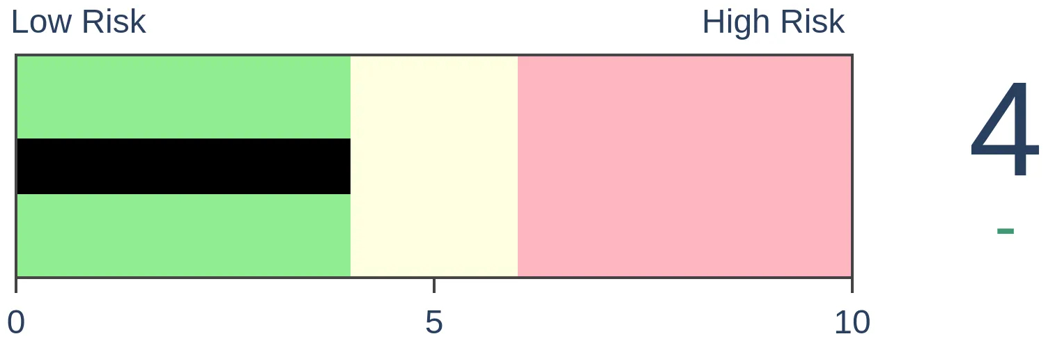
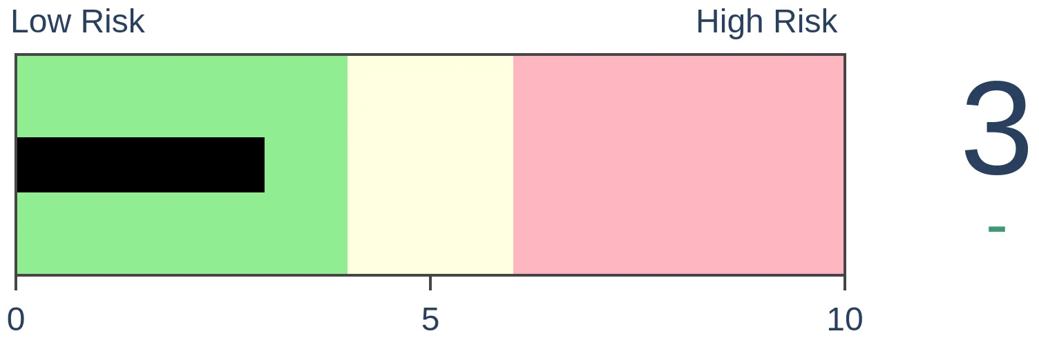
Risk Levels
Stocks Short-Term
|
Stocks Medium-Term
|
|
Bonds
|
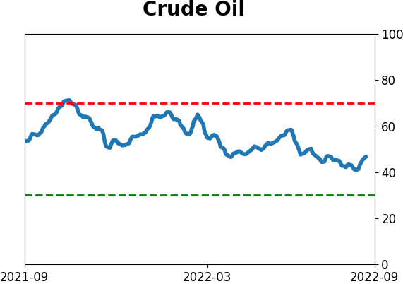
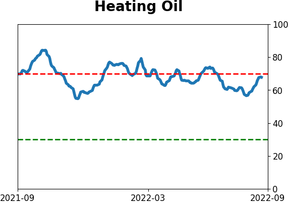
Crude Oil
|
|
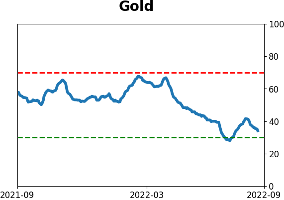
Gold
|
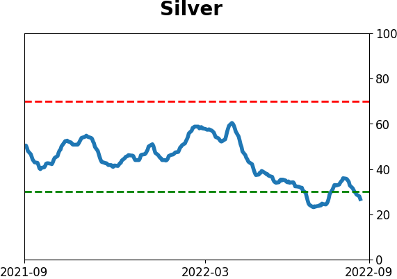
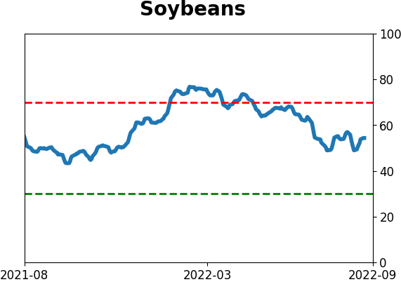
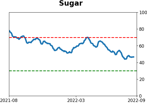
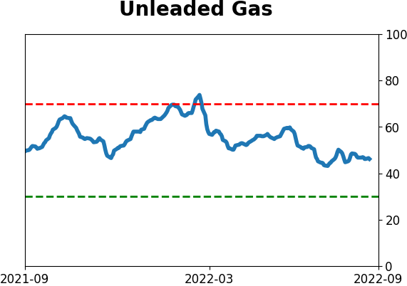
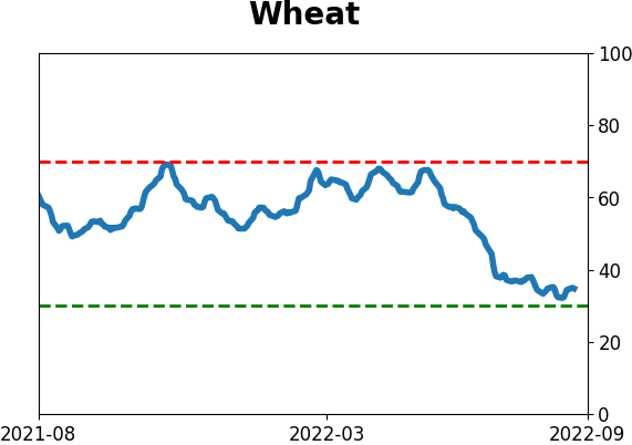
Agriculture

|
|
Research
By Jason Goepfert
BOTTOM LINE
Now that we've reached the 50-day point of the rally, it can be instructive to look at how other rallies unfolded over their first 50 days. When we look at price analogs of the highest-correlated rallies, they show some weakness over the next couple of months but a strong probability of long-term gains.
FORECAST / TIMEFRAME
None
|
Key points:
- The 50-day rally off the June low is comparable to other long-term bottoms
- A price analog shows that the highest-correlated 50-day patterns all showed one-year gains
- Shorter-term returns were inconsistent, with several giving back most or all of the initial rally
Unfolding price action is comparable to other long-term lows
On Monday, we saw that based on the behavior of short-, medium-, and long-term participation in the rally off the bottom, the current rebound has been closest to 1962. Out of all the highest-correlated rallies, there were several failures but most went on to long-term gains.
Now, let's look at the price action in the S&P 500 itself, not the performance of its individual stocks. The chart below shows the S&P's price return in the 50 days following the June low, compared to the 15 rebounds from a low that had a correlation of more than +0.55 (out of a scale from -1.00 to +1.00).
The black line, which shows the average of those rebounds, tended to peak a little later than we did this time, and our current pullback is more extensive than average. The initial shot off the low tends to run out of steam around day #50 and last through day #90.
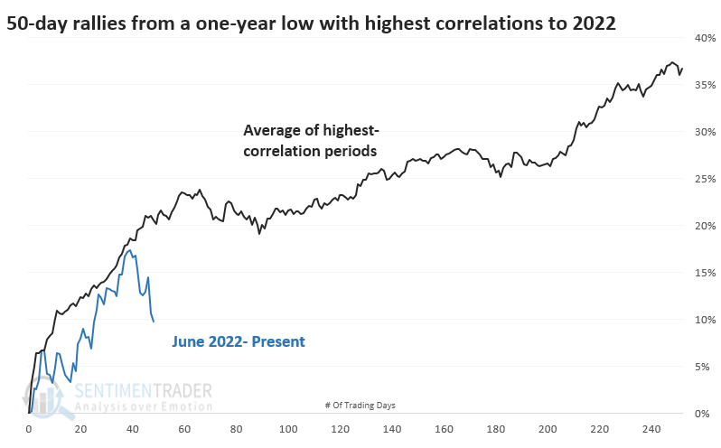
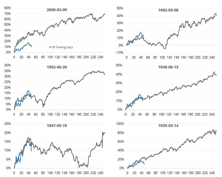
The thumbnails below show the ten most recent signals. Every one of them ran out of juice at about this point in the rebound off the low.
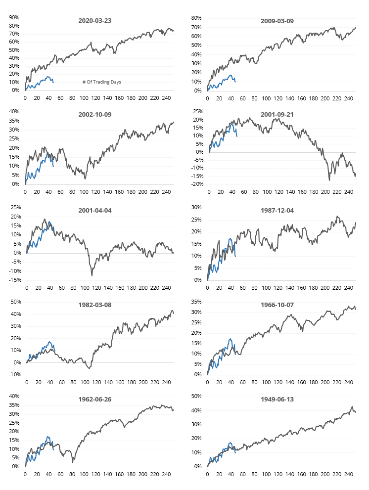
Overall, the S&P tended to do well after similar 50-day rebounds. Its returns are shown below, and like the one from Monday, there were failures in 1931 and 2001. The others all showed gains over the next year.
The highest-correlated rallies all showed long-term gains
If we filter the table to show only the most similar rallies to the current one, those with a correlation above +0.85, returns over the next year were impressive.
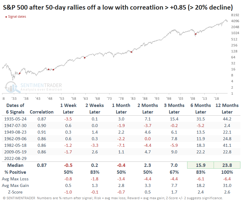
Those rallies tended to peak right where we did this time.
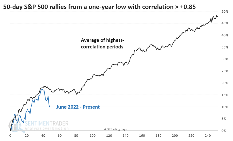
A few pulled back significantly after the initial rally, but all recovered over the longer term.
What the research tells us...
A few weeks ago, we noted that the size of the retracement was the most crucial consideration in whether we're seeing "just a bear market rally." We passed that test. Now that we've hit the 50-day mark, the way the rally has unfolded is similar to other successful lows. There were some failures, though, and that's important to note. Nothing is guaranteed. And even some of the longer-term successful rallies gave back a significant portion of the initial rally before buyers stepped in again. It suggests caution over shorter time frames but a higher likelihood that the weakness will find buyers.
Indicators at Extremes
Phase Table
Ranks
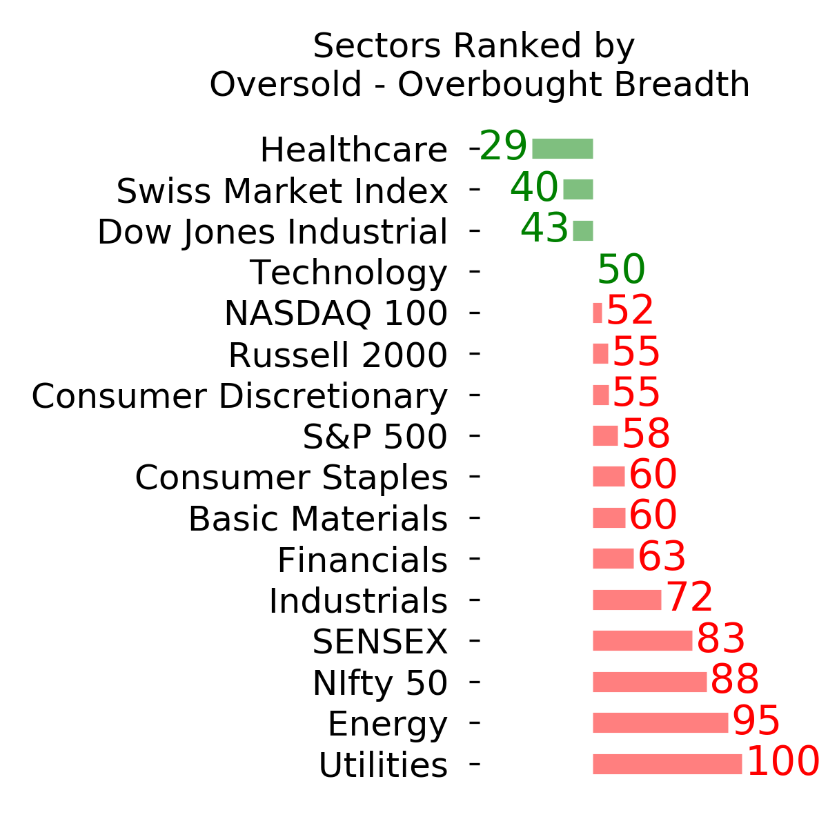
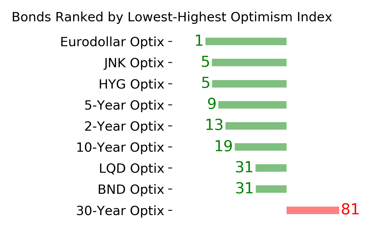
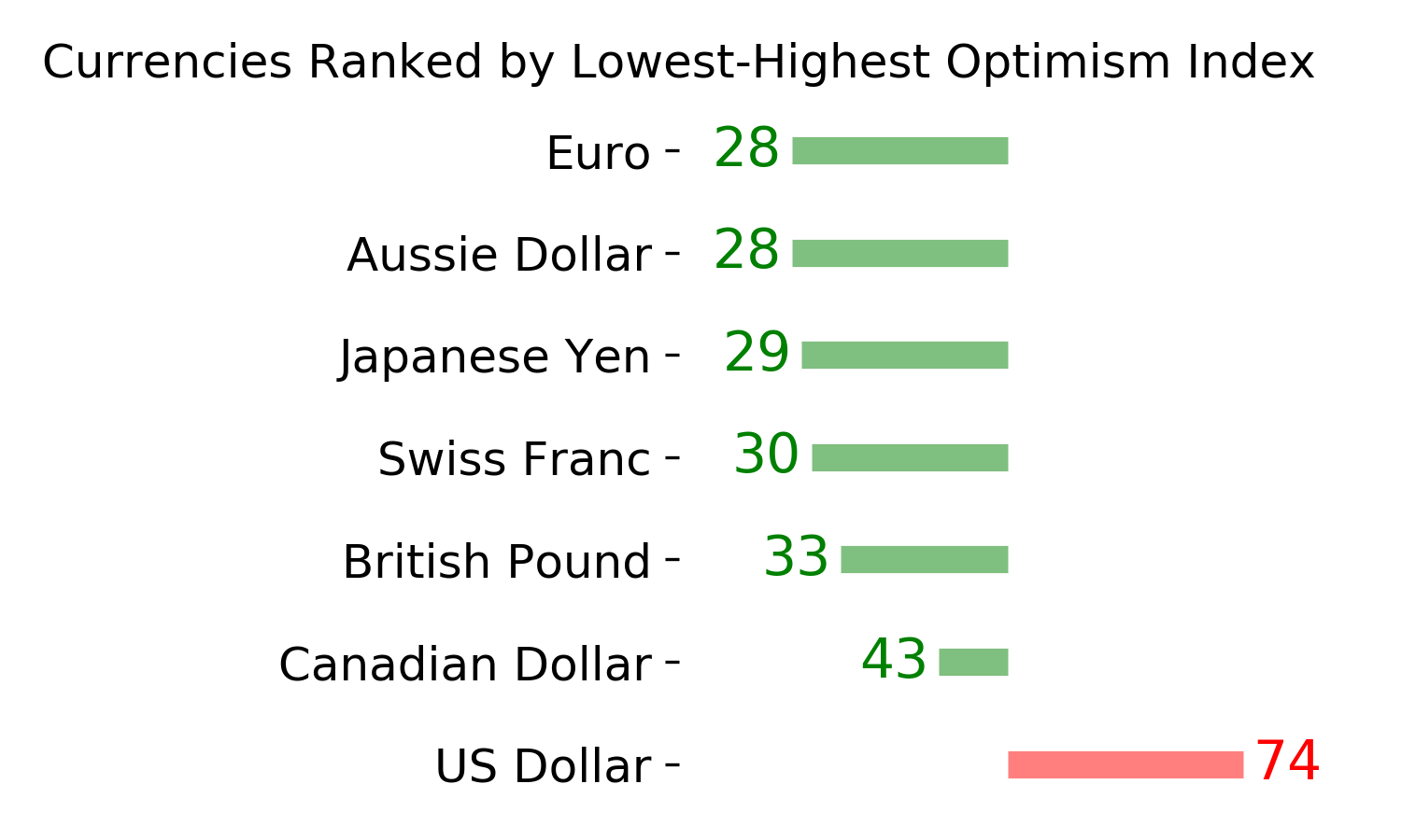
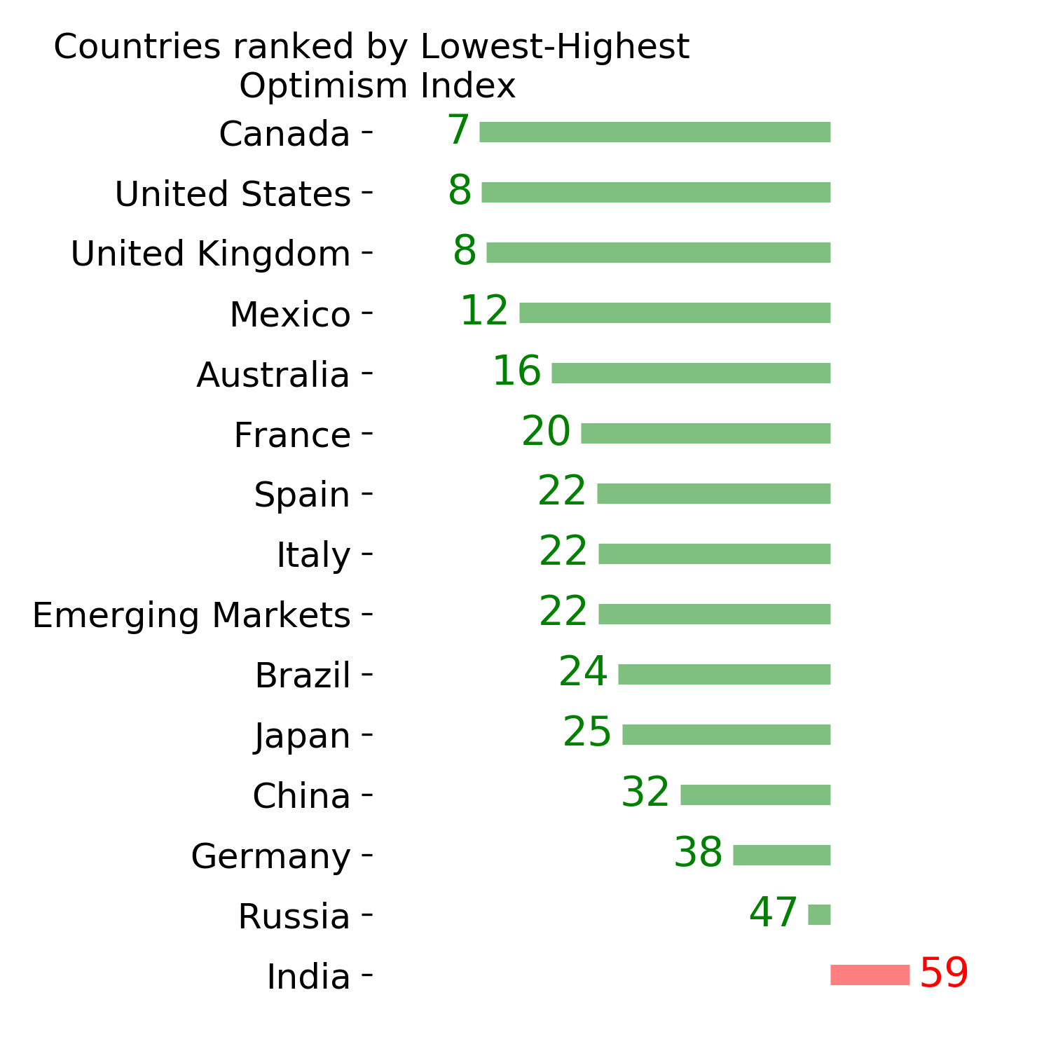
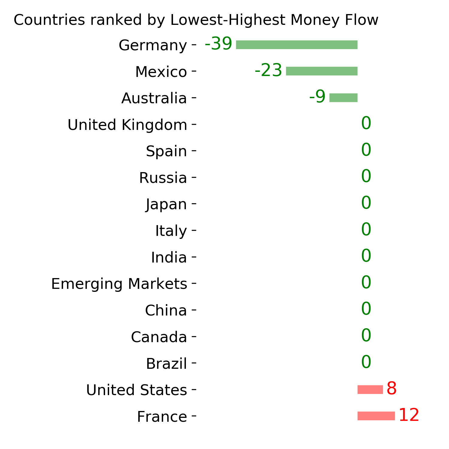
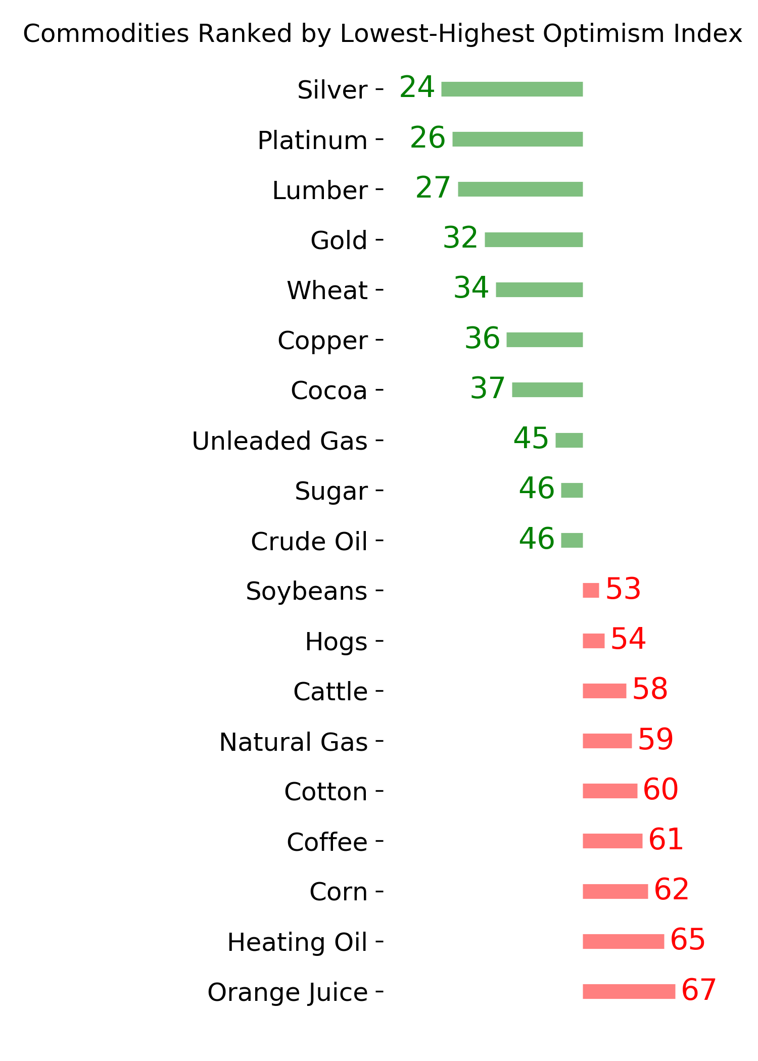
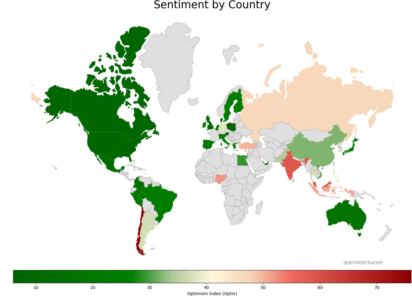
Sentiment Around The World
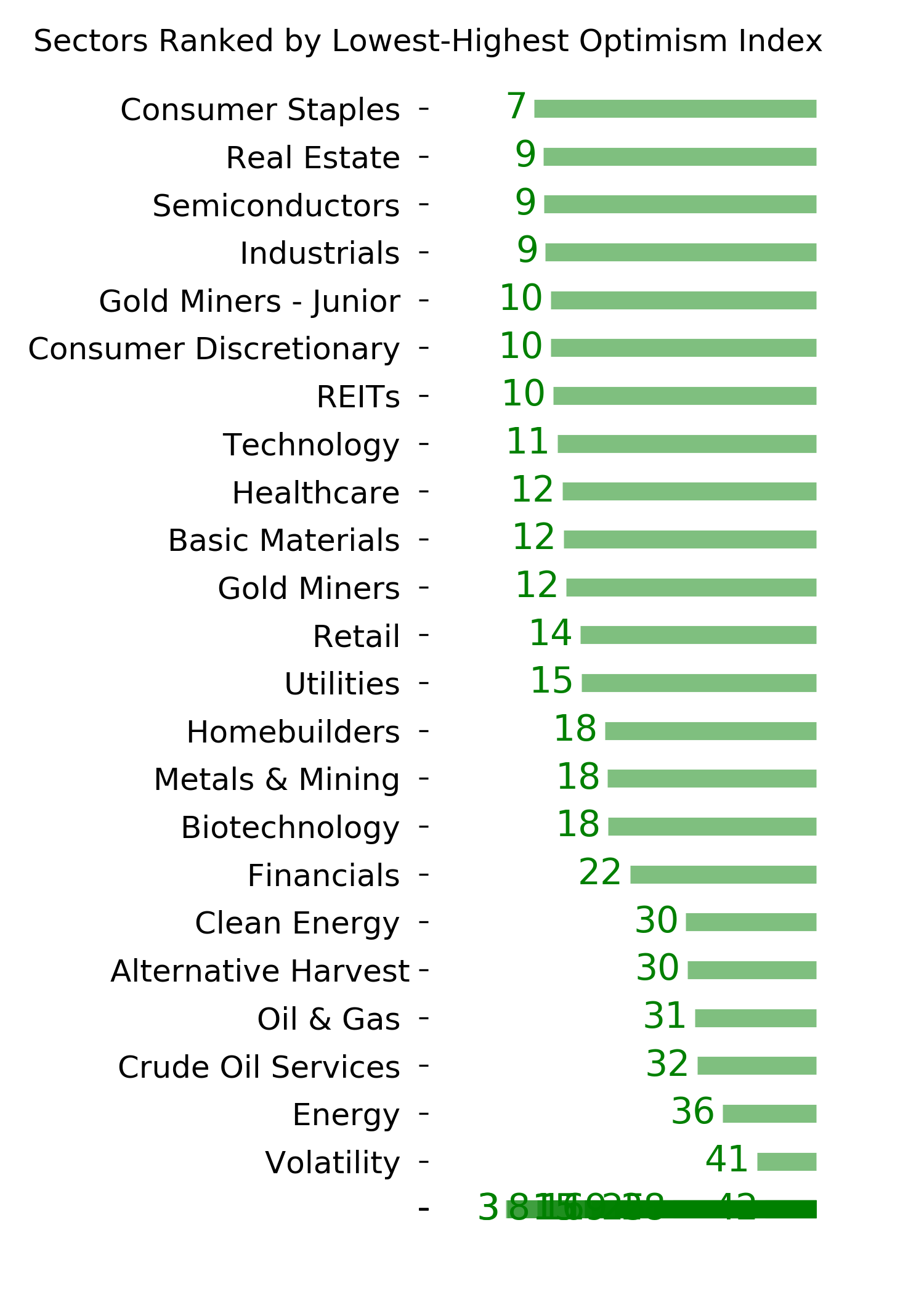
Optimism Index Thumbnails
|
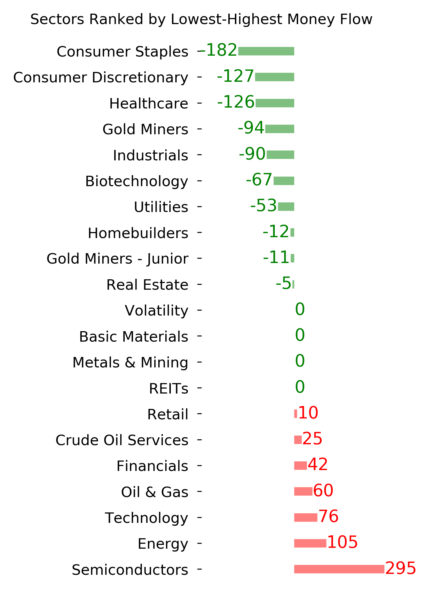
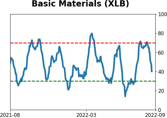
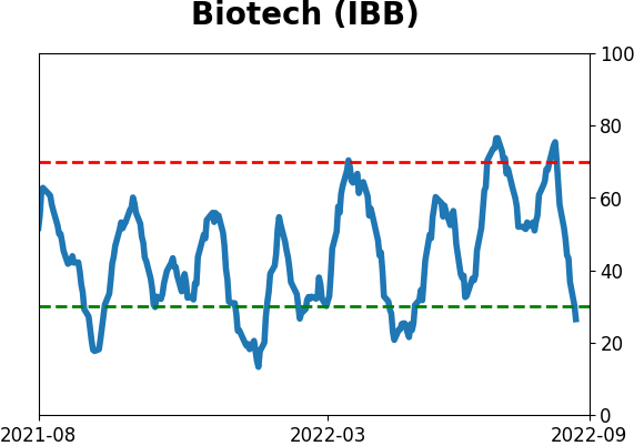
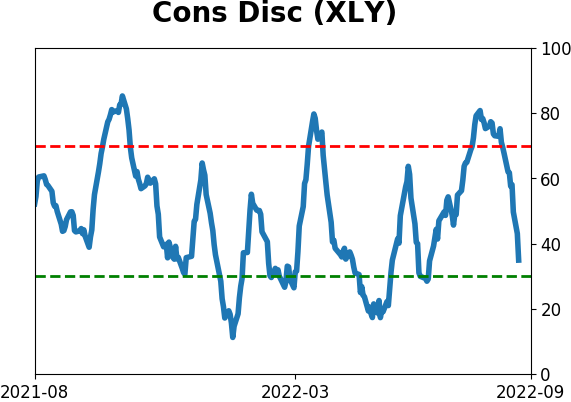
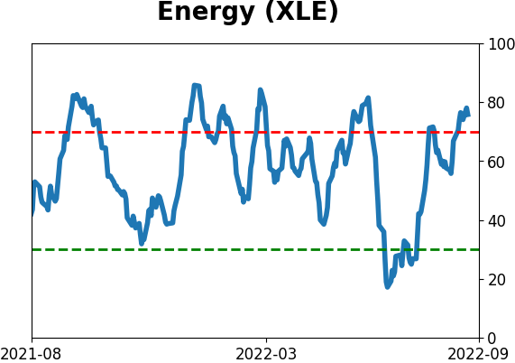
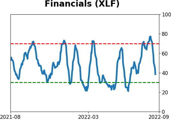
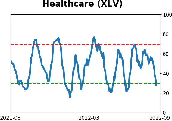
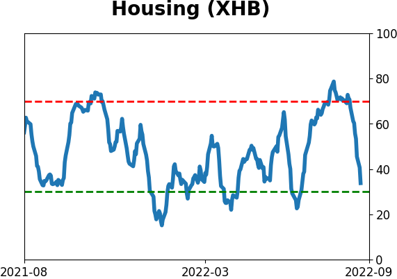
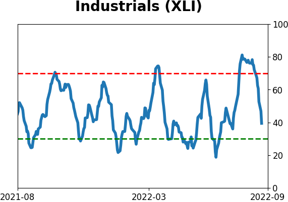
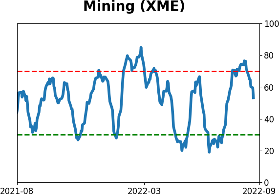
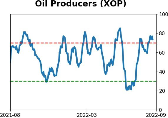
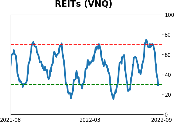
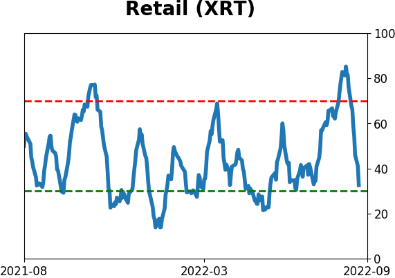
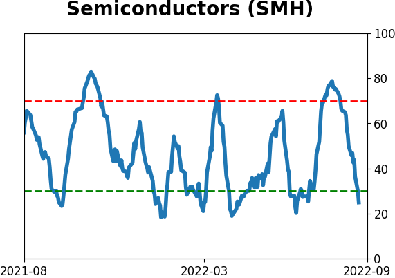
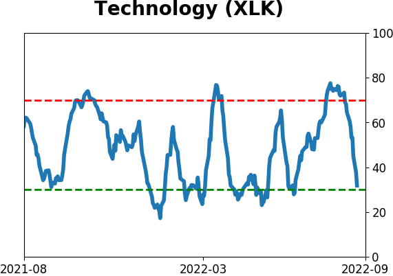
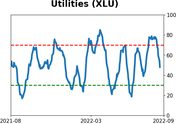
Sector ETF's - 10-Day Moving Average
|
|
|
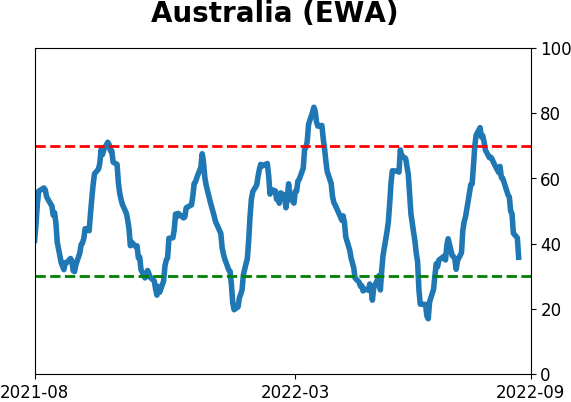
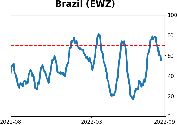
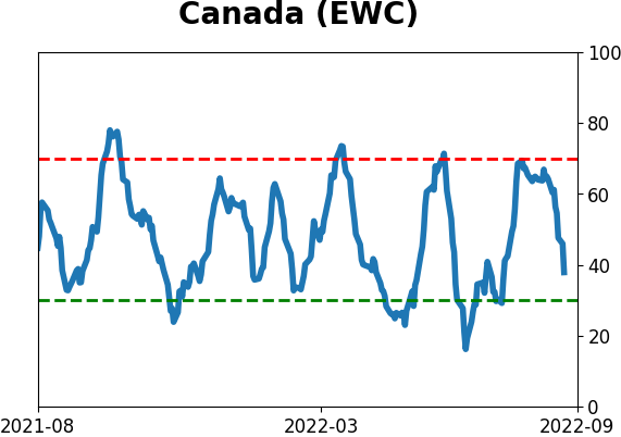
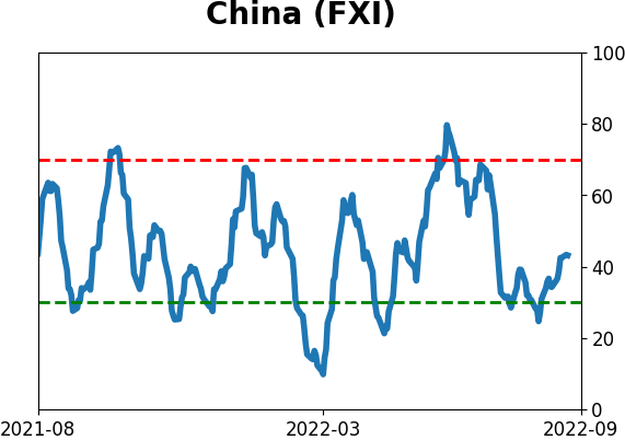
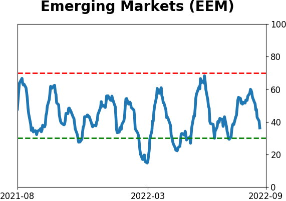
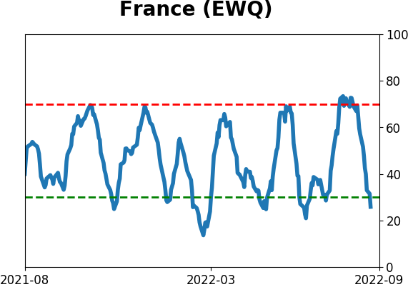
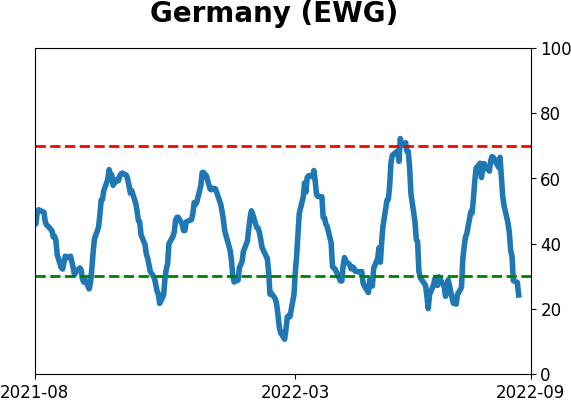
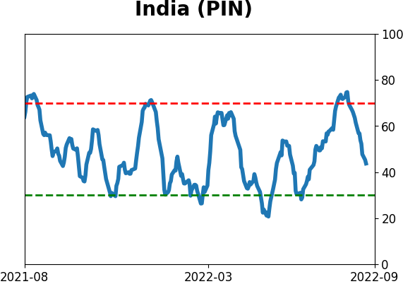
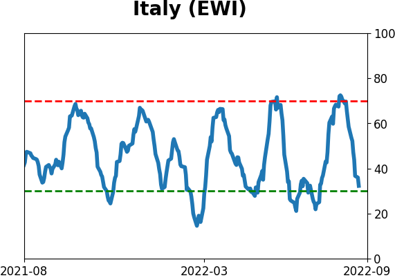
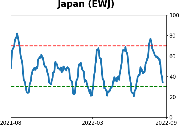
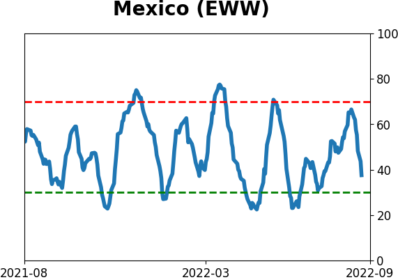
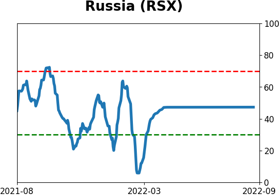
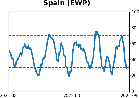
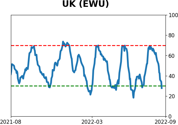
Country ETF's - 10-Day Moving Average
|
|
|
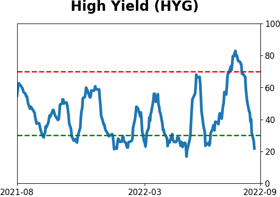
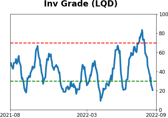
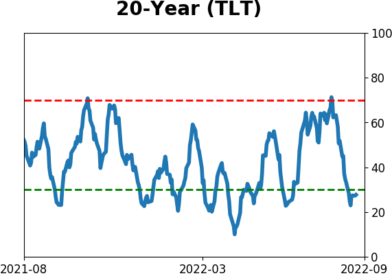
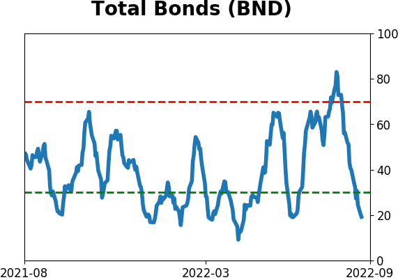
Bond ETF's - 10-Day Moving Average
|
|
|
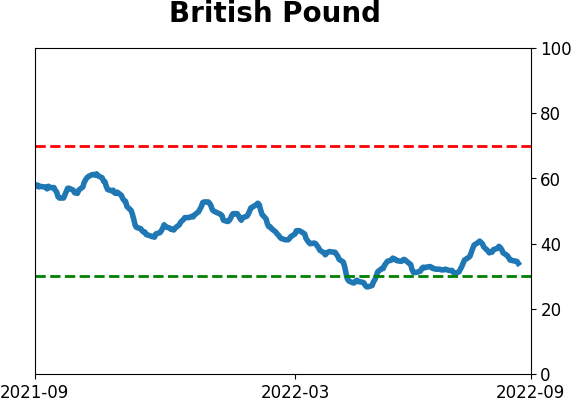
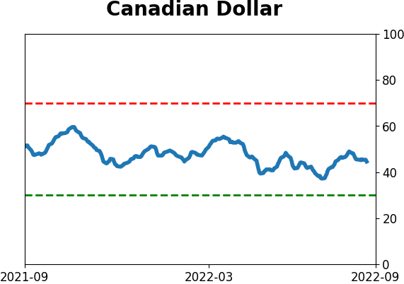
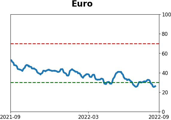
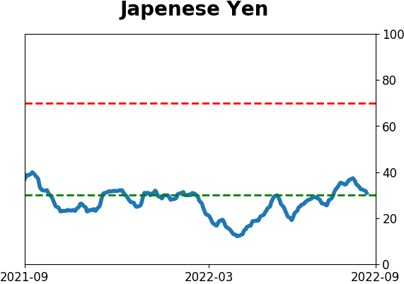
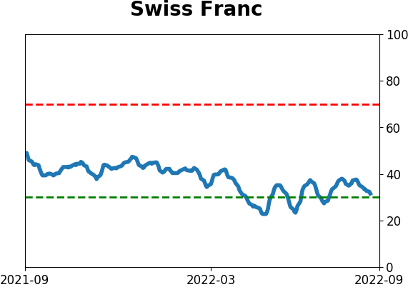
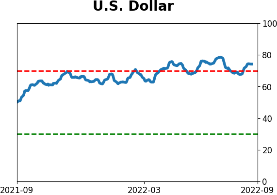
Currency ETF's - 5-Day Moving Average
|
|
|
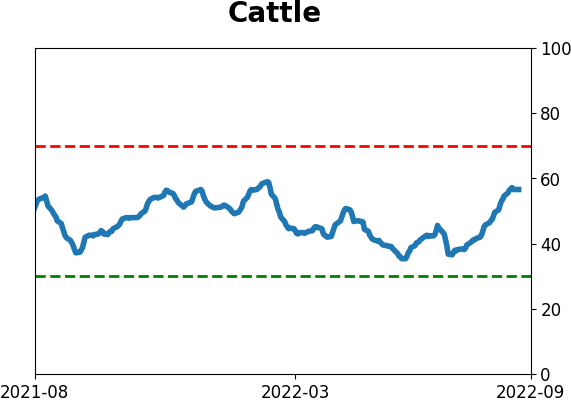
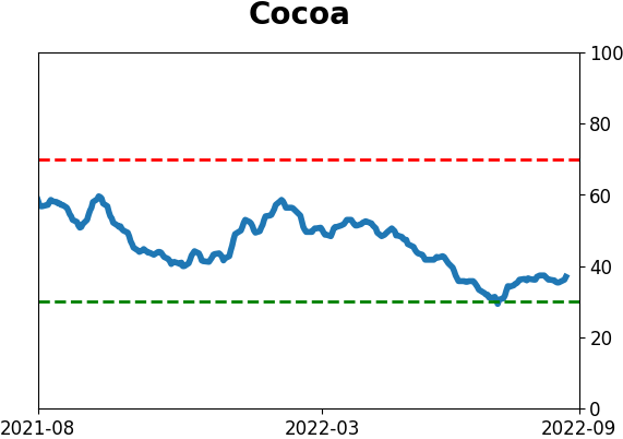
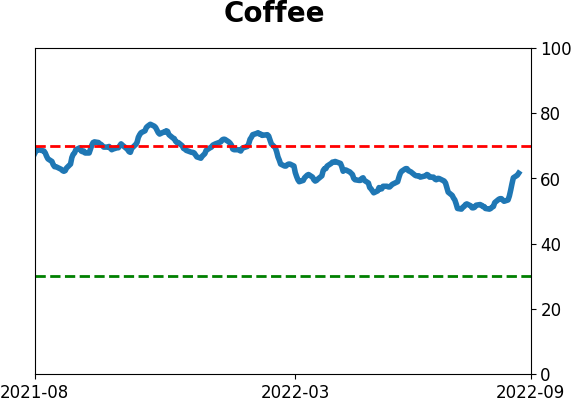
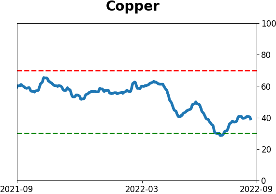
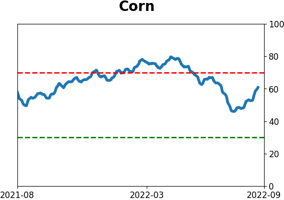
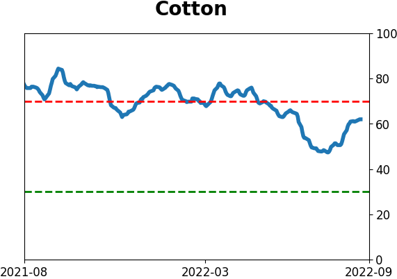
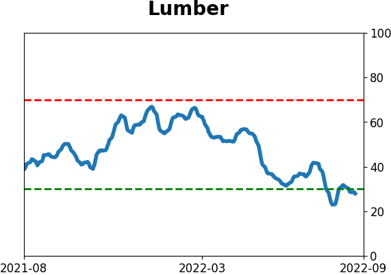
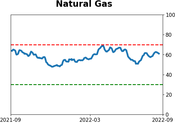
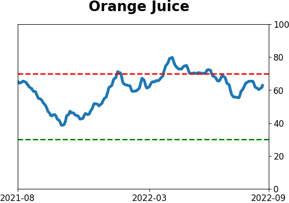
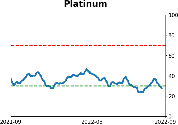
Commodity ETF's - 5-Day Moving Average
|
|