Headlines
|
|
A Sharpe Rally Thrusts Stocks Into Historic Territory:
The risk-adjusted rally in the S&P 500 over the past year is among the best ever. Its Sharpe Ratio is among the best in history but is starting to roll over now. That has usually preceded weak returns, with defensive sectors showing the best relative performance.
Bottom Line:
See the Outlook & Allocations page for more details on these summaries STOCKS: Hold
The speculative frenzy in February is wrung out. Internal dynamics have mostly held up, with some exceptions. Many of our studies still show a mixed to poor short-term view, with medium- and long-term ones turning more positive. BONDS: Hold
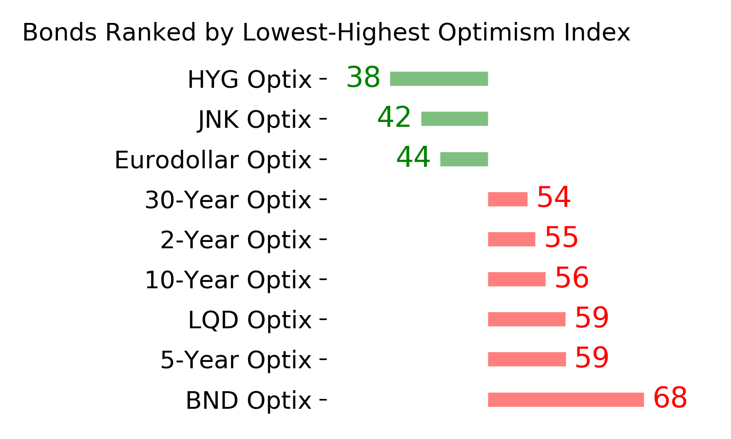
Various parts of the market got hit in March, with the lowest Bond Optimism Index we usually see during healthy environments. After a shaky couple of weeks, the broad bond market has modestly recovered. Not a big edge here either way. GOLD: Hold
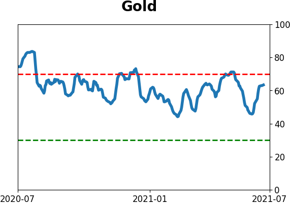
Gold and miners have done very well, recovering above long-term trend lines. The issue is that both have tended to perform poorly after similar situations - will have to wait and see how it plays out.
|
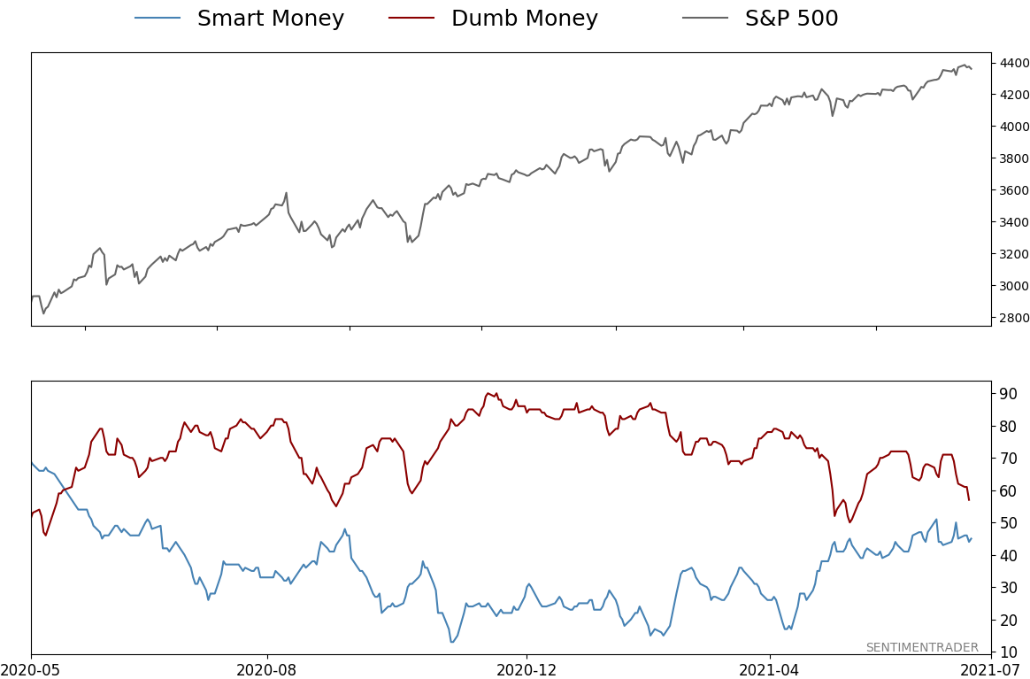
Smart / Dumb Money Confidence
|
Smart Money Confidence: 45%
Dumb Money Confidence: 57%
|
|
Risk Levels
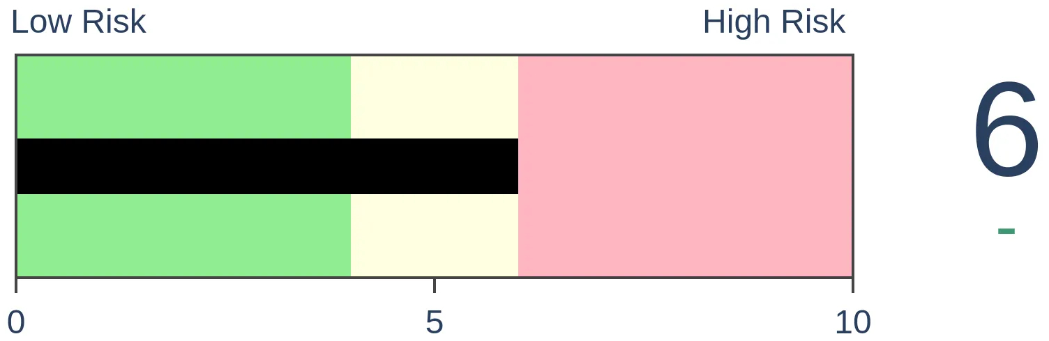
Stocks Short-Term

|
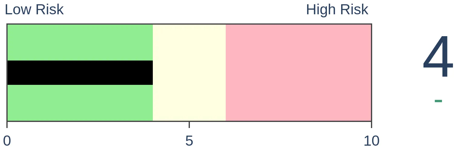
Stocks Medium-Term

|
|
Bonds
|
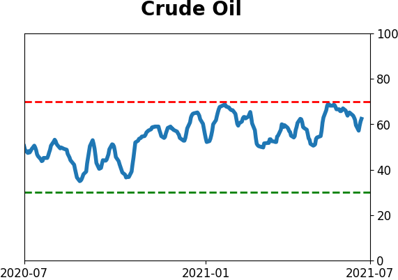
Crude Oil

|
|
Gold
|
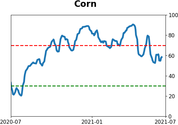
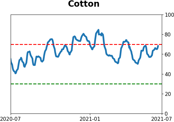
Agriculture
|
|
Research
BOTTOM LINE
The risk-adjusted rally in the S&P 500 over the past year is among the best ever. Its Sharpe Ratio is among the best in history but is starting to roll over now. That has usually preceded weak returns, with defensive sectors showing the best relative performance.
FORECAST / TIMEFRAME
None
|
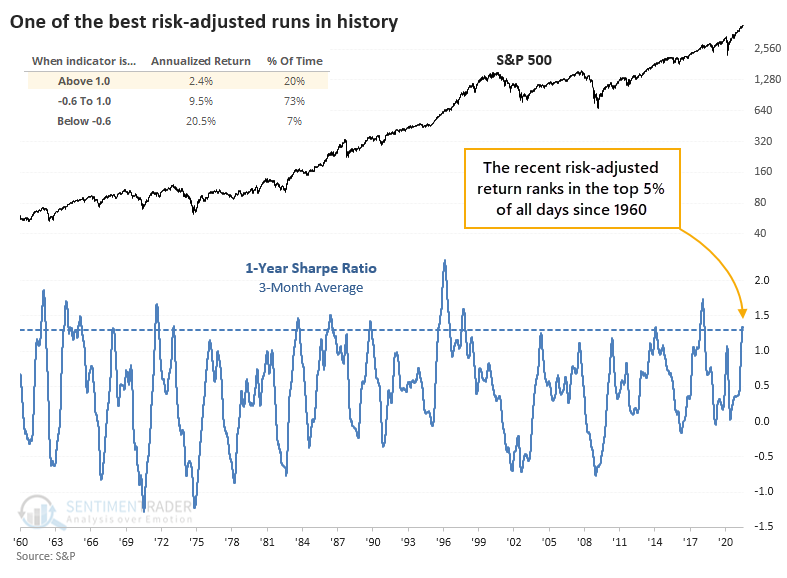
For investors, nirvana is a market showing steady and impressive gains without much risk. That pretty much sums up the past year.
Using a version of the Sharpe Ratio, the S&P 500 has seen the best risk-adjusted returns since late 2017 and ranking among the best ever. From Investopedia (edited for brevity):
The Sharpe ratio was developed by Nobel laureate William F. Sharpe and is used to help investors understand the return of an investment compared to its risk. The ratio is the average return earned in excess of the risk-free rate per unit of volatility or total risk. Volatility is a measure of the price fluctuations of an asset or portfolio.
Subtracting the risk-free rate from the mean return allows an investor to better isolate the profits associated with risk-taking activities.
Generally, the greater the value of the Sharpe ratio, the more attractive the risk-adjusted return.
Methodologies for calculating the ratio can vary, and using it as a measure of portfolio managers' acumen is subject to fierce debate. It's still a handy way to determine just how ideal market conditions have been for investors.
THE S&P 500'S SHARPE RATIO
For the S&P, its Sharpe Ratio is just now rolling over from an extremely high level.
After other times the ratio got as high as it recently was and started to roll over, the S&P saw some weakness over the medium-term.
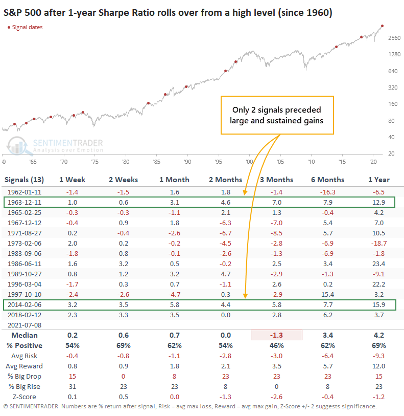
Over the next three months, the S&P showed a negative average return and poor risk/reward ratio. Across all medium- to long-term time frames, returns were below average.
If we focus on the next 1-6 months, only the signals in December 1963 and February 2014 saw the S&P continue its trend uninterrupted. The others either saw weakness at some point during that time frame or only minor gains.
IMPACT ON SECTORS
Looking at other impressive but ebbing risk-adjusted rallies in the S&P and their impact on sectors, Energy, Utilities, and Health Care tended to hold up the best. Technology, Industrials, and Financials showed among the lowest returns. It was not great for Growth stocks over the next several months.
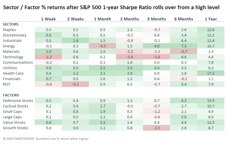
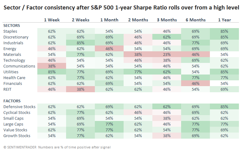
We can see similar behavior with the consistency of returns. Over the next three months, Materials, Technology, Small-Caps, and Growth stocks were higher only 38% of the time or less. The most consistent winners were the more defensive sectors.
The past six months have been particularly rewarding to investors, as momentum has totally steamrolled measures that historically put a brake on future returns. Maybe that means we're in a new paradigm of candy and rainbows for anyone putting their money into the market. It's certainly possible. Whether it's probable is debatable. When a trend feels this good, for this long, it encourages behavior that is very rarely rewarded.
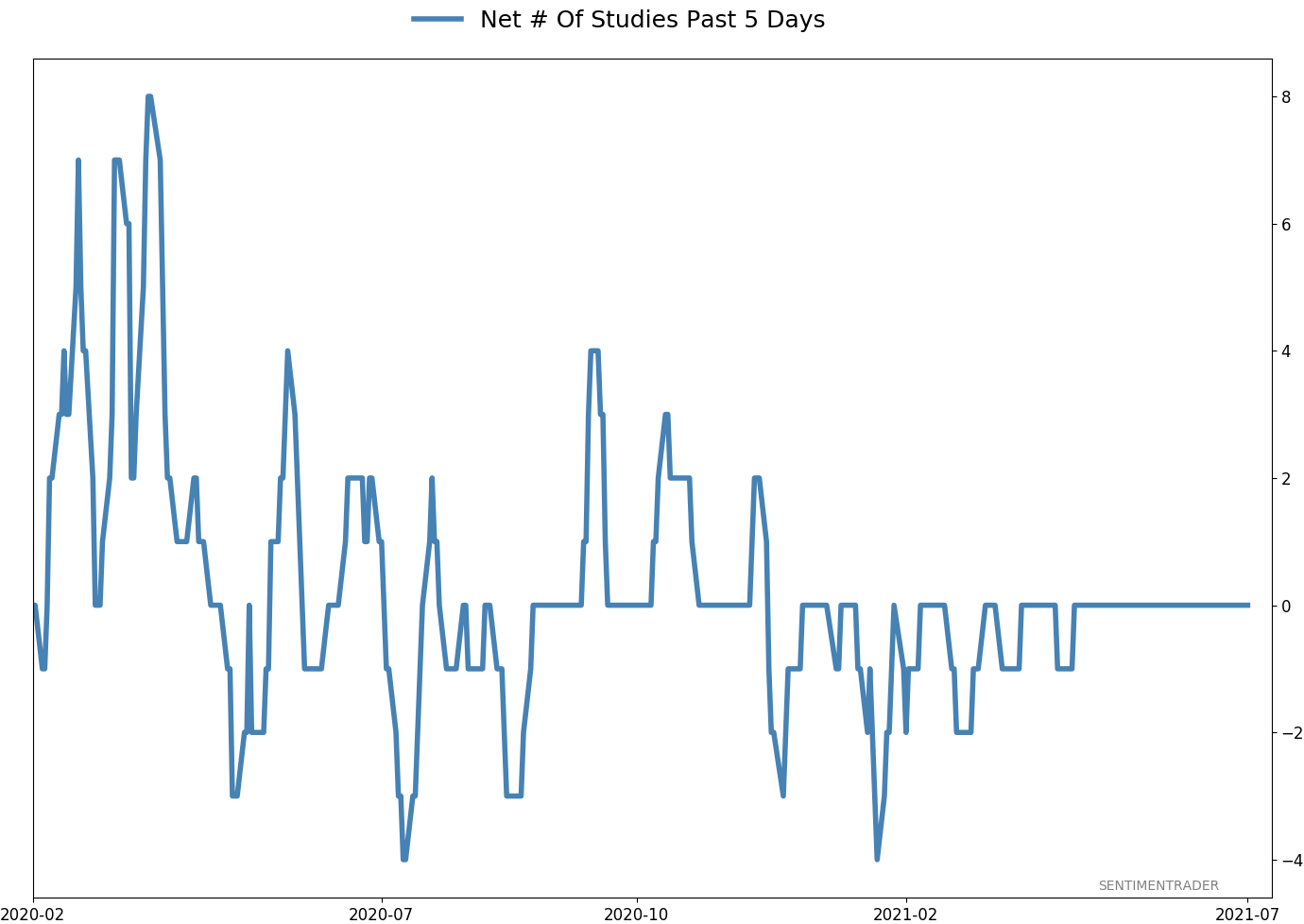
Active Studies
| Time Frame | Bullish | Bearish | | Short-Term | 0 | 1 | | Medium-Term | 2 | 3 | | Long-Term | 9 | 5 |
|
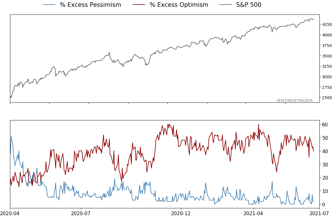
Indicators at Extremes
Portfolio
| Position | Description | Weight % | Added / Reduced | Date | | Stocks | RSP | 4.1 | Added 4.1% | 2021-05-19 | | Bonds | 23.9% BND, 6.9% SCHP | 30.7 | Reduced 7.1% | 2021-05-19 | | Commodities | GCC | 2.6 | Reduced 2.1%
| 2020-09-04 | | Precious Metals | GDX | 5.6 | Reduced 4.2% | 2021-05-19 | | Special Situations | 4.3% XLE, 2.2% PSCE | 7.6 | Reduced 5.6% | 2021-04-22 | | Cash | | 49.4 | | |
|
Updates (Changes made today are underlined)
Much of our momentum and trend work has remained positive for several months, with some scattered exceptions. Almost all sentiment-related work has shown a poor risk/reward ratio for stocks, especially as speculation drove to record highs in exuberance in February. Much of that has worn off, and most of our models are back toward neutral levels. There isn't much to be excited about here. The same goes for bonds and even gold. Gold has been performing well lately and is back above long-term trend lines. The issue is that it has a poor record of holding onto gains when attempting a long-term trend change like this, so we'll take a wait-and-see approach. RETURN YTD: 9.1% 2020: 8.1%, 2019: 12.6%, 2018: 0.6%, 2017: 3.8%, 2016: 17.1%, 2015: 9.2%, 2014: 14.5%, 2013: 2.2%, 2012: 10.8%, 2011: 16.5%, 2010: 15.3%, 2009: 23.9%, 2008: 16.2%, 2007: 7.8%
|
|
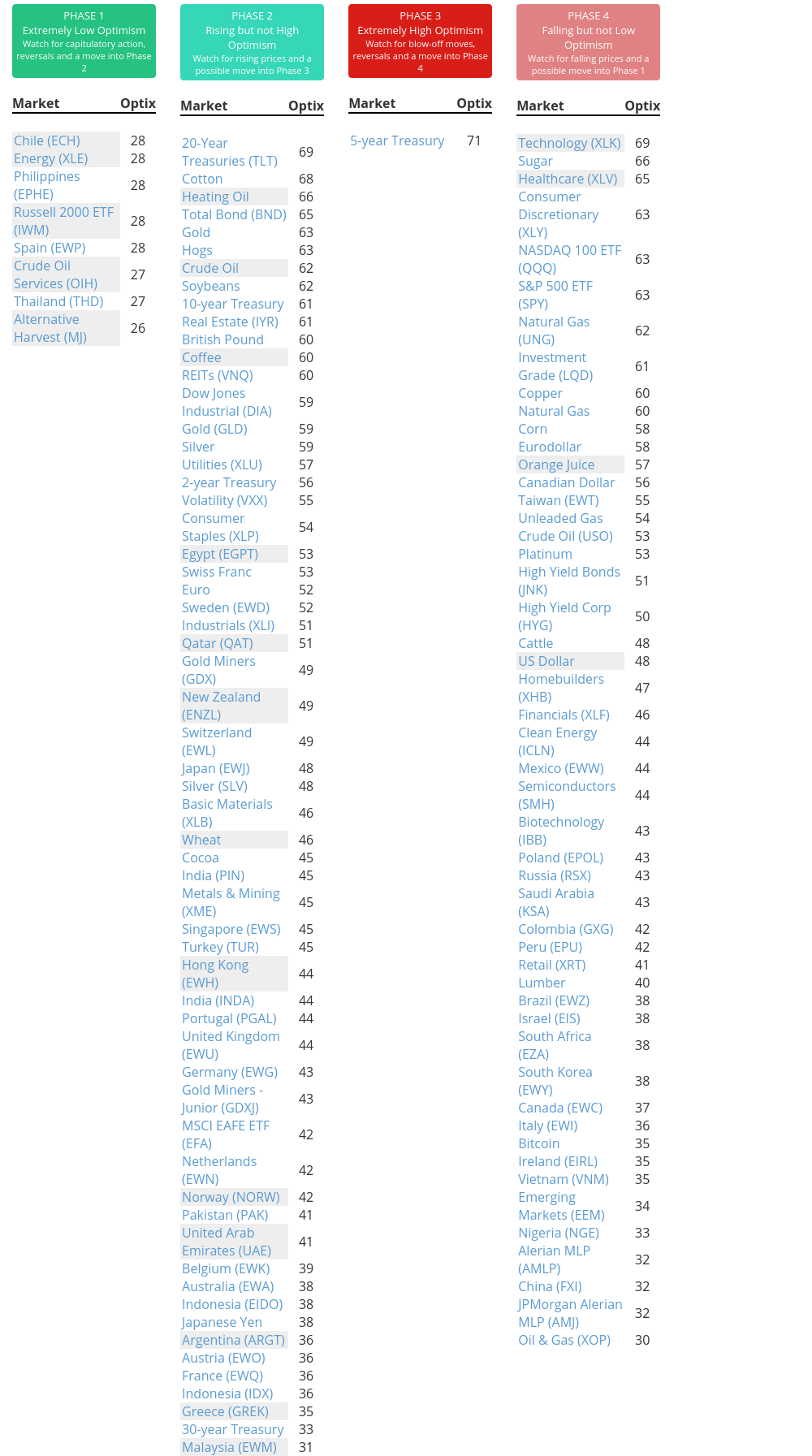
Phase Table
Ranks
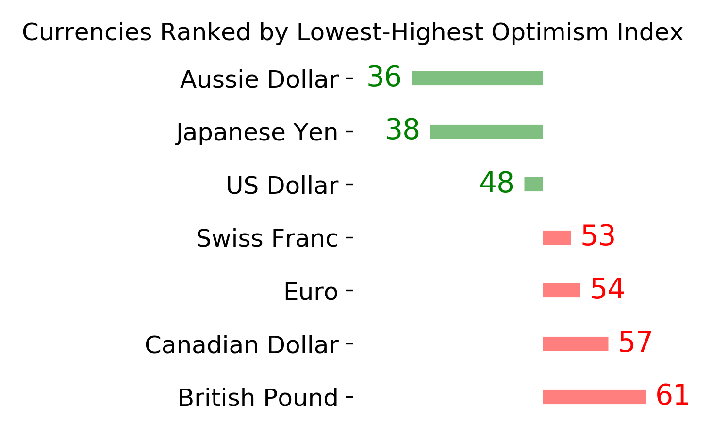
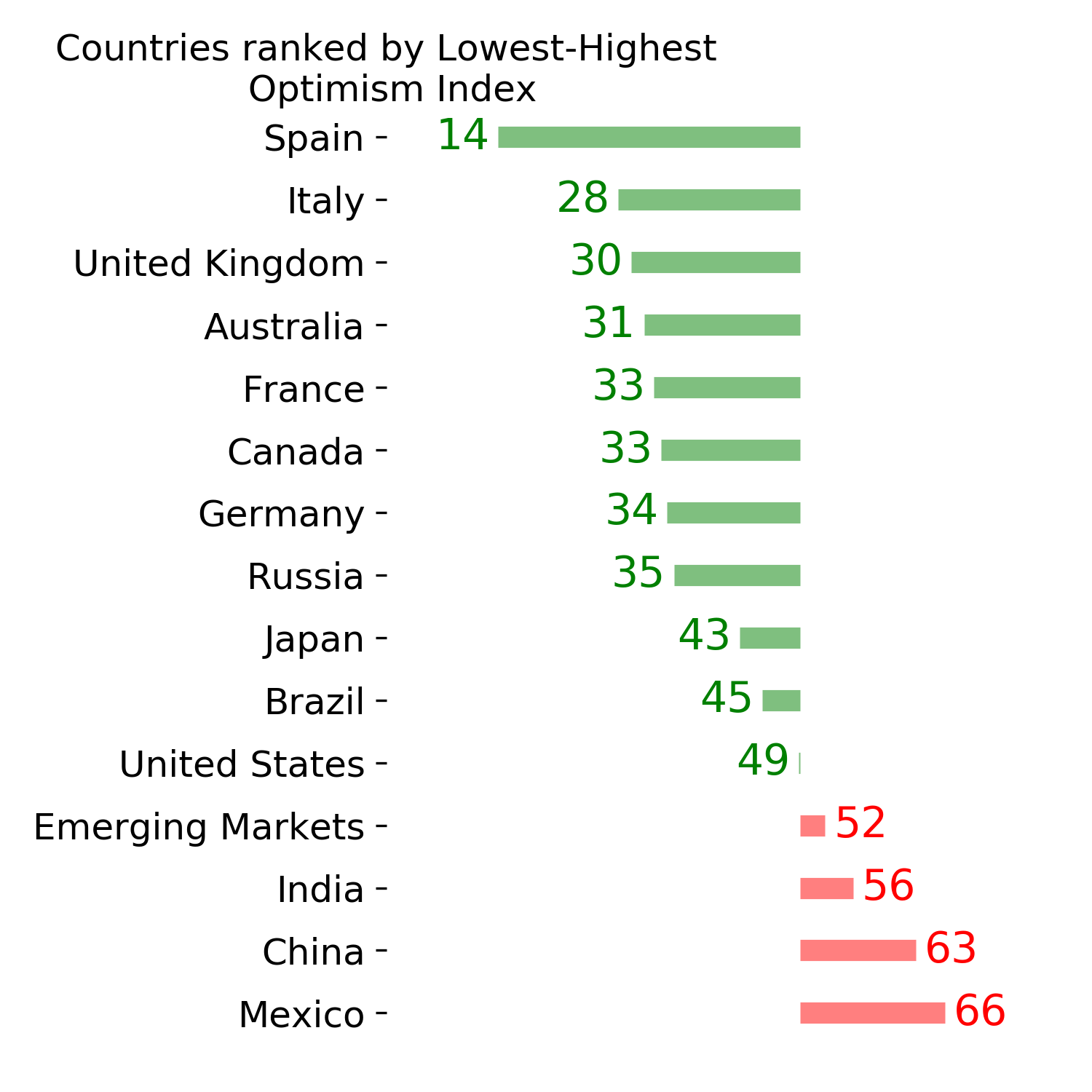
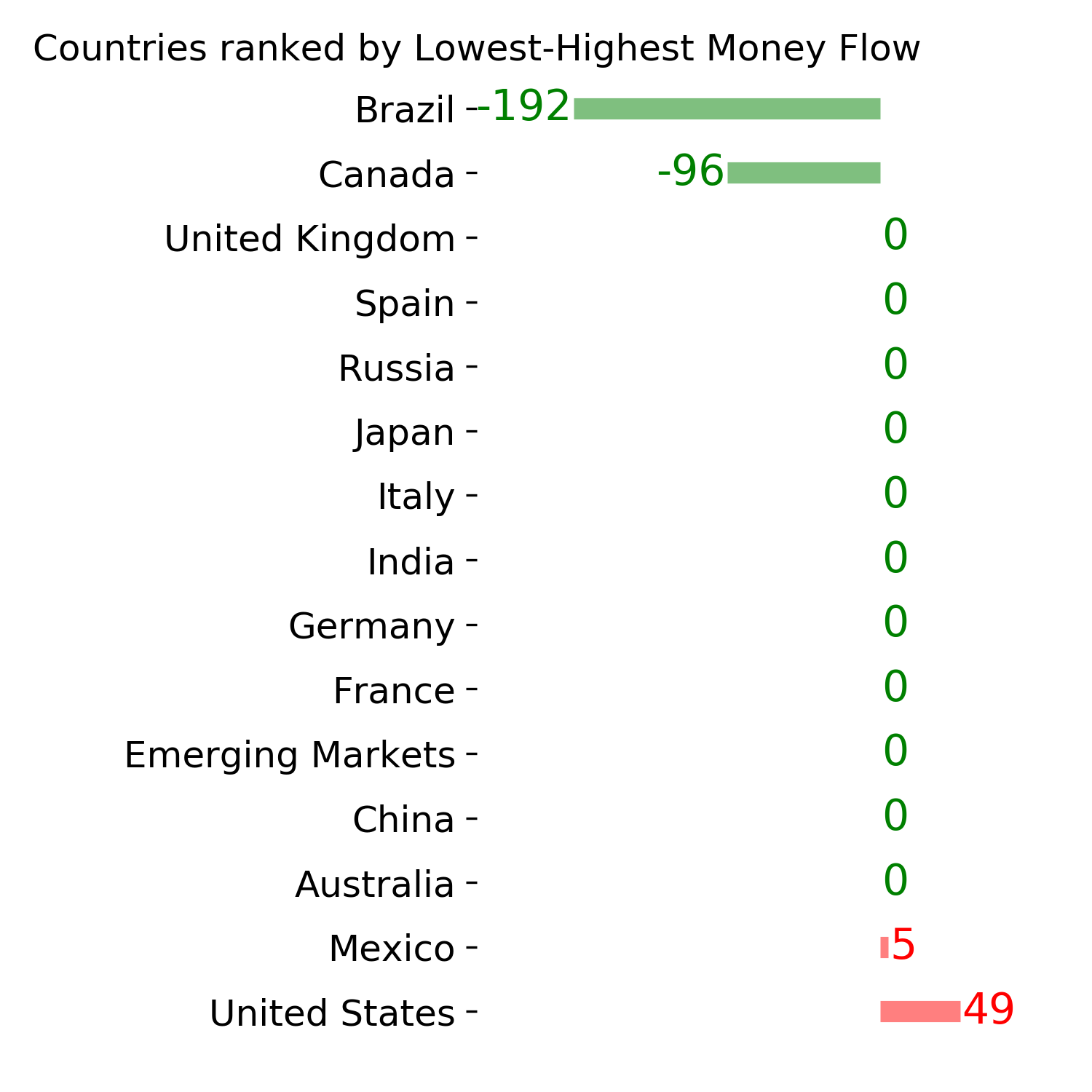
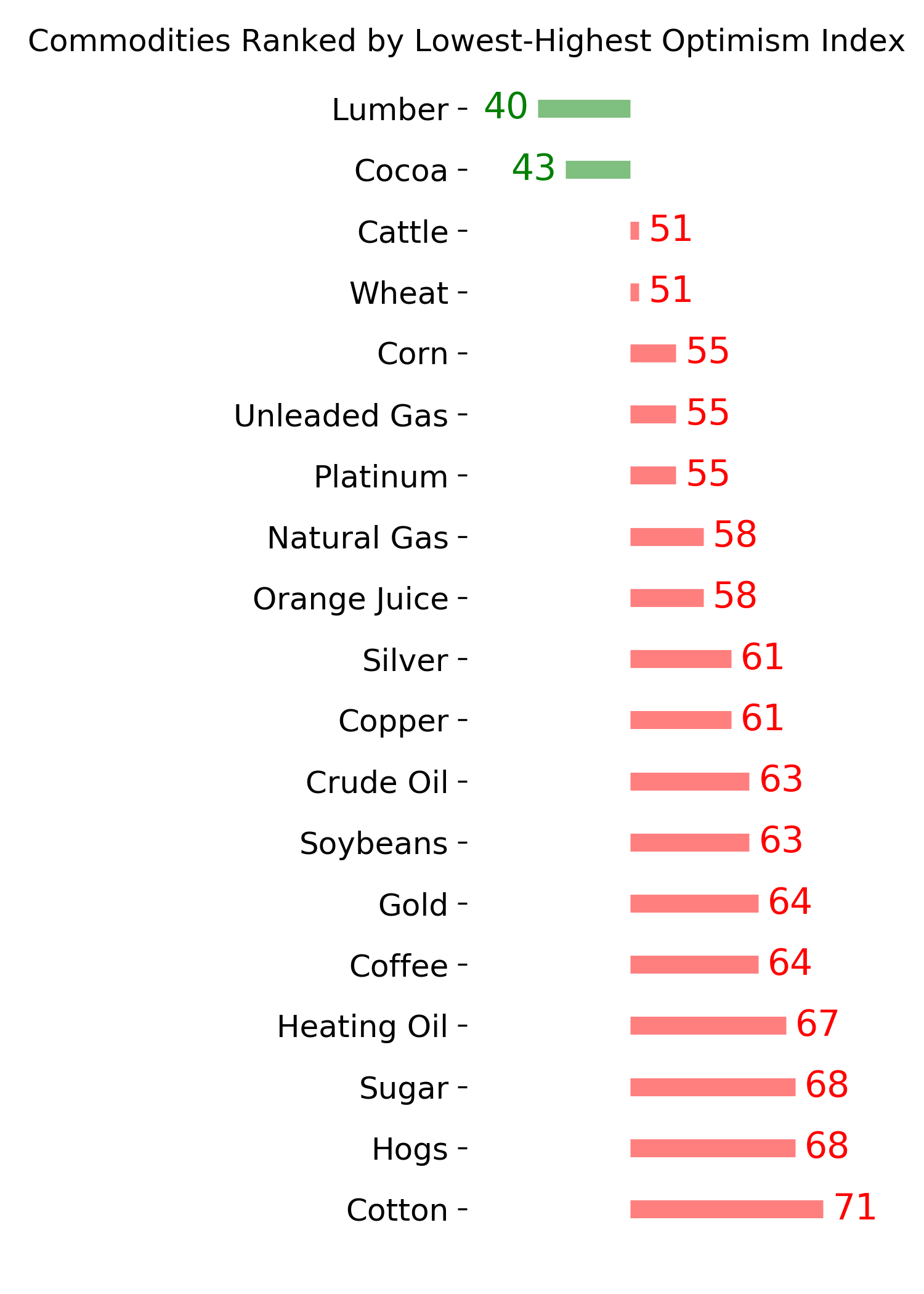
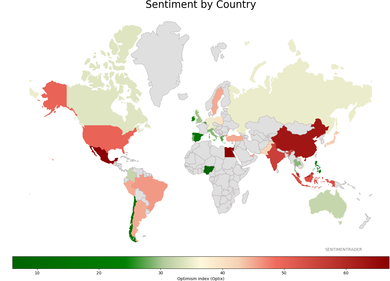
Sentiment Around The World
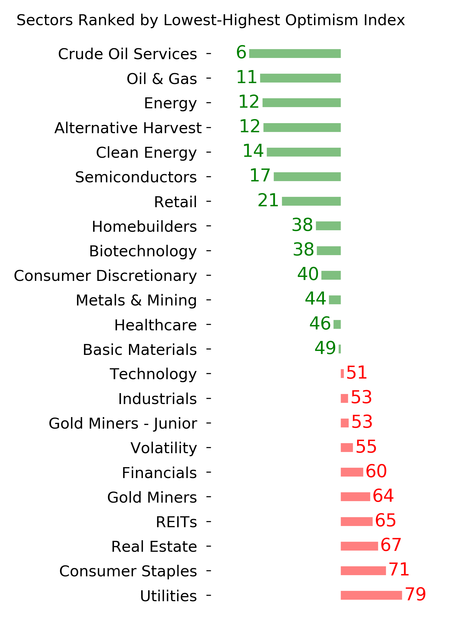
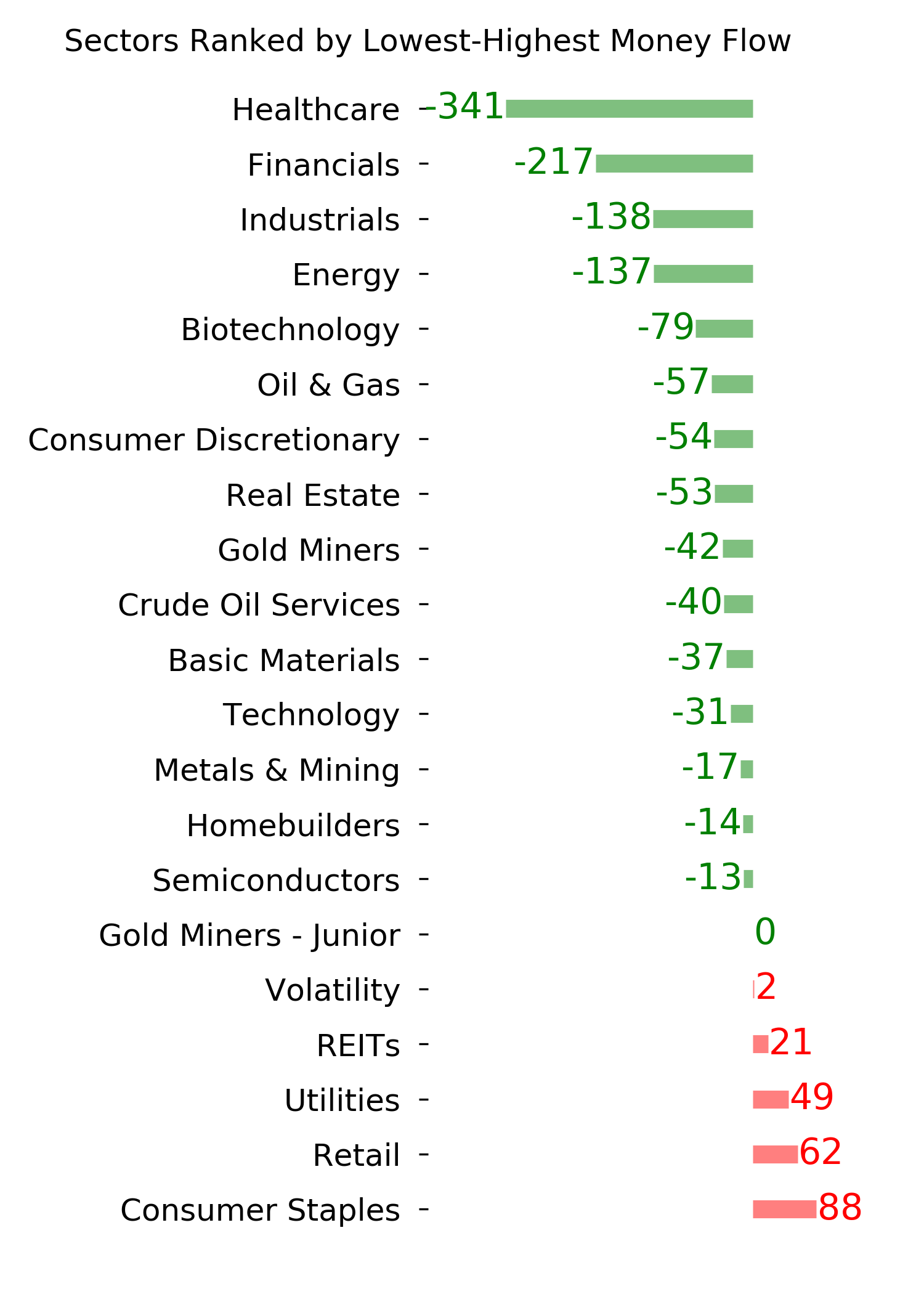
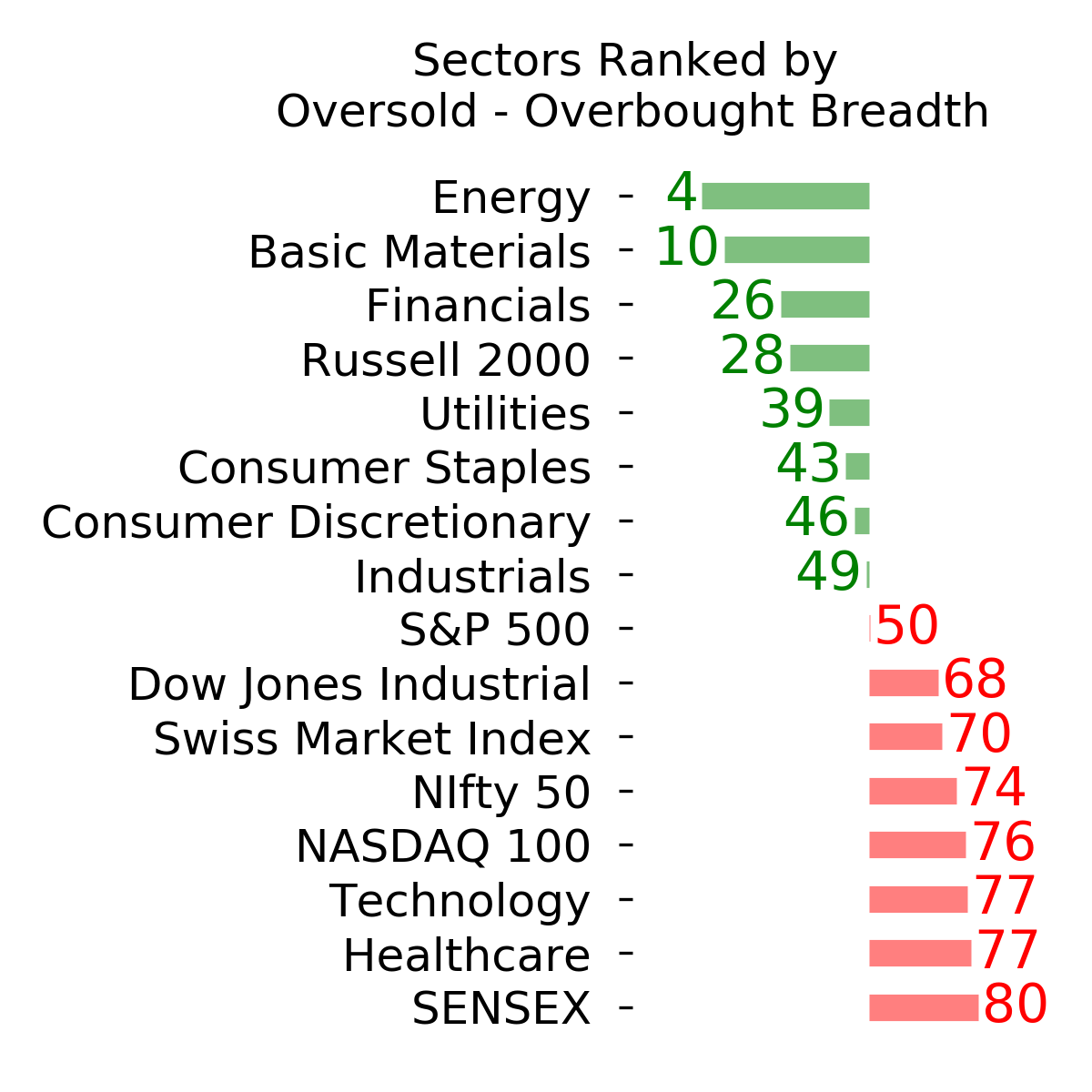
Optimism Index Thumbnails
|
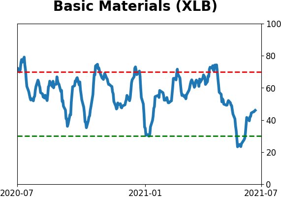
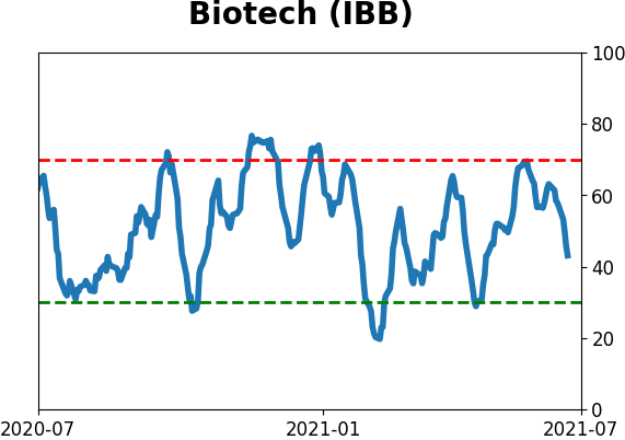
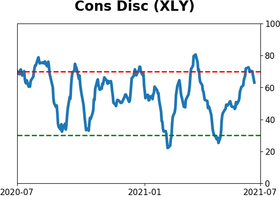
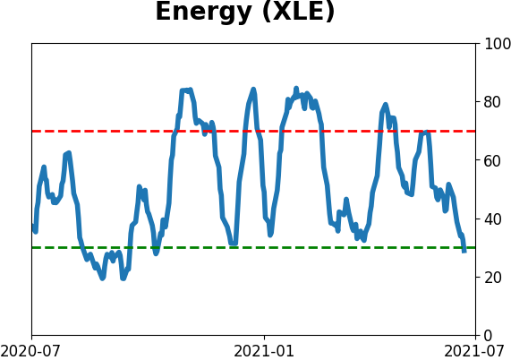
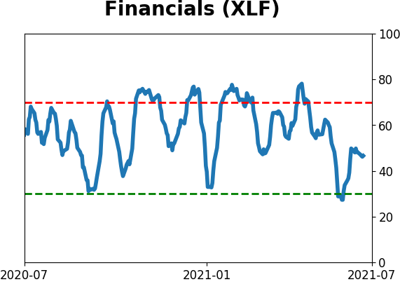
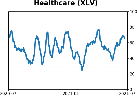
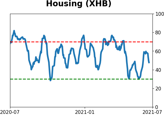
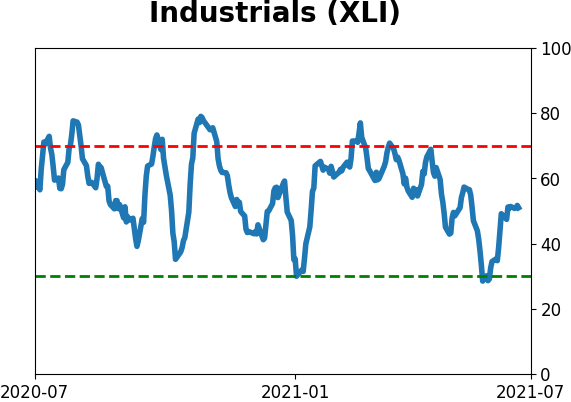
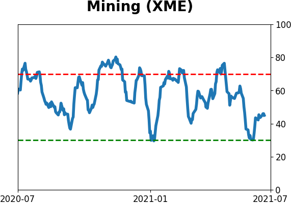
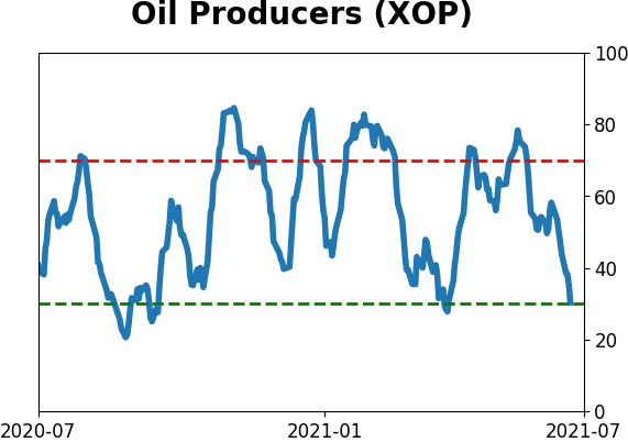
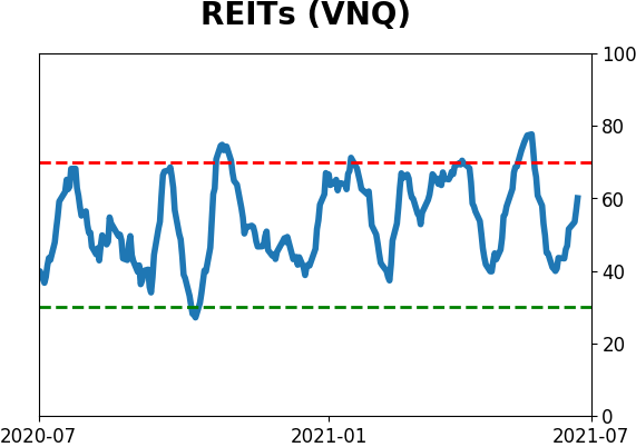
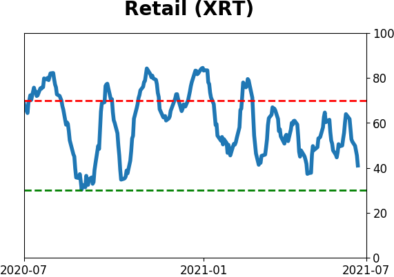
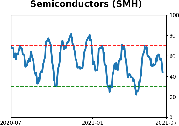
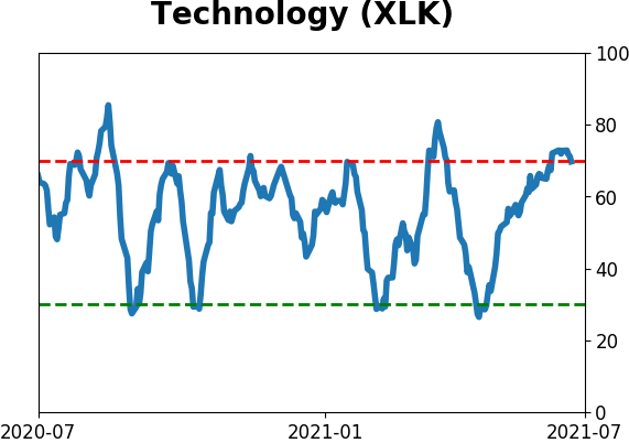
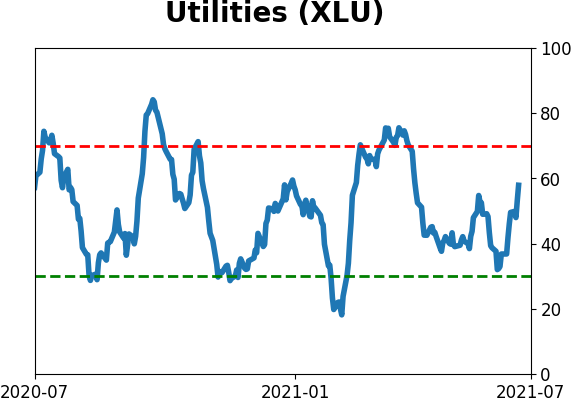
Sector ETF's - 10-Day Moving Average
|
|
|
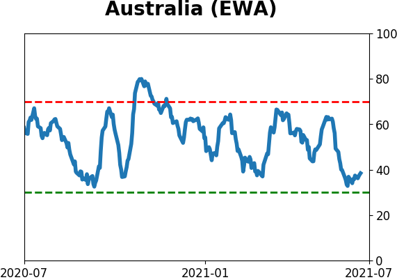
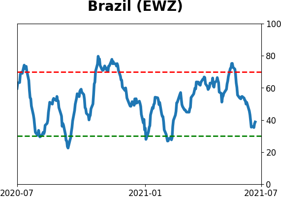
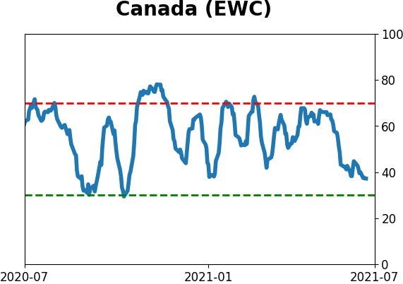
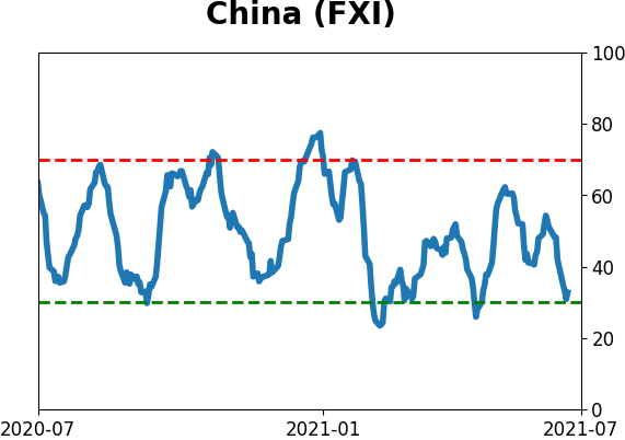
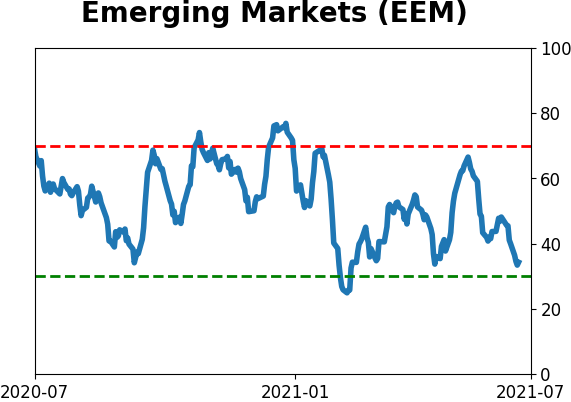
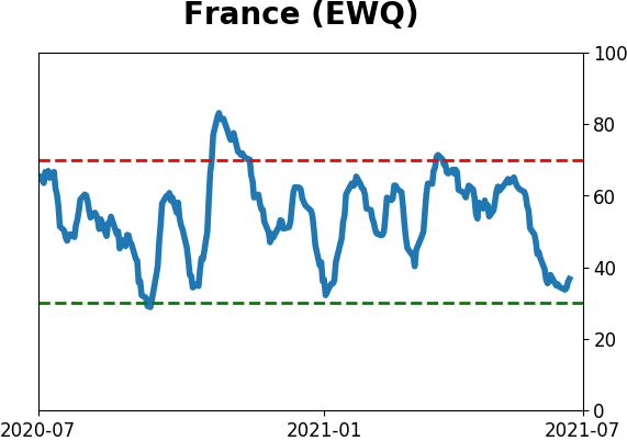
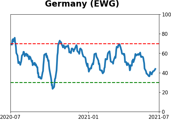
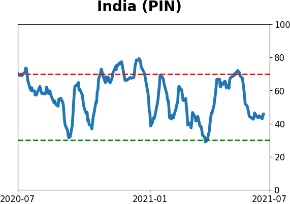
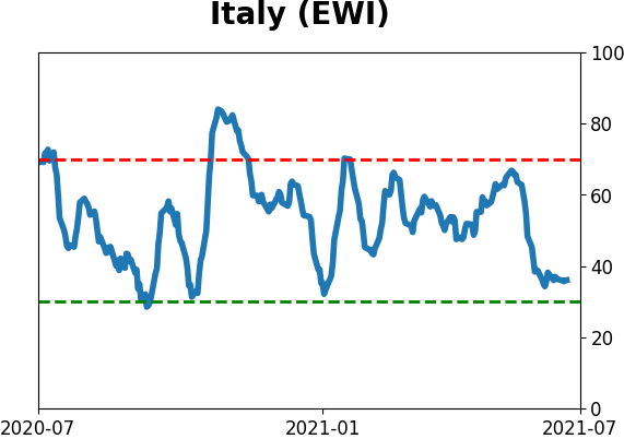
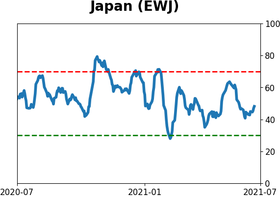
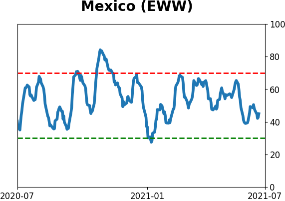
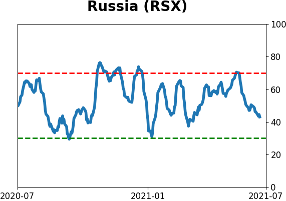
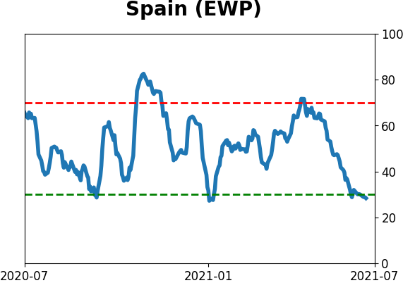
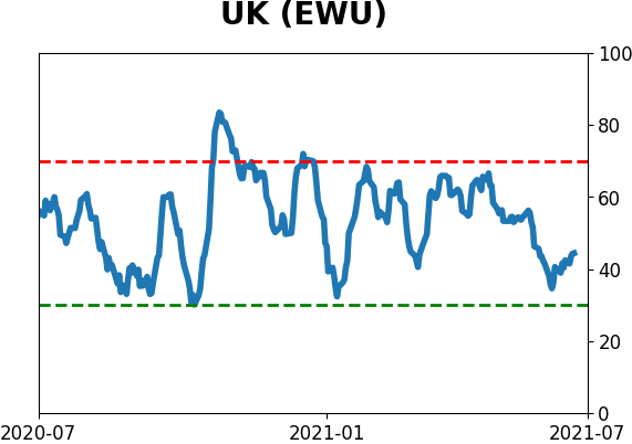
Country ETF's - 10-Day Moving Average
|
|
|
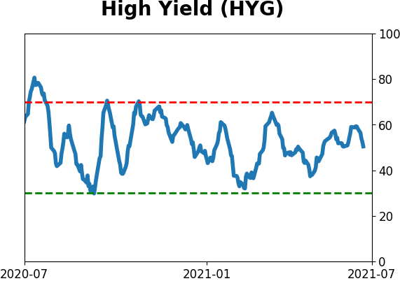
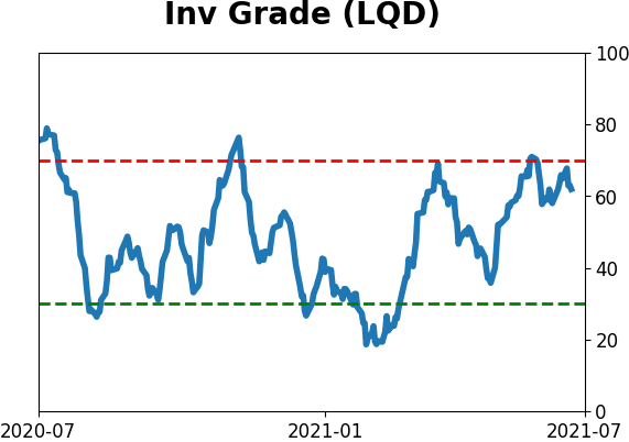
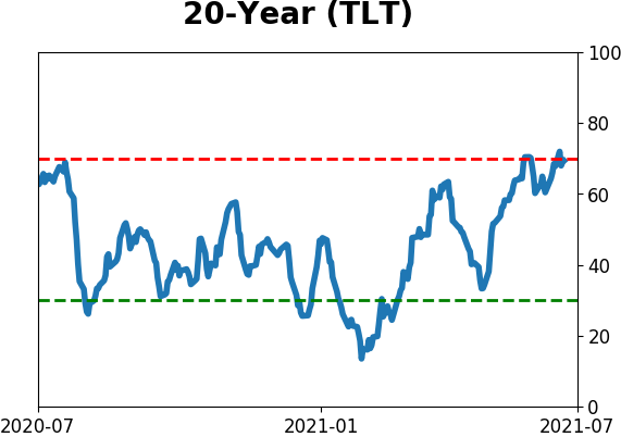
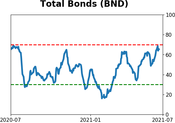
Bond ETF's - 10-Day Moving Average
|
|
|
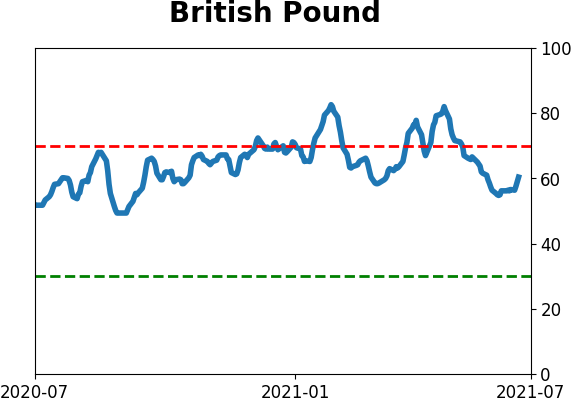
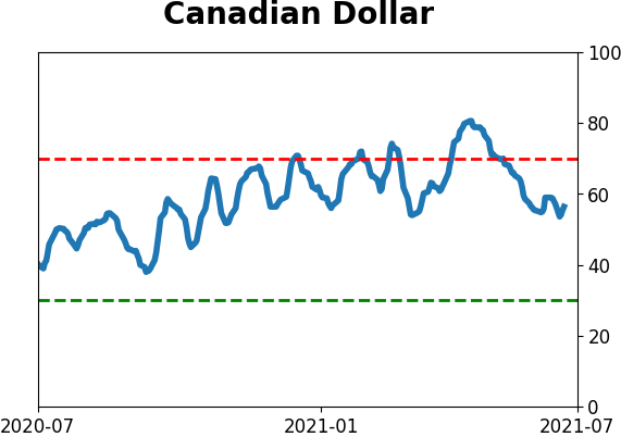
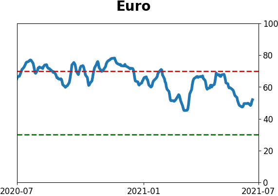
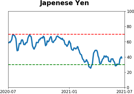
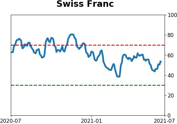
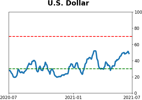
Currency ETF's - 5-Day Moving Average
|
|
|
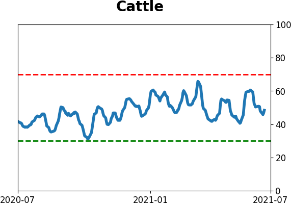
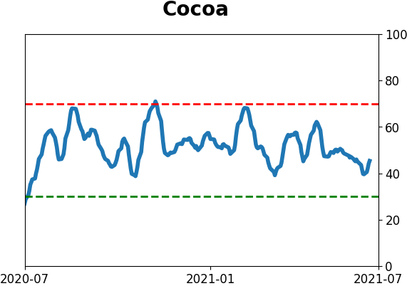
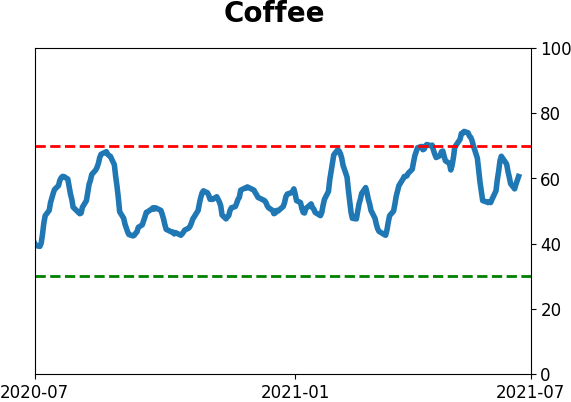
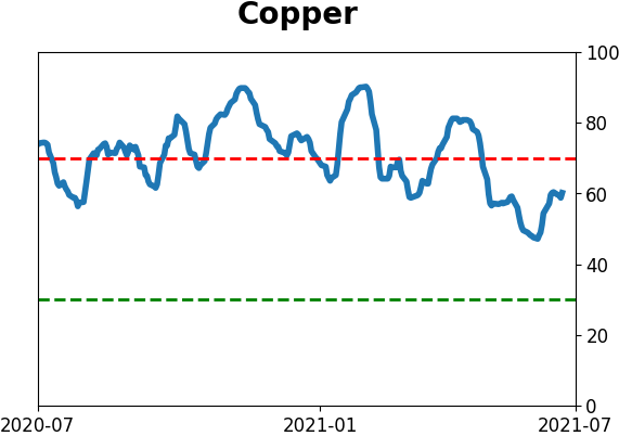
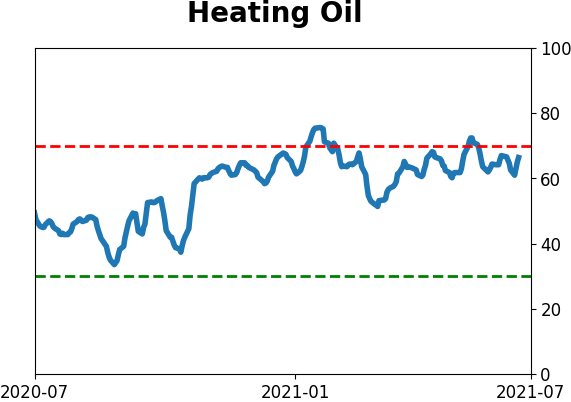
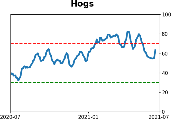
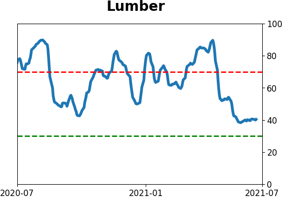
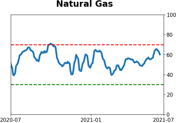
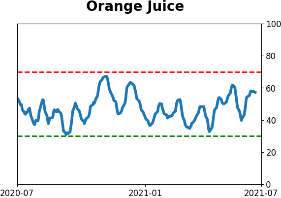
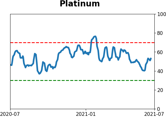
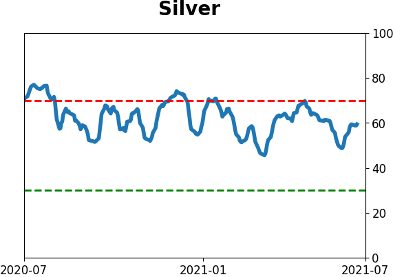
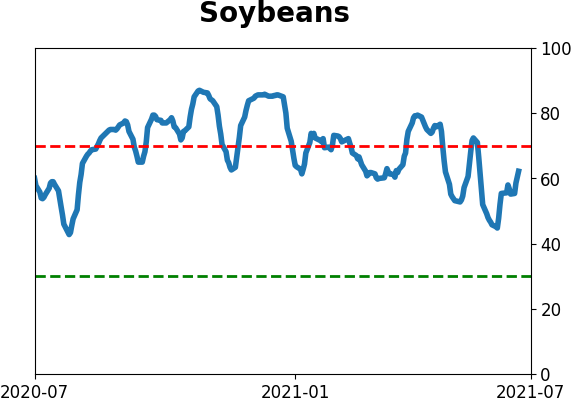
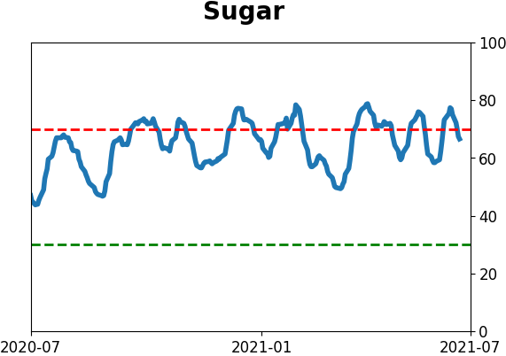
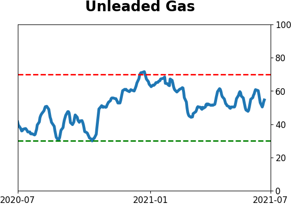
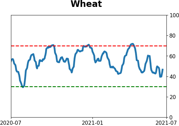
Commodity ETF's - 5-Day Moving Average
|
|