Headlines
|
|
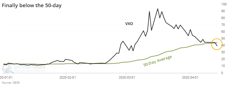
VIX drops below 50-day average:
The VIX "fear gauge" crossed below its 50-day average for the first time in almost 2 months, after showing a high level of panic. That has usually led to shorter-term chop, but was typically a sign that the worst was over long-term.
Another thrust narrowly missed:
Once again this week, stocks missed triggering a technical buying thrust by the narrowest of margins. A trio of signals popularized by Wayne Whaley in a 2009 white paper were on track to trigger this week, but didn't quite make it. Even so, when stocks matched the conditions they have seen over the past week, they continued higher.
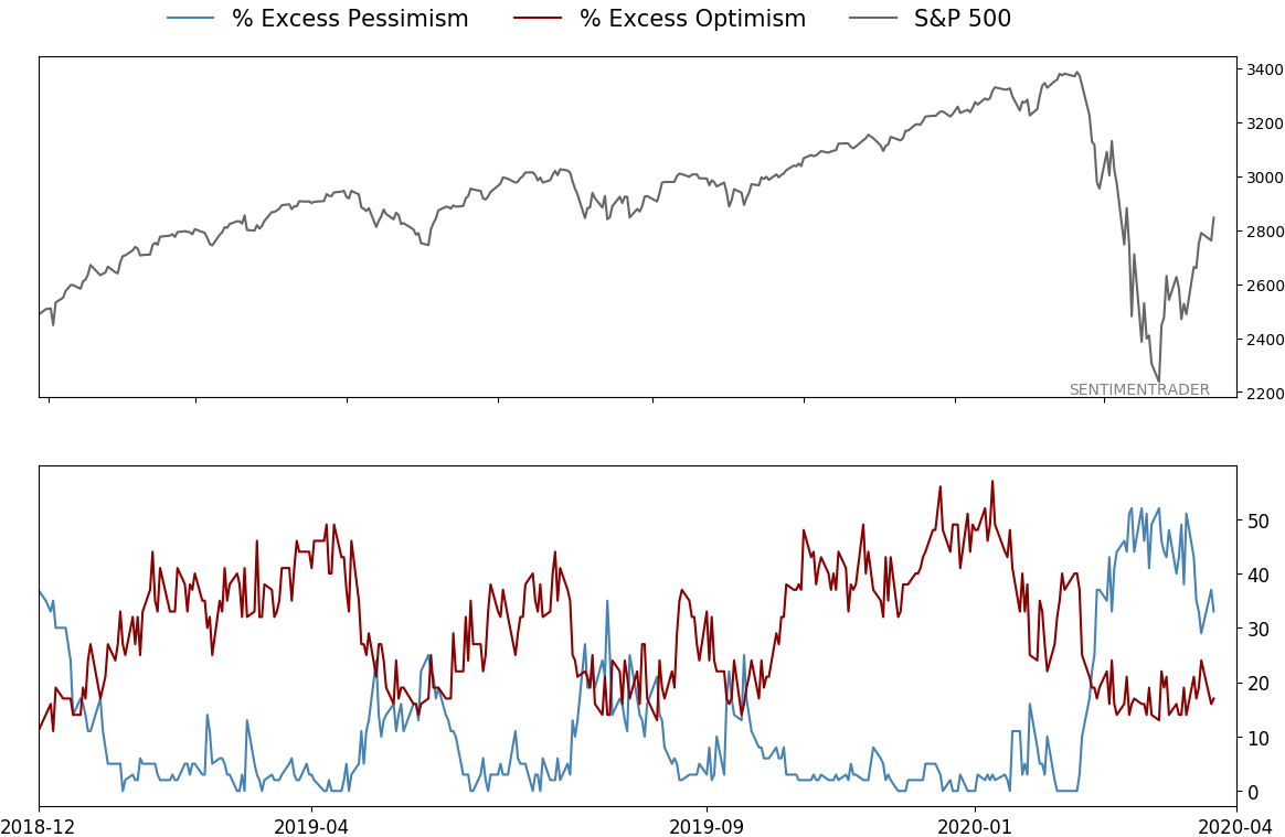
An overwhelming number of buy signals:
More and more stocks within the S&P 500 have triggered buy signals using a Point & Figure methodology. This follows a period when almost all of the stocks had been on sell signals. When this measure moves from a deep oversold to deep overbought reading, it has only triggered at important inflection points.
|
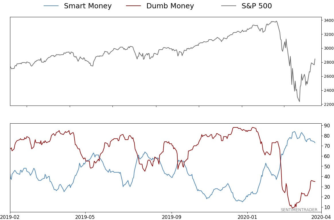
Smart / Dumb Money Confidence
|
Smart Money Confidence: 73%
Dumb Money Confidence: 35%
|
|
Risk Levels
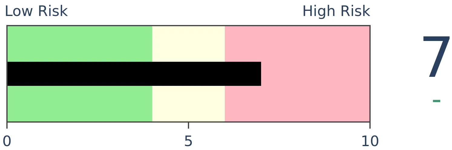
Stocks Short-Term
|
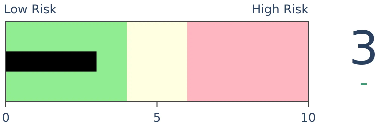
Stocks Medium-Term
|
|
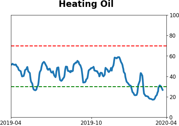
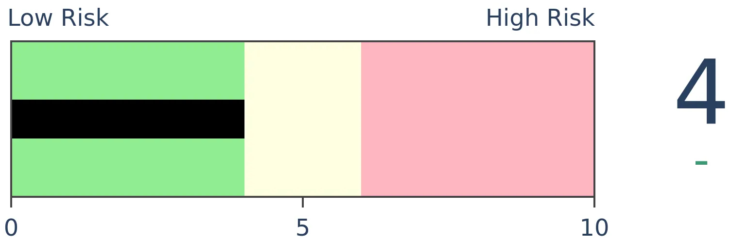
Bonds

|
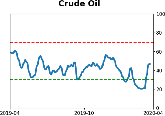
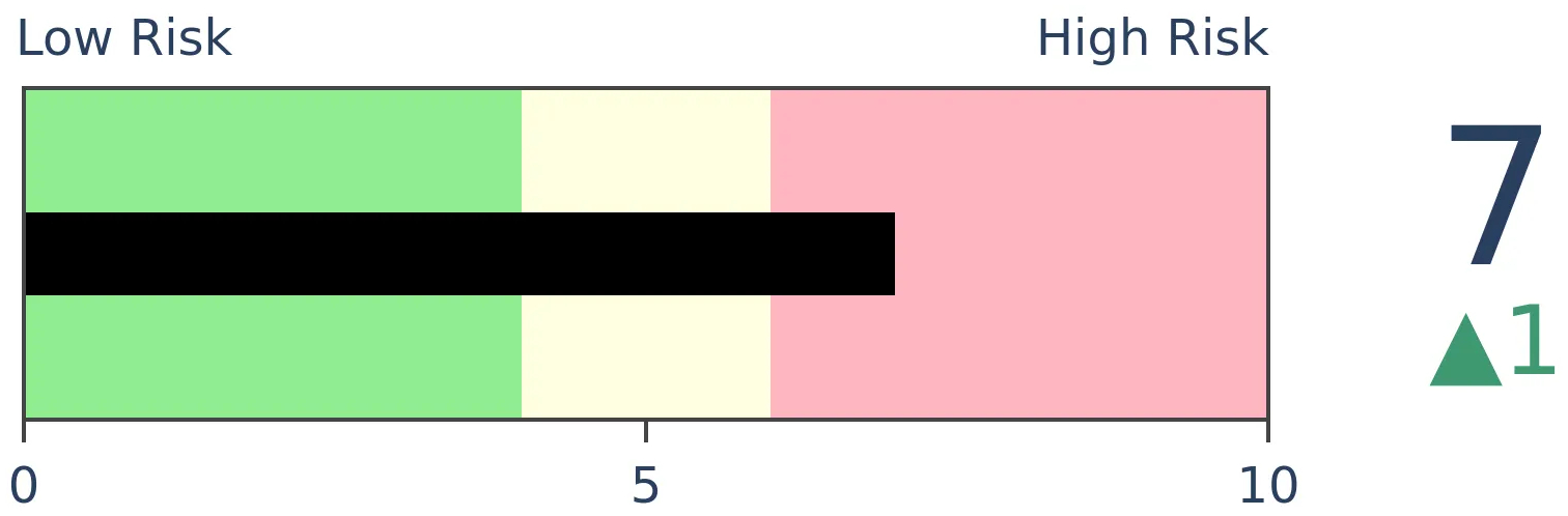
Crude Oil
|
|
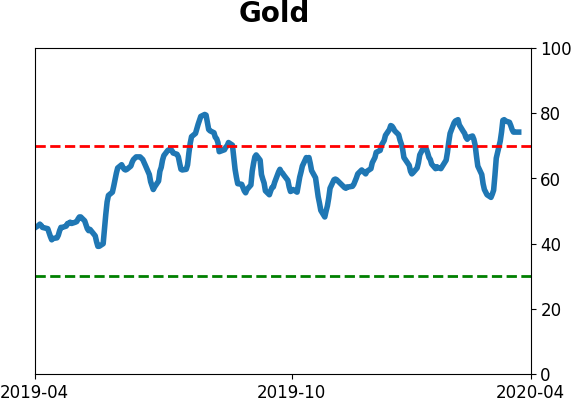
Gold

|
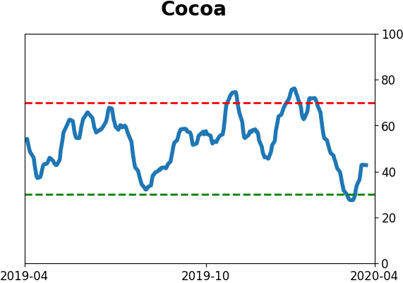
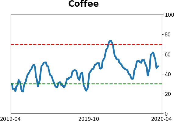
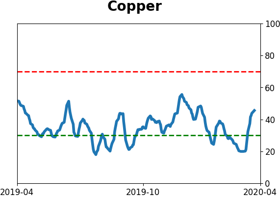
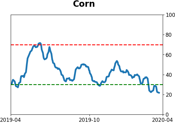
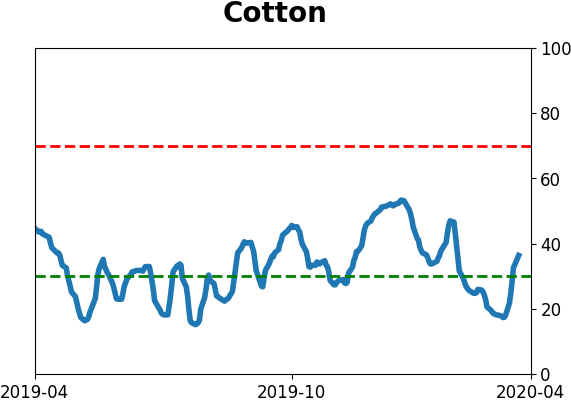
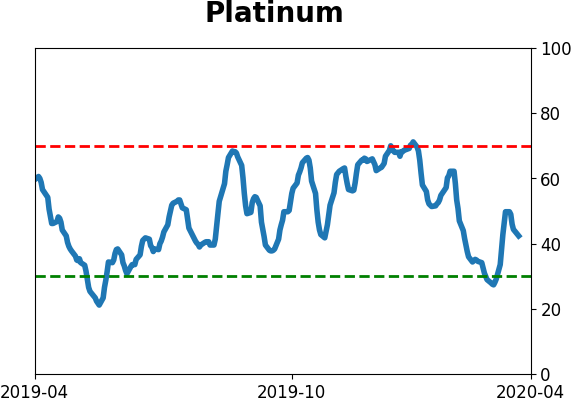
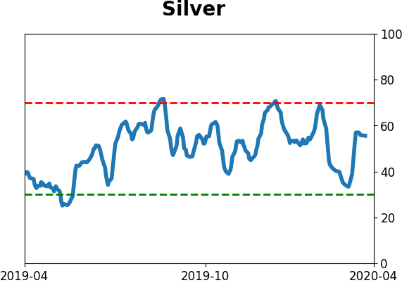
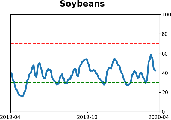
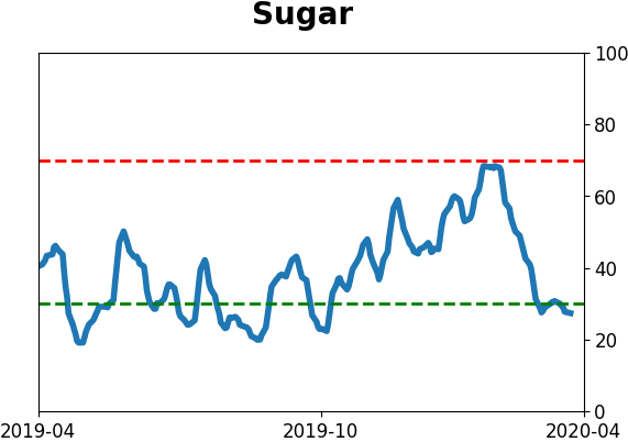
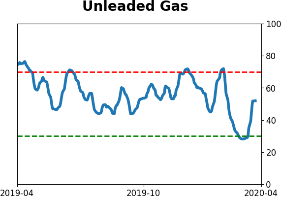
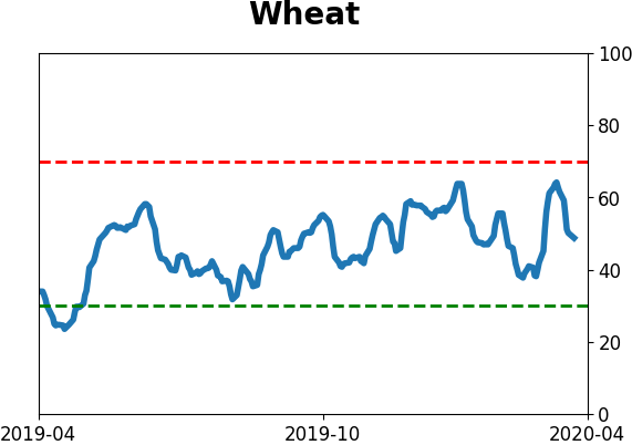
Agriculture
|
|
Research
BOTTOM LINE
The VIX "fear gauge" crossed below its 50-day average for the first time in almost 2 months, after showing a high level of panic. That has usually led to shorter-term chop, but was typically a sign that the worst was over long-term.
FORECAST / TIMEFRAME
SPY -- Down, Short-Term
|
Volatility continues to seep lower, and the VIX "fear gauge" has shown signs of reversing its medium-term trend. For the first time in nearly two months, it has closed below its 50-day moving average, suggesting a regime of lower volatility ahead.
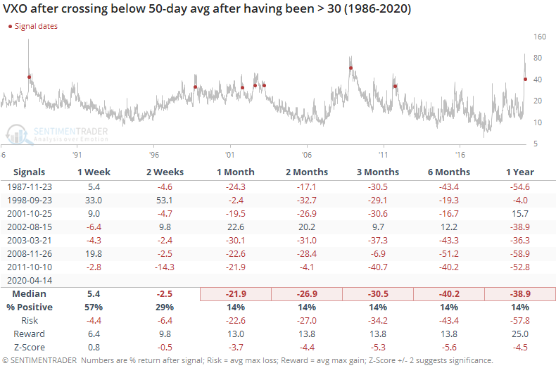
To get more history, we use the old VIX calculation (VXO).
This ends one of the longer streaks above its 50-day average since 1986.
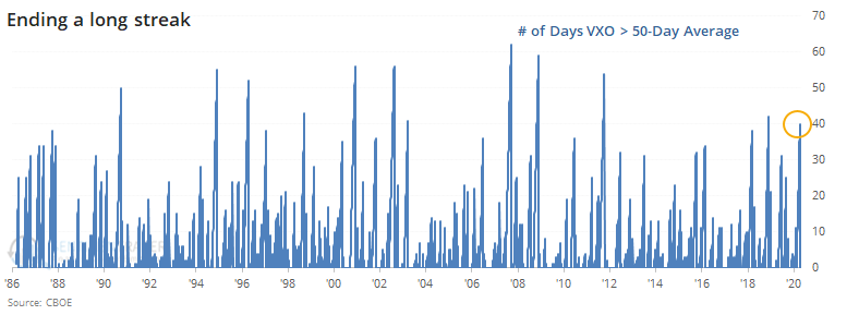
One the VXO has dropped below its 50-day after having been above it for at least 30 days, with a high of at least 30 during its streak, the S&P 500 has usually struggled in the short-term, with some big swings. But it was typically a sign that the most of the losses were behind.
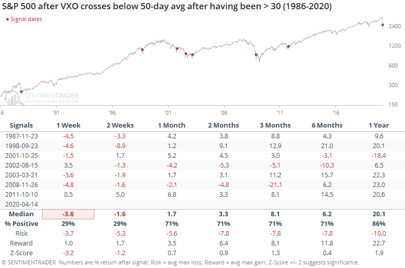
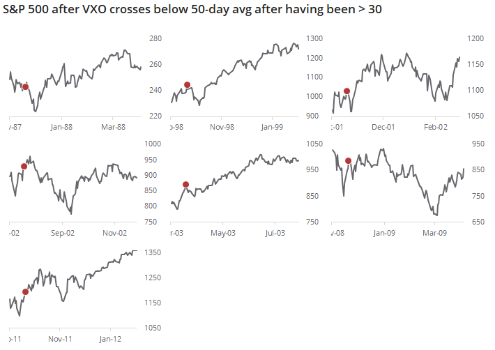
The thumbnail charts show just how volatile the next few weeks tended to be, with almost immediate losses, then a recovery.
For the VXO itself, it was mostly the opposite pattern, with a jump during the next week, then solid losses.
This is further sign of a lasting recovery, but doesn't say much about the near-term risk to those who are just now trying to jump in.
BOTTOM LINE
Once again this week, stocks missed triggering a technical buying thrust by the narrowest of margins. A trio of signals popularized by Wayne Whaley in a 2009 white paper were on track to trigger this week, but didn't quite make it. Even so, when stocks matched the conditions they have seen over the past week, they continued higher.
FORECAST / TIMEFRAME
None
|
Once again, we almost got an "official" thrust, but didn't quite make it.
Starting in late March and triggering multiple times since then, there have been days with overwhelmingly positive buying pressure (see here and here and here and here).
Even so, at the start of this month we narrowly missed a commonly-defined breadth thrust. By the smallest of margins, breadth wasn't quite good enough to trigger a Zweig Breadth Thrust. As we saw at the time, that was not a good reason to worry.
Heading into Monday's session, we were on track to trigger another type of breath thrust, popularized in a white paper by Wayne Whaley over a decade ago. Like the Zweig thrust, it relies on very precise parameters. And like the Zweig concept, we barely missed triggering those parameters because of one bad day. Out of 3 possible triggers, only 1 of them actually exceeded the required threshold.
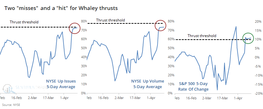
Because of a relatively large number of declining issues on Monday, stocks barely missed triggering one of the conditions. But it does't really matter, it's the concept that counts.
There were some periods in history when there was a surge in Up Issues, but not Up Volume. Or maybe breadth was good, but the return in the S&P wasn't so great. Over the past week, though, we've seen a surge in all three measures, even if they didn't quite exceed the precise thresholds given in the white paper.
Below, we can see every time since 1962 when Up Issues and Volume both hit a very high level, along with a big surge in the S&P 500.
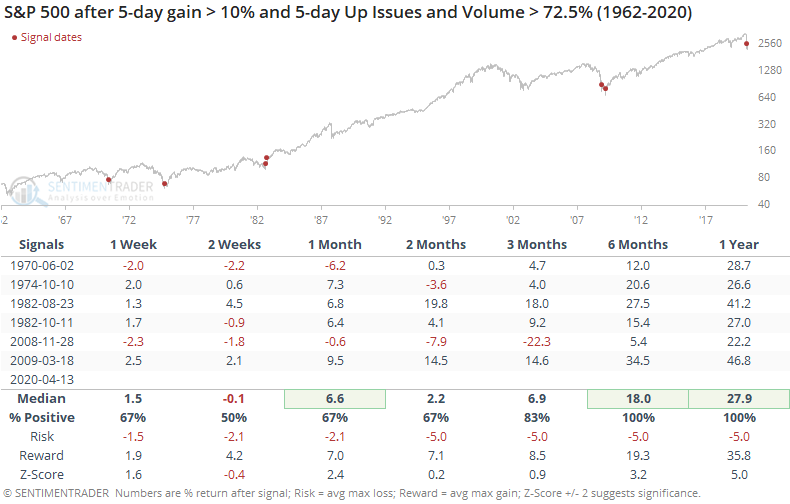
Like we've seen after a lot of thrust-type signals, returns in the shorter-term were mixed to weak. But over the medium- to long-term, these were important signs of a change in buyers' mentality. The overwhelming display of buying interest was an important sign that sentiment had shifted enough to be permanent, or at least enough to lead to another 6-12 months of a get-me-in mentality.
BOTTOM LINE
More and more stocks within the S&P 500 have triggered buy signals using a Point & Figure methodology. This follows a period when almost all of the stocks had been on sell signals. When this measure moves from a deep oversold to deep overbought reading, it has only triggered at important inflection points.
FORECAST / TIMEFRAME
None
|
According to a popular charting service, a huge number of stocks within the S&P 500 have flipped to buy signals.
The indicator measures how many stocks within the index are currently on buy signals. A buy signal is given when the Point & Figure chart is showing an uptrend.
According to Investopedia:
Contrary to some other types of charts, like candlesticks, which mark the degree of an asset's movement over set time periods, P&F charts utilize columns consisting of stacked Xs or Os, each of which represents a set amount of price movement. The Xs illustrate rising prices, while Os represent a falling price.
Technicians use P&F charts in various ways, from simple reversals to trendline analysis to pattern recognition. For example, the P&F pattern carved out in recent months is very close to what happened from January through June 2009.
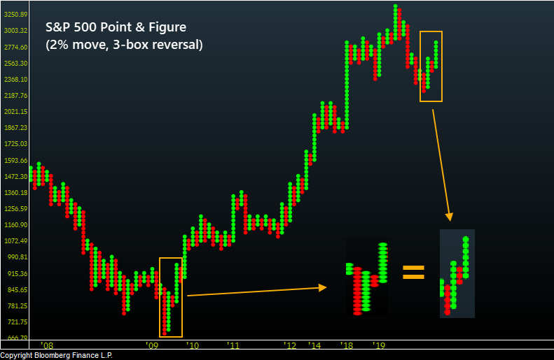
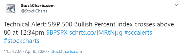
The reason this is getting attention now is because almost all stocks within the S&P 500 were on sell signals in March, and in recent sessions most of them have flipped to buy signals, as noted by StockCharts.
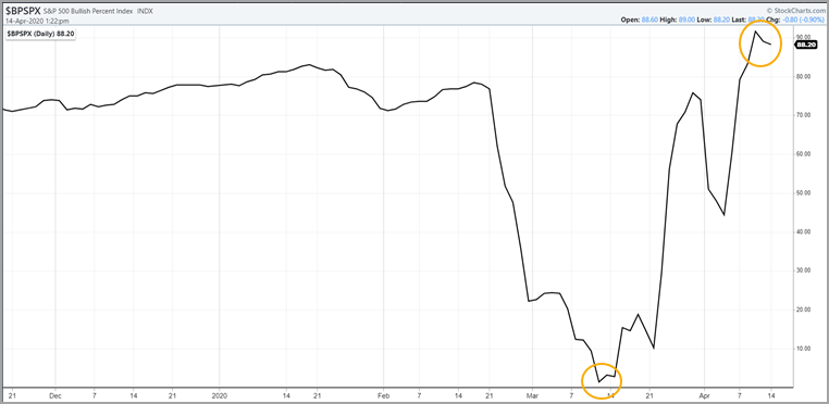
To say this is unusual is an understatement. Going back to 1996, it's only occurred 3 other times, and their implications were consistent.
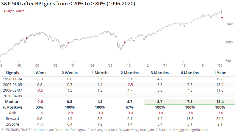
While all of them saw a period of consolidation after the surge in P&F buy signals, at least over the next week or two, they all resumed their march higher in the months ahead.
The risk/reward table was impressive as well.
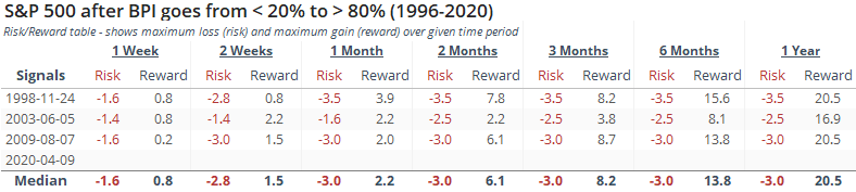
Even though these signals triggered during (or more accurately, after) a few of the most volatile stretches in 25 years, maximum losses over the next year were limited to -3.5%, while maximum gains were all in the double digits.
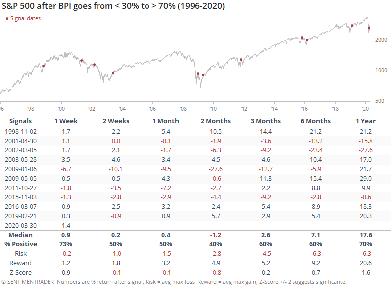
If we relax the parameters to get a larger sample size, the returns were not robust. The table was filled with at least temporary failures as these lesser extremes led to a quick resumption of the downtrend.
So the big question is whether we can rely on the tiny sample size based off an obscure indicator. Not really - we certainly wouldn't put a lot of weight on it.
But it's at least interesting to note that an overwhelming percentage of stocks have reversed enough on a percentage basis to trigger these buy signals, and every time it's cycled from so many sell signals to so many buys, it has coincided with important inflection points.
Active Studies
| Time Frame | Bullish | Bearish | | Short-Term | 0 | 2 | | Medium-Term | 11 | 0 | | Long-Term | 31 | 3 |
|
Indicators at Extremes
Portfolio
| Position | Weight % | Added / Reduced | Date | | Stocks | 73.2 | Added 31.3% | 2020-03-17 | | Bonds | 0.0 | Reduced 6.7% | 2020-02-28 | | Commodities | 5.5 | Added 2.4%
| 2020-02-28 | | Precious Metals | 0.0 | Reduced 3.6% | 2020-02-28 | | Special Situations | 0.0 | Reduced 31.9% | 2020-03-17 | | Cash | 21.3 | | |
|
Updates (Changes made today are underlined)
In the first months of the year, we saw manic trading activity. From big jumps in specific stocks to historic highs in retail trading activity to record highs in household confidence to almost unbelievable confidence among options traders. All of that has come amid a market where the average stock can’t keep up with their indexes. There were signs of waning momentum in stocks underlying the major averages, which started triggering technical warning signs in late January. The kinds of extremes we saw in December and January typically take months to wear away, but the type of selling we’ve seen over the past month has gone a long way toward getting there. When we place the kind of moves we saw into March 23 into the context of coming off an all-time high, there has been a high probability of a multi-month rebound. The volatility we’ve seen lately is extremely compelling from a medium-term point of view. Virtually everything we’ve looked at suggests a strong probability of gains over the next several months, even within the context of a potential bear market, and even from what had been higher prices. After stocks bottomed on the 23rd, they enjoyed a historic buying thrust. While other signs are mixed at best that panic is subsiding, that thrust is one of the most encouraging sign we've seen in years. There is often a test of a panic low in the weeks after an initial recovery, but that thrust we saw, combined with the larger-than-usual retracement, have me less convinced a test is necessary. For now, I see no overwhelming reason to add or reduce exposure.
RETURN YTD: -9.4% 2019: 12.6%, 2018: 0.6%, 2017: 3.8%, 2016: 17.1%, 2015: 9.2%, 2014: 14.5%, 2013: 2.2%, 2012: 10.8%, 2011: 16.5%, 2010: 15.3%, 2009: 23.9%, 2008: 16.2%, 2007: 7.8%
|
|
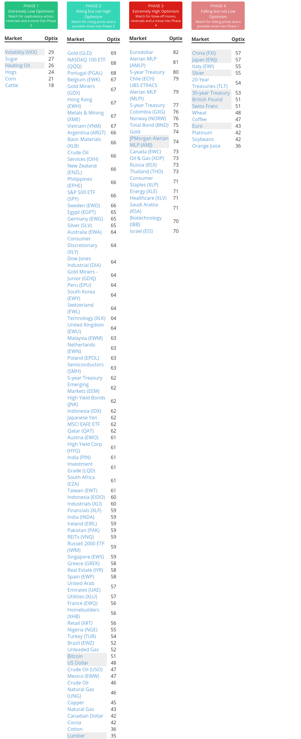
Phase Table
Ranks
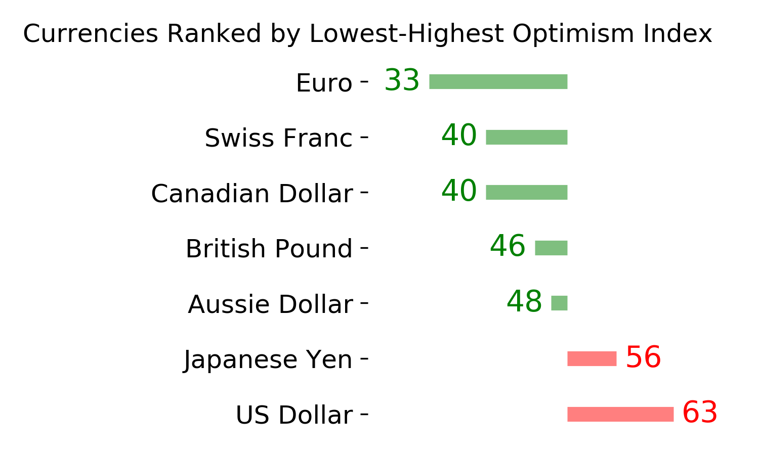
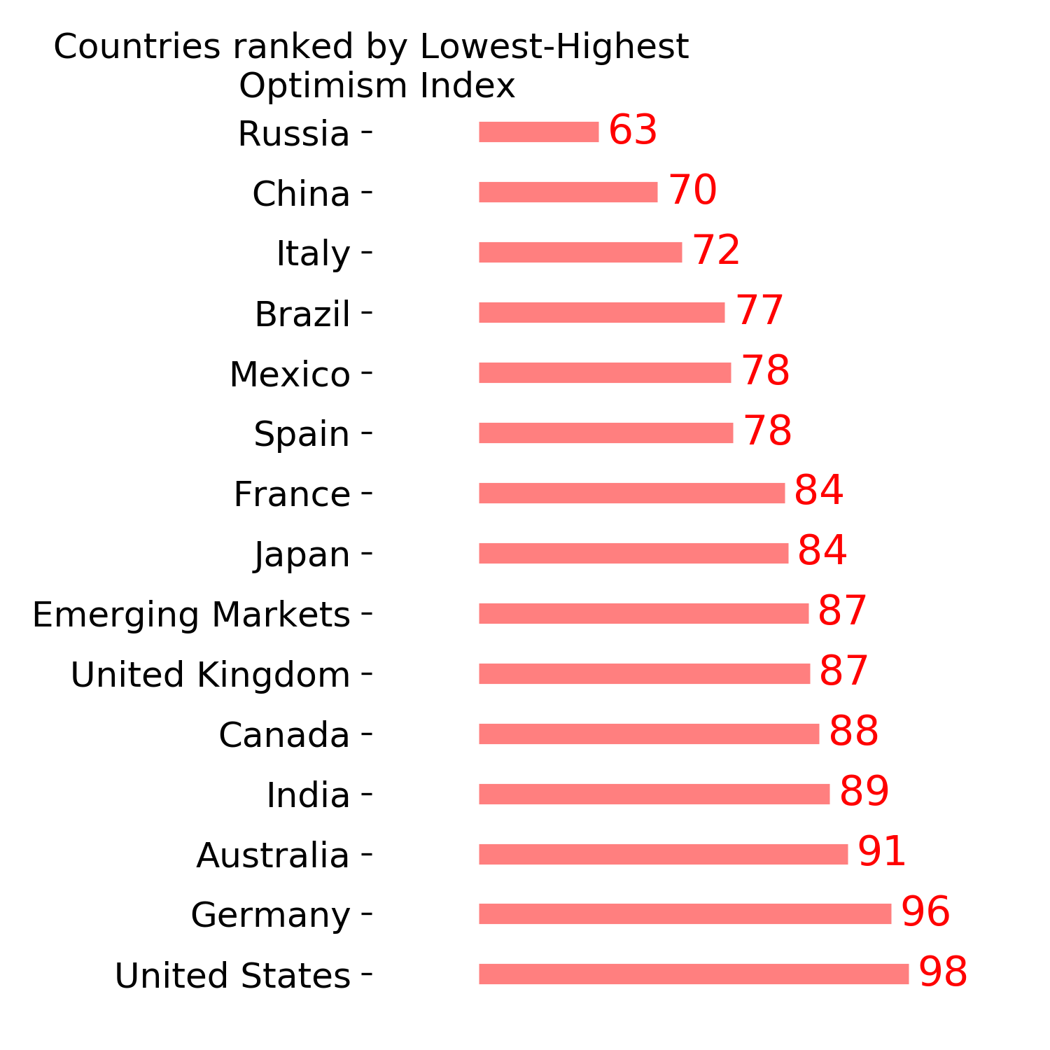
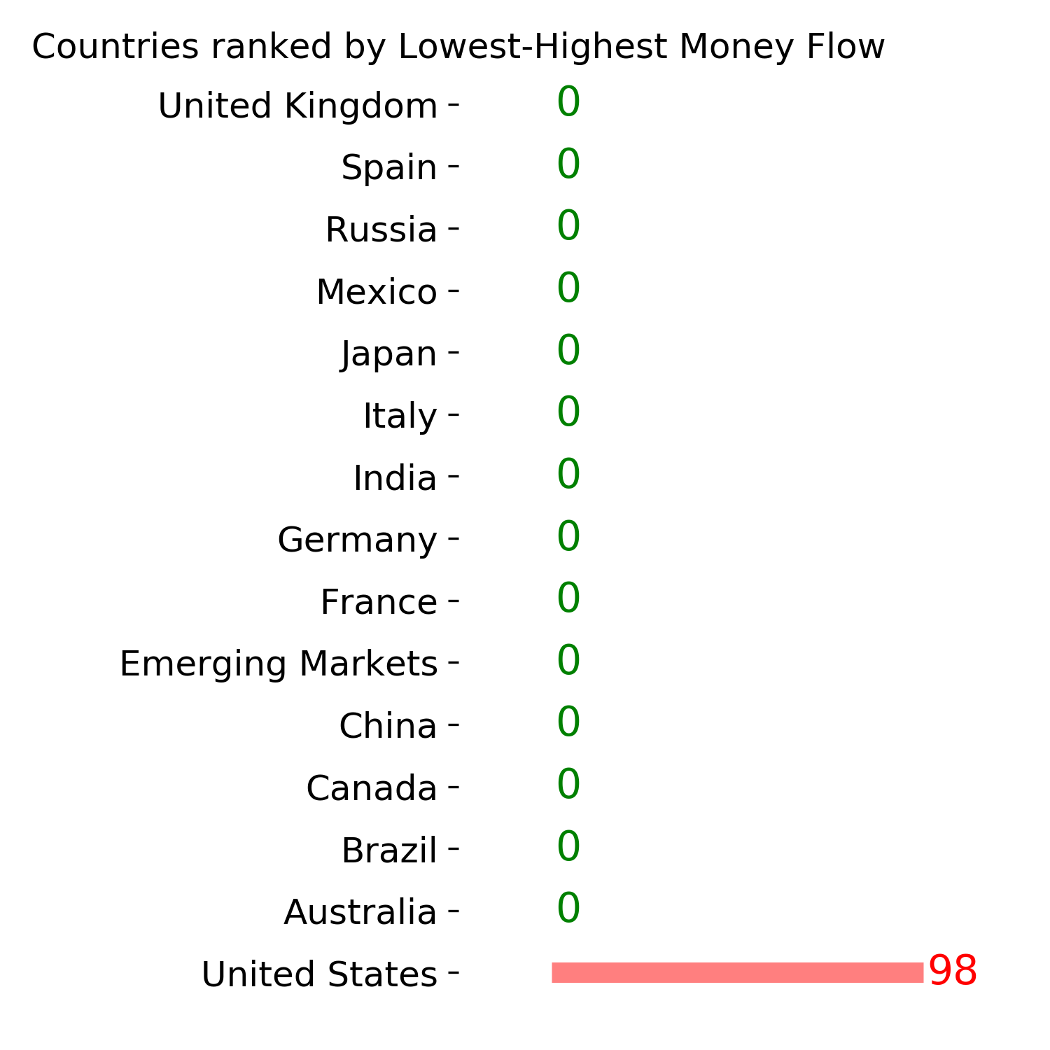
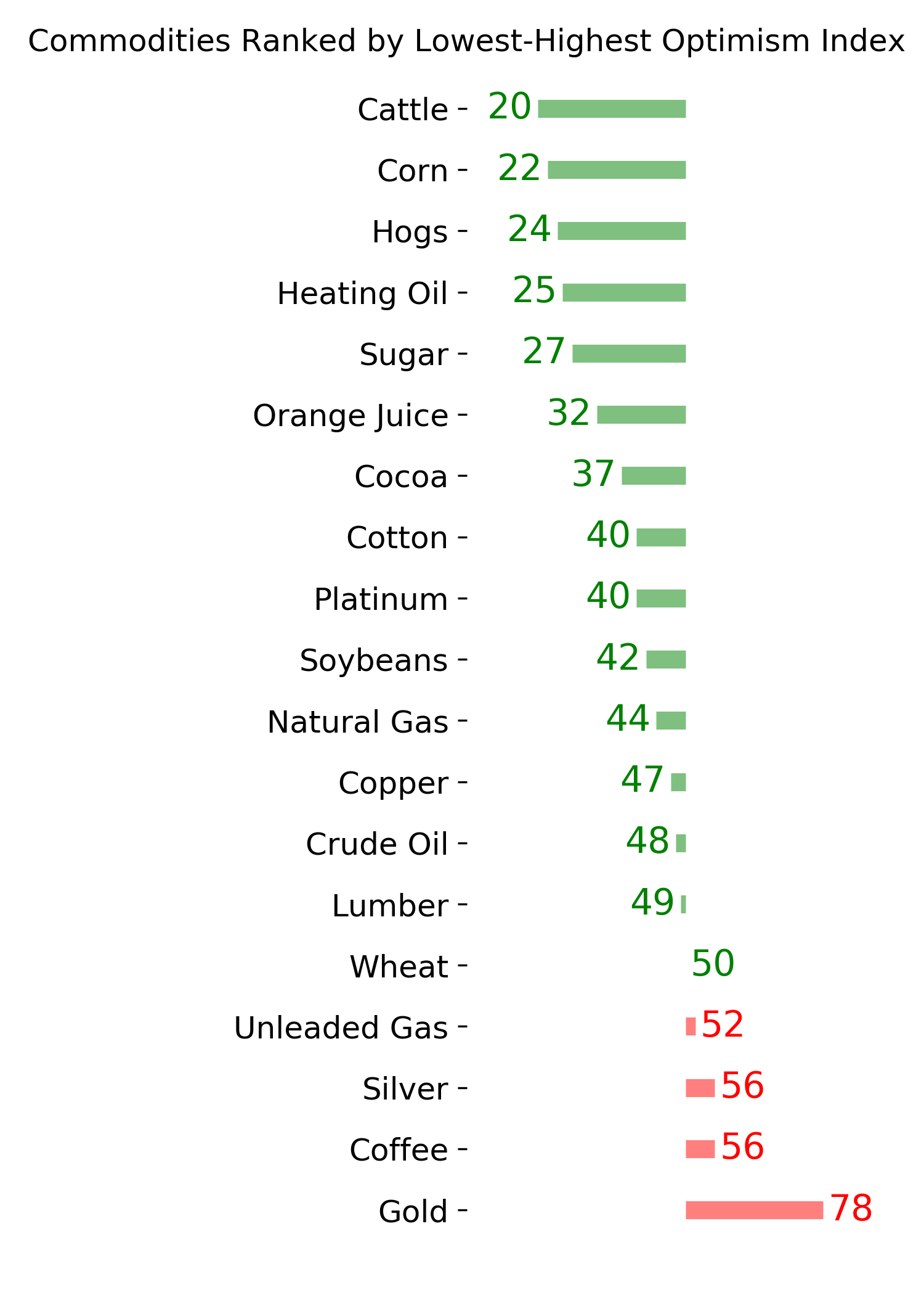
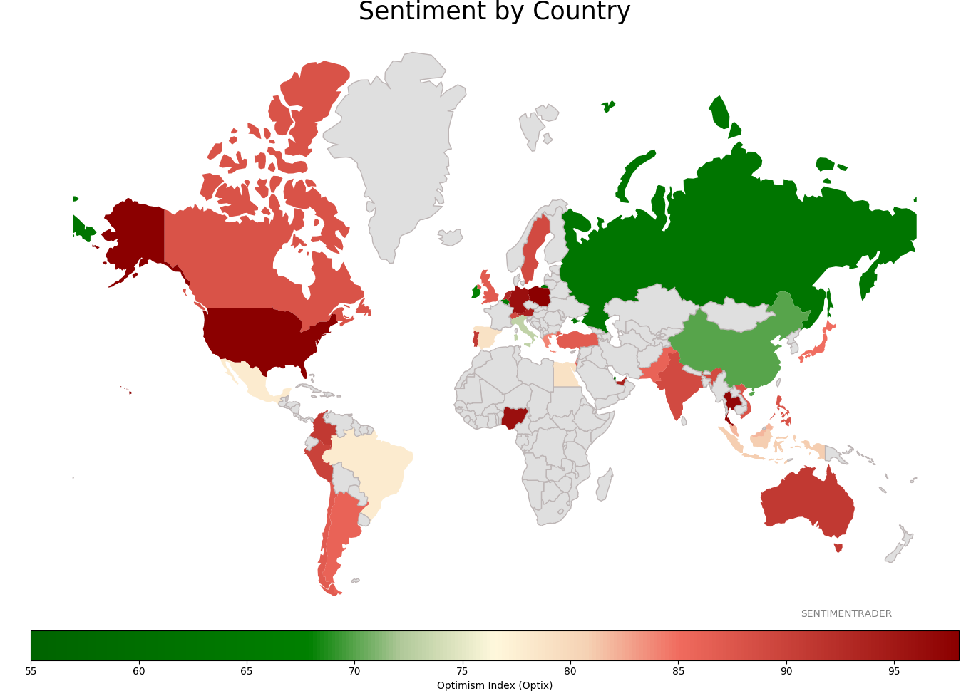
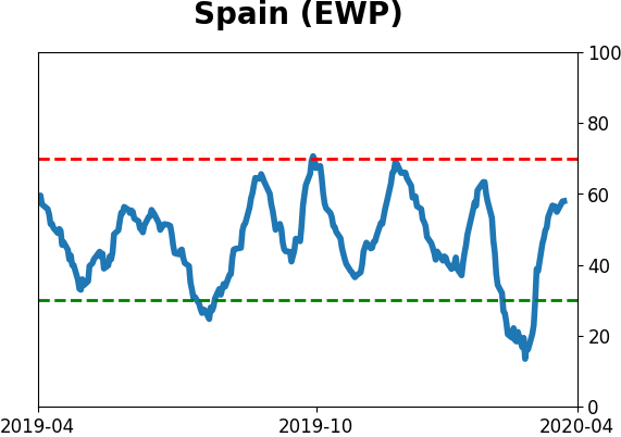
Sentiment Around The World
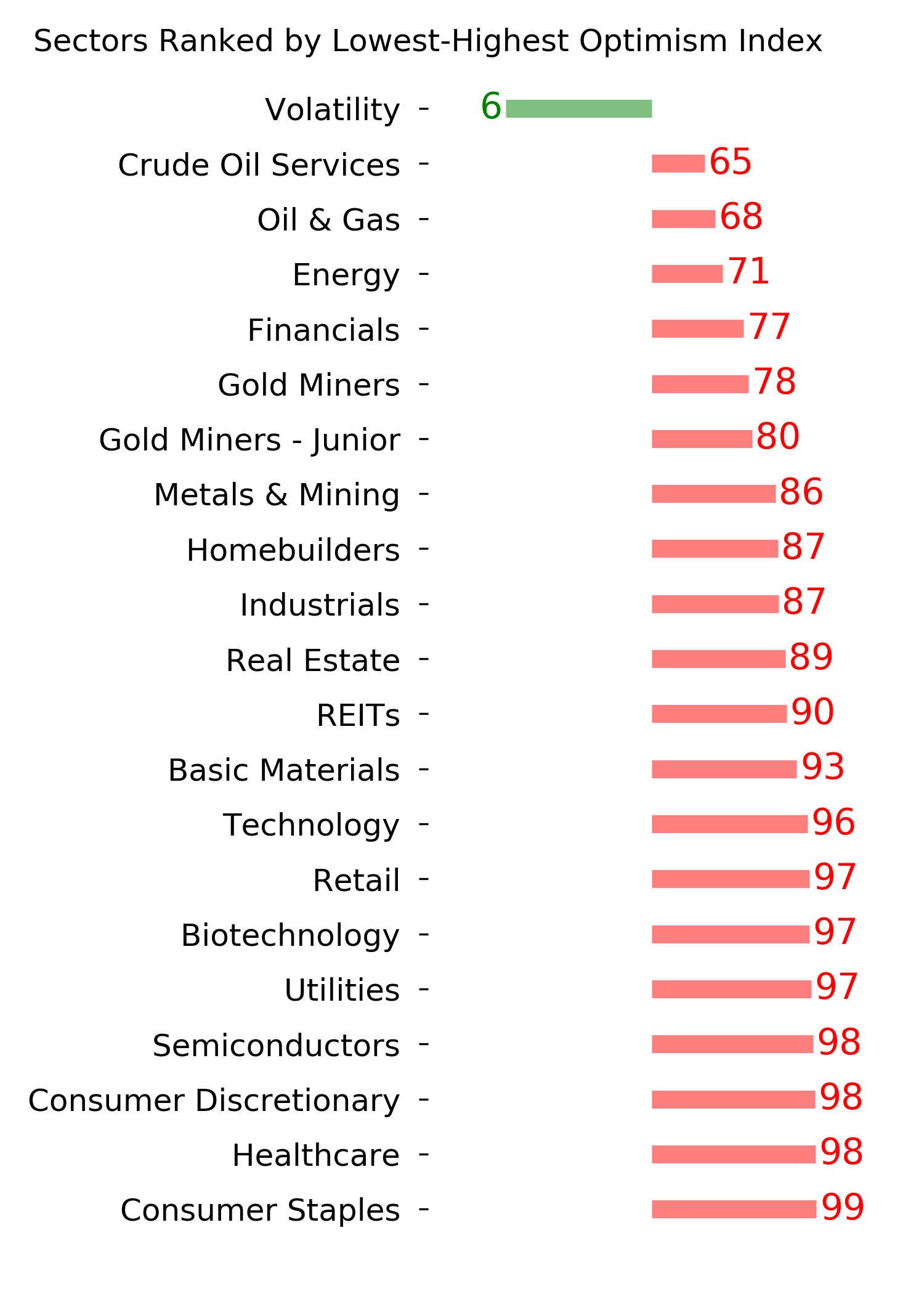
Optimism Index Thumbnails
|
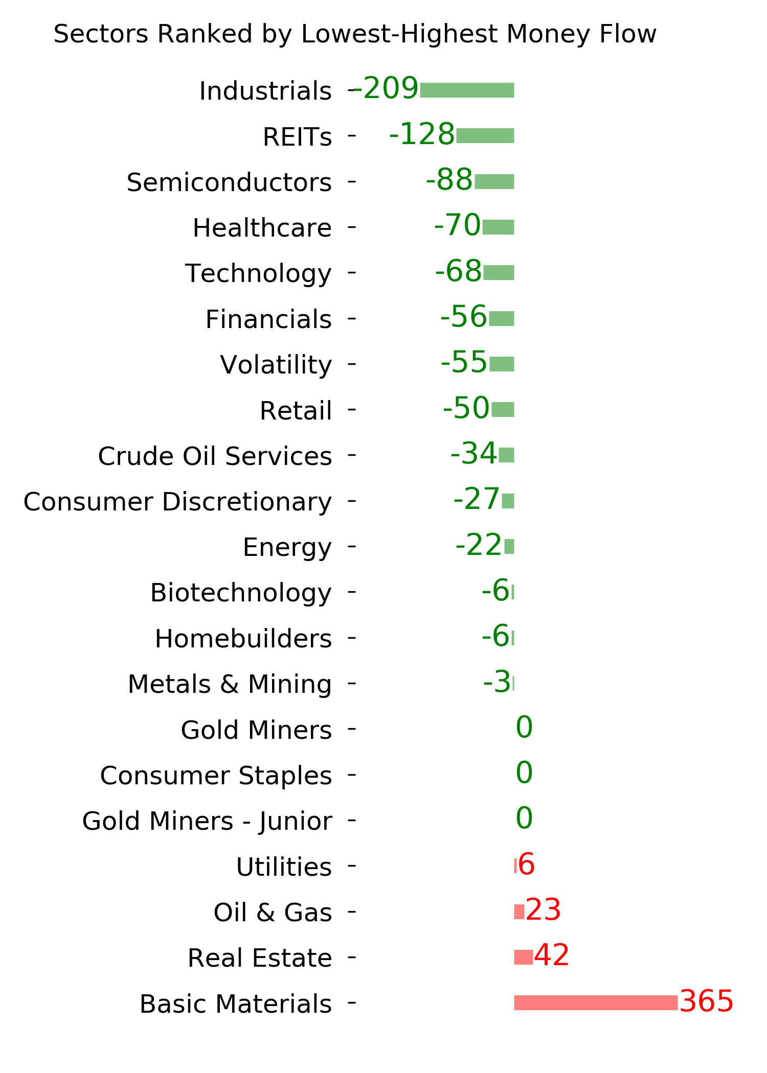
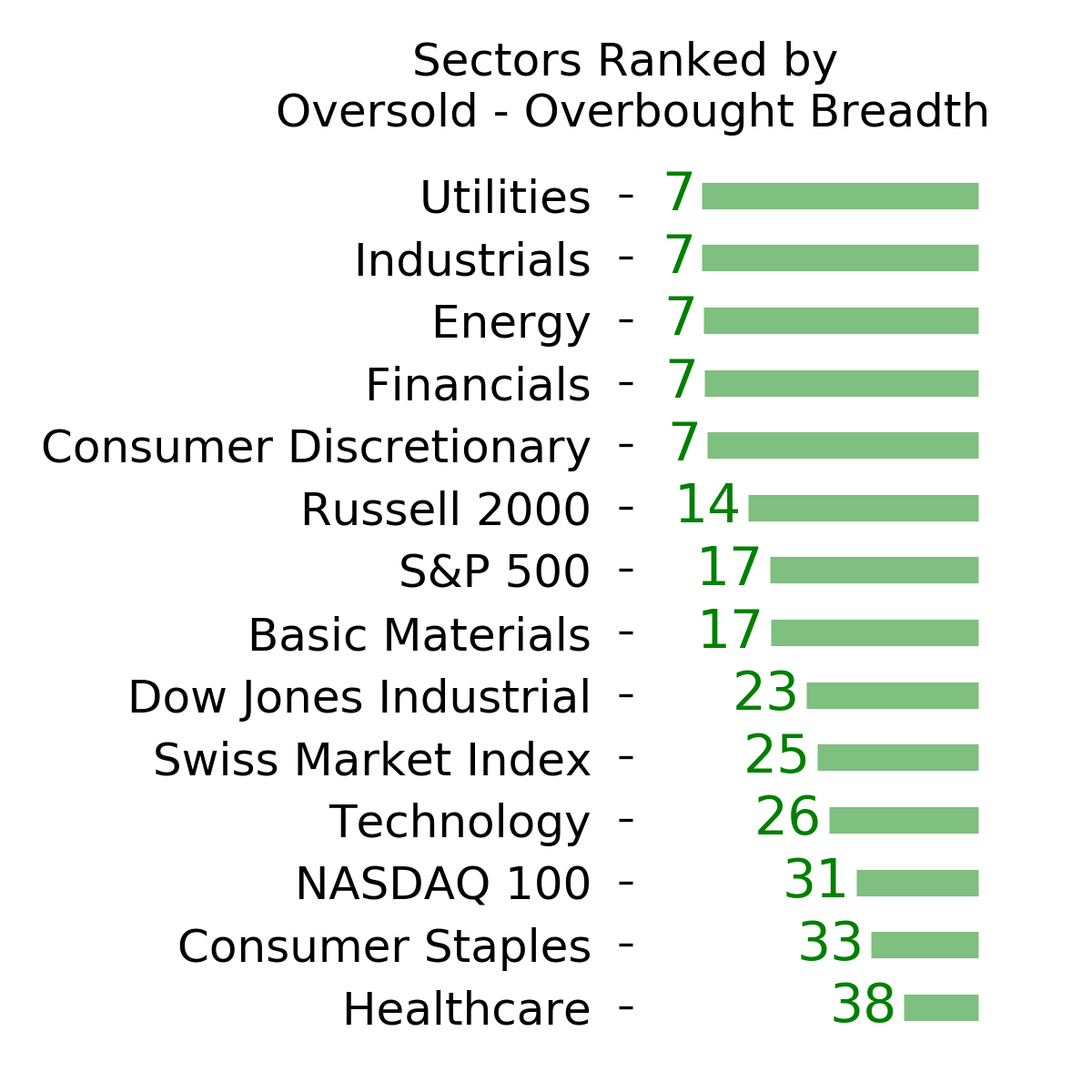
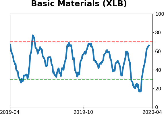
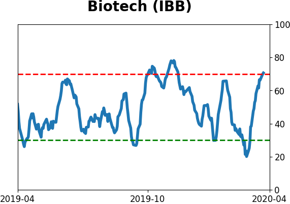
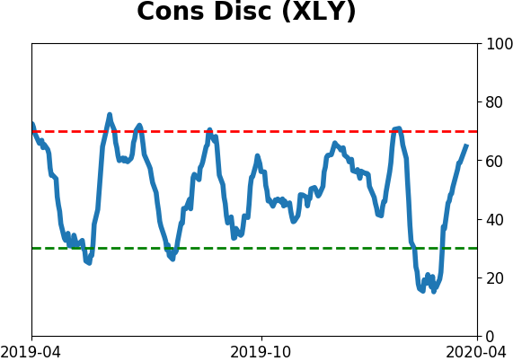
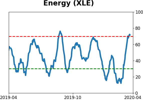
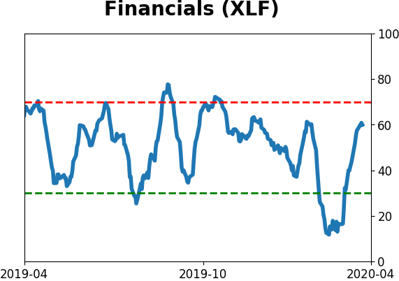
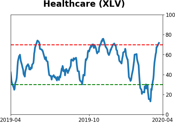
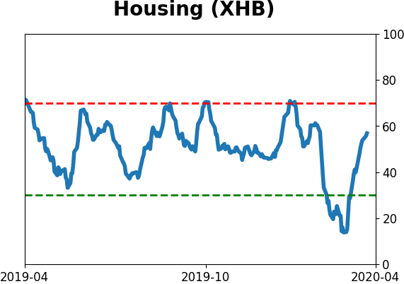
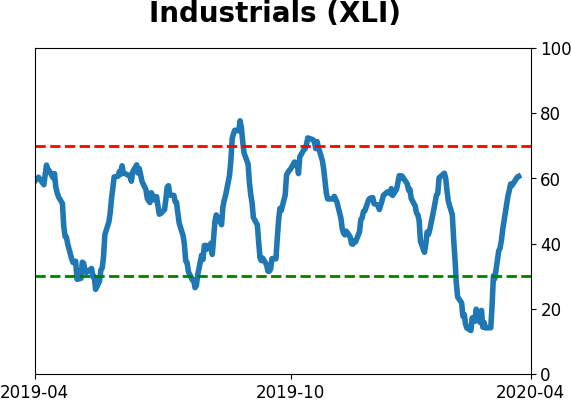
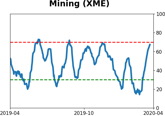
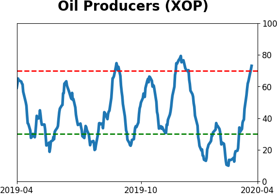
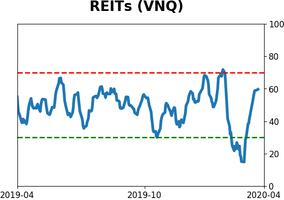
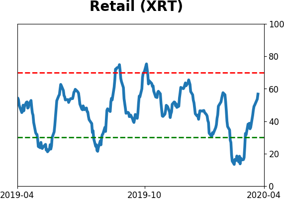
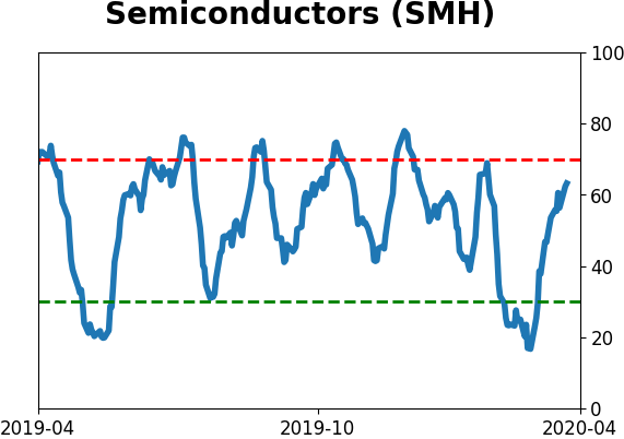
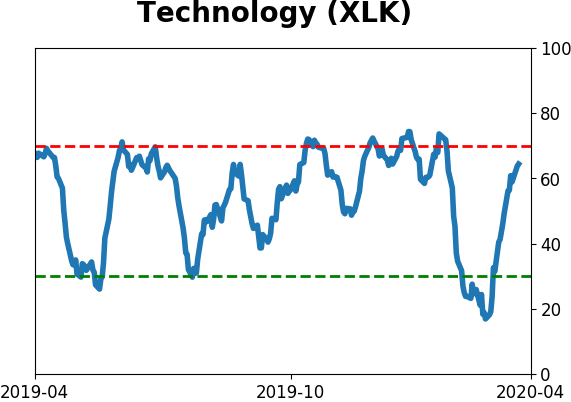
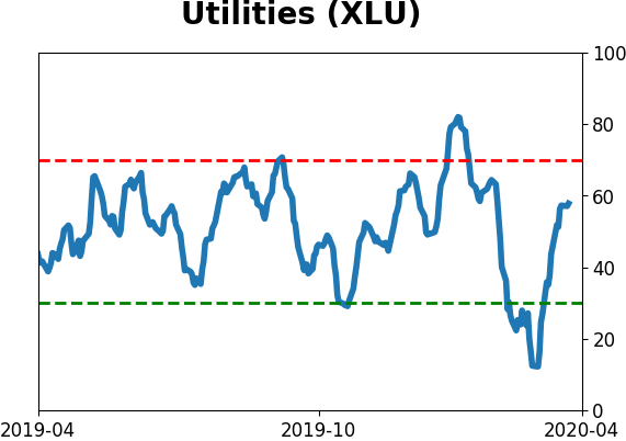
Sector ETF's - 10-Day Moving Average
|
|
|
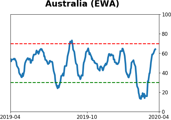
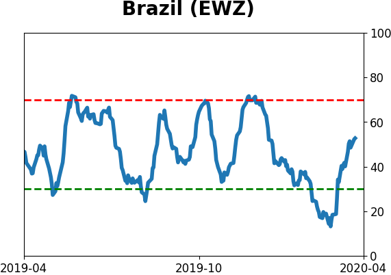
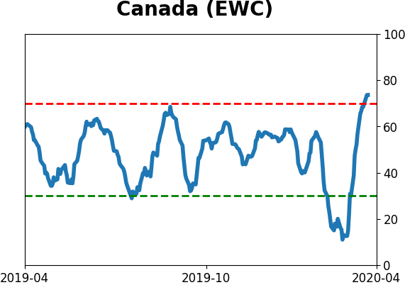
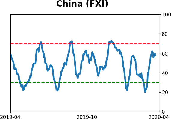
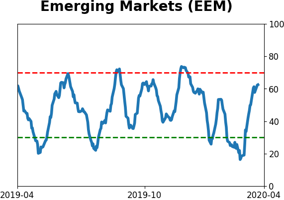
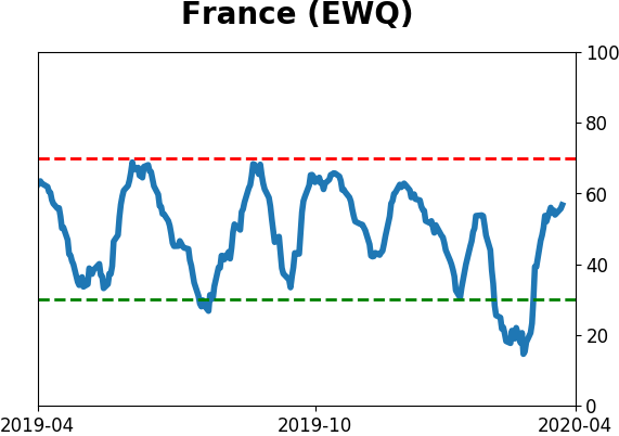
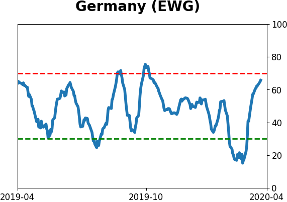
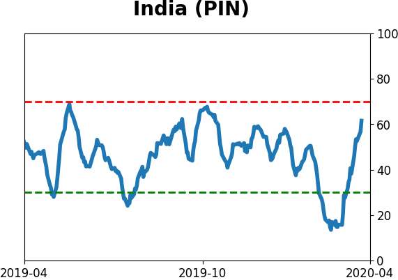
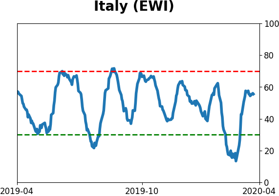
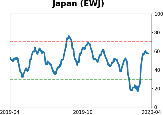
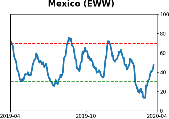
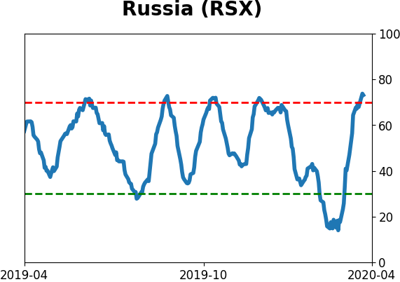
Country ETF's - 10-Day Moving Average
|
|
|
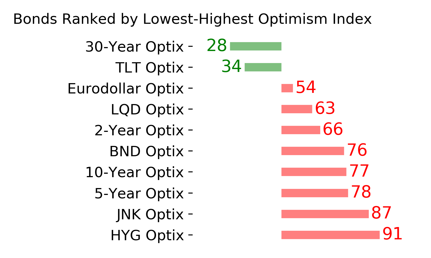
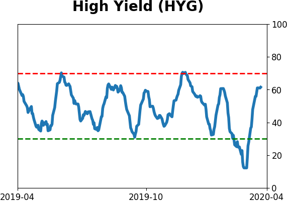
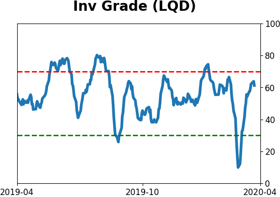
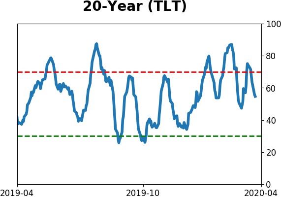
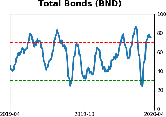
Bond ETF's - 10-Day Moving Average
|
|
|
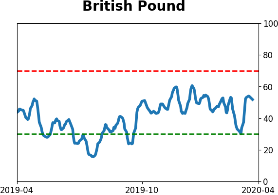
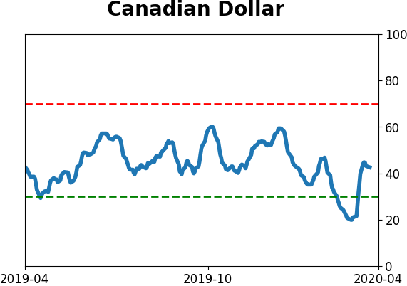
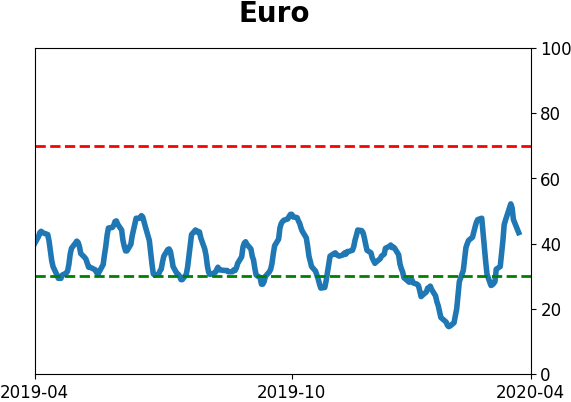
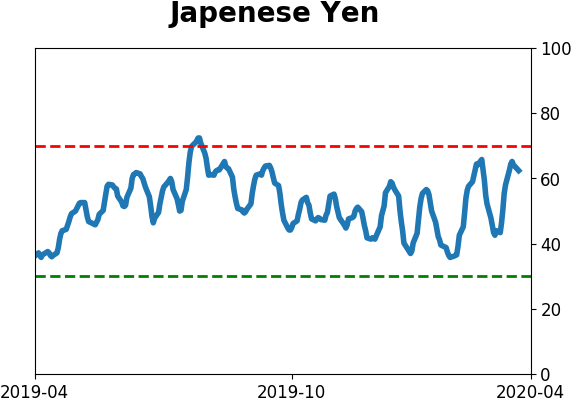
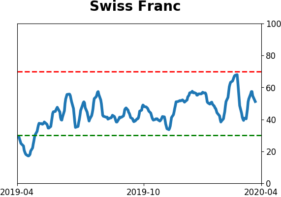
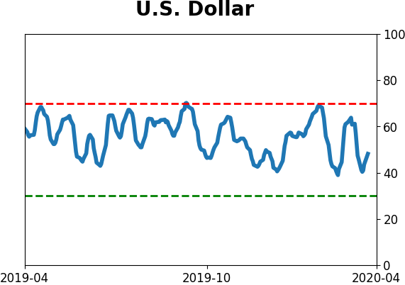
Currency ETF's - 5-Day Moving Average
|
|
|
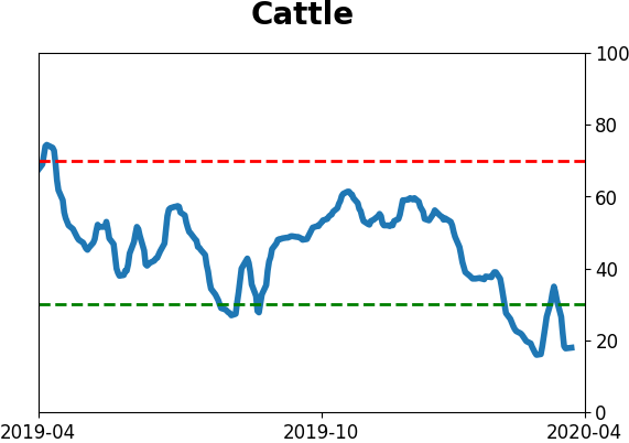
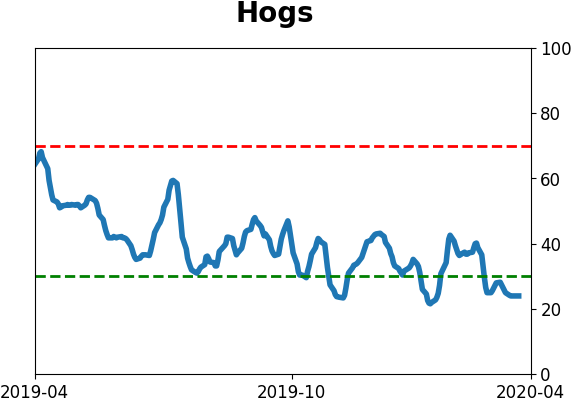
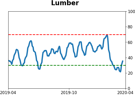
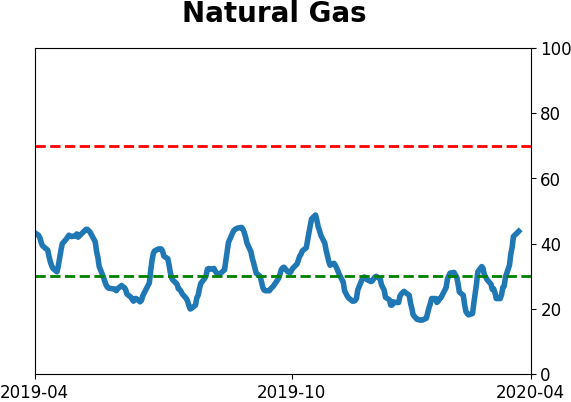
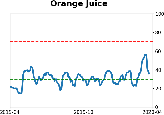
Commodity ETF's - 5-Day Moving Average
|
|