Headlines
|
|
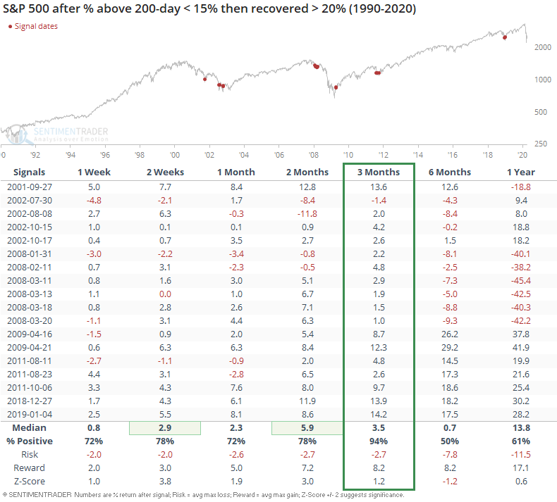
Recovering from under the 200 day average:
Few stocks within the S&P 500 have managed to climb above their 200-day moving averages. While that has typically meant the worst of the selling is over, it can also be early in the "puke" phase of a decline. If we optimize the parameters, we see that a good compromise is waiting until there is a modest sign of recovery.
Looking to financials for a bottoming clue:
The financial sector hasn't done much to confirm the idea that stocks are near a bottom. On a relative basis, they continue to reach lower lows. But a look at past bottoms shows that this is not unusual behavior, as the group rarely leads out of major declines.
|
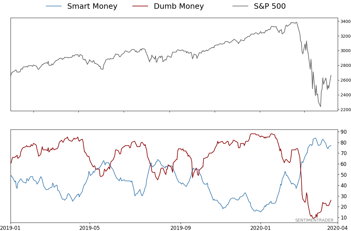
Smart / Dumb Money Confidence
|
Smart Money Confidence: 77%
Dumb Money Confidence: 26%
|
|
Risk Levels
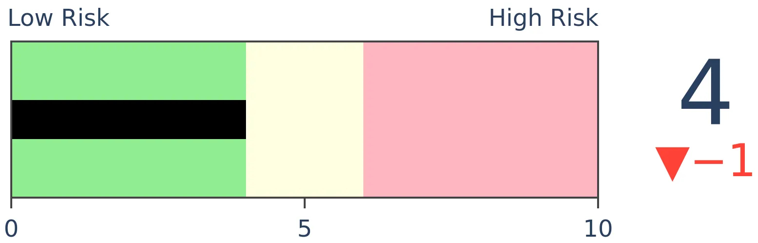
Stocks Short-Term
|
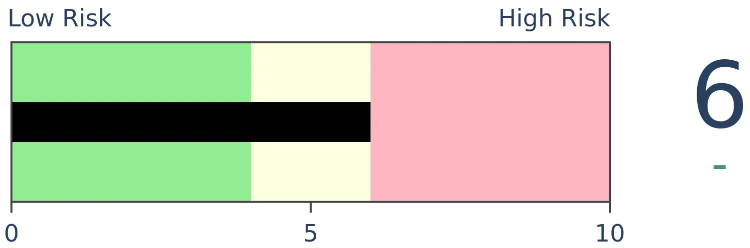
Stocks Medium-Term
|
|
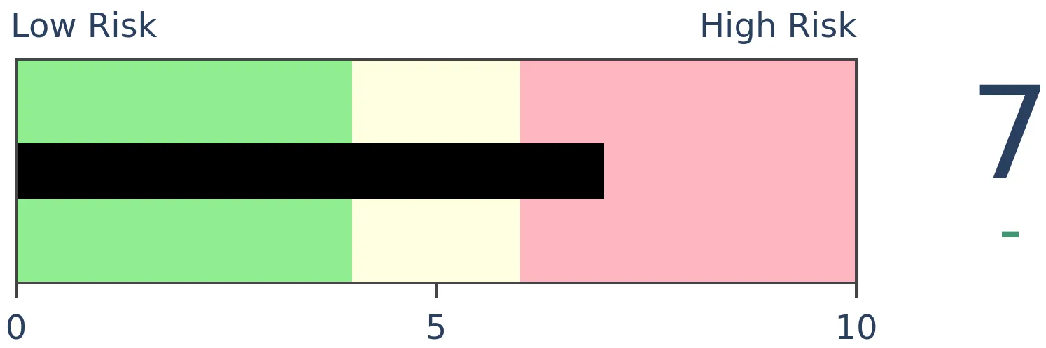
Bonds
|
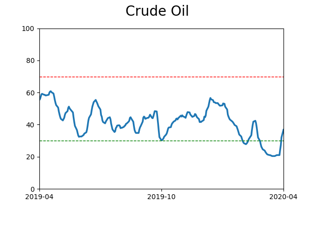
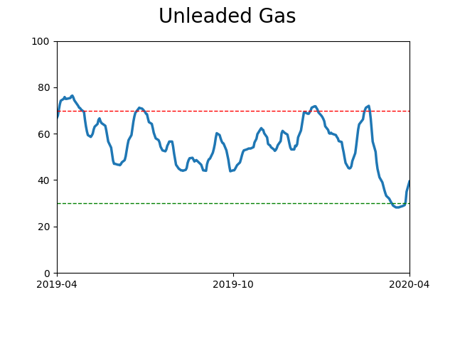
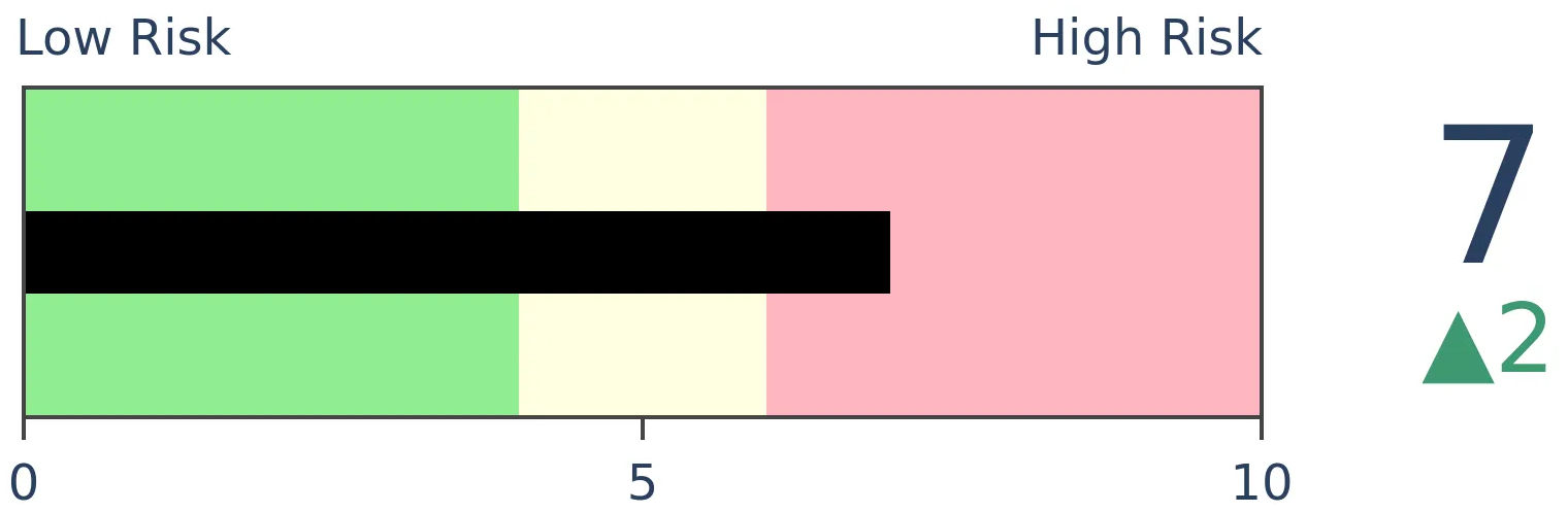
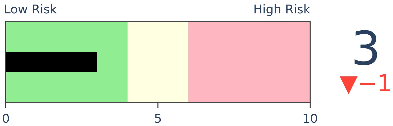
Crude Oil
|
|
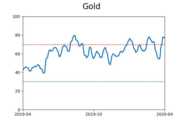
Gold
|
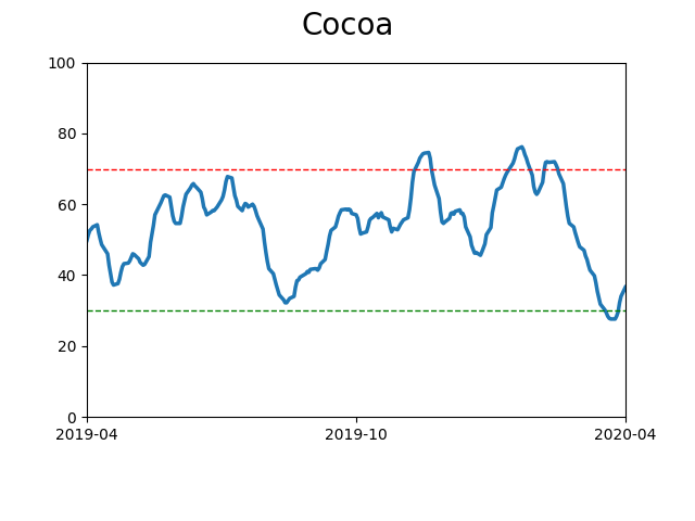
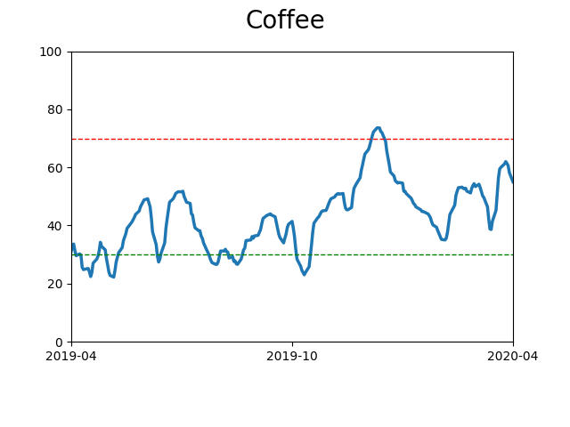
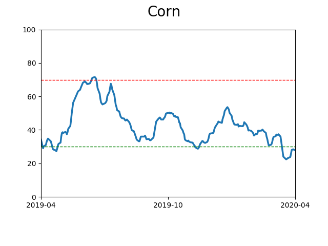
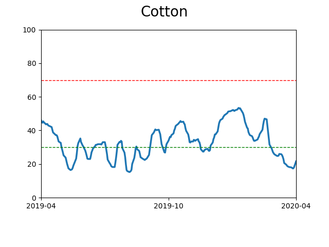
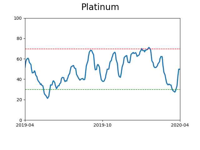
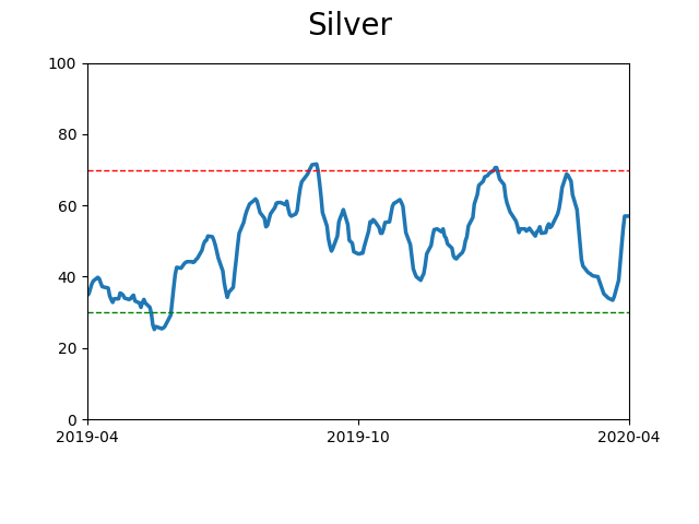
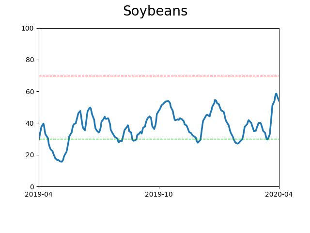
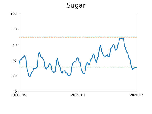
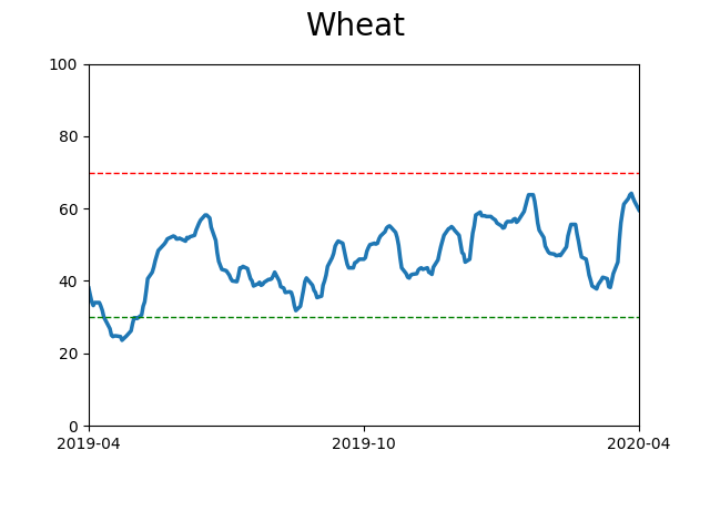
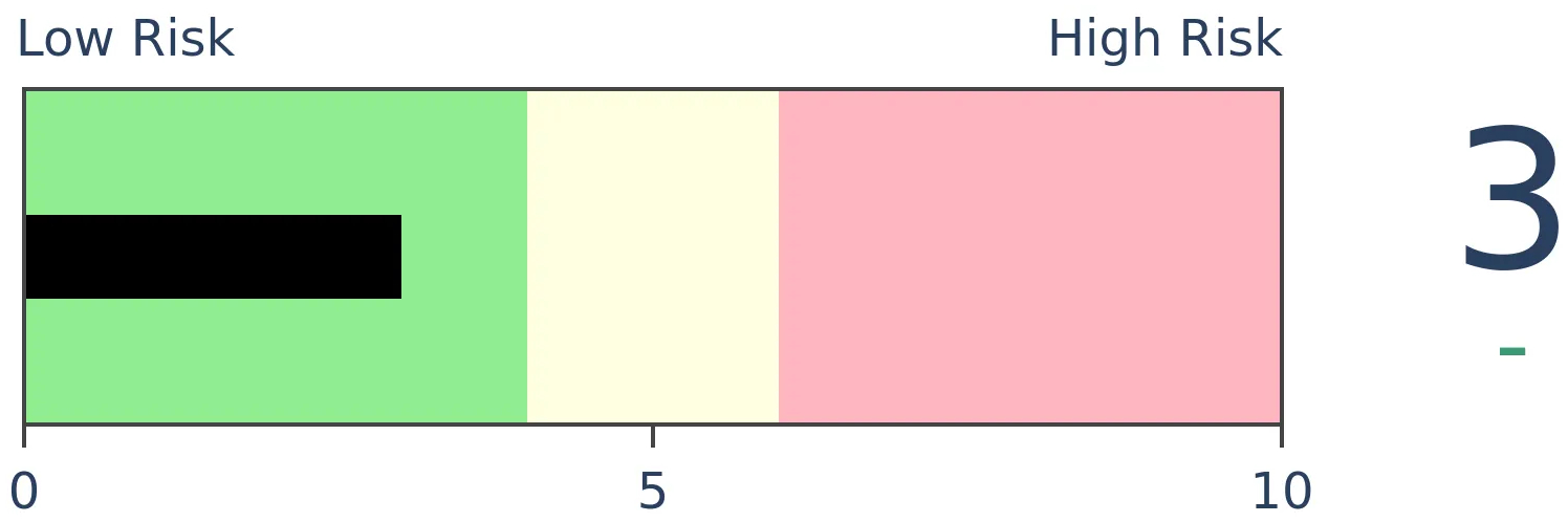
Agriculture
|
|
Research
BOTTOM LINE
Few stocks within the S&P 500 have managed to climb above their 200-day moving averages. While that has typically meant the worst of the selling is over, it can also be early in the "puke" phase of a decline. If we optimize the parameters, we see that a good compromise is waiting until there is a modest sign of recovery.
FORECAST / TIMEFRAME
None
|
A lot of stocks were taken out in March and are struggling to recover. Over the past month, there has been almost no movement in the percentage of stocks within the S&P 500 (or most other indexes) that have managed to climb above their 200-day moving averages. Even with some very good days in the index itself (including Monday), this breadth metric hasn't responded much.
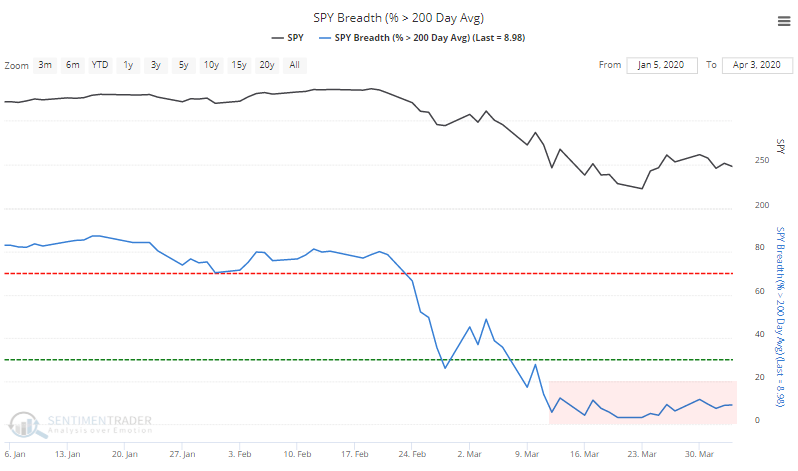
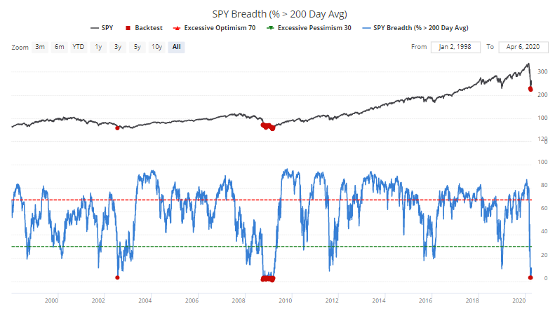
The Backtest Engine shows it's trying to recover from one of the worst readings in more than 20 years.
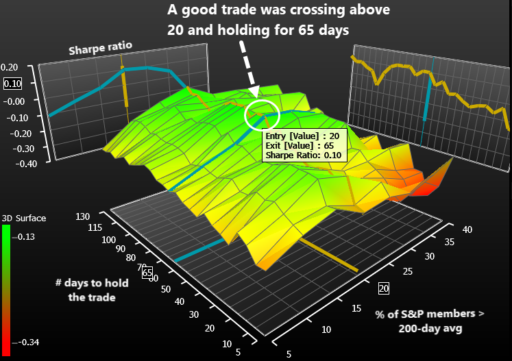
With all oscillating indicators, there is a balance between risk and reward. We can try buying after it reaches an extreme, with the risk that it will become even more extreme. Or we can wait for a recovery, which might reduce the "extreme can get more extreme" scenario but often we've already missed out on the best part of the recovery. There is no right answer; everyone's risk tolerance is different.
But maybe we can optimize the factors to see where the balance is best. With any optimization, we're relying on the future to look at least roughly like the past. For the most part it works, but it's like seeing a celebrity in a big-screen movie versus Zoom. They kind of look like we expected, but it's never quite as good.

Using Bloomberg's optimization engine, we can churn through a vast number of scenarios and look for combinations that led to the best results. There isn't any one measure to define what "best" actually means, but we're looking for a combination of high number of trades, high win rate, good return, and low drawdown.
What we're doing is looking for times when the percentage of S&P 500 components above their 200-day moving average drops to a low level and then starts to recover. We'll buy and then hold for a while. The optimization will help us determine what level we should use for an entry (how many stocks need to close above their 200-day averages) and how long we should hold the trade.
According to these factors, we should wait until 20% of members are above their averages, and we should hold for 65 days. While other combinations led to better results depending on what factor we were looking at, this combination had one of the best Sharpe Ratios (we're not interested in the absolute value of the ratio, only its value relative to all other combinations). It also struck a good balance among the other factors like win rate.
When we use the Backtest Engine to look at how this performed over the past 20 years, it worked well, with good returns over the next 2-3 months. Some of them were false signals, but that's the risk we run when waiting for an extreme to reverse.
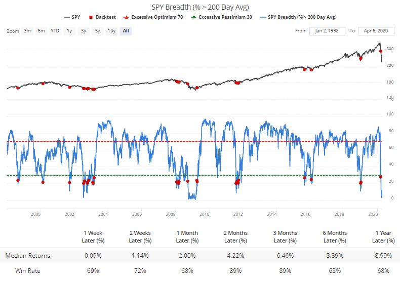
If we look for times when conditions had gotten really bad and fewer than 15% of stocks held above their 200-day averages at some point over the past month, then when this metric started to recover, there was only one small loss over the next 3 months.
 Again, there is no right way to approach this particular indicator (or any other). Different investors use different methodologies to try to match their different goals.
If we try to find the best balance between being too early vs late, and the risk of a major loss vs missing out on too much of a recovery, then one of the better options is to wait for this indicator to fall below 15% (which it has already done) and wait for it to recover above 20%. If we see that in the coming days, then it should be another good sign of a multi-month recovery.
BOTTOM LINE
The financial sector hasn't done much to confirm the idea that stocks are near a bottom. On a relative basis, they continue to reach lower lows. But a look at past bottoms shows that this is not unusual behavior, as the group rarely leads out of major declines.
FORECAST / TIMEFRAME
None
|
One of the many concerns being bandied about now is the continued relative underperformance of financials. Analysts keep looking for this group to lead, or at least show some signs of relative strength versus the broader market, and they keep disappointing. Even with a big day so far on Monday, the ratio is barely moving.
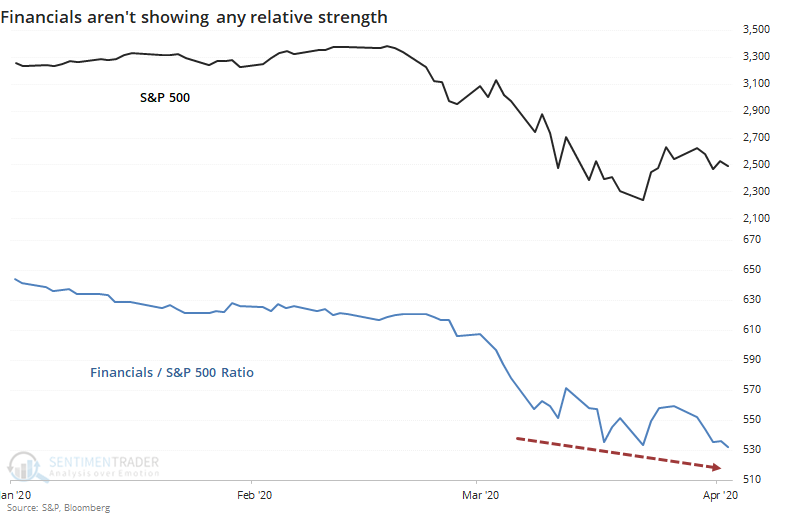
It raises a good question - at other recent and important low points, did financials turn up relative to the market before stocks bottomed? We'll look at the most recent inflection points, as well as the more important lows since 1928 to see if there's a pattern.
For those who prefer to read the conclusion first, the answer was "no."
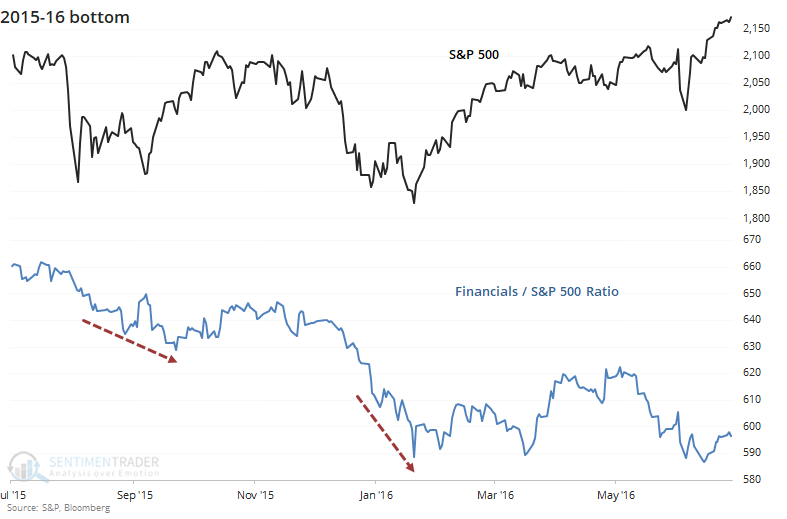
At the bottom(s) in 2015-16, there were negative divergences the whole way. The ratio of the financial sector to the S&P 500 kept hitting lower lows, either along with the S&P or even as the S&P made higher lows. If we were watching the financial sector for clues, we would have dismissed the probability of any kind of a low anywhere around these time frames.
It was no different in 2011. Financials performed horribly around that time, and even as the S&P was stabilizing, financials kept sinking on a relative basis.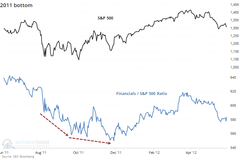
At the major low in 2009, same story. During the depths of the panic in October and November 2008, it's no surprise to see that financials were leading the market lower. That was still the case into the early spring of 2009 as stocks formed a v-shaped bottom and financials were hitting new relative lows that entire time.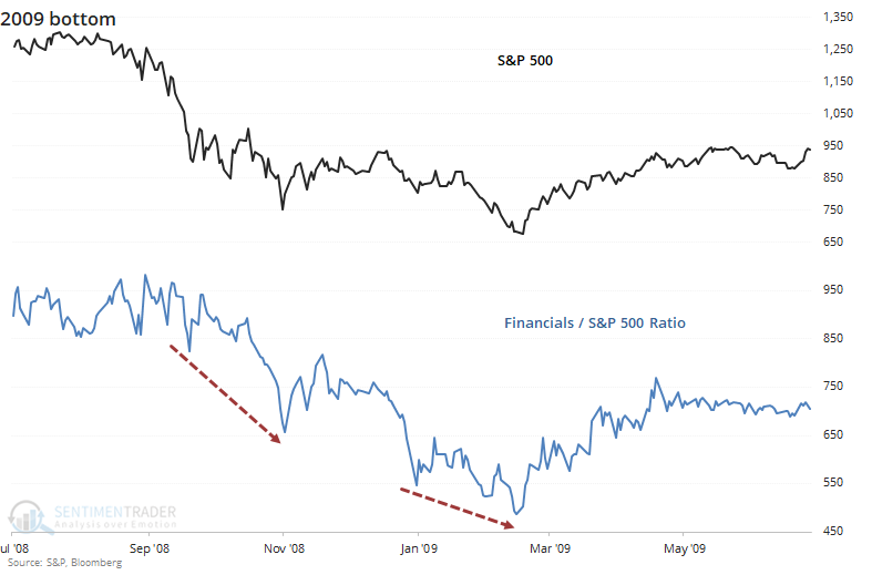
At the other major low that decade, in 2002, it was mostly the same picture but a case could be made there was a larger positive divergence. In October of that year, financials made a clear lower low and would have suggested a failure was imminent. As the S&P rallied then fell again to test the low in early 2003, financials were sinking quickly but at least formed a higher low than the previous October. So that was something of a good sign.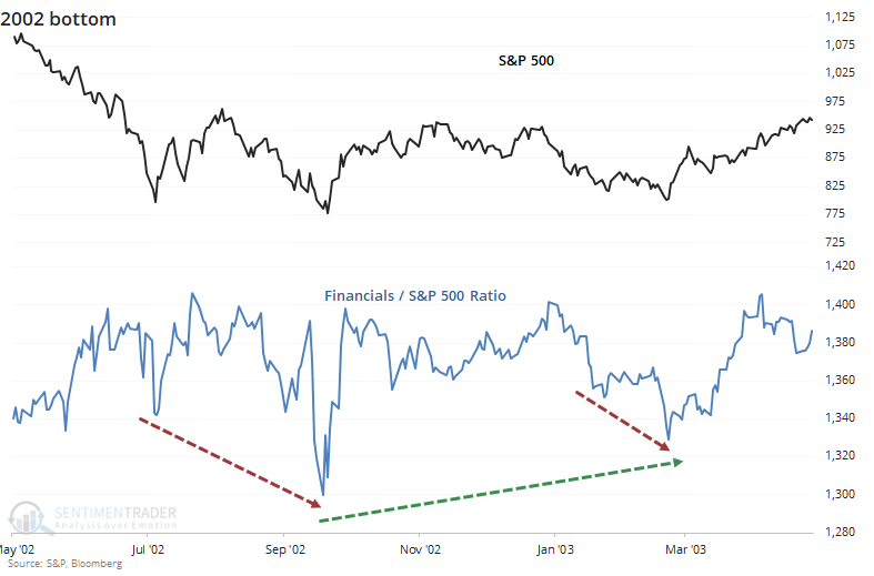
At the medium-term bottoms in 2001, relative strength in financials proved to be a decent sign in March, but didn't provide much of a clue following the tragedy of 9/11. Even as the S&P rebounded strongly, financials kept sinking on a relative basis.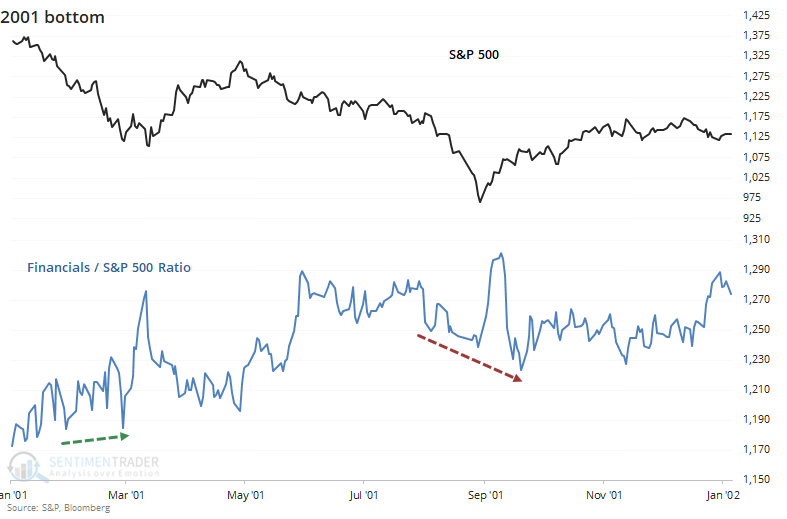
The banking crisis of 1990 saw financial tank drastically even as the broader market held up relatively well. By only following the financials, an investor would have been deeply pessimistic about the probability of a bottom and would have missed out on a massive recovery, or at least would have been negative at the lows.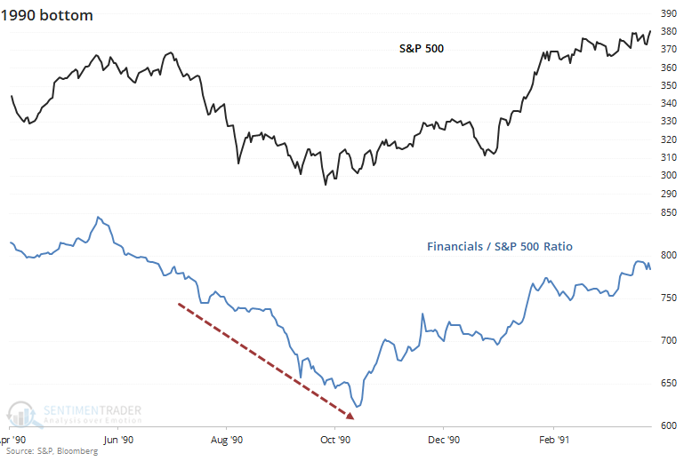
During the crash of 1987, there was a chaotic spike in relative strength that quickly evaporated. By the time stocks bottomed in December, financials were hitting a years-long relative low, and an investor watching this sector for clues would have once again been misguided.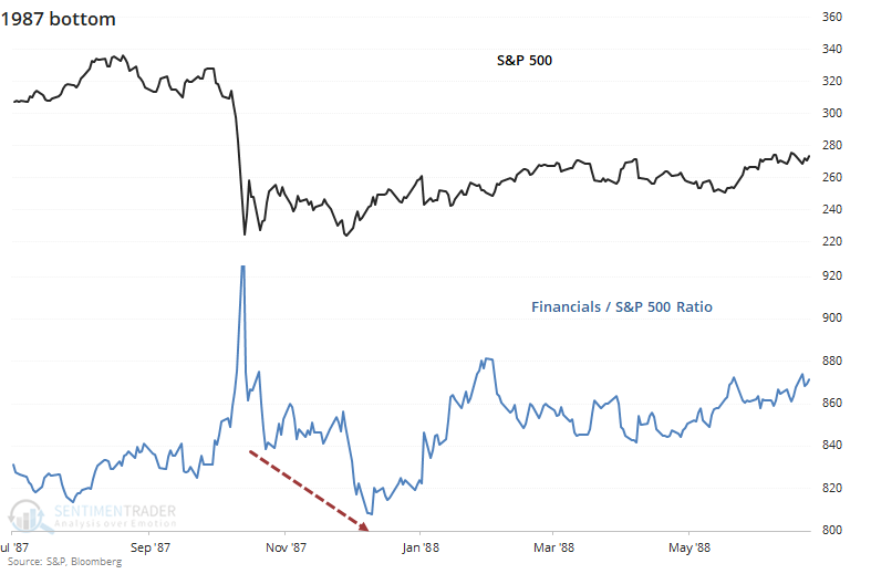
The big bottom in 1974 is the one case where analysts using this method could cherry-pick as a reason to watch for relative strength from this sector. As stocks slid horribly into that fall, financials were perking up and they formed a classic positive divergence. It would have been an excellent clue that investors should be using lower prices to load up on shares.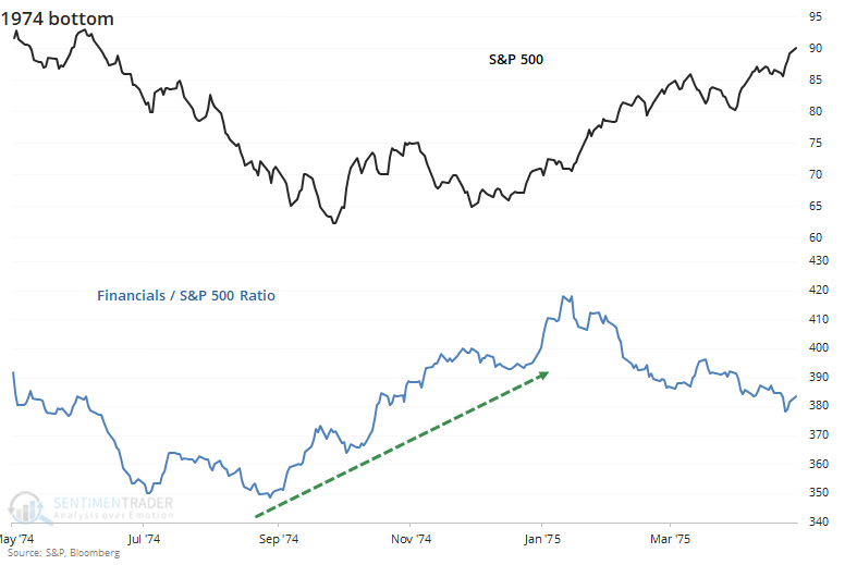
The banking crisis in 1932 showed a somewhat similar pattern to a couple other bottoms. During the initial panic and slide lower at the ultimate low, there was no positive clue from financials. But after the initial bounce off the low and subsequent test later that year, financials were showing decent relative strength.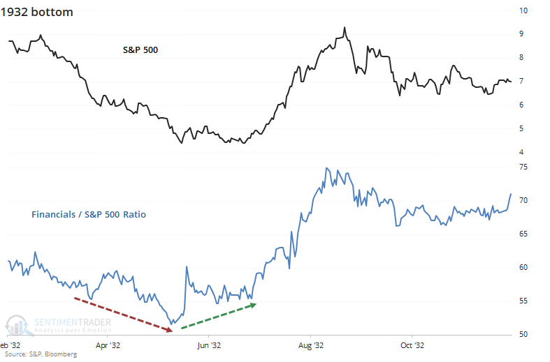
During the initial crash in 1929 and subsequent after-shocks, there was no positive clue from financials. They continued to hit new lows relative to the broader market the whole way, including at the major low.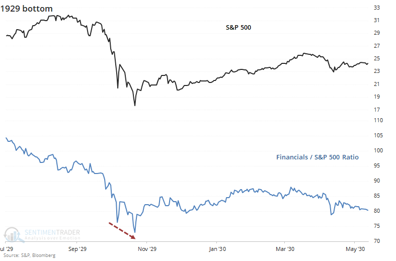
Overall, there is nothing here to suggest that an investor needs to look for financials as a source of relative strength ahead of a low, major or minor, in the broader market.
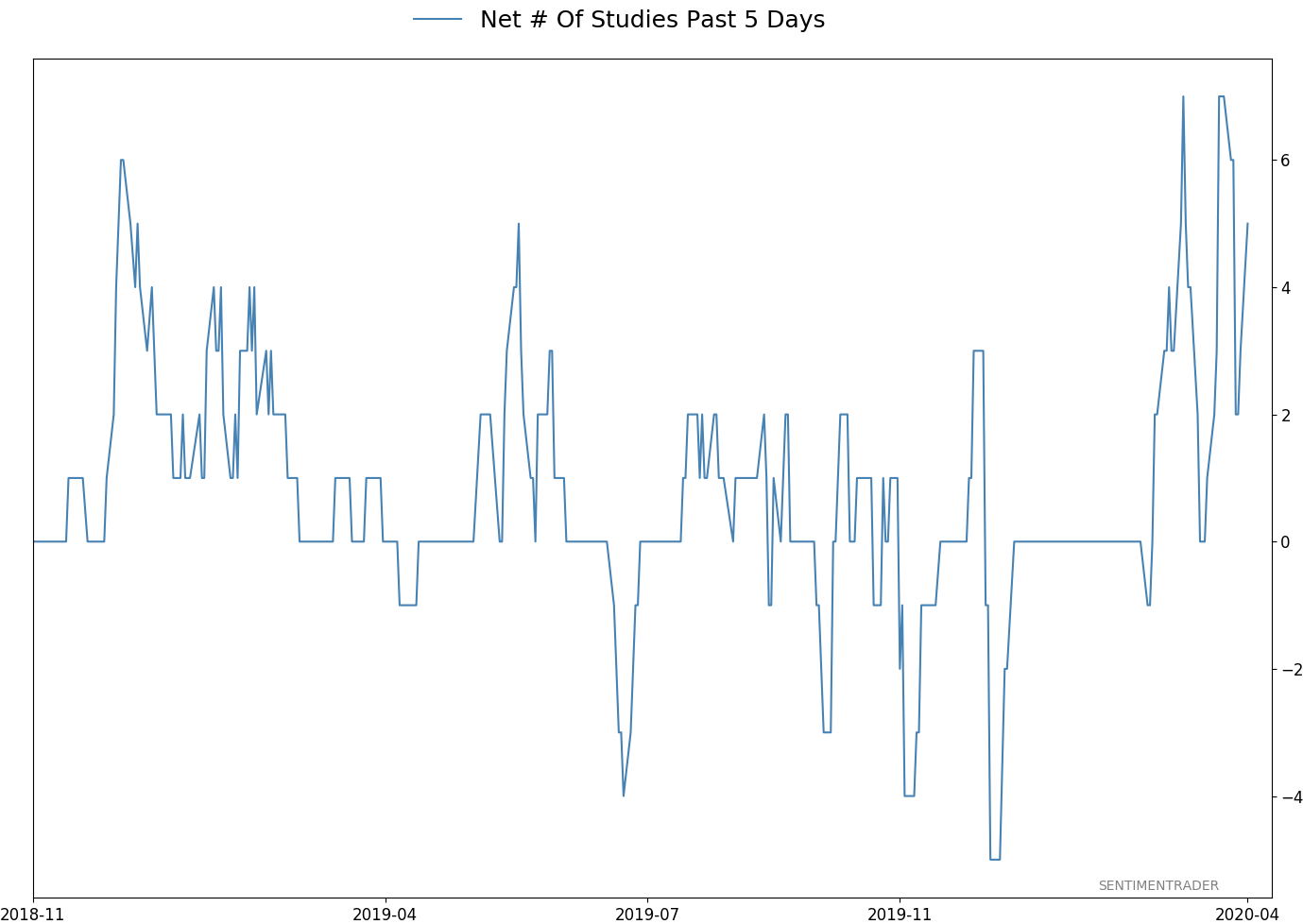
Active Studies
| Time Frame | Bullish | Bearish | | Short-Term | 0 | 0 | | Medium-Term | 11 | 0 | | Long-Term | 24 | 3 |
|
Indicators at Extremes
Portfolio
| Position | Weight % | Added / Reduced | Date | | Stocks | 73.2 | Added 31.3% | 2020-03-17 | | Bonds | 0.0 | Reduced 6.7% | 2020-02-28 | | Commodities | 5.5 | Added 2.4%
| 2020-02-28 | | Precious Metals | 0.0 | Reduced 3.6% | 2020-02-28 | | Special Situations | 0.0 | Reduced 31.9% | 2020-03-17 | | Cash | 21.3 | | |
|
Updates (Changes made today are underlined)
In the first months of the year, we saw manic trading activity. From big jumps in specific stocks to historic highs in retail trading activity to record highs in household confidence to almost unbelievable confidence among options traders. All of that has come amid a market where the average stock can’t keep up with their indexes. There were signs of waning momentum in stocks underlying the major averages, which started triggering technical warning signs in late January. The kinds of extremes we saw in December and January typically take months to wear away, but the type of selling we’ve seen over the past month has gone a long way toward getting there. When we place the kind of moves we saw into March 23 into the context of coming off an all-time high, there has been a high probability of a multi-month rebound. The volatility we’ve seen lately is extremely compelling from a medium-term point of view. Virtually everything we’ve looked at suggests a strong probability of gains over the next several months, even within the context of a potential bear market, and even from what had been higher prices. After stocks bottomed on the 23rd, they enjoyed a historic buying thrust. While other signs are mixed at best that panic is subsiding, that thrust is one of the most encouraging sign we've seen in years. There is often a test of a panic low in the weeks after an initial recovery, but that thrust we saw, combined with the larger-than-usual retracement, have me less convinced a test is necessary. For now, I see no overwhelming reason to add or reduce exposure.
RETURN YTD: -14.2% 2019: 12.6%, 2018: 0.6%, 2017: 3.8%, 2016: 17.1%, 2015: 9.2%, 2014: 14.5%, 2013: 2.2%, 2012: 10.8%, 2011: 16.5%, 2010: 15.3%, 2009: 23.9%, 2008: 16.2%, 2007: 7.8%
|
|
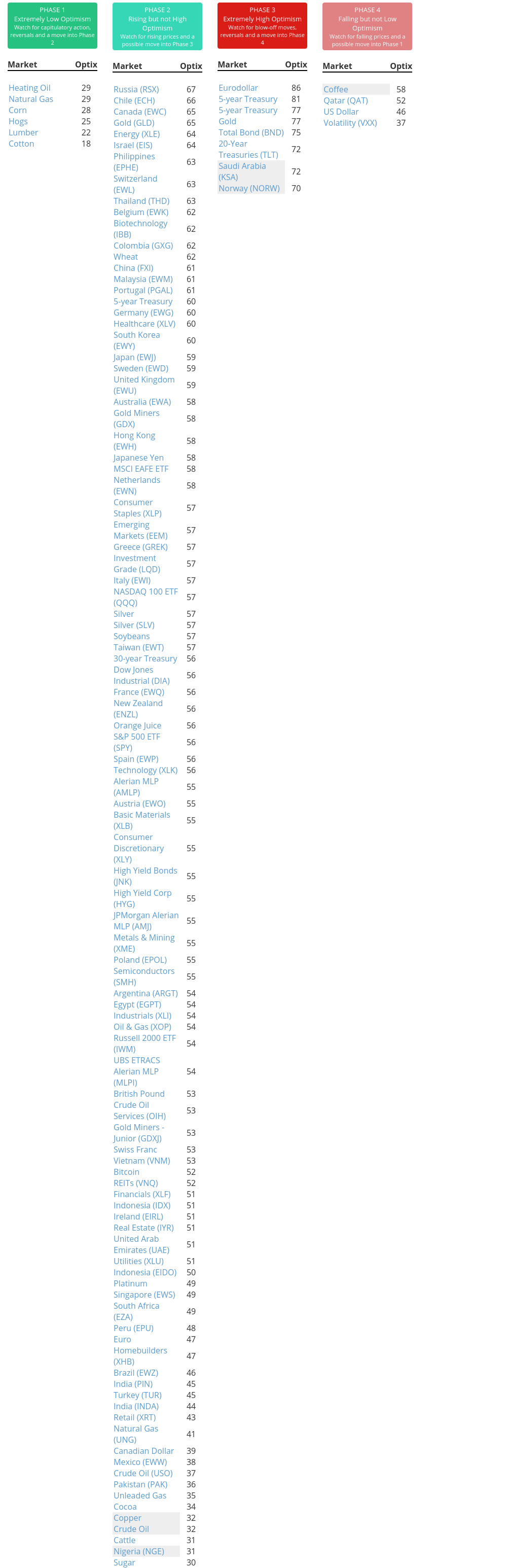
Phase Table
Ranks
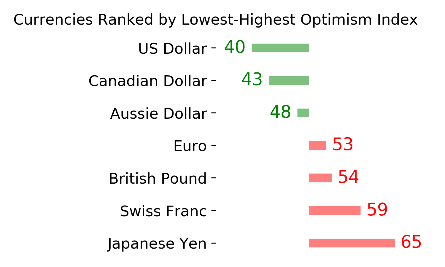
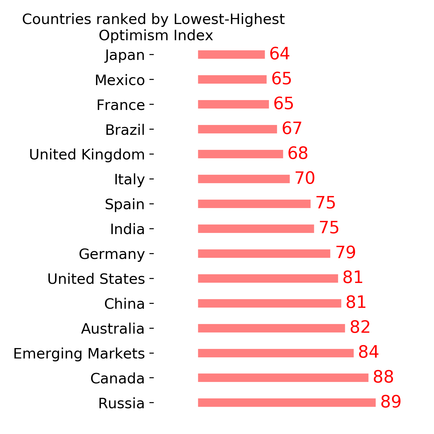
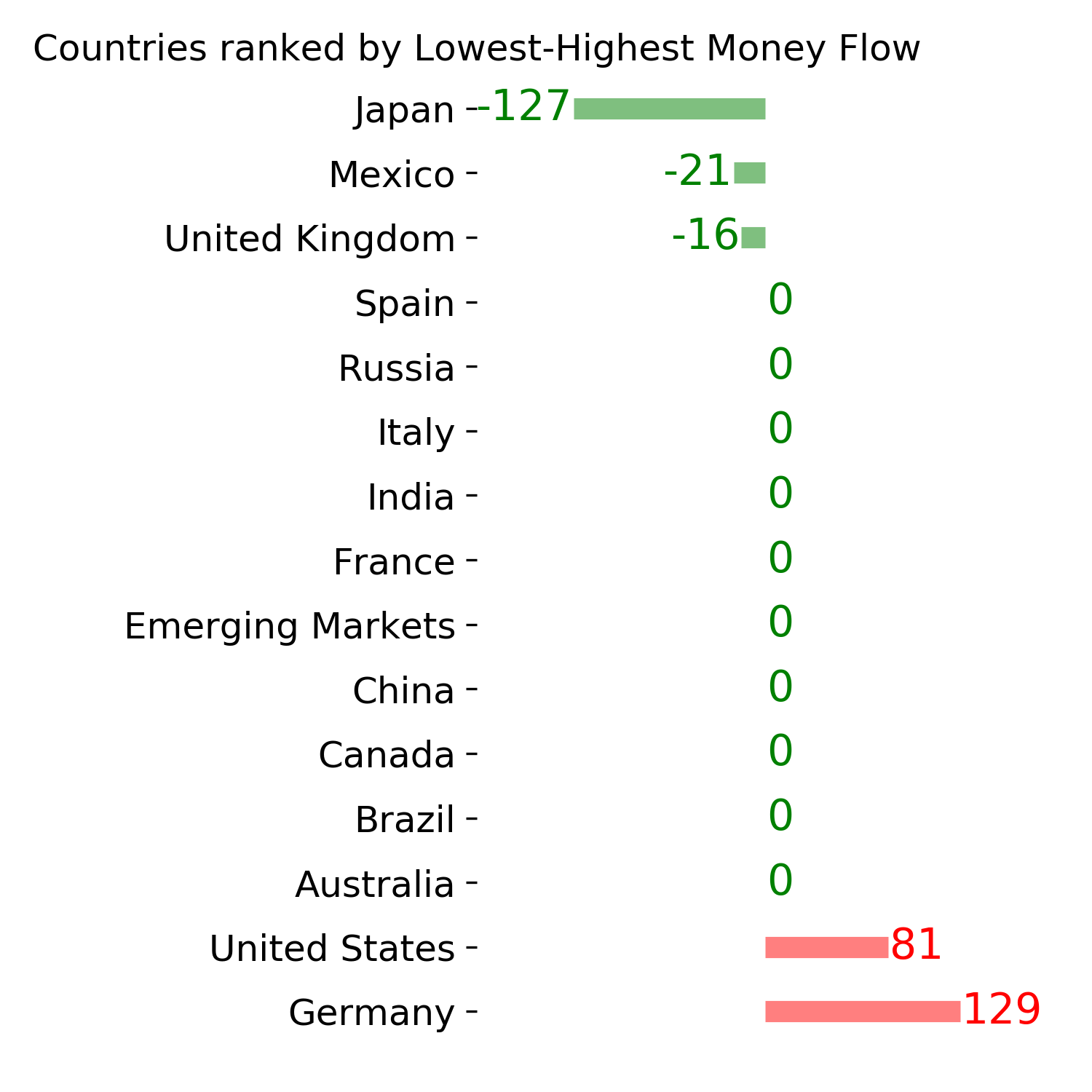
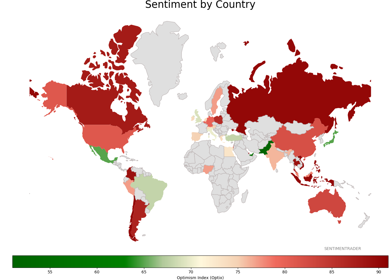
Sentiment Around The World
Optimism Index Thumbnails
|
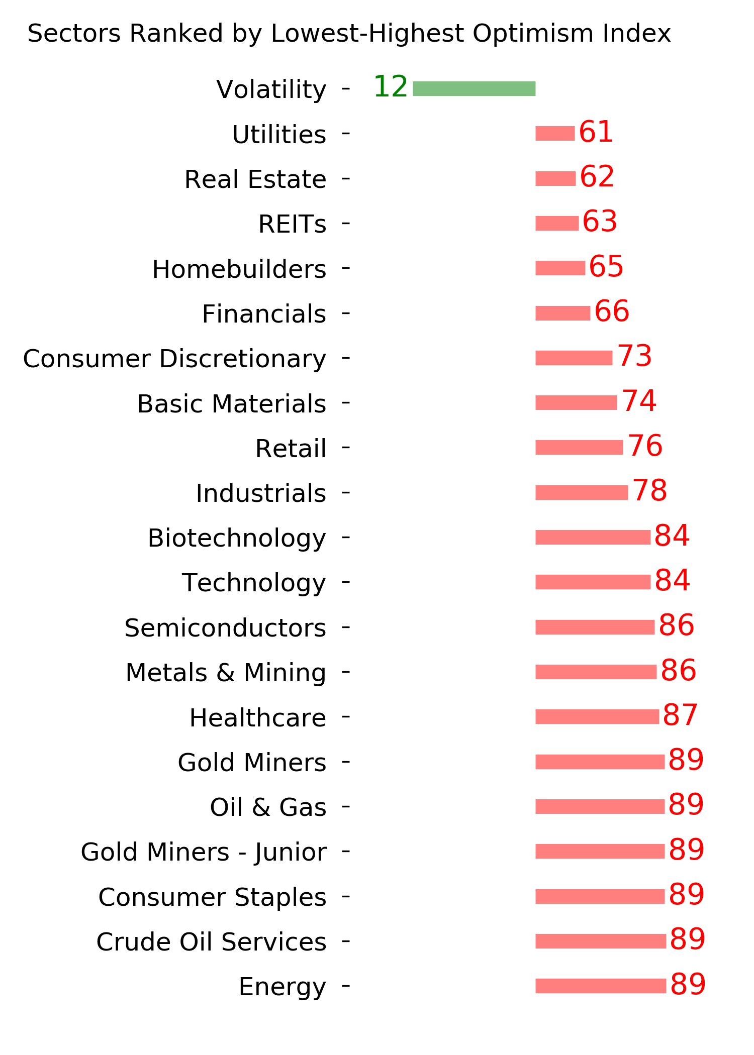
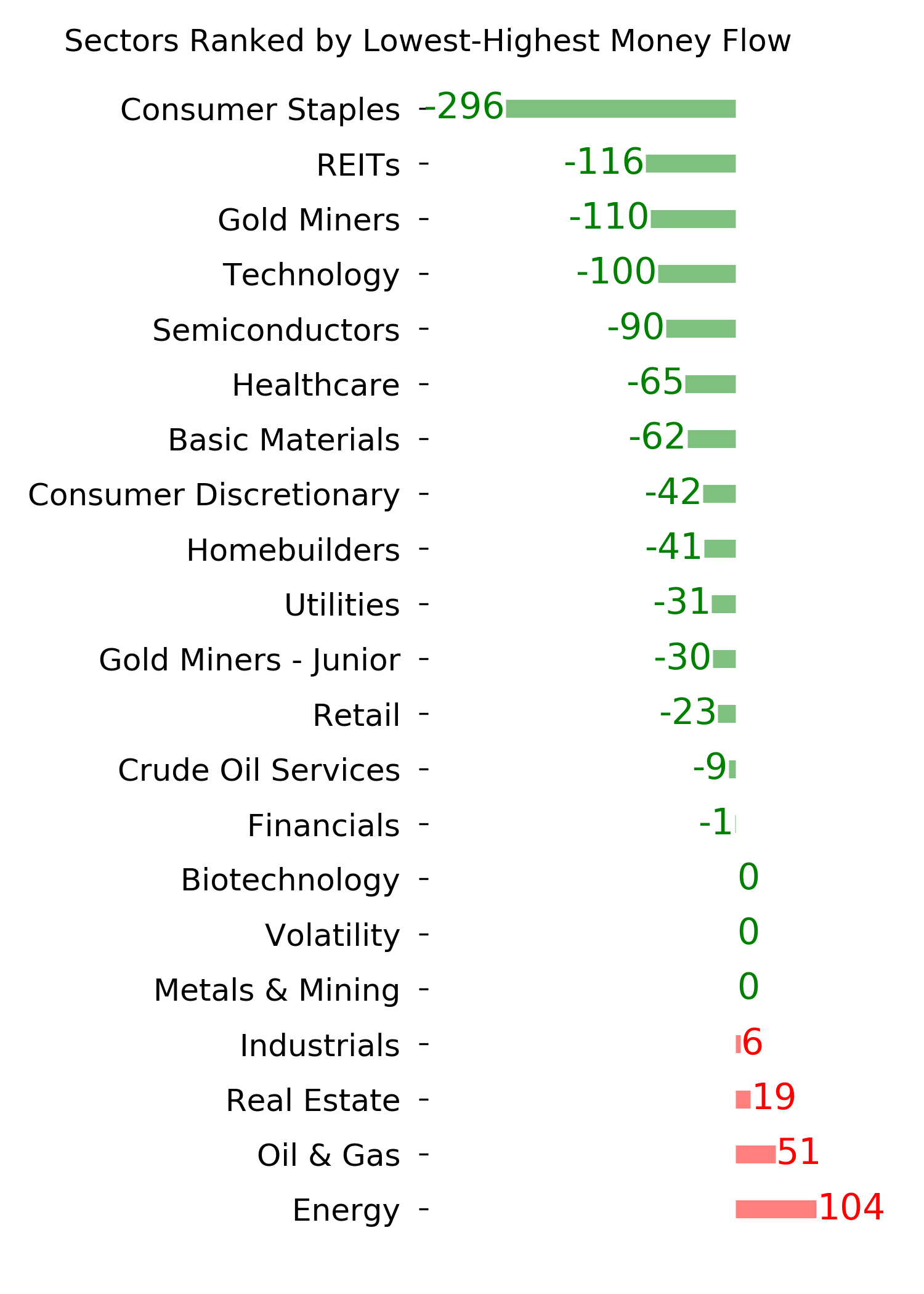
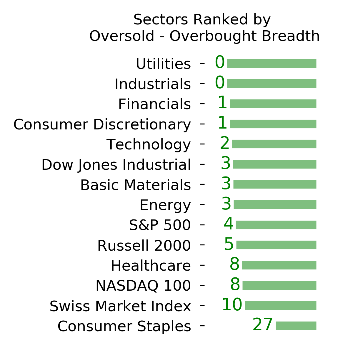
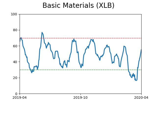
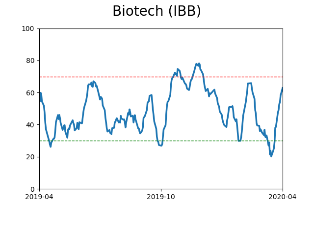
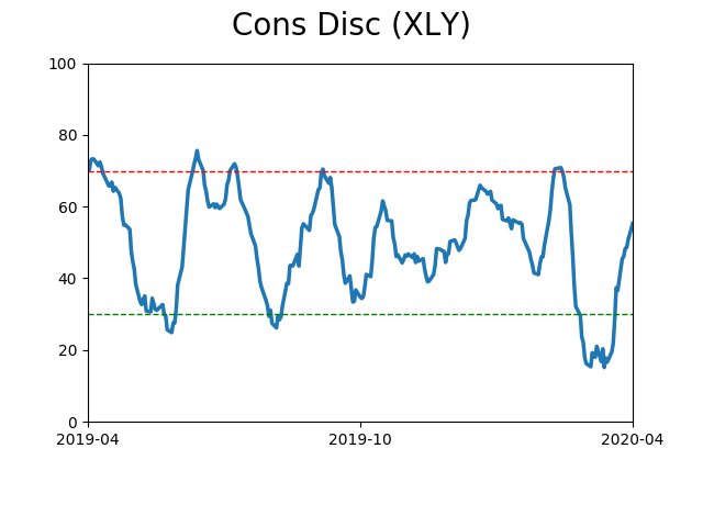
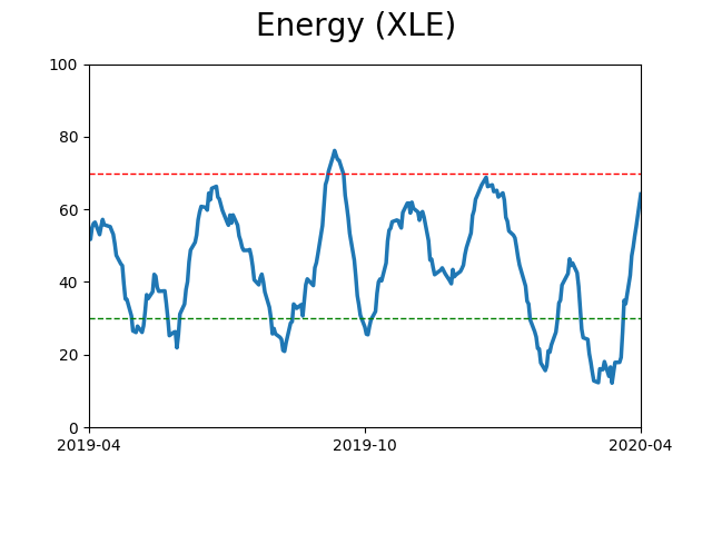
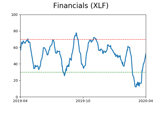
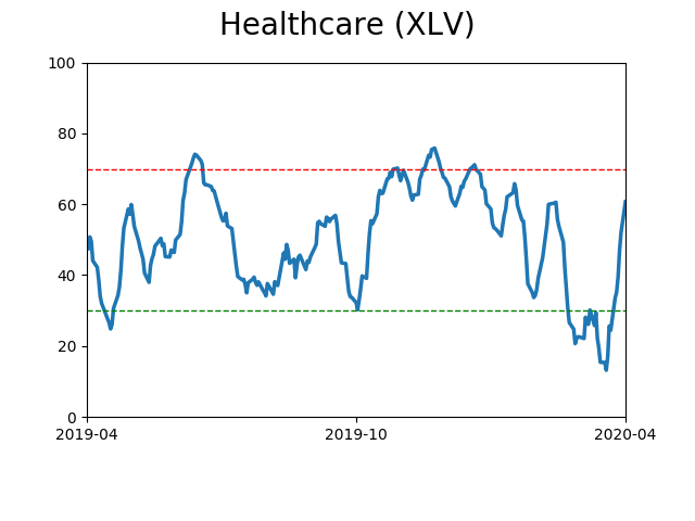
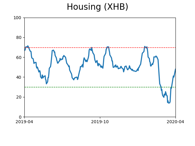
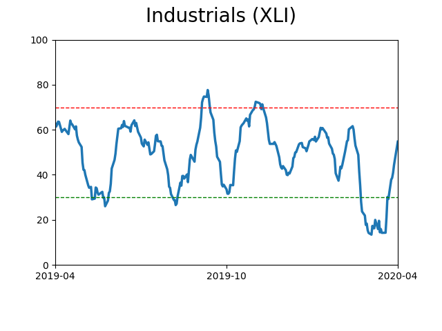
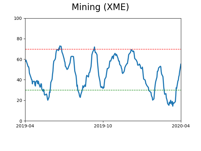
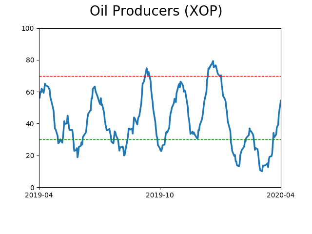
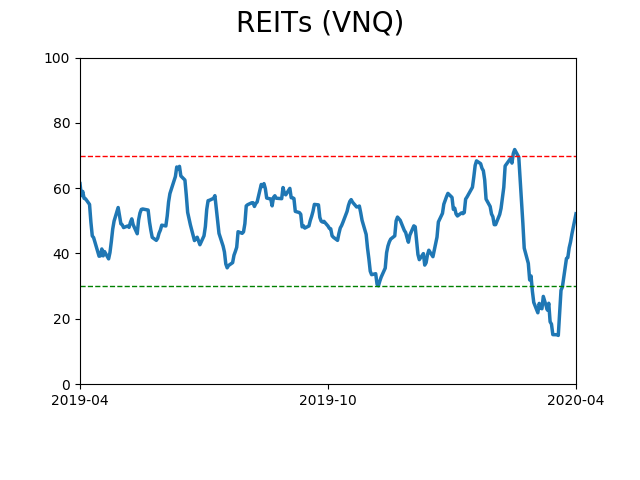
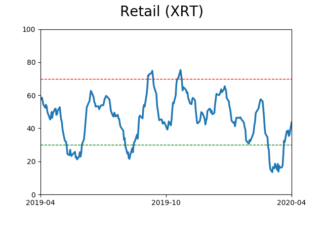
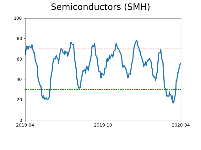
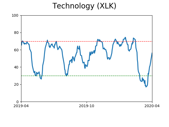
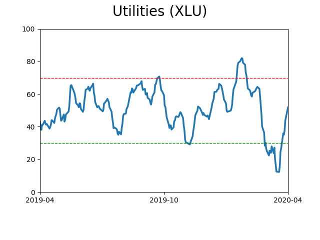
Sector ETF's - 10-Day Moving Average
|
|
|
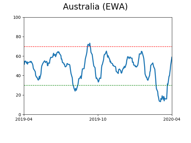
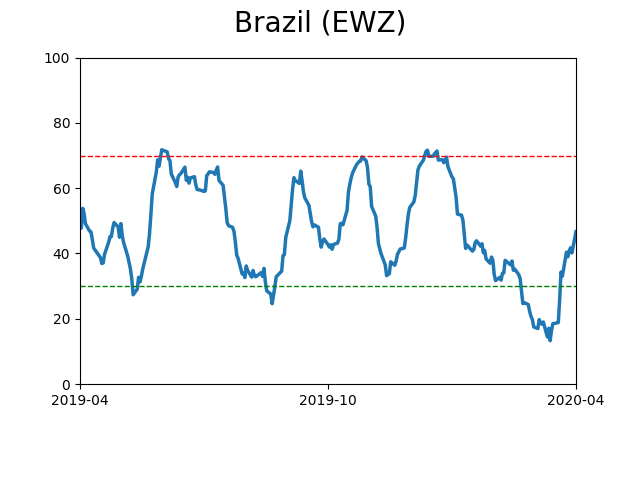
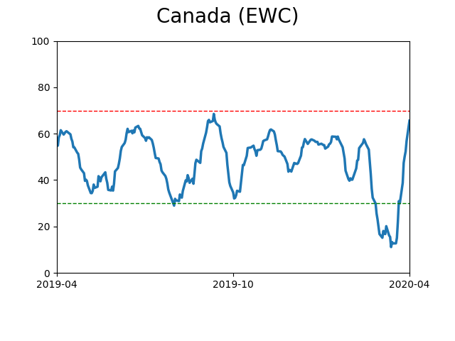
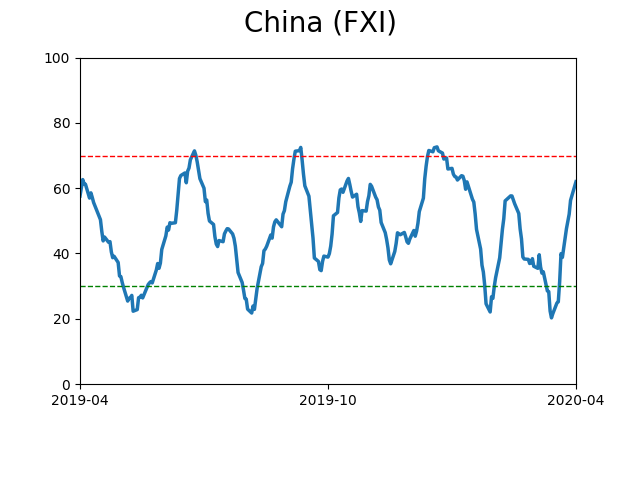
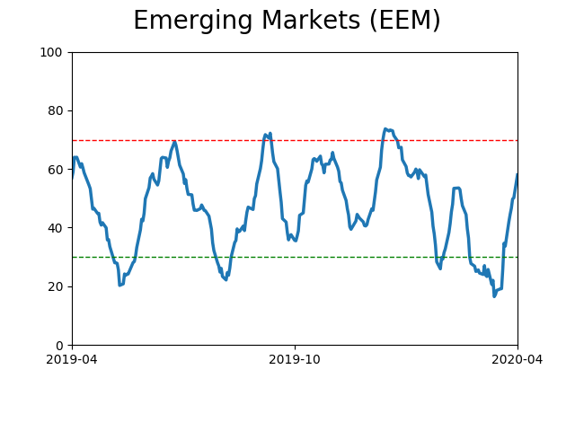
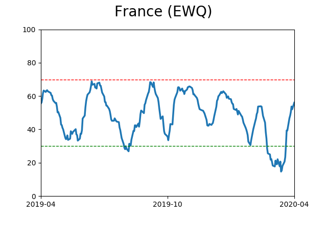
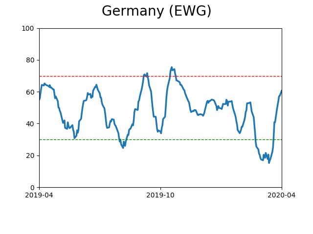
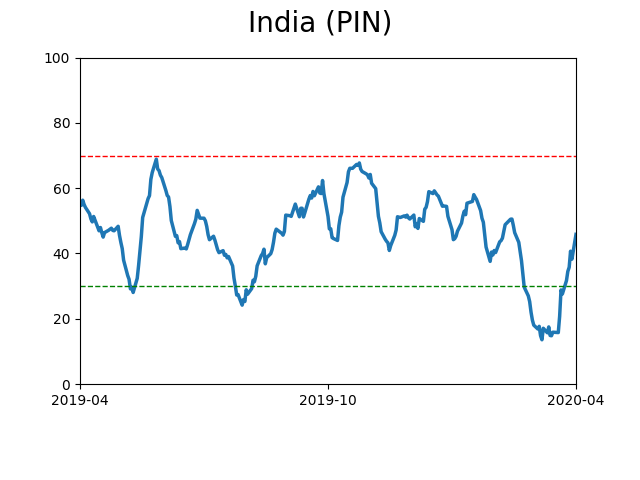
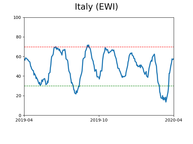
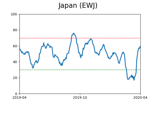
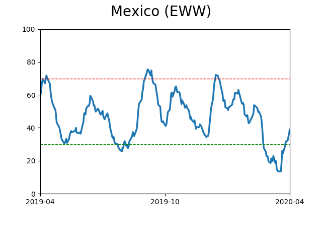
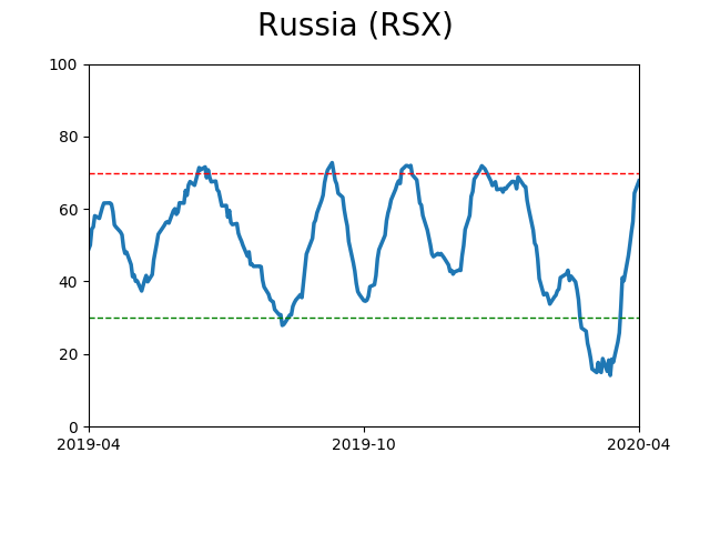
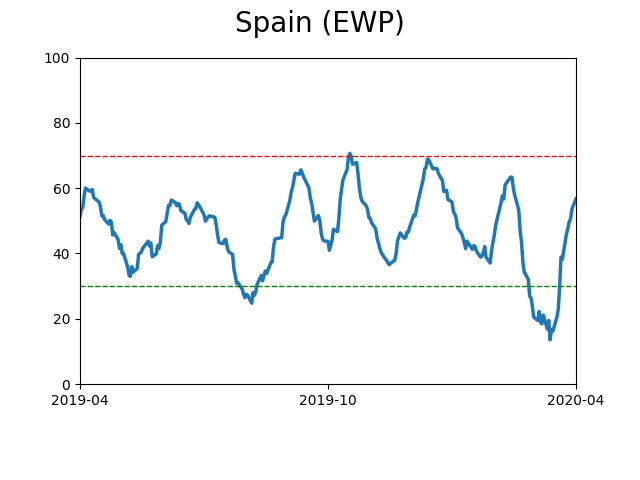
Country ETF's - 10-Day Moving Average
|
|
|
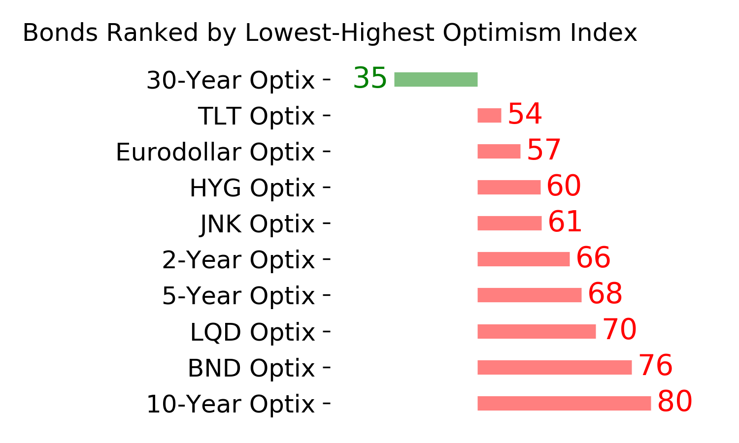
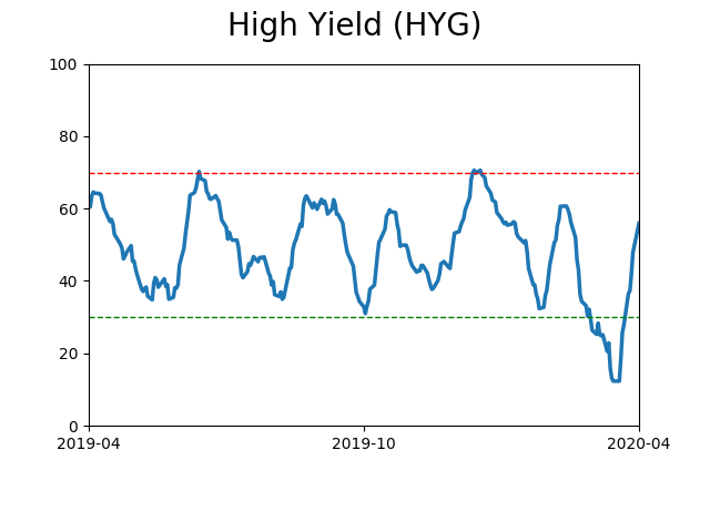
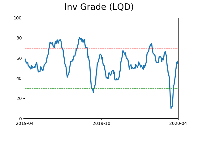
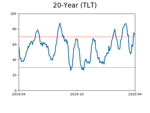
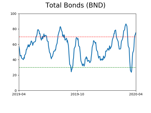
Bond ETF's - 10-Day Moving Average
|
|
|
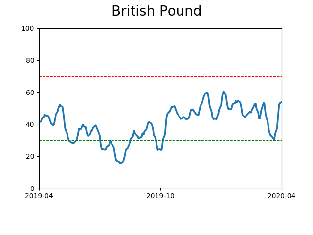
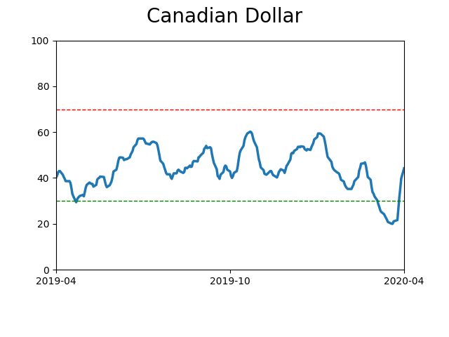
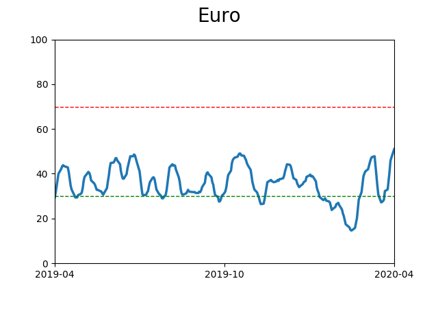
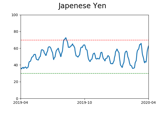
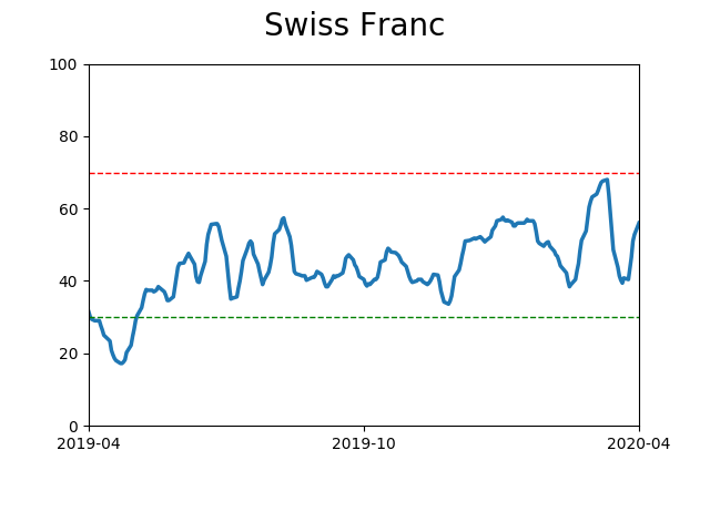
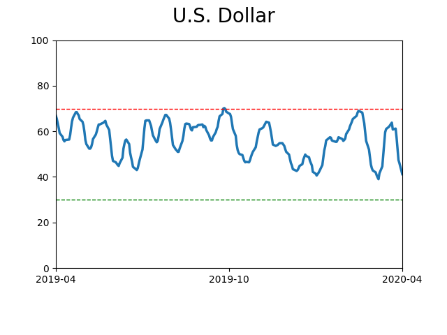
Currency ETF's - 5-Day Moving Average
|
|
|
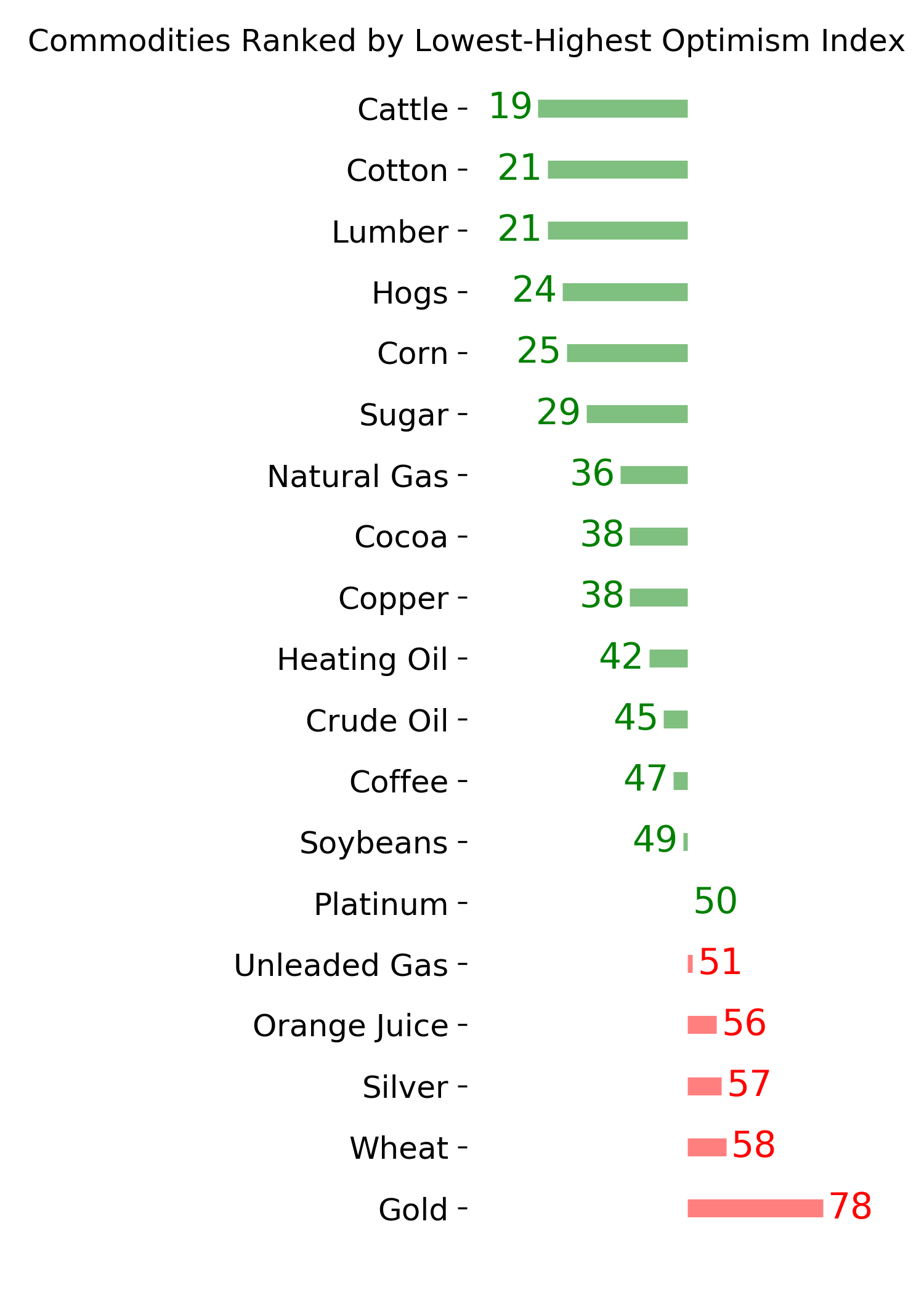
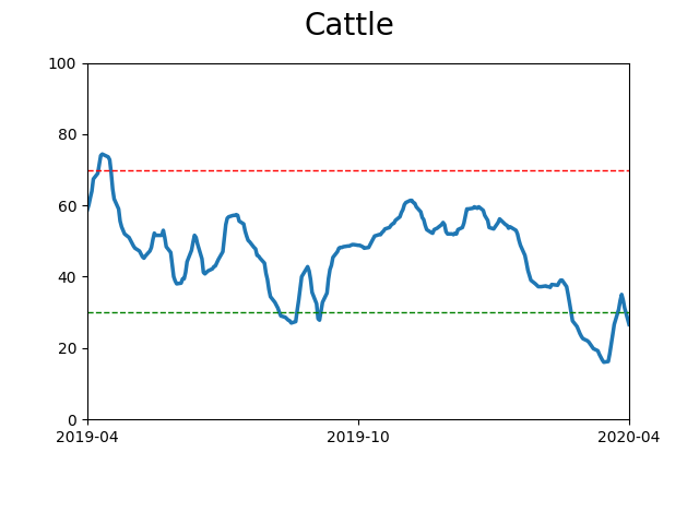
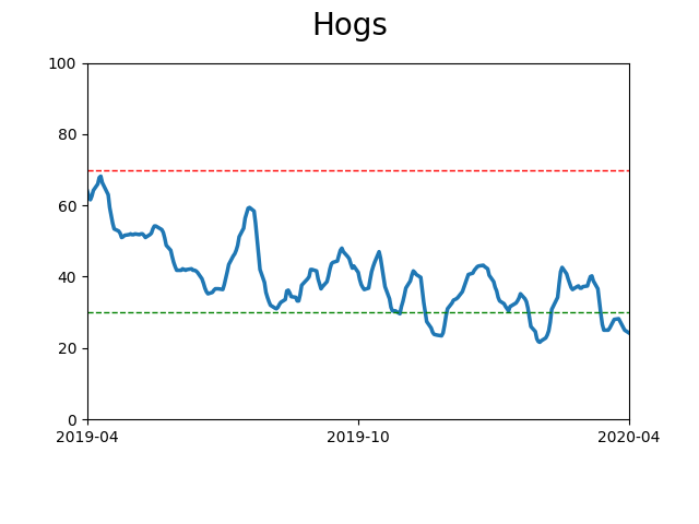
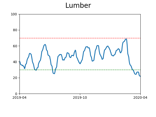
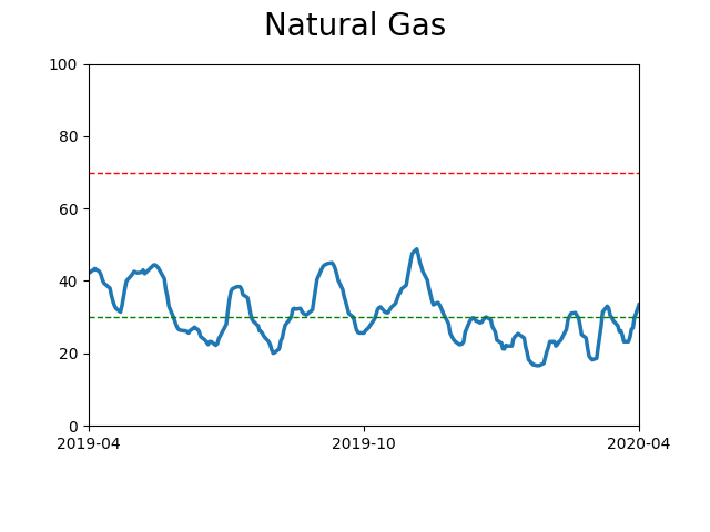
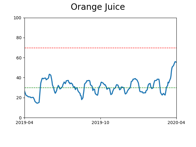
Commodity ETF's - 5-Day Moving Average
|
|