Bond Risk Levels send a message... for stocks
Key points
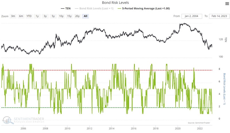
- Our Bond Risk Levels indicator is derived using bond market data to assess the current state of the bond market
- However, because the stock market is influenced by the bond market, the indicator can be quite useful for stock traders when it reaches an extreme
- The 5-day moving average of Bond Risk Levels recently fell to its lowest possible reading of 1.
Bond Risk Levels versus S&P 500 Index
The chart below displays our Bond Risk Levels indicator's 5-day moving average (green line). We want to focus on when this 5-day average reaches its lowest possible level of 1. This implies that the raw indicator has been at a reading of 1 for the last 5 days. This is a relatively rare occurrence.
However, we are not interested in the bond market but rather the stock market. The chart below displays all days when the 5-day moving average of the Bond Risk Levels (BRL) indicator is at 1 - including overlapping signals.
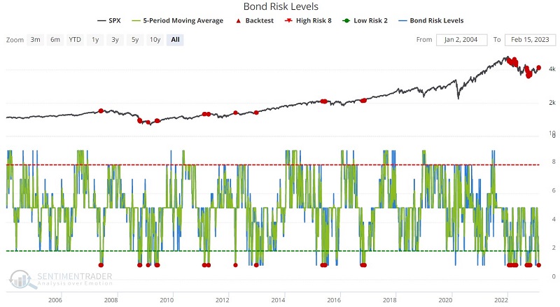
The table below displays a summary of the performance of the S&P 500 Index following the dates highlighted in the chart above.

The thing to note is that overall, SPX performance has been very subpar following these signals. The S&P 500 Index closed lower six months later 77% of the time with a median loss of more than -5%. The BRL indicator 5-day average fell to 1 on 2023-02-10. The good news is that this is just one indicator, and no one indicator guarantees anything in the stock market. In the face of all of the much more favorable evidence we have presented lately, it is possible that this latest reading will turn out to be a non-event. Nevertheless, the bad news is that this latest reading falls on the ledger's bearish side.
Now let's consider some other segments of the market.
Bond Risk Levels versus NYSE Composite
Using the NYSE Composite Index, let's first consider an even broader slice of the overall stock market. The chart below displays the same signals used with SPX above, and the table shows a summary of NYA performance following previous BRL signals.
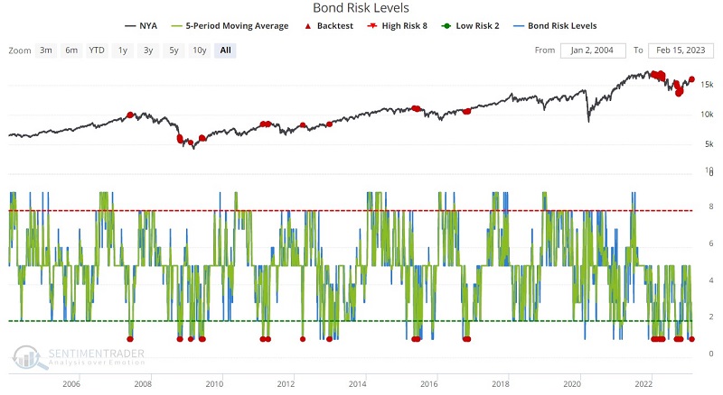

Here we see that results across the broader market are slightly worse than those shown for the S&P 500 Index.
Bond Risk Levels versus Financials sector
Now let's look at a sector we would expect to be impacted based on its relationship to interest rates and bond trends. The chart below displays the same signals used with SPX above, and the table shows a summary of XLF performance following previous BRL signals.
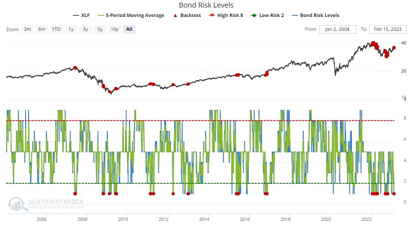

As shown in the figures above, the financial sector does not appear to be the place to be when Bond Risk Levels are at a low level. Note the median decline of over -15% during the 6 months after a BRL signal.
Bond Risk Levels versus high-yield bonds
High-yield bonds are much more closely correlated to the stock market than they are to interest rates of treasury bonds. Given the wealth of bullish indicators we have highlgihted lately, one would be inclined to be bullish on high-yield bonds. However, there may also be reason for pause.
The chart below displays the same signals used with SPX above, and the table shows a summary of HYG performance following previous BRL signals.
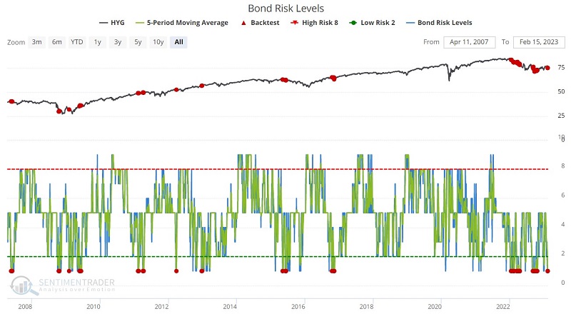

Here too, the forward results have been significantly underwhelming.
What the research tells us…
In recent months we have highlighted many indicators that have turned favorable for the stock market. The natural inclination under such circumstances is to give the bullish case the benefit of the doubt. And that may be the appropriate thing to do. However, it is also important to keep an eye open for the potential "fly in the ointment." The historical tendency of a wide cross section of the stock market to struggle following readings of 1 from the Bond Risk Levels 5-day moving average clearly fits in that category.

