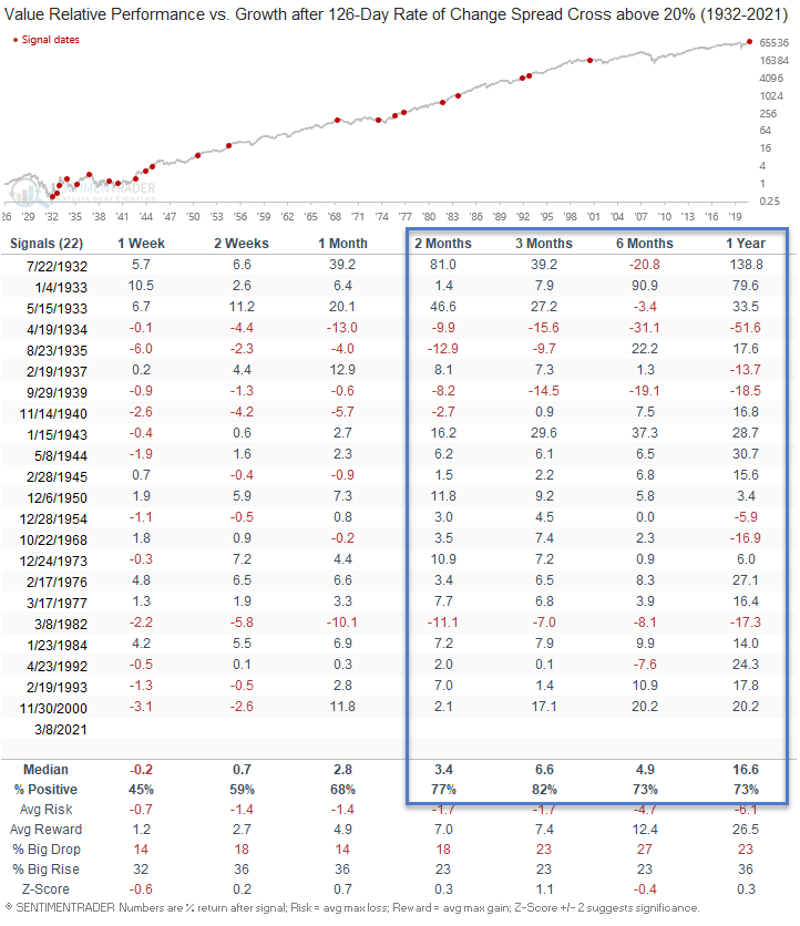
Big Picture Value vs. Growth Signal

As many of you know, I worked for a large-cap growth manager for 20 years, and my personal accounts have a clear tilt toward growth-oriented groups. Even with a preference for growth, I learned a long time ago that one must keep an open mind and view data without bias to be successful at investing. When the market provides us with a message, take note.
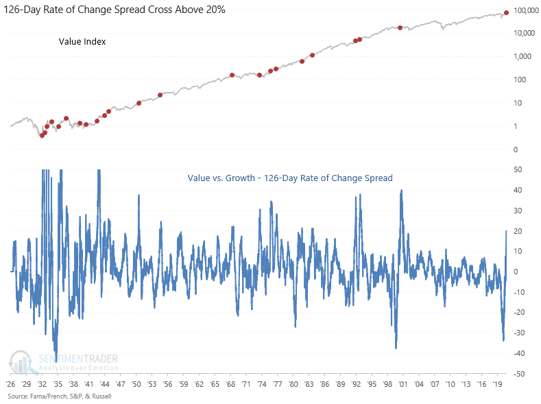
The 126-day rate of change spread between value and growth crossed above 20% on Monday. Before the current signal, one has to go back over two decades to find the last cross in November 2000.
Let's look at what a spread signal means for value, growth, and several other groups.
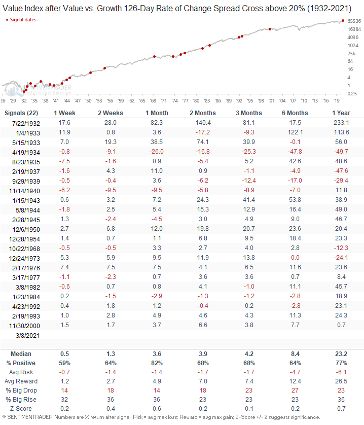
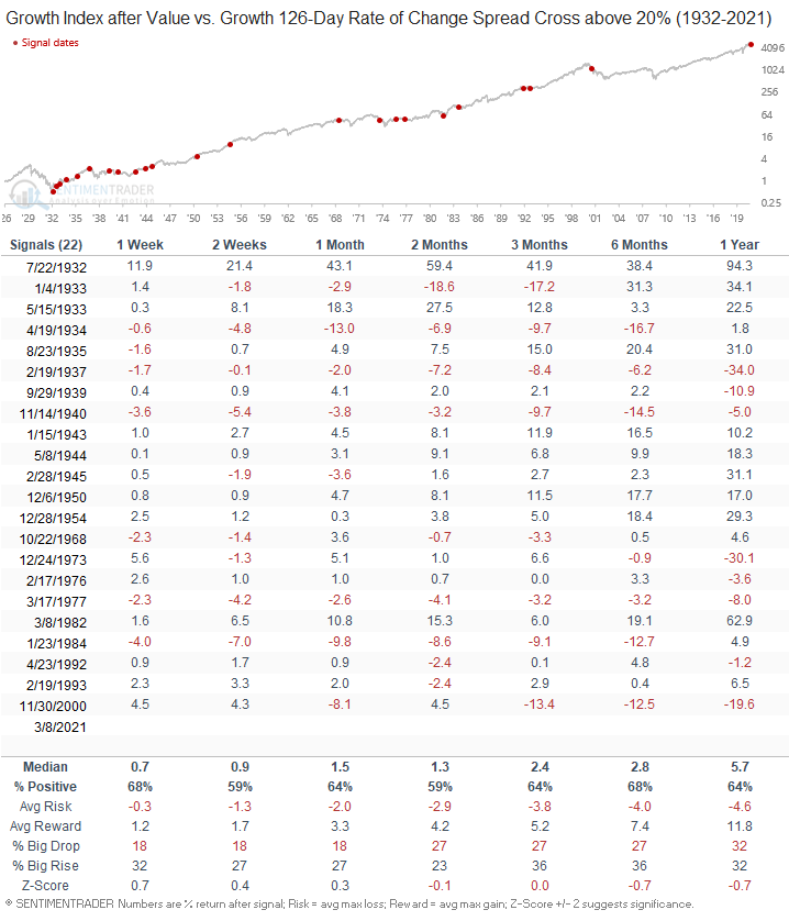
The following chart and tables use total return data, and the relative performance tables represent the net difference between the two groups.
Value vs. Growth Rate of Change Spread Chart
Value - Absolute Signal Performance
Growth - Absolute Signal Performance
Value vs. Growth - Relative Signal Performance
Interestingly, the value index shows a tendency to underperform growth in the 1-week timeframe after a signal. As I write this note, growth is trouncing value.
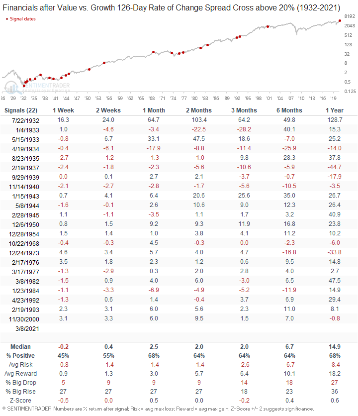
Financials - Absolute Signal Performance
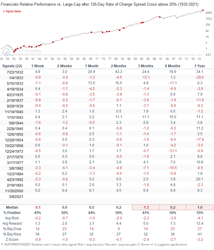
Financials vs. Large Cap - Relative Signal Performance
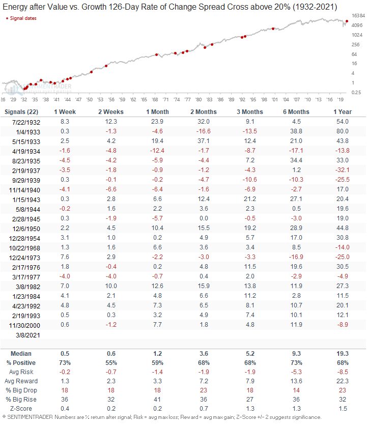
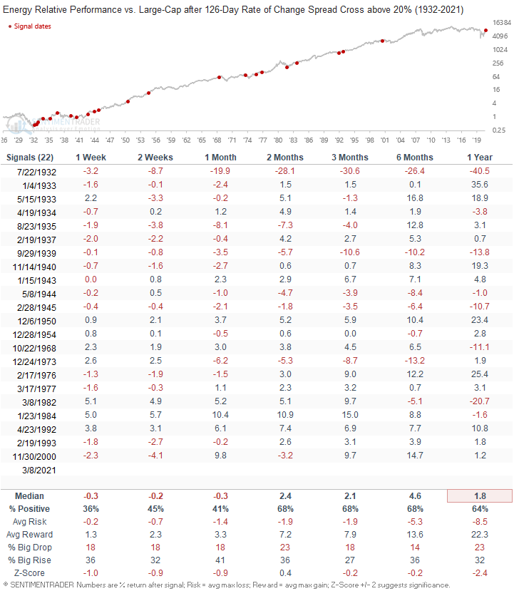
Energy - Absolute Signal Performance
Energy vs. Large-Cap - Relative Signal Performance
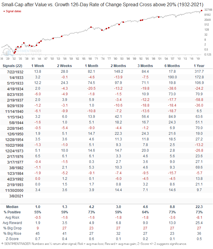
Small-Cap - Absolute Signal Performance
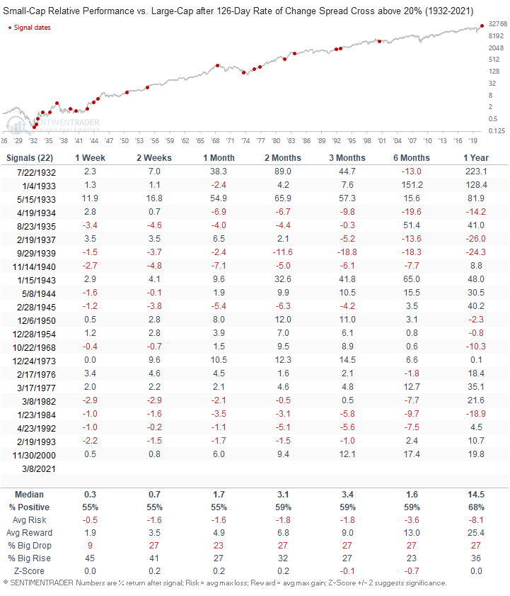
Small-Cap vs. Large-Cap - Relative Signal Performance
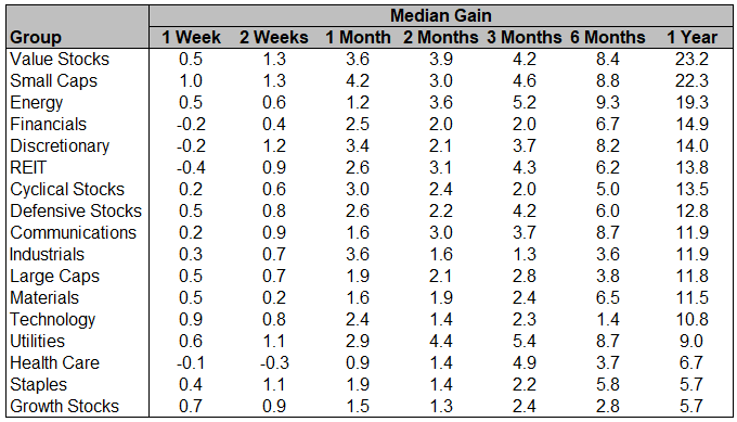
All Groups Absolute Performance
The following table is sorted by the 1-year median gain.
What can we expect from here in the next few months?
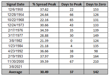
The following table provides more context around signals since 1950. The historical statistics show that the spread continues to rise to an average peak of roughly 30% after an additional 37 trading days have passed. The final column shows how many trading days it takes for the spread to cross back below zero.