A Simple Fix For Skewed Charts
We've added a minor feature to the charts this week that will help analyze some longer-term data.
When there is a long-term price series, the up and down moves can get distorted if they're volatile. Looking at a long-term chart of stock prices, it's always dominated by the last 25 or so years, and it's hard to make out the ebbs and flows from prior decades. Changing the scale of the chart to logarithmic fixes this, so that the percentage change over time is consistent.
For extremely volatile contracts like silver or natural gas, this can really help when looking at the chart, even on shorter time frames.
Here's an example.
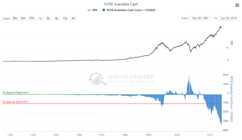
First, the chart of Available Cash (margin debt minus free credits). Notice how flat the price of the S&P 500 looks prior to 1995, almost like it was smooth sailing for the 60 years prior.

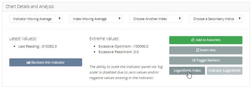
If we click the "Logarithmic Index" button below the chart, then it will change the scale of the S&P to log.

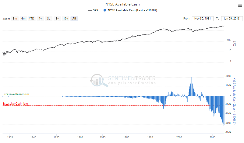
Then we get this chart:

Now, the S&P's moves over time are consistent and put in better perspective.
Using a log scale is a great way to look at long-term data, or for any indicator or index where the moves are highly volatile. A log scale won't wok for an indicator that has 0 or negative values, but for everything else, it's worth trying to make sure you're seeing an accurate picture.

