
What sector drawdowns say about the S&P's record high

Key points:
- An analysis of sector drawdowns after S&P 500 new highs shows several with similar characteristics
- After those instances, the S&P 500 tended to rise over the following year with a decent risk/reward ratio
- Value stocks tended to benefit among factors
A mixed picture in sector drawdowns
We've written quite a bit about sector performance in recent weeks. About how some are leading while others are sucking the hind teat, as my grandpa used to say.
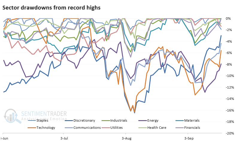
Now that the S&P 500 has scored a fresh high, it may be instructive to look at the sectors and how far each is from its own high. Then, we can go back over nearly 100 years and look for the highest-correlated sector drawdowns on a day the S&P hit a record high for the first time in months.
When we look at current drawdowns, we can see that while they've jumped recently, energy, technology, communication, and discretionary stocks have lagged the others. They're the furthest from their record highs.
Let's look at other times the S&P 500 closed at a record high for the first time in at least a couple of months. Then, we'll look at where each sector is trading relative to its own record high and pinpoint the instances with the closest sector drawdowns to what we're seeing now.
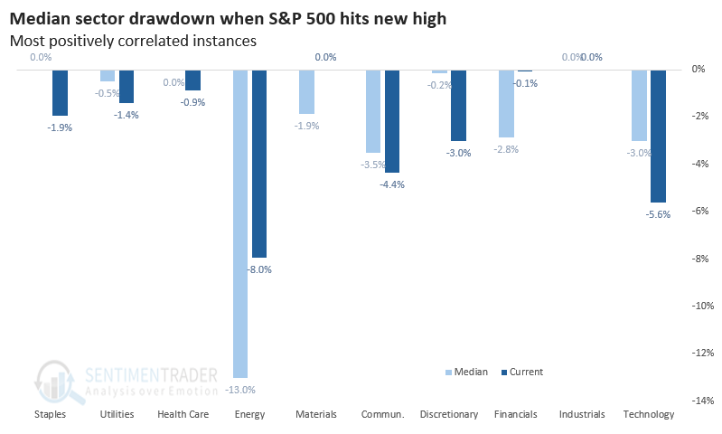
The chart above shows us that utilities are about 1.4% below their all-time high, while on average, the fifteen highest-correlated instances saw utilities about 0.5% below their high. Technology was around 3% from its high during those instances, while now it's a little more than 5% below. You get the drift.
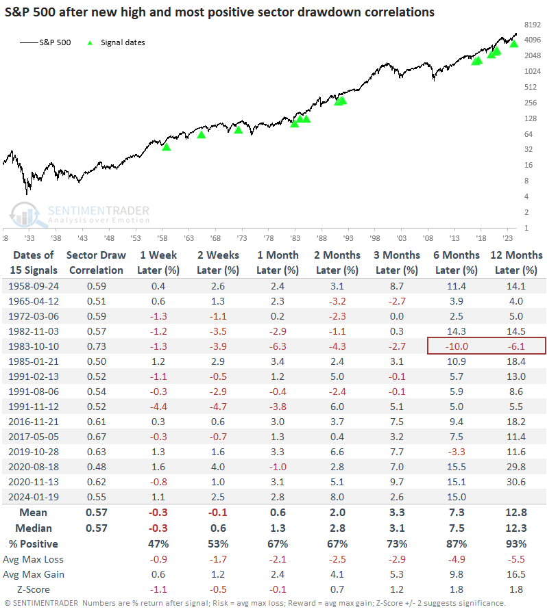
The point of the exercise is to look at forward performance. We want to see how the S&P 500 performed after other times it reached a record high, and the sector drawdowns were the most closely aligned with what we see now. The table below tells us that.
Similar sector drawdowns led to good one-year returns
It wasn't great news for short-term traders, but returns got progressively more encouraging. During the next 6-12 months, there was only a single loss of any magnitude, and over the following year, the average reward was three times the average risk. While the pandemic interruption was deeply uncomfortable for investors, the only absolute failure was in 1983, with moderate losses across all time frames.
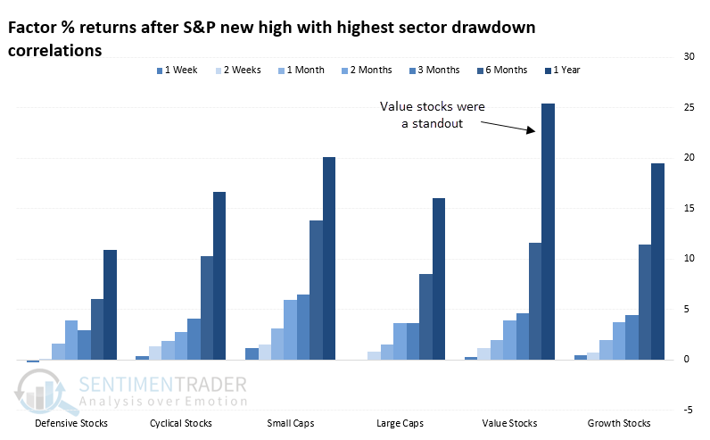
Among factors, value stocks stood out. Over the following year, they averaged more than a +25% return, outpacing any other factor.
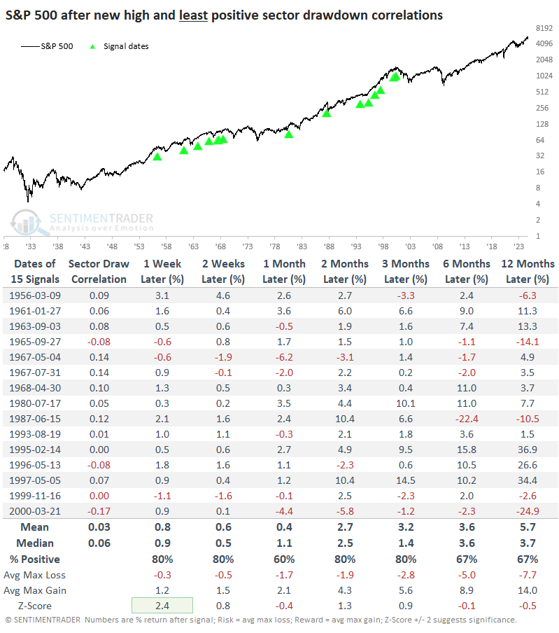
It often helps to look at counter-examples, so the table below shows record S&P 500 highs with the least correlated sector drawdowns. Notably, these included the pre-crash peaks in 1987 and 2000. Returns were quite favorable over the short- to medium-term, but long-term returns suffered. They were about half the returns of the table above, with higher risk and lower reward.
What the research tells us...
Market watchers like to make a big deal about which sectors are leading and lagging. For the broader market, this rarely matters. We've looked at data like this many times over the years, and usually, there wasn't a significant edge. Most often, it doesn't really matter which sectors are leading and lagging.
We can kind of see that above. There isn't a concrete theme on which sectors are currently at new highs or close to it versus the ones that aren't. However, when we compare this mix to other times the S&P 500 reached record highs, the ones with the closest mix of sector drawdowns tended to lead to good long-term returns, especially for value stocks.