
TradingEdge for Mar 25 - Continued surge amid better seasonality and easing pessimism, bonds have been destroyed

Key points:
- There have been early signs of a surge in buying interest among a handful of indicators
- Seasonality is turning positive for stock indexes and many sectors
- Pessimism is starting to ease, typically helping to support rising prices
- Treasury yield curves have NOT inverted in any meaningful way, and the Macro Index Model is solidly positive
- High-yield bonds have been hammered and look deeply oversold
- There have been sentiment reversals in a couple of alternative energy industries
Nascent signs of a surge
Ever since we looked at the disaster among stocks trading on the Nasdaq exchange, we've been looking for signs of a recovery. Few signs are better than a thrust of buyers returning quickly and en masse.
There are nascent signs we're seeing that now. The McClellan Oscillator for the Nasdaq has cycled from below -70 to above +70. Over the past 5 years, it has done this only 2 other times, preceding sustained rallies.
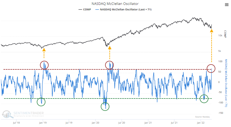
The Nasdaq Composite's returns following all similar reversals over the past 40 years were good, with 14 out of 17 signals showing a positive one-year return, which averaged a robust 17%.
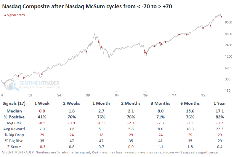
The biggest issue is the post-bubble bear market. That, and the financial crisis, were the only times when sellers returned immediately and in force.
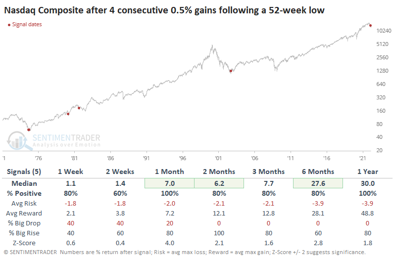
The thrust in price has been impressive and nearly unprecedented. The only other time in its history when the Nasdaq Composite closed at a 52-week low then enjoyed 4 consecutive days with larger than 1% gains was in April 1980. That ended up leading to a further gain of 56% during the following year.
Even if we look at "only" gains of 0.5% on back-to-back-to-back-to-back days, there are few precedents, all leading to further gains.
Seasonality is turning into a tailwind, too
The seasonal trends for many equity ETFs and indexes are about to turn from poor or neutral to positive as we enter the spring months.
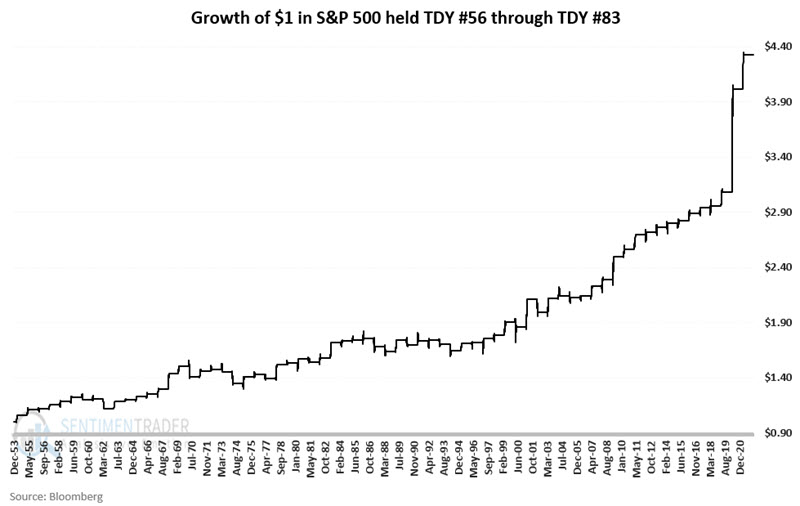
Jay highlighted a favorable seasonal period that extends from Trading Day of the Year (TDY) #56 through TDY #83. For 2022, this period extends from 3/23 through 5/2.
The chart below displays the growth of $1 invested in the S&P 500 Index only during this favorable period each year since 1954. It showed a gain 53 times and a loss only 15 times.
If we look at the year-to-date loss in the S&P 500 and compare it to other years, we can objectively find periods when poor returns and seasonality combined forces. The chart below shows the S&P in 2022 and an average of 14 other years with more than a +0.7 correlation to this year (on a scale from -1.0 to +1.0).
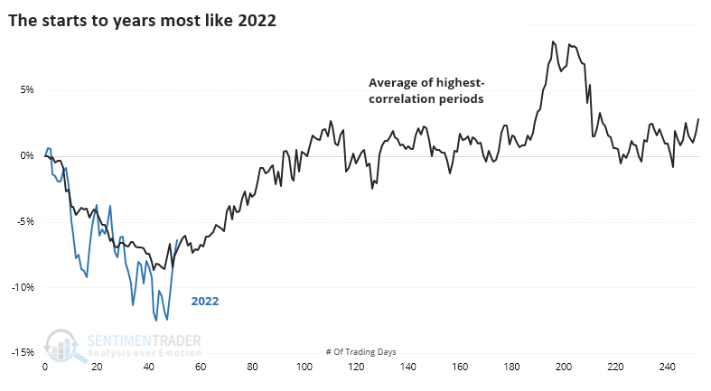
Many of them bottomed right about where we did this year and typically carried higher into early summer. Only 1976 suffered an immediate rejection and lower lows. The others rallied for about 30 days before failing, if they did at all.
As always, we're more concerned with where we may be going instead of where we've been. The table below shows the S&P's returns after those periods ended. Out of the 13 years with a YTD correlation greater than +0.70, 11 of them showed gains during the next 6 months.
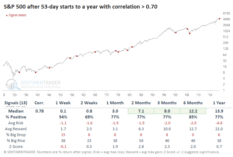
Out of that sample, there were a handful of years with the highest correlations, above +0.80. Those all showed gains in the months ahead.
Easing options hedging should be a good sign
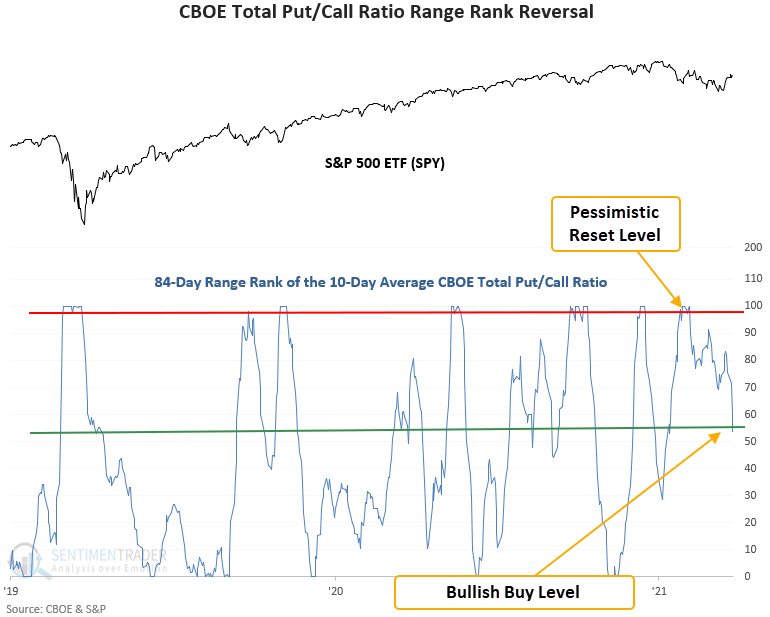
When investors are bearish on stocks, they buy put options to bet on declining stocks. The CBOE total put/call ratio can be used as a contrary indicator to identify an environment where sentiment has become too pessimistic on the future direction of stocks.
Dean noted that the total put/call ratio trading model triggered a buy signal this week. The model uses a medium-term lookback period and ranks each day's smoothed reading of the ratio. A buy signal triggers when sentiment moves from deeply pessimistic to neutral, combined with positive momentum in the underlying market.
This signal triggered 62 other times over the past 26 years. After the others, future returns, win rates, and risk/reward profiles were excellent across all time frames, especially on a medium-term basis.
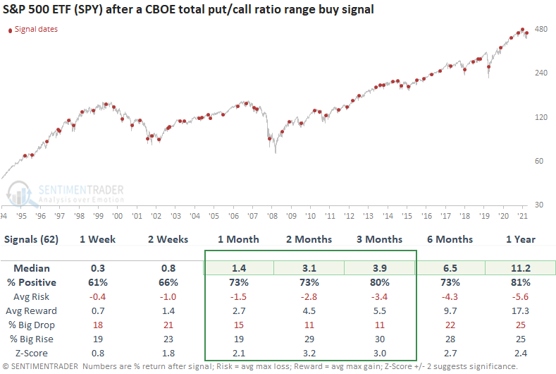
The model performed well during challenging market environments, which is something we might expect now with a federal reserve that is less friendly.
The yield curve isn't inverted enough to throw the surge off track
Headlines are stuffed once again with concerns about yield curves. But across 55 different combinations of Treasury yields from 11 different maturities ranging from 1 month to 30 years, inversion is still rare. Fewer than 10% of the combinations are currently inverted.
When fewer than 10% of curves were inverted (like now), the S&P 500's annualized return was +13.2%. Only when more than a quarter of the curves inverted did annualized returns start to really suffer.
That's probably a ways off. The chart below shows the median spread between the different combinations. This dipped below zero before every recession in the past 60 years. It's still well above that point now.
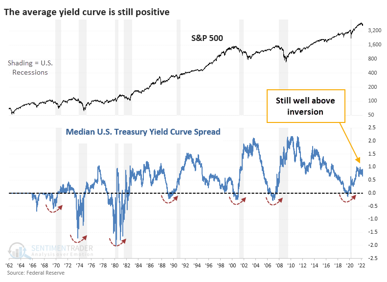
Based on where we are now relative to all other days,there was only a 4% probability that we'd be in recession within the next 12 months.
From a fundamental macro point of view, the Macro Index Model is still in healthy territory. Any month with a reading equal to or above 70% can be considered healthy. We'll get a fresh monthly reading during the first week of April.
Over the past 50+ years, the S&P 500 has returned +12.2% p.a. (per annum, or annualized percentage) when it was equal to or above 70% versus only +1.2% when it was below 70%. The most protracted declines in stocks occurred when this model was below 70%.
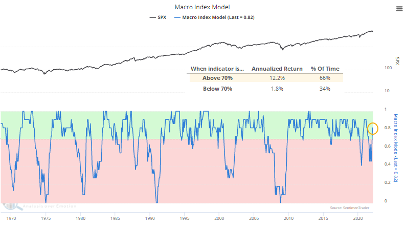
This is not a macro forecasting newsletter; there are much better sources for educated guesses on what might happen and which factors might most affect the U.S. economy. We take the data as they come and see if it has provided an edge. Currently, that data shows the concerns about the yield curve are premature. If more than a quarter of Treasury curves invert in the weeks and months ahead, we'd be more concerned. If that rises above 50%, we'd be a LOT more worried, especially in combination with a Macro Index Model below 70%.
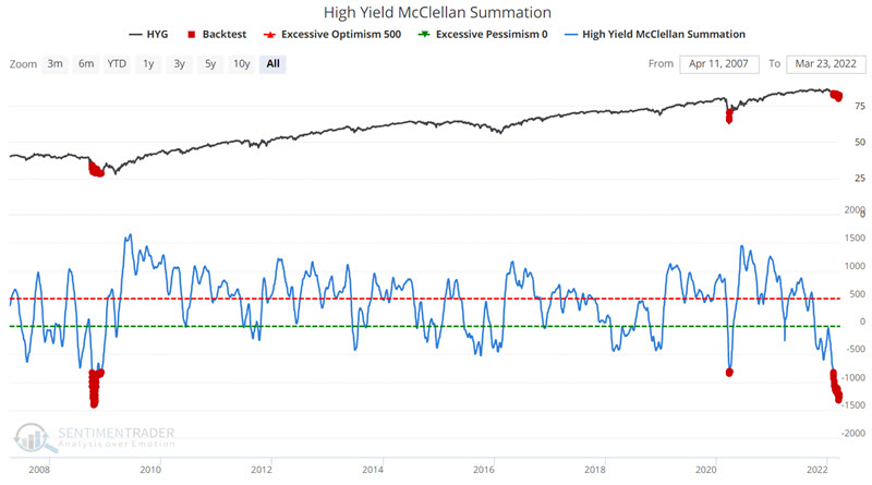
High-yield bonds have gotten smoked
Jay showed that with the decline in the stock market during the first quarter of 2022, combined with weakness in the overall bond market, the high yield bond sector took it on the chin.
High-yield bond performance is generally highly correlated to stock market performance. The chart below highlights with a red dot those days when the High-Yield McClellan Summation Index was below -800. Note that this is an infrequent occurrence, and as such, we are dealing with an admittedly small sample size.
The below indicator notes the number of high-yield bonds making new 52-week highs and 52-week lows on each given day. We then take a 10-day moving average. Rather than using this measure to find "buy on weakness" opportunities, we look for a reversal from below to above -350 for the 10-day average. We are looking for a "buy on confirmation of a reversal" opportunity.
The chart below displays those occasions when the 10-day average of High Yield Bonds NH - NL crossed above -350.
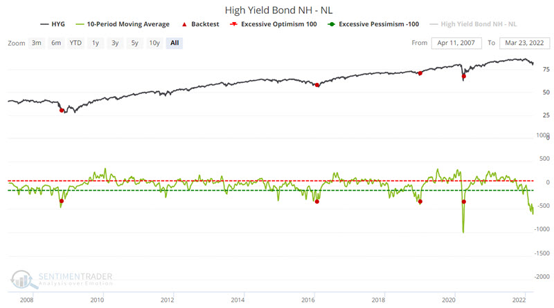
Please note that this signal has not triggered yet. Nevertheless, the expectation is that it will move above -350 relatively soon, thus offering a bullish confirmation signal for high-yield bonds.
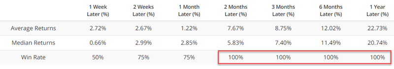
The table below displays the performance summary for HYG following previous crossings above -350.
The chart below displays the annual seasonal trend for ticker HYG (iShares iBoxx $ High Yield Corporate Bond ETF). As you can see, we are on the cusp of a favorable seasonal period.
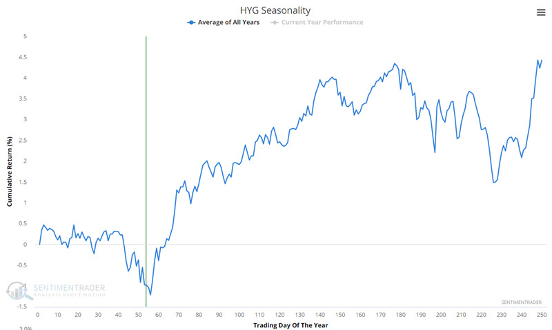
Since the inception of HYG, this period showed a gain 14 times, and no losses. A different fund with history back to 1980 showed 36 gains and only 6 losses.
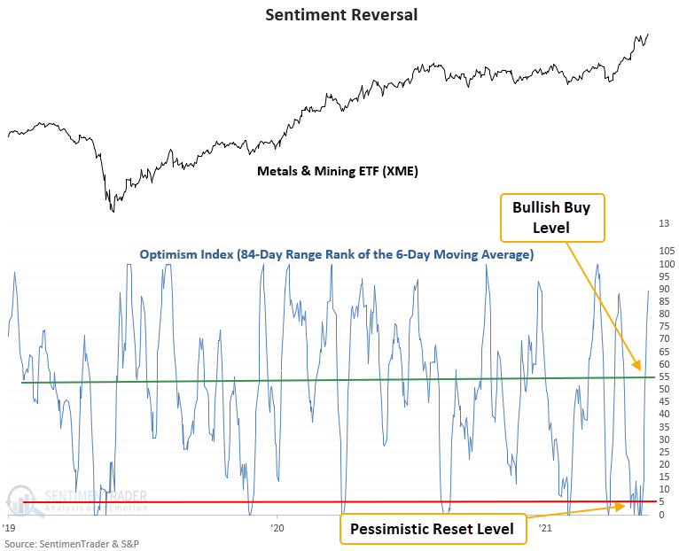
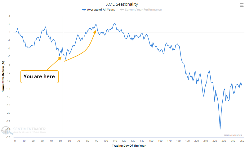
Metal and mining sentiment reversal
Dean noted that our Optimism Index (Optix) for the metals and mining industry reversed higher relative to its recent range.
A trading model that uses the Optix Index to identify when sentiment reverses from a period of pessimism issued a buy signal for that industry this week.
The model uses a medium-term lookback period and ranks each day's smoothed reading of the Optimism Index. A buy signal triggers when sentiment moves from deeply pessimistic to neutral, combined with positive momentum in the underlying market.
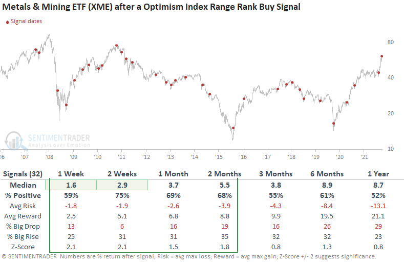
This signal has triggered 32 other times over the past 15 years. After the others, the XME ETF future returns, win rates, and risk/reward profiles were solid across the 1-8 week time frames, especially the 2-week window. The near-term results are even more impressive considering the problematic long-term backdrop since the peak in 2008.
Seasonality for the Metals and Mining ETF (XME) is also about to turn favorable.
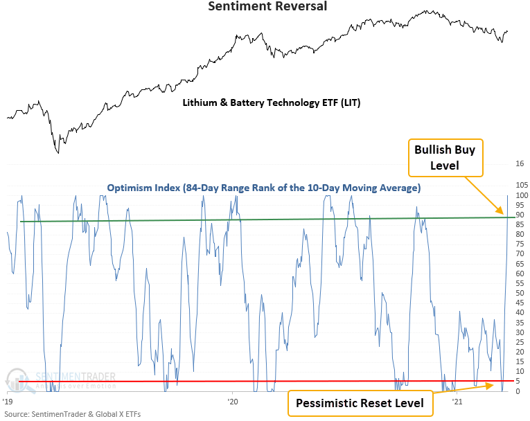
A sentiment reversal in batteries, too
The Optimism Index for the Lithium & Battery Technology ETF reversed higher relative to its recent range. Dean discussed a trading model that uses the Optimism Index (Optix) to pinpoint when sentiment reverses from a period of pessimism. The model is very similar to the one noted directly above.
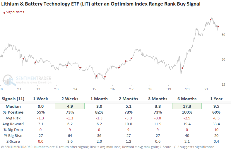
This signal triggered 11 other times over the past decade. After the others, the LIT ETF future returns, win rates, and risk/reward profiles were solid across almost all time frames. The signal showed a positive return in all 11 instances at some point in the first 2 months, which is impressive considering the amount of time the ETF has spent in a downtrend. The LIT ETF is a relatively new instrument so the sample size is small.
Energy seasonality is entering its best phase of the year
The energy sector has had a terrific run - quadrupling since the 2020 Covid lows. Jay pointed out that this market is about to enter a seasonal period of typically favorable performance.
The chart below displays the annual seasonal trend for XLE (Energy Select Sector SPDR ETF). A favorable seasonal period extends from Trading Day of the Year (TDY) #56 through TDY #83. For 2022, this period extends from 3/23 through 5/2.
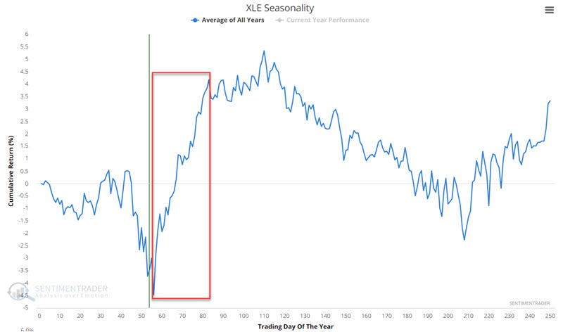
Jay looked back further using an energy sector data series that goes back to 1954. The table below displays a summary of performance results.
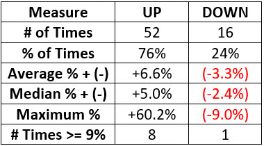
Over the decades, this seasonal stretch has shown a gain 52 times and a loss only 16 times, with the average win twice as large as the average loss.
About the Weekly Wrap...
The goal of the Weekly Wrap is to summarize our recent research. Some of it includes premium content (underlined links), but we're highlighting the key focus of the research for all. Sometimes there is a lot to digest, with this summary meant to highlight the highest conviction ideas we discussed. Tags will show any symbols and time frames related to the research.