
Warning Signs to Look Out For

Key points:
- In terms of price action, the major U.S. market indexes remain in uptrends
- However, market tops often take a while to play out, and typically involve some deterioration "under the surface"
- Here, we highlight some key indicators to keep an eye on to identify when that deterioration may be taking place
The overall trend remains positive
The price charts below for the S&P 500 Index, Nasdaq 100 Index, Dow Jones Industrial Average, and Russell 2000 show each index near all-time highs and still well above its respective 200-day moving average.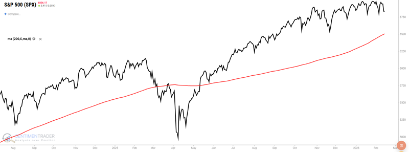
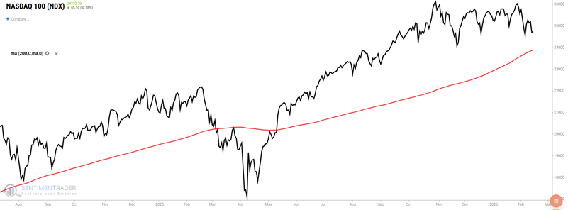
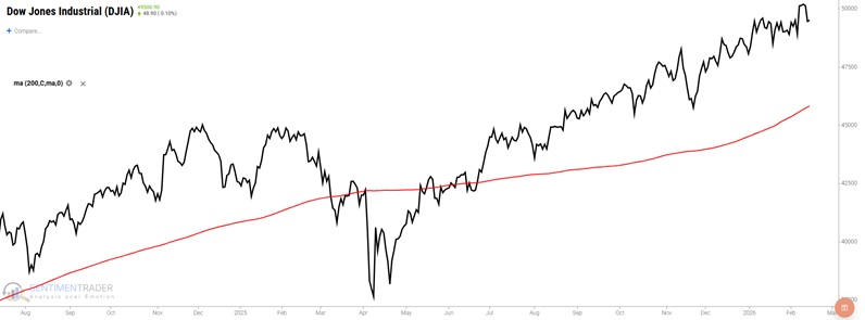
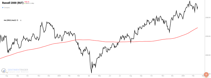
This type of action is the textbook definition of a bull market. That's the good news. The bad news is that no bull market lasts forever. The conundrum investors face is one of not falling obliviously in love with the current uptrend, while also not scaring themselves out of the market unnecessarily because they think it is "due" for a decline.
Historically, market tops typically - though importantly, not always - take some time to play out. Often, the major indexes continue higher or, at worst, trade sideways, while many stocks top out and start to head lower. In essence, the "Generals continue to lead, but fewer soldiers follow."
The keys to identifying this type of action are a) looking for objective warning signs that this type of action is happening, while b) not paranoidly seeing signs "hiding behind every tree." So let's look at a few indicators that may offer "early warning" signs of impending market trouble. Note that none of the signals highlighted should be viewed as a "SELL EVERYTHING!!!" type of panic signal. When they do occur, they alert us that negative weight is being added to the unfavorable side of the weight of the evidence ledger.
Indicator #1: The Nasdaq HiLo Logic Index
The original HiLo Logic Index was created by Norman Fosback in 1979. Intended to observe "split" market conditions, it looks for periods when there are BOTH a large number of 52-week highs AND 52-week lows among exchange-listed securities. When there are many of both, the market is severely split between winners and losers, which tends to be negative for stocks. When the number is very low, the market is heavily one-sided, which tends to be positive for stocks. The indicator is traditionally interpreted over a longer time frame, so we suggest viewing it with a 10-day moving average. For this test, we will look at the Nasdaq version.
The chart below highlights all dates when the 10-day average of the Nasdaq HiLo Logic Index crossed above 3.00. As you can see, this happens very infrequently. The most recent signal occurred on February 2nd.
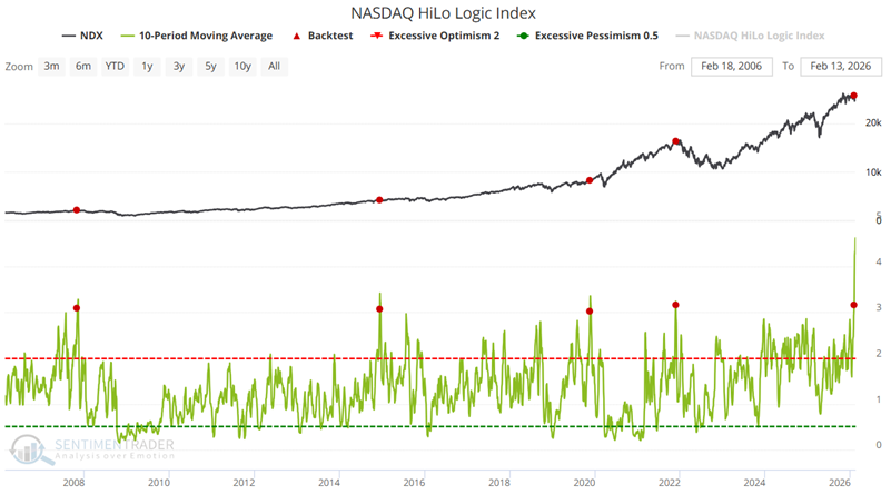
The table below summarizes subsequent Nasdaq 100 Index performance.
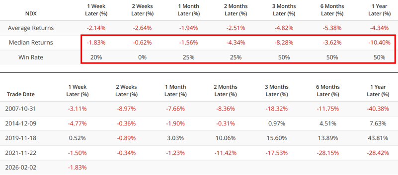
There is no set pattern for how the market reacts after a signal. However, the critical point is that the Win Rates and Median Returns are far below average, suggesting that some sort of market trouble is likely to unfold. Viewed in isolation, the recent signal from this indicator suggests that investors should adjust their market expectations in the months ahead.
Indicator #2:The Nasdaq Titanicburg Indicator
The NASDAQ Titanicburg is a composite indicator that combines the NASDAQ Titanic Syndrome and the NASDAQ Hindenburg Omen. Each of these indicators looks for a specific pattern in market action versus new high and new low activity to identify potential underlying weakness in the market. Like its NYSE counterpart, higher readings on the NASDAQ Titanicburg signal unfavorable market conditions, while lower values are considered more favorable. This indicator is tailored to track the pulse of the NASDAQ market, helping investors understand the broader trend by incorporating both the Titanic and Hindenburg signals into a single metric. The NASDAQ Titanicburg offers valuable insights for those focused on the tech-heavy index, helping to refine decision-making strategies in response to market shifts.
The key thing to watch for is a dramatic spike in the indicator value. The chart below highlights those dates when the indicator rose above 40.
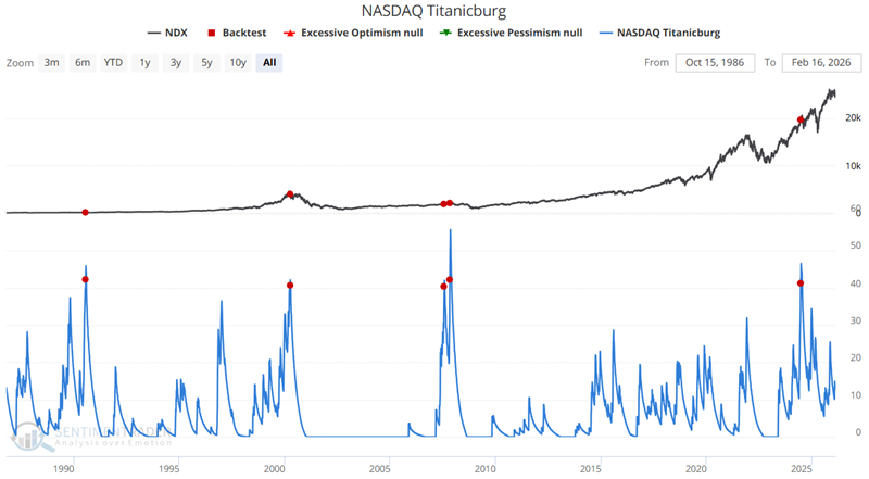
The table below summarizes subsequent Nasdaq 100 Index performance.
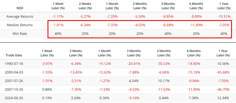
A random Hindenburg Omen signal or occasional Titanic Syndrome signal is not typically a reason to worry. However, when they accumulate, it generally indicates serious deterioration in market breadth. A spike in the Nasdaq Titanicburg indicator normally reveals this type of action.
Despite a few recent Nasdaq Hindenburg Omen signals, this indicator is presently far from issuing a warning. Nevertheless, with the number of stocks making new highs and lows on the rise lately, investors should check the Nasdaq Titanicburg indicator at least once a week for any warning signs of trouble.
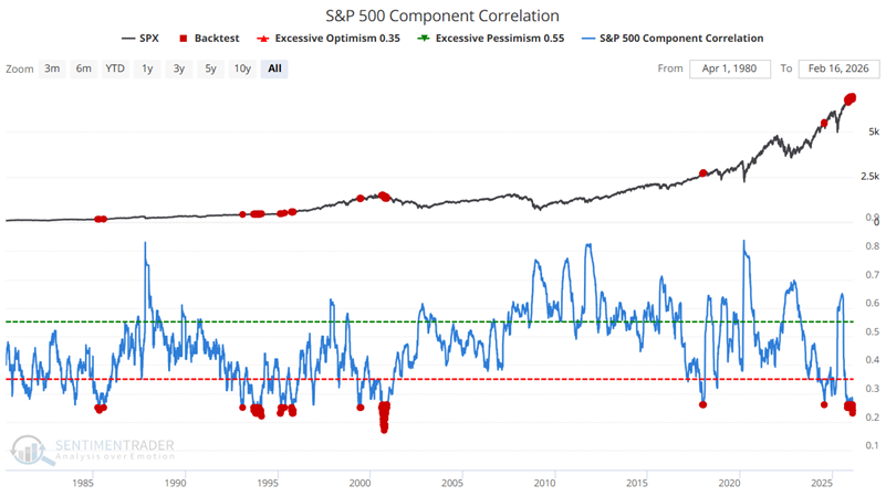
Indicator #3: S&P 500 Component Correlation
This shows the correlation among members of the S&P 500 index. During times of panic, investors tend to buy or sell "everything" together, no matter their individual merits, so correlation rises. The higher it goes, the more we're seeing groupthink, which tends to occur during periods of extreme pessimism and is thus usually a positive for stocks in the future. When conditions are calm and investors become complacent, they trade stocks on their own merits, and correlation drops. That tends to lead to below-average returns for the index going forward.
The chart below highlights all dates when the S&P 500 Component Correlation Indicator was below 0.26. The indicator has been below this level at times during November and December of 2025 and again in February 2026.
The table below summarizes the subsequent performance of the S&P 500 Index.
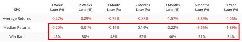
Once again, historical results suggest a reason for concern and moderated expectations, but not necessarily for panic.
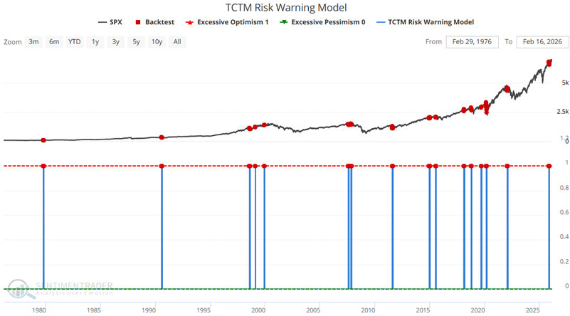
Indicator #4: TCTM Risk Warning Model
The TCTM Risk-Warning Model contains ten algorithms designed to identify historical instances of declining market participation and excessive optimism. Historically, weak internal trends and overly optimistic sentiment have often served as early warning signs of a potential trend change.
A in-depth look at the TCTM Risk Warning Model, see the ModelEdge notes here and here.
The chart below shows the times the model triggered a warning sign.
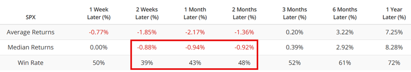
The table below summarizes subsequent S&P 500 performance. Note the tendency for weakness in the month following a signal
The chart below displays the hypothetical % gain or loss achieved by holding a long position in the S&P 500 Index for one month following each warning signal from the TCT Risk Warning Model.
The most recent signal occurred in early December 2025, so the one-month "danger zone" for that signal has passed. Nevertheless, investors should review the status of this indicator at least once a week for any new short-term warning signals.
What the research tells us…
The Nasdaq HiLo Logic Index and S&P 500 Component Correlation indicators are presently showing active warning signals; the Nasdaq Titanicburg indicator and our TCTCM Risk Warning Model are not. What does it mean? In reality, there is no definitive answer. In the past, the market reaction to a single warning signal from any of these indicators has ranged from no reaction at all to a short-term sell-off to a prolonged sideways range to a significant bear market. The current open warning signs suggest at a minimum that investors adjust their expectations for the year ahead. Additional warning signals in the months ahead would indicate an increased risk of trouble in the stock market. Rather than reacting emotionally to headlines and events, investors are encouraged to review the status of the indicators highlighted here at a minimum weekly for objective warning signs.