
TradingEdge Weekly for Sep 5 - Yield curve steepening, September seasonality, wheat and gold outlook, treasury bonds

Key points:
- Treasury yield curve steepening to widest in years - historical implications for stocks and small caps
- September's worst-month status and a strategic approach to improve returns
- Wheat entering favorable seasonal period after multi-year decline
- Gold at critical juncture with extreme signals from miners and sentiment
- T-bond ETF TLT entering seasonally weak period despite potential Fed rate cut
- Energy sector's swift RSI reversal reveals weak short-term outlook
From inverted to kinda steep: Treasury yield curve implications
There have been some notable machinations in one of the world's most liquid markets, and few seem to be paying attention.
The Wall Street Journal noted that the yield spread between the 2-year Treasury note and 30-year Treasury bond has steepened to the widest point in several years.
In Treasury markets, something of a Trump effect has begun to take hold in recent weeks. Investors expecting rate cuts have snapped up 2-year Treasurys, weighing down the yield on those notes. Those expecting higher rates over time have sold 30-year Treasurys, boosting the yield there.
This is, understandably, unnerving to some investors who have pulled up a chart of the past 25 years. The last two times this yield curve cycled from inversion to a spread of +1.25%, it coincided with the two most wicked bear markets in generations.
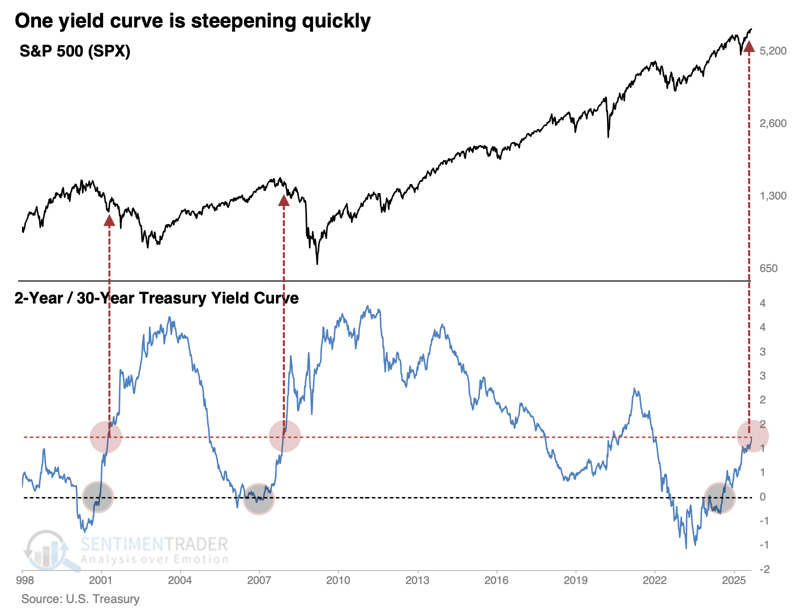
Those weren't the only two cycles in history; the Treasury has data going back nearly 50 years. Spreads were much more volatile before the 1980s, but there have been a handful of times the curve cycled as it has over the past few months.
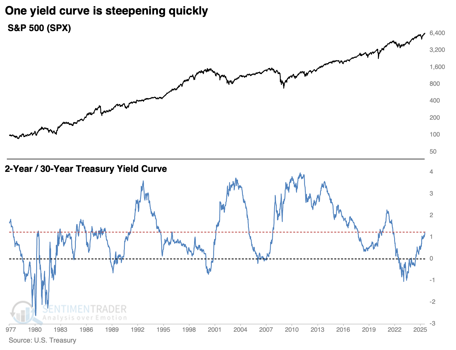
Two bad, four good
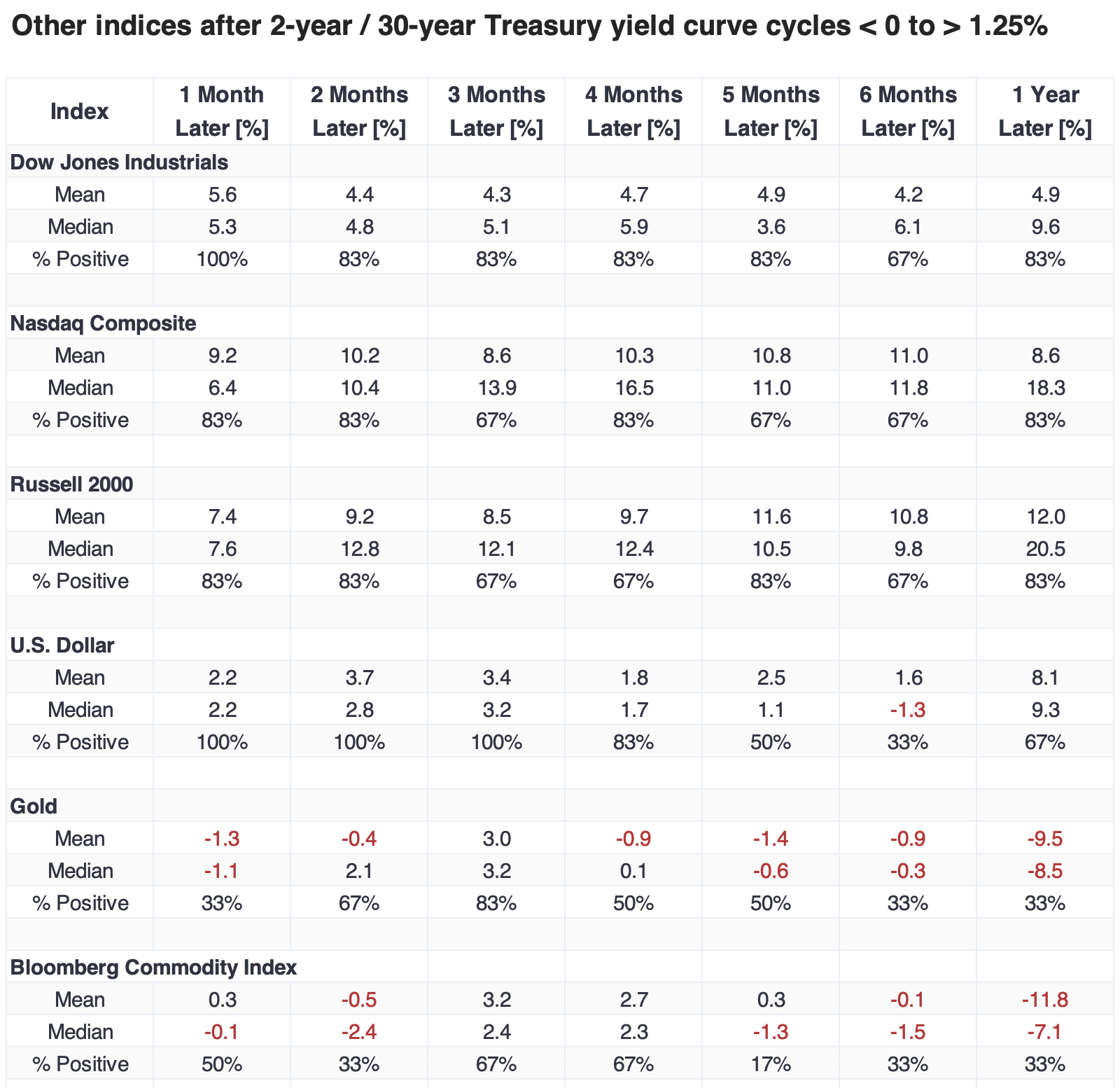
Clearly, the last two signals were atrocious for equity investors over longer time frames. The chart below shows every similar cycle since 1977, and the S&P 500 showed gains a month after each cycle. The implications of the structure of that yield curve became apparent within a couple of months of the last two signals, and stocks started to sell off. However, those were the only two that showed negative returns.
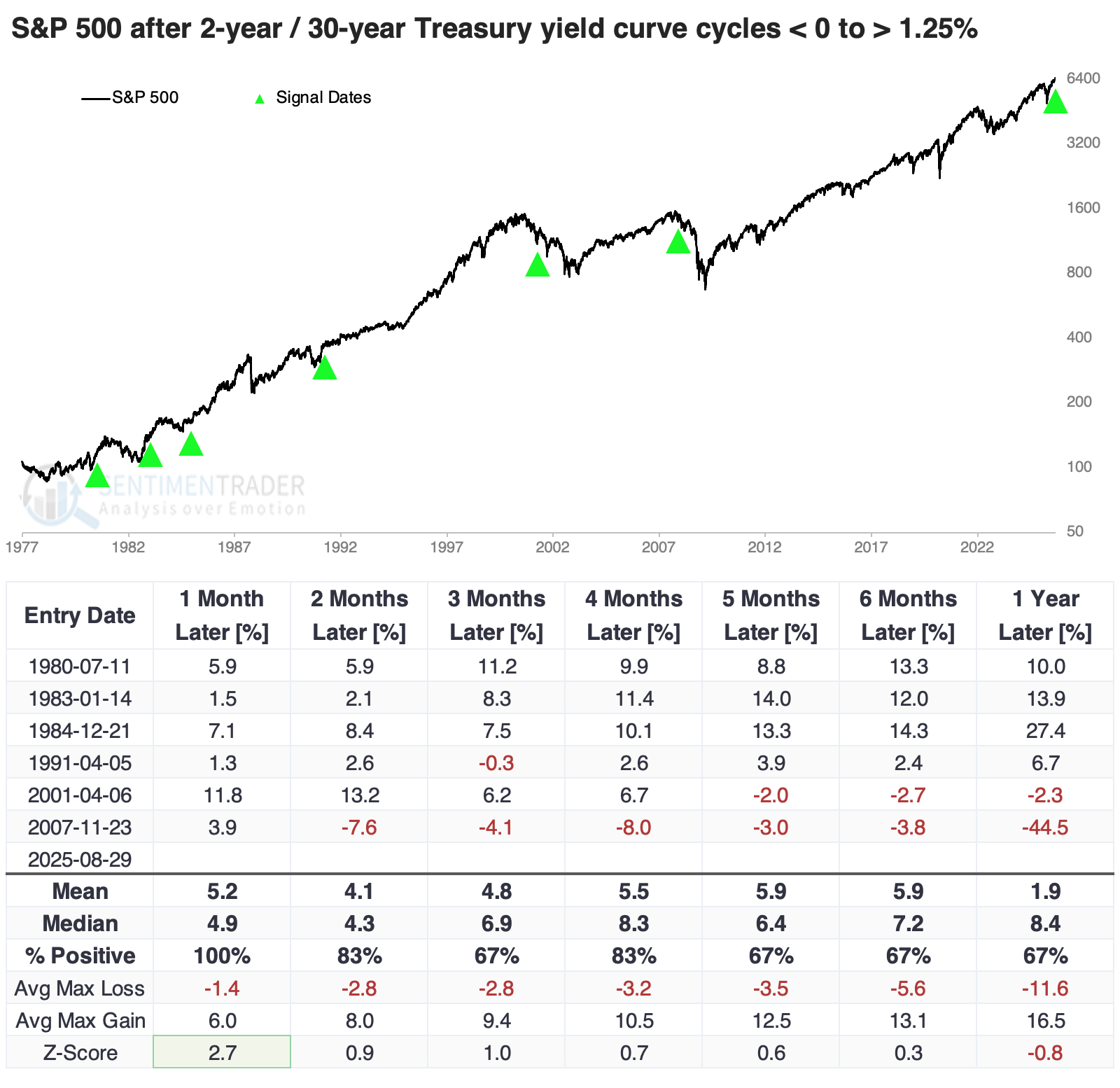
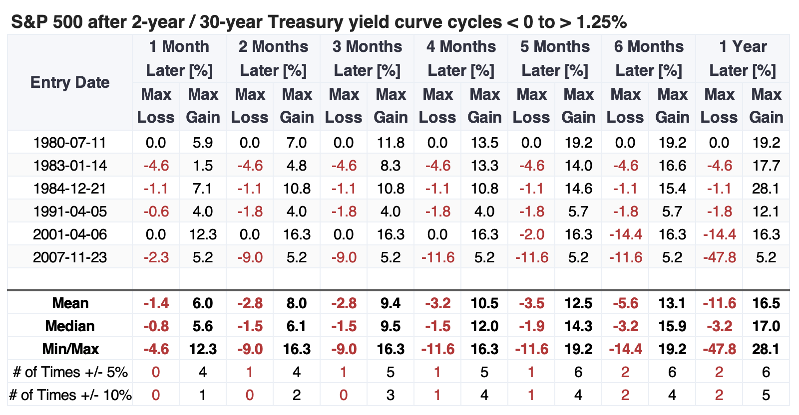
The table of maximum gains and losses across time frames shows that within the first five months, only the global financial crisis signal saw the S&P 500 decline more than 4.6%, while it rallied double-digits after four of the five other signals.
Good for small caps
The first couple of months after these signals tended to be good for returns in other major equity indices, and over the following year, the small-cap Russell 2000 outpaced the others. The dollar showed a strong tendency to rise over shorter time frames, then fade. Gold and the broader commodity complex struggled.
September has been the worst month for stocks by far
For reasons no one can fully explain, the stock market has historically performed well in some months and much more poorly in others.
For testing purposes, we broke the 105 years from 1920 through 2024 into two periods: the first 52 years, which run from 1920 through 1972, and the final 53 years, which run from 1972 through 2024. Using monthly price action for the S&P 500 from 1920 through 2024, the table below displays the cumulative gain or loss for each month of the year for these two periods and the whole 105-year history.
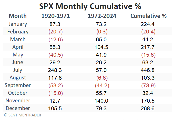
February and September are the only months that show a negative return over both periods. But more importantly, September is by far the worst performer over both test periods.
Zooming in on a September quirk
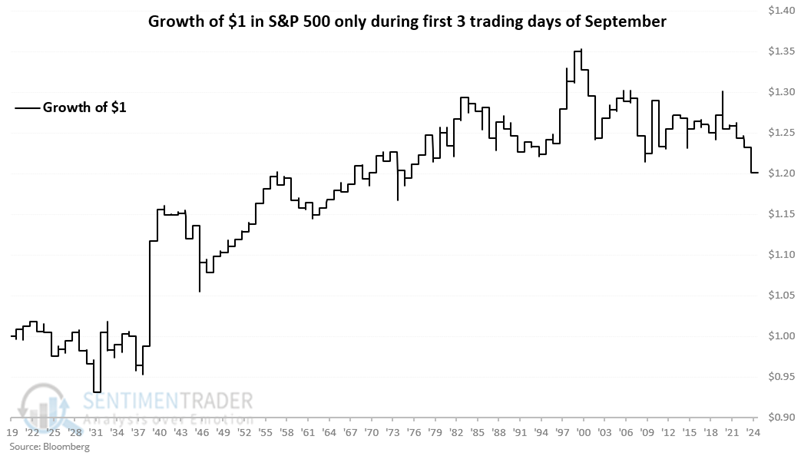
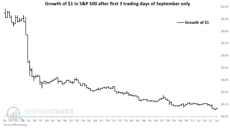
The stock market tends to show strength around holidays, and September's first three trading days invariably occur directly before or after Labor Day.
Below, we break down September's performance by the first three trading days of the month compared to all other trading days. Over the last 105 years, the S&P 500 has registered a modest 20% cumulative gain during the first three trading days of September and an abysmal 78% cumulative loss during all other trading days through the end of the month.
Wheat has been a dreadful performer for years
Due to the vagaries of the planting and growing cycles and the unpredictability of weather in locations where wheat is grown, wheat has been one of the most highly cyclical commodities. This fact is readily apparent in a monthly chart of wheat futures prices going back to the start of the previous century.
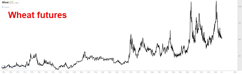
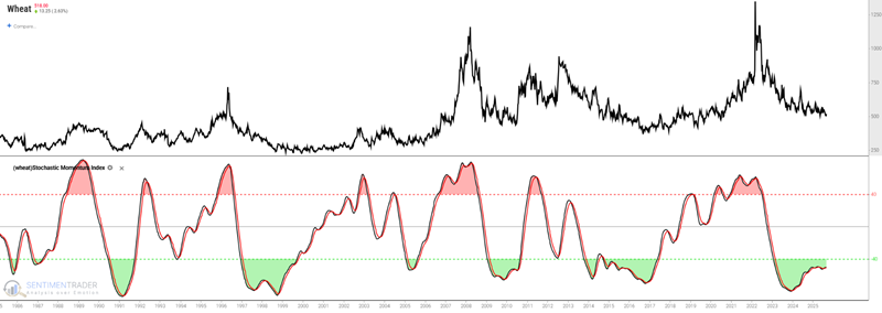
In the weekly chart below, we can note that in the past three and a half years, wheat has plunged 65% in price. However, momentum has begun to swing back to the upside, and previous upswings have often presaged significant subsequent rallies.
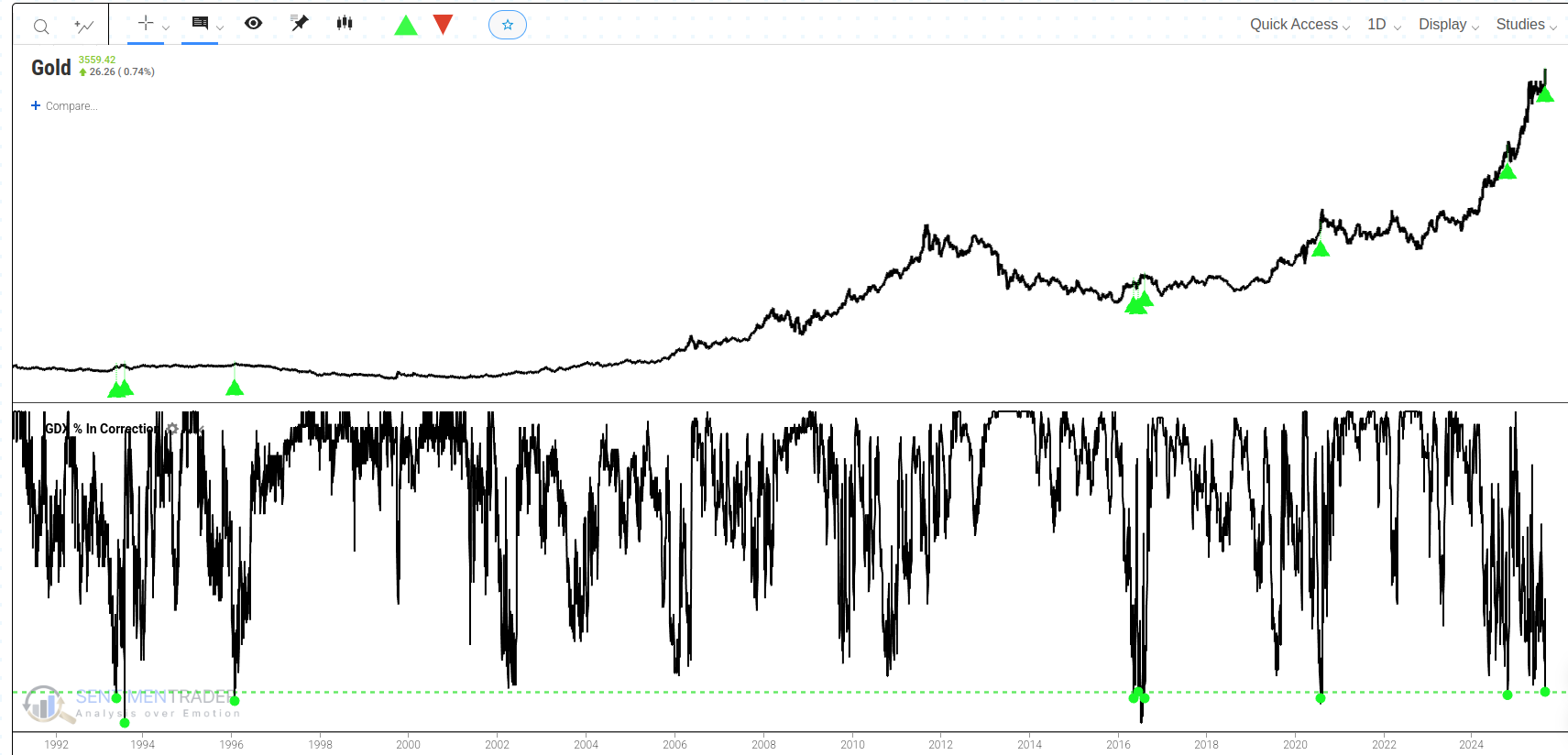
Extreme Strength in Gold Miners: A Warning for Gold?
Recently, the gold miners (GDX) sector has displayed considerable internal strength, with two key indicators reaching historic extremes. It is worth taking a deeper look at their potential impact on gold's future trajectory.
First, the "GDX % in Correction" indicator has fallen to a historic low of 10. This metric measures the percentage of GDX component stocks that have fallen more than 10% from their 52-week highs. The current extremely low reading means that almost all gold mining companies are at or very near their yearly highs, reflecting an exceptionally broad and consistent rally.
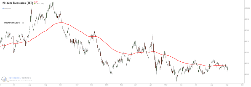
TLT has been a dreadful performer for years
The chart below shows the dreadful performance for the iShares 20+ Year Treasury Bond ETF (TLT) in recent years as interest rates have risen steadily from less than 1% to almost 5%.
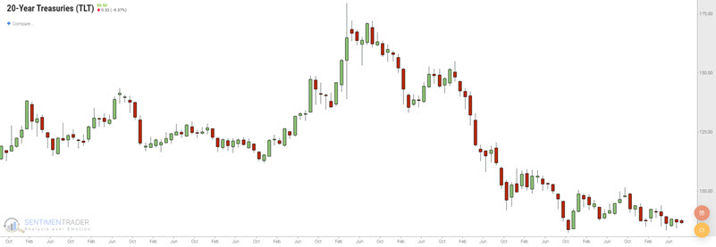
The "popular" interpretation now seems to be that a) a long base is forming, and b) the Fed will finally cut rates in September, triggering a significant rally in t-bonds. And that is a reasonable possibility. However, meanwhile in the here and now, TLT remains very weak and is now entering the weakest seasonal period of the year.
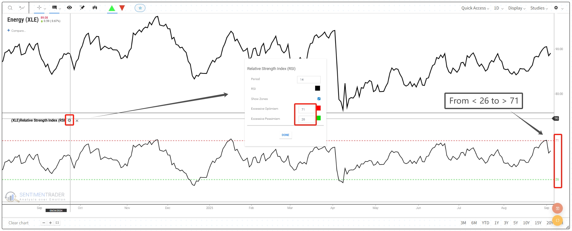
A reversal for a widely followed price momentum indicator
The Relative Strength Index (RSI), a well-known price momentum indicator, excels at identifying trends and potential turning points in the market. Traders and analysts value its flexibility, using it as a standalone trading signal, a component of a larger strategy, or as an overlay for other systems.
While readings below 30 are typically considered "oversold" and readings above 70 "overbought," some of the most potent signals occur when the indicator travels from one extreme to the other in a short period. Such a move suggests a significant reversal in market sentiment and money flow.
This week, the RSI for the Energy Select Sector SPDR Fund (XLE) provided a textbook example of this phenomenon. The indicator surged from a reading below 26 to a level above 71 on September 4th, 2025. This quick journey from a low reading to strongly overbought territory is an uncommon event that warrants a deeper look into its historical implications. click here.
About TradingEdge Weekly...
The goal of TradingEdge Weekly is to summarize some of the research published to SentimenTrader over the past week. Sometimes there is a lot to digest, and this summary highlights the highest conviction or most compelling ideas we discussed. This is NOT the published research; rather, it pulls out some of the most relevant parts. It includes links to the published research for convenience, and if you don't subscribe to those products, it will present the options for access.