
TradingEdge Weekly for Sep 29 - Cash is king, breadth woes, volatility bets

Key points:
- A topping pattern in the S&P 500 (well..."topping" pattern)
- Breadth on the NYSE was negative for over a week straight
- Adding more evidence of "oversold in an uptrend"
- Speculative fervor has ebbed
- Using the decline in Small Caps and Industrials as a recession signal
- Soft economic releases are finally showing more positive surprises than hard economic releases
- Updating an options trade on VXX from a week ago
- The Optimism Index on VXX has surged
- Cash is king
- A simple trend-following method in credit spreads for trading stocks
- Persistent long-term uptrends in gold mining stocks are dwindling quickly
A not-so-toppy topping pattern
The S&P 500 closed at a 3-month low but not a 4-month low, completing a base breakdown. Dean showed that similar "topping" patterns in an uptrend led to bullish results for the S&P 500 over the subsequent month.
Whether the pattern turns out to be something more significant or a garden variety correction in an uptrend remains to be seen. As always, we will use an objective and unbiased approach to analyzing the potential outlook after similar patterns.
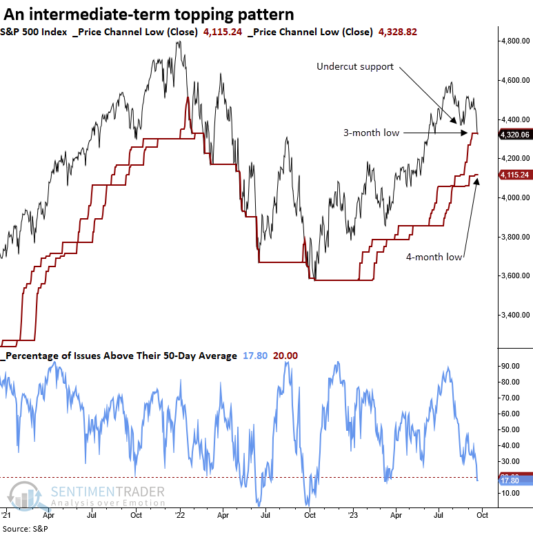
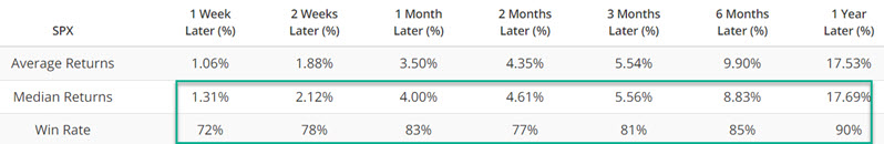
When the S&P 500 closed at a 3-month low but not a 4-month low, with the index above its 200-day average, the breakdown tends to be closer to the end of a corrective phase rather than the beginning. A month later, the S&P 500 was higher 76% of the time, with a median gain of 2.4%. Additionally, the one and two-month horizons show gains that are significant relative to the median gain over the study period.
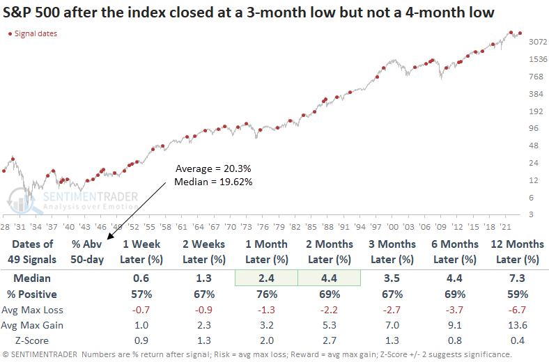
When the base breakdown pattern occurs, and fewer than 20% of issues close above their 50-day average, the S&P 500 displays slightly more favorable returns and win rates. So, the oversold condition generates some buying interest from traders.
An unfortunate streak
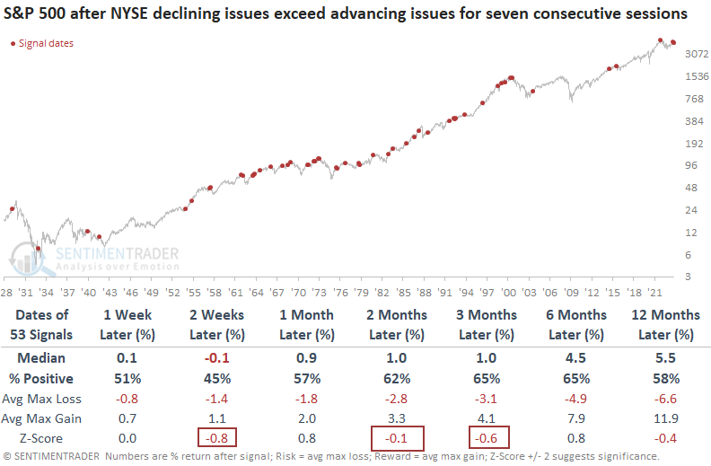
Dean also noted that declining issues on the NYSE outnumbered advancing issues for seven consecutive sessions, but similar advance-decline dynamics led to lackluster returns over the subsequent three months even when the lopsided streak occurred in an uptrend.
With bond yields pressed near the upper end of multi-year highs, stocks and bond proxies on the NYSE have come under pressure. In each of the previous seven sessions, declining stocks on the NYSE have outpaced advancing issues. This dynamic has only occurred 1% of the time since 1928.
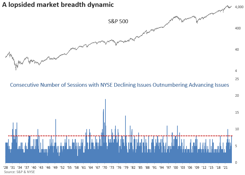
When the number of declining issues on the NYSE exceeds that of advancing issues like now, the S&P 500 showed uninspiring returns over the ensuing three months. During that timeframe, S&P 500 returns were worse than the overall study period returns in 3 out of 5 horizons.
Let's add some context, requiring the S&P 500 to close above its 200-day average, signifying an uptrend similar to now. Returns were still lackluster over the subsequent three months. Once again, 3 out of 5 time frames up to three months later underform the median return over the study period.
More evidence of "oversold in an uptrend"
Jay noted that numerous indicators are - or have recently - flashed "oversold in an uptrend" signals. As long as the majority of major market indexes hold above their long-term averages, the normal correction argument holds water.
Given the strength of the advance through the first seven months of the year and the general seasonal pattern for stocks, a market pullback should probably not come as a surprise. The current status is "oversold in an uptrend," which suggests that the recent decline would ultimately end up as a buying opportunity. However, if the other major averages break down further, a re-examination will be in order.
Our Major Sector Breadth (% above 50-Day Avg) indicator shows the percentage of 11 major sectors trading above their 50-day moving averages. The chart below highlights those dates when fewer than 10% of sectors were above their 50-day moving averages while the S&P 500 Index was above its 200-day average - i.e., a pullback in an uptrend.
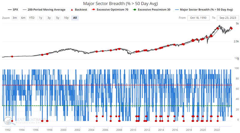
In a nutshell, the signals in mid-2007 and late 2021 were significant losers. All others saw the market advance in the ensuing 12 months.
Our S&P High Beta / S&P High-Quality Relative Ratio Rank indicator shows where the ratio is relative to its range over the past four months. One sign of growing fear in the market is signaled by a decline in the performance of high beta (i.e., more volatile, high-risk, high-reward types of stocks) relative to high-quality stocks. The chart below highlights those dates when the 5-day moving average of the S&P High Beta / S&P High-Quality Relative Ratio Rank equals 0.
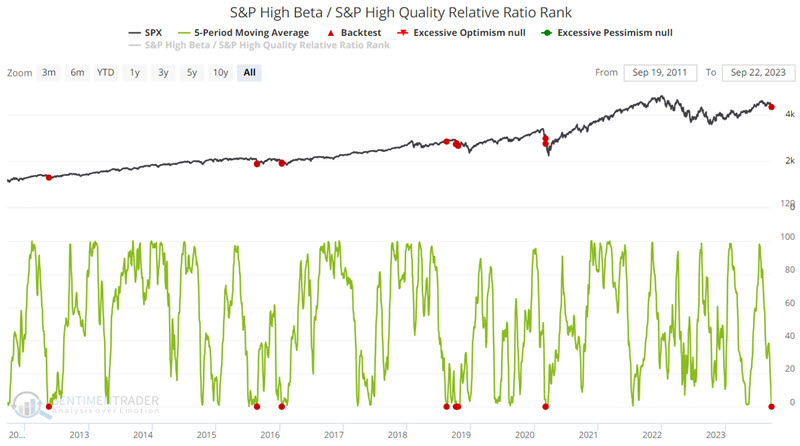
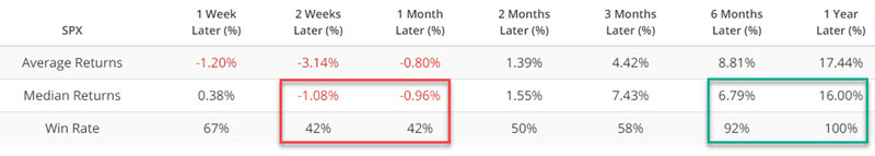
Returns during the first two months after a signal has been hit-or-miss. However - and more importantly to longer-term investors - 6 to 12-month returns have been consistently favorable.
Speculative fervor has ebbed
Jay highlighted three indicators showing that the speculative behavior earlier this year has eroded. The IPO / S&P 500 Relative Ratio Rank indicator recently crossed a critical threshold, and fear is evident in the ROBO Put/Call Ratio and Equity Put/Call Ratio.
This indicator below looks at the performance of an Initial Public Offerings (IPO) index relative to the S&P 500 Index. It shows where the ratio is relative to its range over the past four months. When the ratio drops to a low level, they are exhibiting risk-off behavior. Rather than focusing here on extremes, let's focus on those occasions when the indicator value crossed above 25.
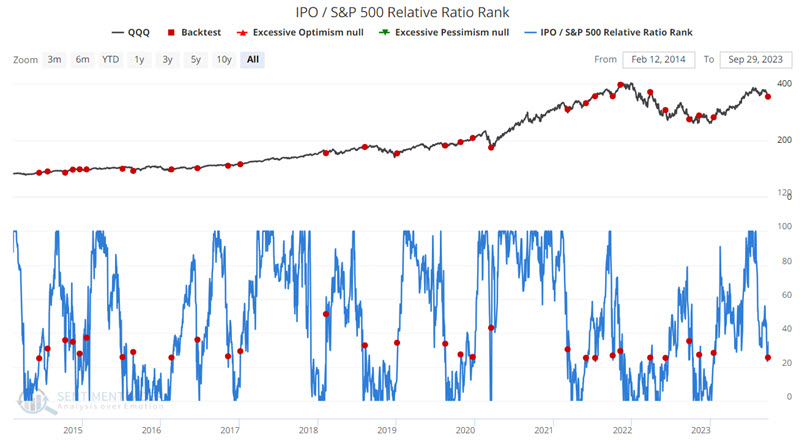
Over the next month, the S&P 500 rose 86% of the time by an average of more than 4%.
In addition to shunning recent IPOs, traders have been buying a lot of protective put options, as the ROBO Put/Call Ratio remains high. This ratio looks at transactions that are buy-to-open only and only for those trades that are under ten contracts. When the ROBO put/call ratio is high, small traders are buying many puts in relation to calls which suggests that they believe their stocks will decline. This is bullish for the market once it reaches an extreme.
The chart below highlights those dates when the ROBO Put/Call Ratio crossed above 0.75 while the S&P 500 Index was above its 50-day moving average.
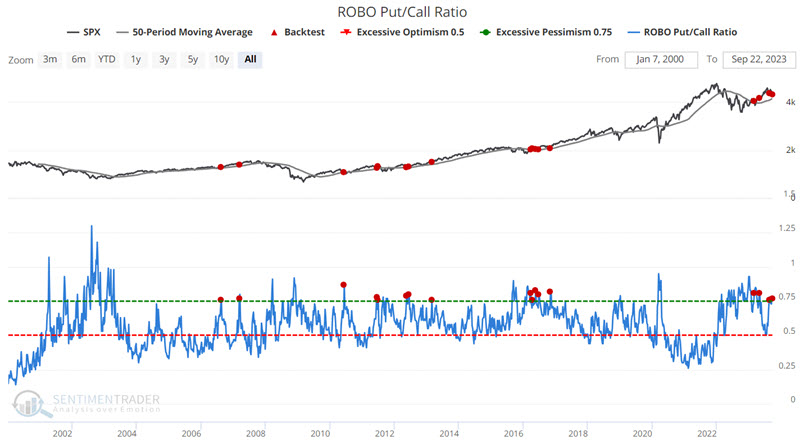
Three months after these signals, the S&P 500 was higher 87% of the time by a median of more than 6%.
The Equity Put/Call ratio indicator measures the volume of puts divided by the volume of calls traded on individual equities on the CBOE (Chicago Board Options Exchange) on a given day. Focusing only on individual equities removes much of the portfolio hedging done by large traders and institutions using index options to hedge against an adverse movement by the overall stock market.
The chart below highlights those dates when the Equity Put/Call Ratio crossed above 1.00 while the S&P 500 Index was above its 200-day moving average.
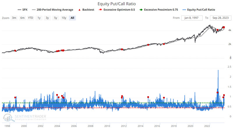
Historically, Median Returns and Win Rates have been modest - and somewhat hit or miss - for the first three months after a signal. 12-month returns, on the other hand, have (so far) shown a 100% Win Rate.
Small Caps and Industrials as recession predictors
Stocks have been struggling for weeks. So have Treasury bonds, which isn't something we'd expect to see if the economy were heading into a recession. Within the weakness in stocks, a couple of sectors and factors stand out as indicating economic weakness.
As Bloomberg noted that steep drops in small-cap and industrial stocks typically occur when the economy is in a recession. To check, we looked for every time when both Small Caps and Industrials had set a 52-week high within the past two months, then both of them suffered declines of at least -7.5% from those highs. Both of them must have suffered declines that were larger than that in the S&P 500.
The table below shows whether these signals preceded U.S. economic recessions.
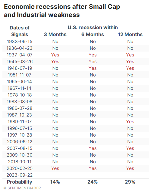
In a word, no. There was only a 14% probability that a recession would occur within three months. Even within the next year, there was less than a 30% chance. Maybe that's higher than any random time, but it's not an especially compelling signal.
Most of us are less concerned about subjective interpretations of economic metrics and more concerned about actual investments. The table below shows returns in the S&P 500 after sharp, sudden weakness in Small Caps and Industrials. The signals preceded two major declines, in 1937 and 2020, which just happened to be two of the signals that also preceded imminent and violent recessions. Outside of those exceptions, the S&P's returns were quite good, and six months later, there was only one decline larger than -4.1%.
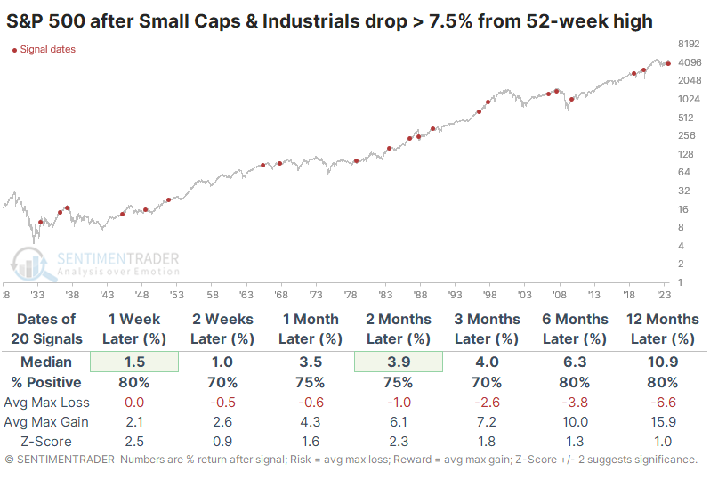
Small Caps themselves showed less impressive returns. Up to three months later, smaller stocks had about an even chance of showing a positive return, and their median across almost all time frames was below random.
Industrials held up much better than Small Caps and even somewhat better than the S&P 500. Over the next 3-6 months, the sector showed losses only three times. Six months later, there was only one loss larger than -1.5%, and the risk/reward was skewed impressively to the reward side.
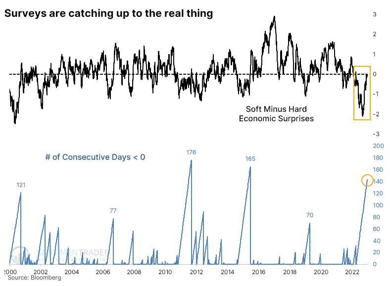
Consumer and executive surveys keep exceeding economists' expectations
Consumers and business executives are starting to feel more optimistic. After a historic period of being more pessimistic than even economists could guess, sentiment is rebounding.
Bloomberg calculates a measure that looks at "soft" economic releases like surveys of U.S. consumers and manufacturing executives and also "hard" releases like retail sales, jobless claims, and home sales.
The spread between them has stayed in negative territory for more than six months, the 3rd-longest streak in more than two decades. While it hasn't flipped yet, it's about as close as it can be and any day should revert. This suggests that surveys are showing more positive surprises (consumers are more optimistic than economists guessed they were) than hard surveys.
This is not necessarily a good thing. While markets typically react well when investors and consumers are becoming more optimistic, when they consistently exceed economists' expectations, and those surprises are outpacing surprises in hard data, it has preceded some severe declines.
This happened during the 2001 ongoing bear market and even more disastrously, right before peaks in 2007 and 2020. The offset is that it was also triggered before a few sustained rallies following the global financial crisis.
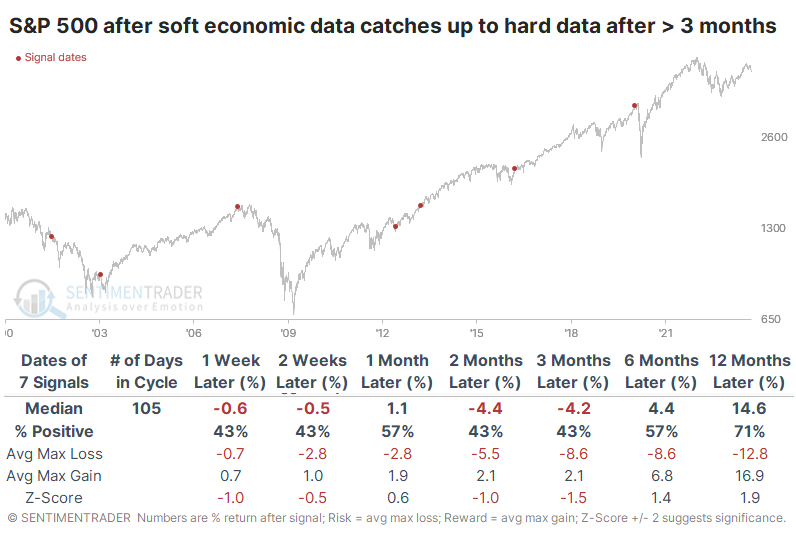
The next few months were not all that great for returns across sectors and factors. Health Care held up quite well, with positive returns six months later after every signal. Small Caps were the most consistently negative, with some of the lowest returns. Because of the timing of the 2001 and 2020 signals, returns were very poor up to three months later, but 6- and 12-month returns were good for some of the higher-beta sectors like Technology, Discretionary, and Small Caps.
Among other markets, weakness was a common theme. The Nasdaq Composite and Russell 2000 showed poor returns over the medium-term. Gold tended to be weak shorter-term while the dollar was weak longer-term. It sported a negative six-month return after every signal. The sole bullish standout was 10-year Treasury note futures, which rallied over the next one and six months after six of the seven instances.
Updating an options trade
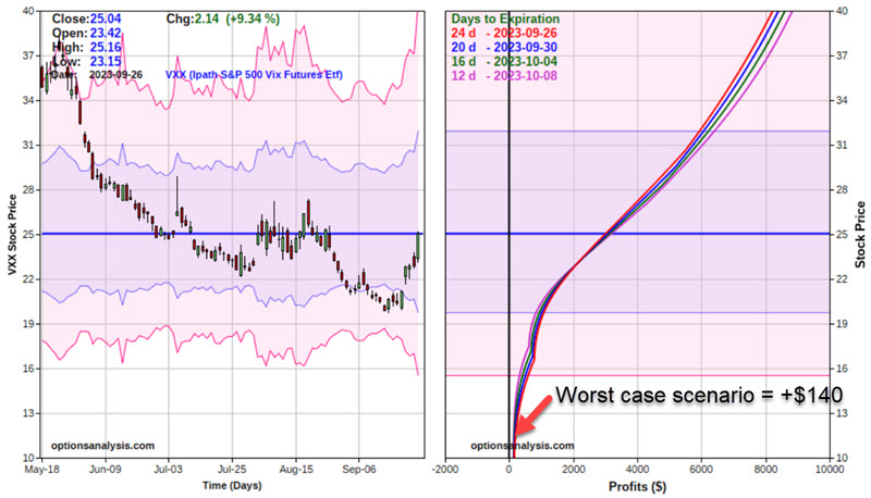
Jay updated a hypothetical trade using options on a volatility product from the prior week. The VIX Index has risen in recent days, and an example option trade from last week is showing a hypothetical gain.
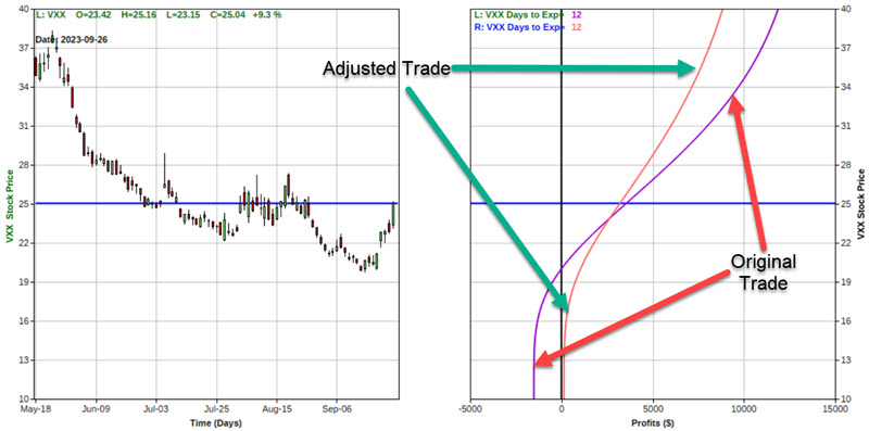
From 9/18 to 9/26, ticker VXX rose from $20.51 to $25.04, leaving a hypothetical open profit of +$ 2,330 for our example trade based on this rise in the price of VXX shares.
This result raises a potential decision for a trader. On the one hand, this trade was highlighted as a way to hedge against a sharp drop in the stock market and a concurrent spike in options volatility. So far, so good - and if the stock market plunges, there is much more profit potential.
On the other hand, the VIX Index - and particularly ticker VXX - has a long history of sharp reversals. If the market selloff ended abruptly and stocks began to rally implied option volatility - and the price of VXX shares - would likely decline significantly. Not only could the $2,330 profit vanish quickly, but the position could still turn into a significant loss.
If a trader thinks the market is headed sharply lower, then retaining the position as it is makes sense. However, another trader might be enticed to adjust the position to lock in a profit while maintaining significant upside potential.
For our example, we will adjust the original 10-lot position as follows:
- Sell 4 VXX 2023 Oct20 20 calls
- Buy 5 VXX 2023 Oct20 35 calls
This adjustment would leave us long 6 of the 20 strike price calls and short only 5 of the 35 strike price calls.
The primary benefit of this hypothetical adjustment is that there is no longer a risk of losing money on the trade. As you can see in the screenshot below, the worst-case scenario changes from a maximum risk of -$1,510 to a minimum profit of +$140.
The good news regarding the adjustment is eliminating the risk of loss. The bad news is that the profit potential is somewhat diminished. The table below shows that the original position shows a Delta of 629.67. This suggests that for every $1 VXX rises in price, the original position will gain $629.67. The adjusted position shows a Delta of 398.71. This means that for every $1 VXX rises in price, the adjusted position will gain $398.71.
The chart below displays the expected profit/loss for both positions as of 2023-10-08. If VXX were trading at $40 a share as of 2023-10-08, the original trade would show a profit of approximately $11,873, while the adjusted position would show a profit of roughly $8,835.
Another note on volatility options
Jay further noted that spikes in the VIX Index often tend to reverse quickly. This is especially true for ticker VXX, which already has a built-in downward bias and a spike in bullish trader sentiment for VXX just flashed a signal.
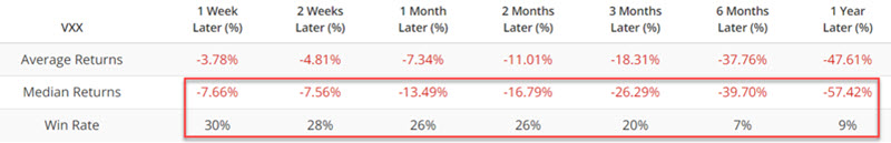
The chart below displays the last five years of price action for ticker VXX and our VXX Optimism Index (Optix). We start with a 5-day moving average for our VXX Optix indicator, highlighting those dates when it crossed below 80%. In other words, there was first a spasm of fear (the 5-day average spiking above 80%), followed by a subsiding of that fear (the 5-day average crossing back below 80). The most recent signal occurred on 2023-09-27.
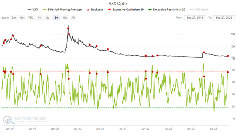
The expectation is not so much that VXX will automatically collapse following an Optix signal but rather that the odds favor it not going much higher, although it must also be understood that that will happen from time to time, so risk management remains the responsibility of each trader and on every trade.
There are any number of potential option trades that could be entered. The one that follows should be considered an educational example, not a specific recommendation. Our example trade uses a strategy known as a Bear Call Credit Spread and involves:
- Buying 10 VXX Oct13 2023 30 Calls @ $0.67
- Selling 10 VXX Oct13 2023 27 Calls @ $1.07
The risk curves for a 10-lot appear in the screenshot below.
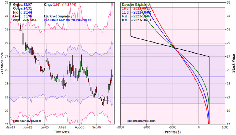
The maximum profit potential is $400, which would occur if VXX is at or below $27 at expiration. The maximum risk is -$2,600, which would happen if VXX was above $30 a share at expiration and no defensive action was taken. With VXX at $23.97 as of the close on 9/27, the breakeven price for this position is $27.40
The primary concern for this example trade is that the maximum risk is much greater than the maximum potential profit. One possibility for this trade is to exit the position if VXX shares trade much above the breakeven price of $27.21 a share.
The other concern is when to take a profit. There are only 16 days left until expiration, so as long as VXX is trading below the breakeven price of $27.21, some traders may wish to hold on to collect the entire $400 profit if and when all the options expire worthless. Other traders may be willing to close the trade when 50% to 80% ($200 to $320) of open profit can be realized.
Cash is king
Dean presented a system that compares high-yield bonds to cash, and which has issued a sell signal for the lower-rated corporate bonds. Periods when the rotation model shifts to cash underperform phases when high-yield bonds are positive.
With rates looking like they will stay higher for longer and a potential government shutdown on the horizon, a system that compares lower-rated corporate bonds to a cash proxy triggered a sell signal for the junk bond ETF (HYG). The rotation system applies an 84-day range rank to the ratio of HYG/BIL. When the range rank falls below the 4th percentile, the model shifts out of the junk bond ETF (HYG). Conversely, when it rises above the 99th percentile, it rotates back to the lower-rated corporate bond ETF.
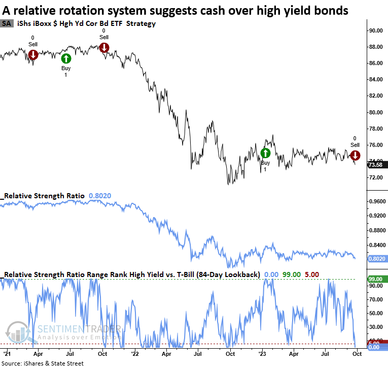
Employing the range rank rotation model's rules, a $10,000 investment in HYG appreciates to $20,700 when the model prefers high-yield bonds. In contrast, when the system suggests cash is a more favorable holding, an investment in high-yield bonds increases to a mere $10,300.
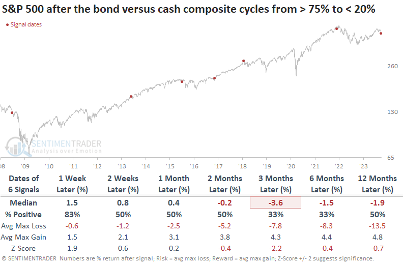
The composite in the chart below applies the same relative ratio range rank system to ten diverse bond ETFs to measure whether they are on a buy signal. i.e., outperforming cash. With the new high-yield signal, the composite has now fallen to 10%, a level associated with negative annual returns for the S&P 500.
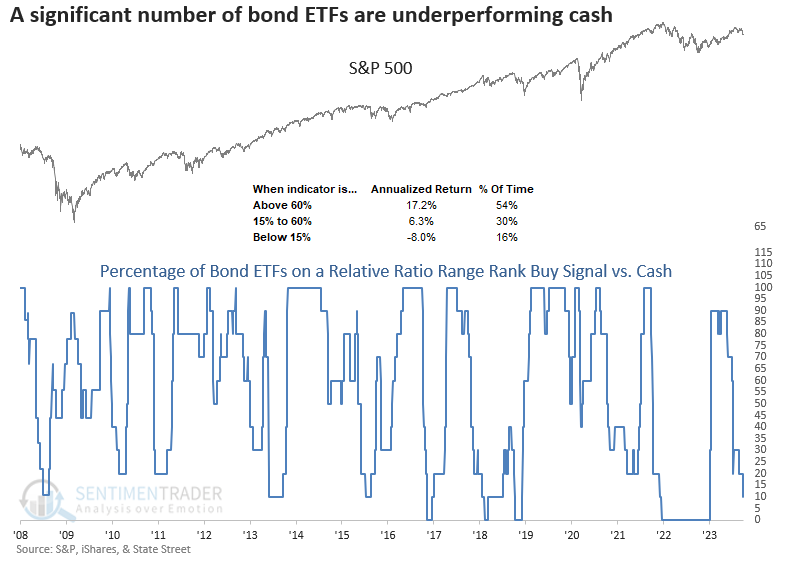
While the sample size is small, when a significant number of bond ETFs fail to outperform cash, all is not well. Over the following three months, the S&P 500 was lower at some point in all but one instance. The one alert that was positive occurred in 2016 and was associated with an event, the presidential election.
It's not uncommon for markets to undergo corrections in anticipation of significant events, resulting in pessimism. It's vital to remember that the current unease regarding a potential government shutdown may soon give way to a reversal in sentiment among stock and bond investors.
Using credit spread trends for trading stocks
Credit spreads measure the yield gap between lower-graded and higher-graded debt securities. Jay noted that monitoring credit spreads can offer important clues about the actual level of risk in the financial markets
A credit spread measures the difference in the current yield for a lower-rated security versus a higher-rated security. The lower the rating for a given debt instrument, the higher the likelihood the issuer will default and be unable to repay all of the promised interest and principal. The higher the rating for a given debt instrument, the less likely the issuer will default and be unable to repay all of the promised interest and principal. As a result, in order to attract buyers, lower-rated debt instruments must offer a higher interest rate to compensate for the higher risk of default.
When there is fear in the bond market, credit spreads will widen as buyers of lower-rated securities demand much higher yields to compensate for the real or perceived increase in risk. On the other hand, if things are generally calm, that demand diminishes, and credit spreads narrow.
The type of credit spread we will focus on in this piece is known as a credit default swap. Credit default swaps are a little-understood derivative that allows the various parties to swap the exposure of default of an underlying bond.
The real question then becomes, "Is there a way to objectively use credit spreads as a trading tool?" One potential way to do so is to follow the trends in the CDX Index. This is a "fear gauge" that measures stress in the financial markets. As such, we expect it to rise when the stock market falls and vice versa. To track the trend of the CDX Index, we will use a 14-week and a 25-week exponential moving average.
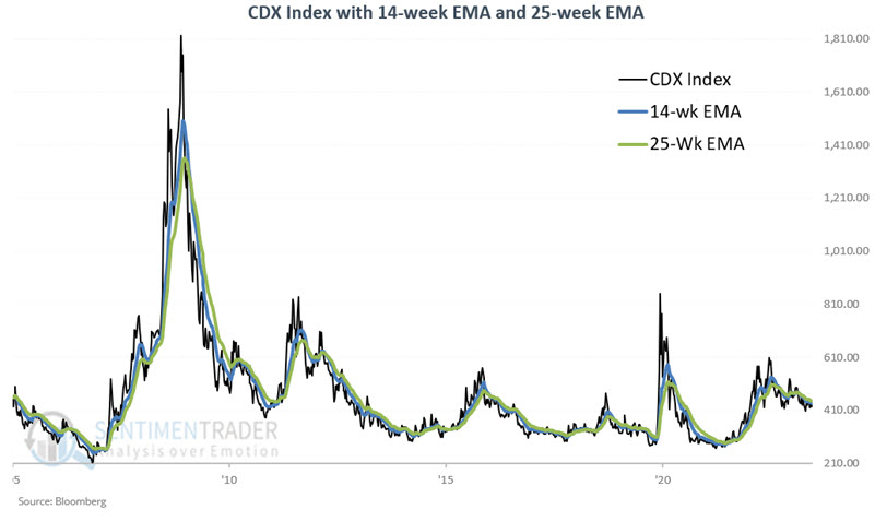
Note the spike during the Covid panic, then the reversal as the stock market turned around. Then, the index started increasing in late 2021 as the stock market peaked and continued to rise during the 2022 bear market. The 14-week EMA finally crossed back below the 25-week EMA on 2023-01-06, suggesting potentially improved conditions for stocks.
Let's analyze the S&P 500 Index performance based on whether the 14-week EMA for the CDX Index is above or below its 25-week EMA. The chart below displays the cumulative percentage performance for the S&P 500 Index if held only when the CDX Index's 14-week EMA is below its 25-week EMA.
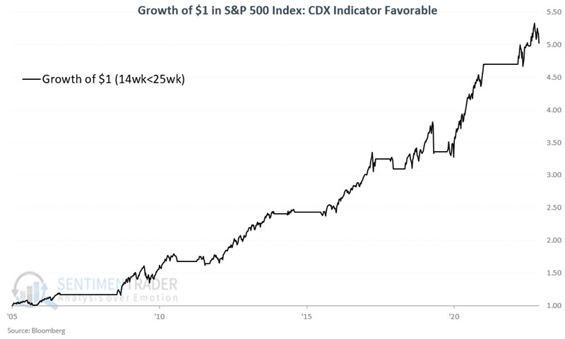
Since the CDX Index was first calculated in 2005, the S&P 500 has gained +402% while the 14-week EMA is below the 25-week EMA. In contrast, the S&P 500 has lost -29% when the 14-week EMA was above the 25-week EMA.
Currently, the 14-week EMA remains below the 25-week EMA. However, the gap has narrowed in the last two months. A cross of the 14-week EMA back above the 25-week EMA would indicate actual trouble in the financial markets.
Gold mining uptrends are dwindling
Gold bugs have been having a tough time of it, which is par for the course.
Even though the stocks have somehow held up in recent weeks despite rising rates and a rocky stock market, more and more of the stocks in the sector have seen their long-term trends turn sour. The percentage of gold mining stocks with a rising 200-day moving average has cratered to less than half of what had been almost universal uptrends.
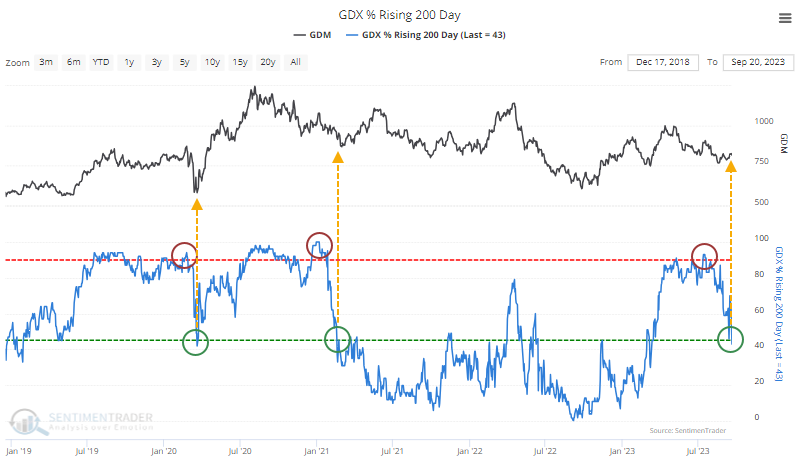
Since gold miners are such a consistently underperforming group, traditional mean-reversion methods can be sketchy. The sector doesn't always respond very well to modest oversold readings. And the current reading isn't really all that oversold; it's just below neutral. But context is important, and the context here is that earlier this year, almost all the stocks were in major and persistent long-term uptrends. That's important.
The table below shows the history of these cycles going back 40 years. The results aren't exceptionally consistent, but their performance over the next six months is the most interesting aspect. Seven of the ten showed a positive return, with only a single double-digit loss. For the broader stock market, that wouldn't be anything special, but it's better than we usually see for a group like gold bugs.
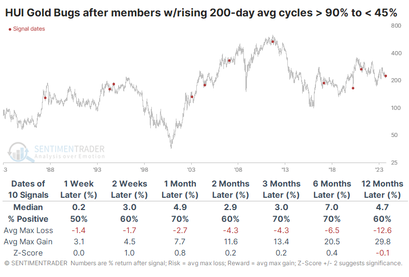
The table of maximum gains and losses across time frames shows that risk was higher than we usually like to see, but at least over the next six months, the average reward was more than three times larger than the average risk. Again, this wouldn't be all that compelling for a broader index, but it's pretty positive for gold bugs.
Other metrics that we calculate are mostly inconclusive. There are a few oversold readings, but nothing that's extraordinarily compelling.
About TradingEdge Weekly...
The goal of TradingEdge Weekly is to summarize some of the research published to SentimenTrader over the past week. Sometimes there is a lot to digest, and this summary highlights the highest conviction or most compelling ideas we discussed. This is NOT the published research; rather, it pulls out some of the most relevant parts. It includes links to the published research for convenience, and if you don't subscribe to those products, it will present the options for access.