
TradingEdge Weekly for Sep 20 - Reversal momentum, mortgage relief, seasonal sore spots

Key points:
- Big weekly reversals in stocks tend to lead to a fear of missing out
- Mortgage rates have dropped by nearly 100 bp over the past year
- A couple of indicators suggesting higher stock prices
- What happened after the ends of long Fed tightening cycles
- Risk appetite across assets is curiously low
- Next week has been consistently negative for a century
- A couple of sectors facing seasonal sore spots
- Copper is looking at a short-term seasonal soft spot
- Wheat is entering a positive seasonal window
FOMO forecast
It would be unfair to blame investors for suffering whiplash after the last couple of weeks. That whiplash has a good chance of morphing into FOMO.
The S&P 500, the most benchmarked index in the world, fell more than -4% a week ago, then nearly made up that entire loss a week later. All while trading within spitting distance of a record high.
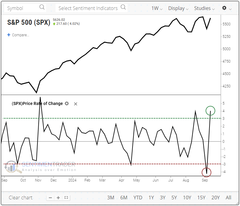
Since the index became a 500-stock index nearly 70 years ago, it has undergone similar weekly reversals only a handful of times. The reversals triggered buyers to step up their game each time, and the index enjoyed more gains over the next 2-6 months. Six months later, the S&P was up by double digits four of the five times. Within the following six months, only one signal suffered more than a -5% pullback.
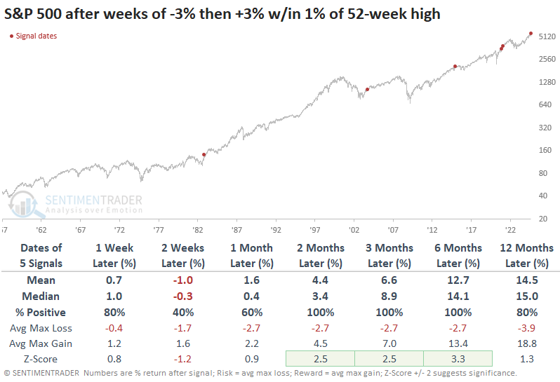
If we expand the reversals to include those within 3% of a 52-week high in the S&P 500, we get double the number of signals. The conclusion remains mostly the same.
The Nasdaq Composite also underwent a significant weekly reversal. Over the next six months, the only actual failures were the signals that were triggered near the peak of the internet bubble. The small-cap Russell 2000 also nearly reversed its previous weekly loss while hovering within pullback territory. That index had less success in pulling in buyers who fretted they were missing out.
When we combine all three indexes and look for significant weekly reversals across all three during the same week, there were only three precedents. The S&P 500 was up by double-digits each time over the next six months.
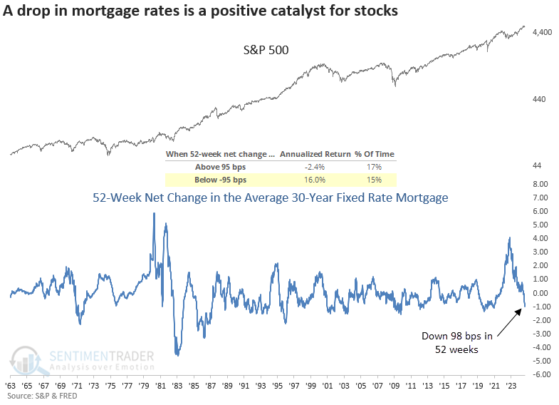
Mortgage relief
The average 30-year fixed-rate mortgage dropped by 98 basis points over 52 weeks. Dean showed that similar declines in this popular financing vehicle produced stellar returns for the S&P 500 over the next year.
As illustrated in the chart below, when the 52-week net change in the average 30-year fixed-rate mortgage falls below -95 basis points, the S&P 500 produces an annualized return of 16%. In contrast, when it increases above 95 basis points, the world's most benchmarked index declines at a -2.4% annualized rate. The S&P 1500 Homebuilding sub-industry group displayed an annualized return of 31.4% under the same yield backdrop.
Following precedents when the 30-year fixed-rate mortgage dropped by over 95 bps in 52 weeks, the world's most benchmarked index displayed outstanding returns, win rates, and significance relative to random returns across most time horizons. Furthermore, instances with the index above its 200-day, like now, resulted in a 100% win rate over the subsequent six months.
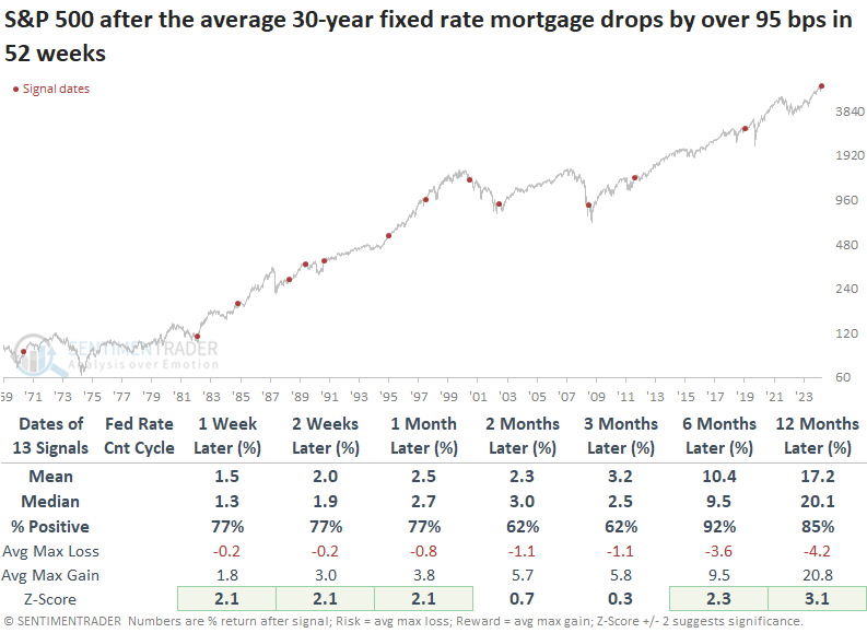
Homebuilders are among the most sensitive groups to shifts in mortgage rates. Consequently, the nearly 100 basis point drop in the 30-year rate has historically triggered massive rallies in these stocks over the subsequent year, with the group displaying a median return of 36%.
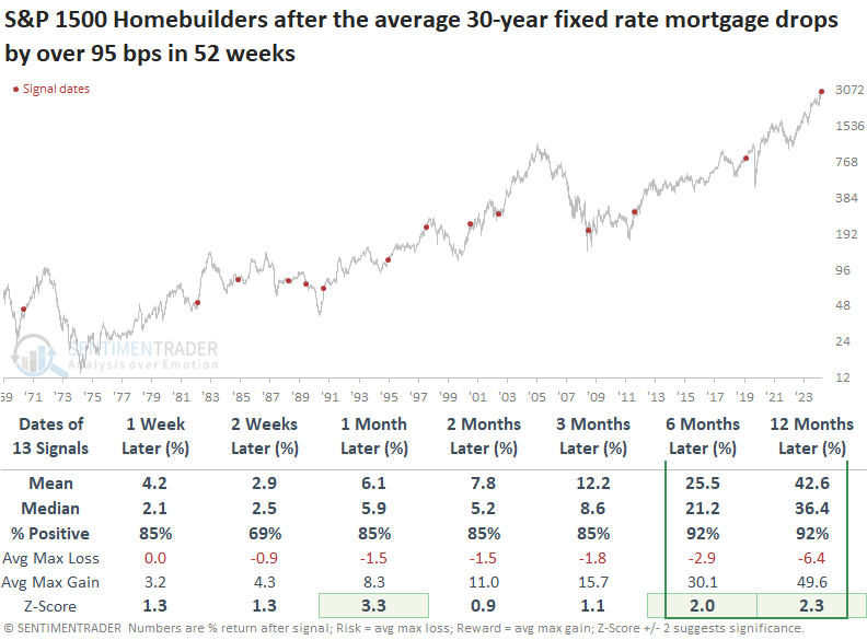
Over the following year, sub-industry groups within the S&P 1500 Consumer Discretionary sector produced outstanding returns, especially those in the housing industry, such as home improvement and home furnishing retail.
More new highs is a good thing
Jay noted that seasonality remains a short-term concern but momentum indicators continue to be positive for stocks. The % of S&P 1500 stocks showing strong momentum just flashed green and the Nasdaq High/Low Ratio indicator crossed a favorable threshold.
The latter indicator is a breadth ratio constructed by the number of issues that closed at a new high is expressed as a percentage of the total highs and lows. The chart below highlights all dates when the 20-day moving average of the Nasdaq High/Low Ratio crossed above 0.559 while the Nasdaq 100 Index was above its 200-day moving average.
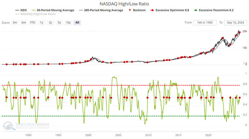
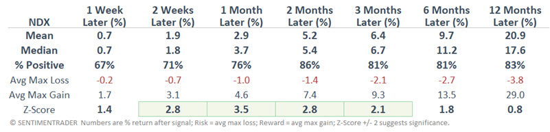
The results here are solid across the board. Still, the usual caveats apply (see the 2001-12-12 and 2021-11-01 signals). The message from the indicators above is NOT "All clear, nothing but blue skies and smooth sailing ahead." The message is that the trend right now is favorable.
The end of a long tightening cycle
After the longest hiking cycle in a decade and a half, the Federal Open Market Committee is expected to reduce its Fed Funds target rate this week. It would mark the end of the 2nd-longest tightening cycle in 35 years.
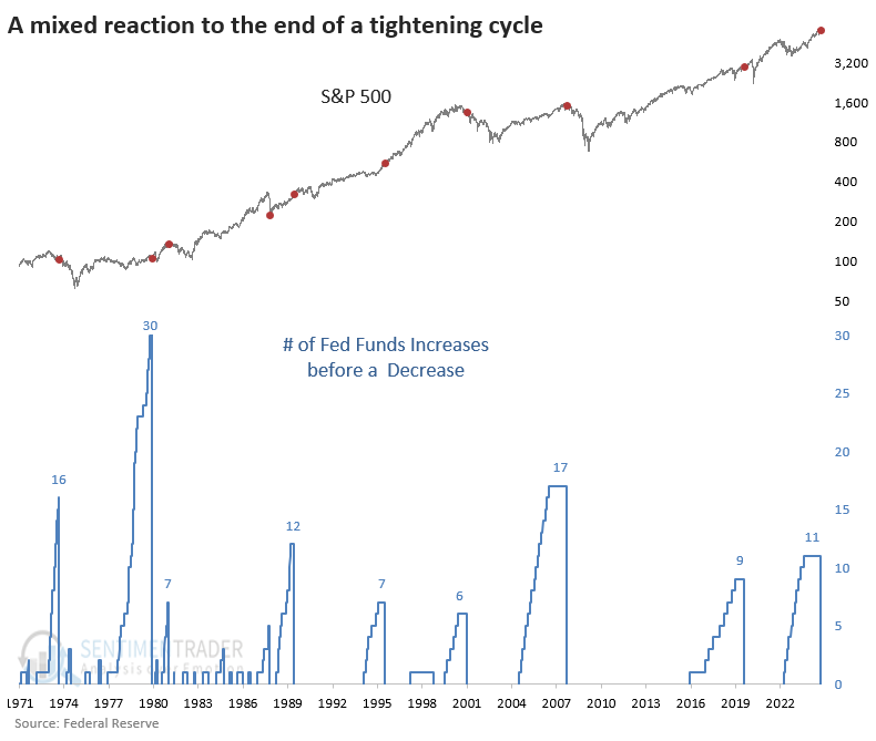
The last three cuts after a hiking cycle all preceded devastating bear markets. Before that, there was no real pattern. There was no discernable difference in returns based on how far the S&P 500 was from a multi-year high at the time of the first cut.
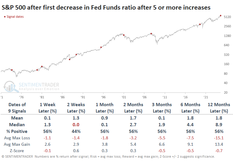
The table of maximum risk and reward across time frames shows a pretty binary result. Over the next year, stocks either enjoyed decent gains with low risk or limited gains with high risk. There wasn't any middle ground. A decent heuristic was watching the next two weeks - if risk exceeded reward, then it was a strong suggestion that the following year would be tough.
It was a mixed picture among other indices and assets, even among time frames. Generally, the Dow Industrials held up better than the S&P or, especially, the Nasdaq Composite and Russell 2000. The dollar tended to suffer in the immediate aftermath of the cut, but that didn't help gold or commodities too much. 10-year Treasury futures did well over the medium-term (suggesting yields declined).
Among sectors and factors, the next three months showed a dramatic difference in the median return between staples (+5.2%) and discretionary stocks (-0.2%). Utilities and health care also enjoyed robust returns, with a definite tilt toward value (+6.1%) over growth (+1.5%).
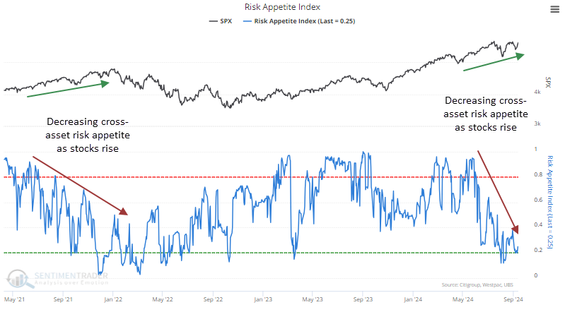
Curiously low risk appetite
All of the above is mostly bullish for stocks. That doesn't mean everything agrees, and we'd be remiss not to mention some of the dangers at least. In that vein, one curiosity that sticks out is the lack of risk appetite across markets. In stocks, optimism is objectively high (though not as extreme as it had been). It's in other markets where the curiosity lies:
- Credit spreads are wider than they typically are when the S&P 500 is a hair's breadth from a record high
- Currencies have been volatile
- Gold is soaring
- Defensive sectors are leading
All of those are signs of investors tapping the brakes. The last time the S&P was sitting near a high while cross-asset Risk Appetite was low was in late 2021.
Divergences are helpful but can be tricky beasts. Sometimes, they're simply useless; other times, they drag on for weeks, months, or even years before having an impact.
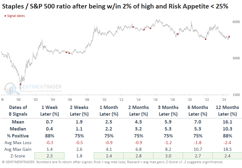
The table below shows every time the S&P was within 2% of a multi-year high and the Risk Appetite Index was 25% or below. The most notable aspect of the returns is that the index showed a loss at some point across the next 2-12 months every time.
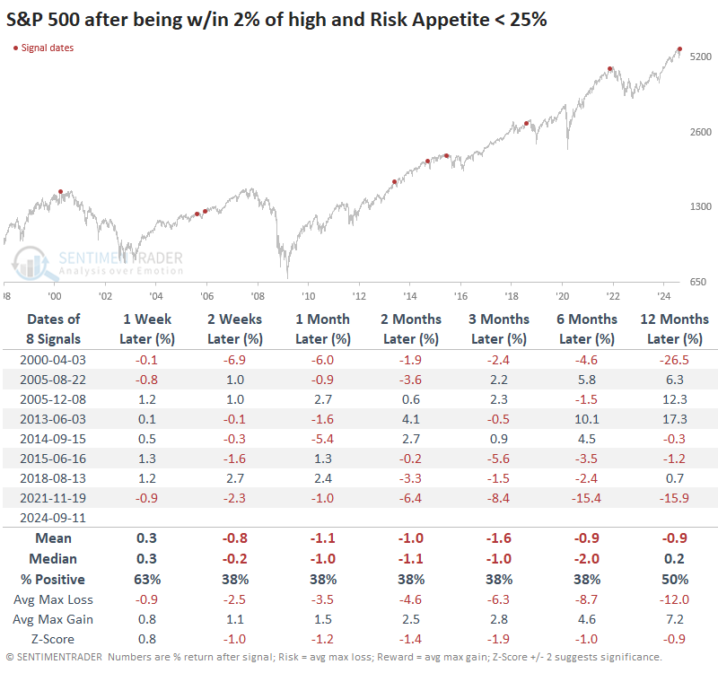
Among sectors and factors, there was a clear bias toward defensive groups. That factor showed a gain six months later 88% of the time versus only a 38% win rate for cyclical stocks. Staples and utilities rallied after every signal over the next year, both averaging more than +13%.
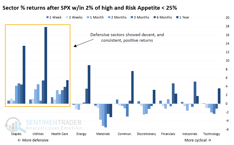
Below, we can see a ratio of consumer staples to the S&P 500 after these signals. Across almost all time frames, the ratio exhibited above-average returns and was consistently positive. The few times staples lost ground relative to the broader market, the losses were minimal and usually not persistent.
We see a similar dynamic using a broader index of defensive sectors (staples, utilities, and health care). A tilt toward these groups proved effective relative to the broader market across most time frames.
A wobbly weak
While there are multiple positives going for stocks right now, Jay noted that for reasons that cannot be fully explained, the week following the third Friday in September has historically been the worst-performing week of the year over the past 104 years.
The reality is that things can vary a lot from year to year except for next week. That week - defined as the week after the 3rd Friday in September - has been pretty awful consistently for a long time. The week after the third Friday in September has seen the S&P 500 decline in 27 of the last 34 years. This week has been up 35 times and down 69 times since 1920.
The chart below displays the hypothetical growth of $1 invested in the S&P 500 Index only the week after the 3rd Friday in September since 1920.
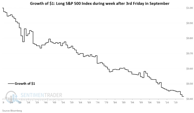
The week was positive 34% of the time, with an average loss about half again as large as the average gain. The S&P lost more than -3% during twelve of the years while gaining more than +3% only twice.
Seasonal sore spots
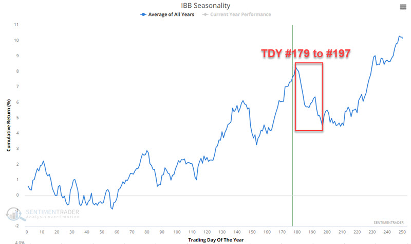
Jay showed that the biotech and metals and mining sectors are nearing a period of potential seasonal weakness with well-established overhead resistance levels overhead.
The biotech sector has flown under the radar for much of the last year even though the iShares Biotechnology ETF (ticker IBB) has advanced +32% since November 2023. The chart below displays the annual seasonal trend for IBB. Note that an unfavorable period extends from Trading Day of Year (TDY) # 179 through TDY #197. For 2024, that period extends from the close on 2024-09-17 through 2024-10-11.
The chart below displays the hypothetical cumulative $ +(-) achieved by holding a long position in IBB only during the TDY #179 to #197 period since 2002.
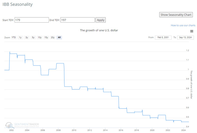
These windows saw gains only 26% of the years. There was only one year with a gain larger than +5%, but five years with a loss larger than -5%.
With gold and silver soaring of late, one might be surprised to learn that the metals and mining sector is lagging the market badly. In addition, the chart below displays the hypothetical cumulative $ +(-) achieved by holding a long position in ticker XME only during the TDY #179 to #191 period since 2006.
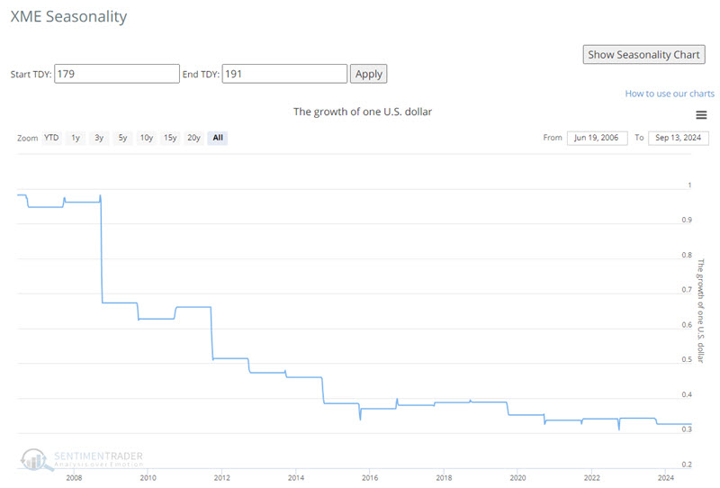
A Win Rate of 39% reminds us that the metals and mining sector is not doomed to decline in the weeks ahead. However, the upside tends to be limited (median gain of +1.5% and max. gain of +5.4%) while downside risk is concerning (median loss of -6.8% and max. loss of -30.0% - likewise six losses in excess of -6%).
Speaking of metals
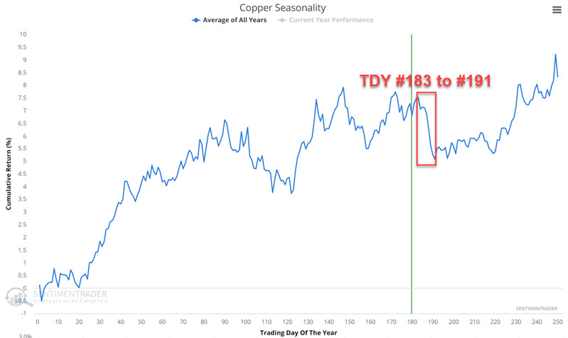
Jay pointed out that copper is about to enter a brief - but especially challenging - time of year. Short-term traders should be alert for an opportunity, while anyone looking to buy copper might be best to show just a little more patience.
Copper has been trading sideways for almost three and a half years in a very large range. The chart below displays the annual seasonal trend for copper futures. Note the period highlighted, which extends from the close on Trading Day of the Year (TDY) #183 through TDY #191. For 2024, this period extends from the close of 2022-09-20 through 2022-10-02.
The chart below displays the cumulative $ +(-) for copper futures held long only during Trading Day of Year #183 through TDY # 191 starting in 1980.
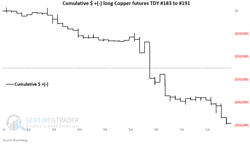
Only 23% of years showed a gain during these seasonal windows, with an average loss significantly larger than an average gain. Four years showed a loss larger than -$5,000 per contract while no years showed a gain larger than +$5,000.
Wheat window
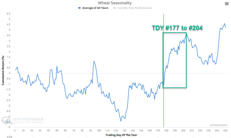
In contrast to the above, Jay showed that wheat is now in the middle of one of the most favorable periods of the year.
The chart below displays the annual seasonal trend for wheat futures. Note a period of seasonal strength that extends from Trading Day of the Year #177 through TDY #204. For 2024, this period extends from the close on 2024-09-13 through 2024-10-22.
The chart below displays the hypothetical cumulative $ +(-) achieved by holding a long position in wheat futures only during the TDY #177 to TDY #204 period every year since 1937.
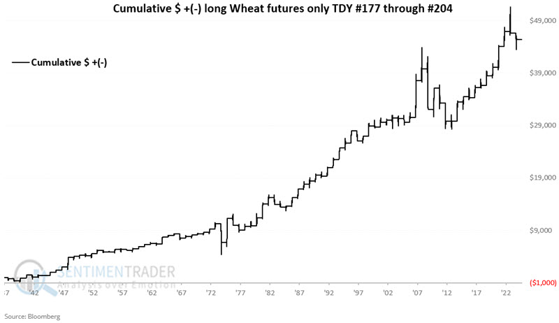
These windows sported a gain 69% of the time, with a median gain more than twice as large as the median loss.
About TradingEdge Weekly...
The goal of TradingEdge Weekly is to summarize some of the research published to SentimenTrader over the past week. Sometimes there is a lot to digest, and this summary highlights the highest conviction or most compelling ideas we discussed. This is NOT the published research; rather, it pulls out some of the most relevant parts. It includes links to the published research for convenience, and if you don't subscribe to those products, it will present the options for access.