
TradingEdge Weekly for Sep 15 - Continuation signals, sector spreads, dollar uptrend

Key points:
- Seasonality is rocky, but a couple of reliable indicators give continuation signals
- Traders' demand for liquidity in stocks is easing
- Breadth in Energy stocks is at a historic spread between than in Utilities
- Corporate insiders don't seem too interested in selling their shares in Materials, Financials, or Healthcare
- Facing a conundrum in commodities
- Traders have become a lot more optimistic about oil
- The dollar has seemingly kicked off a new uptrend
- The buck also triggered a buy signal in a technical trend-following system
- Checking in on opposite seasonal trends in soybeans versus wheat
Stock market continuation signals
Despite ongoing short-term weakness, individual objective indicators continue to flash favorable signals for the stock market. Jay noted that the Risk Appetite Index has flashed a series of favorable signals while the percentage of industries in a bear market indicator suggests an oversold condition in an established uptrend.
The major market indexes peaked in late July and have been consolidating ever since. Given rising interest rates, rising debt levels, and an inverted yield curve - to name a few of the top worries - it is not unreasonable to be concerned about the ability of the market to reverse back to the upside. In addition, stock market seasonality is entering its most unfavorable period of the year.
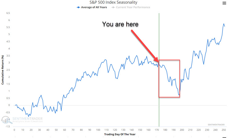
We ultimately try to rely on the larger message from typically reliable indicators regarding the longer-term picture. So far, there has been enough favorable action to remain optimistic that the recent weakness is part of a correction and not the beginning of a long-term bear market.
We combined three measures of risk appetite and normalized them into a single index. As the index rises, it means that investors are becoming more and more risk-seeking. In a longer-term bullish trend, a high reading for the Risk Appetite Index can serve as a helpful trend confirmation tool (remember, more bulls and more buying are needed to sustain a bull market).
The chart and table below display S&P 500 results after the Risk Appetite Index was above 0.95 while the S&P 500 Index was above its 200-week moving average.
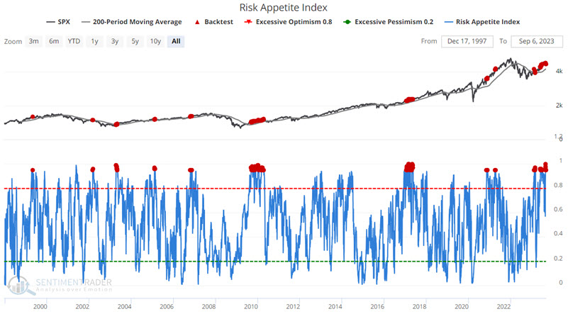
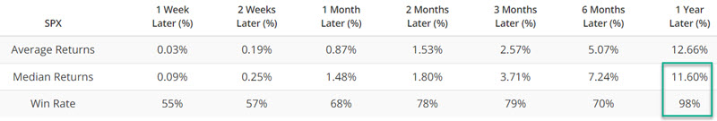
For the test period from 1997 to today, the median 1-year return for the S&P 500 Index for ALL DAYS is +9.93% with a Win Rate of 74%. Following the abovementioned signal from the Risk Appetite Index, the median 1-year return jumps to 11.60%, and the Win Rate soars to 98%. Only one signal triggered during on ongoing bear market.
Our Industry % Indexes in Bear Market indicator shows the percentage of 23 industries that are trading more than 20% below their 52-week highs. The chart and table below highlight the S&P 500 Index performance after the indicator crosses above 10%.
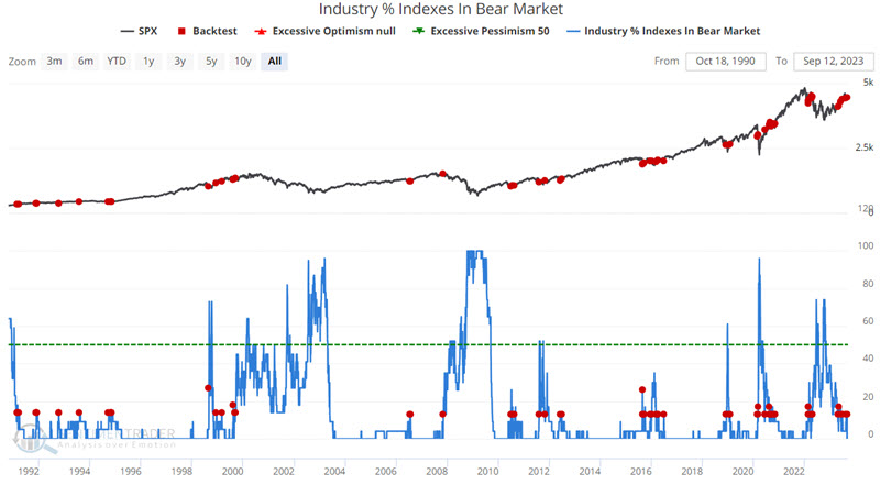
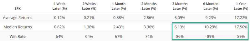
The S&P 500 Index has historically generated above-average Win Rates, particularly for 3-month, 6-month, and 1-year periods, as well as robust Median Returns. This is somewhat counterintuitive as a rising value for this indicator implies that more industries are performing poorly - and an increasing value ultimately precedes every bear market. That said, we have also found that far more often than not, crosses above 10% mark a routine pullback in a bull market and not necessarily the start of a new bear market.
Demand for liquidity is easing
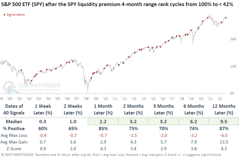
The SPY liquidity premium cycled from the top of its 4-month range to the lower half. Dean showed that after similar reversals, the S&P 500 displayed excellent returns and win rates over all horizons and signals that occurred in an uptrend were higher 85% of the time over the subsequent month.
The SPY liquidity premium, an indicator that gauges uncertainty, soared to the highest level in 19 months as traders flocked to the relative safety of the world's most benchmarked index before the traditionally sluggish months of September and October. However, the indecision has now eased, triggering a buy signal for stocks.
The previous alert was triggered in March, leading to a 10% gain in the S&P 500 over the subsequent three months.
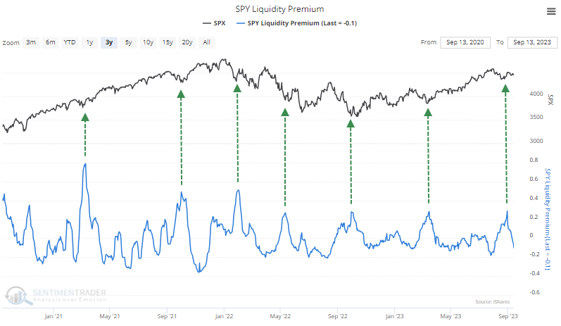
By applying a range rank to the liquidity premium indicator and optimizing the most effective lookback period and threshold levels, the model can identify when sentiment amongst traders has eased from a period of uncertainty.
When the range rank for the SPY liquidity premium cycles from 100% to less than 42% and market momentum is positive, S&P 500 returns, win rates, and z-scores are excellent. Although the system predominantly generated signals in bull markets, it effectively capitalized on mean reversion opportunities during significant drawdown periods like 2000-02, 2007-08, and 2022.
Suppose we include a condition that requires the SPY ETF to trade above its 200-day average when a reversal signal triggers. In that case, uptrend precedents show slightly better win rates with returns about the same as signals in any environment.
Sentimentrader maintains a liquidity premium indicator for the Nasdaq 100 ETF (QQQ). The same model triggered a buy signal on 2023-09-05 when the range rank cycled from 100% to less than 27%.
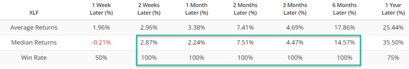
Historic showdown between Energy and Utilities
We've seen in various research lately how well stocks in the Energy sector have been doing...and how poorly they've been faring among Utilities.
Almost all stocks in the former sector have been holding above their short-, medium-, and long-term moving averages. In the latter, few of the stocks have been able to hold above their averages.
If we average the percentage of stocks in the Energy sector holding above their 10-, 50-, and 200-day moving averages, it comes out to over 88%. The same calculation for Utilities results in an average of just 30%, but that's up from a miserable 5% a few days ago. A 5-day average of the spread between these moving averages for the two sectors is below. Over the past week, that reading reached its 2nd-highest level in more than 30 years, just missing the previous record from March 3, 2021.
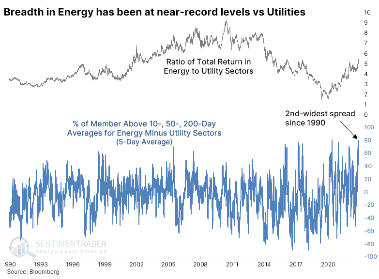
The table below shows other times when the spread in breadth between the two sectors reached at least 70% for the first time in at least three months. The sample is tiny, but there was only one time when the spread continued to widen over the following three months, and that one quickly - and severely - reversed in the months after that.
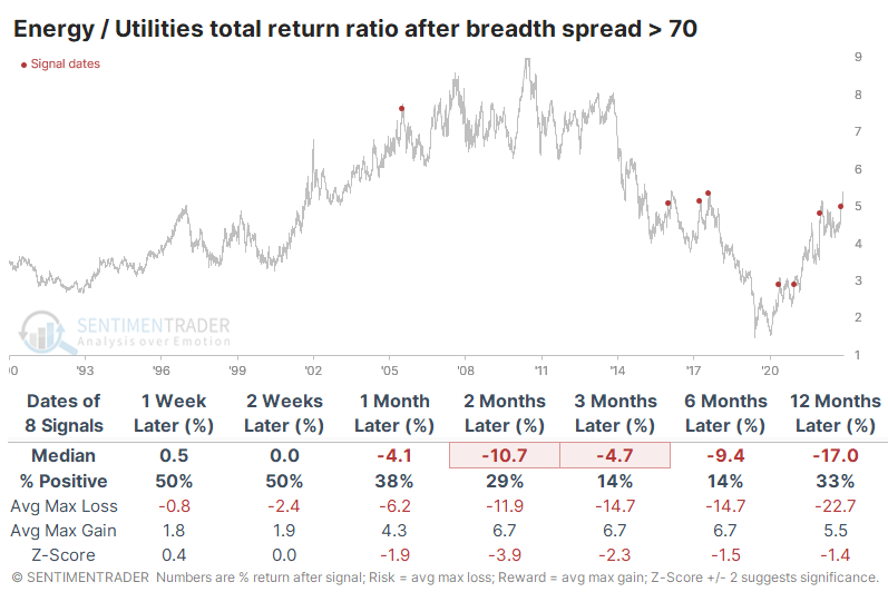
We can generate a larger sample size by relaxing the parameters. The spread tended to continue to widen in the short term, as it did this time. But over the medium- to long-term, those gains tended to evaporate.
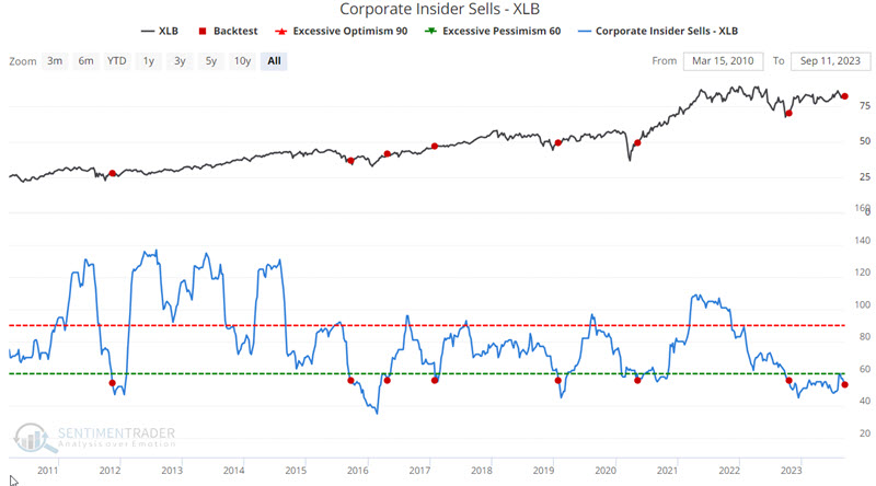
Lack of insider selling in Materials and Financials
Not every blip in corporate insider activity has real meaning, but when buying or selling reaches an extreme, it can have significant implications. Jay showed that notable insider action has occurred recently in Materials, Financials, and Healthcare.
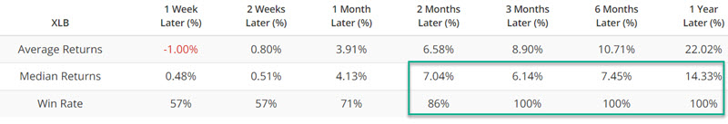
Generally, insider buying is considered more important than insider selling. That said, there can be instances when a low level of selling across a sector can flash a favorable signal. The chart and table below display performance for the Materials Select Sector SPDR Fund ETF (ticker XLB) after there were fewer than 56 sell transactions over the past six months.
When dealing with a long-term indicator with fairly limited history, our sample size is necessarily going to be small. But at least it was consistent, showing gains in XLB every time over the following 3-12 months.
The financial sector suffered a shock earlier this year when several banks were forced to close. Since that time, financial corporate insiders have been heavy buyers. The tradeoff between buying and selling has once again accelerated of late.
Once again, the sector showed gains every time over the medium term when the ratio reached this type of extreme.
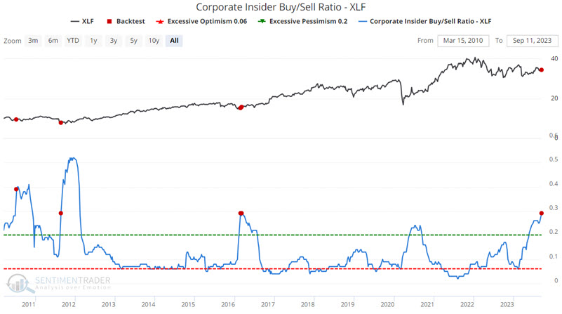
The good news is the high Win Rate from 2 weeks through six months. The bad news is the small sample size and the potential for seasonal weakness in the financial sector in the month ahead. In light of recent financial insider activity, any weakness in the month ahead should likely be viewed as a buying opportunity.
In the Healthcare sector, our Corporate Insider Velocity indicator presents a unique look at insider activity. It takes a 4-week rate of change for insider buys and subtracts a 4-week rate of change for insider sales. Interestingly, the Velocity has now spiked above +100 for only the fourth time in the past 13 years. Each one preceded impressive and positive returns from one month and beyond.
A commodities conundrum
Jay noted that one prominent long-term cycle suggests that commodities will vastly outperform in the years ahead, but investors face a conundrum. The recent action of our Macro Index Model portends favorable action for commodities while Hedge Fund Exposure to Gold can act as a leading indicator.
A 30-year cycle in commodity prices entered a favorable 15-year period. At any given point, traders must pay close attention to price action and other indicators that might confirm or deny an overall bullish trend. This is tricky at the moment, as commodity price action is very mixed, and - as we will see in a moment, some typically reliable indicators are sending decidedly mixed signals.
The chart below displays our Macro Index Model. After the monthly reading crosses above 0.50, commodities as an asset class tend to perform well.
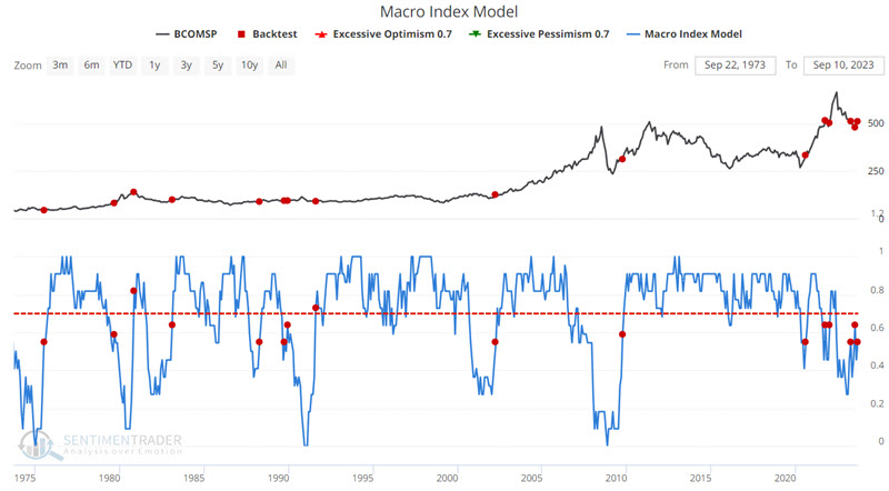
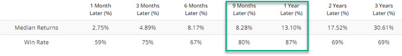
Commodity performance one year later tends to be quite positive. That's the good news. The bad news appears in the chart and tables below, which displays the Bloomberg Commodity Index performance when hedge funds appear to be heavily short gold for the first time in six months.
This only triggered during the past decade, so it has a much more limited history of commodity cycles than the indicator above. But it was also consistently negative for that market.
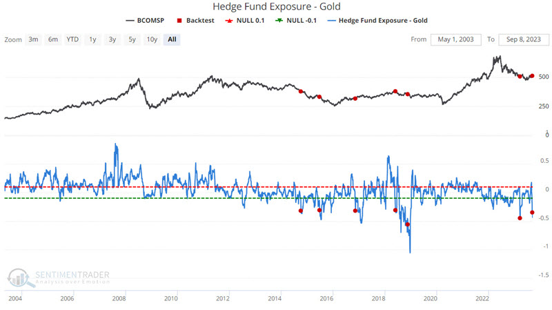
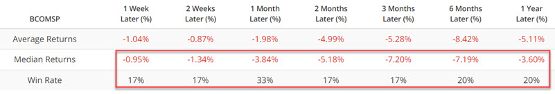
Jay further outlined performance for various commodities after hedge fund exposure reached a very low level, and silver showed particularly bad returns.
Traders have become a lot more optimistic about oil
As happens for pretty much every financial asset in the history of the human race, investors have become more optimistic about oil's future prospects because it has already rallied.
The result is that the Optimism Index for oil has reversed from modest pessimism to optimism, the highest reading in over a year. Oil is an unusual market that shows negative annualized returns when optimism is high or low. It does best when traders don't really care too much one way or the other.
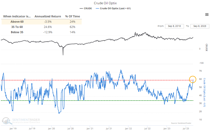
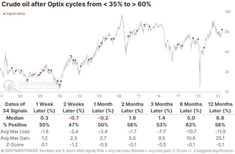
The table below shows other times since 1990 when the Optix for crude cycled from 35% or below to 60% or above. Most of the cycles happened quicker than the current one, but regardless, future returns were mediocre. It did tend to struggle over the next couple of weeks in particular.
There was a +0.4 correlation (out of a scale from -1.0 to +1.0) between crude's return two weeks later and one year later, mildly suggesting that if traders continue to push the commodity higher despite already-high optimism, then there is a decent chance that this only the beginning of one of those sustained trend changes.
In the futures market, large speculators have only recently started adding to what had been a decade-low exposure to crude oil. The two other times in the past decade when they cycled from holding less than 10% of open interest net long to more than 17%, crude struggled in the months ahead.
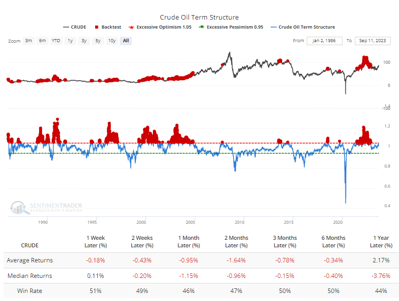
Renewed optimism has pushed the term structure for crude to a relatively high level, meaning that traders are putting more of a premium on shorter-term contracts than longer-term ones. The Backtest Engine shows that when the front-month contract was at least 5% pricier than the contract six months out, crude tended to show poor returns in the weeks and months ahead.
In addition, implied volatility in crude contracts has dropped significantly to about half what it was in March. The Backtest Engine shows that when the VIX for oil was 30% or below, crude averaged negative returns from one month and beyond.
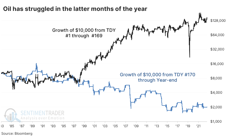
Our seasonality chart for crude shows the general trend in the latter part of the year is a bit troubling for oil bulls. The contract's worst months have consistently been October and November, which are right around the corner. The chart below shows the growth of $10,000 invested in crude oil futures since 1984.
The black line shows the growth from the first Trading Day of the Year (TDY) through day #169. The $10,000 grew to $148,358. The blue line shows the "growth" from day #170 through year-end, during which $10,000 turned into just $2,014.
A historic run for the dollar
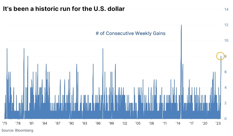
In mid-July, we looked at how optimism on the U.S. dollar was slipping after it had just suffered a week of heavy losses and a new 52-week low. Similar conditions tended to show even more losses in the weeks and months ahead. Man, was that ever wrong. It pretty much marked the bottom for the decline. Since then, the buck has gained for eight consecutive weeks, one of its best runs in history.
The dollar's reaction after similar bouts of momentum was mixed. The sample size is necessarily tiny, so for what it's worth, the dollar continued to consistently gain in the months ahead twice while faltering three times. Not much to see there.
As part of the streak of weekly gains, the dollar has climbed back above its long-term 200-day moving average and is on the cusp of staying there for a month after spending more than six months below average. The last time it did this was in the spring of 2018, which marked a long-term change in trend. It was close to doing this in 2021 before another historic run but didn't qualify for the study because of a brief false breakout earlier in the year.
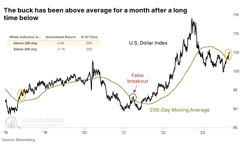
Over the past 50 years, the dollar has spent almost half its trading days above the 200-day average and half below. When it has been above its average, the dollar's next-day performance returned an annualized +4.0% versus -3.1% when below average. This is indicative of a market that shows persistent trends.
After other sustained breakouts above its average for the first time in six months, the dollar tended to keep rising. Its best performance was over the following month, when it gained 78% of the time, with a median return well above random. It suffered two losses over that time frame, and both were reversed in the months after. We're assuming here that the dollar doesn't suffer a historic drop over the next couple of sessions.
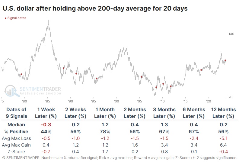
Other assets had some difficulty during that next month, except for the S&P 500. Other stock indexes and commodities didn't react all that well to a continually rising dollar. The potential negative impact tended to be focused on that time frame, though, and most showed decent medium- to long-term returns, other than emerging markets and a broad basket of commodities.
Dollar breakout system
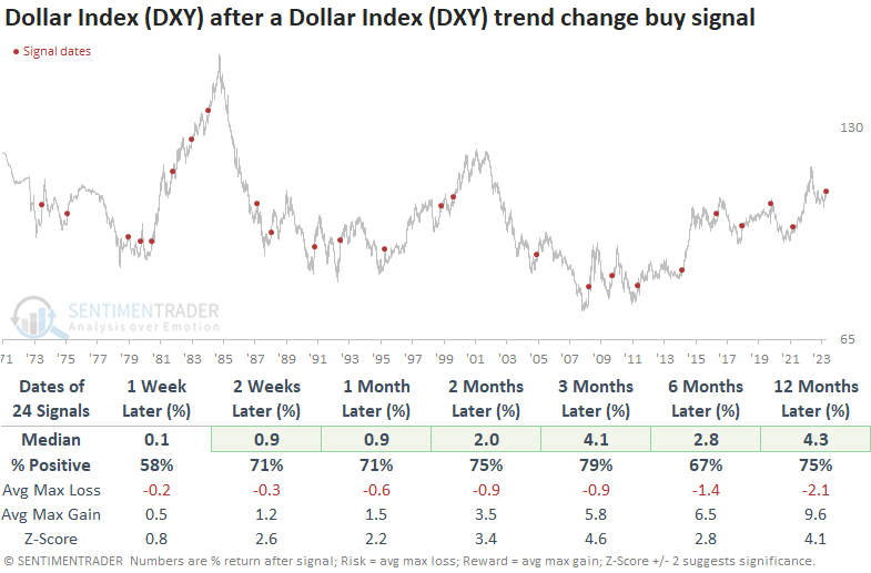
Dean also looked at the dollar, showing that a breakout system triggered a bearish to bullish trend change signal for the Dollar Index (DXY) . After similar trend change alerts, the DXY shows a strong tendency to rally further over the following year.
The system uses a price channel breakout methodology made famous by Richard Donchian, a pioneer in the managed futures industry. Historical testing determined that a 133-day high or low breakout provided the optimal timeframe for a DXY trading system.
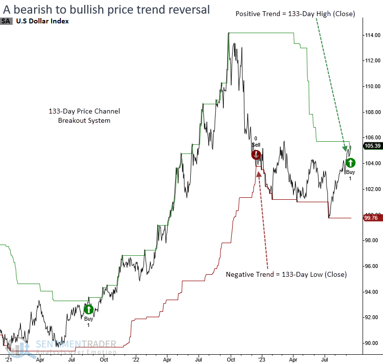
As clearly indicated by the outlook table, currencies typically exhibit a strong tendency to follow the direction of breakout signals. At some point in the first six months, the Dollar Index (DXY) experienced gains in all but one preceding instance.
The bullish trend change in the Dollar Index does not mark an unfavorable environment for stocks unless the S&P 500 is in a clearly defined downtrend like 1973 and 2008, which is not the case now.
Signals associated with an FOMC tightening cycle also display positive returns over all time frames. Except for 1973, every precedent showed a positive return at some point in the first three months.
Most sectors and industries show weak results in the first few weeks. Despite a brief lull, the overall outlook for medium and long-term returns is solid. The lackluster returns in Technology suggest companies in that sector, which derive a large percentage of revenues globally, could struggle as the stronger dollar becomes a headwind.
Seasonals in soybeans versus wheat
Jay noted that due to their planting and harvesting cycles, soybeans and wheat typically operate on different cycles. One of the most pronounced periods of inverse behavior is starting now.
The charts below display the annual seasonal trend for soybean and wheat futures.
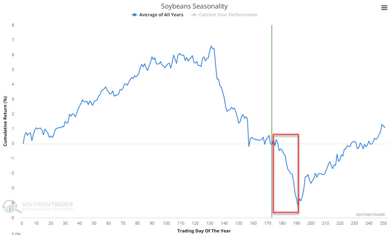
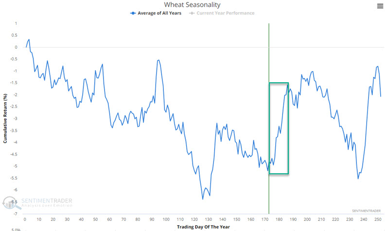
The tendency for both is almost inverse in the very near term. Soybeans tend to show significant weakness, while wheat tends to show strength. This creates an opportunity to trade a futures spread involving selling short a November 2023 soybean futures contract and buying long a December 2023 wheat futures contract.
Jay discussed the vicissitudes of futures trading, margin, and risks at length, which is important to know before anyone should try their hand at a relatively obscure and multi-pronged trade.
With a basic understanding in mind, we will examine the period from the close on Trading Day of the Year #176 through TDY #191. For 2023, this period extends from the close on 2023-09-14 through 2023-10-05.
We start our hypothetical test back in 1937. Each year, at the close of TDY #176, we buy a wheat futures contract and simultaneously sell short a soybean futures contract. Fifteen trading days later, we exit both positions. For the sake of this test, no stop-loss is entered. We are simply measuring hypothetical results during this 15-trading day period.
The chart below displays the cumulative hypothetical $ gain/loss from holding long wheat/short soybeans for these 15 trading days each year.
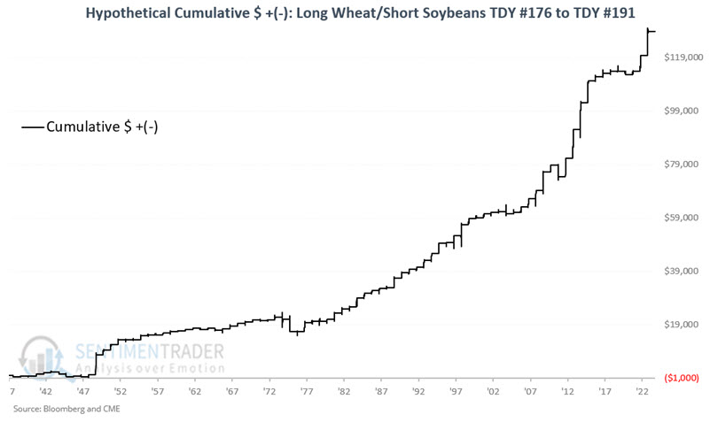
The results are pretty compelling for a trader comfortable trading commodity futures spreads. The historical Win Rate over 86 years is 84%, the average and median winner is significantly greater than the average and median loser and returns over $5,000 are skewed 8 to 0 in favor of winners. The bad news is that there are no guarantees, and futures trading involves exposure to unlimited risk, even when trading spreads.
About TradingEdge Weekly...
The goal of TradingEdge Weekly is to summarize some of the research published to SentimenTrader over the past week. Sometimes there is a lot to digest, and this summary highlights the highest conviction or most compelling ideas we discussed. This is NOT the published research; rather, it pulls out some of the most relevant parts. It includes links to the published research for convenience, and if you don't subscribe to those products, it will present the options for access.