
TradingEdge Weekly for Oct 6 - Employment trends, warning signs, gold getting flushed

Key points:
- Using an employment model to time stocks and other economic trends
- S&P 500 breadth has been curiously weak during the 240 days since last October's bottom
- A couple of other indicators are giving warning signs
- Smaller stocks continue their relative struggle
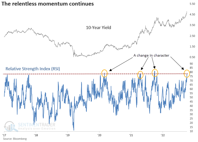
- The RSI indicator on note yields is extreme
- The relentless rise in yields
- Utilities got hit hard
- Oil prices had a crude week
- A bad seasonal stretch for gold miners
- Why gold itself might fare a bit better
- The RSI on gold futures fell to one of the lowest levels in history
An employment trend model for stocks
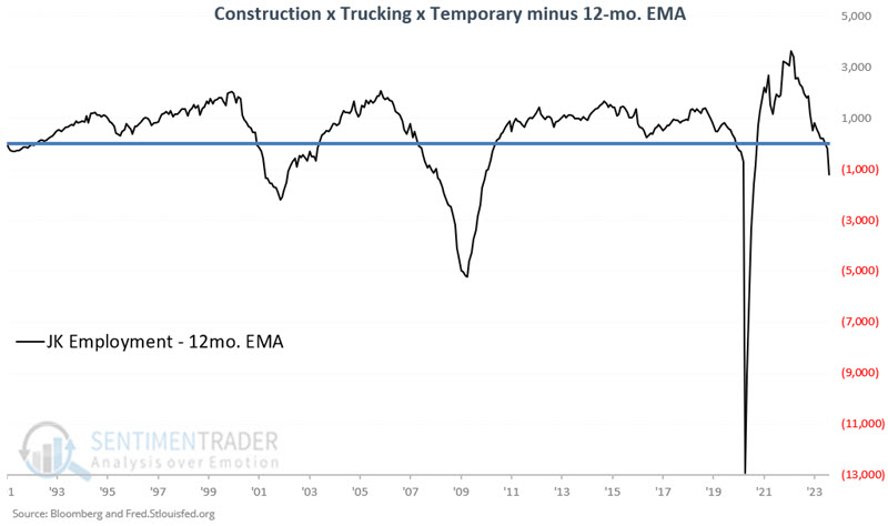
Strong employment is both a catalyst and harbinger of economic growth. Jay noted that weakening employment is often an early clue of a weakening economy and construction, trucking, and temporary employment trends may offer a better picture of employment trends than the official unemployment rate.
The raw data for each sector is generally available in the first week of each month. However, the model does not analyze this data until the close of the last trading day of each month.
- The raw indicator is calculated at the end of the month by multiplying the latest value for each of the three data series and then dividing the result by one million
- This raw indicator is then compared to its own 12-month exponential moving average to determine if it is in an uptrend or a downtrend.
- Uptrends are considered favorable for stocks and the economy as a whole; downtrends unfavorable
The chart below displays the indicator, which I refer to as JK Employment, minus its 12-month EMA. Values above 0 are considered favorable for stocks and the economy and vice versa. The latest signal was a cross back below 0 on 2023-08-31.
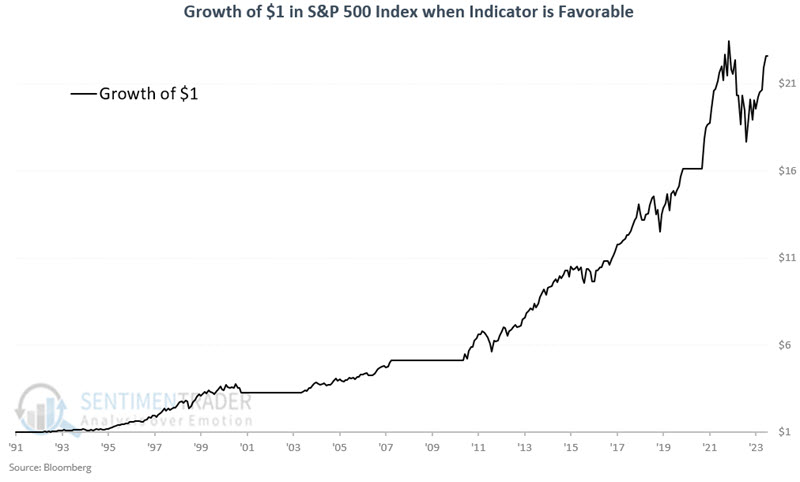
Our test period extends from 1991-03-31 through 2023-09-30. If the latest calculation shows JK Employment to be above its 12-month EMA at the end of the month, then we hold the S&P 500 during the following month.
The chart below shows the growth of $1 invested in the S&P 500 Index only when JK Employment is above its 12-month EMA. The cumulative gain was +2,159.7%. Note that this employment indicator remained favorable throughout the 2022 bear market. This suggests that the 2022 decline was primarily a reaction to inflation and not a sign of an impending recession.
Conversely, the chart below displays the growth of $1 invested in the S&P 500 Index only when JK Employment is below its 12-month EMA. The cumulative loss is -45.7%.
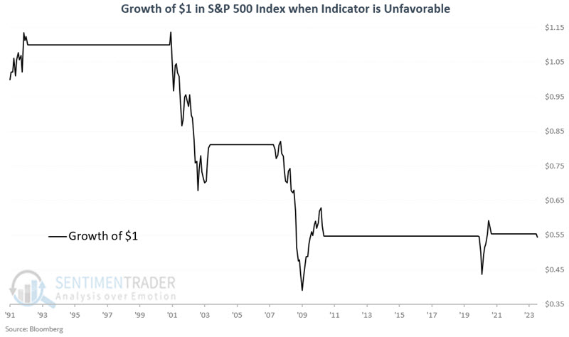
This model is not intended to be a standalone 100% in or 100% out trading model. It is best used in a broader "weight of the evidence" approach.
Jay also looked at economic performance based on this model via a cumulative increase or decrease for the Coincident Economic Indicators. It was successful in predicting whether future conditions would rise or fall as well.
A weak rally for a new bull market
It's been a rough couple of months for the average stock. Over the past 50 days, an average of 25 more stocks in the S&P 500 have declined than advanced, one of the most extreme readings in the past decade.
Over the past 200 sessions, the S&P 500's breadth is almost flat. That's taking an average of each day's net number of advancing minus declining stocks.
It's been 240 days since the S&P's bottom last October, so let's extend our time frame a bit longer. There has been an overall total of 2,943 more stocks rising than declining during this stretch. The chart below ranks the net number of advancing minus declining stocks in the S&P during the 240 days following a 52-week low. There were 28 of these bottoms, and the current one is on the weaker end.
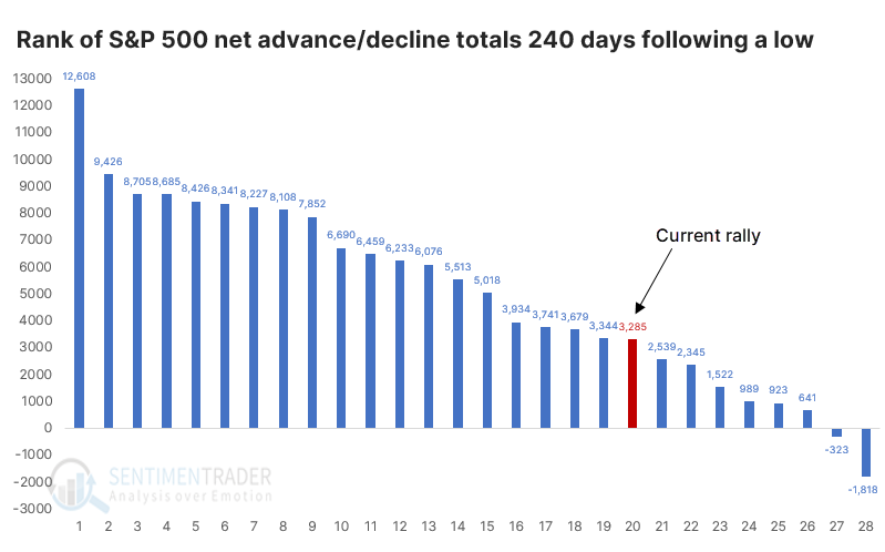
The S&P's returns after the weakest rallies were unimpressive. While it rallied across all time frames most of the time, and its median returns were mostly slightly above random, it was uninspiring. There were a couple of significant declines, though those were in earlier decades. Over the past 40 years, the S&P showed a gain every time over the next six and twelve months.
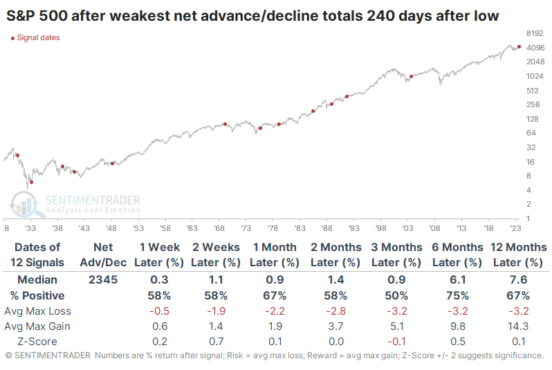
Compare that to the strongest rallies, when many more stocks tended to rally more consistently. The average net number of advancing minus declining stocks was much stronger during these rallies and preceded more robust returns. The S&P rose more strongly and more consistently, with less risk. So, there did seem to be some benefit to seeing more consistently stronger breadth numbers than we've seen during the first 240 days following the bottom.
There is also some concern that within the S&P 500, we haven't truly seen a surge in the percentage of stocks that managed to climb above their 200-day moving averages. At no point during the first 240 days of the rally did more than 80% of stocks close above their long-term averages.
The table below shows the S&P's future returns when it went 240 days past a low, with the fewest members climbing above their 200-day averages.
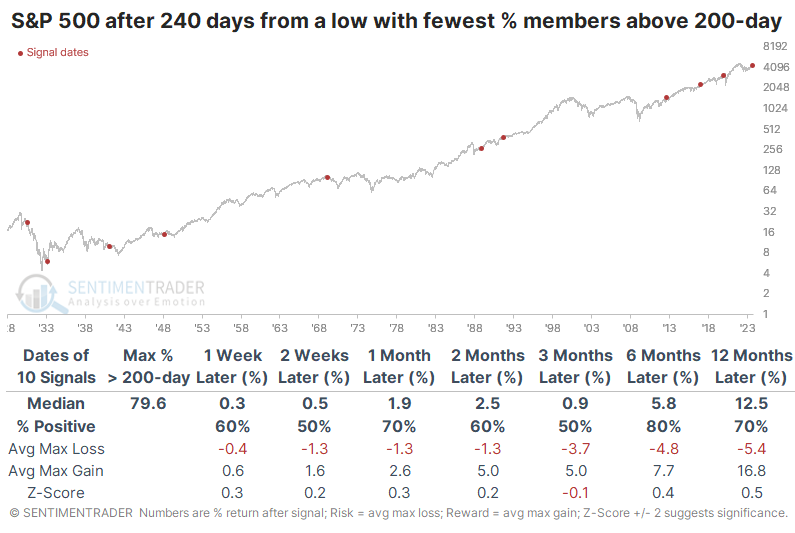
Once again, the returns were mostly positive but not all that inspiring. However, they were mostly better this time than after those rallies when almost all stocks exceeded their averages.
A couple more warning signs
Jay noted that the ratio of the S&P 500 Price/Earnings Ratio to the VIX "fear gauge" recently turned down from an extreme level, and the percentage of stocks in the index falling to a 52-week low spiked to a critical level.
The PE/VIX Spread shows the spread between the forward price/earnings multiple on the S&P 500 and the VIX volatility gauge. The higher it is, the more investors are willing to value stocks while not suffering the consequences of high volatility, which tends to lead to poor future returns.
Like many indicators that can reach extreme readings, it is not so much the extreme reading itself - but rather the reversal from an extreme reading - that appears to matter most. The chart below highlights those times when the 50-day average for the PE/VIX spread crossed below 5.0, which just triggered again.
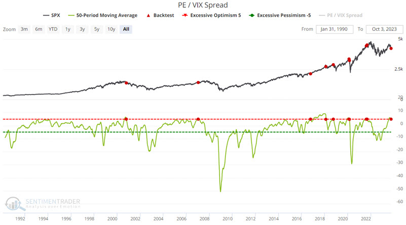
It is important to note that this signal is not a "sell everything and head for the hills" indication. Market gains followed signals in 2007, 2016, and 2020. Nevertheless, the overall median results are a warning sign that stock investors may need to temper their expectations for the year ahead.
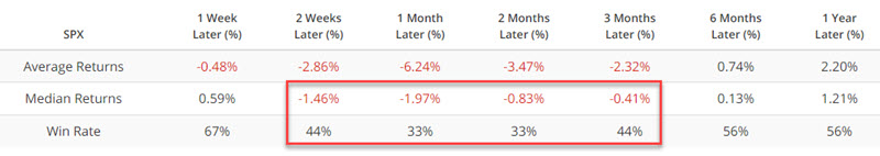
An increase in the number of stocks reaching a new 52-week low is objectively a sign of weakness in the market. For the record, it can be a bullish oversold signal when things get overdone - i.e., when a huge percentage of stocks (say 40% or more) reach new lows at once.
The chart below highlights those dates when the SPY New Low % indicator was above 8% while SPY was above its 150-day moving average. This represents a situation where apparent strength in the overall index is masking a lot of internal weakness. It triggered this week.
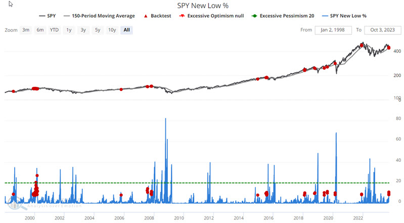
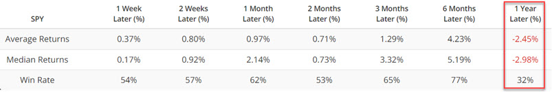
In a nutshell, the results are just plain weird. Median Returns and Win Rates are decent, if not necessarily above average, through six months. However, the 12-month results are negative and far below average. So, once again, we are not talking about an immediately actionable signal. This appears to be more of a shot across the bow to investors to alert them that things may get even more tricky in the year ahead.
Smaller stocks continue their relative struggle
Through the third quarter, the total return on Small Caps underperformed Large Caps by more than 10%, ranking in the bottom 15% of all years since 1928.
This is now the 5th consecutive year that Small Caps underperformed Large Caps through Q3, a record stretch (some of the returns before 1950 were cut off as they were so egregious that they distorted the scale).
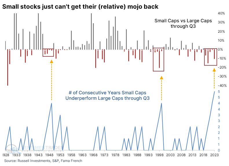
There were only three other times that the streak lasted four years, shown in the table below. Even though they underperformed again after the 2022 streak reached four years, their absolute return is still quite positive.
If we ignore the fact that they've underperformed through Q3 for five straight years and just look at the magnitude of the underperformance, the table below shows returns after they trailed Large Caps by 10% or more.
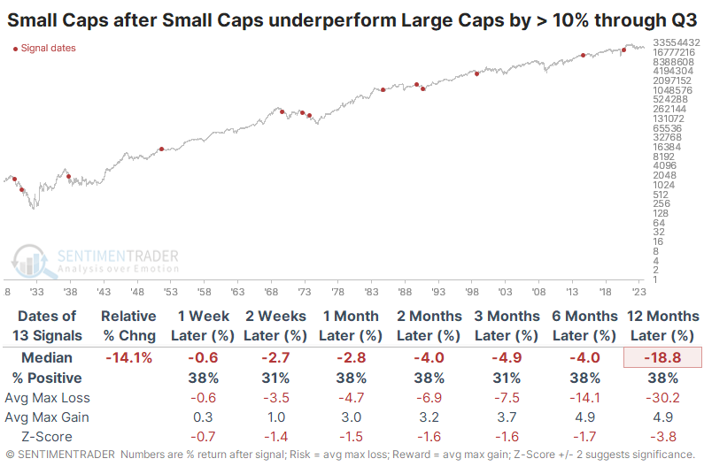
Like other studies we've looked at in recent weeks, it wasn't encouraging for mean-reversion investors. The last few signals were decent, so that's something. But prior to the last 25 years, all of them preceded losses for Small Caps either three or six months later.
Even though recent signals have preceded positive absolute returns, they have still mostly trailed the returns on Large Caps. The last two were the exception - all the preceding signals saw Small Caps continue to underperform Large Caps over the next three months, roughly taking us through year-end.
An extreme indicator for bonds
The Relative Strength Index (RSI) for the 10-year yield crossed above 77. Dean showed that similar momentum signals suggest the long-term bond yield can rise further.
What makes the overbought condition significant? It's worth mentioning because, during the secular downtrend in yields from 1981 to 2020, the RSI never crossed above 77 more than two times in any countertrend rally in the 10-year, let alone four times like now. This change in character provides additional evidence suggesting the secular downtrend in yields has reversed to a secular uptrend.
When the RSI exceeds 77, the upward trajectory in the 10-year yield will likely continue in the near term. In 52 out of 60 prior instances, the benchmark yield was higher at some point over the next month. Two months later, it was higher in 55 out of 60 cases.
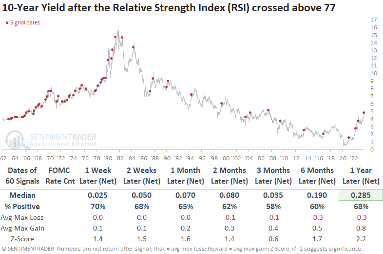
Even during the secular downtrend in Treasury yields since 1981, the 10-year yield tended to increase in the short term after similar RSI readings. Over the next month, the benchmark yield experienced an increase in 16 out of 17 previous occurrences.
When the FOMC rate hike count is five or more, there is a stronger tendency for the 10-year yield to experience further upside. The benchmark yield was higher at some point over the subsequent month in every case.
The Utility sector has struggled when rates rise, and most sub-industries within the financials sector also struggled in a rising rate environment like now. Banks, in particular, are a critical group to monitor for signs of credit market stress.
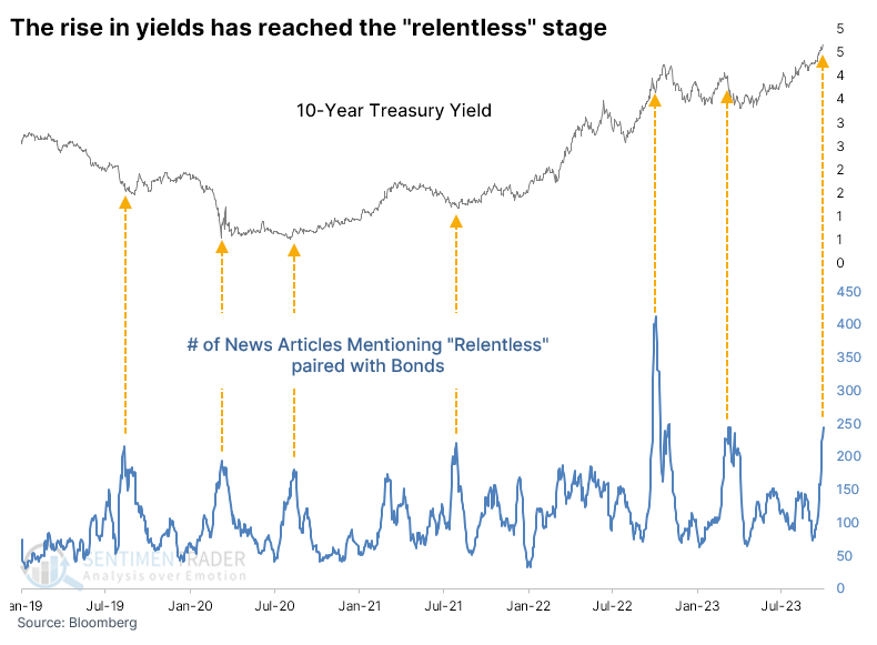
The relentless rise in yields
We've reached the "relentless" stage of the rise in Treasury yields.
The number of news articles in the Bloomberg data feed that mention relentless along with the bond market has spiked to the 2nd-highest reading in at least eight years. Over the past five years, spikes in news mentions have roughly coincided with turning points in yield.
In the past, we've often looked at a market's rise or fall over multiple time frames, usually one, three, and six months. It gives us a decent look at momentum over a wide time frame and has been moderately useful at indicating extremes.
Looking at this for 10-year Treasury yields, we see that they have increased by more than 50 basis points over the past month, 75 b.p. over three months, and 125 b.p. over six months. On average, the rise is just under 100 basis points or 1% over the three time frames. This is among the largest triple time frame rises in over 60 years.
The table below shows that T-note yields tended to drop (in basis points) during the next couple of weeks, but not by much. After that, it was a toss-up whether they rose or fell. Only in 1969 and 1984 did it approximately equate with a significant peak. We could maybe throw 2009 in there even though that took longer to play out.
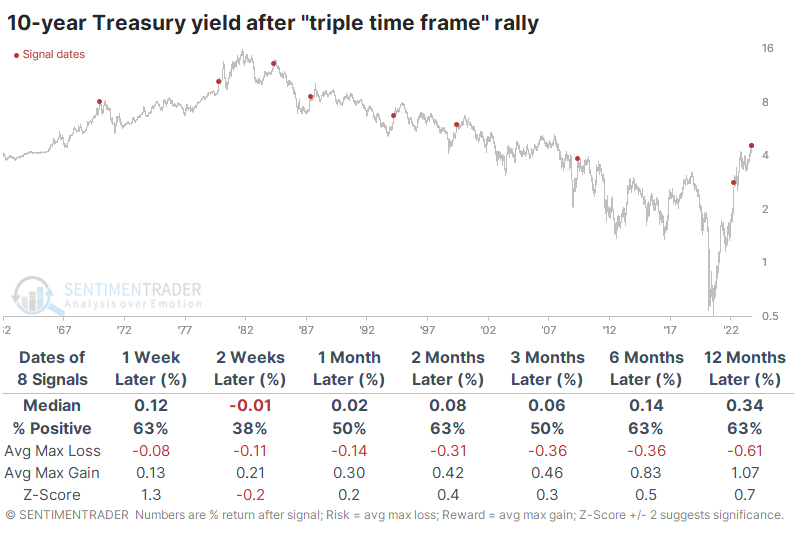
Where it gets interesting (and concerning) is related to other markets. The most benchmarked index in the world, the S&P 500, did not react well to these rapid and sustained increases in the 10-year yield. The first month was rough except for 1999, which ended up being rough over a much longer time frame.
Among other indexes and markets, the Nasdaq Composite and Russell 2000 fared even worse than the S&P across most time frames up to six months later. They had a tough time showing any meaningful or sustained gains. Surprisingly, the dollar also didn't fare all that well beyond the first couple of weeks. That didn't help gold much at first, but six months later, the yellow metal sported a gain 71% of the time.
An ugly week for Utilities
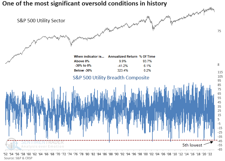
Dean noted that over five sessions, the Dow Jones Utility Average underperformed the S&P 500 by more than -9% and a breadth composite for the utility sector plunged to one of the most oversold conditions in history.
Investors have abandoned the traditionally defensive equity sectors like Consumer Staples, Health Care, and Utilities, with Treasuries offering enticing yields not seen in over a decade. In particular, the utility sector is witnessing unprecedented destruction.
On Monday, the 5-day rate of change spread between the Dow Jones Utility Average and the S&P 500 plunged by more than -9%, the 10th most severe period of underperformance since 1929.
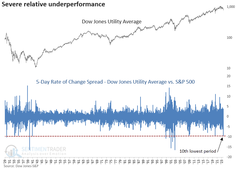
When the Dow Jones Utility Average underperforms the S&P 500 by -9% or more over five days, the extreme selling pressure tends to diminish. Except for October 1998 and June 2000, severe underperformance by the utility sector, like now, occurred in significant drawdown periods for the broad market.
A composite that contains six market breadth indicators with varying duration lengths plunged to the 5th lowest reading in history, indicating severe downside participation from components within the S&P 500 Utility sector. While a composite score of -30% or greater is scarce, the annualized returns associated with similar conditions suggest a massive snapback can occur when utility stocks are oversold, like now.
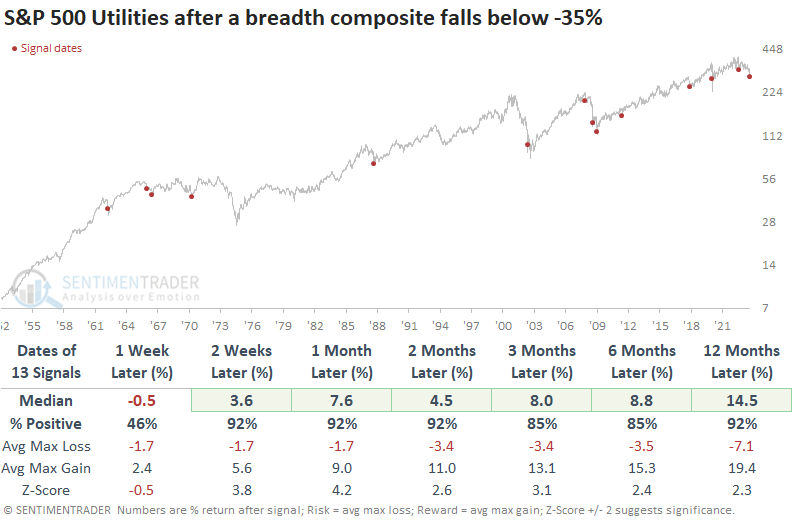
When the composite score falls below -35%, the downside momentum in the S&P 500 Utility sector tends to persist over the following week but median returns, win rates, and z-scores show outstanding results across medium and long-term horizons.
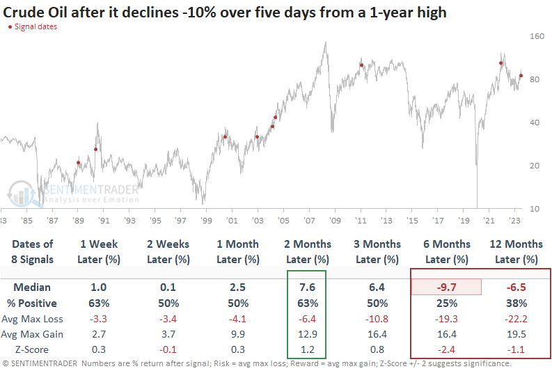
Oil's crude week
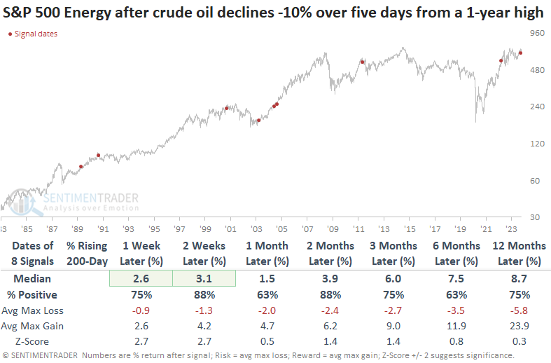
Crude oil plunged by more than -10% over five sessions from a 1-year high. Dean showed that similar patterns led to downside follow-through over the subsequent four sessions, followed by a rebound. Remarkably, the energy sector did not follow crude oil's descent.
In recent research reports, we shared several studies suggesting caution for crude oil as the commodity was overbought, exhibiting bullish optimism, and the curve was in backwardation. In overbought markets characterized by optimism, it's not uncommon for a catalyst to emerge, causing traders to doubt their bullish outlook, ultimately leading to a price reversal.
For only the 9th time since 1983, crude oil futures declined more than -10% over five sessions from a 1-year high.
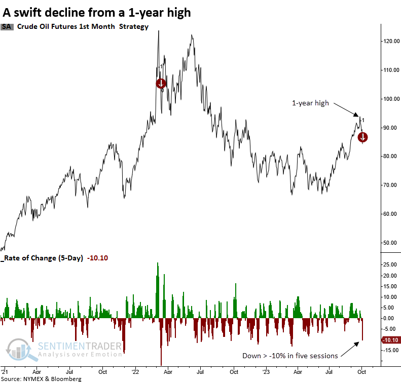
When crude oil experiences a swift decline from a high, like now, the commodity was lower at some point in 7 out of 8 previous cases.
Over longer time horizons, crude oil tends to bounce back over the next two months. However, the six and twelve-month periods suggest one should be mindful that the violent move down from a high could foreshadow a more significant topping pattern.
Contrary to the drop in oil prices, the S&P 500 Energy sector remains resilient over the next four sessions, with 6 out of 8 precedents yielding a positive return at some point during this period.
Except for 2000 and 2011, the sector's 5-day rate of change proved to be surprisingly durable in light of the sharp oil price decline. While the swift decline from a high tends to create an unfavorable long-term outlook for crude oil, that's not the case for energy stocks. In most precedents, a high percentage of energy stocks maintained a rising 200-day average, indicating a bullish long-term trend backdrop.
A bad seasonal stretch for gold miners
Jay showed that gold stock miners tend to see weakness during October.
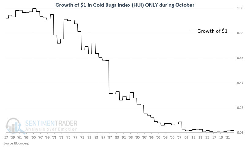
Ticker HUI represents the Gold Bugs Index, which tracks an index of gold mining stocks and has a history dating back to 1957. The period of significant concern encompasses the entire month of October.
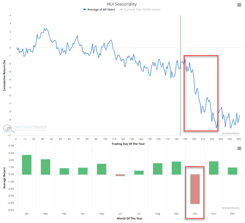
To better understand the potential danger associated with holding gold stocks in October, the chart below displays the cumulative growth (or, more accurately, decline) of $1 invested in gold stocks only during this month every year from 1958 through 2022. The cumulative result has been a loss of -90.3%.
It wasn't all bad; the stocks managed to rally 41% of the time. However, the average gain during winning years was +5.9% while the average loss during losing years was -9.1%. Also, the stocks were twice as likely to suffer a -10% loss than enjoy a +10% gain. Also, results have somewhat flattened out in the last decade, and October has shown a gain in four of the previous five years.
Gold itself might fare a bit better
Perhaps anticipating some poor seasonality, Jay noted that trader sentiment for the SPDR Gold Trust (GLD) just touched an extreme level, though seasonality, trend, and momentum are potential headwinds.
Our GLD Optimism Index (Optix) indicator has declined to an unusually low level and stayed there over a period of days. The Optix can go from 0 (maximum pessimism) to 100 (maximum optimism), though it generally stays above 20 and below 80.
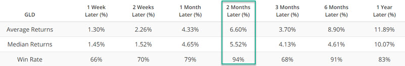
We use a 5-day moving average of daily GLD Optix readings for the test below. The chart below highlights all dates when the 5-day GLD Optix average was below 15% (i.e., 85% of traders have been bearish over the last five days). The most recent signal occurred on 2023-10-02. Over the next two months, GLD rallied 94% of the time.
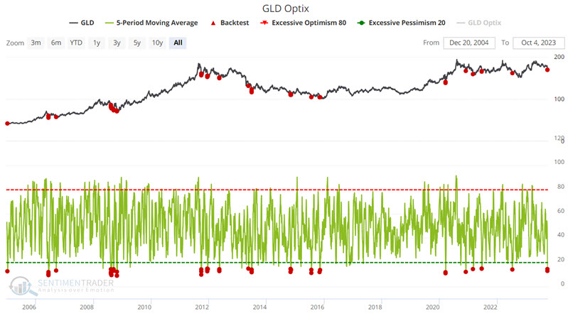
As we saw above with gold miners, however, seasonality is a headwind here.
Seasonality is climate, not weather, and does not constitute a roadmap, only an average of previous tendencies. While it can be considered a factor when making trading decisions, it should rarely be relied upon 100%. The reason for all this rhetoric regarding seasonality is that gold has demonstrated a historical tendency to show weakness during October. The chart below displays the annual seasonal trend for gold futures.
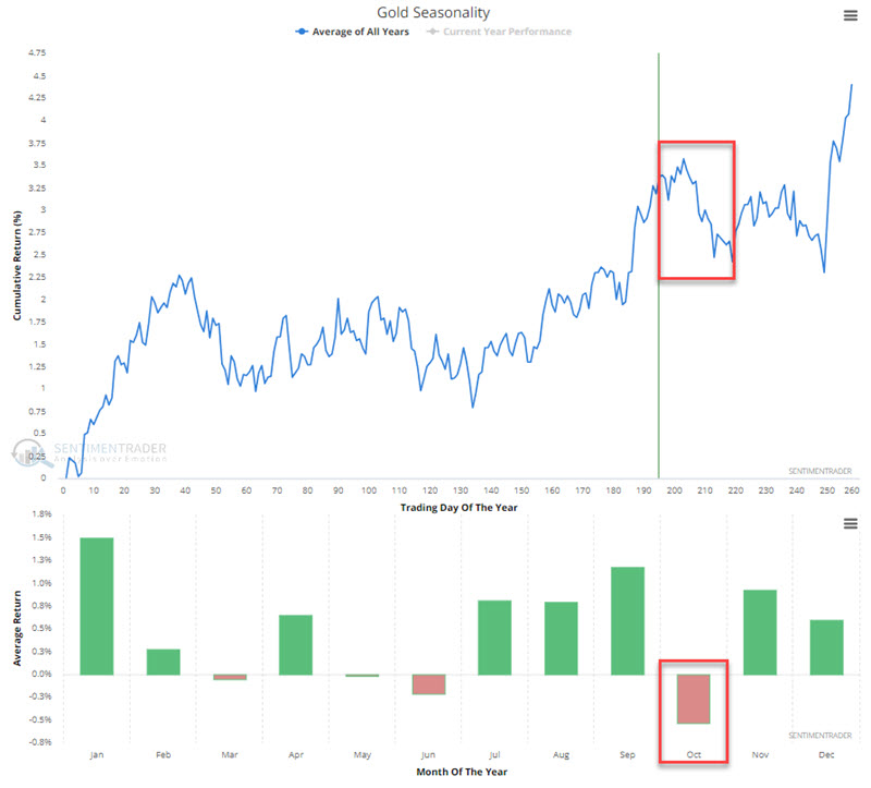
For the record, gold futures have declined in October 27 times in the past 48 years (i.e., 44% of the time up, 56% of the time down). The average and median returns for October are -0.63% and -0.41%, respectively.
Ticker GLD has a shorter history, as it started trading in 2004. For the record, ticker GLD has been up nine times and down nine times during October since inception. The average and median returns for October are +0.05% and +0.48%, respectively.
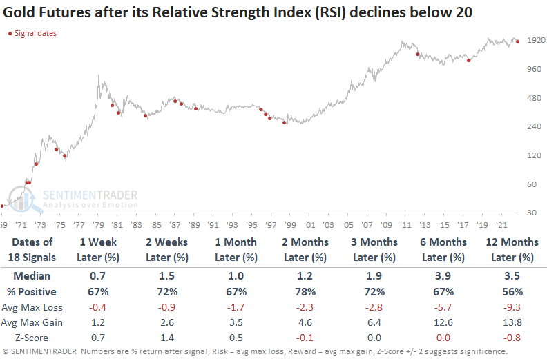
More on the oversold nature of gold
Dean showed that the Relative Strength Index (RSI) for gold futures declined to one of the lowest values in history. Similar oversold conditions led to a rally 78% of the time over the subsequent two months. When gold and the S&P 500 register oversold RSI conditions in unison, gold rallied 100% of the time.
Traders want nothing to do with traditionally defensive investment vehicles like Gold or Utility stocks as Treasury yields again soar to new highs, providing a more compelling option. The intense selling pressure in gold sent the Relative Strength Index (RSI), a momentum indicator, to one of the most oversold conditions in history, a level seen less than 1% of the time since 1971.
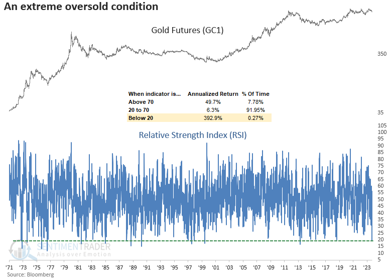
When the Relative Strength Index (RSI) for gold falls below 20, the precious metal shows a solid tendency to rally over the next two months with a 78% win rate. However, median returns over all time horizons are not exactly compelling.
For only the 11th time in history, the Relative Strength Index (RSI) for gold and the S&P 500 fell below a reading of 30 on the same day. When gold and stocks are oversold, the precious metal is higher two months later every time. The median return of 24% over the subsequent six months is outstanding.
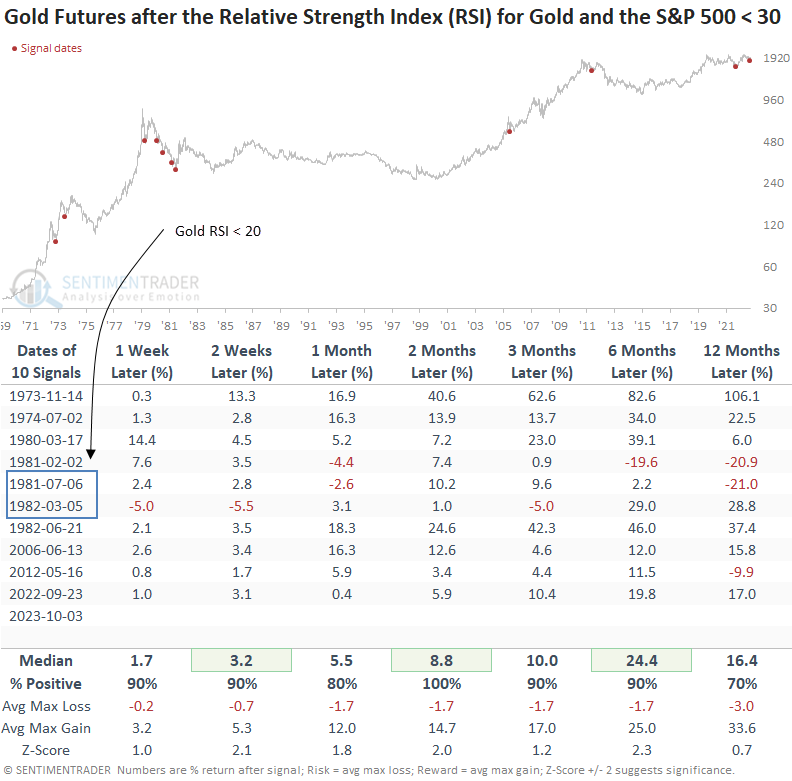
While the outlook for the S&P 500 looks okay, most of the signals occurred in the 1966-82 secular bear market, a period more similar to the current environment regarding inflation and Federal Reserve policy.
A relative comparison between gold and the S&P 500 suggests the precious metal could outperform the world's most benchmarked index over the next six months.
About TradingEdge Weekly...
The goal of TradingEdge Weekly is to summarize some of the research published to SentimenTrader over the past week. Sometimes there is a lot to digest, and this summary highlights the highest conviction or most compelling ideas we discussed. This is NOT the published research; rather, it pulls out some of the most relevant parts. It includes links to the published research for convenience, and if you don't subscribe to those products, it will present the options for access.